


1.基础布局
1.1线性布局 LinearLayout
怎么将Android Studio默认的ConstrantLayout改为LinearLayout?
- 在design页面下->component tree->ConstrainLayout右键->Convert view…->选择LinearLayout 点击apply
- 在code页面下->直接修改代码 将 androidx.constraintlayout.widget.ConstraintLayout 改为 LinearLayout
- 线性布局有两种:
水平的线性布局 所有控件都是水平挨个排布
android:orientation=“horizontal”
垂直的线性布局 所有控件都是垂直挨个排布
android:orientation=“vertical”
小tips:
在android中,所有在页面上显示的东西,必须具备两个属性,这两个属性是宽和高
android:layout_width 宽度
Android:layout_height 高度
对于宽度和高度,他们的值有三个
 wrap_content  按照内容自适应
 match_parent  按照父容器尺寸填满
 50dp                  数值(用的地方很单一)
嵌套线性布局结构
<LinearLayout
	android:layout_width="match_parent"
	android:layout_height="match_parent"
	android:orientation="vertical">

	<LinearLayout
		android:layout_width="match_parent"
		android:layout_height="wrap_content">

	</LinearLayout>

	<LinearLayout
		android:layout_width="match_parent"
		android:layout_height="wrap_content">

	</LinearLayout>

</LinearLayout>
1.2相对布局 RelativeLayout
嵌套相对布局结构
```bash
<RelativeLayout
	android:layout_width="match_parent"
	android:layout_height="match_parent"
	android:orientation="vertical">

	<RelativeLayout
		android:layout_width="match_parent"
		android:layout_height="wrap_content">

	</RelativeLayout>

	<RelativeLayout
		android:layout_width="match_parent"
		android:layout_height="wrap_content">

	</RelativeLayout>

</RelativeLayout>
相对于父元素给控件布局
android:layout_centerHrizontal 水平居中
android:layout_centerVertical 垂直居中
android:layout_centerInparent 相对于父元素完全居中
android:layout_alignParentBottom 位于父元素的下边缘
android:layout_alignParentLeft 位于父元素的左边缘
android:layout_alignParentRight 位于父元素的右边缘
android:layout_alignParentTop 位于父元素的上边缘
android:layout_alignWithParentIfMissing 如果对应的兄弟元素找不到的话就以父元素做参照物
属性值必须为id的引用名“@id/id-name”
android:layout_below      位于元素的下方
android:layout_above      位于元素的的上方
android:layout_toLeftOf   位于元素的左边
android:layout_toRightOf  位于元素的右边

android:layout_alignTop   该元素的上边缘和某元素的的上边缘对齐
android:layout_alignLeft  该元素的左边缘和某元素的的左边缘对齐
android:layout_alignBottom 该元素的下边缘和某元素的的下边缘对齐
android:layout_alignRight  该元素的右边缘和某元素的的右边缘对齐

给属性赋予像素值
android:layout_marginBottom      底边缘的距离
android:layout_marginLeft           左边缘的距离
android:layout_marginRight         右边缘的距离
android:layout_marginTop           上边缘的距离
1.3帧布局 FrameLayout
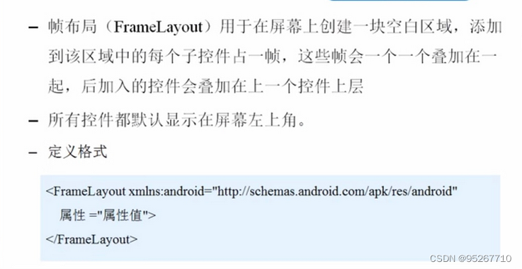 实现代码如下:
<FrameLayout
xmlns:android="http://schemas.android.com/apk/res/android"
    xmlns:tools="http://schemas.android.com/tools"
    android:id="@+id/FrameLayout1"
    android:layout_width="match_parent"
    android:layout_height="match_parent"
    tools:context=".MainActivity"
    android:foreground="@drawable/logo"
    android:foregroundGravity="right|bottom">

    <TextView
        android:layout_width="200dp"
        android:layout_height="200dp"
        android:background="#FF6143" />
    <TextView
        android:layout_width="150dp"
        android:layout_height="150dp"
        android:background="#7BFE00" />
     <TextView
        android:layout_width="100dp"
        android:layout_height="100dp"
        android:background="#FFFF00" />

</FrameLayout>
1.4ConstrantLayout 约束布局 (Android Studio默认布局)
一、ConstraintLayout优点:
1、解决了布局的层级嵌套问题
2、布局适配度较高:主要体现在bias(偏移量)属性
二、当做百分比布局使用(解决布局适配问题)
1.常用的相对定位 Margin 属性 :
android:layout_marginStart=“10dp” //左侧边的空白
android:layout_marginEnd=“10dp” //右侧边的空白
android:layout_marginLeft=“10dp” //左侧边的空白
android:layout_marginRight=“10dp” //右侧边的空白
android:layout_marginTop=“10dp” //顶部边的空白
android:layout_marginBottom=“10dp” //底部边的空白
2.对齐
android:layout_constraintTop_toTopOf // 将所需视图的顶部与另一个视图的顶部对齐。
android:layout_constraintTop_toBottomOf // 将所需视图的顶部与另一个视图的底部对齐。
android:layout_constraintBottom_toTopOf // 将所需视图的底部与另一个视图的顶部对齐。
android:layout_constraintBottom_toBottomOf// 将所需视图的底部与另一个视图的底部对齐。
android:layout_constraintLeft_toLeftOf // 将所需视图的左边与另一个视图的左边对齐。
android:layout_constraintLeft_toRightOf // 将所需视图的左边与另一个视图的右边对齐。
android:layout_constraintRight_toLeftOf // 将所需视图的右边与另一个视图的左边对齐。
android:layout_constraintRight_toRightOf // 将所需视图的右边与另一个视图的右边对齐
注意:该属性使用注意事项:如需使用该属性需同时指定对应轴向的两条边才会生效,例如使用app:layout_constraintVertical_bias=“0.5” 属性时需要同时指定当前控件的top边和bottom约束才能生效。该值默认为0.5居中位置,取值范围在0~1之间。
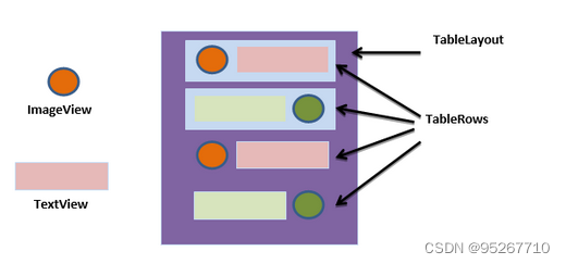
1.5TableLayout 表格布局
- TableLayout 的特性
和其他 Layout 一样,TableLayout 也派生自 ViewGroup,它可以将内部的 View 或者 Layout 整齐的排成几行几列,按照表格的形式摆放。我用使用标签标识一行,在标签内的 View 或者 Layout 都将摆放在同一行中。
 注:看到行标签,大家可以想到,TableLayout 是不需要注明表格列的数量的,因为 Android 系统会自动根据我们声明在中的元素推算出最终表格的列数
 - 关键属性的用法
刚刚提到,我们用来声明表格的一行,而很多属性都是作用于内部 View 的,这个也是和其他 Layout 不太一样的地方,需要注意,下面就分别介绍一下 TableLayout 中这两类属性。
2.1 作用于 TableLayout 的属性
android:stretchColumns:
当表格的某些列宽度比较窄的时候,你可以通过给 TableLayout 设置stretchColumns属性来设置某些列向行方向伸展,最多可占据一整行。该属性的参数直接填入需要拉伸的列的序号即可(从 0 开始),另外支持多输入,各个列序号通过“,”分隔。如果需要对所有列拉伸,可以直接用“*”表示,如下:
<!-- 针对所有列做拉伸 -->
android:stretchColumns="*"

<!-- 针对第1列、4列、13列做拉伸 -->
android:stretchColumns="0,3,12"
这是与 stretchColumns 相对的属性,如果某些列的所占的空间太大,那么可以通过该属性设置可收缩的列。当该列子控件的内容太多(比如 TextView 中文本太长),已经挤满所在行,那么该子控件的内容将往列方向显示(TextView 折行显示)。
注:虽然从名字上讲,一个是扩展,一个是收缩,但二者并不冲突。一个列可以同时具备stretchColumns及shrinkColumns属性。若此,那么当该列的内容过多时,将“多行”显示其内容。当然这里不是真正的多行,而是系统根据需要自动调节该行的 layout_height。
android:collapseColumns:
隐藏部分列的内容,使用方法和上述两个属性一样,直接填入列的序号即可,支持多个列
这 3 个属性的用法示例如下
<?xml version="1.0" encoding="utf-8"?>
<TableLayout xmlns:android="http://schemas.android.com/apk/res/android"
    xmlns:tools="http://schemas.android.com/tools"
    android:layout_width="match_parent"
    android:layout_height="match_parent"
    android:shrinkColumns="0"
    android:stretchColumns="1,2"
    android:collapseColumns="3"
    tools:context=".MainActivity">

    <TableRow>

        <TextView
            android:id="@+id/center"
            android:layout_width="wrap_content"
            android:layout_height="wrap_content"
            android:background="#EE0D0D"
            android:text="column1, Emercy Android Study"
            android:textSize="20sp" />

        <TextView
            android:layout_width="wrap_content"
            android:layout_height="wrap_content"
            android:background="#DBEE14"
            android:text="column2"
            android:textSize="20sp" />

        <TextView
            android:layout_width="wrap_content"
            android:layout_height="wrap_content"
            android:background="#7492CC"
            android:text="column3"
            android:textSize="20sp" />

        <TextView
            android:layout_width="wrap_content"
            android:layout_height="wrap_content"
            android:background="#09A234"
            android:text="column4"
            android:textSize="20sp" />
    </TableRow>

    <TableRow>

        <TextView
            android:layout_width="wrap_content"
            android:layout_height="wrap_content"
            android:background="#FF80AB"
            android:text="row2"
            android:textSize="20sp" />
    </TableRow>
</TableLayout>
2.常用控件
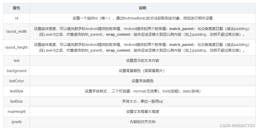
2.1TextView 文本控件 给用户一个文字性的提示
-
文本的字体尺寸单位为
sp -
sp: scaled pixels(放大像素). 主要用于字体显示。
基本属性:
 实例:
实例:
<TextView

    android:id="@+id/tView1"
    android:layout_width="200dp"
    android:layout_height="wrap_content"
    android:text="修改"
    android:textColor="@color/white"
    android:textSize="90dp"
    android:textStyle="bold"
    android:gravity="center"
    android:background="@color/black"/>
<TextView
    android:id="@+id/tv1"
    android:layout_width="wrap_content"
    android:layout_height="wrap_content"
    android:text="Hello World" />
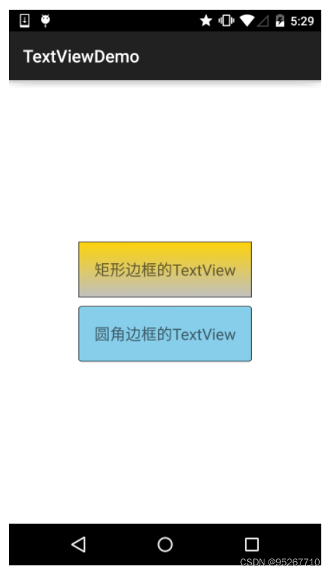
2.1.1文本设置边框
-
实现原理:
编写一个ShapeDrawable的资源文件!然后TextView将 background 设置为这个drawable资源即可
-
ShapeDrawable的资源文件
-
这个是设置背景颜色的
-
这个是设置边框的粗细,以及边
框颜色的
-
这个是设置边距的
-
这个是设置圆角的
-
这个是设置渐变色的,可选属性有: startColor:起始颜色 endColor:结束颜色 centerColor:中间颜色 angle:方向角度,等于0时,从左到右,然后逆时针方向转,当angle = 90度时从下往上 type:设置渐变的类型
-
编写矩形边框的Drawable:
-
实现代码:
  - <?xml version="1.0" encoding="utf-8"?>
<shape xmlns:android="http://schemas.android.com/apk/res/android">
  <!-- 设置一个黑色边框 -->
  <stroke android:width="2px" android:color="#000000"/>
  <!-- 渐变 -->
  <gradient
    android:angle="270"
    android:endColor="#C0C0C0"
    android:startColor="#FCD209" />
  <!-- 设置一下边距,让空间大一点 -->
  <padding
    android:left="5dp"
    android:top="5dp"
    android:right="5dp"
    android:bottom="5dp"/>
</shape>
编写圆角矩形边框的Drawable
<?xml version="1.0" encoding="utf-8"?>
<shape xmlns:android="http://schemas.android.com/apk/res/android">
  <!-- 设置透明背景色 -->
  <solid android:color="#87CEEB" />
  <!-- 设置一个黑色边框 -->
  <stroke
    android:width="2px"
    android:color="#000000" />
  <!-- 设置四个圆角的半径 -->
  <corners
    android:bottomLeftRadius="10px"
    android:bottomRightRadius="10px"
    android:topLeftRadius="10px"
    android:topRightRadius="10px" />
  <!-- 设置一下边距,让空间大一点 -->
  <padding
    android:bottom="5dp"
    android:left="5dp"
    android:right="5dp"
    android:top="5dp" />
</shape>
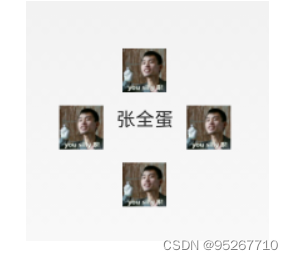
2.1.2带图片(drawableXxx)的TextView
<RelativeLayout
  xmlns:android="http://schemas.android.com/apk/res/android"
  xmlns:tools="http://schemas.android.com/tools"
  android:layout_width="match_parent"
  android:layout_height="match_parent"
  tools:context="com.jay.example.test.MainActivity" >
  <TextView
    android:layout_width="wrap_content"
    android:layout_height="wrap_content"
    android:layout_centerInParent="true"
    android:drawableTop="@drawable/show1"
    android:drawableLeft="@drawable/show1"
    android:drawableRight="@drawable/show1"
    android:drawableBottom="@drawable/show1"
    android:drawablePadding="10dp"
    android:text="张全蛋" />
</RelativeLayout>
2.2EditText 输入文本控件
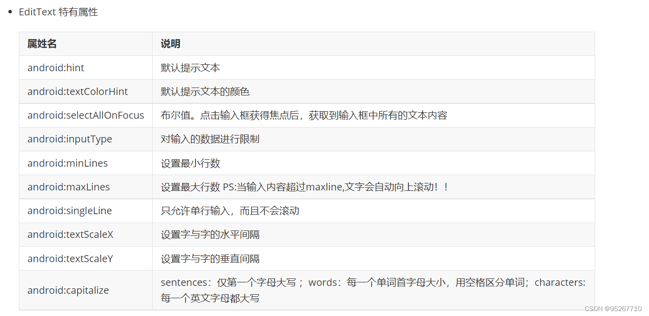 文本类型:
文本类型:
android:inputType=“none”
android:inputType=“text”
android:inputType=“textCapCharacters”
android:inputType=“textCapWords”
android:inputType=“textCapSentences”
android:inputType=“textAutoCorrect”
android:inputType=“textAutoComplete”
android:inputType=“textMultiLine”
android:inputType=“textImeMultiLine”
android:inputType=“textNoSuggestions”
android:inputType=“textUri”
android:inputType=“textEmailAddress”
android:inputType=“textEmailSubject”
android:inputType=“textShortMessage”
android:inputType=“textLongMessage”
android:inputType=“textPersonName”
android:inputType=“textPostalAddress”
android:inputType=“textPassword”
android:inputType=“textVisiblePassword”
android:inputType=“textWebEditText”
android:inputType=“textFilter”
android:inputType=“textPhonetic”
数据类型:
android:inputType=“number”
android:inputType=“numberSigned”
android:inputType=“numberDecimal”
android:inputType=“phone”//拨号键盘
android:inputType=“datetime”
android:inputType=“date”//日期键盘
android:inputType=“time”//时间键盘
2.2.1设置EditText获得焦点,同时弹出小键盘
edit.requestFocus(); //请求获取焦点
edit.clearFocus(); //清除焦点
低版本的系统直接requestFocus就会自动弹出小键盘了
稍微高一点的版本则需要我们手动地去弹键盘:
第一种:
InputMethodManager imm = (InputMethodManager)getSystemService(Context.INPUT_METHOD_SERVICE);
imm.toggleSoftInput(0, InputMethodManager.HIDE_NOT_ALWAYS);
第二种 :
InputMethodManager imm = (InputMethodManager)getSystemService(Context.INPUT_METHOD_SERVICE); imm.showSoftInput(view,InputMethodManager.SHOW_FORCED); imm.hideSoftInputFromWindow(view.getWindowToken(), 0); //强制隐藏键盘
2.2.2 EditText光标位置的控制
setSelection();//一个参数的是设置光标位置的,两个参数的是设置起始位置与结束位置的中间括的部分,即部分选中
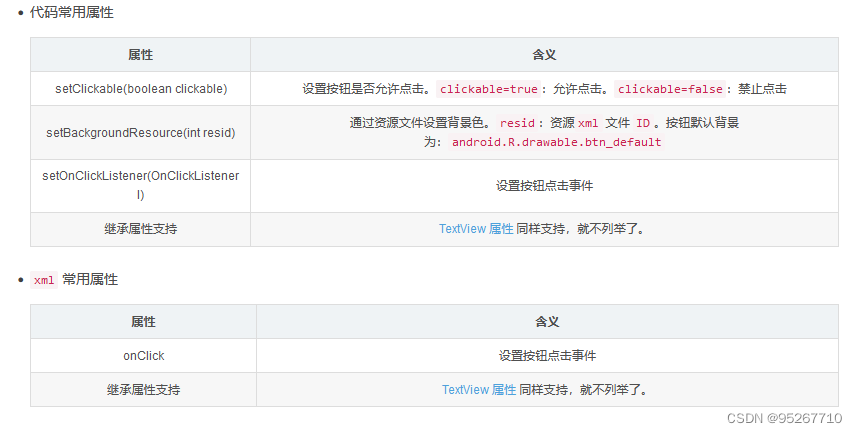
2.3Button 按钮
Button 控件继承 TextView ,拥有 TextView 的属性
常用属性:
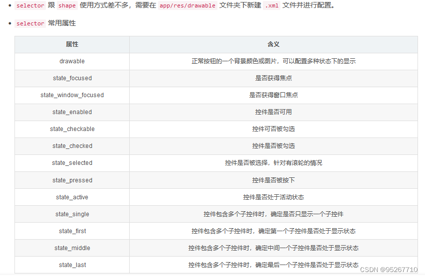
 selector 使用:
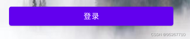
代码实例:
<?xml version="1.0" encoding="utf-8"?>
<LinearLayout xmlns:android="http://schemas.android.com/apk/res/android"
    xmlns:app="http://schemas.android.com/apk/res-auto"
    xmlns:tools="http://schemas.android.com/tools"
    android:layout_width="match_parent"
    android:layout_height="match_parent"
    android:orientation="vertical"
    tools:context=".MainActivity2">
<Button
            android:id="@+id/But_2"
            android:layout_width="match_parent"
            android:layout_height="wrap_content"
            android:background="@drawable/rounded"
            android:text="登录" />
</LinearLayout>
效果:
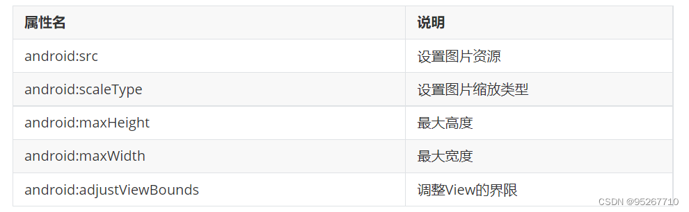
2.4 ImageView的基本使用
ImageView的常用属性:
2.5scaleType 属性 android:scaleType
-
android:scaleType用于设置显示的图片如何缩放或者移动以适应ImageView的大小 Java代码中可以通过imageView.setScaleType(ImageView.ScaleType.CENTER);来设置。
-
scaleType可选值如下:
-
fitXY:对图像的横向与纵向进行独立缩放,使得该图片完全适应ImageView,但是图片的横纵比可能会发生改变
-
fitStart:保持纵横比缩放图片,知道较长的边与Image的编程相等,缩放完成后将图片放在ImageView的左上角
-
fitCenter:同上,缩放后放于中间;
-
fitEnd:同上,缩放后放于右下角;
-
center:保持原图的大小,显示在ImageView的中心。当原图的size大于ImageView的size,超过部分裁剪处理。
-
centerCrop:保持横纵比缩放图片,知道完全覆盖ImageView,可能会出现图片的显示不完全
-
centerInside:保持横纵比缩放图片,直到ImageView能够完全地显示图片
-
matrix:默认值,不改变原图的大小,从ImageView的左上角开始绘制原图, 原图超过ImageView的部分作裁剪处理
-
-
fitEnd , fitStart , fitCenter,fitXY
带有“fit”字样的,会显示图片的全部内容。
fitStart,fitCenter,fitEnd 图片会按原比例显示。图片会往指定的方向靠拢。
fitXY会拉伸图片,铺满整个ImageView。
  <ImageView
    android:background="#ffc"
    android:layout_width="300dp"
    android:layout_height="wrap_content"
    android:layout_gravity="center"
    android:scaleType="fitStart"
    android:src="@mipmap/ic_launcher" />
-
centerCrop 与 centerInside
centerCrop:按横纵比缩放,直接完全覆盖整个ImageView
centerInside:按横纵比缩放,使得ImageView能够完全显示这个图片 -
fitXY
不按比例缩放图片,目标是把图片塞满整个View
-
matrix
从ImageView的左上角开始绘制原图,原图超过ImageView的部分作裁剪处理
-
center
保持原图的大小,显示在ImageView的中心。当原图的size大于ImageView的size,超过部分裁剪处理
2.6alpha 设置图片透明度
设置 alpha 值,能改变整个 ImageView 的透明度
<ImageView
   style="@style/IvDemo1"
   android:layout_marginStart="20dp"
   android:alpha="0.9"
   android:scaleType="fitCenter"
   android:src="@drawable/pic_2_robots" />


 135
135


 被折叠的 条评论
为什么被折叠?
被折叠的 条评论
为什么被折叠?
 到【灌水乐园】发言


