


弹性盒布局模型(Flexible Box Layout)是 CSS3 规范中提出的一种新的布局方式。该布局模型的目的是提供一种更加高效的方式来对容器中的条目进行布局、对齐和分配空间。这种布局方式在条目尺寸未知或动态时也能工作。这种布局方式已经被主流浏览器所支持,可以在 Web 应用开发中使用。看到这里相信大家也知道什么是弹性盒子模型了,下面给大家介绍几个案例:
弹性盒子模型:Flex布局,称为flex容器。可以简单、完整、响应式布局。元素设置display:flex时,其他样式display,vertical-align,float属性会失效。父级元素设置为ClassName:first。子元素span设置圆点即可。 注释只打了一遍。。希望大家能看懂!!
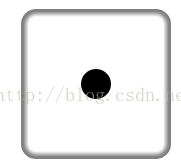
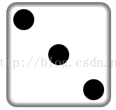
1.Flex。
.first{
display:flex; // 设置弹性盒子模型
justify-content:center; // 设置主轴(可以理解为水平)方向居中
align-item-center; // 设置交叉轴(可以理解为垂直)方向居中
}

效果图:
2.Flex。
.second{
display:flex;
justify-content:space-between; // 设置主轴方向俩端对齐
}
.second>span:nth-child(2){
align-self:flex-end; // 设置单个元素在交叉轴上底部对齐
}
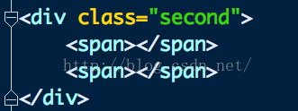
效果图:
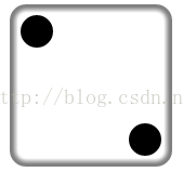
3.flex
.third{
display:flex;
justify-content:space-between;
}
.third>span:nth-child(2){
align-self: center; // 设置单个元素居中对齐
}
.third>span:nth-child(3){
align-self: flex-end;
}
效果图:
4.flex
.fourth{
display: flex;
justify-content: space-between;
}
.fourth .column{
display:flex;
flex-direction: column; // 设置交叉轴(水平)方向对齐
justify-content:space-between;
}

效果图:
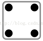
5.flex
.fifth{
display:flex;
justify-content:space-between;
}
.fifth .column:nth-child(odd){
display:flex;
flex-direction:column;
justify-content:space-between;
}
.fifth .column:nth-child(even){
display:flex;
flex-direction:column;
justify-content:center; // 设置主轴上居中对齐
}

效果图:

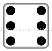
6.flex
.sixth{
display:flex;
justify-content:space-between;
}
.sixth .column:nth-child(odd){
display:flex;
flex-direction:column;
justify-content:space-between;
}
.sixth .column:nth-child(even){
display:flex;
flex-direction:column;
justify-content:space-between;
}
效果图:
总结:1、flex-direction 设置决定主轴的方向。 row为主轴水平方向 column为主轴垂直方向
2、flex-wrap 设置换行。 wrap 为换行 wrap-reverse 为第一行在下
3、justify-content 设置主轴对齐方式。 flex-start左对齐 flex-end右对齐 center居中对齐 space-between俩端对齐 space-around设置间距
4、align-content 设置交叉轴对齐方式。 与3用法相同
5、align-items 设置交叉轴对齐方式。 flex-start交叉轴起点的位置 flex-end交叉轴结束的位置 flex-center交叉轴中心店 baseline设置基线对齐
6、align-self 设置子元素的对齐方式。 flex-start起始点对齐 flex-end结束点对齐 center居中对齐


 扫一扫
扫一扫
 360
360

 被折叠的 条评论
为什么被折叠?
被折叠的 条评论
为什么被折叠?
 到【灌水乐园】发言


