


目录
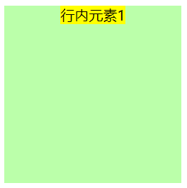
方法三:display:flex + justify-content:center
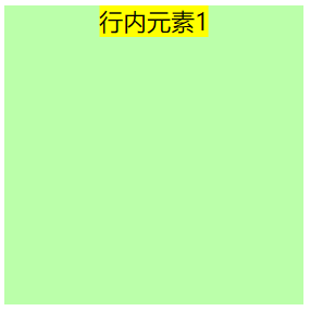
方法一:display:flex + align-items:center
方法三:display:table-cell + vertical-align:middle
方法一:text-align:center + (line-height)
方法二:dispaly:table-cell + text-align:center + vertical-align:middle
方法三:display:flex + align-items:center + justify-content:center
方法四:dispaly:flex + margin:auto;
方法二:display:flex + justify-content:center
方法三:display:flex + margin: 0 auto;
方法一:display:flex + algin-items:center
方法二:display:flex + margin:auto 0
方法一:display:flex + algin-items:center + justify-content
方法二:display:flex + margin: auto;
三、关于display:table-cell和margin的说明
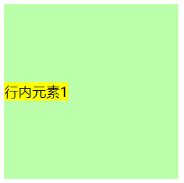
一、行内元素
1.水平居中
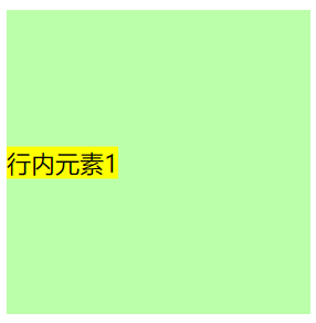
方法一:text-align: center
父元素设置:text-align:center
说明:1.text-align设置在父元素上,对子元素的居中效果上只能对子元素中的行内元素起作用,对块级元素不起作用。
2.text-align在对本元素中的文字居中效果上,只对块级元素起作用,对行内元素不起作用,行内元素的宽度由内容决定。
3.text-align会被后代元素继承
.outer{
	width: 200px;
	height: 200px;
	background-color: #bfa;
	text-align:center;
}
.inner{
	background-color: yellow;
}
<div class="outer">
	<span class="inner">
		行内元素1
	</span>
</div>
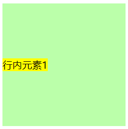
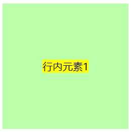
方法二:子绝父相
父元素设置:postion:relative
子元素设置:postion:absolute + left:50% + transform:translateX(-50%)
.outer{
	width: 200px;
	height: 200px;
	background-color: #bfa;
	position: relative;
}
.inner{
	position: absolute;
	left: 50%;
	transform: translateX(-50%);
	background-color: yellow;
}
<div class="outer">
	<span class="inner">
		行内元素1
	</span>
</div>
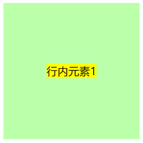
方法三:display:flex + justify-content:center
父元素设置:display:flex , justify-content:center
.outer{
	width: 200px;
	height: 200px;
	background-color: #bfa;
	display: flex;
	justify-content: center;
}
.inner{
	background-color: yellow;
}
<div class="outer">
	<span class="inner">
		行内元素1
	</span>
</div>
2.垂直居中
方法一:display:flex + align-items:center
父元素设置:display:felx , align-items:center
.outer{
	width: 200px;
	height: 200px;
	background-color: #bfa;
	display: flex;
	align-items: center;
}
.inner{
	background-color: yellow;
}
<div class="outer">
	<span class="inner">
		行内元素1
	</span>
</div>
方法二:子绝父相
父元素设置:postion:relative
子元素设置:postion:absolute + top:50% + transform:translateY(-50%)
.outer{
	width: 200px;
	height: 200px;
	background-color: #bfa;
	position: relative;
}
.inner{
	position: absolute;
	top: 50%;
	transform: translateY(-50%);
	background-color: yellow;
}
<div class="outer">
	<span class="inner">
		行内元素1
	</span>
</div>
方法三:display:table-cell + vertical-align:middle
父元素设置:display:table-cell , vertical-align:middle
说明:
vertical-algin是用来设置行内元素垂直对齐的方式
该属性定义行内元素的基线相对于该元素(设置了vertical-algin的元素)所在行的基线的垂直对齐方式。在表格中,这个属性会设置单元格框中的单元格内容的对齐方式。
只有元素是inline-block和inline的时候,设置vertical-algin才会起作用
.outer{
	width: 300px;
	/*height: 200px;*/
	background-color: #bfa;
	display: table-cell;
	vertical-align: middle;
}
.inner{
	background-color: yellow;
	vertical-align: middle;
}
img{
	vertical-align: middle;
}
<div class="outer">
	<span class="inner">
		行内元素1
	</span>
	<img src="./img/1.png" alt="">
</div>
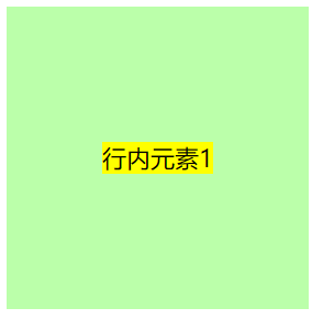
3.水平居中
方法一:text-align:center + (line-height)
父元素设置:text-align:center , line-height = height
说明:块级元素只设置line-height而不设置height时,line-height = height
.outer{
	width: 200px;
	height: 200px;
	background-color: #bfa;
	text-align: center;
	line-height: 200px;
}
.inner{
	background-color: yellow;
}
<div class="outer">
	<span class="inner">
		行内元素1
	</span>
</div>
方法二:dispaly:table-cell + text-align:center + vertical-align:middle
父元素设置:display:table-cell , text-align:center , vertical-align:middle
.outer{
	width: 200px;
	height: 200px;
	background-color: #bfa;
	display: table-cell;
	text-align: center;
	vertical-align: middle;
}
.inner{
	background-color: yellow;
}
<div class="outer">
	<span class="inner">
		行内元素1
	</span>
</div>
方法三:display:flex + align-items:center + justify-content:center
父元素设置:display:flex , align-items:center , justify-content:center
.outer{
	width: 200px;
	height: 200px;
	background-color: #bfa;
	display: flex;
	align-items: center;
	justify-content: center;
}
.inner{
	background-color: yellow;
}
<div class="outer">
	<span class="inner">
		行内元素1
	</span>
</div>

方法四:dispaly:flex + margin:auto;
父元素设置:display:flex
子元素设置:margin:auto
.outer{
	width: 200px;
	height: 200px;
	background-color: #bfa;
	display: flex;
}
.inner{
	background-color: yellow;
	margin: auto;
}
<div class="outer">
	<span class="inner">
		行内元素1
	</span>
</div>

方法五:子绝父相
父元素设置:position:relative
子元素设置:position:absolute + left:50% + top50%+transform:translate(-50%,-50%)
.outer{
	width: 200px;
	height: 200px;
	background-color: #bfa;
	position: relative;
}
.inner{
	position: absolute;
	left: 50%;
	top: 50%;
	transform: translate(-50%,-50%);
	background-color: yellow;
}
<div class="outer">
	<span class="inner">
		行内元素1
	</span>
</div>
二、块级元素
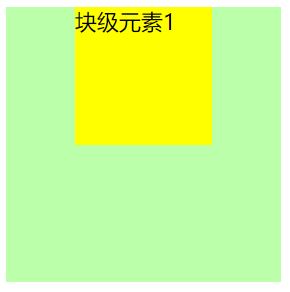
1.水平居中
方法一:margin: 0 atuo
子元素设置:margin: 0 atuo
.outer{
	width: 200px;
	height: 200px;
	background-color: #bfa;
}
.inner{
	width: 100px;
	height: 100px;
	margin: 0 auto;
	background-color: yellow;
}
<div class="outer">
	<div class="inner">
		块级元素1
	</div>
</div>
方法二:display:flex + justify-content:center
父元素设置:dispaly:felx + justify-content:center
.outer{
	width: 200px;
	height: 200px;
	background-color: #bfa;
	display: flex;
	justify-content: center;
}
.inner{
	width: 100px;
	height: 100px;
	background-color: yellow;
}
<div class="outer">
	<div class="inner">
		块级元素1
	</div>
</div>

方法三:display:flex + margin: 0 auto;
父元素设置:display:flex
子元素设置:margin:0 atuo
.outer{
	width: 200px;
	height: 200px;
	background-color: #bfa;
	display:flex;
}
.inner{
	width: 100px;
	height: 100px;
	background-color: yellow;
	margin: 0 auto;
}
<div class="outer">
	<div class="inner">
		块级元素1
	</div>
</div>

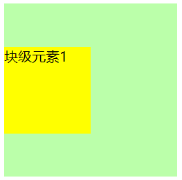
方法四:子绝父相
父元素设置:position:relative
子元素设置:position:absolute + left:50% + transform:translate(-50%)
.outer{
	width: 200px;
	height: 200px;
	background-color: #bfa;
	position: relative;
}
.inner{
	width: 100px;
	height: 100px;
	background-color: yellow;
	position: absolute;
	left: 50%;
	transform: translateX(-50%);
}
<div class="outer">
	<div class="inner">
		块级元素1
	</div>
</div>
2.垂直居中
方法一:display:flex + algin-items:center
父元素设置:display:flex + algin-items:center
<style>
	.outer{
		width: 200px;
		height: 200px;
		background-color: #bfa;
		display: flex;
		align-items: center;
	}
	.inner{
		width: 100px;
		height: 100px;
		background-color: yellow;
	}
</style>
<div class="outer">
	<div class="inner">
		块级元素1
	</div>
</div>
方法二:display:flex + margin:auto 0
父元素设置:display:flex
子元素设置:display:flex + margin:auto 0
.outer{
	width: 200px;
	height: 200px;
	background-color: #bfa;
	display: flex;
}
.inner{
	width: 100px;
	height: 100px;
	background-color: yellow;
	margin: auto 0;
}
<div class="outer">
	<div class="inner">
		块级元素1
	</div>
</div>
方法三:子绝父相
父元素设置:position:relative
子元素设置:position:absolute + top:50% + transform:translateY(-50%)
.outer{
	width: 200px;
	height: 200px;
	background-color: #bfa;
	position: relative;
}
.inner{
	width: 100px;
	height: 100px;
	background-color: yellow;
	position: absolute;
	top: 50%;
	transform: translateY(-50%);
}
<div class="outer">
	<div class="inner">
		块级元素1
	</div>
</div>
3.水平垂直居中
方法一:display:flex + algin-items:center + justify-content
父元素设置:display:flex + algin-items:center + justify-content
.outer{
	width: 200px;
	height: 200px;
	background-color: #bfa;
	display: flex;
	justify-content: center;
	align-items: center;
}
.inner{
	width: 100px;
	height: 100px;
	background-color: yellow;
}
<div class="outer">
	<div class="inner">
		块级元素1
	</div>
</div>
方法二:display:flex + margin: auto;
父元素设置:display:flex
子元素设置:margin: auto
.outer{
	width: 200px;
	height: 200px;
	background-color: #bfa;
	display: flex;

}
.inner{
	margin: auto;
	width: 100px;
	height: 100px;
	background-color: yellow;
}
<div class="outer">
	<div class="inner">
		块级元素1
	</div>
</div>
方法三:子绝父相
父元素设置:position:relative
子元素设置:position:absolute + top:50% + left:50% + transform:translate(-50%,-50%)
.outer{
	width: 200px;
	height: 200px;
	background-color: #bfa;
	position: relative;

}
.inner{
	width: 100px;
	height: 100px;
	background-color: yellow;
	position: absolute;
	top: 50%;
	left: 50%;
	transform: translate(-50%, -50%);
}
<div class="outer">
	<div class="inner">
		块级元素1
	</div>
</div>
方法四:子绝父相2
父元素设置:position:relative
子元素设置:position:absolute + top:0 + bottom:0 + left:0 + right:0 + margin:auto
.outer{
	width: 200px;
	height: 200px;
	background-color: #bfa;
	position: relative;

}
.inner{
	width: 100px;
	height: 100px;
	background-color: yellow;
	position: absolute;
	top: 0;
	left: 0;
	right: 0;
	bottom: 0;
	margin: auto;
}
<div class="outer">
	<div class="inner">
		块级元素1
	</div>
</div>
三、关于display:table-cell和margin的说明
display:table-cell:
父元素设置dispaly:table-cell,[text-align:center],[vertical-align:middle],子元素设置dispaly:inline-block。可以实现行内元素,块级元素的水平居中,垂直居中,水平垂直居中;但是这种方式改变了父元素和子元素的性质
margin:
- 当元素脱离默认文档流时(浮动,绝对定位,固定定位),margin失效
- 给inline-block和inline设置margin:0 auto时是没用的


 5098
5098


 被折叠的 条评论
为什么被折叠?
被折叠的 条评论
为什么被折叠?
 到【灌水乐园】发言


