


- 页面尺寸事件会在窗口尺寸改变的时候触发。事件名:resize
例如:
window.addEventListener('resize', function () {
  // 执行的代码
})
- 检测屏幕宽度
例如:
window.addEventListener('resize', function () {
  let w = document.documentElement.clientWidth
})
- 获取宽高
获取元素的可见部分宽高(包含padding)(不包含边框、margin、滚动条等)
clientWidth 和 clientHeight
示例:没有边框,打印div的clientWidth 和 clientHeight
<!DOCTYPE html>
<html lang="en">
<head>
<meta charset="UTF-8">
<meta name="viewport" content="width=device-width, initial-scale=1.0">
<title>Document</title>
<style>
div {
width: 200px;
height: 200px;
background-color: pink;
}
</style>
</head>
<body>
<div></div>
<script>
const div = document.querySelector('div')
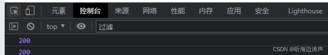
console.log(div.clientWidth)
console.log(div.clientHeight)
</script>
</body>
</html>
控制台输出宽和高都是200像素:
示例:打印div的clientWidth 和 clientHeight(其中包含了padding)
<!DOCTYPE html>
<html lang="en">
<head>
<meta charset="UTF-8">
<meta name="viewport" content="width=device-width, initial-scale=1.0">
<title>Document</title>
<style>
div {
width: 200px;
height: 200px;
background-color: pink;
padding: 10px;
}
</style>
</head>
<body>
<div></div>
<script>
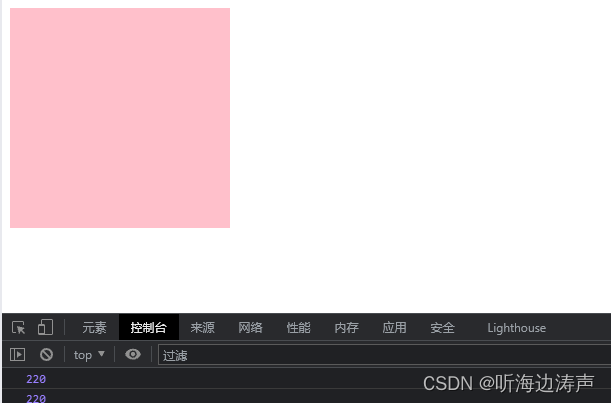
const div = document.querySelector('div')
console.log(div.clientWidth)
console.log(div.clientHeight)
</script>
</body>
</html>
现在打印的clientWidth 和 clientHeight都是220像素:
打印div的clientWidth 和 clientHeight(不包含border)
<!DOCTYPE html>
<html lang="en">
<head>
<meta charset="UTF-8">
<meta name="viewport" content="width=device-width, initial-scale=1.0">
<title>Document</title>
<style>
div {
display: inline-block;
width: 200px;
height: 200px;
background-color: pink;
padding: 10px;
border: 20px solid red;
}
</style>
</head>
<body>
<div>dfdsfsafsafdfdsfsafsafdfgfgfgdsfsafsafdfdsfsafsafdfdsfsafsaf</div>
<script>
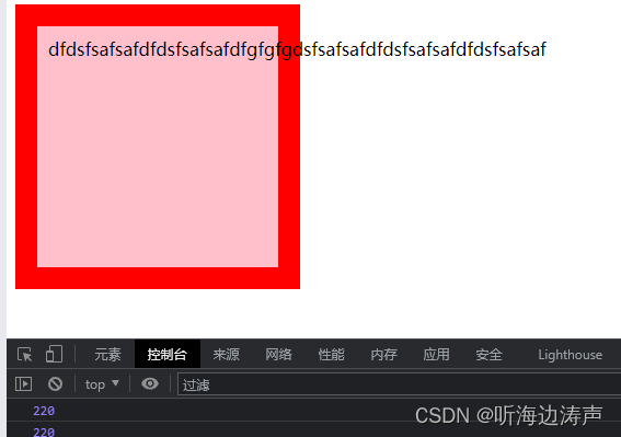
const div = document.querySelector('div')
console.log(div.clientWidth)
console.log(div.clientHeight)
</script>
</body>
</html>
打印的clientWidth 和 clientHeight中不包含border:


 4万+
4万+


 被折叠的 条评论
为什么被折叠?
被折叠的 条评论
为什么被折叠?
 到【灌水乐园】发言


