


圆角边框后面语法:
- border-radius后跟一个值,代表了四个角
// 设置4个圆角
border-radius: length;
参数值可以为数值、或者百分比的形式。
- border-radius后面可以跟4个值,分别代表左上角、右上角、左下角、右下角
例如:
左上角10像素、右上角20像素、左下角30像素、右下角40像素
border-radius: 10px 20px 30px 40px;
- border-radius后面可以跟2个值,第一个值表示左上和右下角,第二个值表示右上和左下角
例如:
  /* 第一个值表示左上和右下角,第二个值表示右上和左下角 */
  border-radius: 10px 40px;
- 也可以用border-top-left-radius、border-top-right-radius、border-bottom-left-radius、border-bottom-right-radius分别设置
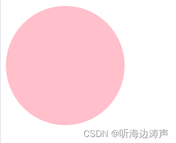
圆形的做法
先准备一个正方形的盒子,然后将border-radius设置为宽的一半。
示例:border-radius具体像素值设置为宽(或者高)的一半
<!DOCTYPE html>
<html lang="en">

<head>
  <meta charset="UTF-8">
  <meta name="viewport" content="width=device-width, initial-scale=1.0">
  <title>Document</title>
  <style>
    .yuanxing {
      width: 200px;
      height: 200px;
      background-color: pink;
      border-radius: 100px;
    }
  </style>
</head>

<body>
  <div class="yuanxing"></div>
</body>

</html>
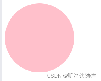
示例:border-radius的具体值设置为百分之50%
<!DOCTYPE html>
<html lang="en">

<head>
  <meta charset="UTF-8">
  <meta name="viewport" content="width=device-width, initial-scale=1.0">
  <title>Document</title>
  <style>
    .yuanxing {
      width: 200px;
      height: 200px;
      background-color: pink;
      /* border-radius: 100px; */
      border-radius: 50%;
    }
  </style>
</head>

<body>
  <div class="yuanxing"></div>
</body>

</html>
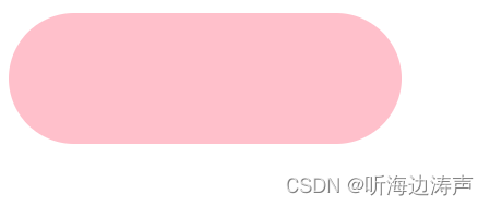
圆角矩形的做法
要做出圆角矩形,将border-radius设置为宽的一半。
示例:
<!DOCTYPE html>
<html lang="en">

<head>
  <meta charset="UTF-8">
  <meta name="viewport" content="width=device-width, initial-scale=1.0">
  <title>Document</title>
  <style>
    .juxing {
      width: 300px;
      height: 100px;
      background-color: pink;
      /* 圆角矩形设置为高度的一半 */
      border-radius: 50px;
    }
  </style>
</head>

<body>
  <div class="juxing"></div>
</body>

</html>
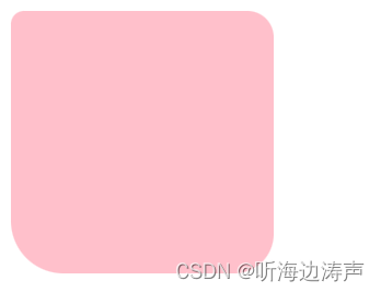
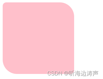
设置不同的圆角:border-radius后跟4个值
示例:
<!DOCTYPE html>
<html lang="en">

<head>
  <meta charset="UTF-8">
  <meta name="viewport" content="width=device-width, initial-scale=1.0">
  <title>Document</title>
  <style>
    .radius {
      width: 200px;
      height: 200px;
      background-color: pink;
      border-radius: 10px 20px 30px 40px;
    }
  </style>
</head>

<body>
  <div class="radius"></div>
</body>

</html>
设置不同的圆角:border-radius后跟2个值
示例:
<!DOCTYPE html>
<html lang="en">

<head>
  <meta charset="UTF-8">
  <meta name="viewport" content="width=device-width, initial-scale=1.0">
  <title>Document</title>
  <style>
    .radius {
      width: 200px;
      height: 200px;
      background-color: pink;
      /* 第一个值表示左上和右下圆角,第二个值表示右上和左下圆角 */
      border-radius: 10px 40px;
    }
  </style>
</head>

<body>
  <div class="radius"></div>
</body>

</html>
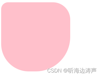
用border-top-left-radius、border-top-right-radius、border-bottom-left-radius、border-bottom-right-radius分别设置
示例:
<!DOCTYPE html>
<html lang="en">

<head>
  <meta charset="UTF-8">
  <meta name="viewport" content="width=device-width, initial-scale=1.0">
  <title>Document</title>
  <style>
    .radius {
      width: 200px;
      height: 200px;
      background-color: pink;
      border-top-left-radius: 20px;
      border-top-right-radius: 50px;
      border-bottom-left-radius: 80px;
      border-bottom-right-radius: 100px;
    }
  </style>
</head>

<body>
  <div class="radius"></div>
</body>

</html>


 4655
4655

 被折叠的 条评论
为什么被折叠?
被折叠的 条评论
为什么被折叠?
 到【灌水乐园】发言


