


案例
选取几个经典的HTML页面案例进行实操,展示其显示效果,并附代码。
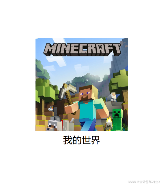
1. 页面居中
<!DOCTYPE html>
<html lang="en">
<head>
    <meta charset="UTF-8">
    <meta name="viewport" content="width=device-width, initial-scale=1.0">
    <title>我的世界</title>

    <style>
        html{
            height: 100%;
        }
        body{
            margin: 0;
            height: 100%;
            height: 100%;
            display: flex;
            justify-content: center;
            align-items: center;
        }
        main{
            height: 100%;
            display: flex;
            justify-content: center;
            align-items: center;

        }

    </style>
</head>
<body>
    <main>
       <div>
            <div>
                <img src="assets/imgs/我的世界.png" alt="我的世界" style="height: 10rem;width: 10rem;">
            </div>
            <div style="text-align: center;">
                我的世界
            </div>
        </div>
    </main>
</body>
</html>
显示效果如图:
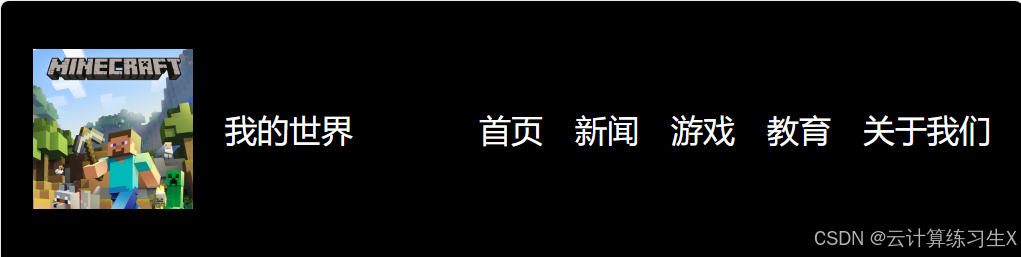
2. 悬浮置顶
<!DOCTYPE html>
<html lang="en">
<head>
    <meta charset="UTF-8">
    <meta name="viewport" content="width=device-width, initial-scale=1.0">
    <title>exmaple</title>
    <style>
        body{
            margin: 0
        }
        .topbar{
            width: 100%;
            display: flex;
            justify-content: space-between;
            align-items: center;
            position: fixed;
            height: 8rem;
            top: 0;
            background-color:  black;
            color: white;
        }
        .logo{
            display: flex;
            justify-content: center;
            align-items: center;
            margin-left: 1rem;
        }
        .dhl{
            display: flex;
            justify-content: space-around;
            gap: 1rem;
            margin-right: 1rem;

        }
        a{
            text-decoration: none;
            color: white;
        }
        a:hover{
            text-decoration: underline;
        }
    </style>

</head>
<body>
    <div>
        <div class="topbar">
            <div class="logo">
                <img src="assets/imgs/我的世界.png" alt="我的世界" style="height: 5rem;width: 5rem;">
                <span style="margin-left: 1rem;">我的世界</span>
            </div>

            <div class="dhl">
                <span><a href="">首页</a></span>
                <span><a href="">新闻</a></span>
                <span><a href="">游戏</a></span>
                <span><a href="">教育</a></span>
                <span><a href="">关于我们</a></span>
            </div>
        </div>
    </div>
</body>
</html>
显示效果如图:
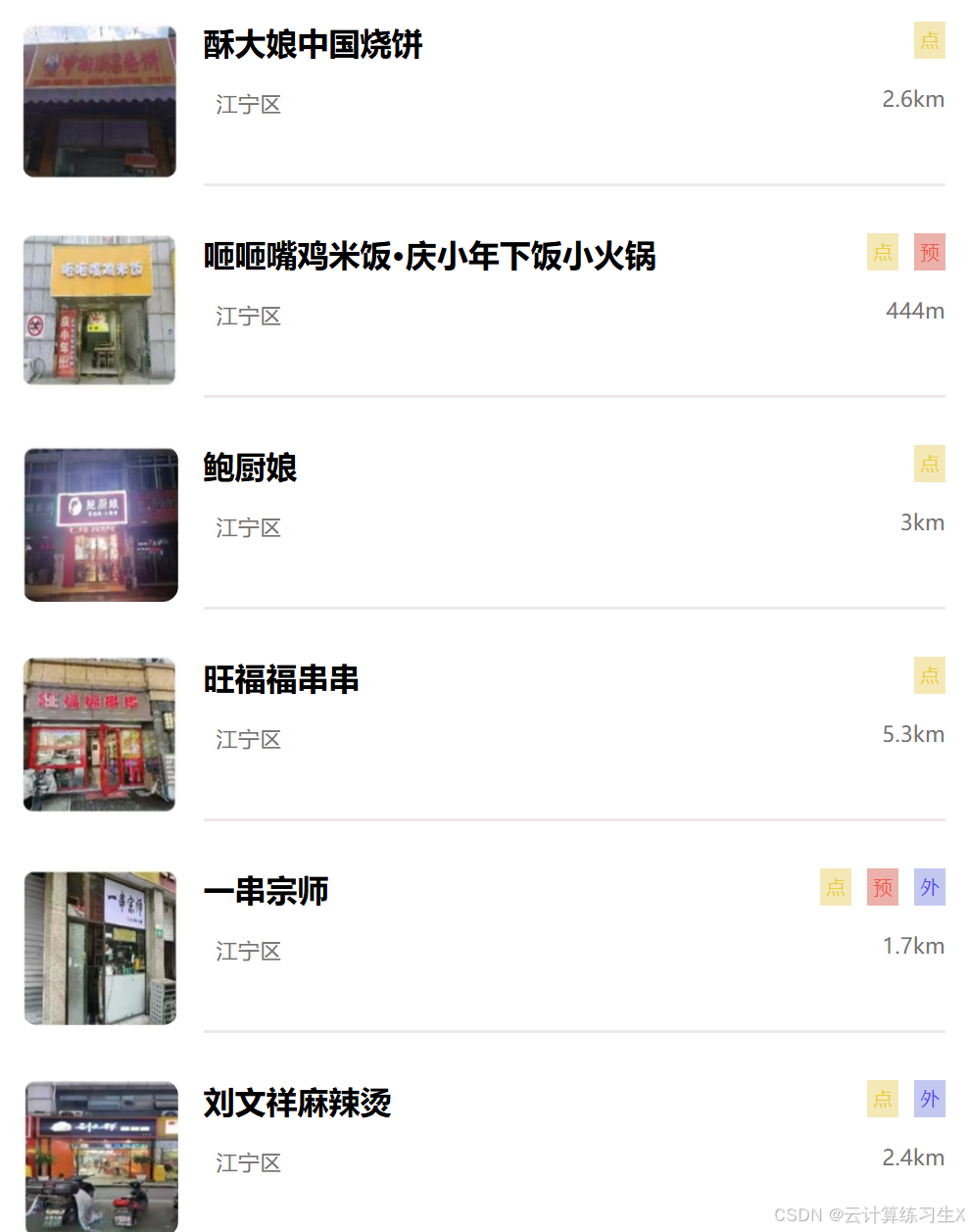
3. 美团外卖
<!DOCTYPE html>
<html lang="en">
<head>
    <meta charset="UTF-8">
    <meta name="viewport" content="width=device-width, initial-scale=1.0">
    <title>美团点餐</title>

    <style>
        * {
            box-sizing: border-box;
        }
        body{
            margin: 0;
            height: 100%;
        }
        ul{
            list-style: none;
            margin: 0;
            padding: 1rem;
        }
        ul>li{
            display: flex;
            margin-bottom: 1.5rem;
        }
        img{
            border-radius: 0.5rem;
            height: 5rem;
            width: 5rem;
        }
        .li-right{
            flex-grow: 1;
            margin-left: 0.8rem;
            display: flex;
            justify-content: space-between;
            border-bottom: 0.1rem solid rgb(237, 233, 233);
        }
        .title{
            font-size: 1rem;
            font-weight: bold;
        }
        .subtitle{
            font-size: 0.7rem;
            color: rgb(118, 115, 115);
            margin-left: 0.4rem;
            margin-top: 0.8rem;
        }
        .km{
            font-size: 0.7rem;
            color: rgb(118, 115, 115);
            margin-top: 0.8rem;
            display: flex;
            flex-direction: row-reverse;
        }
        .icon{
            display: flex;
            flex-direction: row-reverse;
            justify-content: space-between;
        }
        .dian{
            background-color: rgb(245, 232, 183);
            color: rgb(233, 206, 54);
            margin-left: 0.5rem;
            font-size: 0.6rem;
            padding: 0.2rem;
        }
        .yu{
            background-color: rgb(236, 177, 170);
            color: rgb(240, 89, 78);
            margin-left: 0.5rem;
            font-size: 0.6rem;
            padding: 0.2rem;
        }
        .wai{
            background-color: rgb(195, 200, 241);
            color: rgb(85, 74, 240);
            margin-left: 0.5rem;
            font-size: 0.6rem;
            padding: 0.2rem;
        }
    </style>

</head>
<body>
    <ul>
        <li>
            <div>
                <img src="assets/imgs/美团/1.png" alt="酥大娘中国烧饼">
            </div>
            <div class="li-right">
                <div>
                    <div class="title">
                        酥大娘中国烧饼
                    </div>
                    <div class="subtitle">
                        江宁区
                    </div>
                </div>
                <div>
                    <div class="icon">
                        <div class="dian">
                            点
                        </div>
                    </div>
                    <div class="km">
                        2.6km
                    </div>
                </div>
            </div>
        </li>
        <li>
            <div>
                <img src="assets/imgs/美团/2.png" alt="咂咂嘴鸡米饭·庆小年下饭小火锅">
            </div>
            <div class="li-right">
                <div>
                    <div class="title">
                        咂咂嘴鸡米饭·庆小年下饭小火锅
                    </div>
                    <div class="subtitle">
                        江宁区
                    </div>
                </div>
                <div>
                    <div class="icon">
                        <div class="yu">
                            预
                        </div>
                        <div class="dian">
                            点
                        </div>
                    </div>
                    <div class="km">
                        444m
                    </div>
                </div>
            </div>
        </li>
        <li>
            <div>
                <img src="assets/imgs/美团/3.png" alt="鲍厨娘">
            </div>
            <div class="li-right">
                <div>
                    <div class="title">
                        鲍厨娘
                    </div>
                    <div class="subtitle">
                        江宁区
                    </div>
                </div>
                <div>
                    <div class="icon">
                        <div class="dian">
                            点
                        </div>
                    </div>
                    <div class="km">
                        3km
                    </div>
                </div>
            </div>
        </li>
        <li>
            <div>
                <img src="assets/imgs/美团/4.png" alt="旺福福串串">
            </div>
            <div class="li-right">
                <div>
                    <div class="title">
                        旺福福串串
                    </div>
                    <div class="subtitle">
                        江宁区
                    </div>
                </div>
                <div>
                    <div class="icon">
                        <div class="dian">
                            点
                        </div>
                    </div>
                    <div class="km">
                        5.3km
                    </div>
                </div>
            </div>
        </li>
        <li>
            <div>
                <img src="assets/imgs/美团/5.png" alt="一串宗师">
            </div>
            <div class="li-right">
                <div>
                    <div class="title">
                        一串宗师
                    </div>
                    <div class="subtitle">
                        江宁区
                    </div>
                </div>
                <div>
                    <div class="icon">
                        <div class="wai">
                            外
                        </div>
                        <div class="yu">
                            预
                        </div>
                        <div class="dian">
                            点
                        </div>
                    </div>
                    <div class="km">
                        1.7km
                    </div>
                </div>
            </div>
        </li>
        <li>
            <div>
                <img src="assets/imgs/美团/6.png" alt="刘文祥麻辣烫">
            </div>
            <div class="li-right">
                <div>
                    <div class="title">
                        刘文祥麻辣烫
                    </div>
                    <div class="subtitle">
                        江宁区
                    </div>
                </div>
                <div>
                    <div class="icon">

                        <div class="wai">
                            外
                        </div>
                        <div class="dian">
                            点
                        </div>
                    </div>
                    <div class="km">
                        2.4km
                    </div>
                </div>
            </div>
        </li>
        <li>
            <div>
                <img src="assets/imgs/美团/7.png" alt="桥头排骨女人街店">
            </div>
            <div class="li-right">
                <div>
                    <div class="title">
                        桥头排骨女人街店
                    </div>
                    <div class="subtitle">
                        江宁区
                    </div>
                </div>
                <div>
                    <div class="icon">
                        <div class="yu">
                            预
                        </div>
                        <div class="dian">
                            点
                        </div>
                    </div>
                    <div class="km">
                        2.5km
                    </div>
                </div>
            </div>
        </li>
    </ul>
</body>
</html>
显示效果如图:
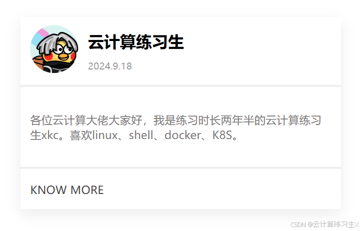
4. 卡片
<!DOCTYPE html>
<html lang="en">
<head>
    <meta charset="UTF-8">
    <meta name="viewport" content="width=device-width, initial-scale=1.0">
    <title>card</title>

    <style>
        *{
            box-sizing: border-box;
        }
        body{
            margin: 0;
        }
        .card{
            width: 20rem;
            height: 12rem;
            margin-top: 2rem;
            margin-left: 2rem;
            box-shadow: 0 5px 15px rgba(15, 15, 15, 0.08);
        }
        .card>.head{
            display: flex;
            align-items: center;

        }
        div>img{
            width: 3rem;
            height: 3rem;
            border-radius: 50%;
            margin-left: 0.6rem;
            margin-top: 0.5rem;
        }
        hr{
            border-color: rgba(0, 0, 0, 0.077);
        }
        .title{
            font-size: 1rem;
            font-weight: bold;
            margin-left: 0.6rem;
            margin-top: 0.5rem;
        }
        .subtitle{
            font-size: 0.6rem;
            color: rgba(0, 0, 0, 0.402);
            margin-left: 0.6rem;
            margin-top: 0.5rem;
        }
        .content{
            height: 4rem;
            font-size: 0.7rem;
            display: flex;
            justify-content: center;
            align-items: center;
            flex-wrap: wrap;
            margin: 0.3rem 0.6rem;
            color: rgb(123, 120, 120);
        }
        .buttom{
            margin-left: 0.6rem;
        }
        .buttom>a{
            text-decoration: none;
            color: rgb(70, 68, 68);
            font-size: 0.7rem;
        }
        a:hover{
            text-decoration: underline;
            text-underline-offset: 0.3rem;
        }
    </style>
</head>
<body>
    <div class="card">
        <div class="head">
            <div>
                <img src="assets/imgs/ctrl.jpg" alt="ctrl">
            </div>
            <div>
                <div class="title">云计算练习生</div>
                <div class="subtitle">2024.9.18</div>
            </div>
        </div>
        <hr>
        <div class="content">
            各位云计算大佬大家好,我是练习时长两年半的云计算练习生xkc。喜欢linux、shell、docker、K8S。
        </div>
        <hr>
        <div class="buttom">
            <a href="">KNOW MORE</a>
        </div>
    </div>
</body>
</html>
显示效果如图:
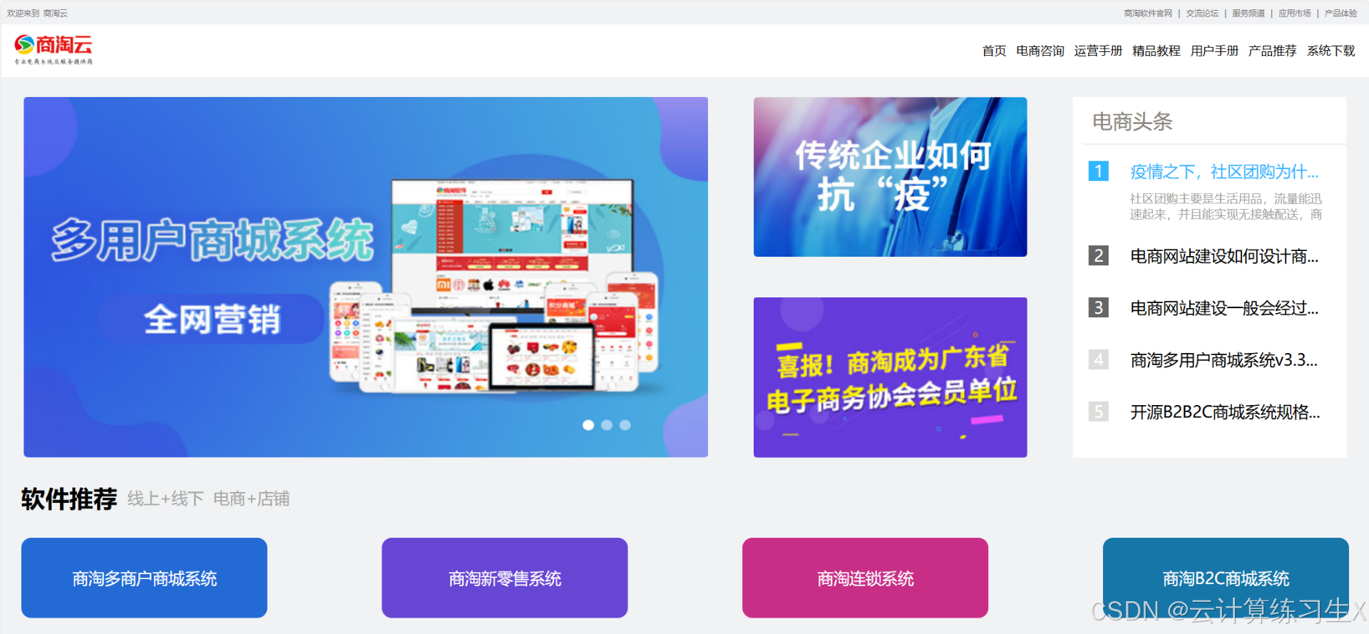
5. 商淘云
<!DOCTYPE html>
<html lang="en">
<head>
    <meta charset="UTF-8">
    <meta name="viewport" content="width=device-width, initial-scale=1.0">
    <title>商淘云</title>

    <style>
        *{
            box-sizing: border-box;
        }
        body{
            margin: 0;
        }
        .head{
            display: flex;
            justify-content: space-between;
            align-items: center;
            width: 100%;
            height: 1.2rem;
            background-color: rgb(241,242,244);
            color: rgb(117, 117, 117);
            font-size: 0.4rem;
            position: relative;
        }
        .head-left{
            display: flex;
            position: absolute;
            left: 0.3rem;

        }
        .head-right{
            display: flex;
            flex-direction: row-reverse;
            position: absolute;
            right: 0.3rem;
        }
        .head-right>div{
            margin-left: 0.3rem;
        }
        .head-right a{
            text-decoration: none;
            color: rgb(117, 117, 117);
        }
        a:hover{
            text-decoration: underline;
            text-underline-offset: 0.1rem;
        }
        .title{
            display: flex;
            justify-content: space-between;
            align-items: center;
            background-color: white;
            width: 100%;
            height: 2.6rem;
            font-size: 0.6rem;
            position: relative;
        }
        .title-left{
            display: flex;
            position: relative;
            left: 0.3rem;
        }
        .title-right{
            display: flex;
            flex-direction: row-reverse;
            position: absolute;
            right: 0.3rem;
        }
        .title-right>div{
            margin-left: 0.5rem;
        }
        .title-right a{
            text-decoration: none;
            color: black;
        }
        a:hover{
            text-decoration: underline;
            text-underline-offset: 0.3rem;
        }
        .container{
            width: 100%;
            max-width: 1920px;
            max-height: 1080px;
            background-color: rgb(241,242,244);
            display: flex;
            flex-direction: column;
        }
        .row{
            display: flex;
            justify-content: space-around;
            height: 20rem;
        }
        .col-12{
            width: 100%;
        }
        .col-6{
            width: 50%;
            margin: 1rem 0;
        }
        .col-4{
            width: 33.33%;
        }
        .col-3{
            width: 25%;
        }
        .col-20{
            width: 20%;
            margin: 1rem 0;
            display: flex;
            flex-direction: column;
            justify-content: space-between;
        }
        .col-2{
            width: 16.67%;
        }
        .col-1{
            width: 8.33%;
        }
        .text{
            width: 20%;
            height: 18rem;
            margin: 1rem 0;
            display: flex;
            flex-direction: column;
            justify-content: space-between;
            background-color: white;
        }
        .txtrow{
            display: flex;
            align-items: center;
            font-size: 0.8rem;
            gap: 0.8rem;
        }
        .number{
            display: flex;
            justify-content: center;
            align-items: center;
            height: 1rem;
            width: 1rem;
            color: white;
            font-size: 0.8rem;
            padding: 0.1rem;
            margin: 0.8rem;
            margin-right: 0.3rem;
        }
        .middle{
            height: 2rem;
            display: flex;
            align-items: center;
            margin-left: 1rem;
        }
        .bottom{
            display: flex;
            justify-content: space-between;
            align-items: center;
        }
        .bottom>.an{
            border-radius: 0.5rem;
            height: 4rem;
            width: 18%;
            display: flex;
            justify-content: center;
            align-items: center;
            margin: 1rem;
        }
        .an>a{
            text-decoration: none;
            color: white;
            font-size: 0.8rem;
        }
    </style>
</head>
<body>
    <div class="head">
        <div class="head-left">
            <div style="margin-right: 0.2rem;">欢迎来到</div>
            <div>商淘云</div>
        </div>
        <div class="head-right">
            <div><a href="" style="margin-right: 0.3rem;">产品体验</a></div>
            <div>|</div>
            <div><a href="">应用市场</a></div>
            <div>|</div>
            <div><a href="">服务频道</a></div>
            <div>|</div>
            <div><a href="">交流论坛</a></div>
            <div>|</div>
            <div><a href="">商淘软件官网</a></div>
        </div>
    </div>
    <div class="title">
        <div class="title-left">
            <div><img src="assets/imgs/商淘云/1.png" alt="商淘云logo" style="height: 2.4rem;"></div>
        </div>
        <div class="title-right">
            <div><a href="" style="margin-right: 0.4rem;">系统下载</a></div>
            <div><a href="">产品推荐</a></div>
            <div><a href="">用户手册</a></div>
            <div><a href="">精品教程</a></div>
            <div><a href="">运营手册</a></div>
            <div><a href="">电商咨询</a></div>
            <div><a href="">首页</a></div>
        </div>
    </div>
    <div class="container">
        <div class="row">
            <div class="col-6"><img src="assets/imgs/商淘云/2.png" alt="" class="col-12" height="100%"></div>
            <div class="col-20">
                <div><img src="assets/imgs/商淘云/3.png" alt="" class="col-12" height="100%"></div>
                <div><img src="assets/imgs/商淘云/4.png" alt="" class="col-12" height="100%"></div>
            </div>
            <div class="text">
                <div style="display: flex;
                font-size: 1rem; color: rgb(135,131,119);border-bottom: 0.1rem solid rgb(243, 242, 240);padding: 0.5rem;margin-left: 0.5rem;">
                    <span style="margin-bottom: 0.1rem solid rgb(50,182,255);">电商头条</span>
                </div>
                <div>
                    <div class="txtrow">
                        <div class="number" style="background-color: rgb(50,182,255);">1</div>
                        <div>
                        <div style="color:rgb(50,182,255);margin-right: 0.5rem;">疫情之下,社区团购为什...</div>
                    </div>
                </div>
                    <div class="txtrow" style="margin-top: -1rem;">
                        <div class="number" style="background-color: rgb(255, 255, 255);">0</div>
                        <div>
                        <div style="font-size: 0.6rem;margin-top: 0.3rem;color: rgb(158, 159, 160);margin-left: 0.3rem; margin-right: 1rem;">社区团购主要是生活用品,流量能迅速起来,并且能实现无接触配送,商</div>
                    </div>
                </div>
                <div>
                    <div class="txtrow">
                        <div class="number" style="background-color: rgb(102,102,102);">2</div>
                        <div style="margin-right: 0.5rem;">电商网站建设如何设计商...</div>
                    </div>
                </div>
                <div>
                    <div class="txtrow">
                        <div class="number" style="background-color: rgb(102,102,102);">3</div>
                        <div style="margin-right: 0.5rem;">电商网站建设一般会经过...</div>
                    </div>
                </div>
                <div>
                    <div class="txtrow">
                        <div class="number" style="background-color: rgb(221,221,219);">4</div>
                        <div style="margin-right: 0.5rem;">商淘多用户商城系统v3.3...</div>
                    </div>
                </div>
                <div>
                    <div class="txtrow" style="margin-bottom: 3rem;">
                        <div class="number" style="background-color: rgb(221,221,219);">5</div>
                        <div style="margin-right: 0.5rem;">开源B2B2C商城系统规格...</div>
                    </div>
                </div>
            </div>
        </div>
    </div>

    <div class="middle">
        <div style="font-size: 1.2rem;font-weight: bold;">软件推荐</div>
        <div style="font-size: 0.8rem;color:rgb(165,168,166) ;margin-left: 0.5rem;">线上+线下</div>
        <div style="font-size: 0.8rem;color:rgb(165,168,166) ;margin-left: 0.5rem;">电商+店铺</div>
    </div>

    <div class="bottom">
        <div class="an" style="background-color:#236AD4;">
            <a href="">商淘多商户商城系统</a>
        </div>
        <div class="an" style="background-color:#6746D3;">
            <a href="">商淘新零售系统</a>
        </div>
        <div class="an" style="background-color:#C82E86;">
            <a href="">商淘连锁系统</a>
        </div>
        <div class="an" style="background-color:#1676A8;">
            <a href="">商淘B2C商城系统</a>
        </div>
    </div>
</body>
</html>
显示效果如下:


 扫一扫
扫一扫


 1323
1323

 被折叠的 条评论
为什么被折叠?
被折叠的 条评论
为什么被折叠?
 到【灌水乐园】发言


