


一、下载
https://github.com/ecomfe/echarts-for-weixin![]() https://github.com/ecomfe/echarts-for-weixin
https://github.com/ecomfe/echarts-for-weixin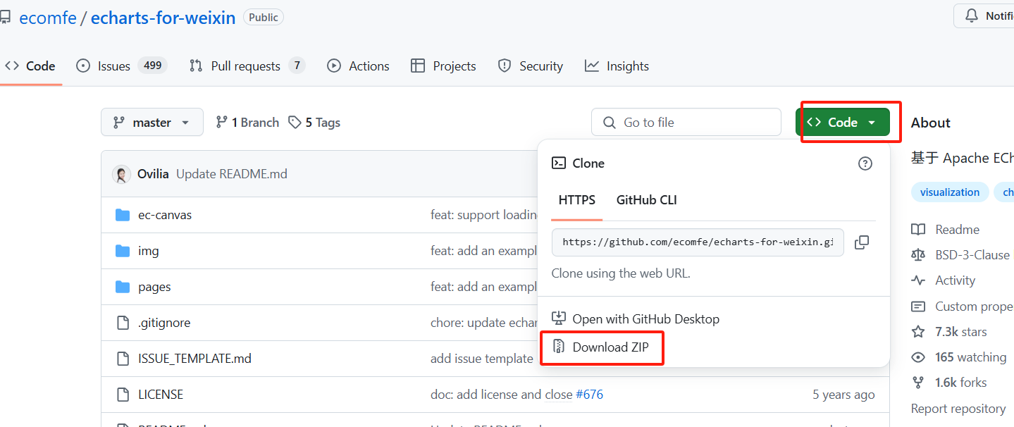
二、引入小程序配置
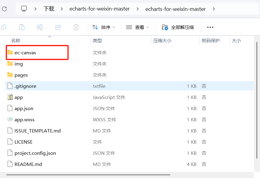
1.解压下载文件
2.复制粘贴’ec-canvas‘文件
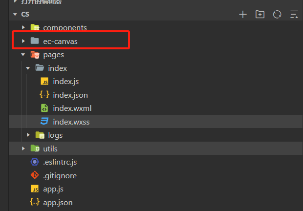
3.将复制粘贴的文件放到小程序根目录当中
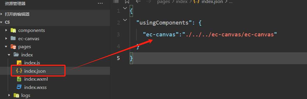
4.在自己需要的页面中引入
三、使用 Echarts 绘制图表
1.index.wxml
<!--index.wxml-->
<!-- 统计图 -->
<scroll-view class="scroll_view" scroll-y="{{true}}" bindscroll="scrollPage" scroll-top="{{scrollTop}}" scroll-into-view="{{toView}}">
  <view style="width: 100%;height: 500rpx;"></view>
  <view class="statistical-chart">
    <ec-canvas id="mychart" canvas-id="mychart-bar" ec="{{ ec }}"></ec-canvas>
  </view>
  <view style="width: 100%;height: 800rpx;"></view>
</scroll-view>
2.在index.js当中引入并且配置option:
// index.js
//第一步引入echarts
import * as echarts from './../../ec-canvas/echarts';


//第二步配置optino

function initChart(canvas, width, height) {
  console.log('canvas',width, height);
  const chart = echarts.init(canvas, null, {
    width: width,
    height: height
  });
  canvas.setChart(chart);
  var option = {
    xAxis: {
      type: 'category',
      boundaryGap: false,
      // data: ['最低价', '本房源', '最高价'],
      axisLabel: {
        show: false // 设置为false,不显示x轴刻度数字
      }
    },
    yAxis: {
      type: 'value',
      axisLabel: {
        show: false // 设置为false,不显示y轴刻度数字
      }
    },
    series: [
      {
        data: ['20','50','80'],
        type: 'line',
        color: '#EA3333',
        areaStyle: {
          color: {
            type: 'linear',
            x: 0,
            y: 0,
            x2: 0,
            y2: 1,
            colorStops: [
              { offset: 0, color: '#ea333300' },
              { offset: 1, color: '#ea333321' }
            ],
            global: false
          }
        },
        label: {
          show: true,
          position: 'top',
          backgroundColor: '#6A6A6A', // 添加标签背景颜色
          color: '#ffff',
          height: '20',
          width: '80',
          distance: 10, // 设置文字与节点的距离为 20
          verticalAlign: 'center',
          fontSize: '10',

        }
      }
    ]
  };
  chart.setOption(option);
  return chart;
}


//第三步初始化折线图


Page({
  data: {
    ec: {
      onInit: initChart
    },
  },


})
3.index.wxss设置样式
.statistical-chart {
  width: 100%;
  height: 200rpx;
  margin-top: 20rpx;
  display: flex;
  align-items: center;
  justify-content: center;
}
ec-canvas{
  width: 100%;
  height: 100%;
}
.scroll_view {
  height: 2500rpx;
}


 被折叠的 条评论
为什么被折叠?
被折叠的 条评论
为什么被折叠?
 到【灌水乐园】发言


