


el-table
1.根据搜索的结果定位到表格某行(或者多行)并高亮显示
高亮关键在于::row-style="rowClass“
 <el-table ref="table" id="firstTable" v-loading="loading" :data="compute_examList" @selection-change="handleSelectionChange" :height="tableHeight" :show-summary="true" :summary-method="getSummaries" :row-style="rowClass">
...
</table>
还有一种高亮的方法:在el-table中需要添加highlight-current-row,之后使用setCurrentRow方法
    // // // 定位表格数据
    elTableScrollToRow($table) {
            const bodyWrapper = $table.$el.querySelector('.el-table__body-wrapper')
            const rowIndex = $table.data.findIndex(item=>item.subject_id==this.send_subjectId)
            this.$refs["firstTable"].setCurrentRow($table.data[rowIndex], true);
            const tr = bodyWrapper.querySelectorAll('tr')[rowIndex]
            if (!bodyWrapper || !tr) {
                return
            }
            bodyWrapper.scrollTop=0
            if (bodyWrapper.clientHeight + bodyWrapper.scrollTop < tr.offsetTop+tr.clientHeight||tr.offsetTop+tr.clientHeight>bodyWrapper.clientHeight){
                bodyWrapper.style.scrollBehavior="smooth"
                bodyWrapper.scrollTop=tr.offsetTop

            }
        },
methods:{
//高亮行
rowClass({ row, rowIndex }) {
return this.setList.includes(rowIndex) ? { "background-color": "#e8f2f2" } :{};
},
// 定位表格数据
gllelTableScrollToRow($table) {
const bodyWrapper = $table.$el.querySelector('.el-table__body-wrapper')
let _that = this
this.setList = []
$table.data.map((v, i, arr) => {
if (_that.send_settlementId == v.settlementId) {
_that.setList.push(i)
}
})
const tr = bodyWrapper.querySelectorAll('tr')[_that.setList[0]]
if (!bodyWrapper || !tr) {
return
}
bodyWrapper.scrollTop = 0
if (bodyWrapper.clientHeight + bodyWrapper.scrollTop < tr.offsetTop + tr.clientHeight || tr.offsetTop + tr.clientHeight > bodyWrapper.clientHeight) {
bodyWrapper.style.scrollBehavior = "smooth"
bodyWrapper.scrollTop = tr.offsetTop
}
},
}2.el-table单双行颜色不同
<el-table :data="tableData" :row-class-name="setRowClassName" style="width: 100%;" height="100%">
            <el-table-column prop="time" label="时间" fit align="center">
            </el-table-column>
            <el-table-column prop="desci" label="告警信息" show-overflow-tooltip align="center">
            </el-table-column>
          </el-table>


//methods部分

    setRowClassName({ row, rowIndex }) {
      return rowIndex % 2 === 0 ? 'bc1' : 'bc2';
    }

//style部分
::v-deep .el-table .bc1 {
  background: rgb(61, 192, 237);
  background: radial-gradient(circle, rgba(61, 192, 237, 0.13209033613445376) 9%, rgba(47, 121, 147, 0) 120%);
}

::v-deep .el-table .bc2 {
  background: rgb(52, 193, 168);
  background: radial-gradient(circle, rgba(52, 193, 168, 0.26094187675070024) 9%, rgba(38, 69, 70, 0) 120%);
}
3.el-table父盒子使用flex之后,el-table宽度不断变宽
解决方法:父盒子高度设置为0,el-table设置集体宽度
  <div style="flex:1;height: 0" class="declarebox">
                            <el-table :data="declaretableData" height="100%" style="width:calc(100% - 20px)" stripe
                                      highlight-current-row @selection-change="handleSelectionChange">
                                <el-table-column type="selection">
                                </el-table-column>
                                <el-table-column prop="tradeDate" label="交易日期" align="center"
                                                 :show-overflow-tooltip="true">
                                </el-table-column>
                                <el-table-column prop="targetDate" label="标的日期" align="center"
                                                 :show-overflow-tooltip="true">
                                </el-table-column>
                                <el-table-column prop="timeType" label="时间类型" align="center"
                                                 :show-overflow-tooltip="true">
                                </el-table-column>
                                <el-table-column prop="tradeDirection" label="交易方向" align="center"
                                                 :show-overflow-tooltip="true">
                                    <template slot-scope="scope">
                                        <span v-if="scope.row.tradeDirection == 1">买入</span>
                                        <span v-if="scope.row.tradeDirection == 2">卖出</span>
                                    </template>
                                </el-table-column>
                                <el-table-column prop="buy1Price" label="买1价" align="center"
                                                 :show-overflow-tooltip="true">
                                </el-table-column>
                                <el-table-column prop="trade1Price" label="卖1价" align="center"
                                                 :show-overflow-tooltip="true">
                                </el-table-column>
                                <el-table-column prop="weightPrice" label="加权价" align="center"
                                                 :show-overflow-tooltip="true">
                                </el-table-column>
                                <el-table-column prop="declaredPrice" label="申报价格" align="center"
                                                 :show-overflow-tooltip="true">
                                </el-table-column>
                            </el-table>
                    </div>
4.切换页面el-table宽高发生了变化
解决方法:虽然给el-table设置了height为100%,可以给表头设置固定高度
方法1:
     /deep/ .el-table__header-wrapper {
 height: 58px;
 }
 /deep/ .el-table__body-wrapper {
 height: calc(100% - 58px) !important;
 }
方法2:
/deep/ .el-table {
	width: 100%;
	display: flex;
	flex-direction: column;
	/deep/ .el-table__body-wrapper {
		flex: 1;
	 }
}
5.重复行字体标红
 computed:{
            findPairsWithSameTimeAndName() {
              const pairs = [];
              for (let i = 0; i < this.declaretableData.length; i++) {
               for (let j = i + 1; j < this.declaretableData.length; j++) {
               if (this.declaretableData[i].tradeDate == this.declaretableData[j].tradeDate&&this.declaretableData[i].targetDate == this.declaretableData[j].targetDate&&this.declaretableData[i].timeType == this.declaretableData[j].timeType) {
                 pairs.push([i, j]); // 添加元素对的索引到pairs数组
                 }
                }
               }
               return pairs;
          },
        },


el-table的cell-class-name的名字

cellClassAiDeclare({row, rowIndex}){
               for(let i = 0;i<this.findPairsWithSameTimeAndName.length;i++){
                   for(let j=0;j<this.findPairsWithSameTimeAndName[i].length;j++){
                        if(this.findPairsWithSameTimeAndName[i][j]==rowIndex){
                      return 'cell-class-declare'
                     }
                 }
                }
            },
6.固定列fixed导致滚动条无法滚动
方法1:是通过修改表格固定列的高度,使固定列无法遮住滚动条,即可实现无障碍拖动。
css代码:
/* 此处的deep属性,可以视情况添加 */
::v-deep .el-table__fixed {
  height: calc(100% - 15px) !important;
}
/* 用于消除固定列下方的伪元素边框线 */
::v-deep .el-table__fixed:before {
  height: 0px;
}
方法2:是通过修改固定列鼠标事件的触发,使固定列点击事件穿透下去。
css代码:
/* 表格固定列-鼠标事件穿透 */
.el-table__fixed,
.el-table__fixed-right {
  pointer-events: none;
}

/* th为表头单元格,td为表格体单元格 */
/* 如果需要禁止固定列里的单元格也无法点击,此处可修改为none */
.el-table__fixed td,
.el-table__fixed-right td,
.el-table__fixed th,
.el-table__fixed-right th {
  pointer-events: auto;
}
el-tabs标签页
1.el-tabs切换时出现闪屏
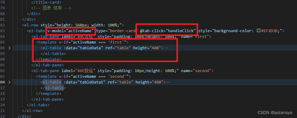
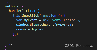
2.el-table切换时高度变化
//先固定表头高度,然后body_wrapper使用calc来减去表头高度

 /deep/ .el-table__header-wrapper {
height: 58px;
}
/deep/ .el-table__body-wrapper {
height: calc(100% - 58px) !important;
}
el-progress进度条
1.样式重写
// 修改圆环背景色
::v-deep  .el-progress svg path:nth-child(1) {
    stroke: #fff;
}

//圆环不显示
.el-progress {
    width: 100%
}

//百分数的背景色
::v-deep  .el-progress  svg path:nth-child(2) {
    stroke: yellow;
}

//中间文字的颜色
::v-deep  .el-progress .el-progress__text {
    color: blue;
}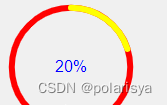
2.圆环中心文本自定义
利用position来定位,show-text=false去掉原生的文字。
<div class="percent_box">
  <el-progress type="circle" class="percent" :percentage="20"  :show-text="false"></el-progress>
  <div class="text_box">
    <p class="title">通过率</p>
    <p class="text">80%</p>
  </div>
</div>
.percent_box {
  position: relative;
  text-align: center;
  width: 200px;
}

.text_box {
  position: absolute;
  top: 50%;
  left: 50%;
  transform: translate(-50%, -50%);
}
3.圆环渐变色
<div class="progressName">
    <el-progress :width="60" :hidden="60" type="circle" :percentage="50"></el-progress>
</div>
<!-- 定义修改svg -->
<div style="width:0px; height: 0px;">
    <svg width="100%" height="100%">
        <defs>
            <linearGradient id="write" x1="0%" y1="0%" x2="100%" y2="0%">
                <stop offset="0%" style="stop-color:#0299E2" stop-opacity="0.8"></stop> // offset 设置起始 stop-color 设置起始位置的颜色
                <stop offset="100%" style="stop-color:#02E4DC" stop-opacity="1"></stop> // offset 设置起始 stop-color 设置起始位置的颜色
            </linearGradient>
        </defs>
    </svg>
</div>
// 此处使用的是scss语法
.progressName {
	// 这里可以用
	/deep/ {
	  .el-progress {
	    margin: 0 6px;
	    position: relative;
	    // 修改进度条文字提示颜色
	    .el-progress__text {}
	  }
	  // 设置渐变进度条,通过重新定义svg标签的url
	  svg>path:nth-child(2) {
	  	// #write 此处的id就是定义的svg标签id 做替换即可
	    stroke: url(#write);
	  }
	  // 修改进度条背景色
	  .el-progress path:first-child {
	    // stroke: #e1e1e1;
	  }
	  // 进度条的图形样式,控制翻转
	  .el-progress-circle {
	    transform: rotateY(180deg);
	  }
	}
}
el-tree
1.某个节点高亮并滚动到该位置
     <div style="height:200px;overflow:scroll;background-color: red;" ref="treeParent">
            <el-tree :data="data" :props="defaultProps" default-expand-all
             highlight-current node-key="id" ref="tree">
            </el-tree>
     </div>

     mounted() {
        this.$nextTick(() => {
            this.$refs.tree.setCurrentKey(21);//高亮id为21的节点
            this.$nextTick(() => {
                let parent = this.$refs.treeParent;
                const node = parent.querySelector(".el-tree-node.is-current");
                console.log(node);
                parent.scrollTo({
                    top: node.offsetTop,
                    behavior: "smooth"
                });
            },3000);
        })
    },
2.el-tree超出盒子tooltip显示
el-tooltip中的:content='node.label'可以直接设置el-tree的文字
<el-tree v-if="currentnode_inner!=null && treedata_inner.length>0" ref="tree" style="flex:1" :data="treedata_inner" :default-expanded-keys="defaultExpandedkey" :filter-node-method="filterNode" :props="defaultProps" @node-click="handleNodeClick" node-key="plantid" :current-node-key="currentnode_inner" :highlight-current="true" :indent='show_tree?10:0' :style="{width:show_tree?'':'100%'}">
                    <span slot-scope="{ node, data }" style="text-align:left;">
                        <el-tooltip :content='node.label' placement="left-end" popper-class="packageDownLoad-tooltip" effect="dark">
                        <span v-if="show_tree" style="display:flex;align-items:center">
                            <img class="tree_node_img" v-if="node.level==1" src="/img/planttype/shoudian.png" style="height:17px" />
                            <img class="tree_node_img" v-if="node.level==2" src="/img/planttype/huodian.png" style="height:17px;">
                            <img class="tree_node_img" v-if="node.level==3" src="/img/planttype/xinnengyuan.png" style="height:29px;">
                            <span>{{node.label}}</span>
                        </span>
                        <span v-else>
                            <span>{{node.label[0]}}</span>
                        </span>
                        </el-tooltip>
                    </span>
                </el-tree>
el-date-picker
1.切换日历时,日历定位变成了fixed,需要给每个el-date-picker设置不同的key
                <el-date-picker v-model="value1"
:type="pickRange"
placeholder="选择日期"
:key="pickRange"
:append-to-body= "false"
style="width:100%;border:0;background-color:transparent;height:100%;text-align:center">
el-cascader
1.修改el-cascader样式

<el-cascader clearable placeholder="请选择交易品种" style="margin-left: 15px;width:350px;" popper-class="zcqhy-own-style"
                                collapse-tags :props="{ multiple: true, expandTrigger: 'hover' }" :options="optionsjypz"
                                @change="handleChange"></el-cascader>


<style lang="scss">
.zcqhy-own-style{
    background: #42475d !important;
    border-color: #00dfe3 !important;
    border-radius: 4px !important;
}
.zcqhy-own-style .el-cascader-menu {
    color: #fff;
    border-right: 1px solid #00dfe3;
}

.zcqhy-own-style .el-cascader-node.in-active-path {
    color: #00dfe3;
    /* background: transparent; */
}
.zcqhy-own-style .el-cascader-node.is-active {
    color: #00dfe3;
}
.zcqhy-own-style .el-cascader-node:not(.is-disabled):focus,
.zcqhy-own-style .el-cascader-node:not(.is-disabled):hover {
    background-color: #26556D!important;
}
.zcqhy-own-style .el-checkbox__inner{
    border-color:#00dfe3 ;
}
.zcqhy-own-style  .el-checkbox__input.is-checked .el-checkbox__inner, .el-checkbox__input.is-indeterminate .el-checkbox__inner{
    background-color:#00dfe3;
    border-color: #00dfe3;
}
</style>


 1469
1469


 被折叠的 条评论
为什么被折叠?
被折叠的 条评论
为什么被折叠?
 到【灌水乐园】发言


