


TextField
属性
按照 Material 设计标准,输入框分为两种:filled text field 和 outlined text field。

在 Compose 的世界里,分别对应:TextField 和 OutlinedTextField。
@Composable
fun TextField(
    value: TextFieldValue,
    onValueChange: (TextFieldValue) -> Unit,
    modifier: Modifier = Modifier,
    enabled: Boolean = true,
    readOnly: Boolean = false,
    textStyle: TextStyle = LocalTextStyle.current,
    label: @Composable (() -> Unit)? = null,
    placeholder: @Composable (() -> Unit)? = null,
    leadingIcon: @Composable (() -> Unit)? = null,
    trailingIcon: @Composable (() -> Unit)? = null,
    isError: Boolean = false,
    visualTransformation: VisualTransformation = VisualTransformation.None,
    keyboardOptions: KeyboardOptions = KeyboardOptions.Default,
    keyboardActions: KeyboardActions = KeyboardActions(),
    singleLine: Boolean = false,
    maxLines: Int = Int.MAX_VALUE,
    interactionSource: MutableInteractionSource = remember { MutableInteractionSource() },
    shape: Shape =
        MaterialTheme.shapes.small.copy(bottomEnd = ZeroCornerSize, bottomStart = ZeroCornerSize),
    colors: TextFieldColors = TextFieldDefaults.textFieldColors()
)
@Composable
fun OutlinedTextField(
    value: TextFieldValue,
    onValueChange: (TextFieldValue) -> Unit,
    modifier: Modifier = Modifier,
    enabled: Boolean = true,
    readOnly: Boolean = false,
    textStyle: TextStyle = LocalTextStyle.current,
    label: @Composable (() -> Unit)? = null,
    placeholder: @Composable (() -> Unit)? = null,
    leadingIcon: @Composable (() -> Unit)? = null,
    trailingIcon: @Composable (() -> Unit)? = null,
    isError: Boolean = false,
    visualTransformation: VisualTransformation = VisualTransformation.None,
    keyboardOptions: KeyboardOptions = KeyboardOptions.Default,
    keyboardActions: KeyboardActions = KeyboardActions.Default,
    singleLine: Boolean = false,
    maxLines: Int = Int.MAX_VALUE,
    interactionSource: MutableInteractionSource = remember { MutableInteractionSource() },
    shape: Shape = MaterialTheme.shapes.small,
    colors: TextFieldColors = TextFieldDefaults.outlinedTextFieldColors()
)
| 属性 | 含义 |
|---|---|
| value | 显示文本 |
| onValueChange | 输入框文本变化回调函数 |
| modifier | 修饰符 |
| enabled | 文本框使能开关 |
| readOnly | 只读开关 |
| textStyle | 文本样式 |
| label | 文本框标签 |
| placeholder | 文本框占位内容 |
| leadingIcon | 左侧图标 |
| trailingIcon | 右侧图标 |
| isError | 是否为错误文本,用于决定是否展示错误信息 |
| visualTransformation | 文本视觉转换器,例如密码形式展示文本等 |
| keyboardOptions | 软键盘选项 |
| keyboardActions | 软键盘回车键功能 |
| singleLine | 是否单行显示 |
| maxLines | 显示最大行数,如果 singleLine 为 true,将会自动设置为1 |
| interactionSource | 输入框交互状态流,可自定义实现逻辑。 |
| shape | 输入框形状 |
| colors | 输入框各种状态下的颜色 |
综合示例
官方示例
TextField
@Composable
fun SimpleTextFieldSample() {
    var text by rememberSaveable { mutableStateOf("") }
    TextField(
        value = text,
        onValueChange = { text = it },
        label = { Text("Label") },
        singleLine = true
    )
}
OutlinedTextField
@Composable
fun SimpleOutlinedTextFieldSample() {
    var text by rememberSaveable { mutableStateOf("") }

    OutlinedTextField(
        value = text,
        onValueChange = { text = it },
        label = { Text("Label") }
    )
}
图标
@Composable
fun TextFieldWithIcons() {
    var text by rememberSaveable { mutableStateOf("") }

    TextField(
        value = text,
        onValueChange = { text = it },
        placeholder = { Text("placeholder") },
        leadingIcon = { Icon(Icons.Filled.Favorite, contentDescription = "Localized description") },
        trailingIcon = { Icon(Icons.Filled.Info, contentDescription = "Localized description") }
    )
}
占位文字
@Composable
fun TextFieldWithPlaceholder() {
    var text by rememberSaveable { mutableStateOf("") }

    TextField(
        value = text,
        onValueChange = { text = it },
        label = { Text("Email") },
        placeholder = { Text("example@gmail.com") }
    )
}
错误状态
@Composable
fun TextFieldWithErrorState() {
    var text by rememberSaveable { mutableStateOf("") }
    var isError by rememberSaveable { mutableStateOf(false) }

    fun validate(text: String) {
        isError = text.count() < 5
    }

    TextField(
        value = text,
        onValueChange = {
            text = it
            isError = false
        },
        singleLine = true,
        label = { Text(if (isError) "Email*" else "Email") },
        isError = isError,
        keyboardActions = KeyboardActions { validate(text) },
        modifier = Modifier.semantics {
            // Provide localized description of the error
            if (isError) error("Email format is invalid.")
        }
    )
}
密码输入框
@Composable
fun PasswordTextField() {
    var password by rememberSaveable { mutableStateOf("") }
    var passwordHidden by rememberSaveable { mutableStateOf(true) }
    TextField(
        value = password,
        onValueChange = { password = it },
        singleLine = true,
        label = { Text("Enter password") },
        visualTransformation =
        if (passwordHidden) PasswordVisualTransformation() else VisualTransformation.None,
        keyboardOptions = KeyboardOptions(keyboardType = KeyboardType.Password),
        trailingIcon = {
            IconButton(onClick = { passwordHidden = !passwordHidden }) {
                val visibilityIcon =
                    if (passwordHidden) Visibility else VisibilityOff
                // Please provide localized description for accessibility services
                val description = if (passwordHidden) "Show password" else "Hide password"
                Icon(imageVector = visibilityIcon, contentDescription = description)
            }
        }
    )
}
软键盘类型与行为
@OptIn(ExperimentalComposeUiApi::class)
@Composable
fun TextFieldWithHideKeyboardOnImeAction() {
    val keyboardController = LocalSoftwareKeyboardController.current
    var text by rememberSaveable { mutableStateOf("") }
    TextField(
        value = text,
        onValueChange = { text = it },
        label = { Text("Label") },
        keyboardOptions = KeyboardOptions(imeAction = ImeAction.Done),
        keyboardActions = KeyboardActions(
            onDone = {
                keyboardController?.hide()
                // do something here
            }
        )
    )
}
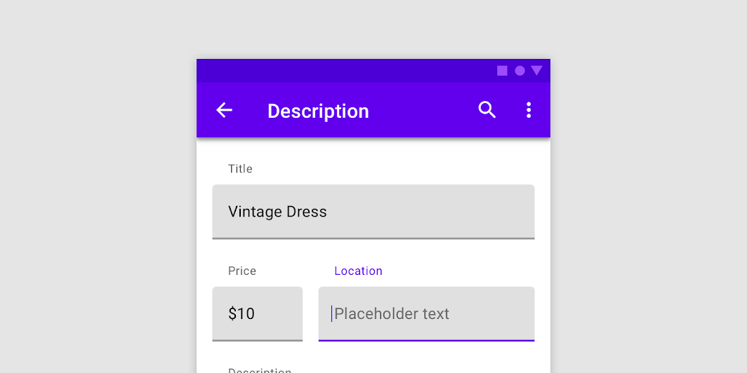
示例效果

源码
https://github.com/onlyloveyd/LearningCompose


 300
300


 被折叠的 条评论
为什么被折叠?
被折叠的 条评论
为什么被折叠?
 到【灌水乐园】发言


