


CSS3 多列 分列
CSS3 多列
通过 CSS3,您能够创建多个列来对文本进行布局 -
就像报纸那样,您可以收藏文章,需要用到的时候看一看。
在本章中,您将学习如下多列属性:
column-count
column-gap
column-rule
- column-rule-color
- column-rule-style
- column-rule-width
- column-width
浏览器支持
表格中的数字表示支持该方法的第一个浏览器的版本号。
紧跟在数字后面的 -webkit- 或 -moz- 为指定浏览器的前缀。
| 属性 | Chrome | IE | Firefox | Safari | Opera |
|---|---|---|---|---|---|
| column-count | 4.0 -webkit- | 10.0 | 2.0 -moz- | 3.1 -webkit- | 15.0 -webkit- 11.1 |
| column-gap | 4.0 -webkit- | 10.0 | 2.0 -moz- | 3.1 -webkit- | 15.0 -webkit- 11.1 |
| column-rule | 4.0 -webkit- | 10.0 | 2.0 -moz- | 3.1 -webkit- | 15.0 -webkit- 11.1 |
| column-rule-color | 4.0 -webkit- | 10.0 | 2.0 -moz- | 3.1 -webkit- | 15.0 -webkit 11.1 |
| column-rule-style | 4.0 -webkit- | 10.0 | 2.0 -moz- | 3.1 -webkit- | 15.0 -webkit 11.1 |
| column-rule-width | 4.0 -webkit- | 10.0 | 2.0 -moz- | 3.1 -webkit- | 15.0 -webkit 11.1 |
| column-width | 4.0 -webkit- | 10.0 | 2.0 -moz- | 3.1 -webkit- | 15.0 -webkit 11.1 |
CSS3创建多列
column-count属性指定元素的列数应分为
注意: IE 9及更早 IE 版本浏览器不支持 column-count 属性。
代码如下:
<!DOCTPYE html>
<html lang="zh">
<head>
    <link rel="icon" href="beyond.jpg" type="image/x-icon"/>
	<meta charset="UTF-8">
	<meta name="author" content="beyond">
	<meta http-equiv="refresh" content="520">
	<meta name="description" content="免费零基础教程">
	<meta name="viewport" content="width=device-width,
	initial-scale=1.0, maximum-scale=1.0,minimum-scale=1.0,user-scalable=0" />
	<meta name="keywords" content="HTML,CSS,JAVASCRIPT">
	<title>beyondの心中の动漫神作</title>
	<link rel="stylesheet" type="text/css" href="beyondbasestylewhite3.css">

	<!--[if lt IE 9]>
		<script src="//apps.bdimg.com/libs/html5shiv/3.7/html5shiv.min.js"></script>
	<![endif]-->

    <style type="text/css">
        body{
            font-size: 100%;
            background-image: url("sakura4.png");
            background-repeat: no-repeat;
            background-position: center center;
            /*声明margin和padding是个好习惯*/
            margin: 0;
            padding: 0;
        }
      	div.class_div {
      		/*兼容 Safari and Chrome*/
      		-webkit-column-count:3;
      		/*兼容 Firefox*/
      		-moz-column-num:3;
      		/*标准的写在最后面*/
      		column-num:3;
      	}
    </style>
</head>

<body>
    <h1 style="color:white;text-shadow:2px 2px 4px #000;letter-spacing:5px;" class="sgcontentcolor sgcenter">
        未闻花名
    </h1>
 	<div class="class_div">
 		在我们走过的季节里,路旁盛开的花朵也在不断变化,那个季节盛开的花是叫什么来着?轻轻摇曳着,一碰会微微刺痛,靠近一闻,隐约有股青涩的阳光的气息。那气息渐渐地淡去,我们也在慢慢长大。可是,那朵花一定还在某个地方盛开着……对,我们永远都会继续实现那朵花的愿望。
 	</div>
 	<br/>
	<p class="sgcontentcolor sgcenter" style="clear:left;">
		<b>注意:</b>column-count属性可以进行分列<br/>
		IE9及更早版本 不支持column-count属性<br/>
	</p>
	<footer id="copyright" style="clear:both;">
        <p style="font-size:14px;text-align:center;font-style:italic;">
        Copyright © <a id="author">2018</a> Powered by <a id="author">beyond</a>
        </p>
	</footer>
</body>
</html>
效果如下:
核心代码:
划分成三列的div元素的文本:
{
-moz-column-count:3; /* Firefox */
-webkit-column-count:3; /* Safari and Chrome */
column-count:3;
}
CSS3的指定列之间的 间距
column-gap属性指定的列之间的 间距
注意: IE 9及更早 IE 版本浏览器不支持 column-count 属性。
代码如下:
<!DOCTPYE html>
<html lang="zh">
<head>
    <link rel="icon" href="beyond.jpg" type="image/x-icon"/>
	<meta charset="UTF-8">
	<meta name="author" content="beyond">
	<meta http-equiv="refresh" content="520">
	<meta name="description" content="免费零基础教程">
	<meta name="viewport" content="width=device-width,
	initial-scale=1.0, maximum-scale=1.0,minimum-scale=1.0,user-scalable=0" />
	<meta name="keywords" content="HTML,CSS,JAVASCRIPT">
	<title>beyondの心中の动漫神作</title>
	<link rel="stylesheet" type="text/css" href="beyondbasestylewhite3.css">

	<!--[if lt IE 9]>
		<script src="//apps.bdimg.com/libs/html5shiv/3.7/html5shiv.min.js"></script>
	<![endif]-->

    <style type="text/css">
        body{
            font-size: 100%;
            background-image: url("sakura4.png");
            background-repeat: no-repeat;
            background-position: center center;
            /*声明margin和padding是个好习惯*/
            margin: 0;
            padding: 0;
        }
      	div.class_div {
      		/*兼容 Safari and Chrome*/
      		-webkit-column-count:3;
      		/*兼容 Firefox*/
      		-moz-column-num:3;
      		/*标准的写在最后面*/
      		column-num:3;


      		/*兼容 Safari and Chrome*/
      		-webkit-column-gap:40px;
      		/*兼容 Firefox*/
      		-moz-column-gap:40px;
      		/*标准的写在最后面*/
      		column-gap:40px;
      	}
    </style>
</head>

<body>
    <h1 style="color:white;text-shadow:2px 2px 4px #000;letter-spacing:5px;" class="sgcontentcolor sgcenter">
        未闻花名
    </h1>
 	<div class="class_div">
 		在我们走过的季节里,路旁盛开的花朵也在不断变化,那个季节盛开的花是叫什么来着?轻轻摇曳着,一碰会微微刺痛,靠近一闻,隐约有股青涩的阳光的气息。那气息渐渐地淡去,我们也在慢慢长大。可是,那朵花一定还在某个地方盛开着……对,我们永远都会继续实现那朵花的愿望。
 	</div>
 	<br/>
	<p class="sgcontentcolor sgcenter" style="clear:left;">
		<b>注意:</b>column-count属性可以进行分列<br/>
		IE9及更早版本 不支持column-count属性<br/>
	</p>
	<footer id="copyright" style="clear:both;">
        <p style="font-size:14px;text-align:center;font-style:italic;">
        Copyright © <a id="author">2018</a> Powered by <a id="author">beyond</a>
        </p>
	</footer>
</body>
</html>
效果如下:
核心代码:
指定列之间40个像素差距:
{
-moz-column-gap:40px; /* Firefox */
-webkit-column-gap:40px; /* Safari and Chrome */
column-gap:40px;
}
CSS3列规则
column-rule属性设置列之间的宽度,样式和颜色。
注意: IE 9及更早 IE 版本浏览器不支持 column-count 属性。
代码如下:
      	div.class_div {
      		/*兼容 Safari and Chrome*/
      		-webkit-column-count:3;
      		/*兼容 Firefox*/
      		-moz-column-num:3;
      		/*标准的写在最后面*/
      		column-num:3;


      		/*兼容 Safari and Chrome*/
      		-webkit-column-gap:40px;
      		/*兼容 Firefox*/
      		-moz-column-gap:40px;
      		/*标准的写在最后面*/
      		column-gap:40px;


      		/*兼容 Safari and Chrome*/
      		-webkit-column-rule:4px outset teal;
      		/*兼容 Firefox*/
      		-moz-column-rule:4px outset teal;
      		/*标准的写在最后面*/
      		column-rule:4px outset teal;
      	}
效果如下:
核心代码:
指定列之间的宽度,样式和颜色的规则:
{
-moz-column-rule:3px outset #ff00ff; /* Firefox */
-webkit-column-rule:3px outset #ff00ff; /* Safari and Chrome */
column-rule:3px outset #ff00ff;
}
CSS3 新多列属性
下表列出了所有 CSS3 的新多列属性,点击属性可以查看更多内容以及用法:
| 属性 | 说明 | CSS |
|---|---|---|
| column-count | 指定元素应分为的列数 | 3 |
| column-fill | 指定如何填充列 | 3 |
| column-gap | 指定列之间间距 | 3 |
| column-rule | 一个用于设置所有列规则的简写属性 | 3 |
| column-rule-color | 指定的列之间颜色规则 | 3 |
| column-rule-style | 指定的列之间的样式规则 | 3 |
| column-rule-width | 指定的列之间的宽度规则 | 3 |
| column-span | 指定一个元素应该横跨多少列 | 3 |
| column-width | 指定列的宽度 | 3 |
| columns | 缩写属性设置列宽和列数 | 3 |
CSS3 用户界面
CSS3 用户界面
在 CSS3 中, 增加了一些新的用户界面特性来调整元素尺寸,边框尺寸和外边框。
在本章中,您将了解以下的用户界面属性:
resize
box-sizing
outline-offset
浏览器支持
表格中的数字表示支持该属性的第一个浏览器版本号。
紧跟在 -webkit-, -ms- 或 -moz- 前的数字为支持该前缀属性的第一个浏览器版本号。
| 属性 | Chrome | IE | Firefox | Safari | Opera |
|---|---|---|---|---|---|
| resize | 4.0 | 不兼容 | 5.0 4.0 -moz- | 4.0 | 15.0 |
| box-sizing | 10.0 4.0 -webkit- | 8.0 | 29.0 2.0 -moz- | 5.1 3.1 -webkit- | 9.5 |
| outline-offset | 4.0 | 不兼容 | 5.0 4.0 -moz- | 4.0 | 9.5 |
CSS3 调整尺寸(Resize)
CSS3中,resize属性指定一个元素是否应该由用户去调整大小(宽度和高度)。
注意: IE 不支持 resize 属性.
CSS代码如下:
<!DOCTPYE html>
<html lang="zh">
<head>
    <link rel="icon" href="beyond.jpg" type="image/x-icon"/>
	<meta charset="UTF-8">
	<meta name="author" content="beyond">
	<meta http-equiv="refresh" content="520">
	<meta name="description" content="免费零基础教程">
	<meta name="viewport" content="width=device-width,
	initial-scale=1.0, maximum-scale=1.0,minimum-scale=1.0,user-scalable=0" />
	<meta name="keywords" content="HTML,CSS,JAVASCRIPT">
	<title>beyondの心中の动漫神作</title>
	<link rel="stylesheet" type="text/css" href="beyondbasestylewhite3.css">

	<!--[if lt IE 9]>
		<script src="//apps.bdimg.com/libs/html5shiv/3.7/html5shiv.min.js"></script>
	<![endif]-->

    <style type="text/css">
        body{
            font-size: 100%;
            background-image: url("sakura4.png");
            background-repeat: no-repeat;
            background-position: center center;
            /*声明margin和padding是个好习惯*/
            margin: 0;
            padding: 0;
        }
        div.class_div {
        	border:2px solid;
        	padding: 10px 40px;
        	width: 300px;
        	/*允许用户调整 宽和高*/
        	resize:both;
        	overflow: auto;
        }
    </style>
</head>

<body>
    <h1 style="color:white;text-shadow:2px 2px 4px #000;letter-spacing:5px;" class="sgcontentcolor sgcenter">
        未闻花名
    </h1>
 	<div class="class_div">
 		在我们走过的季节里,路旁盛开的花朵也在不断变化,那个季节盛开的花是叫什么来着?轻轻摇曳着,一碰会微微刺痛,靠近一闻,隐约有股青涩的阳光的气息。那气息渐渐地淡去,我们也在慢慢长大。可是,那朵花一定还在某个地方盛开着……对,我们永远都会继续实现那朵花的愿望。
 	</div>
 	<br/>
	<p class="sgcontentcolor sgcenter" style="clear:left;">
		<b>注意:</b>resize属性可以允许用户调整元素的宽高<br/>
		只有Chrome Safari Firefox支持resize属性
	</p>
	<footer id="copyright" style="clear:both;">
        <p style="font-size:14px;text-align:center;font-style:italic;">
        Copyright © <a id="author">2018</a> Powered by <a id="author">beyond</a>
        </p>
	</footer>
</body>
</html>
效果如下:
核心代码:
由用户指定一个div元素尺寸大小:
{
resize:both; /*允许用户调整其宽和高*/
overflow:auto;
}
CSS3 方框大小调整(Box Sizing)
box-sizing 属性允许您以确切的方式定义适应某个区域的具体内容。
在CSS2时代, 默认width:250px;仅仅是在给盒子模型中的content设置宽度!
而在CSS3时代,当一个div的box-sizing属性值为border-box的时候,
给这个div设置width:250px;那么这个250就是全部的宽度了(内容content+ padding + border = 一共就是250px)
代码如下:
<!DOCTPYE html>
<html lang="zh">
<head>
    <link rel="icon" href="beyond.jpg" type="image/x-icon"/>
	<meta charset="UTF-8">
	<meta name="author" content="beyond">
	<meta http-equiv="refresh" content="520">
	<meta name="description" content="免费零基础教程">
	<meta name="viewport" content="width=device-width,
	initial-scale=1.0, maximum-scale=1.0,minimum-scale=1.0,user-scalable=0" />
	<meta name="keywords" content="HTML,CSS,JAVASCRIPT">
	<title>beyondの心中の动漫神作</title>
	<link rel="stylesheet" type="text/css" href="beyondbasestylewhite3.css">

	<!--[if lt IE 9]>
		<script src="//apps.bdimg.com/libs/html5shiv/3.7/html5shiv.min.js"></script>
	<![endif]-->

    <style type="text/css">
        body{
            font-size: 100%;
            background-image: url("sakura4.png");
            background-repeat: no-repeat;
            background-position: center center;
            /*声明margin和padding是个好习惯*/
            margin: 0;
            padding: 0;
        }
        div.class_div_container {
        	/*div容器这个500的width宽度是内容content的宽度
        	所以这个div容器的总的宽度是:500 + 2*10 + 2*10 = 540*/
        	width: 500px;
        	height: 100px;
        	padding: 10px;
        	border:10px solid;
        }
        div.class_div_box {
        	/*这个box_div的width250的宽度是 整个box_div的宽度(包括了padding + border)*/
        	width: 250px;
        	border:10px solid teal;
        	float:left;

        	/*指定  宽度 === border的宽度*/
        	box-sizing:border-box;
        	/*兼容Firefox*/
        	-moz-box-sizing:border-box;
        }
    </style>
</head>

<body>
    <h1 style="color:white;text-shadow:2px 2px 4px #000;letter-spacing:5px;" class="sgcontentcolor sgcenter">
        未闻花名
    </h1>
 	<div class="class_div_container">
 		<div class="class_div_box">
 			left half
 		</div>

 		<div class="class_div_box">
 			right half
 		</div>
 	</div>
 	<br/>
	<p class="sgcontentcolor sgcenter" style="clear:left;">
		<b>注意:</b>里面的两个小div的box-sizing属性值是border-box<br/>
		也就是说两个小div总的宽度就是属性width:250px;<br/>
		而外面大的容器div的总宽度是:<br/>属性width(500) +  padding(2*10) + border(2*10) = 540px;
	</p>
	<footer id="copyright" style="clear:both;">
        <p style="font-size:14px;text-align:center;font-style:italic;">
        Copyright © <a id="author">2018</a> Powered by <a id="author">beyond</a>
        </p>
	</footer>
</body>
</html>
效果如下:
核心代码:
规定两个并排的带边框方框:
{ /*属性box-sizing值为border-box,意思就是width为整个div的宽度了*/
box-sizing:border-box;
-moz-box-sizing:border-box; /* Firefox */
width:50%;
float:left;
}
CSS3 外形修饰(outline-offset )
outline-offset 属性对轮廓进行偏移,并在超出边框边缘的位置绘制轮廓。
轮廓与边框有两点不同:
轮廓不占用空间
轮廓可能是非矩形
注意: IE 不兼容 outline-offset属性.
代码如下:
<!DOCTPYE html>
<html lang="zh">
<head>
    <link rel="icon" href="beyond.jpg" type="image/x-icon"/>
	<meta charset="UTF-8">
	<meta name="author" content="beyond">
	<meta http-equiv="refresh" content="520">
	<meta name="description" content="免费零基础教程">
	<meta name="viewport" content="width=device-width,
	initial-scale=1.0, maximum-scale=1.0,minimum-scale=1.0,user-scalable=0" />
	<meta name="keywords" content="HTML,CSS,JAVASCRIPT">
	<title>beyondの心中の动漫神作</title>
	<link rel="stylesheet" type="text/css" href="beyondbasestylewhite3.css">

	<!--[if lt IE 9]>
		<script src="//apps.bdimg.com/libs/html5shiv/3.7/html5shiv.min.js"></script>
	<![endif]-->

    <style type="text/css">
        body{
            font-size: 100%;
            background-image: url("sakura4.png");
            background-repeat: no-repeat;
            background-position: center center;
            /*声明margin和padding是个好习惯*/
            margin: 0;
            padding: 0;
        }
        div.class_div {
        	margin: 20px;
        	padding: 10px;
        	width: 100px;
        	border:2px solid black;
        	/*在border的外面10px处,有一个不占空间外轮廓线*/
        	outline:2px solid pink;
        	outline-offset:10px;
        }

    </style>
</head>

<body>
    <h1 style="color:white;text-shadow:2px 2px 4px #000;letter-spacing:5px;" class="sgcontentcolor sgcenter">
        未闻花名
    </h1>
 	<div class="class_div">
 		I have a outline border
 	</div>
 	<br/>
	<p class="sgcontentcolor sgcenter" style="clear:left;">
		<b>注意:</b>outline-offset属性可在元素的border外再指定一个不占空间的轮廓<br/>
		IE不支持outline-offset属性<br/>
	</p>
	<footer id="copyright" style="clear:both;">
        <p style="font-size:14px;text-align:center;font-style:italic;">
        Copyright © <a id="author">2018</a> Powered by <a id="author">beyond</a>
        </p>
	</footer>
</body>
</html>
效果如下:
核心代码:
规定边框边缘之外 15 像素处的轮廓:
{
border:2px solid black;
outline:2px solid red;
outline-offset:15px;
}
新的用户界面特性
下表中为CSS3的新用户界面属性,您可以点击对应的属性,了解到更多的内容以及对应属性的用法等等:
| 属性 | 说明 | CSS |
|---|---|---|
| appearance | 允许您使一个元素的外观像一个标准的用户界面元素 | 3 |
| box-sizing | 允许你以适应区域而用某种方式定义某些元素 | 3 |
| icon | Provides the author the ability to style an element with an iconic equivalent | 3 |
| nav-down | 指定在何处使用箭头向下导航键时进行导航 | 3 |
| nav-index | 指定一个元素的Tab的顺序 | 3 |
| nav-left | 指定在何处使用左侧的箭头导航键进行导航 | 3 |
| nav-right | 指定在何处使用右侧的箭头导航键进行导航 | 3 |
| nav-up | 指定在何处使用箭头向上导航键时进行导航 | 3 |
| outline-offset | 外轮廓修饰并绘制超出边框的边缘 | 3 |
| resize | 指定一个元素是否是由用户调整大小 | 3 |
CSS 图片
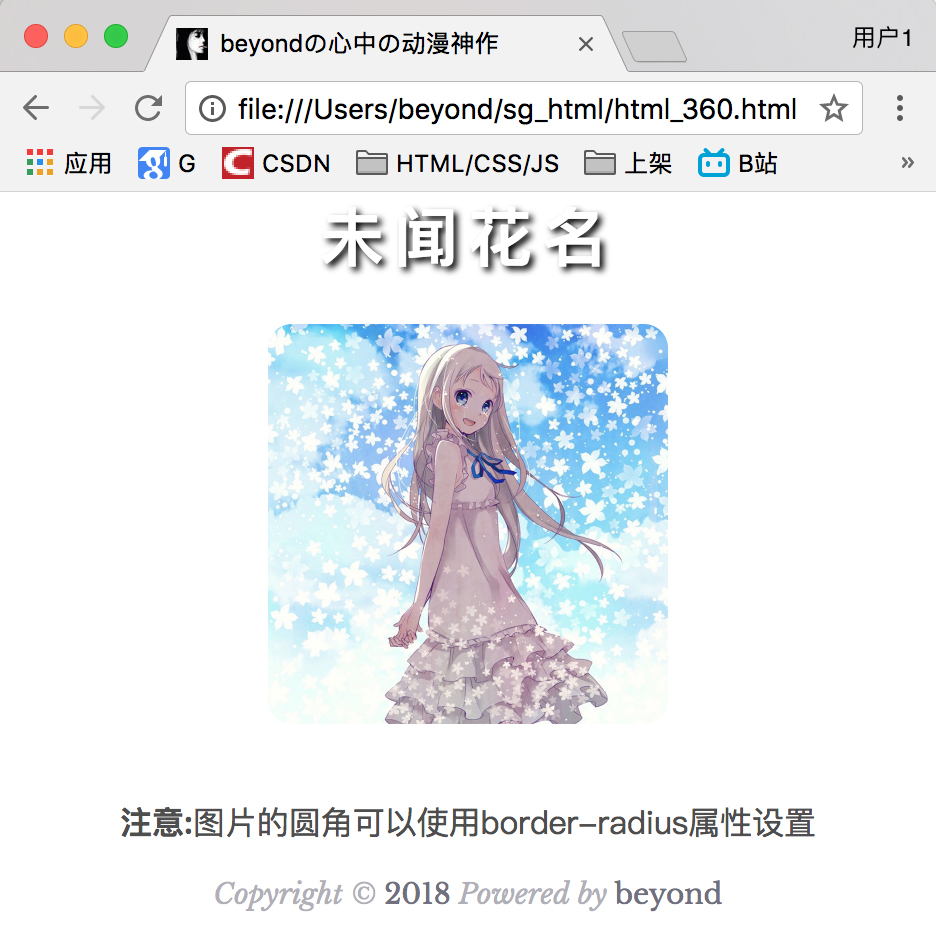
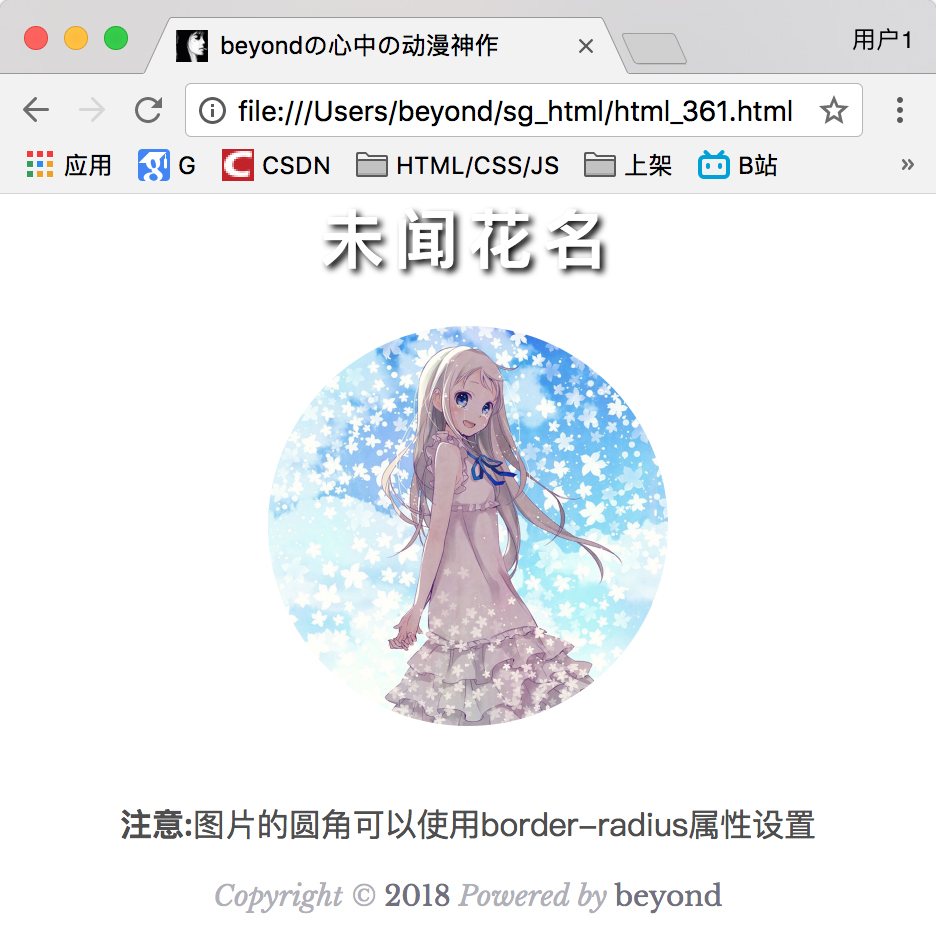
本章节将为大家介绍如何使用 CSS 来布局图片。
圆角图片
代码如下:
<!DOCTPYE html>
<html lang="zh">
<head>
    <link rel="icon" href="beyond.jpg" type="image/x-icon"/>
	<meta charset="UTF-8">
	<meta name="author" content="beyond">
	<meta http-equiv="refresh" content="520">
	<meta name="description" content="免费零基础教程">
	<meta name="viewport" content="width=device-width,
	initial-scale=1.0, maximum-scale=1.0,minimum-scale=1.0,user-scalable=0" />
	<meta name="keywords" content="HTML,CSS,JAVASCRIPT">
	<title>beyondの心中の动漫神作</title>
	<link rel="stylesheet" type="text/css" href="beyondbasestylewhite3.css">

	<!--[if lt IE 9]>
		<script src="//apps.bdimg.com/libs/html5shiv/3.7/html5shiv.min.js"></script>
	<![endif]-->

    <style type="text/css">
        body{
            font-size: 100%;
            /*background-image: url("sakura4.png");
            background-repeat: no-repeat;
            background-position: center center;  */
            /*声明margin和padding是个好习惯*/
            margin: 0;
            padding: 0;
        }
        img {
        	display: block;
        	margin: auto;
        	/*给图片创建圆角*/
        	border-radius: 12px;
        }
    </style>
</head>

<body>
    <h1 style="color:white;text-shadow:2px 2px 4px #000;letter-spacing:5px;" class="sgcontentcolor sgcenter">
        未闻花名
    </h1>
 	<img src="menma.png" alt="面码" width="200" height="200" />
 	<br/>
	<p class="sgcontentcolor sgcenter" style="clear:left;">
		<b>注意:</b>图片的圆角可以使用border-radius属性设置
	</p>
	<footer id="copyright" style="clear:both;">
        <p style="font-size:14px;text-align:center;font-style:italic;">
        Copyright © <a id="author">2018</a> Powered by <a id="author">beyond</a>
        </p>
	</footer>
</body>
</html>
效果如下:
核心代码:
圆角图片:
border-radius: 12px;
}
核心代码:
椭圆形图片:
border-radius: 50%;
}
效果如下:
缩略图
我们使用 border 属性来创建缩略图。
完整代码如下:
<!DOCTPYE html>
<html lang="zh">
<head>
    <link rel="icon" href="beyond.jpg" type="image/x-icon"/>
	<meta charset="UTF-8">
	<meta name="author" content="beyond">
	<meta http-equiv="refresh" content="520">
	<meta name="description" content="免费零基础教程">
	<meta name="viewport" content="width=device-width,
	initial-scale=1.0, maximum-scale=1.0,minimum-scale=1.0,user-scalable=0" />
	<meta name="keywords" content="HTML,CSS,JAVASCRIPT">
	<title>beyondの心中の动漫神作</title>
	<link rel="stylesheet" type="text/css" href="beyondbasestylewhite3.css">

	<!--[if lt IE 9]>
		<script src="//apps.bdimg.com/libs/html5shiv/3.7/html5shiv.min.js"></script>
	<![endif]-->

    <style type="text/css">
        body{
            font-size: 100%;
            /*background-image: url("sakura4.png");
            background-repeat: no-repeat;
            background-position: center center;  */
            /*声明margin和padding是个好习惯*/
            margin: 0;
            padding: 0;
        }
        img {
        	display: block;
        	margin: auto;
        	/*给图片创建圆角*/
        	border-radius: 12px;
        	padding: 6px;
        	border:1px solid #ddd;
        }
    </style>
</head>

<body>
    <h1 style="color:white;text-shadow:2px 2px 4px #000;letter-spacing:5px;" class="sgcontentcolor sgcenter">
        未闻花名
    </h1>
 	<img src="menma.png" alt="面码" width="200" height="200" />
 	<br/>
	<p class="sgcontentcolor sgcenter" style="clear:left;">
		<b>注意:</b>图片的圆角可以使用border-radius属性设置
	</p>
	<footer id="copyright" style="clear:both;">
        <p style="font-size:14px;text-align:center;font-style:italic;">
        Copyright © <a id="author">2018</a> Powered by <a id="author">beyond</a>
        </p>
	</footer>
</body>
</html>
效果如下:

核心代码:
border: 1px solid #ddd;
border-radius: 4px;
padding: 5px;
}
<img src="paris.jpg" alt="Paris">
实例
display: inline-block;
border: 1px solid #ddd;
border-radius: 4px;
padding: 5px;
transition: 0.3s;
}
a:hover {
box-shadow: 0 0 2px 1px rgba
(0, 140, 186, 0.5);
}
<a href="paris.jpg">
<img src="paris.jpg" alt="Paris">
</a>
荧光动画效果代码如下:
<!DOCTPYE html>
<html lang="zh">
<head>
    <link rel="icon" href="beyond.jpg" type="image/x-icon"/>
	<meta charset="UTF-8">
	<meta name="author" content="beyond">
	<meta http-equiv="refresh" content="520">
	<meta name="description" content="免费零基础教程">
	<meta name="viewport" content="width=device-width,
	initial-scale=1.0, maximum-scale=1.0,minimum-scale=1.0,user-scalable=0" />
	<meta name="keywords" content="HTML,CSS,JAVASCRIPT">
	<title>beyondの心中の动漫神作</title>
	<link rel="stylesheet" type="text/css" href="beyondbasestylewhite3.css">

	<!--[if lt IE 9]>
		<script src="//apps.bdimg.com/libs/html5shiv/3.7/html5shiv.min.js"></script>
	<![endif]-->

    <style type="text/css">
        body{
            font-size: 100%;
            /*background-image: url("sakura4.png");
            background-repeat: no-repeat;
            background-position: center center;  */
            /*声明margin和padding是个好习惯*/
            margin: 0;
            padding: 0;
        }

        a.class_a {
        	/*居中的3行核心代码*/
        	display: block;
        	margin: 0 auto;
        	width: 200px;
        	/*当hover的时候,边框阴影的荧光动画效果的时长*/
        	transition:1s;
        	/*给图片创建圆角*/
        	border-radius: 12px;
        	padding: 6px;
        	border:1px solid #ddd;
        }
        a.class_a:hover {
        	/*几个参数是啥意思???
        	box-shadow: h-shadow v-shadow blur spread color inset;*/
        	box-shadow: 0 0 4px 1px rgba(0,140,186,0.5);
        }
    </style>
</head>

<body>
    <h1 style="color:white;text-shadow:2px 2px 4px #000;letter-spacing:5px;" class="sgcontentcolor sgcenter">
        未闻花名
    </h1>
    <a class="class_a" href="http://baidu.com/s?wd=anohana" target="_blank">
	 	<img src="menma.png" alt="面码" width="200" height="200" />
 	</a>
 	<br/>
	<p class="sgcontentcolor sgcenter" style="clear:left;">
		<b>注意:</b>图片的圆角可以使用border-radius属性设置<br/>
		在图片外再套一个a标签
	</p>
	<footer id="copyright" style="clear:both;">
        <p style="font-size:14px;text-align:center;font-style:italic;">
        Copyright © <a id="author">2018</a> Powered by <a id="author">beyond</a>
        </p>
	</footer>
</body>
</html>
荧光动画效果如下:

响应式图片
响应式图片会自动适配各种尺寸的屏幕。
如果你需要自由缩放图片,且图片放大的最大尺寸不大于其原始的最大值,则可使用以下代码:
实例
max-width: 100%;
height: auto;
}
提示: Web 响应式设计更多内容可以参考前面的CSS 响应式设计教程。
图片中文本的定位 position:absolute;
如何定位图片中的文本:

其中一个例子,居中的代码如下:
<!DOCTPYE html>
<html lang="zh">
<head>
    <link rel="icon" href="beyond.jpg" type="image/x-icon"/>
	<meta charset="UTF-8">
	<meta name="author" content="beyond">
	<meta http-equiv="refresh" content="520">
	<meta name="description" content="免费零基础教程">
	<meta name="viewport" content="width=device-width,
	initial-scale=1.0, maximum-scale=1.0,minimum-scale=1.0,user-scalable=0" />
	<meta name="keywords" content="HTML,CSS,JAVASCRIPT">
	<title>beyondの心中の动漫神作</title>
	<link rel="stylesheet" type="text/css" href="beyondbasestylewhite3.css">

	<!--[if lt IE 9]>
		<script src="//apps.bdimg.com/libs/html5shiv/3.7/html5shiv.min.js"></script>
	<![endif]-->

    <style type="text/css">
        body{
            font-size: 100%;
            /*background-image: url("sakura4.png");
            background-repeat: no-repeat;
            background-position: center center;  */
            /*声明margin和padding是个好习惯*/
            margin: 0;
            padding: 0;
        }
        div.class_div_container {
        	/*父容器一般是relative好让子元素能够absolute*/
        	position: relative;
        }
        div.class_div_center {
        	/*绝对定位:居中*/
        	position: absolute;
        	top: 50%;
        	/*占满整个长度*/
        	left: 0;
        	width: 100%;
        	/*文本居中*/
        	text-align: center;
        	font-size: 18px;
        }
        img {
        	display: block;
        	margin: 0 auto;
        }
    </style>
</head>

<body>
    <h1 style="color:white;text-shadow:2px 2px 4px #000;letter-spacing:5px;" class="sgcontentcolor sgcenter">
        未闻花名
    </h1>
    <div class="class_div_container">
    	<img src="menma.png" alt="面码" width="200" height="200" />
    	<div class="class_div_center">面码</div>
    </div>
 	<br/>
	<p class="sgcontentcolor sgcenter" style="clear:left;">
		<b>注意:</b>通过position:absolute;让文本处在图片的左上或居中
	</p>
	<footer id="copyright" style="clear:both;">
        <p style="font-size:14px;text-align:center;font-style:italic;">
        Copyright © <a id="author">2018</a> Powered by <a id="author">beyond</a>
        </p>
	</footer>
</body>
</html>
效果如下:

让文字处于图片的左上角的代码如下:
<!DOCTPYE html>
<html lang="zh">
<head>
    <link rel="icon" href="beyond.jpg" type="image/x-icon"/>
	<meta charset="UTF-8">
	<meta name="author" content="beyond">
	<meta http-equiv="refresh" content="520">
	<meta name="description" content="免费零基础教程">
	<meta name="viewport" content="width=device-width,
	initial-scale=1.0, maximum-scale=1.0,minimum-scale=1.0,user-scalable=0" />
	<meta name="keywords" content="HTML,CSS,JAVASCRIPT">
	<title>beyondの心中の动漫神作</title>
	<link rel="stylesheet" type="text/css" href="beyondbasestylewhite3.css">

	<!--[if lt IE 9]>
		<script src="//apps.bdimg.com/libs/html5shiv/3.7/html5shiv.min.js"></script>
	<![endif]-->

    <style type="text/css">
        body{
            font-size: 100%;
            /*background-image: url("sakura4.png");
            background-repeat: no-repeat;
            background-position: center center;  */
            /*声明margin和padding是个好习惯*/
            margin: 0;
            padding: 0;
        }
        div.class_div_container {
        	/*父容器一般是relative好让子元素能够absolute*/
        	position: relative;
        }
        div.class_div_center {
        	/*绝对定位:居中*/
        	position: absolute;
        	top: 20px;
        	/*占满整个长度*/
        	left: 20px;
        	font-size: 18px;
        }
        img {
        	width: 100%;
        	height: auto;
        }
    </style>
</head>

<body>
    <h1 style="color:white;text-shadow:2px 2px 4px #000;letter-spacing:5px;" class="sgcontentcolor sgcenter">
        未闻花名
    </h1>
    <div class="class_div_container">
    	<img src="menma.png" alt="面码" width="200" height="200" />
    	<div class="class_div_center">面码</div>
    </div>
 	<br/>
	<p class="sgcontentcolor sgcenter" style="clear:left;">
		<b>注意:</b>通过position:absolute;<br/>让文本处在图片的左上或居中
	</p>
	<footer id="copyright" style="clear:both;">
        <p style="font-size:14px;text-align:center;font-style:italic;">
        Copyright © <a id="author">2018</a> Powered by <a id="author">beyond</a>
        </p>
	</footer>
</body>
</html>
效果如下:

卡片式图片
卡片特效专用box-shadow属性的代码如下:<!DOCTPYE html>
<html lang="zh">
<head>
<link rel="icon" href="beyond.jpg" type="image/x-icon"/>
<meta charset="UTF-8">
<meta name="author" content="beyond">
<meta http-equiv="refresh" content="520">
<meta name="description" content="免费零基础教程">
<meta name="viewport" content="width=device-width,
initial-scale=1.0, maximum-scale=1.0,minimum-scale=1.0,user-scalable=0" />
<meta name="keywords" content="HTML,CSS,JAVASCRIPT">
<title>beyondの心中の动漫神作</title>
<link rel="stylesheet" type="text/css" href="beyondbasestylewhite3.css">
<!--[if lt IE 9]>
<script src="//apps.bdimg.com/libs/html5shiv/3.7/html5shiv.min.js"></script>
<![endif]-->
<style type="text/css">
body{
font-size: 100%;
/*background-image: url("sakura4.png");
background-repeat: no-repeat;
background-position: center center; */
/*声明margin和padding是个好习惯*/
margin: 0;
padding: 0;
}
div.class_div_container {
/*div居中*/
margin: 0 auto;
/*跟图片一样宽*/
width: 200px;
background-color: white;
/*卡片阴影专业特效*/
box-shadow: 0 4px 8px 0 rgba(0,0,0,0.2), 0 6px 20px 0 rgba(0,0,0,0.19);
}
div.class_div_content {
text-align: center;
padding: 10px 10px;
}
p.class_div_p {
/*去掉p顶部和底部默认的空行*/
padding: 0px;
display: inline;
}
</style>
</head>
<body>
<h1 style="color:white;text-shadow:2px 2px 4px #000;letter-spacing:5px;" class="sgcontentcolor sgcenter">
未闻花名
</h1>
<div class="class_div_container">
<img src="menma.png" alt="面码" width="200" />
<div class="class_div_content">
<p class="class_div_p">あの日見た花の名前を僕達はまだ知らない</p>
</div>
</div>
<br/>
<p class="sgcontentcolor sgcenter" style="clear:left;">
<b>注意:</b>图片的卡片特效专用box-shadow属性参数
</p>
<footer id="copyright" style="clear:both;">
<p style="font-size:14px;text-align:center;font-style:italic;">
Copyright © <a id="author">2018</a> Powered by <a id="author">beyond</a>
</p>
</footer>
</body>
</html> 效果如下:

核心代码:
width: 80%;
background-color: white;
box-shadow: 0 4px 8px 0 rgba(0, 0, 0, 0.2), 0 6px 20px 0 rgba(0, 0, 0, 0.19);
}
img { width: 100%}
div.container {
text-align: center;
padding: 10px 20px;
}
图片滤镜
CSS filter 属性用为元素添加可视效果 (例如:模糊blur与饱和度) 。
注意: IE 或 Safari 5.1 (及更早版本) 不支持该属性。

代码如下:
<!DOCTPYE html>
<html lang="zh">
<head>
    <link rel="icon" href="beyond.jpg" type="image/x-icon"/>
	<meta charset="UTF-8">
	<meta name="author" content="beyond">
	<meta http-equiv="refresh" content="520">
	<meta name="description" content="免费零基础教程">
	<meta name="viewport" content="width=device-width,
	initial-scale=1.0, maximum-scale=1.0,minimum-scale=1.0,user-scalable=0" />
	<meta name="keywords" content="HTML,CSS,JAVASCRIPT">
	<title>beyondの心中の动漫神作</title>
	<link rel="stylesheet" type="text/css" href="beyondbasestylewhite3.css">

	<!--[if lt IE 9]>
		<script src="//apps.bdimg.com/libs/html5shiv/3.7/html5shiv.min.js"></script>
	<![endif]-->

    <style type="text/css">
        body{
            font-size: 100%;
            /*background-image: url("sakura4.png");
            background-repeat: no-repeat;
            background-position: center center;  */
            /*声明margin和padding是个好习惯*/
            margin: 0;
            padding: 0;
        }
        img {
        	width: 33%;
        	height: auto;
        	/*要进行浮动了*/
        	float: left;
        	/*最大缩放不超过原图大小*/
        	max-width: 300px;
        }
    </style>
</head>

<body>
    <h1 style="color:white;text-shadow:2px 2px 4px #000;letter-spacing:5px;" class="sgcontentcolor sgcenter">
        未闻花名
    </h1>
    <img src="penguin.jpg" alt="penguin" width="300" height="251" />
   	<img style="-webkit-filter: blur(4px);filter: blur(4px);" src="penguin.jpg" alt="penguin" width="300" height="251" />
   	<img  style="-webkit-filter: brightness(250%);filter: brightness(250%);" src="penguin.jpg" alt="penguin" width="300" height="251" />
   	<img  style="-webkit-filter: contrast(180%);filter: contrast(180%);" src="penguin.jpg" alt="penguin" width="300" height="251" />
   	<img  style="-webkit-filter: grayscale(100%);filter: grayscale(100%);" src="penguin.jpg" alt="penguin" width="300" height="251" />
   	<img  style="-webkit-filter: hue-rotate(180deg);filter: hue-rotate(180deg);" src="penguin.jpg" alt="penguin" width="300" height="251" />
   	<img  style="-webkit-filter: invert(100%);filter: invert(100%);" src="penguin.jpg" alt="penguin" width="300" height="251" />
   	<img  style="-webkit-filter: opacity(30%);filter: opacity(30%);" src="penguin.jpg" alt="penguin" width="300" height="251" />
   	<img  style="-webkit-filter: saturate(7);filter: saturate(7);" src="penguin.jpg" alt="penguin" width="300" height="251" />
   	<img  style="-webkit-filter: sepia(100%);filter: sepia(100%);" src="penguin.jpg" alt="penguin" width="300" height="251" />
   	<img  style="-webkit-filter: drop-shadow(8px 8px 10px darkgray);filter: drop-shadow(8px 8px 10px darkgray);" src="penguin.jpg" alt="penguin" width="300" height="251" />

	<p class="sgcontentcolor sgcenter" style="clear:left;">
		<br/><b>注意:</b>filter属性一览表<br/>
		IE或Safari5.1(及更早版本)不支持filter属性<br/>
		无特效、brightness(250%)、contrast(180%)<br/>
		contrast(180%)、grayscale(100%)、hue-rotate(180deg)<br/>
		invert(100%)、opacity(30%)、saturate(7)<br/>
		sepia(100%)和drop-shadow(8px 8px 10px darkgray)
	</p>
	<footer id="copyright" style="clear:both;">
        <p style="font-size:14px;text-align:center;font-style:italic;">
        Copyright © <a id="author">2018</a> Powered by <a id="author">beyond</a>
        </p>
	</footer>
</body>
</html>
效果如下:

核心代码:
修改所有图片的颜色为黑白 (100% 灰度):
-webkit-filter: grayscale(100%); /* Chrome, Safari, Opera */
filter: grayscale(100%);
}
提示: 访问 CSS 滤镜参考手册 查看更多内容。
补充知识如下:
CSS 语法
filter: none | blur() | brightness() | contrast() | drop-shadow() | grayscale() | hue-rotate() | invert() | opacity() | saturate() | sepia() | url();
提示: 使用空格分隔多个滤镜。
Filter 函数
注意: 滤镜通常使用百分比 (如:75%), 当然也可以使用小数来表示 (如:0.75)。


| Filter | 描述 |
|---|---|
| none | 默认值,没有效果。 |
| blur(px) | 给图像设置高斯模糊。"radius"一值设定高斯函数的标准差,或者是屏幕上以多少像素融在一起, 所以值越大越模糊; 如果没有设定值,则默认是0;这个参数可设置css长度值,但不接受百分比值。 |
| brightness(%) | 给图片应用一种线性乘法,使其看起来更亮或更暗。如果值是0%,图像会全黑。值是100%,则图像无变化。其他的值对应线性乘数效果。值超过100%也是可以的,图像会比原来更亮。如果没有设定值,默认是1。 |
| contrast(%) | 调整图像的对比度。值是0%的话,图像会全黑。值是100%,图像不变。值可以超过100%,意味着会运用更低的对比。若没有设置值,默认是1。 |
| drop-shadow(h-shadow v-shadow blur spread color) | 给图像设置一个阴影效果。阴影是合成在图像下面,可以有模糊度的,可以以特定颜色画出的遮罩图的偏移版本。 函数接受<shadow>(在CSS3背景中定义)类型的值,除了"inset"关键字是不允许的。该函数与已有的box-shadow box-shadow属性很相似;不同之处在于,通过滤镜,一些浏览器为了更好的性能会提供硬件加速。
注意: Webkit, 以及一些其他浏览器 不支持第四个长度,如果加了也不会渲染。 <color> (可选)。若未设定,颜色值基于浏览器。在Gecko (壁虎Firefox), Presto (Opera)和Trident (三叉戟Internet Explorer)中, 会应用colorcolor属性的值。另外, 如果颜色值省略,WebKit中阴影是透明的。 |
| grayscale(%) | 将图像转换为灰度图像。值定义转换的比例。值为100%则完全转为灰度图像,值为0%图像无变化。值在0%到100%之间,则是效果的线性乘子。若未设置,值默认是0; |
| hue-rotate(deg) | 给图像应用色相旋转。"angle"一值设定图像会被调整的色环角度值。值为0deg,则图像无变化。若值未设置,默认值是0deg。该值虽然没有最大值,超过360deg的值相当于又绕一圈。 |
| invert(%) | 反转输入图像。值定义转换的比例。100%的价值是完全反转。值为0%则图像无变化。值在0%和100%之间,则是效果的线性乘子。 若值未设置,值默认是0。 |
| opacity(%) | 转化图像的透明程度。值定义转换的比例。值为0%则是完全透明,值为100%则图像无变化。值在0%和100%之间,则是效果的线性乘子,也相当于图像样本乘以数量。 若值未设置,值默认是1。该函数与已有的opacity属性很相似,不同之处在于通过filter,一些浏览器为了提升性能会提供硬件加速。 |
| saturate(%) | 转换图像饱和度。值定义转换的比例。值为0%则是完全不饱和,值为100%则图像无变化。其他值,则是效果的线性乘子。超过100%的值是允许的,则有更高的饱和度。 若值未设置,值默认是1。 |
| sepia(%)乌贼 | 将图像转换为深褐色。值定义转换的比例。值为100%则完全是深褐色的,值为0%图像无变化。值在0%到100%之间,则是效果的线性乘子。若未设置,值默认是0; |
| url() | URL函数接受一个XML文件,该文件设置了 一个SVG滤镜,且可以包含一个锚点来指定一个具体的滤镜元素。 例如: |
| initial | 设置属性为默认值,可参阅: CSS initial 关键字 |
| inherit | 从父元素继承该属性,可参阅:CSS inherit 关键字 |
响应式图片相册
代码如下:
<!DOCTPYE html>
<html lang="zh">
<head>
    <link rel="icon" href="beyond.jpg" type="image/x-icon"/>
	<meta charset="UTF-8">
	<meta name="author" content="beyond">
	<meta http-equiv="refresh" content="520">
	<meta name="description" content="免费零基础教程">
	<meta name="viewport" content="width=device-width,
	initial-scale=1.0, maximum-scale=1.0,minimum-scale=1.0,user-scalable=0" />
	<meta name="keywords" content="HTML,CSS,JAVASCRIPT">
	<title>beyondの心中の动漫神作</title>
	<link rel="stylesheet" type="text/css" href="beyondbasestylewhite3.css">

	<!--[if lt IE 9]>
		<script src="//apps.bdimg.com/libs/html5shiv/3.7/html5shiv.min.js"></script>
	<![endif]-->

    <style type="text/css">
        body{
            font-size: 100%;
            /*background-image: url("sakura4.png");
            background-repeat: no-repeat;
            background-position: center center;  */
            /*声明margin和padding是个好习惯*/
            margin: 0;
            padding: 0;
        }
        /*响应式布局都有的一句话*/
        * {
        	/*指定width为全宽*/
        	box-sizing:border-box;
        }
        /*最外面的容器*/
        div.class_div_container {
        	/*默认每排显示4张图片*/
        	width: 25%;
        	/*左右有间距*/
        	padding: 0 6px;
        	float: left;
        }
        /*内有a和txt*/
        div.class_div_img {
        	border:1px solid #ccc;
        }
        /*hover时改边框样式*/
        div.class_div_img:hover {
        	border:1px solid #777;
        }
        /*图片宽度设置*/
        div.class_div_img img {
        	width: 100%;
        	height: auto;
        }
        /*描述文本居中*/
        div.class_div_content {
        	text-align: center;
        	padding: 5px;
        }
        /*响应式布局核心代码:@media查询
        当屏幕小于768px时,每排显示2张图片*/
        @media only screen and (max-width: 768px){
        	div.class_div_container {
        		width: 50%;
        		margin: 6px 0;
        	}
        }
        /*响应式布局核心代码:@media查询
        当屏幕小于640px时,每排只显示一张图片*/
        @media only screen and (max-width: 640px){
        	div.class_div_container {
        		width: 100%;
        	}
        }
        /*清一下屁股,写不写无所谓*/
        div.class_div_content:after {
        	/*content: "";
        	display: table;
        	clear: both;*/
        }
    </style>
</head>

<body>
    <h1 style="color:white;text-shadow:2px 2px 4px #000;letter-spacing:5px;" class="sgcontentcolor sgcenter">
        未闻花名
    </h1>
    <div class="class_div_container">
    	<div class="class_div_img">
    		<a href="http://baidu.com/s?wd=anohana">
    			<img src="menma.png" alt="面码" width="200" height="200" />
    		</a>
    		<div class="class_div_content">
    			あの日見た花の名前を僕達はまだ知らない
    		</div>
    	</div>
    </div>
    <div class="class_div_container">
    	<div class="class_div_img">
    		<a href="http://baidu.com/s?wd=anohana">
    			<img src="menma.png" alt="面码" width="200" height="200" />
    		</a>
    		<div class="class_div_content">
    			あの日見た花の名前を僕達はまだ知らない
    		</div>
    	</div>
    </div>
    <div class="class_div_container">
    	<div class="class_div_img">
    		<a href="http://baidu.com/s?wd=anohana">
    			<img src="menma.png" alt="面码" width="200" height="200" />
    		</a>
    		<div class="class_div_content">
    			あの日見た花の名前を僕達はまだ知らない
    		</div>
    	</div>
    </div>
    <div class="class_div_container">
    	<div class="class_div_img">
    		<a href="http://baidu.com/s?wd=anohana">
    			<img src="menma.png" alt="面码" width="200" height="200" />
    		</a>
    		<div class="class_div_content">
    			あの日見た花の名前を僕達はまだ知らない
    		</div>
    	</div>
    </div>

	<p class="sgcontentcolor sgcenter" style="clear:left;">
		<br/><b>注意:</b>响应式,重置窗口大小可看到变化
	</p>
	<footer id="copyright" style="clear:both;">
        <p style="font-size:14px;text-align:center;font-style:italic;">
        Copyright © <a id="author">2018</a> Powered by <a id="author">beyond</a>
        </p>
	</footer>
</body>
</html>
效果如下:

核心代码:
padding: 0 6px;
float: left;
width: 25%; /*默认电脑一行显示4个图片*/
}
@media only screen and (max-width: 768px){
.responsive {
width: 50%; /*平板上一行显示2个图片*/
margin: 6px 0;
}
}
@media only screen and (max-width: 640px){
.responsive {
width: 100%; /*手机屏幕上一行显示1个图片*/
}
}
图片 Modal(模态)
本实例演示了如何结合 CSS 和 JavaScript 来一起渲染图片。
首先,我们使用 CSS 来创建 modal 窗口 (对话框), 默认是隐藏的。
然后,我们使用 JavaScript 来显示模态窗口,当我们点击图片时,图片会在弹出的窗口中显示
完整代码如下:
<!DOCTPYE html>
<html lang="zh">
<head>
    <link rel="icon" href="beyond.jpg" type="image/x-icon"/>
	<meta charset="UTF-8">
	<meta name="author" content="beyond">
	<meta http-equiv="refresh" content="520">
	<meta name="description" content="免费零基础教程">
	<meta name="viewport" content="width=device-width,
	initial-scale=1.0, maximum-scale=1.0,minimum-scale=1.0,user-scalable=0" />
	<meta name="keywords" content="HTML,CSS,JAVASCRIPT">
	<title>beyondの心中の动漫神作</title>
	<link rel="stylesheet" type="text/css" href="beyondbasestylewhite3.css">

	<!--[if lt IE 9]>
		<script src="//apps.bdimg.com/libs/html5shiv/3.7/html5shiv.min.js"></script>
	<![endif]-->

    <style type="text/css">
        body{
            font-size: 100%;
            /*background-image: url("sakura4.png");
            background-repeat: no-repeat;
            background-position: center center;  */
            /*声明margin和padding是个好习惯*/
            margin: 0;
            padding: 0;
        }
        /*小图*/
        img#id_img_small {
        	/*图片居中的两行代码*/
        	display: block;
        	margin: auto;
        	border-radius: 12px;
        	cursor: pointer;
        	transition: 1s;
        }
        /*小图动画*/
        img#id_img_small:hover {
        	opacity: 0.7;
        }
        /*弹出框div容器*/
        div.class_div_container {
        	/*核心代码:默认隐藏*/
        	display: none;
        	/*脱离文档流,fixed定位*/
        	position: fixed;
        	/*显示在最上方*/
        	z-index: 1;
        	/*???*/
        	padding-top: 100px;
        	left: 0;
        	top: 0;
        	/*调试用*/
        	background-color: rgb(0,0,0,0.8);
        	/*全屏*/
        	width: 100%;
        	height: 100%;
        	/*enable scroll滚动条*/
        	overflow: auto;
        }
        /*弹出框 内部 的big img*/
        img.class_img_big {
        	/*居中*/
        	display: block;
        	margin: auto;
        	width: 80%;
        	max-width: 768px;
        }
        /*弹出框中的 图片描述*/
        div#id_div_caption {
        	/*居中*/
        	display: block;
        	margin: auto;
        	width: 80%
        	max-width:768px;
        	text-align: center;
        	color: #ccc;
        	/*background-color: teal;*/
        	/*???*/
        	height: 150px;
        	/*???*/
        	padding: 10px 0;
        }
        /*弹出框中的 关闭×按钮*/
        span.class_span_close {
        	/*绝对定位于右上角(相对于有定位的父类,若不存在有定位的父类,则相对于html元素)*/
        	position: absolute;
        	top: 15px;
        	right: 15px;
        	font-size: 40px;
        	font-weight: bold;
        	color: #f1f1f1;
        	/*动画效果*/
        	transition:0.3s;
        }
        /*弹出框中的 关闭×按钮 hover时,动画效果*/
        span.class_span_close:hover,span.class_span_close:focus {
        	/*变色动画*/
        	color: #bbb;
        	text-decoration: none;
        	cursor: pointer;
        }
        /*响应式布局*/
        @media only screen and (max-width: 640px) {
        	img.class_img_big {
        		/*在小屏幕上,弹出框中的图片占全屏*/
        		width: 100%;
        	}
        }
        /*定义缩放动画*/
        @keyframes beyondAnimation {
        	/* 0%时 */
        	from {transform:scale(0.1);}
        	/* 100%时 */
        	to {transform:scale(1.0);}
        }
        /*定义动画,兼容性*/
        @-webkit-keyframes beyondAnimation {
        	/* 0%时 */
        	from {transform:scale(0.1);}
        	/* 100%时 */
        	to {transform:scale(1.0);}
        }
        /*绑定动画到元素,动画名称+运动时长*/
        img.class_img_big,div#id_div_caption {
        	/*兼容性*/
        	-webkit-animation-name:beyondAnimation;
        	-webkit-animation-duration:0.6s;
        	/*标准的写法放最后面*/
        	animation-name:beyondAnimation;
        	animation-duration:0.6s;
        }
    </style>


</head>

<body>
    <h1 style="color:white;text-shadow:2px 2px 4px #000;letter-spacing:5px;" class="sgcontentcolor sgcenter">
        未闻花名
    </h1>
    <!-- 点击小图,弹出大图 -->
    <img id="id_img_small" src="menma.png" alt="面码" width="100" height="100" />

    <div id="id_div_container" class="class_div_container">
    	<span class="class_span_close">×</span>
    	<img id="id_img_big" class="class_img_big" />
    	<div id="id_div_caption">未闻花名</div>
    </div>
	<p class="sgcontentcolor sgcenter" style="clear:left;">
		<br/><b>注意:</b>点击图片,可弹出模态对话框
	</p>
	<footer id="copyright" style="clear:both;">
        <p style="font-size:14px;text-align:center;font-style:italic;">
        Copyright © <a id="author">2018</a> Powered by <a id="author">beyond</a>
        </p>
	</footer>

	<!-- 这段js必须写在最后面,不然无法给img绑定点击事件 -->
	<script type="text/javascript">
    	// small img 点击事件
    	var img_small = document.getElementById("id_img_small");
    	img_small.onclick = function(){
    		// 将默认隐藏的弹出框,变成显示状态
    		var div_container = document.getElementById("id_div_container");
    		div_container.style.display = "block";
    		// 将大图的src设置一下
    		var img_big = document.getElementById("id_img_big");
    		// this 指的是 被点击的small img
    		img_big.src = this.src;
    		img_big.alt = this.alt;
    		// 设置一下 弹出框中 标题div里广本
    		var div_caption = document.getElementById("id_div_caption");
    		div_caption.innerHTML = this.alt;
    	}

    	// close按钮的点击事件
    	var span_close = document.getElementsByClassName("class_span_close")[0];
    	span_close.onclick = function() {
    		// 将已经显示的弹出框,隐藏
    		var div_container = document.getElementById("id_div_container");
    		div_container.style.display = "none";
    	}
    </script>

</body>
</html>
效果如下:

核心代码:
var div_container = document.getElementById( 'id_div_container');
// 获取图片模态框,alt 属性作为图片弹出中文本描述
var img_small = document.getElementById( 'id_img_small');
var img_big = document.getElementById( "id_img_big");
var div_caption = document.getElementById( "id_div_caption");
img_small.onclick = function(){
div_container.style.display = "block";
img_big.src = this.src;
img_big.alt = this.alt;
div_caption.innerHTML = this.alt;
}
// Get the <span> element that closes the modal
var span_close = document.getElementsByClassName( "class_span_close")[ 0];
// When the user clicks on <span> (x), close the modal
span_close.onclick = function() {
div_container.style.display = "none";
}
CSS 按钮
本章节我们为大家介绍使用 CSS 来制作按钮。

默认按钮CSS 按钮
代码如下:
<!DOCTPYE html>
<html lang="zh">
<head>
    <link rel="icon" href="beyond.jpg" type="image/x-icon"/>
	<meta charset="UTF-8">
	<meta name="author" content="beyond">
	<meta http-equiv="refresh" content="520">
	<meta name="description" content="免费零基础教程">
	<meta name="viewport" content="width=device-width,
	initial-scale=1.0, maximum-scale=1.0,minimum-scale=1.0,user-scalable=0" />
	<meta name="keywords" content="HTML,CSS,JAVASCRIPT">
	<title>beyondの心中の动漫神作</title>
	<link rel="stylesheet" type="text/css" href="beyondbasestylewhite3.css">

	<!--[if lt IE 9]>
		<script src="//apps.bdimg.com/libs/html5shiv/3.7/html5shiv.min.js"></script>
	<![endif]-->

    <style type="text/css">
        body{
            font-size: 100%;
            /*background-image: url("sakura4.png");
            background-repeat: no-repeat;
            background-position: center center;  */
            /*声明margin和padding是个好习惯*/
            margin: 0;
            padding: 0;
        }
        /*设置css3的按钮样式,input的按钮样式*/
        a.class_a_btn,button.class_btn,input.class_input_btn {
        	cursor: pointer;
        	border:none;
        	font-size: 16px;
        	color: white;
        	text-align: center;
        	text-decoration: none;
        	background-color: #4CAF50;
        	/*核心代码*/
        	padding: 15px 32px;
        	margin: 4px 2px;
        	display: inline-block;
        }
    </style>
</head>

<body>
    <h1 style="color:white;text-shadow:2px 2px 4px #000;letter-spacing:5px;" class="sgcontentcolor sgcenter">
        未闻花名
    </h1>
    <button>默认按钮样式</button>
    <a href="#" class="class_a_btn">a链接按钮</a>
    <button class="class_btn">CSS3按钮样式</button>
    <input type="button" class="class_input_btn" value="input按钮样式" />
	<p class="sgcontentcolor sgcenter" style="clear:left;">
		<br/><b>注意:</b>按钮CSS3样式演示
	</p>
	<footer id="copyright" style="clear:both;">
        <p style="font-size:14px;text-align:center;font-style:italic;">
        Copyright © <a id="author">2018</a> Powered by <a id="author">beyond</a>
        </p>
	</footer>
</body>
</html>
效果如下:

CSS 实例
background-color: #4CAF50; /* Green */
border: none;
color: white;
padding: 15px 32px;
text-align: center;
text-decoration: none;
display: inline-block;
font-size: 16px;
}

我们可以使用 background-color 属性来设置按钮颜色
代码如下:
<!DOCTPYE html>
<html lang="zh">
<head>
    <link rel="icon" href="beyond.jpg" type="image/x-icon"/>
	<meta charset="UTF-8">
	<meta name="author" content="beyond">
	<meta http-equiv="refresh" content="520">
	<meta name="description" content="免费零基础教程">
	<meta name="viewport" content="width=device-width,
	initial-scale=1.0, maximum-scale=1.0,minimum-scale=1.0,user-scalable=0" />
	<meta name="keywords" content="HTML,CSS,JAVASCRIPT">
	<title>beyondの心中の动漫神作</title>
	<link rel="stylesheet" type="text/css" href="beyondbasestylewhite3.css">

	<!--[if lt IE 9]>
		<script src="//apps.bdimg.com/libs/html5shiv/3.7/html5shiv.min.js"></script>
	<![endif]-->

    <style type="text/css">
        body{
            font-size: 100%;
            /*background-image: url("sakura4.png");
            background-repeat: no-repeat;
            background-position: center center;  */
            /*声明margin和padding是个好习惯*/
            margin: 0;
            padding: 0;
        }
        /*设置css3的按钮样式,input的按钮样式*/
        button.class_btn {
        	cursor: pointer;
        	border:none;
        	font-size: 16px;
        	color: white;
        	text-align: center;
        	text-decoration: none;
        	background-color: #4CAF50;
        	/*核心代码*/
        	padding: 15px 32px;
        	margin: 4px 2px;
        	display: inline-block;
        }
    </style>
</head>

<body>
    <h1 style="color:white;text-shadow:2px 2px 4px #000;letter-spacing:5px;" class="sgcontentcolor sgcenter">
        未闻花名
    </h1>

    <button class="class_btn">Green</button>
    <button class="class_btn" style="background-color:#008CBA;">Blue</button>
    <button class="class_btn" style="background-color:#f44336;">Red</button>
    <button class="class_btn" style="background-color:#e7e7e7;color:black;">Gray</button>
    <button class="class_btn" style="background-color:#555555;">Black</button>

	<p class="sgcontentcolor sgcenter" style="clear:left;">
		<b>注意:</b>按钮CSS3样式演示
	</p>
	<footer id="copyright" style="clear:both;">
        <p style="font-size:14px;text-align:center;font-style:italic;">
        Copyright © <a id="author">2018</a> Powered by <a id="author">beyond</a>
        </p>
	</footer>
</body>
</html>
效果如下:

CSS 核心代码:
.button2{background-color: #008CBA;} /* Blue */
.button3 {background-color:#f44336;} /* Red */
.button4 {background-color: #e7e7e7; color: black;} /* Gray */
.button5{background-color: #555555;} /* Black */
按钮大小
10px 12px 16px 20px 24px
我们可以使用 font-size 属性来设置按钮大小
代码如下:
<!DOCTPYE html>
<html lang="zh">
<head>
    <link rel="icon" href="beyond.jpg" type="image/x-icon"/>
	<meta charset="UTF-8">
	<meta name="author" content="beyond">
	<meta http-equiv="refresh" content="520">
	<meta name="description" content="免费零基础教程">
	<meta name="viewport" content="width=device-width,
	initial-scale=1.0, maximum-scale=1.0,minimum-scale=1.0,user-scalable=0" />
	<meta name="keywords" content="HTML,CSS,JAVASCRIPT">
	<title>beyondの心中の动漫神作</title>
	<link rel="stylesheet" type="text/css" href="beyondbasestylewhite3.css">

	<!--[if lt IE 9]>
		<script src="//apps.bdimg.com/libs/html5shiv/3.7/html5shiv.min.js"></script>
	<![endif]-->

    <style type="text/css">
        body{
            font-size: 100%;
            /*background-image: url("sakura4.png");
            background-repeat: no-repeat;
            background-position: center center;  */
            /*声明margin和padding是个好习惯*/
            margin: 0;
            padding: 0;
        }
        /*设置css3的按钮样式,input的按钮样式*/
        button.class_btn {
        	cursor: pointer;
        	border:none;
        	font-size: 10px;
        	color: white;
        	text-align: center;
        	text-decoration: none;
        	background-color: #4CAF50;
        	/*核心代码*/
        	padding: 15px 32px;
        	margin: 4px 2px;
        	display: inline-block;
        }
    </style>
</head>

<body>
    <h1 style="color:white;text-shadow:2px 2px 4px #000;letter-spacing:5px;" class="sgcontentcolor sgcenter">
        未闻花名
    </h1>

    <button class="class_btn">10px</button>
    <button class="class_btn" style="background-color:#008CBA;font-size:12px;">12px</button>
    <button class="class_btn" style="background-color:#f44336;font-size:16px;">16px</button>
    <button class="class_btn" style="background-color:#e7e7e7;color:black;font-size:20px;">20px</button>
    <button class="class_btn" style="background-color:#555555;font-size:24px;">24px</button>

	<p class="sgcontentcolor sgcenter" style="clear:left;">
		<b>注意:</b>按钮CSS3样式演示
	</p>
	<footer id="copyright" style="clear:both;">
        <p style="font-size:14px;text-align:center;font-style:italic;">
        Copyright © <a id="author">2018</a> Powered by <a id="author">beyond</a>
        </p>
	</footer>
</body>
</html>
效果如下:

CSS 核心代码:
.button2 {font-size: 12px;}
.button3{font-size: 16px;}
.button4 {font-size: 20px;}
.button5 {font-size: 24px;}
圆角按钮
2px4px8px12px50%
我们可以使用 border-radius 属性来设置圆角按钮
代码如下:
<!DOCTPYE html>
<html lang="zh">
<head>
    <link rel="icon" href="beyond.jpg" type="image/x-icon"/>
	<meta charset="UTF-8">
	<meta name="author" content="beyond">
	<meta http-equiv="refresh" content="520">
	<meta name="description" content="免费零基础教程">
	<meta name="viewport" content="width=device-width,
	initial-scale=1.0, maximum-scale=1.0,minimum-scale=1.0,user-scalable=0" />
	<meta name="keywords" content="HTML,CSS,JAVASCRIPT">
	<title>beyondの心中の动漫神作</title>
	<link rel="stylesheet" type="text/css" href="beyondbasestylewhite3.css">

	<!--[if lt IE 9]>
		<script src="//apps.bdimg.com/libs/html5shiv/3.7/html5shiv.min.js"></script>
	<![endif]-->

    <style type="text/css">
        body{
            font-size: 100%;
            /*background-image: url("sakura4.png");
            background-repeat: no-repeat;
            background-position: center center;  */
            /*声明margin和padding是个好习惯*/
            margin: 0;
            padding: 0;
        }
        /*设置css3的按钮样式,input的按钮样式*/
        button.class_btn {
        	cursor: pointer;
        	border:none;
        	font-size: 16px;
        	color: white;
        	text-align: center;
        	text-decoration: none;
        	background-color: #4CAF50;
        	/*核心代码*/
        	padding: 15px 32px;
        	margin: 4px 2px;
        	display: inline-block;
            /*圆角*/
            border-radius:2px;
        }
    </style>
</head>

<body>
    <h1 style="color:white;text-shadow:2px 2px 4px #000;letter-spacing:5px;" class="sgcontentcolor sgcenter">
        未闻花名
    </h1>

    <button class="class_btn">2px</button>
    <button class="class_btn" style="background-color:#008CBA;border-radius:4px;">4px</button>
    <button class="class_btn" style="background-color:#f44336;border-radius:8px;">8px</button>
    <button class="class_btn" style="background-color:#e7e7e7;color:black;border-radius:12px;">12px</button>
    <button class="class_btn" style="background-color:#555555;border-radius:50%;">50%</button>

	<p class="sgcontentcolor sgcenter" style="clear:left;">
		<b>注意:</b>按钮CSS3样式演示
	</p>
	<footer id="copyright" style="clear:both;">
        <p style="font-size:14px;text-align:center;font-style:italic;">
        Copyright © <a id="author">2018</a> Powered by <a id="author">beyond</a>
        </p>
	</footer>
</body>
</html>
效果如下:

CSS 核心代码:
.button2 {border-radius: 4px;}
.button3{border-radius: 8px;}
.button4 {border-radius: 12px;}
.button5 {border-radius: 50%;}
按钮边框颜色
绿蓝红灰黑
我们可以使用 border 属性设置按钮边框颜色
代码如下:
<!DOCTPYE html>
<html lang="zh">
<head>
    <link rel="icon" href="beyond.jpg" type="image/x-icon"/>
	<meta charset="UTF-8">
	<meta name="author" content="beyond">
	<meta http-equiv="refresh" content="520">
	<meta name="description" content="免费零基础教程">
	<meta name="viewport" content="width=device-width,
	initial-scale=1.0, maximum-scale=1.0,minimum-scale=1.0,user-scalable=0" />
	<meta name="keywords" content="HTML,CSS,JAVASCRIPT">
	<title>beyondの心中の动漫神作</title>
	<link rel="stylesheet" type="text/css" href="beyondbasestylewhite3.css">

	<!--[if lt IE 9]>
		<script src="//apps.bdimg.com/libs/html5shiv/3.7/html5shiv.min.js"></script>
	<![endif]-->

    <style type="text/css">
        body{
            font-size: 100%;
            /*background-image: url("sakura4.png");
            background-repeat: no-repeat;
            background-position: center center;  */
            /*声明margin和padding是个好习惯*/
            margin: 0;
            padding: 0;
        }
        /*设置css3的按钮样式,input的按钮样式*/
        button.class_btn {
        	cursor: pointer;
        	border:none;
        	font-size: 16px;
        	color: black;
        	text-align: center;
        	text-decoration: none;
        	background-color: white;
        	/*核心代码*/
        	padding: 15px 32px;
        	margin: 4px 2px;
        	display: inline-block;
            border:2px solid #4CAF50;
        }
    </style>
</head>

<body>
    <h1 style="color:white;text-shadow:2px 2px 4px #000;letter-spacing:5px;" class="sgcontentcolor sgcenter">
        未闻花名
    </h1>

    <button class="class_btn">Green</button>
    <button class="class_btn" style="border:2px solid #008CBA;">Blue</button>
    <button class="class_btn" style="border:2px solid #f44336;">Red</button>
    <button class="class_btn" style="border:2px solid #e7e7e7;">Gray</button>
    <button class="class_btn" style="border:2px solid #555;">Black</button>

	<p class="sgcontentcolor sgcenter" style="clear:left;">
		<b>注意:</b>按钮CSS3样式演示
	</p>
	<footer id="copyright" style="clear:both;">
        <p style="font-size:14px;text-align:center;font-style:italic;">
        Copyright © <a id="author">2018</a> Powered by <a id="author">beyond</a>
        </p>
	</footer>
</body>
</html>
效果如下:

CSS 核心代码:
background-color: white;
color: black;
border: 2px solid #4CAF50; /* Green */
}
...
鼠标悬停按钮
绿蓝红灰黑绿蓝红灰黑

我们可以使用 :hover 选择器来修改鼠标悬停在按钮上的样式。
提示: 我们可以使用 transition-duration 属性来设置 "hover" 效果的速度
代码如下:
<!DOCTPYE html>
<html lang="zh">
<head>
    <link rel="icon" href="beyond.jpg" type="image/x-icon"/>
    <meta charset="UTF-8">
    <meta name="author" content="beyond">
    <meta http-equiv="refresh" content="520">
    <meta name="description" content="免费零基础教程">
    <meta name="viewport" content="width=device-width,
    initial-scale=1.0, maximum-scale=1.0,minimum-scale=1.0,user-scalable=0" />
    <meta name="keywords" content="HTML,CSS,JAVASCRIPT">
    <title>beyondの心中の动漫神作</title>
    <link rel="stylesheet" type="text/css" href="beyondbasestylewhite3.css">

    <!--[if lt IE 9]>
        <script src="//apps.bdimg.com/libs/html5shiv/3.7/html5shiv.min.js"></script>
    <![endif]-->

    <style type="text/css">
        body{
            font-size: 100%;
            /*background-image: url("sakura4.png");
            background-repeat: no-repeat;
            background-position: center center;  */
            /*声明margin和padding是个好习惯*/
            margin: 0;
            padding: 0;
        }
        /*设置css3的按钮样式,input的按钮样式*/
        button.class_btn {
            cursor: pointer;
            border:none;
            font-size: 16px;
            color: black;
            text-align: center;
            text-decoration: none;
            background-color: white;
            /*核心代码*/
            padding: 16px 32px;
            margin: 4px 2px;
            display: inline-block;
            border:2px solid #4CAF50;

            /*核心代码*/
            /*兼容Safari*/
            -webkit-transition-duration:0.4s;
            transition-duration:0.4s;
        }
        /*第1个绿色按钮*/
        button.class_btn_green {
            border: 2px solid #4CAF50;
        }
        button.class_btn_green:hover {
            color: white;
            background-color: #4CAF50;
        }
        /*第2个blue按钮*/
        button.class_btn_blue {
            border: 2px solid #008CBA;
        }
        button.class_btn_blue:hover {
            color: white;
            background-color: #008CBA;
        }
        /*第3个red按钮*/
        button.class_btn_red {
            border: 2px solid #f44336;
        }
        button.class_btn_red:hover {
            color: white;
            background-color: #f44336;
        }
        /*第4个gray按钮*/
        button.class_btn_gray {
            border: 2px solid #e7e7e7;
        }
        button.class_btn_gray:hover {
            background-color: #e7e7e7;
        }
        /*第5个black按钮*/
        button.class_btn_black {
            border: 2px solid #555555;
        }
        button.class_btn_black:hover {
            color: white;
            background-color: #555555;
        }
    </style>
</head>

<body>
    <h1 style="color:white;text-shadow:2px 2px 4px #000;letter-spacing:5px;" class="sgcontentcolor sgcenter">
        未闻花名
    </h1>

    <button class="class_btn class_btn_green">Green</button>
    <button class="class_btn class_btn_blue">Blue</button>
    <button class="class_btn class_btn_red">Red</button>
    <button class="class_btn class_btn_gray">Gray</button>
    <button class="class_btn class_btn_black">Black</button>

    <p class="sgcontentcolor sgcenter" style="clear:left;">
        <b>注意:</b>按钮CSS3样式演示<br/>
        :hover设置鼠标悬停时的样式<br/>
        transition-duration属性修改动画时长
    </p>
    <footer id="copyright" style="clear:both;">
        <p style="font-size:14px;text-align:center;font-style:italic;">
        Copyright © <a id="author">2018</a> Powered by <a id="author">beyond</a>
        </p>
    </footer>
</body>
</html>
效果如下:

CSS 核心代码:
-webkit-transition-duration: 0.4s; /* Safari */
transition-duration: 0.4s;
}
.button:hover {
background-color: #4CAF50; /* Green */
color: white;
}
...
按钮阴影
阴影按钮鼠标悬停后显示阴影我们可以使用 box-shadow 属性来为按钮添加阴影
代码如下:
<!DOCTPYE html>
<html lang="zh">
<head>
    <link rel="icon" href="beyond.jpg" type="image/x-icon"/>
    <meta charset="UTF-8">
    <meta name="author" content="beyond">
    <meta http-equiv="refresh" content="520">
    <meta name="description" content="免费零基础教程">
    <meta name="viewport" content="width=device-width,
    initial-scale=1.0, maximum-scale=1.0,minimum-scale=1.0,user-scalable=0" />
    <meta name="keywords" content="HTML,CSS,JAVASCRIPT">
    <title>beyondの心中の动漫神作</title>
    <link rel="stylesheet" type="text/css" href="beyondbasestylewhite3.css">

    <!--[if lt IE 9]>
        <script src="//apps.bdimg.com/libs/html5shiv/3.7/html5shiv.min.js"></script>
    <![endif]-->

    <style type="text/css">
        body{
            font-size: 100%;
            /*background-image: url("sakura4.png");
            background-repeat: no-repeat;
            background-position: center center;  */
            /*声明margin和padding是个好习惯*/
            margin: 0;
            padding: 0;
        }
        /*设置css3的按钮样式,input的按钮样式*/
        button.class_btn {
            cursor: pointer;
            border:none;
            font-size: 16px;
            color: white;
            text-align: center;
            text-decoration: none;
            background-color: #4CAF50;
            /*核心代码*/
            padding: 16px 32px;
            margin: 4px 2px;
            display: inline-block;
            border:2px solid #4CAF50;

            /*核心代码*/
            /*兼容Safari*/
            -webkit-transition-duration:0.4s;
            transition-duration:0.4s;
        }
        button.class_btn_shadow {
            /*阴影的核心代码*/
            box-shadow: 0 8px 16px 0 rgba(0,0,0,0.2),0 6px 20px 0 rgba(0,0,0,0.19);
        }
        button.class_btn_hovershadow:hover {
            box-shadow: 0 8px 16px 0 rgba(0,0,0,0.2),0 6px 20px 0 rgba(0,0,0,0.19);
        }
    </style>
</head>

<body>
    <h1 style="color:white;text-shadow:2px 2px 4px #000;letter-spacing:5px;" class="sgcontentcolor sgcenter">
        未闻花名
    </h1>

    <button class="class_btn class_btn_shadow">阴影按钮</button>
    <button class="class_btn class_btn_hovershadow">悬停后有阴影按钮</button>

    <p class="sgcontentcolor sgcenter" style="clear:left;">
        <b>注意:</b>按钮CSS3样式演示<br/>
        :hover设置鼠标悬停时的样式<br/>
        transition-duration属性修改动画时长
    </p>
    <footer id="copyright" style="clear:both;">
        <p style="font-size:14px;text-align:center;font-style:italic;">
        Copyright © <a id="author">2018</a> Powered by <a id="author">beyond</a>
        </p>
    </footer>
</body>
</html>
效果如下:

CSS 核心代码:
box-shadow: 0 8px 16px 0 rgba(0,0,0,0.2), 0 6px 20px 0rgba(0,0,0,0.19);
}
.button2:hover {
box-shadow: 0 12px16px 0 rgba(0,0,0,0.24), 0 17px 50px 0 rgba(0,0,0,0.19);
}
禁用按钮
正常按钮 禁用按钮
我们可以使用 opacity 属性为按钮添加透明度 (看起来类似"disabled" 属性效果)。
提示: 我么可以添加 cursor 属性并设置为"not-allowed" 来设置一个禁用的图片:
代码如下:
<!DOCTPYE html>
<html lang="zh">
<head>
    <link rel="icon" href="beyond.jpg" type="image/x-icon"/>
    <meta charset="UTF-8">
    <meta name="author" content="beyond">
    <meta http-equiv="refresh" content="520">
    <meta name="description" content="免费零基础教程">
    <meta name="viewport" content="width=device-width,
    initial-scale=1.0, maximum-scale=1.0,minimum-scale=1.0,user-scalable=0" />
    <meta name="keywords" content="HTML,CSS,JAVASCRIPT">
    <title>beyondの心中の动漫神作</title>
    <link rel="stylesheet" type="text/css" href="beyondbasestylewhite3.css">

    <!--[if lt IE 9]>
        <script src="//apps.bdimg.com/libs/html5shiv/3.7/html5shiv.min.js"></script>
    <![endif]-->

    <style type="text/css">
        body{
            font-size: 100%;
            /*background-image: url("sakura4.png");
            background-repeat: no-repeat;
            background-position: center center;  */
            /*声明margin和padding是个好习惯*/
            margin: 0;
            padding: 0;
        }
        /*设置css3的按钮样式,input的按钮样式*/
        button.class_btn {
            cursor: pointer;
            border:none;
            font-size: 16px;
            color: white;
            text-align: center;
            text-decoration: none;
            background-color: #4CAF50;
            /*核心代码*/
            padding: 16px 32px;
            margin: 4px 2px;
            display: inline-block;
            border:2px solid #4CAF50;
        }
        /*opacity可使用按钮看起来被disabled*/
        button.class_btn_opacity {
            opacity: 0.6;
            cursor: not-allowed;
        }

    </style>
</head>

<body>
    <h1 style="color:white;text-shadow:2px 2px 4px #000;letter-spacing:5px;" class="sgcontentcolor sgcenter">
        未闻花名
    </h1>

    <button class="class_btn">正常按钮</button>
    <button class="class_btn class_btn_opacity">禁用按钮</button>

    <p class="sgcontentcolor sgcenter" style="clear:left;">
        <b>注意:</b>按钮CSS3样式演示<br/>
        :hover设置鼠标悬停时的样式<br/>
        transition-duration属性修改动画时长<br/>
        opacity属性可以使按钮看起来disabled
    </p>
    <footer id="copyright" style="clear:both;">
        <p style="font-size:14px;text-align:center;font-style:italic;">
        Copyright © <a id="author">2018</a> Powered by <a id="author">beyond</a>
        </p>
    </footer>
</body>
</html>
效果如下:

CSS 核心代码:
opacity: 0.6;
cursor: not-allowed;
}
按钮宽度
250px50%,100%

默认情况下,按钮的大小有按钮上的文本内容决定( 根据文本内容匹配长度 )。 我们可以使用 width 属性来设置按钮的宽度:
提示: 如果要设置固定宽度可以使用像素 (px) 为单位,如果要设置响应式的按钮可以设置为百分比。
代码如下:
<!DOCTPYE html>
<html lang="zh">
<head>
    <link rel="icon" href="beyond.jpg" type="image/x-icon"/>
    <meta charset="UTF-8">
    <meta name="author" content="beyond">
    <meta http-equiv="refresh" content="520">
    <meta name="description" content="免费零基础教程">
    <meta name="viewport" content="width=device-width,
    initial-scale=1.0, maximum-scale=1.0,minimum-scale=1.0,user-scalable=0" />
    <meta name="keywords" content="HTML,CSS,JAVASCRIPT">
    <title>beyondの心中の动漫神作</title>
    <link rel="stylesheet" type="text/css" href="beyondbasestylewhite3.css">

    <!--[if lt IE 9]>
        <script src="//apps.bdimg.com/libs/html5shiv/3.7/html5shiv.min.js"></script>
    <![endif]-->

    <style type="text/css">
        body{
            font-size: 100%;
            /*background-image: url("sakura4.png");
            background-repeat: no-repeat;
            background-position: center center;  */
            /*声明margin和padding是个好习惯*/
            margin: 0;
            padding: 0;
        }
        /*设置css3的按钮样式,input的按钮样式*/
        button.class_btn {
            cursor: pointer;
            border:none;
            font-size: 16px;
            color: white;
            text-align: center;
            text-decoration: none;
            background-color: #4CAF50;
            /*核心代码*/
            padding: 16px 32px;
            margin: 4px 2px;
            display: inline-block;
            border:2px solid #4CAF50;
        }
        /*默认按钮宽度由文本长度决定
        若响应式按钮则推荐百分比*/
        button.class_btn_width1 {
            width: 250px;
        }
        button.class_btn_width2 {
            width: 50%;
        }
        button.class_btn_width3 {
            width: 100%;
            padding-left: 0px;
            padding-right: 0px;
        }
    </style>
</head>

<body>
    <h1 style="color:white;text-shadow:2px 2px 4px #000;letter-spacing:5px;" class="sgcontentcolor sgcenter">
        未闻花名
    </h1>

    <button class="class_btn class_btn_width1">宽250px</button>
    <button class="class_btn class_btn_width2">宽50%</button>
    <button class="class_btn  class_btn_width3">宽100%</button>

    <p class="sgcontentcolor sgcenter" style="clear:left;">
        <b>注意:</b>按钮CSS3样式演示<br/>
        :hover设置鼠标悬停时的样式<br/>
        transition-duration属性修改动画时长<br/>
        opacity属性可以使按钮看起来disabled<br/>
        默认按钮宽度由文本长度决定<br/>
        若响应式按钮则推荐百分比
    </p>
    <footer id="copyright" style="clear:both;">
        <p style="font-size:14px;text-align:center;font-style:italic;">
        Copyright © <a id="author">2018</a> Powered by <a id="author">beyond</a>
        </p>
    </footer>
</body>
</html>
效果如下:

CSS 核心代码:
.button2 {width: 50%;}
.button3 {width:100%;}
按钮组

移除外边距并添加 float:left 来设置按钮组:
代码如下:
<!DOCTPYE html>
<html lang="zh">
<head>
    <link rel="icon" href="beyond.jpg" type="image/x-icon"/>
    <meta charset="UTF-8">
    <meta name="author" content="beyond">
    <meta http-equiv="refresh" content="520">
    <meta name="description" content="免费零基础教程">
    <meta name="viewport" content="width=device-width,
    initial-scale=1.0, maximum-scale=1.0,minimum-scale=1.0,user-scalable=0" />
    <meta name="keywords" content="HTML,CSS,JAVASCRIPT">
    <title>beyondの心中の动漫神作</title>
    <link rel="stylesheet" type="text/css" href="beyondbasestylewhite3.css">

    <!--[if lt IE 9]>
        <script src="//apps.bdimg.com/libs/html5shiv/3.7/html5shiv.min.js"></script>
    <![endif]-->

    <style type="text/css">
        body{
            font-size: 100%;
            /*background-image: url("sakura4.png");
            background-repeat: no-repeat;
            background-position: center center;  */
            /*声明margin和padding是个好习惯*/
            margin: 0;
            padding: 0;
        }
        /*设置css3的按钮样式,input的按钮样式*/
        button.class_btn {
            cursor: pointer;
            border:none;
            font-size: 16px;
            color: white;
            text-align: center;
            text-decoration: none;
            background-color: #4CAF50;
            /*核心代码*/
            padding: 16px 32px;
            margin: 4px 2px;
            display: inline-block;
            border:2px solid #4CAF50;
            /*核心代码*/
            float: left;
            transition:0.5s;
        }
        /*hover时变色效果*/
        button.class_btn:hover {
            background-color: #3e8e41;
        }
    </style>
</head>

<body>
    <h1 style="color:white;text-shadow:2px 2px 4px #000;letter-spacing:5px;" class="sgcontentcolor sgcenter">
        未闻花名
    </h1>

    <button class="class_btn">未闻花名</button>
    <button class="class_btn">轻音少女</button>
    <button class="class_btn">来自深渊</button>
    <button class="class_btn">散华礼弥</button>

    <p class="sgcontentcolor sgcenter" style="clear:left;">
        <b>注意:</b>按钮CSS3样式演示<br/>
        :hover设置鼠标悬停时的样式<br/>
        transition-duration属性修改动画时长<br/>
        opacity属性可以使按钮看起来disabled<br/>
        默认按钮宽度由文本长度决定<br/>
        若响应式按钮则推荐百分比<br/>
        可以通过float:left设置按钮组喔
    </p>
    <footer id="copyright" style="clear:both;">
        <p style="font-size:14px;text-align:center;font-style:italic;">
        Copyright © <a id="author">2018</a> Powered by <a id="author">beyond</a>
        </p>
    </footer>
</body>
</html>
效果如下:

CSS 核心代码
float: left;
}
带边框按钮组
我们可以使用 border 属性来设置带边框的按钮组:
代码如下:
<!DOCTPYE html>
<html lang="zh">
<head>
    <link rel="icon" href="beyond.jpg" type="image/x-icon"/>
    <meta charset="UTF-8">
    <meta name="author" content="beyond">
    <meta http-equiv="refresh" content="520">
    <meta name="description" content="免费零基础教程">
    <meta name="viewport" content="width=device-width,
    initial-scale=1.0, maximum-scale=1.0,minimum-scale=1.0,user-scalable=0" />
    <meta name="keywords" content="HTML,CSS,JAVASCRIPT">
    <title>beyondの心中の动漫神作</title>
    <link rel="stylesheet" type="text/css" href="beyondbasestylewhite3.css">

    <!--[if lt IE 9]>
        <script src="//apps.bdimg.com/libs/html5shiv/3.7/html5shiv.min.js"></script>
    <![endif]-->

    <style type="text/css">
        body{
            font-size: 100%;
            /*background-image: url("sakura4.png");
            background-repeat: no-repeat;
            background-position: center center;  */
            /*声明margin和padding是个好习惯*/
            margin: 0;
            padding: 0;
        }
        /*设置css3的按钮样式,input的按钮样式*/
        button.class_btn {
            cursor: pointer;
            border:none;
            font-size: 16px;
            color: white;
            text-align: center;
            text-decoration: none;
            background-color: #4CAF50;
            /*核心代码*/
            padding: 16px 32px;
            display: inline-block;
            border:1px solid rgba(255,255,255,0.5);
            /*核心代码*/
            float: left;
            transition:0.5s;
        }
        /*hover时变色效果*/
        button.class_btn:hover {
            background-color: #3e8e41;
        }
    </style>
</head>

<body>
    <h1 style="color:white;text-shadow:2px 2px 4px #000;letter-spacing:5px;" class="sgcontentcolor sgcenter">
        未闻花名
    </h1>

    <button class="class_btn">未闻花名</button>
    <button class="class_btn">轻音少女</button>
    <button class="class_btn">来自深渊</button>
    <button class="class_btn">散华礼弥</button>

    <p class="sgcontentcolor sgcenter" style="clear:left;">
        <b>注意:</b>按钮CSS3样式演示<br/>
        :hover设置鼠标悬停时的样式<br/>
        transition-duration属性修改动画时长<br/>
        opacity属性可以使按钮看起来disabled<br/>
        默认按钮宽度由文本长度决定<br/>
        若响应式按钮则推荐百分比<br/>
        可以通过float:left设置按钮组喔
    </p>
    <footer id="copyright" style="clear:both;">
        <p style="font-size:14px;text-align:center;font-style:italic;">
        Copyright © <a id="author">2018</a> Powered by <a id="author">beyond</a>
        </p>
    </footer>
</body>
</html>
效果如下:

CSS 核心代码:
float: left;
border: 1pxsolid green
}
按钮动画
代码如下:
<!DOCTPYE html>
<html lang="zh">
<head>
    <link rel="icon" href="beyond.jpg" type="image/x-icon"/>
    <meta charset="UTF-8">
    <meta name="author" content="beyond">
    <meta http-equiv="refresh" content="520">
    <meta name="description" content="免费零基础教程">
    <meta name="viewport" content="width=device-width,
    initial-scale=1.0, maximum-scale=1.0,minimum-scale=1.0,user-scalable=0" />
    <meta name="keywords" content="HTML,CSS,JAVASCRIPT">
    <title>beyondの心中の动漫神作</title>
    <link rel="stylesheet" type="text/css" href="beyondbasestylewhite3.css">

    <!--[if lt IE 9]>
        <script src="//apps.bdimg.com/libs/html5shiv/3.7/html5shiv.min.js"></script>
    <![endif]-->

    <style type="text/css">
        body{
            font-size: 100%;
            /*background-image: url("sakura4.png");
            background-repeat: no-repeat;
            background-position: center center;  */
            /*声明margin和padding是个好习惯*/
            margin: 0;
            padding: 0;
        }
        /*设置css3的按钮样式,input的按钮样式*/
        button.class_btn {
            width: 200px;
            cursor: pointer;
            border:none;
            font-size: 28px;
            color: white;
            text-align: center;
            text-decoration: none;
            background-color: #f4511e;
            border-radius: 4px;
            /*核心代码*/
            padding: 16px 32px;
            display: inline-block;
            border:none;
            /*hover的时候,padding-right会变大,给花腾出空间*/
            padding: 20px;
            margin: 5px;
            /*核心代码*/
            transition:all 0.5s;


        }

        /*父容器,作为后面新增的花✿*/
        button.class_btn span {
            cursor: pointer;
            /*核心代码*/
            display: inline-block;
            position: relative;
            transition:0.5s;
        }
        /*默认span后面的花✿是不可见的*/
        button.class_btn span:after {
            content: "✿";
            /*开始是隐藏*/
            opacity: 0;
            transition:0.5s;
            /*核心代码*/
            position: absolute;
            top: 2.5px;
            /*默认时,在后面*/
            right: -20px;

        }
        /*当hover的时候*/
        button.class_btn:hover span {
            /*span向左移动,腾出位置给花*/
            padding-right: 25px;
        }
        /*当hover的时候,显示花*/
        button.class_btn:hover span:after {
            opacity: 1;
            /*hover的时候,由于span(右间距加大)往左移动了,所以after内的文本也要跟着span一起向左运动*/
            right: 0;
        }
    </style>
</head>

<body>
    <h1 style="color:white;text-shadow:2px 2px 4px #000;letter-spacing:5px;" class="sgcontentcolor sgcenter">
        未闻花名
    </h1>

    <button class="class_btn" style="vertical-align: middle; display:block;margin:auto;"><span>那朵花 </span></button>

    <p class="sgcontentcolor sgcenter" style="clear:left;">
        <b>注意:</b>按钮CSS3样式演示<br/>
        :hover设置鼠标悬停时的样式<br/>
        transition-duration属性修改动画时长<br/>
        opacity属性可以使按钮看起来disabled<br/>
        默认按钮宽度由文本长度决定<br/>
        若响应式按钮则推荐百分比<br/>
        可以通过float:left设置按钮组喔
    </p>
    <footer id="copyright" style="clear:both;">
        <p style="font-size:14px;text-align:center;font-style:italic;">
        Copyright © <a id="author">2018</a> Powered by <a id="author">beyond</a>
        </p>
    </footer>
</body>
</html>
效果如下:

点击时,产生"波纹"效果:
代码如下:
<!DOCTPYE html>
<html lang="zh">
<head>
    <link rel="icon" href="beyond.jpg" type="image/x-icon"/>
    <meta charset="UTF-8">
    <meta name="author" content="beyond">
    <meta http-equiv="refresh" content="520">
    <meta name="description" content="免费零基础教程">
    <meta name="viewport" content="width=device-width,
    initial-scale=1.0, maximum-scale=1.0,minimum-scale=1.0,user-scalable=0" />
    <meta name="keywords" content="HTML,CSS,JAVASCRIPT">
    <title>beyondの心中の动漫神作</title>
    <link rel="stylesheet" type="text/css" href="beyondbasestylewhite3.css">

    <!--[if lt IE 9]>
        <script src="//apps.bdimg.com/libs/html5shiv/3.7/html5shiv.min.js"></script>
    <![endif]-->

    <style type="text/css">
        body{
            font-size: 100%;
            /*background-image: url("sakura4.png");
            background-repeat: no-repeat;
            background-position: center center;  */
            /*声明margin和padding是个好习惯*/
            margin: 0;
            padding: 0;
        }
        /*设置css3的按钮样式,input的按钮样式*/
        button.class_btn {
            background-color: #4CAF50;
            border:none;
            font-size: 28px;
            color: white;
            text-align: center;
            text-decoration: none;
            cursor: pointer;
            width: 200px;
            padding: 20px;
            /*动画时长 兼容Safari*/
            -webkit-transition-duration:0.5s;
            transition-duration:0.5s;
            /*核心代码 做为after的父容器*/
            position: relative;
            overflow: hidden;
        }
        button.class_btn:after {
            content: "";
            background-color: #90EE90;
            /*动画*/
            opacity: 0;
            transition:all 0.8s;
            /*核心代码*/
            display: block;
            position: absolute;
            /*超级核心代码*/
            /*把这个空的span撑得特别高*/
            padding-top: 300%;
            /*把这个空的span撑得特别宽*/
            padding-left: 350%;
            /*把这个大的空的span往上移*/
            margin-top:-120%;
            /*把这个大的空的span往左移20px,使之与按钮左边对齐*/
            margin-left: -20px!important;
        }
        /*点击时特效*/
        button.class_btn:active:after {
            opacity: 1;
            /*超核心代码 ??? */
            transition:0s;
            /*核心代码*/
            /*点击的一瞬间 这个空的span很小*/
            padding: 0;
            /*点击的一瞬间 这个空的span在文字的下方初始位置*/
            margin: 0;
            /*点击的一瞬间 这个空的span在文字的下方初始位置 再往下走20px,使空的span的上边线 跟 btn的下边线对齐 */
            margin-top: 20px;

        }
    </style>
</head>

<body>
    <h1 style="color:white;text-shadow:2px 2px 4px #000;letter-spacing:5px;" class="sgcontentcolor sgcenter">
        未闻花名
    </h1>

    <button class="class_btn" style="display:block;margin:auto;"><span>那朵花 </span></button>

    <p class="sgcontentcolor sgcenter" style="clear:left;">
        <b>注意:</b>按钮CSS3样式演示<br/>
        :hover设置鼠标悬停时的样式<br/>
        transition-duration属性修改动画时长<br/>
        opacity属性可以使按钮看起来disabled<br/>
        默认按钮宽度由文本长度决定<br/>
        若响应式按钮则推荐百分比<br/>
        可以通过float:left设置按钮组喔
    </p>
    <footer id="copyright" style="clear:both;">
        <p style="font-size:14px;text-align:center;font-style:italic;">
        Copyright © <a id="author">2018</a> Powered by <a id="author">beyond</a>
        </p>
    </footer>
</body>
</html>
效果如下:

点击时,产生"压下弹不起"效果:
代码如下:
<!DOCTPYE html>
<html lang="zh">
<head>
    <link rel="icon" href="beyond.jpg" type="image/x-icon"/>
    <meta charset="UTF-8">
    <meta name="author" content="beyond">
    <meta http-equiv="refresh" content="520">
    <meta name="description" content="免费零基础教程">
    <meta name="viewport" content="width=device-width,
    initial-scale=1.0, maximum-scale=1.0,minimum-scale=1.0,user-scalable=0" />
    <meta name="keywords" content="HTML,CSS,JAVASCRIPT">
    <title>beyondの心中の动漫神作</title>
    <link rel="stylesheet" type="text/css" href="beyondbasestylewhite3.css">

    <!--[if lt IE 9]>
        <script src="//apps.bdimg.com/libs/html5shiv/3.7/html5shiv.min.js"></script>
    <![endif]-->

    <style type="text/css">
        body{
            font-size: 100%;
            /*background-image: url("sakura4.png");
            background-repeat: no-repeat;
            background-position: center center;  */
            /*声明margin和padding是个好习惯*/
            margin: 0;
            padding: 0;
        }
        /*设置css3的按钮样式,input的按钮样式*/
        button.class_btn {
            cursor: pointer;
            color: white;
            font-size: 24px;
            text-align: center;
            text-decoration: none;
            background-color: #4CAF50;
            border:none;
            border-radius: 15px;
            padding: 15px 25px;
            /*核心代码*/
            box-shadow: 0 9px #999;
            display: inline-block;
            /*这个是按钮点击的默认的淡蓝色边框*/
            outline: none;
        }
        /*hover的时候*/
        button.class_btn:hover {
            background-color: #3e8e41;
        }
        /*按下的一瞬间*/
        button.class_btn:active {
            background-color: #3e8e41;
            /*阴影变深,且浓*/
            box-shadow: 0 5px #666;
            /*按钮往下走4px,造成把按钮按下去了的视觉错觉*/
            transform:translateY(4px);
        }

    </style>
</head>

<body>
    <h1 style="color:white;text-shadow:2px 2px 4px #000;letter-spacing:5px;" class="sgcontentcolor sgcenter">
        未闻花名
    </h1>

    <button class="class_btn" style="display:block;margin:auto;"><span>那朵花 </span></button>

    <p class="sgcontentcolor sgcenter" style="clear:left;">
        <b>注意:</b>按钮CSS3样式演示<br/>
        :hover设置鼠标悬停时的样式<br/>
        transition-duration属性修改动画时长<br/>
        opacity属性可以使按钮看起来disabled<br/>
        默认按钮宽度由文本长度决定<br/>
        若响应式按钮则推荐百分比<br/>
        可以通过float:left设置按钮组喔
    </p>
    <footer id="copyright" style="clear:both;">
        <p style="font-size:14px;text-align:center;font-style:italic;">
        Copyright © <a id="author">2018</a> Powered by <a id="author">beyond</a>
        </p>
    </footer>
</body>
</html>
效果如下:

CSS 分页实例
本章节我们将为大家介绍如何通过使用 CSS 来创建分页的实例。
简单分页
如果你的网站有很多个页面,你就需要使用分页来为每个页面做导航。
以下实例演示了如何使用 HTML 和 CSS 来创建分页
代码如下:
<!DOCTPYE html>
<html lang="zh">
<head>
    <link rel="icon" href="beyond.jpg" type="image/x-icon"/>
    <meta charset="UTF-8">
    <meta name="author" content="beyond">
    <meta http-equiv="refresh" content="520">
    <meta name="description" content="免费零基础教程">
    <meta name="viewport" content="width=device-width,
    initial-scale=1.0, maximum-scale=1.0,minimum-scale=1.0,user-scalable=0" />
    <meta name="keywords" content="HTML,CSS,JAVASCRIPT">
    <title>beyondの心中の动漫神作</title>
    <link rel="stylesheet" type="text/css" href="beyondbasestylewhite3.css">

    <!--[if lt IE 9]>
        <script src="//apps.bdimg.com/libs/html5shiv/3.7/html5shiv.min.js"></script>
    <![endif]-->

    <style type="text/css">
        body{
            font-size: 100%;
            /*background-image: url("sakura4.png");
            background-repeat: no-repeat;
            background-position: center center;  */
            /*声明margin和padding是个好习惯*/
            margin: 0;
            padding: 0;
        }
        ul.class_ul {
            /*一行显示的核心代码*/
            display: inline-block;
            margin: 0;
            padding: 0;
            background-color: rgba(222,222,222,0.3);
        }
        ul.class_ul li {
            /*一行显示的核心代码*/
            display: inline;
        }
        ul.class_ul li a {
            text-decoration: none;
            color: black;
            padding: 8px 16px;
            /*核心代码*/
            float: left;
        }

    </style>
</head>

<body>
    <h1 style="color:white;text-shadow:2px 2px 4px #000;letter-spacing:5px;" class="sgcontentcolor sgcenter">
        未闻花名
    </h1>

    <ul class="class_ul">
        <li><a href="#">«</a></li>
        <li><a href="#">1</a></li>
        <li><a href="#">2</a></li>
        <li><a href="#" class="class_a_active">3</a></li>
        <li><a href="#">4</a></li>
        <li><a href="#">5</a></li>
        <li><a href="#">6</a></li>
        <li><a href="#">7</a></li>
        <li><a href="#">»</a></li>
    </ul>

    <p class="sgcontentcolor sgcenter" style="clear:left;">
        <b>注意:</b>分页CSS3样式演示
    </p>
    <footer id="copyright" style="clear:both;">
        <p style="font-size:14px;text-align:center;font-style:italic;">
        Copyright © <a id="author">2018</a> Powered by <a id="author">beyond</a>
        </p>
    </footer>
</body>
</html>
效果如下:

CSS 核心代码:
display: inline-block;
padding: 0;
margin: 0;
}
ul.class_ul li { display: inline;}
ul.class_ul li a {
color: black;
float: left;
padding: 8px 16px;
text-decoration: none;
}
点击及鼠标悬停分页样式
如果点击当前页,可以使用 .class_a_active 来设置当前页码的特殊样式,
鼠标悬停可以使用 :hover 选择器来修改样式
代码如下:
<!DOCTPYE html>
<html lang="zh">
<head>
    <link rel="icon" href="beyond.jpg" type="image/x-icon"/>
    <meta charset="UTF-8">
    <meta name="author" content="beyond">
    <meta http-equiv="refresh" content="520">
    <meta name="description" content="免费零基础教程">
    <meta name="viewport" content="width=device-width,
    initial-scale=1.0, maximum-scale=1.0,minimum-scale=1.0,user-scalable=0" />
    <meta name="keywords" content="HTML,CSS,JAVASCRIPT">
    <title>beyondの心中の动漫神作</title>
    <link rel="stylesheet" type="text/css" href="beyondbasestylewhite3.css">

    <!--[if lt IE 9]>
        <script src="//apps.bdimg.com/libs/html5shiv/3.7/html5shiv.min.js"></script>
    <![endif]-->

    <style type="text/css">
        body{
            font-size: 100%;
            /*background-image: url("sakura4.png");
            background-repeat: no-repeat;
            background-position: center center;  */
            /*声明margin和padding是个好习惯*/
            margin: 0;
            padding: 0;
        }
        ul.class_ul {
            /*一行显示的核心代码*/
            display: inline-block;
            margin: 0;
            padding: 0;
            background-color: rgba(232,232,232,0.6);
        }
        ul.class_ul li {
            /*一行显示的核心代码*/
            display: inline;
        }
        ul.class_ul li a {
            text-decoration: none;
            color: black;
            padding: 8px 16px;
            /*核心代码*/
            float: left;
        }
        /*当前页码加特效*/
        ul.class_ul li a.class_a_active {
            background-color: #4CAF50;
            color: white;
        }
        /*hover时,加特效
        牛X的重点语法*/
        ul.class_ul li a:hover:not(.class_a_active) {
            background-color: #ddd;
        }
    </style>
</head>

<body>
    <h1 style="color:white;text-shadow:2px 2px 4px #000;letter-spacing:5px;" class="sgcontentcolor sgcenter">
        未闻花名
    </h1>

    <ul class="class_ul">
        <li><a href="#">«</a></li>
        <li><a href="#">1</a></li>
        <li><a href="#">2</a></li>
        <li><a href="#" class="class_a_active">3</a></li>
        <li><a href="#">4</a></li>
        <li><a href="#">5</a></li>
        <li><a href="#">6</a></li>
        <li><a href="#">7</a></li>
        <li><a href="#">»</a></li>
    </ul>

    <p class="sgcontentcolor sgcenter" style="clear:left;">
        <b>注意:</b>分页CSS3样式演示
    </p>
    <footer id="copyright" style="clear:both;">
        <p style="font-size:14px;text-align:center;font-style:italic;">
        Copyright © <a id="author">2018</a> Powered by <a id="author">beyond</a>
        </p>
    </footer>
</body>
</html>
效果如下:

CSS 核心代码:
background-color: #4CAF50;
color: white;
}
ul.class_ul li a:hover :not(.active) { background-color: #ddd; }
圆角样式
可以使用 border-radius 属性为选中的页码来添加圆角样式:
代码如下:
<!DOCTPYE html>
<html lang="zh">
<head>
    <link rel="icon" href="beyond.jpg" type="image/x-icon"/>
    <meta charset="UTF-8">
    <meta name="author" content="beyond">
    <meta http-equiv="refresh" content="520">
    <meta name="description" content="免费零基础教程">
    <meta name="viewport" content="width=device-width,
    initial-scale=1.0, maximum-scale=1.0,minimum-scale=1.0,user-scalable=0" />
    <meta name="keywords" content="HTML,CSS,JAVASCRIPT">
    <title>beyondの心中の动漫神作</title>
    <link rel="stylesheet" type="text/css" href="beyondbasestylewhite3.css">

    <!--[if lt IE 9]>
        <script src="//apps.bdimg.com/libs/html5shiv/3.7/html5shiv.min.js"></script>
    <![endif]-->

    <style type="text/css">
        body{
            font-size: 100%;
            /*background-image: url("sakura4.png");
            background-repeat: no-repeat;
            background-position: center center;  */
            /*声明margin和padding是个好习惯*/
            margin: 0;
            padding: 0;
        }
        ul.class_ul {
            /*一行显示的核心代码*/
            display: inline-block;
            margin: 0;
            padding: 0;
            background-color: rgba(232,232,232,0.6);
        }
        ul.class_ul li {
            /*一行显示的核心代码*/
            display: inline;
        }
        ul.class_ul li a {
            text-decoration: none;
            color: black;
            padding: 8px 16px;
            /*一行显示的核心代码*/
            float: left;
            /*圆角*/
            border-radius: 5px;

        }
        /*当前页码加特效*/
        ul.class_ul li a.class_a_active {
            background-color: #4CAF50;
            color: white;
            border-radius: 5px;
        }
        /*hover时,加特效
        牛X的重点语法*/
        ul.class_ul li a:hover:not(.class_a_active) {
            background-color: #ddd;
        }
    </style>
</head>

<body>
    <h1 style="color:white;text-shadow:2px 2px 4px #000;letter-spacing:5px;" class="sgcontentcolor sgcenter">
        未闻花名
    </h1>

    <ul class="class_ul">
        <li><a href="#">«</a></li>
        <li><a href="#">1</a></li>
        <li><a href="#">2</a></li>
        <li><a href="#" class="class_a_active">3</a></li>
        <li><a href="#">4</a></li>
        <li><a href="#">5</a></li>
        <li><a href="#">6</a></li>
        <li><a href="#">7</a></li>
        <li><a href="#">»</a></li>
    </ul>

    <p class="sgcontentcolor sgcenter" style="clear:left;">
        <b>注意:</b>分页CSS3样式演示
    </p>
    <footer id="copyright" style="clear:both;">
        <p style="font-size:14px;text-align:center;font-style:italic;">
        Copyright © <a id="author">2018</a> Powered by <a id="author">beyond</a>
        </p>
    </footer>
</body>
</html>
效果如下:

CSS 核心代码:
border-radius: 5px;
}
ul.class_ul li a.active {
border-radius: 5px;
}
鼠标悬停过渡效果
我们可以通过添加 transition 属性来为鼠标移动到页码上时添加过渡动画特效
to the page links to create a transition animation effect on hover:
代码如下:
<!DOCTPYE html>
<html lang="zh">
<head>
    <link rel="icon" href="beyond.jpg" type="image/x-icon"/>
    <meta charset="UTF-8">
    <meta name="author" content="beyond">
    <meta http-equiv="refresh" content="520">
    <meta name="description" content="免费零基础教程">
    <meta name="viewport" content="width=device-width,
    initial-scale=1.0, maximum-scale=1.0,minimum-scale=1.0,user-scalable=0" />
    <meta name="keywords" content="HTML,CSS,JAVASCRIPT">
    <title>beyondの心中の动漫神作</title>
    <link rel="stylesheet" type="text/css" href="beyondbasestylewhite3.css">

    <!--[if lt IE 9]>
        <script src="//apps.bdimg.com/libs/html5shiv/3.7/html5shiv.min.js"></script>
    <![endif]-->

    <style type="text/css">
        body{
            font-size: 100%;
            /*background-image: url("sakura4.png");
            background-repeat: no-repeat;
            background-position: center center;  */
            /*声明margin和padding是个好习惯*/
            margin: 0;
            padding: 0;
        }
        ul.class_ul {
            /*一行显示的核心代码*/
            display: inline-block;
            margin: 0;
            padding: 0;
            background-color: rgba(232,232,232,0.1);
        }
        ul.class_ul li {
            /*一行显示的核心代码*/
            display: inline;
        }
        ul.class_ul li a {
            text-decoration: none;
            color: black;
            padding: 8px 16px;
            /*一行显示的核心代码*/
            float: left;
            /*过渡特效的核心代码*/
            transition:background-color 0.8s;

        }
        /*当前页码加特效*/
        ul.class_ul li a.class_a_active {
            background-color: #4CAF50;
            color: white;
        }
        /*hover时,加特效
        牛X的重点语法*/
        ul.class_ul li a:hover:not(.class_a_active) {
            background-color: #888;
        }
    </style>
</head>

<body>
    <h1 style="color:white;text-shadow:2px 2px 4px #000;letter-spacing:5px;" class="sgcontentcolor sgcenter">
        未闻花名
    </h1>

    <ul class="class_ul">
        <li><a href="#">«</a></li>
        <li><a href="#">1</a></li>
        <li><a href="#">2</a></li>
        <li><a href="#" class="class_a_active">3</a></li>
        <li><a href="#">4</a></li>
        <li><a href="#">5</a></li>
        <li><a href="#">6</a></li>
        <li><a href="#">7</a></li>
        <li><a href="#">»</a></li>
    </ul>

    <p class="sgcontentcolor sgcenter" style="clear:left;">
        <b>注意:</b>分页CSS3样式演示
    </p>
    <footer id="copyright" style="clear:both;">
        <p style="font-size:14px;text-align:center;font-style:italic;">
        Copyright © <a id="author">2018</a> Powered by <a id="author">beyond</a>
        </p>
    </footer>
</body>
</html>
效果如下:

CSS 核心代码:
transition: background-color 0.3s;
}
带边框分页
我们可以使用 border 属性来添加带边框分页:
代码如下:
<!DOCTPYE html>
<html lang="zh">
<head>
    <link rel="icon" href="beyond.jpg" type="image/x-icon"/>
    <meta charset="UTF-8">
    <meta name="author" content="beyond">
    <meta http-equiv="refresh" content="520">
    <meta name="description" content="免费零基础教程">
    <meta name="viewport" content="width=device-width,
    initial-scale=1.0, maximum-scale=1.0,minimum-scale=1.0,user-scalable=0" />
    <meta name="keywords" content="HTML,CSS,JAVASCRIPT">
    <title>beyondの心中の动漫神作</title>
    <link rel="stylesheet" type="text/css" href="beyondbasestylewhite3.css">

    <!--[if lt IE 9]>
        <script src="//apps.bdimg.com/libs/html5shiv/3.7/html5shiv.min.js"></script>
    <![endif]-->

    <style type="text/css">
        body{
            font-size: 100%;
            /*background-image: url("sakura4.png");
            background-repeat: no-repeat;
            background-position: center center;  */
            /*声明margin和padding是个好习惯*/
            margin: 0;
            padding: 0;
        }
        ul.class_ul {
            /*一行显示的核心代码*/
            display: inline-block;
            margin: 0;
            padding: 0;
            background-color: rgba(232,232,232,0.1);
        }
        ul.class_ul li {
            /*一行显示的核心代码*/
            display: inline;
        }
        ul.class_ul li a {
            text-decoration: none;
            color: black;
            padding: 8px 16px;
            /*一行显示的核心代码*/
            float: left;
            /*过渡特效的核心代码*/
            transition:background-color 0.8s;
            /*边框的核心代码*/
            border:1px solid #ddd;

        }
        /*当前页码加特效*/
        ul.class_ul li a.class_a_active {
            background-color: #4CAF50;
            color: white;
            border:1px solid #4CAF50;
        }
        /*hover时,加特效
        牛X的重点语法*/
        ul.class_ul li a:hover:not(.class_a_active) {
            background-color: #ddd;
        }
    </style>
</head>

<body>
    <h1 style="color:white;text-shadow:2px 2px 4px #000;letter-spacing:5px;" class="sgcontentcolor sgcenter">
        未闻花名
    </h1>

    <ul class="class_ul">
        <li><a href="#">«</a></li>
        <li><a href="#">1</a></li>
        <li><a href="#">2</a></li>
        <li><a href="#" class="class_a_active">3</a></li>
        <li><a href="#">4</a></li>
        <li><a href="#">5</a></li>
        <li><a href="#">6</a></li>
        <li><a href="#">7</a></li>
        <li><a href="#">»</a></li>
    </ul>

    <p class="sgcontentcolor sgcenter" style="clear:left;">
        <b>注意:</b>分页CSS3样式演示
    </p>
    <footer id="copyright" style="clear:both;">
        <p style="font-size:14px;text-align:center;font-style:italic;">
        Copyright © <a id="author">2018</a> Powered by <a id="author">beyond</a>
        </p>
    </footer>
</body>
</html>
效果如下:

CSS 核心代码:
border: 1px solid #ddd; /* Gray */
}
圆角边框
提示: 在第1个分页a链接的左上方和左下方
以及最后1个分页a链接的右上方和右下方 添加圆角:
代码如下:
<!DOCTPYE html>
<html lang="zh">
<head>
    <link rel="icon" href="beyond.jpg" type="image/x-icon"/>
    <meta charset="UTF-8">
    <meta name="author" content="beyond">
    <meta http-equiv="refresh" content="520">
    <meta name="description" content="免费零基础教程">
    <meta name="viewport" content="width=device-width,
    initial-scale=1.0, maximum-scale=1.0,minimum-scale=1.0,user-scalable=0" />
    <meta name="keywords" content="HTML,CSS,JAVASCRIPT">
    <title>beyondの心中の动漫神作</title>
    <link rel="stylesheet" type="text/css" href="beyondbasestylewhite3.css">

    <!--[if lt IE 9]>
        <script src="//apps.bdimg.com/libs/html5shiv/3.7/html5shiv.min.js"></script>
    <![endif]-->

    <style type="text/css">
        body{
            font-size: 100%;
            /*background-image: url("sakura4.png");
            background-repeat: no-repeat;
            background-position: center center;  */
            /*声明margin和padding是个好习惯*/
            margin: 0;
            padding: 0;
        }
        ul.class_ul {
            /*一行显示的核心代码*/
            display: inline-block;
            margin: 0;
            padding: 0;
            background-color: rgba(232,232,232,0.1);
        }
        ul.class_ul li {
            /*一行显示的核心代码*/
            display: inline;
        }
        ul.class_ul li a {
            text-decoration: none;
            color: black;
            padding: 8px 16px;
            /*一行显示的核心代码*/
            float: left;
            /*过渡特效的核心代码*/
            transition:background-color 0.8s;
            /*边框的核心代码*/
            border:1px solid #ddd;

        }
        /*当前页码加特效*/
        ul.class_ul li a.class_a_active {
            background-color: #4CAF50;
            color: white;
            border:1px solid #4CAF50;
        }
        /*hover时,加特效
        牛X的重点语法*/
        ul.class_ul li a:hover:not(.class_a_active) {
            background-color: #ddd;
        }
        /*第1个和最后1个加圆角*/
        ul.class_ul li:first-child a {
            /*第1个a标签 左上方和左下方 加圆角*/
            border-top-left-radius: 5px;
            border-bottom-left-radius: 5px;
        }
        ul.class_ul li:last-child a {
            /*最后1个a标签 右上方和右下方 加圆角*/
            border-top-right-radius: 5px;
            border-bottom-right-radius: 5px;
        }
    </style>
</head>

<body>
    <h1 style="color:white;text-shadow:2px 2px 4px #000;letter-spacing:5px;" class="sgcontentcolor sgcenter">
        未闻花名
    </h1>

    <ul class="class_ul">
        <li><a href="#">«</a></li>
        <li><a href="#">1</a></li>
        <li><a href="#">2</a></li>
        <li><a href="#" class="class_a_active">3</a></li>
        <li><a href="#">4</a></li>
        <li><a href="#">5</a></li>
        <li><a href="#">6</a></li>
        <li><a href="#">7</a></li>
        <li><a href="#">»</a></li>
    </ul>

    <p class="sgcontentcolor sgcenter" style="clear:left;">
        <b>注意:</b>分页CSS3样式演示<br/>
        第1个左上方和左下方加圆角<br/>
        最后1个右上方和右下方加圆角
    </p>
    <footer id="copyright" style="clear:both;">
        <p style="font-size:14px;text-align:center;font-style:italic;">
        Copyright © <a id="author">2018</a> Powered by <a id="author">beyond</a>
        </p>
    </footer>
</body>
</html>
效果如下:

CSS 核心代码:
border-top-left-radius: 5px;
border-bottom-left-radius: 5px;
}
ul.class_ul li:last-child a {
border-top-right-radius: 5px;
border-bottom-right-radius: 5px;
}
分页间隔
提示: 你可以使用 margin 属性来为每个页码直接添加空格
代码如下:
<!DOCTPYE html>
<html lang="zh">
<head>
    <link rel="icon" href="beyond.jpg" type="image/x-icon"/>
    <meta charset="UTF-8">
    <meta name="author" content="beyond">
    <meta http-equiv="refresh" content="520">
    <meta name="description" content="免费零基础教程">
    <meta name="viewport" content="width=device-width,
    initial-scale=1.0, maximum-scale=1.0,minimum-scale=1.0,user-scalable=0" />
    <meta name="keywords" content="HTML,CSS,JAVASCRIPT">
    <title>beyondの心中の动漫神作</title>
    <link rel="stylesheet" type="text/css" href="beyondbasestylewhite3.css">

    <!--[if lt IE 9]>
        <script src="//apps.bdimg.com/libs/html5shiv/3.7/html5shiv.min.js"></script>
    <![endif]-->

    <style type="text/css">
        body{
            font-size: 100%;
            /*background-image: url("sakura4.png");
            background-repeat: no-repeat;
            background-position: center center;  */
            /*声明margin和padding是个好习惯*/
            margin: 0;
            padding: 0;
        }
        ul.class_ul {
            /*一行显示的核心代码*/
            display: inline-block;
            margin: 0;
            padding: 0;
            background-color: rgba(232,232,232,0.1);
        }
        ul.class_ul li {
            /*一行显示的核心代码*/
            display: inline;
        }
        ul.class_ul li a {
            text-decoration: none;
            color: black;
            padding: 8px 16px;
            /*一行显示的核心代码*/
            float: left;
            /*过渡特效的核心代码*/
            transition:background-color 0.8s;
            /*边框的核心代码*/
            border:1px solid #ddd;
            /*间距的核心代码*/
            margin: 0 4px;

        }
        /*当前页码加特效*/
        ul.class_ul li a.class_a_active {
            background-color: #4CAF50;
            color: white;
            border:1px solid #4CAF50;
        }
        /*hover时,加特效
        牛X的重点语法*/
        ul.class_ul li a:hover:not(.class_a_active) {
            background-color: #ddd;
        }
    </style>
</head>

<body>
    <h1 style="color:white;text-shadow:2px 2px 4px #000;letter-spacing:5px;" class="sgcontentcolor sgcenter">
        未闻花名
    </h1>

    <ul class="class_ul">
        <li><a href="#">«</a></li>
        <li><a href="#">1</a></li>
        <li><a href="#">2</a></li>
        <li><a href="#" class="class_a_active">3</a></li>
        <li><a href="#">4</a></li>
        <li><a href="#">5</a></li>
        <li><a href="#">6</a></li>
        <li><a href="#">7</a></li>
        <li><a href="#">»</a></li>
    </ul>

    <p class="sgcontentcolor sgcenter" style="clear:left;">
        <b>注意:</b>分页CSS3样式演示
    </p>
    <footer id="copyright" style="clear:both;">
        <p style="font-size:14px;text-align:center;font-style:italic;">
        Copyright © <a id="author">2018</a> Powered by <a id="author">beyond</a>
        </p>
    </footer>
</body>
</html>
效果如下:

CSS 实例
margin: 0 4px; /* 0 is for top and bottom. Feel free to change it */
}
分页字体大小
我们可以使用 font-size 属性来设置分页的字体大小:
代码如下:
<!DOCTPYE html>
<html lang="zh">
<head>
    <link rel="icon" href="beyond.jpg" type="image/x-icon"/>
    <meta charset="UTF-8">
    <meta name="author" content="beyond">
    <meta http-equiv="refresh" content="520">
    <meta name="description" content="免费零基础教程">
    <meta name="viewport" content="width=device-width,
    initial-scale=1.0, maximum-scale=1.0,minimum-scale=1.0,user-scalable=0" />
    <meta name="keywords" content="HTML,CSS,JAVASCRIPT">
    <title>beyondの心中の动漫神作</title>
    <link rel="stylesheet" type="text/css" href="beyondbasestylewhite3.css">

    <!--[if lt IE 9]>
        <script src="//apps.bdimg.com/libs/html5shiv/3.7/html5shiv.min.js"></script>
    <![endif]-->

    <style type="text/css">
        body{
            font-size: 100%;
            /*background-image: url("sakura4.png");
            background-repeat: no-repeat;
            background-position: center center;  */
            /*声明margin和padding是个好习惯*/
            margin: 0;
            padding: 0;
        }
        ul.class_ul {
            /*一行显示的核心代码*/
            display: inline-block;
            margin: 0;
            padding: 0;
            background-color: rgba(232,232,232,0.1);
        }
        ul.class_ul li {
            /*一行显示的核心代码*/
            display: inline;
        }
        ul.class_ul li a {
            text-decoration: none;
            color: black;
            padding: 8px 16px;
            /*一行显示的核心代码*/
            float: left;
            /*过渡特效的核心代码*/
            transition:background-color 0.8s;
            /*边框的核心代码*/
            border:1px solid #ddd;
            /*默认是以字体大小为准*/
            font-size: 22px;

        }
        /*当前页码加特效*/
        ul.class_ul li a.class_a_active {
            background-color: #4CAF50;
            color: white;
            border:1px solid #4CAF50;
        }
        /*hover时,加特效
        牛X的重点语法*/
        ul.class_ul li a:hover:not(.class_a_active) {
            background-color: #ddd;
        }
    </style>
</head>

<body>
    <h1 style="color:white;text-shadow:2px 2px 4px #000;letter-spacing:5px;" class="sgcontentcolor sgcenter">
        未闻花名
    </h1>

    <ul class="class_ul">
        <li><a href="#">«</a></li>
        <li><a href="#">1</a></li>
        <li><a href="#">2</a></li>
        <li><a href="#" class="class_a_active">3</a></li>
        <li><a href="#">4</a></li>
        <li><a href="#">5</a></li>
        <li><a href="#">6</a></li>
        <li><a href="#">7</a></li>
        <li><a href="#">»</a></li>
    </ul>

    <p class="sgcontentcolor sgcenter" style="clear:left;">
        <b>注意:</b>分页CSS3样式演示
    </p>
    <footer id="copyright" style="clear:both;">
        <p style="font-size:14px;text-align:center;font-style:italic;">
        Copyright © <a id="author">2018</a> Powered by <a id="author">beyond</a>
        </p>
    </footer>
</body>
</html>
效果如下:

CSS 实例
font-size: 22px;
}
居中分页
如果要让分页居中,可以先套在容器元素上 (如 <div>),然后再添加 text-align:center 样式:
代码如下:
<!DOCTPYE html>
<html lang="zh">
<head>
    <link rel="icon" href="beyond.jpg" type="image/x-icon"/>
    <meta charset="UTF-8">
    <meta name="author" content="beyond">
    <meta http-equiv="refresh" content="520">
    <meta name="description" content="免费零基础教程">
    <meta name="viewport" content="width=device-width,
    initial-scale=1.0, maximum-scale=1.0,minimum-scale=1.0,user-scalable=0" />
    <meta name="keywords" content="HTML,CSS,JAVASCRIPT">
    <title>beyondの心中の动漫神作</title>
    <link rel="stylesheet" type="text/css" href="beyondbasestylewhite3.css">

    <!--[if lt IE 9]>
        <script src="//apps.bdimg.com/libs/html5shiv/3.7/html5shiv.min.js"></script>
    <![endif]-->

    <style type="text/css">
        body{
            font-size: 100%;
            /*background-image: url("sakura4.png");
            background-repeat: no-repeat;
            background-position: center center;  */
            /*声明margin和padding是个好习惯*/
            margin: 0;
            padding: 0;
        }
        ul.class_ul {
            /*一行显示的核心代码*/
            display: inline-block;
            margin: 0;
            padding: 0;
            background-color: rgba(232,232,232,0.1);
        }
        ul.class_ul li {
            /*一行显示的核心代码*/
            display: inline;
        }
        ul.class_ul li a {
            text-decoration: none;
            color: black;
            padding: 8px 16px;
            /*一行显示的核心代码*/
            float: left;
            /*过渡特效的核心代码*/
            transition:background-color 0.8s;
            /*边框的核心代码*/
            border:1px solid #ddd;
        }
        /*当前页码加特效*/
        ul.class_ul li a.class_a_active {
            background-color: #4CAF50;
            color: white;
            border:1px solid #4CAF50;
        }
        /*hover时,加特效
        牛X的重点语法*/
        ul.class_ul li a:hover:not(.class_a_active) {
            background-color: #ddd;
        }
        /*让div居中*/
        div.class_div_container {
            text-align: center;
        }
    </style>
</head>

<body>
    <h1 style="color:white;text-shadow:2px 2px 4px #000;letter-spacing:5px;" class="sgcontentcolor sgcenter">
        未闻花名
    </h1>
    <div class="class_div_container">
        <ul class="class_ul">
            <li><a href="#">«</a></li>
            <li><a href="#">1</a></li>
            <li><a href="#">2</a></li>
            <li><a href="#" class="class_a_active">3</a></li>
            <li><a href="#">4</a></li>
            <li><a href="#">5</a></li>
            <li><a href="#">6</a></li>
            <li><a href="#">7</a></li>
            <li><a href="#">»</a></li>
        </ul>
    </div>
    <p class="sgcontentcolor sgcenter" style="clear:left;">
        <b>注意:</b>分页CSS3样式演示<br/>
        要居中的话,可以先将ul套在div中<br/>然后对div使用text-align:center;
    </p>
    <footer id="copyright" style="clear:both;">
        <p style="font-size:14px;text-align:center;font-style:italic;">
        Copyright © <a id="author">2018</a> Powered by <a id="author">beyond</a>
        </p>
    </footer>
</body>
</html>
效果如下:

CSS 核心代码:
text-align: center;
}
更多实例
代码如下:
<!DOCTPYE html>
<html lang="zh">
<head>
    <link rel="icon" href="beyond.jpg" type="image/x-icon"/>
    <meta charset="UTF-8">
    <meta name="author" content="beyond">
    <meta http-equiv="refresh" content="520">
    <meta name="description" content="免费零基础教程">
    <meta name="viewport" content="width=device-width,
    initial-scale=1.0, maximum-scale=1.0,minimum-scale=1.0,user-scalable=0" />
    <meta name="keywords" content="HTML,CSS,JAVASCRIPT">
    <title>beyondの心中の动漫神作</title>
    <link rel="stylesheet" type="text/css" href="beyondbasestylewhite3.css">

    <!--[if lt IE 9]>
        <script src="//apps.bdimg.com/libs/html5shiv/3.7/html5shiv.min.js"></script>
    <![endif]-->

    <style type="text/css">
        body{
            font-size: 100%;
            /*background-image: url("sakura4.png");
            background-repeat: no-repeat;
            background-position: center center;  */
            /*声明margin和padding是个好习惯*/
            margin: 0;
            padding: 0;
        }
        ul.class_ul {
            /*一行显示的核心代码*/
            display: inline-block;
            margin: 0;
            padding: 0;
            background-color: rgba(232,232,232,0.1);
        }
        ul.class_ul li {
            /*一行显示的核心代码*/
            display: inline;
        }
        ul.class_ul li a {
            text-decoration: none;
            color: black;
            padding: 8px 16px;
            /*一行显示的核心代码*/
            float: left;
            /*过渡特效的核心代码*/
            transition:background-color 0.8s;
            /*边框的核心代码*/
            border:1px solid #ddd;
            font-size: 18px;
        }
        /*当前页码加特效*/
        ul.class_ul li a.class_a_active {
            background-color: #4CAF50;
            color: white;
            border:1px solid #4CAF50;
        }
        /*hover时,加特效
        牛X的重点语法*/
        ul.class_ul li a:hover:not(.class_a_active) {
            background-color: #ddd;
        }
    </style>
</head>

<body>
    <h1 style="color:white;text-shadow:2px 2px 4px #000;letter-spacing:5px;" class="sgcontentcolor sgcenter">
        未闻花名
    </h1>
    <ul class="class_ul">
        <li><a href="#">❮</a></li>
        <li><a href="#">❯</a></li>

    </ul>
    <br/>
    <ul class="class_ul">
        <li><a href="#" class="class_a_active">主页</a></li>
        <li><a href="#">APP</a></li>
        <li><a href="#">动漫</a></li>
        <li><a href="#">民间偏方</a></li>
    </ul>

    <p class="sgcontentcolor sgcenter" style="clear:left;">
        <b>注意:</b>分页CSS3样式演示
    </p>
    <footer id="copyright" style="clear:both;">
        <p style="font-size:14px;text-align:center;font-style:italic;">
        Copyright © <a id="author">2018</a> Powered by <a id="author">beyond</a>
        </p>
    </footer>
</body>
</html>
效果如下:

面包屑导航
另外一种导航为面包屑导航,实例如下
代码如下:
<!DOCTPYE html>
<html lang="zh">
<head>
    <link rel="icon" href="beyond.jpg" type="image/x-icon"/>
    <meta charset="UTF-8">
    <meta name="author" content="beyond">
    <meta http-equiv="refresh" content="520">
    <meta name="description" content="免费零基础教程">
    <meta name="viewport" content="width=device-width,
    initial-scale=1.0, maximum-scale=1.0,minimum-scale=1.0,user-scalable=0" />
    <meta name="keywords" content="HTML,CSS,JAVASCRIPT">
    <title>beyondの心中の动漫神作</title>
    <link rel="stylesheet" type="text/css" href="beyondbasestylewhite3.css">

    <!--[if lt IE 9]>
        <script src="//apps.bdimg.com/libs/html5shiv/3.7/html5shiv.min.js"></script>
    <![endif]-->

    <style type="text/css">
        body{
            font-size: 100%;
            /*background-image: url("sakura4.png");
            background-repeat: no-repeat;
            background-position: center center;  */
            /*声明margin和padding是个好习惯*/
            margin: 0;
            padding: 0;
        }
        ul.class_ul {
            list-style: none;
            background-color: #eee;
            padding: 8px 16px;
        }
        ul.class_ul li {
            /*一行显示的核心代码*/
            display: inline;
        }

        /*牛X代码*/
        ul.class_ul li+li:before{
            /*  \00a0  就是一个空格??? */
            content: "/\00a0";
            color: black;
            padding: 8px;
        }

        ul.class_ul li a {
            color: green;
        }
    </style>
</head>

<body>
    <h1 style="color:white;text-shadow:2px 2px 4px #000;letter-spacing:5px;" class="sgcontentcolor sgcenter">
        未闻花名
    </h1>

    <ul class="class_ul">
        <li><a href="#">首页</a></li>
        <li><a href="#">前端</a></li>
        <li><a href="#">CSS3</a></li>
        <li>弹性盒子</li>
    </ul>

    <p class="sgcontentcolor sgcenter" style="clear:left;">
        <b>注意:</b>分页CSS3样式演示
    </p>
    <footer id="copyright" style="clear:both;">
        <p style="font-size:14px;text-align:center;font-style:italic;">
        Copyright © <a id="author">2018</a> Powered by <a id="author">beyond</a>
        </p>
    </footer>
</body>
</html>
效果如下:

CSS 核心代码:
padding: 8px 16px;
list-style: none;
background-color: #eee;
}
ul.breadcrumb li {display: inline;}
ul.breadcrumb li+li:before {
padding: 8px;
color: black;
content: "/\00a0"; /* \00a0 就是一个空格 ???*/
}
CSS3 框大小
CSS3 box-sizing 属性可以设置 width 和 height 属性中是否包含 padding(内边距) 和 border(边框)。
浏览器支持
表格中的数字表示支持该属性的第一个浏览器的版本号。
紧跟在数字后面的 -webkit- 或 -moz- 为指定浏览器的前缀。
| 属性 | Chrome | IE | FireFox | Safari | Opera |
|---|---|---|---|---|---|
| box-sizing | 10.0 4.0 -webkit- | 8.0 | 29.0 2.0 -moz- | 5.1 3.1 -webkit- | 9.5 |
不使用 CSS3 box-sizing 属性
默认情况下,元素的宽度与高端计算方式如下:
内容的width(宽) + padding(内边距) + border(边框) = 元素实际宽度
内容的height(高) + padding(内边距) + border(边框) = 元素实际高度
这就意味着我们在设置元素的 width/height 时,
元素真实展示的高度与宽度会更大(因为元素的边框border与内边距padding也会计算在 整个的width/height 中)。

以上两个 <div> 元素虽然宽度width与高度height属性值设置一样,由于padding不同,
所以真实展示的大小也不一致,因为 div2 指定了50px的内边距padding:
实例
width: 300px;
height: 100px;
border: 1px solid blue;
}
div.class_div_haspadding{
width: 300px;
height: 100px;
padding: 50px;
border: 1px solid red;
}
使用这种方式如果想要获得较小的那个框且包含内边距,就不得不考虑到边框和内边距的宽度。
CSS3 的 box-sizing 属性很好的解决了这个问题。
使用 CSS3 box-sizing 属性
CSS3 box-sizing 属性在一个元素的 width 和 height 中包含 padding(内边距) 和 border(边框)。
如果在元素上设置了 box-sizing: border-box; 则 padding(内边距) 和 border(边框) 也包含在 width 和 height 中:
box-sizing: border-box;
属性的简单实例。
代码如下:
<!DOCTPYE html>
<html lang="zh">
<head>
    <link rel="icon" href="beyond.jpg" type="image/x-icon"/>
    <meta charset="UTF-8">
    <meta name="author" content="beyond">
    <meta http-equiv="refresh" content="520">
    <meta name="description" content="免费零基础教程">
    <meta name="viewport" content="width=device-width,
    initial-scale=1.0, maximum-scale=1.0,minimum-scale=1.0,user-scalable=0" />
    <meta name="keywords" content="HTML,CSS,JAVASCRIPT">
    <title>beyondの心中の动漫神作</title>
    <link rel="stylesheet" type="text/css" href="beyondbasestylewhite3.css">

    <!--[if lt IE 9]>
        <script src="//apps.bdimg.com/libs/html5shiv/3.7/html5shiv.min.js"></script>
    <![endif]-->

    <style type="text/css">
        body{
            font-size: 100%;
            /*background-image: url("sakura4.png");
            background-repeat: no-repeat;
            background-position: center center;  */
            /*声明margin和padding是个好习惯*/
            margin: 0;
            padding: 0;
        }
        div.class_div_nopadding {
            width: 300px;
            height: 100px;
            border:1px solid teal;
            /*核心代码*/
            box-sizing:border-box;
        }
        div.class_div_haspadding {
            width: 300px;
            height: 100px;
            border:1px solid teal;
            /*核心代码
            此时padding和border已经算在了width里了*/
            box-sizing:border-box;
            padding: 50px;
        }
    </style>
</head>

<body>
    <h1 style="color:white;text-shadow:2px 2px 4px #000;letter-spacing:5px;" class="sgcontentcolor sgcenter">
        未闻花名
    </h1>
    <div class="class_div_nopadding">
        same width ,but no padding
    </div>
    <br/>
    <div class="class_div_haspadding">
        same width ,but has 50px padding
    </div>
    <p class="sgcontentcolor sgcenter" style="clear:left;">
        <b>注意:</b>box-sizing:border-box演示<br/>
        虽然两个div的padding不一样<br/>但是由于box-sizing属性值为border-box<br/>
        只要设置width(此时包含了padding和border)一样即可
    </p>
    <footer id="copyright" style="clear:both;">
        <p style="font-size:14px;text-align:center;font-style:italic;">
        Copyright © <a id="author">2018</a> Powered by <a id="author">beyond</a>
        </p>
    </footer>
</body>
</html>
效果如下:

实例
width: 300px;
height: 100px;
border: 1px solid blue;
box-sizing: border-box;
}
div.class_div_haspadding{
width: 300px;
height: 100px;
padding: 50px;
border: 1px solid red;
box-sizing: border-box;
}
从结果上看 box-sizing: border-box; 效果更好,也正是很多开发人员需要的效果。
以下代码可以让所有元素以更直观的方式展示大小。
很多浏览器已经支持 box-sizing: border-box;
(但是并非所有 - 这就是为什么input 和 text 元素设置了 width: 100%; 后的宽度却不一样)。
如果没有box-sizing:border-box属性,
那么即使把input(text) 、textarea、input(submit) 设置同样的100%宽度,
也会发现,input(submit)有时候有可能会要短一些!如图所示:

因此,所有元素都使用 box-sizing 是强烈推荐的:
代码如下:
<!DOCTPYE html>
<html lang="zh">
<head>
    <link rel="icon" href="beyond.jpg" type="image/x-icon"/>
    <meta charset="UTF-8">
    <meta name="author" content="beyond">
    <meta http-equiv="refresh" content="520">
    <meta name="description" content="免费零基础教程">
    <meta name="viewport" content="width=device-width,
    initial-scale=1.0, maximum-scale=1.0,minimum-scale=1.0,user-scalable=0" />
    <meta name="keywords" content="HTML,CSS,JAVASCRIPT">
    <title>beyondの心中の动漫神作</title>
    <link rel="stylesheet" type="text/css" href="beyondbasestylewhite3.css">

    <!--[if lt IE 9]>
        <script src="//apps.bdimg.com/libs/html5shiv/3.7/html5shiv.min.js"></script>
    <![endif]-->

    <style type="text/css">
        body{
            font-size: 100%;
            /*background-image: url("sakura4.png");
            background-repeat: no-repeat;
            background-position: center center;  */
            /*声明margin和padding是个好习惯*/
            margin: 0;
            padding: 0;
        }
        input,textarea {
            width: 100%;
        }
        /*核心代码*/
        * {
            box-sizing:border-box;
        }
    </style>
</head>

<body>
    <h1 style="color:white;text-shadow:2px 2px 4px #000;letter-spacing:5px;" class="sgcontentcolor sgcenter">
        未闻花名
    </h1>
    <form action="" method="post">
        动漫名:<br/>
        <input type="text" name="anime" value="未闻花名" />
        <br/>
        女主角:<br/>
        <input type="text" name="actress" value="面码" />
        <br/>
        观看感:<br/>
        <textarea name="content" rows="5" cols="30">

        </textarea>
        <br/>
        <br/>
        <input type="submit" value="发布" />
    </form>
    <p class="sgcontentcolor sgcenter" style="clear:left;">
        <b>注意:</b>box-sizing:border-box演示
    </p>
    <footer id="copyright" style="clear:both;">
        <p style="font-size:14px;text-align:center;font-style:italic;">
        Copyright © <a id="author">2018</a> Powered by <a id="author">beyond</a>
        </p>
    </footer>
</body>
</html>
效果如下:

核心代码:
box-sizing: border-box;
}
未完待续,下一章节,つづく


 618
618


 被折叠的 条评论
为什么被折叠?
被折叠的 条评论
为什么被折叠?
 到【灌水乐园】发言


