


代码片段 css
import styled, { css } from "styled-components";
const flexCenter = css`
  justify-content: center;
  align-items: center;
  flex-direction: column;
`;
使用:
const Card = styled.div`
   ${flexCenter}
	//根据props判断
   ${(props) => props.center ? flexCenter : undefined}
	// 甚至可以在里面写js(sc确实就是js)灵活的令人发指
   ${(props: { bgc?: string; center?: boolean }) => {
	    console.log("props:", props);
	    return props.center ? flexCenter : undefined;
	  }}
`;
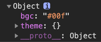
打印的一个 props (theme没有配置)
继承 styled() 拓展extend(不推荐)
import { Button } from "antd";

const AntDButton = styled(Button)`
  background-color: tomato;
`;

<AntDButton type="ghost">AntDButton</AntDButton>

注意 type属性是antd 上的属性,styled设计属性最好不要和其有重复,否则
const AntDButton = styled(Button)`
	background-color: tomato;
	font-size: ${(props: { type?: string }) => (props.type ? "2rem" : "1rem")};
`;
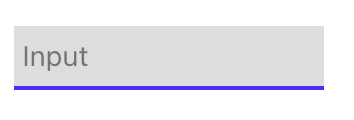
属性 attrs
const PassWorldInput = styled.input.attrs({
  type: "password",
  placeholder: "Input",
})`
  border: none;
  border-bottom: 2px solid #51f;
  background-color: #ddd;
  padding: 4px;
  outline: none;
`;

<PassWorldInput />
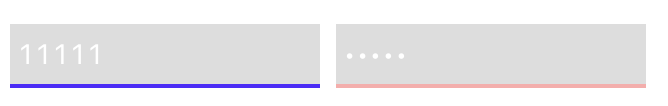
还可以这样 继承然后设置属性
const Input = styled.input`
  border: none;
  border-bottom: 2px solid #51f;
  background-color: #ddd;
  padding: 4px;
  outline: none;
  color: white;
`;

const PassWorldInput = styled(Input).attrs({
  type: "password",
  placeholder: "Input",
})`
  border-bottom: 2px solid #faa;
`;

<Input />
<PassWorldInput />
const Card = styled.div`
  width: 200px;
  height: 200px;
  display: flex;
  box-shadow: 0px 0px 10px 3px #ccc;
  border-radius: 5px;
  transition: 0.3s linear all;
  background-color: ${({ bgc }: { bgc?: string }) => bgc || "orange"};

  ${(props: { center?: boolean }) => props.center ? flexCenter : undefined}

  :hover {
    box-shadow: ${({ bgc }: { bgc?: string }) => `0px 0px 15px 5px ${bgc || "orange"}`};
  }
	// 内部所有button样式
  button {
    background-color: ${({ bgc }: { bgc?: string }) => bgc || "orange"};
  }
`;
可以加入 !important 提升级别 写法和css都一样,灵活的一批
const AntDButton = styled(Button)`
  background-color: tomato !important;
`;
还可以根据场景选择是否提升级别
const AntDButton = styled(Button)`
  background-color: tomato ${(props: { imp?: boolean }) => (props.imp ? "!important" : "")};
`;

 <AntDButton imp type="ghost">AntDButton</AntDButton>
and
const AntDButton = styled(Button)`
  background-color: ${({ imp, bgc }: { imp?: boolean; bgc?: string }) => {
    console.log("hello!");
    return `${bgc} ${imp ? "!important" : ""}`;
  }};
`;

<AntDButton imp bgc="#000" type="ghost">
	AntDButton
</AntDButton>
默认属性也能安排
const AntDButton = styled(Button)`
  background-color: ${({
    imp,
    bgc = "green",
  }: {
    imp?: boolean;
    bgc?: string;
  }) => {
    console.log("hello!");
    return `${bgc} ${imp ? "!important" : ""}`;
  }};
`;
&& 复制类的名字给它更高的特异性 没有 !important高
const redBackGround = css`
  background-color: red; // 如果加了!important则这个更高
`;

const ExtendCard = styled(Card)`
  && {
    background: black; // 这个有效
  }
  background-color: green;
  ${redBackGround}
`;
as / withComponent(不推荐) 更改样式组件的标签类型
as
只要加上要转换的标签即可
<Card bgc="blue">
 <span>blue</span>
</Card>
<Card as="a" href="http://hongbin.xyz" bgc="black">
  <span>Link</span>
</Card>
withComponent
const AntDButtonWithA = AntDButton.withComponent("a");
const LinkCard = Card.withComponent("a");
const PassWorldInputWithA = PassWorldInput.withComponent("a");
这样原来的标签就变成了a标签,我这三个只有LinkCard div转a ok了,剩下两个都不见了当然控制台是能看到的,没有深入研究,应该不会常用
太灵活了,感觉也更容易造成写麻烦的情况
上面这些写法,性能感觉不会多好,只是个人感觉灵活无比简直活了,足以引起学习使用的热情,对比less,sass简直起飞了🛫️
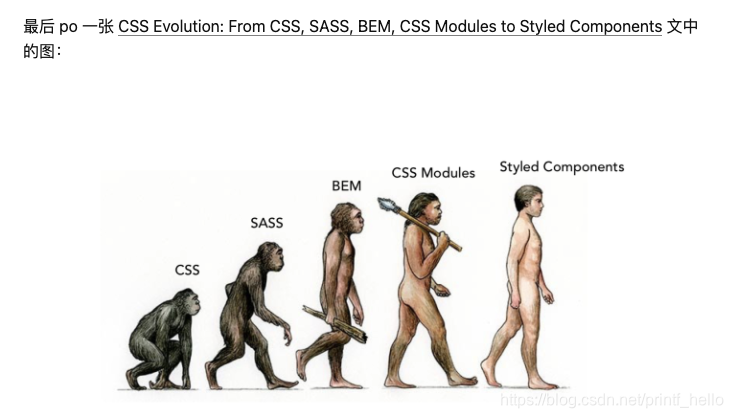
怪不得大多styled-components的文章都会有如下⬇️
膜拜styled-components的作者🙏


 扫一扫
扫一扫


 5653
5653

 被折叠的 条评论
为什么被折叠?
被折叠的 条评论
为什么被折叠?
 到【灌水乐园】发言


