


一. css3中的动画属性效果:transform,注意浏览器兼容的写法
**2D:**
translate(x偏移量,y偏移量)  //移动
rotate(角度)               //旋转
scale(宽度倍数,高度倍数)    //缩放
skew(绕x角度,绕y角度)      //倾斜 透视
matirx()                 //矩阵
**3D:**
rotateX()
rotateY()
以上变化只是变化,需要加入过度效果才能成为动画:transition,举例:
div{
    width:100px;
    height:100px;
    background-color:gray;
    //浏览器兼容(chrome、Safari)
    -webkit-transition:width 2s,height 2s,-webkit-transform 2s;
    //动画过度效果 和 时间设置
    transition:widht2s,height 2s,transform 2s;
    //延时两秒执行动画
    -webkit-transition-delay:2s;
    transition-delay:2s;
    }

div:hover{
    width:200px;
    height:200px;
    transform:rotate(360deg);                   //旋转360度
    -webkit-transform:rotate(360deg);
    }
二. css3动画遵循@keyframes 规则:①规定动画时长 ②规定动画名称
举例:
div{
width:100px;
height:100px;
background-color:red;
position:relative;
animation:anim 5s; //@keyframes规则
-webkit-animation:anim 5s;
}
@keyframes{
0%{background:red;left:0px;top:0px}
25%{background:blue;left:200px;top:0px}
50%{background:#gray;left:200px;top:200px}
75%{background:yellow;left:0px;top:200px}
100%{background:red;left:0px;top:0px}
}
//浏览器适配
@-webkit-keyframes anim{
0%{background:red;left:0px;top:0px}
25%{background:blue;left:200px;top:0px}
50%{background:#gray;left:200px;top:200px}
75%{background:yellow;left:0px;top:200px}
100%{background:red;left:0px;top:0px}
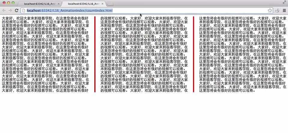
}三. 多列效果
在css3中,可以将块级元素内容分为多个列来显示,像报纸 或 常常看到的pdf论文那样,例如:
.div1{
            column-count:3;//分三列显示
            -webkit-column-count:3;//浏览器适配
            -webkit-column-gap:50px;
            column-gap:50px;
            column-rule:5px outset gray; //画竖线分割几个列
            -webkit-column-rule:5px outset gray;
}
效果图示(图片截取自极客学院视频教学,视频很好,强烈推荐):


 5448
5448


 被折叠的 条评论
为什么被折叠?
被折叠的 条评论
为什么被折叠?
 到【灌水乐园】发言


