vue使用echarts画出好看的图

<template>
  <div class="charts">
      <div id="main" style=" width:100%; height:350px;"></div> 
  </div>
</template>

<script>
import echarts from 'echarts';  
  export default {  
      data() {  
            return {  
              chart: null,   
              title: "I'm title",
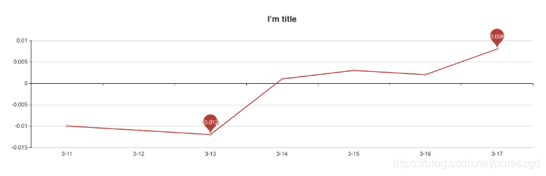
              datas: [-0.01, -0.011, -0.012, 0.001, 0.003, 0.002, 0.008],
              labels: ['3-11', '3-12', '3-13', '3-14', '3-15', '3-16', '3-17']
            }  
        },  
        methods: {  
            drawGraph(id) {   
                this.chart = echarts.init(document.getElementById(id))  
                this.chart.showLoading(); 
                var that = this  
                this.chart.setOption({  
                    title: {  
                        text: this.title,   
                        x: 'center'  
                    },  
                    xAxis: {
                        type: 'category',
                        data: this.labels
                    },
                    yAxis: {
                        type: 'value'
                    },   
                    series: [{  
                        data: this.datas,
                        type: 'line',
                        markPoint: {
                            data: [
                                {type: 'max'},
                                {type: 'min'}
                            ]
                        },
                    }]  
                })  
                this.chart.hideLoading()  
            }  
        },  
        mounted() {  
            this.$nextTick(function() {  
                this.drawGraph('main')  
            })  
        }  
}  
</script>

在这里插入图片描述

  • 0
    点赞
  • 0
    收藏
    觉得还不错? 一键收藏
  • 0
    评论
使用 Echarts 画流程,可以使用 Echarts 的关系(graph)来实现。具体步骤如下: 1. 引入 Echarts 库和主题: ```html <script src="https://cdn.jsdelivr.net/npm/echarts/dist/echarts.min.js"></script> <script src="https://cdn.jsdelivr.net/npm/echarts-gl/dist/echarts-gl.min.js"></script> <script src="https://cdn.jsdelivr.net/npm/echarts/dist/extension/bmap.min.js"></script> <script src="https://cdn.jsdelivr.net/npm/echarts/dist/theme/macarons.js"></script> ``` 2. 准备容器: ```html <div id="main" style="width: 100%; height: 600px;"></div> ``` 3. 初始化 Echarts 实例: ```javascript var myChart = echarts.init(document.getElementById('main'), 'macarons'); ``` 4. 设置 Echarts 的 option: ```javascript option = { tooltip: {}, legend: { data: ['流程'], show: false }, series: [{ type: 'graph', layout: 'none', roam: true, symbolSize: 50, label: { show: true }, edgeSymbol: ['circle', 'arrow'], edgeSymbolSize: [4, 10], edgeLabel: { fontSize: 20 }, data: [{ name: '节点1', x: 300, y: 300 }, { name: '节点2', x: 800, y: 300 }, { name: '节点3', x: 550, y: 100 }, { name: '节点4', x: 550, y: 500 }], // links 表示节点之间的连线 links: [{ source: 0, target: 1, symbolSize: [5, 20], label: { show: true }, lineStyle: { width: 5, curveness: 0.2 } }, { source: 1, target: 2, label: { show: true }, lineStyle: { curveness: 0.2 } }, { source: 1, target: 3, label: { show: true }, lineStyle: { curveness: 0.2 } }] }] }; myChart.setOption(option); ``` 在以上的代码中,我们使用Echarts 的关系(graph)来实现流程,通过设置节点(data)和节点之间的连线(links)来实现。同时,我们还可以设置节点和连线的样式、标签等属性来美化流程。 以上是一个简单的示例,你可以根据实际需求修改节点和连线的数量、位置、样式等属性,来绘制出更加复杂和美观的流程

“相关推荐”对你有帮助么?

  • 非常没帮助
  • 没帮助
  • 一般
  • 有帮助
  • 非常有帮助
提交
评论
添加红包

请填写红包祝福语或标题

红包个数最小为10个

红包金额最低5元

当前余额3.43前往充值 >
需支付:10.00
成就一亿技术人!
领取后你会自动成为博主和红包主的粉丝 规则
hope_wisdom
发出的红包
实付
使用余额支付
点击重新获取
扫码支付
钱包余额 0

抵扣说明:

1.余额是钱包充值的虚拟货币,按照1:1的比例进行支付金额的抵扣。
2.余额无法直接购买下载,可以购买VIP、付费专栏及课程。

余额充值