


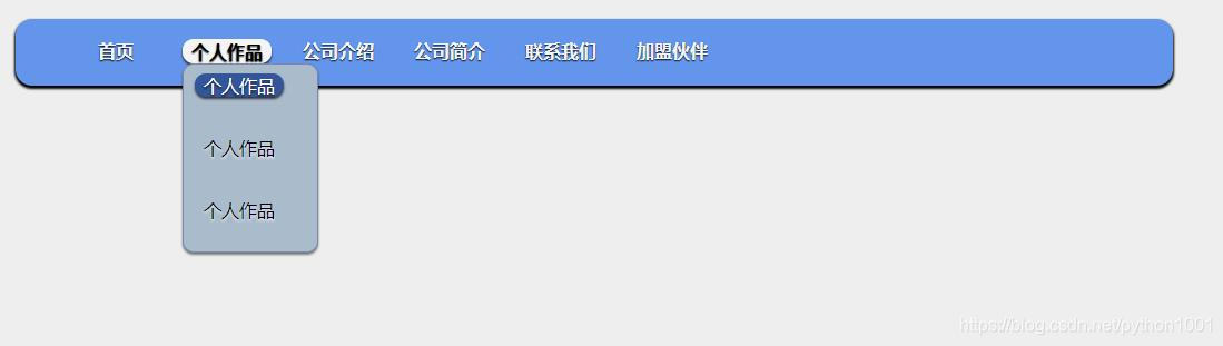
 本文详细介绍了一款精美且响应式的导航栏CSS样式设计,包括背景颜色、边框圆角、阴影效果、字体样式和下拉菜单的过渡效果。通过精心的CSS布局和样式调整,实现了美观与功能性的完美结合。
<!DOCTYPE HTML PUBLIC "-//W3C//DTD HTML 4.01 Transitional//EN" "http://www.w3.org/TR/html4/loose.dtd">
<html>
<head>
<title> 导航 </title>
<meta name="Generator" content="EditPlus">
<meta name="Author" content="">
<meta name="Keywords" content="">
<meta name="Description" content="">
<style>
body {
background: #eee;
margin: 0;
padding: 0;
}
#nav {
width: 1000px;
margin: 20px auto;
height: 50px;
background:cornflowerblue;
border-radius: 15px;
padding-top: 10px;
box-shadow: 0 2px 2px 1px #000;
}
#nav li {
float: left;
list-style: none;
text-align: center;
height: 40px;
width: 80px;
padding: 8px 10px;
}
#nav a {
font-weight: bold;
color: #f4f4f4;
text-decoration: none;
display: block;
border-radius: 10px;
-moz-border-radius: 10px;
-webkit-border-radius: 10px;
text-shadow: 0 1px 1px #000;
}
#nav li:hover > a {
background:#f4f4f4 repeat-x 0 -20px;
color: #000;
border-top: 1px solid #f8f8f8;
box-shadow: 0 2px 2px rgba(0,0,0, .7);
-moz-box-shadow: 0 2px 2px rgba(0,0, .7);
-webkit-box-shadow: 0 2px 2px rgba(0,0, .7);
text-shadow: 0 2px 2px rgb(255,255,255, 0.7);
}
#nav ul li:hover a, #nav li:hover li a {
background: none;
border: none;
color:#000;
}
#nav ul li a:hover {
background:#335599 repeat-x 0 -100px;
color:#fff;
border-radius:10px;
-moz-border-radius:10px;
-webkit-border-radius:10px;
text-shadow:0 2px 2px rgba(0,0,0, 0.7);
}
#nav ul li:first-child > a {
-moz-border-radius-topleft: 10px;
-moz-border-radius-topright:10px;
-webkit-border-top-left-radius:10px;
-webkit-border-top-right-radius:10px;
}
#nav ul li:last-child > a {
-moz-border-radius-buttomleft:10px;
-moz-border-radius-buttomright:10px;
-webkit-border-bottom-left-radius:10px;
-webkit-border-bottom-right-radius:10px;
}
#nav li:hover > ul {
opacity:1;
visibility:visible;
}
#nav ul {
opacity:0;/*opacity 属性设置元素的不透明级别。*/
visibility:hidden;/*visibility 属性规定元素是否可见。hidden元素是不可见的。*/
padding:0;
width:120px;
position:absolute;
background:#aabbcc repeat-x 0 0;
border:1px solid #7788aa;
border-radius:10px;
-moz-border-radius:10px;
-web-border-radius:10px;
box-shadow:0 2px 2px rgba(0,0,0, .5);
-moz-box-shadow:0 2px 2px rgba(0,0,0, .5);
-webkit-box-shadow:0 2px 2px rgba(0,0,0, .5);
-moz-transiton:opacity .25 linear, visibility .1s linear .1s;
-webkit-transiton:opacity .25s linear, visibility .1s linear .1s;
-o-transition:opacity .25s linear, visibility .1s linear .1s;
transition:opacity .25s linear, visibility .1s linear .1s;
}
#nav ul li {
float:none;
margin:0;
}
#nav ul a {
font-weight:normal;
text-shadow:0 2px 2px rgba(255,255,255, 0.7);
}
#nav ul ul {
left:160px;
top:0px;
}
#bottom {
width:100%;
text-align: center;
}
</style>
</head>
<body>
<nav>
<ul id="nav">
<li><a href="#">首页</a></li>
<li><a href="#">个人作品</a>
<ul>
<li><a href="#">个人作品</a></li>
<li><a href="#">个人作品</a></li>
<li><a href="#">个人作品</a></li>
</ul>
</li>
<li><a href="#">公司介绍</a></li>
<li><a href="#">公司简介</a></li>
<li><a href="#">联系我们</a></li>
<li><a href="#">加盟伙伴</a></li>
</ul>
</nav>
</body>
</html>
案例效果图:


 扫一扫
扫一扫


 4894
4894

 被折叠的 条评论
为什么被折叠?
被折叠的 条评论
为什么被折叠?
 到【灌水乐园】发言


