


Android M新控件有很多,Toolbar,TabLayout,AppBarLayout,NavigationView,CoordinatorLayout,CollapsingToolbarLayout等等。写出这篇文章纯粹因为本人记忆力不行,特意来此记录,如有不对的地方,还请帮忙纠正!
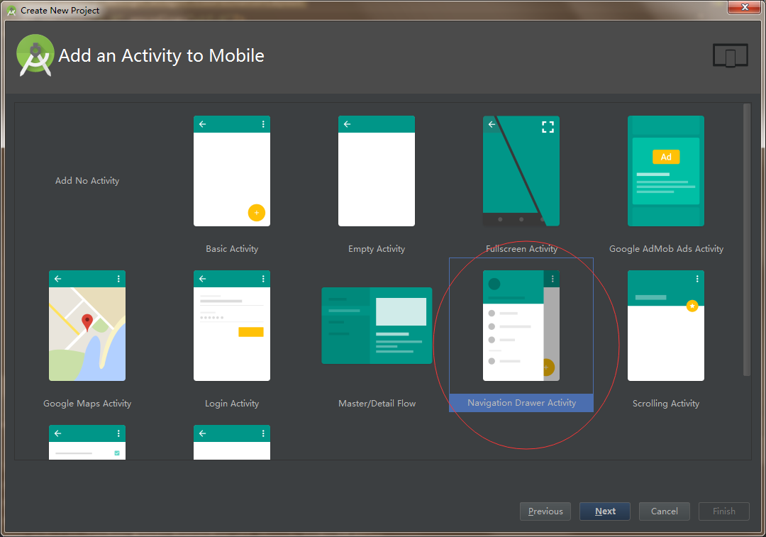
如果想快速的认识怎么用以上控件,Google推出的Android Studio已经把整个Material整合成一个Model,大家直接Create New Project就能很直观的知道怎么用了~下面这张图为整个Material的Medel
以下就分模块来介绍各控件
首先先引入design包:
compile 'com.android.support:design:23.4.0'
AppBarLayout嵌套Toolbar与TabLayout
与 Actionbar 相比, Toolbar 明显要灵活的多。它不像 Actionbar 一样,一定要固定在Activity的顶部,而是可以放到界面的任意位置。Google留给了开发者很多可定制修改的余地,这些可定制修改的属性在API文档中都有详细介绍
效果如下:
布局文件如下:
<?xml version="1.0" encoding="utf-8"?>
<android.support.design.widget.CoordinatorLayout
    xmlns:android="http://schemas.android.com/apk/res/android"
    xmlns:app="http://schemas.android.com/apk/res-auto"
    android:layout_width="match_parent"
    android:layout_height="match_parent"
    android:background="@color/colorAccent"
    android:fitsSystemWindows="true"
    >

    <android.support.design.widget.AppBarLayout
        android:layout_width="match_parent"
        android:layout_height="wrap_content"
        android:theme="@style/ThemeOverlay.AppCompat.Dark.ActionBar">

        <android.support.v7.widget.Toolbar
            android:id="@+id/toolbar"
            android:layout_width="match_parent"
            android:layout_height="wrap_content"
            android:background="@color/colorAccent"
            app:layout_scrollFlags="scroll|enterAlways"
            app:popupTheme="@style/ThemeOverlay.AppCompat.Light"
            />

        <android.support.design.widget.TabLayout
            android:id="@+id/tab"
            android:layout_width="match_parent"
            android:layout_height="wrap_content"
            android:background="@color/colorAccent"
            app:tabMode="fixed"/>
    </android.support.design.widget.AppBarLayout>

    <android.support.v4.view.ViewPager
        android:id="@+id/viewpager"
        android:layout_width="match_parent"
        android:layout_height="match_parent"
        android:background="@android:color/white"
        app:layout_behavior="@string/appbar_scrolling_view_behavior"/>

    <android.support.design.widget.FloatingActionButton
        android:id="@+id/fab"
        android:layout_width="wrap_content"
        android:layout_height="wrap_content"
        android:layout_gravity="end|bottom"
        android:layout_margin="16dp"
        android:src="@mipmap/ic_notifications"/>
</android.support.design.widget.CoordinatorLayout>
注意以下几点:
- 为了ToolBar可以滚动,CoordinatorLayout里面,放一个带有可滚动的View.如上的例子,放的是ViewPager,而ViewPager里面是放了RecylerView的,即是可以滚动的View。
- CoordinatorLayout中的
android:fitsSystemWindows="true"是必写的,不然你的Toolbar会与状态栏重叠在一起; - CoordinatorLayout包含的子视图中带有滚动属性的View需要设置app:layout_behavior属性,如ViewPager控件;
app:layout_behavior="@string/appbar_scrolling_view_behavior"
android:theme="@style/ThemeOverlay.AppCompat.Dark.ActionBar"
app:popupTheme="@style/ThemeOverlay.AppCompat.Light"
这几句是完全纯手打,没有提示!(对于我这老年人脑袋实在是一个考验TAT)
为了使得Toolbar有滑动效果,必须做到如下三点:
1. CoordinatorLayout作为布局的父布局容器。
2. 给需要滑动的组件(本身没有滑动功能)设置 app:layout_scrollFlags=”scroll|enterAlways” 属性。
3. 给滑动的组件(本身有滑动功能)设置app:layout_behavior属性
而scrollFlags会有几个属性值:
1.scroll: 所有想滚动出屏幕的view都需要设置这个flag, 没有设置这个flag的view将被固定在屏幕顶部。例如,TabLayout 没有设置这个值,将会停留在屏幕顶部。
2.snap:当下拉不到一定高度时,Toolbar回弹回去,如果上滑不到一定高度,Toolbar不会收缩。但是上滑时会全隐藏Toolbar
3.enterAlways: 设置这个flag时,向下的滚动都会导致该view变为可见,启用快速“返回模式”。
4.enterAlwaysCollapsed: 当你的视图已经设置minHeight属性又使用此标志时,你的视图只能已最小高度进入,只有当滚动视图到达顶部时才扩大到完整高度。
5.exitUntilCollapsed: 滚动退出屏幕,最后折叠在顶端,向下滑时要等item是第一个时才能滑出Toolbar。
部分代码如下:
@Override
    protected void onCreate(@Nullable Bundle savedInstanceState) {
        super.onCreate(savedInstanceState);
        supportRequestWindowFeature(Window.FEATURE_NO_TITLE);
        setContentView(R.layout.activity_coordinator);
        mToolbar = (Toolbar) findViewById(R.id.toolbar);
        //如果你的主题没有设置NoActionbar且没有调用supportRequestWindowFeature(Window.FEATURE_NO_TITLE);下面这句话报错
        setSupportActionBar(mToolbar);
        fab = (FloatingActionButton) findViewById(R.id.fab);
        mViewPager = (ViewPager) findViewById(R.id.viewpager);
        mTabLayout = (TabLayout) findViewById(R.id.tab);
        initData();
    }

    private void initData() {
    //模拟数据
        list = new ArrayList<>();
        for (int i = 0; i < 100; i++) {
            list.add("item" + i);
        }
        //如果没有调用getSupportActionBar().setDisplayShowTitleEnabled(false);主标题会显示默认的app名称
        if (getSupportActionBar() != null)
            getSupportActionBar().setDisplayShowTitleEnabled(false);
        if (fab != null)
            fab.setOnClickListener(this);
        mToolbar.setLogo(R.mipmap.ic_launcher);//Logo
        mToolbar.setSubtitle("副标题");//副标题
        mToolbar.setTitle("首页");//主标题
        mToolbar.setSubtitleTextColor(Color.GREEN);//小标题颜色
        mToolbar.setTitleTextColor(Color.BLUE);//主标题颜色
        mToolbar.setNavigationIcon(R.mipmap.ic_drawer_home);//侧边栏图标
        mViewPager.setAdapter(new MyPagerAadapter());
        mTabLayout.setSelectedTabIndicatorColor(Color.BLUE);//tab选定时指示器的颜色
        mTabLayout.setupWithViewPager(mViewPager);
    }
Toolbar点击事件代码如下:
@Override
    public void onClick(View v) {
        if (v == fab)
            count();//提醒回收垃圾
        Snackbar.make(v, "结束Activity", Snackbar.LENGTH_SHORT)
                .setAction("Finish", new View.OnClickListener() {
                    @Override
                    public void onClick(View v) {
                        //点击Action按钮后的操作
                        finish();
                    }
                }).show();
    }

    @Override
    public boolean onCreateOptionsMenu(Menu menu) {
        //在这里绑定你的menu
        getMenuInflater().inflate(R.menu.main, menu);
        return super.onCreateOptionsMenu(menu);
    }

    @Override
    public boolean onOptionsItemSelected(MenuItem item) {
        //这里是处理menu中选中item的地方
        int id = item.getItemId();
        if (id == R.id.action_setting)
            Toast.makeText(this, "点击了Setting", Toast.LENGTH_SHORT).show();
        else if (id == R.id.action_search)
            Toast.makeText(this, "点击了Search", Toast.LENGTH_SHORT).show();
        else if (id == R.id.action_notification)
            Toast.makeText(this, "点击了Notification", Toast.LENGTH_SHORT).show();
        return super.onOptionsItemSelected(item);
    }
这里再提醒一点,Google官方说Snackbar是个轻量级的控件,比Toast交互性更好一些,但是比Dialog更轻量级,确实也是如此。但是连续点击按钮,会不断生成Snackbar实例,这个时候内存是不断增加的,以恒定的数量增加。所以自己创建了一个方法提醒回收。
private int TotalCount = 0;
private int gcCount = 5;
private void count() {
        TotalCount ++;
        if (TotalCount >= gcCount) {
            System.gc();
            TotalCount = 0;
        }
}
AppBarLayout嵌套CollapsingToolbarLayout
效果如下:
<?xml version="1.0" encoding="utf-8"?>
<android.support.design.widget.CoordinatorLayout
    xmlns:android="http://schemas.android.com/apk/res/android"
    xmlns:app="http://schemas.android.com/apk/res-auto"
    android:layout_width="match_parent"
    android:layout_height="match_parent"
    android:fitsSystemWindows="true"
    >

    <android.support.design.widget.AppBarLayout
        android:id="@+id/appbar"
        android:layout_width="match_parent"
        android:layout_height="222dp"
        android:fitsSystemWindows="true"
        android:theme="@style/ThemeOverlay.AppCompat.Dark.ActionBar">

        <!--app:expandedTitleMarginEnd="60dp"标题距离右边的距离,不设置也行-->
        <!--app:expandedTitleMarginStart="40dp"标题距离左边的距离,不设置也行-->
        <android.support.design.widget.CollapsingToolbarLayout
            app:expandedTitleMarginEnd="60dp"
            app:expandedTitleMarginStart="40dp"
            android:layout_width="match_parent"
            android:layout_height="match_parent"
            app:contentScrim="?attr/colorPrimary"
            app:layout_scrollFlags="scroll|exitUntilCollapsed">

            <ImageView
                android:layout_width="match_parent"
                android:layout_height="match_parent"
                android:scaleType="centerCrop"
                android:src="@mipmap/head"
                app:layout_collapseMode="parallax"/>

            <android.support.v7.widget.Toolbar
                android:id="@+id/toolbar"
                android:layout_width="match_parent"
                android:layout_height="?attr/actionBarSize"
                app:layout_collapseMode="pin"
                app:popupTheme="@style/ThemeOverlay.AppCompat.Light"/>

        </android.support.design.widget.CollapsingToolbarLayout>
    </android.support.design.widget.AppBarLayout>

    <android.support.v7.widget.RecyclerView
        android:id="@+id/recycler_view"
        android:layout_width="match_parent"
        android:layout_height="wrap_content"
        app:layout_behavior="@string/appbar_scrolling_view_behavior">

    </android.support.v7.widget.RecyclerView>

    <android.support.design.widget.FloatingActionButton
        android:id="@+id/fab"
        android:layout_width="wrap_content"
        android:layout_height="wrap_content"
        android:layout_margin="@dimen/fab_margin"
        android:clickable="true"
        android:src="@mipmap/ic_notifications"
        app:layout_anchor="@id/appbar"
        app:layout_anchorGravity="bottom|right|end"/>
</android.support.design.widget.CoordinatorLayout>
CollapsingToolbarLayout可实现Toolbar的折叠效果。
CollapsingToolbarLayout 提供以下属性和方法使用:
1. Collapsing title:ToolBar的标题。你可以调用CollapsingToolbarLayout .setTitle(CharSequence)方法设置title,也可以用Toolbar.setTitle(CharSequence)设置title,CollapsingToolbarLayout 优先级高。
2. Content scrim:ToolBar被折叠到顶部固定时候的背景,你可以调用setContentScrim(Drawable)方法改变背景或者在属性中使用 app:contentScrim=”?attr/colorPrimary”来改变背景。
3. Status bar scrim:状态栏的背景,调用方法setStatusBarScrim(Drawable)。不过这个只能在Android5.0以上系统有效果。
4. Parallax scrolling children:CollapsingToolbarLayout滑动时,子视图的视觉差,可以通过属性app:layout_collapseParallaxMultiplier=”0.6”改变。值的范围[0.0,1.0],值越大视察越大。
5. CollapseMode :子视图的折叠模式,在子视图设置,有两种模式,一种是“pin”:固定模式,在折叠的时候最后固定在顶端;“parallax”:视差模式,在折叠的时候会有个视差折叠的效果。我们可以在布局中使用属性app:layout_collapseMode=”parallax”来改变。
CoordinatorLayout 还提供了一个 layout_anchor 的属性,连同 layout_anchorGravity 一起,可以用来放置与其他视图关联在一起的悬浮视图(如 FloatingActionButton)。本例中使用FloatingActionButton。
通过下面的参数设置了FloatingActionButton的位置,两个属性共同作用使得FAB 浮动按钮也能折叠消失,展现。
app:layout_anchor="@id/appbar"
app:layout_anchorGravity="bottom|right|end"
使用CollapsingToolbarLayout实现折叠效果,需要注意几点(其实的结合下Toolbar的注意项):
1. AppBarLayout高度要固定的;
2. AppBarLayout要设置android:fitsSystemWindows="true"属性,不然收缩后Toolbar与状态栏重叠;
3. CollapsingToolbarLayout的子视图设置layout_collapseMode属性
4. 关联悬浮视图设置app:layout_anchor,app:layout_anchorGravity属性
NavigationView
用于侧滑菜单中的menu布局。
效果如下:
布局如下:
<?xml version="1.0" encoding="utf-8"?>
<android.support.v4.widget.DrawerLayout
    xmlns:android="http://schemas.android.com/apk/res/android"
    xmlns:app="http://schemas.android.com/apk/res-auto"
    xmlns:tools="http://schemas.android.com/tools"
    android:id="@+id/drawer_nav"
    android:layout_width="match_parent"
    android:layout_height="match_parent"
    android:fitsSystemWindows="true"
    app:layout_behavior="@string/appbar_scrolling_view_behavior"
    tools:openDrawer="start">

    <android.support.design.widget.CoordinatorLayout
        xmlns:android="http://schemas.android.com/apk/res/android"
        xmlns:app="http://schemas.android.com/apk/res-auto"
        android:layout_width="match_parent"
        android:layout_height="match_parent"
        android:background="@color/colorAccent"
        android:fitsSystemWindows="true"
        >

        <android.support.design.widget.AppBarLayout
            android:fitsSystemWindows="true"
            android:layout_width="match_parent"
            android:layout_height="wrap_content"
            android:theme="@style/ThemeOverlay.AppCompat.Dark.ActionBar">
            <android.support.v7.widget.Toolbar
                android:id="@+id/toolbar"
                android:layout_width="match_parent"
                android:layout_height="wrap_content"
                android:background="@color/colorAccent"
                app:layout_scrollFlags="scroll|enterAlways"
                app:popupTheme="@style/ThemeOverlay.AppCompat.Light"
                />
        </android.support.design.widget.AppBarLayout>

        <android.support.v4.view.ViewPager
            android:background="#FFFFFF"
            android:layout_width="match_parent"
            android:layout_height="match_parent"
            app:layout_behavior="@string/appbar_scrolling_view_behavior">
        </android.support.v4.view.ViewPager>
    </android.support.design.widget.CoordinatorLayout>

    <android.support.design.widget.NavigationView
        android:id="@+id/nav_view"
        android:layout_width="wrap_content"
        android:layout_height="match_parent"
        android:layout_gravity="start"
        app:headerLayout="@layout/nav_header_main"
        app:menu="@menu/activity_main_drawer"/>
</android.support.v4.widget.DrawerLayout>
其中NavigationView 中的 android:layout_gravity=”start” 属性来控制抽屉菜单从哪边滑出,一般“start ”从左边滑出,“end”从右边滑出。
这里最主要的两个属性分别是:
1.app:headerLayout: 给NavigationView添加头部布局
2.app:menu:给NavigationView添加menu菜单布局
app:headerLayout布局如下:
<?xml version="1.0" encoding="utf-8"?>
<LinearLayout xmlns:android="http://schemas.android.com/apk/res/android"
              android:layout_width="match_parent"
              android:layout_height="@dimen/nav_header_height"
              android:background="@drawable/side_nav_bar"
              android:gravity="bottom"
              android:orientation="vertical"
              android:paddingBottom="@dimen/activity_vertical_margin"
              android:paddingLeft="@dimen/activity_horizontal_margin"
              android:paddingRight="@dimen/activity_horizontal_margin"
              android:paddingTop="@dimen/activity_vertical_margin"
              android:theme="@style/ThemeOverlay.AppCompat.Dark">

    <ImageView
        android:id="@+id/imageView"
        android:layout_width="wrap_content"
        android:layout_height="wrap_content"
        android:paddingTop="@dimen/nav_header_vertical_spacing"
        android:src="@android:drawable/sym_def_app_icon"/>

    <TextView
        android:layout_width="match_parent"
        android:layout_height="wrap_content"
        android:paddingTop="@dimen/nav_header_vertical_spacing"
        android:text="Android Studio"
        android:textAppearance="@style/TextAppearance.AppCompat.Body1"/>

    <TextView
        android:id="@+id/textView"
        android:layout_width="wrap_content"
        android:layout_height="wrap_content"
        android:text="android.studio@android.com"/>

</LinearLayout>
app:menu 布局如下:
<?xml version="1.0" encoding="utf-8"?>
<menu xmlns:android="http://schemas.android.com/apk/res/android">

    <group android:checkableBehavior="single">
        <item
            android:id="@+id/nav_camera"
            android:icon="@drawable/ic_menu_camera"
            android:title="Import"/>
        <item
            android:id="@+id/nav_gallery"
            android:icon="@drawable/ic_menu_gallery"
            android:title="Gallery"/>
        <item
            android:id="@+id/nav_slideshow"
            android:icon="@drawable/ic_menu_slideshow"
            android:title="Slideshow"/>
        <item
            android:id="@+id/nav_manage"
            android:icon="@drawable/ic_menu_manage"
            android:title="Tools"/>
    </group>

    <item android:title="Communicate">
        <menu>
            <item
                android:id="@+id/nav_share"
                android:icon="@drawable/ic_menu_share"
                android:title="Share"/>
            <item
                android:id="@+id/nav_send"
                android:icon="@drawable/ic_menu_send"
                android:title="Send"/>
        </menu>
    </item>

</menu>
代码如下:
@Override
    protected void onCreate(@Nullable Bundle savedInstanceState) {
        super.onCreate(savedInstanceState);
        supportRequestWindowFeature(Window.FEATURE_NO_TITLE);
        setContentView(R.layout.activity_navigation);
        ```
        drawer = (DrawerLayout) findViewById(R.id.drawer_nav);
        NavigationView navigationView = (NavigationView) findViewById(R.id.nav_view);
        //设置侧滑菜单选择监听事件
        navigationView.setNavigationItemSelectedListener(this);
        //设置侧边栏滑出的按钮,会有动画效果
        ActionBarDrawerToggle toggle = new ActionBarDrawerToggle(this, drawer, mToolbar, R.string.navigation_drawer_open, R.string.navigation_drawer_close);
        drawer.setDrawerListener(toggle);
        toggle.syncState();

    }
    //返回键的监听
    @Override
    public void onBackPressed() {
        if (drawer.isDrawerOpen(GravityCompat.START)) {
            drawer.closeDrawer(GravityCompat.START);
        } else {
            super.onBackPressed();
        }
    }

    @SuppressWarnings("StatementWithEmptyBody")
    @Override
    public boolean onNavigationItemSelected(MenuItem item) {
        // Handle navigation view item clicks here.
        int id = item.getItemId();

        if (id == R.id.nav_camera) {
            // Handle the camera action
            Toast.makeText(this, "click camera", Toast.LENGTH_SHORT).show();
        } else if (id == R.id.nav_gallery) {
            Toast.makeText(this, "click gallery", Toast.LENGTH_SHORT).show();
        } else if (id == R.id.nav_slideshow) {
            Toast.makeText(this, "click slideshow", Toast.LENGTH_SHORT).show();
        } else if (id == R.id.nav_manage) {
            Toast.makeText(this, "click manage", Toast.LENGTH_SHORT).show();
        } else if (id == R.id.nav_share) {
            Toast.makeText(this, "click share", Toast.LENGTH_SHORT).show();
        } else if (id == R.id.nav_send) {
            Toast.makeText(this, "click send", Toast.LENGTH_SHORT).show();
        }
        //关闭抽屉侧滑菜单
        drawer.closeDrawer(GravityCompat.START);
        return true;
    }
当然你可以通过如下方法或者属性来改变这一状态:
setItemBackgroundResource(int):给menu设置背景资源,对应的属性app:itemBackground
setItemIconTintList(ColorStateList):给menu的icon设置颜色,对应的属性app:itemIconTint
setItemTextColor(ColorStateList):给menu的item设置字体颜色,对应的属性app:itemTextColor
关于NavigationView中item的字体颜色和icon选中状态颜色是去当前主题theme中的
<--正常状态下字体颜色和icon颜色-->
<item name="android:textColorPrimary">@android:color/darker_gray</item>
<--选中状态icon的颜色和字体颜色-->
 <item name="colorPrimary">@color/accent_material_light</item>
如果想像图中状态栏和Toolbar颜色一样,可这样设置:
在styles.xml中的主题中设置colorPrimaryDark属性的颜色,跟Toolbar一样的颜色就行了。
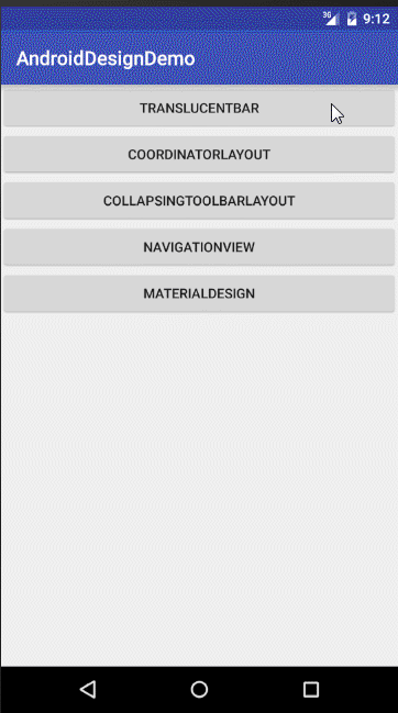
最后来一张集成所有的:
最后提醒一点:原生的Model中会用到NestedScrollView,我还不了解,只是知道可以帮助item处理touch事件,在这之前,我们知道Android对Touch事件的分发是有自己一套机制的。主要是有是三个函数:
dispatchTouchEvent、onInterceptTouchEvent和onTouchEvent,而NestedScroll有自己的一套touch处理方式。如果不想烧脑,就用我以上的方法吧~即用Viewpager做内容容器,然后用RecyclerView做item容器,RecyclerView本身支持NestedScroll。一朋友说用List会出现滑不动的情况,有兴趣的朋友可以试试。
Demo下载地址:Android Material Design


 扫一扫
扫一扫
 3万+
3万+

 被折叠的 条评论
为什么被折叠?
被折叠的 条评论
为什么被折叠?
 到【灌水乐园】发言


