PC端封装侧边导航

24 篇文章 0 订阅
18 篇文章 0 订阅
本文介绍了如何使用Vue.js和CSS实现一个可切换的PC端侧边导航栏,通过组件化设计和CSS样式控制其显示、隐藏、固定及动画效果。
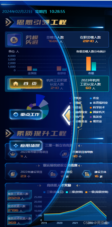
摘要由CSDN通过智能技术生成

PC端封装侧边导航

在这里插入图片描述
在这里插入图片描述

template

 <div v-if="showBox == false" class="leftShow" @click.stop="toggleBox"></div>
    <div class="container" :class="{ show: showBox, fixed: fixedBox }">
      <div class="arrow" @click="toggleBox"></div>
      <div class="content">
        <!-- 盒子内容 -->
        <div class="img1" @click="$router.push('/home/home')"></div>
        <div class="img2"></div>
        <div class="img3" @click="$router.push('/scenarios/home')"></div>
      </div>
    </div>

js

<script>
  export default {
    components: {
    },
    data() {
      return {
        showBox: false, // 控制盒子显示和隐藏
        fixedBox: false, // 控制盒子固定和取消固定
      }
    },
    watch: {},
    mounted() {},
    methods: {
      toggleBox() {
        this.showBox = !this.showBox
        if (this.showBox) {
          this.fixedBox = true
        } else {
          this.fixedBox = false
        }
      },
    },
  }
</script>

css

  .leftShow {
    width: 50px;
    height: 114px;
    position: absolute;
    top: 50%;
    left: 0;
    transform: translate(0, -50%);
    background: url(~@/assets/imgs/home/sy_wzk@2x.png) no-repeat;
    background-size: contain;
    cursor: pointer;
    z-index: 3;
  }
  .container {
    position: fixed;
    left: -336px; /* 初始位置在左侧隐藏 */
    top: 50%;
    transform: translateY(-50%);
    width: 336px;
    height: 1080px;
    transition: left 0.5s; /* 过渡效果 */
    z-index: 888;
    background: url(~@/assets/imgs/home/sy_yzk@2x.png) no-repeat;
    background-size: contain;
  }

  .container.show {
    left: 0; /* 划出后固定在左侧中间 */
  }

  .container.fixed {
    position: fixed; /* 固定位置 */
  }

  .arrow {
    width: 50px;
    height: 114px;
    cursor: pointer;
    position: absolute;
    right: 40px;
    top: 50%;
    transform: translate(0, -50%);
    display: flex;
    align-items: center;
  }

  .content {
    padding: 10px;
    position: relative;
    .img1 {
      position: absolute;
      top: 358px;
      left: 30px;
      width: 191.41px;
      height: 65.89px;
      background: url(~@/assets/imgs/home/sy_sy@2x.png) no-repeat;
      background-size: contain;
      cursor: pointer;
    }
    .img2 {
      position: absolute;
      top: 504px;
      left: 30px;
      width: 191.41px;
      height: 65.89px;
      background: url(~@/assets/imgs/home/sy_yzd@2x.png) no-repeat;
      background-size: contain;
      cursor: pointer;
    }
    .img3 {
      position: absolute;
      top: 651px;
      left: 30px;
      width: 191.41px;
      height: 65.89px;
      background: url(~@/assets/imgs/home/sy_yycj@2x.png) no-repeat;
      background-size: contain;
      cursor: pointer;
    }
  }```

  • 5
    点赞
  • 3
    收藏
    觉得还不错? 一键收藏
  • 打赏
    打赏
  • 0
    评论
好的,您想要了解如何封装elementUI的侧边导航栏并在实际页面中进行应用,下面是一些简单的步骤: 1. 首先,您需要创建一个Vue组件来封装elementUI的侧边导航栏。您可以使用Vue CLI或手动创建一个.vue文件来创建组件。 2. 在组件中,您需要导入elementUI的侧边导航栏组件。您可以使用类似于以下代码的方式导入: ``` import { Menu, MenuItem, Submenu } from 'element-ui'; ``` 3. 在组件中,您需要定义一个data属性来存储侧边导航栏的数据。例如: ``` data() { return { menuData: [ { name: '首页', icon: 'el-icon-s-home', path: '/' }, { name: '用户管理', icon: 'el-icon-user-solid', children: [ { name: '用户列表', path: '/user/list' }, { name: '添加用户', path: '/user/add' } ] } ] } } ``` 在这个例子中,我们定义了一个menuData数组来存储侧边导航栏的数据,并在其中定义了两个菜单项和一个子菜单项。 4. 在组件中,您需要使用elementUI的Menu、Submenu和MenuItem组件来渲染侧边导航栏。例如: ``` <template> <el-menu default-active="1" class="el-menu-vertical-demo" :collapse="isCollapse"> <template v-for="(item, index) in menuData"> <el-submenu v-if="item.children" :index="index"> <template slot="title"> <i :class="item.icon"></i> <span>{{ item.name }}</span> </template> <el-menu-item-group> <el-menu-item v-for="(child, cIndex) in item.children" :index="`${index}-${cIndex}`">{{ child.name }}</el-menu-item> </el-menu-item-group> </el-submenu> <el-menu-item v-else :index="index"> <i :class="item.icon"></i> <span>{{ item.name }}</span> </el-menu-item> </template> </el-menu> </template> ``` 在这个例子中,我们使用了v-for指令来循环渲染菜单项和子菜单项,并使用了elementUI的Menu、Submenu和MenuItem组件来渲染侧边导航栏。 5. 最后,您需要将组件导出并在实际页面中进行应用。例如: ``` <template> <div> <sidebar></sidebar> <router-view></router-view> </div> </template> <script> import Sidebar from '@/components/Sidebar.vue'; export default { components: { Sidebar } } </script> ``` 在这个例子中,我们在实际页面中导入了刚刚创建的组件,并将其应用在页面中。 以上就是封装elementUI的侧边导航栏并在实际页面中进行应用的简单步骤。希望能对您有所帮助!

“相关推荐”对你有帮助么?

  • 非常没帮助
  • 没帮助
  • 一般
  • 有帮助
  • 非常有帮助
提交
评论
添加红包

请填写红包祝福语或标题

红包个数最小为10个

红包金额最低5元

当前余额3.43前往充值 >
需支付:10.00
成就一亿技术人!
领取后你会自动成为博主和红包主的粉丝 规则
hope_wisdom
发出的红包

打赏作者

周亚鑫

你的鼓励将是我创作的最大动力

¥1 ¥2 ¥4 ¥6 ¥10 ¥20
扫码支付:¥1
获取中
扫码支付

您的余额不足,请更换扫码支付或充值

打赏作者

实付
使用余额支付
点击重新获取
扫码支付
钱包余额 0

抵扣说明:

1.余额是钱包充值的虚拟货币,按照1:1的比例进行支付金额的抵扣。
2.余额无法直接购买下载,可以购买VIP、付费专栏及课程。

余额充值