


方便日后项目中提取样式代码,记录在此博客中
样式代码如下:
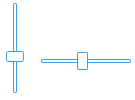
<!-- Slider 样式 -->
<Style x:Key="SliderHorizontalThumb" TargetType="Thumb">
 <Setter Property="Background" Value="#FFFFFFFF"/>
 <Setter Property="BorderThickness" Value="1"/>
 <Setter Property="IsTabStop" Value="False"/>
 <Setter Property="BorderBrush" Value="#41a3ef" />
 <Setter Property="Template">
  <Setter.Value>
   <ControlTemplate TargetType="Thumb">
    <Grid>
     <VisualStateManager.VisualStateGroups>
      <VisualStateGroup x:Name="CommonStates">
       <VisualState x:Name="Normal"/>
       <VisualState x:Name="MouseOver">
        <Storyboard>
         <DoubleAnimation Duration="0" To="1" Storyboard.TargetProperty="Opacity" Storyboard.TargetName="BackgroundAnimation"/>
         <ColorAnimation Duration="0" To="#FFd4eff6" Storyboard.TargetProperty="(Border.Background).(SolidColorBrush.Color)" Storyboard.TargetName="Background"/>
        </Storyboard>
       </VisualState>
       <VisualState x:Name="Pressed">
        <Storyboard>
         <ColorAnimation Duration="0" To="#FFd4eff6" Storyboard.TargetProperty="(Border.Background).(SolidColorBrush.Color)" Storyboard.TargetName="Background"/>
         <DoubleAnimation Duration="0" To="1" Storyboard.TargetProperty="Opacity" Storyboard.TargetName="BackgroundAnimation"/>
        </Storyboard>
       </VisualState>
       <VisualState x:Name="Disabled">
        <Storyboard>
         <DoubleAnimation Duration="0" To=".55" Storyboard.TargetProperty="Opacity" Storyboard.TargetName="DisabledVisualElement"/>
        </Storyboard>
       </VisualState>
      </VisualStateGroup>
      <VisualStateGroup x:Name="FocusStates">
       <VisualState x:Name="Focused">
        <Storyboard>
         <DoubleAnimation Duration="0" To="1" Storyboard.TargetProperty="Opacity" Storyboard.TargetName="FocusVisualElement"/>
        </Storyboard>
       </VisualState>
       <VisualState x:Name="Unfocused"/>
      </VisualStateGroup>
     </VisualStateManager.VisualStateGroups>
     <Border x:Name="Background" BorderBrush="{TemplateBinding BorderBrush}" BorderThickness="{TemplateBinding BorderThickness}" Background="White" CornerRadius="1">
      <Grid Background="{TemplateBinding Background}" Margin="1">
       <Border x:Name="BackgroundAnimation" Background="#FFFFFF" Opacity="0"/>
       <Rectangle x:Name="BackgroundGradient" Fill="Transparent" />
      </Grid>
     </Border>
     <Rectangle x:Name="DisabledVisualElement" Fill="#FFFFFFFF" IsHitTestVisible="false" Opacity="0" RadiusY="2" RadiusX="2"/>
     <Rectangle x:Name="FocusVisualElement" IsHitTestVisible="false" Margin="1" Opacity="0" RadiusY="1" RadiusX="1" Stroke="#FF6DBDD1" StrokeThickness="1"/>
    </Grid>
   </ControlTemplate>
  </Setter.Value>
 </Setter>
</Style>

<Style x:Key="SliderVerticalThumb" TargetType="Thumb">
 <Setter Property="Background" Value="#FFFFFF"/>
 <Setter Property="BorderThickness" Value="1"/>
 <Setter Property="IsTabStop" Value="False"/>
 <Setter Property="BorderBrush" Value="#41a3ef" />
 <Setter Property="Template">
  <Setter.Value>
   <ControlTemplate TargetType="Thumb">
    <Grid>
     <VisualStateManager.VisualStateGroups>
      <VisualStateGroup x:Name="CommonStates">
       <VisualState x:Name="Normal"/>
       <VisualState x:Name="MouseOver">
        <Storyboard>
         <DoubleAnimation Duration="0" To="1" Storyboard.TargetProperty="Opacity" Storyboard.TargetName="BackgroundAnimation"/>
         <ColorAnimation Duration="0" To="#FFd4eff6" Storyboard.TargetProperty="(Border.Background).(SolidColorBrush.Color)" Storyboard.TargetName="Background"/>
        </Storyboard>
       </VisualState>
       <VisualState x:Name="Pressed">
        <Storyboard>
         <ColorAnimation Duration="0" To="#FFd4eff6" Storyboard.TargetProperty="(Border.Background).(SolidColorBrush.Color)" Storyboard.TargetName="Background"/>
         <DoubleAnimation Duration="0" To="1" Storyboard.TargetProperty="Opacity" Storyboard.TargetName="BackgroundAnimation"/>
        </Storyboard>
       </VisualState>
       <VisualState x:Name="Disabled">
        <Storyboard>
         <DoubleAnimation Duration="0" To=".55" Storyboard.TargetProperty="Opacity" Storyboard.TargetName="DisabledVisualElement"/>
        </Storyboard>
       </VisualState>
      </VisualStateGroup>
      <VisualStateGroup x:Name="FocusStates">
       <VisualState x:Name="Focused">
        <Storyboard>
         <DoubleAnimation Duration="0" To="1" Storyboard.TargetProperty="Opacity" Storyboard.TargetName="FocusVisualElement"/>
        </Storyboard>
       </VisualState>
       <VisualState x:Name="Unfocused"/>
      </VisualStateGroup>
     </VisualStateManager.VisualStateGroups>
     <Border x:Name="Background" BorderBrush="{TemplateBinding BorderBrush}" BorderThickness="{TemplateBinding BorderThickness}" Background="White" CornerRadius="2">
      <Grid Background="{TemplateBinding Background}" Margin="1">
       <Border x:Name="BackgroundAnimation" Background="#FFFFFF" Opacity="0"/>
       <Rectangle x:Name="BackgroundGradient" Fill="Transparent" />
      </Grid>
     </Border>
     <Rectangle x:Name="DisabledVisualElement" Fill="#FFFFFFFF" IsHitTestVisible="false" Opacity="0" RadiusY="2" RadiusX="2"/>
     <Rectangle x:Name="FocusVisualElement" IsHitTestVisible="false" Margin="1" Opacity="0" RadiusY="1" RadiusX="1" Stroke="#FF6DBDD1" StrokeThickness="1"/>
    </Grid>
   </ControlTemplate>
  </Setter.Value>
 </Setter>
</Style>


<Style TargetType="Slider">
 <Setter Property="BorderThickness" Value="1"/>
 <Setter Property="Maximum" Value="10"/>
 <Setter Property="Minimum" Value="0"/>
 <Setter Property="Value" Value="0"/>
 <Setter Property="BorderBrush" Value="#41a3ef" />
 <Setter Property="IsTabStop" Value="False"/>
 <Setter Property="Template">
  <Setter.Value>
   <ControlTemplate TargetType="Slider">
    <Grid x:Name="Root">
     <Grid.Resources>
      <ControlTemplate x:Key="RepeatButtonTemplate">
       <Grid x:Name="Root" Background="Transparent" Opacity="0"/>
      </ControlTemplate>
     </Grid.Resources>
     <VisualStateManager.VisualStateGroups>
      <VisualStateGroup x:Name="CommonStates">
       <VisualState x:Name="Normal"/>
       <VisualState x:Name="MouseOver"/>
       <VisualState x:Name="Disabled">
        <Storyboard>
         <ObjectAnimationUsingKeyFrames Duration="0" Storyboard.TargetProperty="Visibility" Storyboard.TargetName="HorizontalTrackRectangleDisabledOverlay">
          <DiscreteObjectKeyFrame KeyTime="0">
           <DiscreteObjectKeyFrame.Value>
            <Visibility>Visible</Visibility>
           </DiscreteObjectKeyFrame.Value>
          </DiscreteObjectKeyFrame>
         </ObjectAnimationUsingKeyFrames>
         <ObjectAnimationUsingKeyFrames Duration="0" Storyboard.TargetProperty="Visibility" Storyboard.TargetName="ThumbDisabledOverlay">
          <DiscreteObjectKeyFrame KeyTime="0">
           <DiscreteObjectKeyFrame.Value>
            <Visibility>Visible</Visibility>
           </DiscreteObjectKeyFrame.Value>
          </DiscreteObjectKeyFrame>
         </ObjectAnimationUsingKeyFrames>
         <ObjectAnimationUsingKeyFrames Duration="0" Storyboard.TargetProperty="Visibility" Storyboard.TargetName="VerticalTrackRectangleDisabledOverlay">
          <DiscreteObjectKeyFrame KeyTime="0">
           <DiscreteObjectKeyFrame.Value>
            <Visibility>Visible</Visibility>
           </DiscreteObjectKeyFrame.Value>
          </DiscreteObjectKeyFrame>
         </ObjectAnimationUsingKeyFrames>
        </Storyboard>
       </VisualState>
      </VisualStateGroup>
     </VisualStateManager.VisualStateGroups>
     <Grid x:Name="HorizontalTemplate" Background="{TemplateBinding Background}">
      <Grid.ColumnDefinitions>
       <ColumnDefinition Width="Auto"/>
       <ColumnDefinition Width="Auto"/>
       <ColumnDefinition Width="*"/>
      </Grid.ColumnDefinitions>
      <Rectangle x:Name="TrackRectangle" Grid.ColumnSpan="3" Grid.Column="0" Fill="#FFFFFF" Height="4" Margin="5,0,5,0" RadiusY="1" RadiusX="1" Stroke="#41a3ef" StrokeThickness="{TemplateBinding BorderThickness}"/>
      <Rectangle x:Name="HorizontalTrackRectangleDisabledOverlay" Grid.ColumnSpan="3" Grid.Column="0" Fill="White" Height="3" Margin="5,0,5,0" Opacity=".55" RadiusY="1" RadiusX="1" Visibility="Collapsed"/>
      <RepeatButton x:Name="HorizontalTrackLargeChangeDecreaseRepeatButton" Grid.Column="0" Height="18" IsTabStop="False" Template="{StaticResource RepeatButtonTemplate}"/>
      <Thumb x:Name="HorizontalThumb" Grid.Column="1" Height="18" IsTabStop="True" Width="11" Style="{StaticResource SliderHorizontalThumb}"/>
      <Rectangle x:Name="ThumbDisabledOverlay" Grid.Column="1" Fill="White" Opacity=".55" RadiusY="2" RadiusX="2" Visibility="Collapsed" Width="11"/>
      <RepeatButton x:Name="HorizontalTrackLargeChangeIncreaseRepeatButton" Grid.Column="2" Height="18" IsTabStop="False" Template="{StaticResource RepeatButtonTemplate}"/>
     </Grid>
     <Grid x:Name="VerticalTemplate" Background="{TemplateBinding Background}" Visibility="Collapsed">
      <Grid.RowDefinitions>
       <RowDefinition Height="*"/>
       <RowDefinition Height="Auto"/>
       <RowDefinition Height="Auto"/>
      </Grid.RowDefinitions>
      <Rectangle Fill="#FFFFFF" Margin="0,5,0,5" RadiusY="1" Grid.Row="0" RadiusX="1" Grid.RowSpan="3" Stroke="#41a3ef" StrokeThickness="{TemplateBinding BorderThickness}" Width="4"/>
      <Rectangle x:Name="VerticalTrackRectangleDisabledOverlay" Fill="White" Margin="0,5,0,5" Opacity=".55" RadiusY="1" Grid.Row="0" RadiusX="1" Grid.RowSpan="3" Visibility="Collapsed" Width="3"/>
      <RepeatButton x:Name="VerticalTrackLargeChangeDecreaseRepeatButton" IsTabStop="False" Grid.Row="2" Template="{StaticResource RepeatButtonTemplate}" Width="18"/>
      <Thumb x:Name="VerticalThumb" Height="11" IsTabStop="True" Grid.Row="1" Width="18" Style="{StaticResource SliderVerticalThumb}" />
      <RepeatButton x:Name="VerticalTrackLargeChangeIncreaseRepeatButton" IsTabStop="False" Grid.Row="0" Template="{StaticResource RepeatButtonTemplate}" Width="18"/>
     </Grid>
    </Grid>
   </ControlTemplate>
  </Setter.Value>
 </Setter>
</Style>


 149
149


 被折叠的 条评论
为什么被折叠?
被折叠的 条评论
为什么被折叠?
 到【灌水乐园】发言


