


思路如下
1.定义一个盒子,然后通过border-radius变为圆
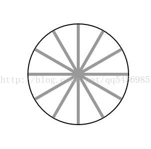
2.画6条线,然后通过定位,把这6条线设置到大盒子里,作为钟表刻度
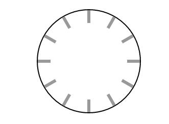
3.画一个小圆,通过定位将中间部分的线条遮住
4.画中心点和时分秒针
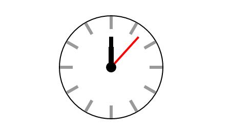
5.最后在设置运动一圈时分秒针的动画,大功告成
上代码:
<!DOCTYPE html>
<html>
	<head>
		<meta charset="UTF-8">
		<title>钟表border-radius</title>
		<style>
			*{padding:0;margin:0;}
			/*steps(60)分段*/
			.father{
				border-radius:50%;
				border:2px solid;
				position:relative;
				height:200px;
				width:200px;
				margin:100px auto;
			}
			.line{
				width:6px;
				height:200px;
				background-color:#999;
				position:absolute;
				left:50%;
				margin-left:-3px;
			}
			.two{
				transform: rotateZ(90deg);
			}
			.three{
				transform: rotateZ(30deg);
			}
			.four{
				transform: rotateZ(60deg);
			}
			.five{
				transform: rotateZ(120deg);
			}
			.six{
				transform: rotateZ(150deg);
			}
			.box{
				background-color: #fff;
				height:150px;
				width:150px;
				border-radius: 50%;
				position:absolute;
				left:50%;
				margin-left:-75px;
				top:25px;
				z-index:2;
			}
			.circle{
				border:10px solid black;
				position:absolute;
				border-radius:50%;
				top:90px;
				left:90px;
				z-index:99;
			}
			.hour{
				width:10px;
				height:40px;
				background-color: #000;
				position:absolute;
				left:95px;
				z-index:4;
				top:60px;
				transform-origin: center bottom;
				animation:hour 43200s steps(12) 0s infinite;
			}
			.minutes{
				height:60px;
				width:8px;
				background-color: #000;
				position:absolute;
				left:96px;
				z-index:5;
				top:40px;
				transform-origin: center bottom;
				animation:minutes 3600s steps(60) 0s infinite;
			}
			.second{
				height:80px;
				width:4px;
				background-color: #f00;
				position:absolute;
				left:98px;
				z-index:6;
				top:20px;
				animation:second 60s steps(60) 0s infinite;
				transform-origin: center bottom;
			}
			@keyframes second{
				from{
					transform: rotateZ(0deg);
				}
				to{
					transform: rotateZ(360deg);

				}
			}
			@keyframes minutes{
				from{
					transform: rotateZ(0deg);
				}
				to{
					transform: rotateZ(360deg);

				}
			}
			@keyframes hour{
				from{
					transform: rotateZ(0deg);
				}
				to{
					transform: rotateZ(360deg);

				}
			}
		</style>
	</head>
	<body>
		<div class="father">
			<div class='one line'></div>
			<div class='two line'></div>
			<div class='three line'></div>
			<div class='four line'></div>
			<div class='five line'></div>
			<div class='six line'></div>
			<div class="box"></div>
			<div class='circle'></div>
			<div class="hour"></div>
			<div class="minutes"></div>
			<div class="second"></div>
		</div>
	</body>
</html>


 扫一扫
扫一扫
 2518
2518

 被折叠的 条评论
为什么被折叠?
被折叠的 条评论
为什么被折叠?
 到【灌水乐园】发言


