


程序运行截图如下:
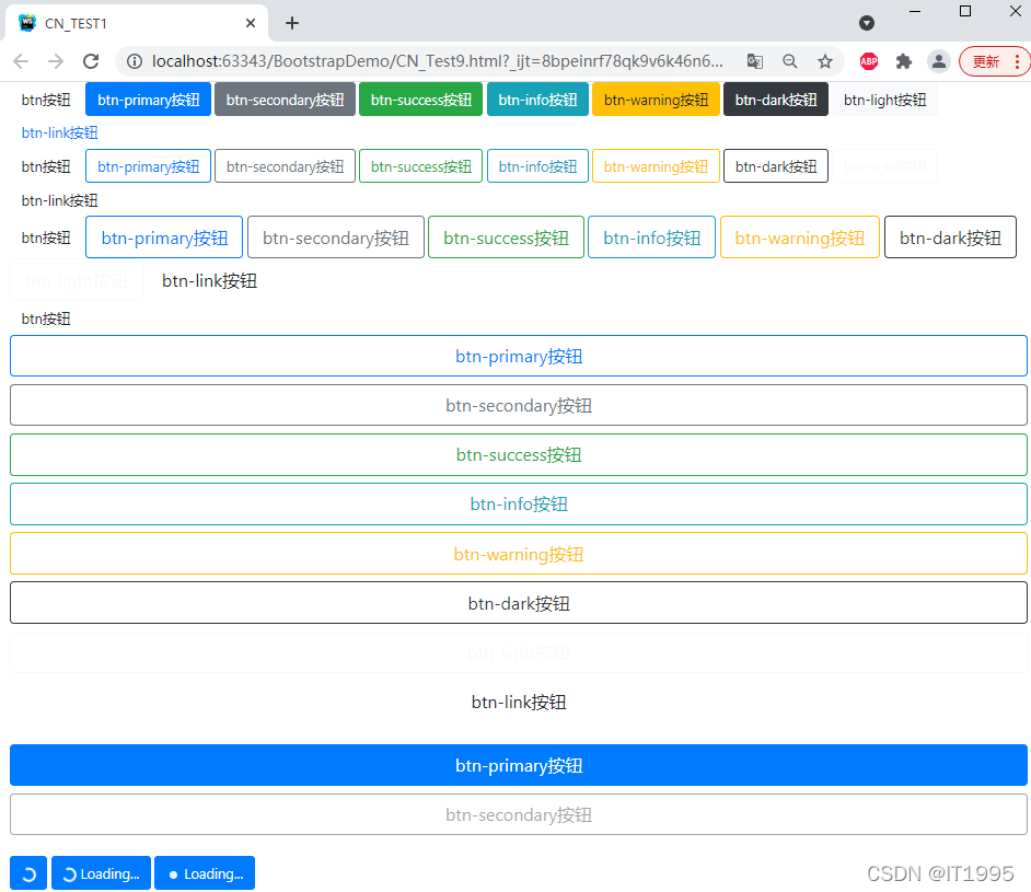
源码如下:
<!DOCTYPE html>
<html lang="en">
<head>
    <meta charset="UTF-8">
    <title>CN_TEST1</title>
    <meta name="viewport" content="width=device-width, initial-scale=1, shrink-to-fit=no">

<!--    bootstrap css核心文件-->
    <link rel="stylesheet" href="bootstrap-4.4.1-dist/css/bootstrap.min.css">
<!--    bootstrap使用到了jquery,需要提前引用-->
    <script src="js/jquery-3.5.1.min.js"></script>
<!--    弹窗、提示、下拉菜单-->
    <script src="bootstrap-4.4.1-dist/js/bootstrap.bundle.js"></script>
<!--    bootstrap核心文件-->
    <script src="bootstrap-4.4.1-dist/js/bootstrap.min.js"></script>

</head>
<body>
    <div class="container-fluid">
        <button type="button" class="btn">btn按钮</button>
        <button type="button" class="btn btn-primary">btn-primary按钮</button>
        <button type="button" class="btn btn-secondary">btn-secondary按钮</button>
        <button type="button" class="btn btn-success">btn-success按钮</button>
        <button type="button" class="btn btn-info">btn-info按钮</button>
        <button type="button" class="btn btn-warning">btn-warning按钮</button>
        <button type="button" class="btn btn-dark">btn-dark按钮</button>
        <button type="button" class="btn btn-light">btn-light按钮</button>
        <button type="button" class="btn btn-link">btn-link按钮</button>
        <br/>
        <button type="button" class="btn">btn按钮</button>
        <button type="button" class="btn btn-outline-primary">btn-primary按钮</button>
        <button type="button" class="btn btn-outline-secondary">btn-secondary按钮</button>
        <button type="button" class="btn btn-outline-success">btn-success按钮</button>
        <button type="button" class="btn btn-outline-info">btn-info按钮</button>
        <button type="button" class="btn btn-outline-warning">btn-warning按钮</button>
        <button type="button" class="btn btn-outline-dark">btn-dark按钮</button>
        <button type="button" class="btn btn-outline-light">btn-light按钮</button>
        <button type="button" class="btn btn-outline-link">btn-link按钮</button>
        <br/>
        <button type="button" class="btn">btn按钮</button>
        <button type="button" class="btn btn-outline-primary btn-lg">btn-primary按钮</button>
        <button type="button" class="btn btn-outline-secondary btn-lg">btn-secondary按钮</button>
        <button type="button" class="btn btn-outline-success btn-lg">btn-success按钮</button>
        <button type="button" class="btn btn-outline-info btn-lg">btn-info按钮</button>
        <button type="button" class="btn btn-outline-warning btn-lg">btn-warning按钮</button>
        <button type="button" class="btn btn-outline-dark btn-lg">btn-dark按钮</button>
        <button type="button" class="btn btn-outline-light btn-lg">btn-light按钮</button>
        <button type="button" class="btn btn-outline-link btn-lg">btn-link按钮</button>
        <br/>
        <button type="button" class="btn">btn按钮</button>
        <button type="button" class="btn btn-outline-primary btn-lg btn-block">btn-primary按钮</button>
        <button type="button" class="btn btn-outline-secondary btn-lg btn-block">btn-secondary按钮</button>
        <button type="button" class="btn btn-outline-success btn-lg btn-block">btn-success按钮</button>
        <button type="button" class="btn btn-outline-info btn-lg btn-block">btn-info按钮</button>
        <button type="button" class="btn btn-outline-warning btn-lg btn-block">btn-warning按钮</button>
        <button type="button" class="btn btn-outline-dark btn-lg btn-block">btn-dark按钮</button>
        <button type="button" class="btn btn-outline-light btn-lg btn-block">btn-light按钮</button>
        <button type="button" class="btn btn-outline-link btn-lg btn-block">btn-link按钮</button>
        <br/>
        <button type="button" class="btn btn-outline-primary btn-lg btn-block active">btn-primary按钮</button>
        <button type="button" class="btn btn-outline-secondary btn-lg btn-block" disabled>btn-secondary按钮</button>
        <br/>
        <button class="btn btn-primary">
            <span class="spinner-border spinner-border-sm"></span>
        </button>
        <button class="btn btn-primary">
            <span class="spinner-border spinner-border-sm"></span>
            Loading...
        </button>
        <button class="btn btn-primary">
            <span class="spinner-grow spinner-grow-sm"></span>
            Loading...
        </button>
    </div>
</body>
</html>
解释:
①span中的一个类是spinner-border和sprnner-graw分别代表的效果:
②使用BootStrap的button属性时,要用btn类,后面再接各种不同的类样式。


 扫一扫
扫一扫


 被折叠的 条评论
为什么被折叠?
被折叠的 条评论
为什么被折叠?
 到【灌水乐园】发言


