


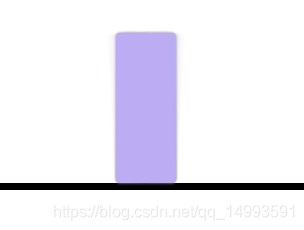
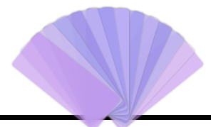
使用到的知识点:过渡,旋转,透明,调整旋转中心,定位
<!DOCTYPE html>
<html lang="en">

<head>
    <meta charset="UTF-8">
    <meta http-equiv="X-UA-Compatible" content="IE=edge">
    <meta name="viewport" content="width=device-width, initial-scale=1.0">
    <title>Document</title>
    <style>
        * {
            margin: 0;
            padding: 0;
        }

        ul {
            list-style: none;
        }

        ul {
            width: 600px;
            height: 400px;
            margin: 0 auto;
            border: 5px solid #000;
            position: relative;
        }

        li {
            width: 40px;
            height: 100px;
            float: left;
            background-color: rgb(207, 157, 157);
            /* border: 1px solid #000; */
            position: absolute;
            bottom: 0;
            left: 50%;
            margin-left: -30px;
            box-shadow: 0 0 2px gray;
            transition: all 3s linear;
            transform-origin: center bottom;
            text-align: center;
            border-radius: 3px;
        }

        ul>li:not(:nth-child(7)) {
            opacity: 0;
        }

        ul:hover>li {
            opacity: 1;
        }

        li:nth-child(1),
        li:nth-child(13) {
            background-color: rgb(188, 136, 236);
        }

        li:nth-child(2),
        li:nth-child(12) {
            background-color: rgb(218, 194, 240);
        }

        li:nth-child(3),
        li:nth-child(11) {
            background-color: rgb(173, 174, 238);
        }

        li:nth-child(4),
        li:nth-child(10) {
            background-color: rgb(141, 126, 226);
        }

        li:nth-child(5),
        li:nth-child(9) {
            background-color: rgb(202, 187, 245);
        }

        li:nth-child(6),
        li:nth-child(8) {
            background-color: rgb(150, 144, 236);
        }

        li:nth-child(7) {
            background-color: rgb(187, 174, 245);
        }

        /* 旋转+-90度 */
        ul:hover>li:nth-child(1) {
            transform: rotate(90deg);
        }

        ul:hover>li:nth-child(13) {
            transform: rotate(-90deg);
        }

        /* 旋转+-75度 */
        ul:hover>li:nth-child(2) {
            transform: rotate(75deg);
        }

        ul:hover>li:nth-child(12) {
            transform: rotate(-75deg);
        }

        /* 旋转+-60度 */
        ul:hover>li:nth-child(3) {
            transform: rotate(60deg);
        }

        ul:hover>li:nth-child(11) {
            transform: rotate(-60deg);
        }

        /* 旋转+-45度 */
        ul:hover>li:nth-child(4) {
            transform: rotate(45deg);
        }

        ul:hover>li:nth-child(10) {
            transform: rotate(-45deg);
        }

        /* 旋转+-30度 */
        ul:hover>li:nth-child(5) {
            transform: rotate(30deg);
        }

        ul:hover>li:nth-child(9) {
            transform: rotate(-30deg);
        }

        /* 旋转+-30度 */
        ul:hover>li:nth-child(6) {
            transform: rotate(15deg);
        }

        ul:hover>li:nth-child(8) {
            transform: rotate(-15deg);
        }
    </style>
</head>

<body>
    <!-- 使用到的知识点:过渡,旋转,透明,调整旋转中心,定位 -->
    <ul>
        <li></li>
        <li></li>
        <li></li>
        <li></li>
        <li></li>
        <li></li>
        <li></li>
        <li></li>
        <li></li>
        <li></li>
        <li></li>
        <li></li>
        <li></li>
    </ul>
</body>

</html>


 扫一扫
扫一扫


 被折叠的 条评论
为什么被折叠?
被折叠的 条评论
为什么被折叠?
 到【灌水乐园】发言


