


这篇文章给大家总结一下Android中UI组件,考虑到看博客的人都有一定的基础,不会介绍的太详细,直接以个人笔记的方式给大家分享一下!
TextView
TextView故名知意,文本展示视图。其实他是一个文本编辑器,只是关闭了文本编辑功能。如果你想用带编辑的文本,可以使用TextView派生的子类,EditText。
TextView的属性很多,你通过查看API可以看到很多属性。这些属性不用一个一个记下来,只需要知道几个常用的就可以了。
android:textColor= “#ff0004”文字颜色
android:textSize= “10pt”文字大小
android:password= “true”密码框
android:autoLink=”email|phone”邮箱和电话模式显示
singleLine= “true”单行显示
EditText
EditText和TextView属性都差不多,只不过是EditText可以进行对文本编辑
下面来一个注册的表单的Demo给大家掰扯掰扯!
<TableLayout
        android:layout_width="match_parent"
        android:layout_height="wrap_content"
        android:background="@drawable/bg">

        <!--用户名-->
        <TableRow>
            <TextView android:layout_width="wrap_content" android:layout_height="wrap_content" android:text="用户名:" android:layout_marginLeft="10dp"/>
            <EditText android:layout_height="wrap_content" android:layout_weight="1" android:singleLine="true" android:hint="请输入用户名"/>
        </TableRow>

        <!--密码,只能接受数字类型的密码-->
        <TableRow>
            <TextView android:layout_width="wrap_content" android:layout_height="wrap_content" android:text="密    码:" android:layout_marginLeft="10dp"/>
            <EditText android:layout_height="wrap_content" android:layout_weight="1" android:singleLine="true" android:inputType="numberPassword"/>
        </TableRow>


        <!--年龄,只能接受数字-->
        <TableRow>
            <TextView android:layout_width="wrap_content" android:layout_height="wrap_content" android:text="年    龄:"  android:layout_marginLeft="10dp"/>
            <EditText android:layout_height="wrap_content" android:layout_weight="1" android:singleLine="true" android:inputType="number"/>
        </TableRow>


        <!--电话号码,弹出键盘为电话号码键盘-->
        <TableRow>
            <TextView android:layout_width="wrap_content" android:layout_height="wrap_content" android:text="电话号码:" android:layout_marginLeft="10dp"/>
            <EditText android:layout_height="wrap_content" android:layout_weight="1" android:singleLine="true" android:inputType="phone"/>
        </TableRow>

        <Button android:layout_width="match_parent" android:layout_height="wrap_content" android:text="提交"/>
</TableLayout>如果你还对上面的TableLayout不太理解,请看一下文章布局管理器中的表格布局。上面代码已经非常清楚了,就不一一属性给大家介绍了!
android:selectAllOnFocus=”true”就是当你得到焦点的时候,系统帮你选中文本内容!
android:background=”@drawable/bg”文件是自己画的一个图案,可以当图片作为背景使用
<?xml version="1.0" encoding="utf-8"?>
<shape xmlns:android="http://schemas.android.com/apk/res/android"
    android:shape="rectangle"><!--代表要画一个矩形-->

    <!--上左角,上右角,下左角,下右角的圆角角度-->
    <corners
        android:bottomLeftRadius="10dp"
        android:bottomRightRadius="10dp"
        android:topLeftRadius="10dp"
        android:topRightRadius="10dp">
    </corners>

    <!--指定边框的宽度和颜色-->
    <stroke android:width="1dp" android:color="#767676"></stroke>

</shape>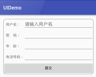
Button
看到这个名字你应该并不陌生,他就是按钮。按钮的使用也是非常简单的了~
<Button
        android:layout_width="match_parent"
        android:layout_height="wrap_content"
        android:background="@drawable/bg"
        android:text="按钮" />
android:background=”@drawable/bg”是一个selector,里面写了当按钮按下和松开时显示的不同背景图片
<?xml version="1.0" encoding="utf-8"?>
<selector xmlns:android="http://schemas.android.com/apk/res/android">
    <item android:state_pressed="true" android:drawable="@drawable/icon"></item>
    <item android:state_pressed="false" android:drawable="@drawable/icon_2"></item>
</selector>
RadioButton
RadioButton是单选按钮,通常要和RadioGroup一起使用
 <RadioGroup
        android:id="@+id/radioGroup_gender"
        android:layout_width="match_parent"
        android:layout_height="wrap_content">

        <RadioButton
            android:id="@+id/radioButton_male"
            android:layout_width="wrap_content"
            android:layout_height="wrap_content"
            android:checked="true"
            android:text="男" />

        <RadioButton
            android:id="@+id/radioButton_female"
            android:layout_width="wrap_content"
            android:layout_height="wrap_content"
            android:text="女" />
    </RadioGroup>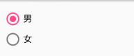
checked= “true”代表默认选择
RadioGroup radioGroup = (RadioGroup)findViewById(R.id.radioGroup_gender);
radioGroup.setOnCheckedChangeListener(new RadioGroup.OnCheckedChangeListener() {
            @Override
            public void onCheckedChanged(RadioGroup radioGroup, int checkId) {
                String choose = checkId == R.id.radioButton_male ? "男" : "女";
                Toast.makeText(MainActivity.this,"你选择了性别" + choose,Toast.LENGTH_SHORT).show();
            }
        });
CheckBox
CheckBox是多选按钮
     <CheckBox
        android:layout_width="wrap_content"
        android:layout_height="match_parent"
        android:text="游泳" />

    <CheckBox
        android:layout_width="wrap_content"
        android:layout_height="match_parent"
        android:checked="true"
        android:text="健身" />

    <CheckBox
        android:layout_width="wrap_content"
        android:layout_height="match_parent"
        android:text="滑冰" />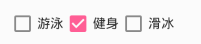
ToggleButton和Switch
见名知意,开关的意思。一般都用于两种状态之间的切换。下面两个控件一起演示了,用法都差不多!
两个控件都有共同属性:textOff和textOn,代表开关的两种状态显示的文字
Switch还可以设置thumb属性和track属性,thumb可以自定义开关按钮的样式,track可以自定义滑动开关的轨道!还有一些别的属性,查阅API吧!
 <ToggleButton
        android:id="@+id/toggleButton_show"
        android:layout_width="wrap_content"
        android:layout_height="wrap_content"
        android:checked="true"
        android:textOff="关"
        android:textOn="开" />

    <Switch
        android:id="@+id/switch_show"
        android:layout_below="@+id/toggleButton_show"
        android:layout_width="wrap_content"
        android:layout_height="wrap_content"
        android:checked="true"
        android:textOff="关"
        android:textOn="开"/>
Java代码控制开关的状态
 mToggleButton = (ToggleButton) findViewById(R.id.toggleButton_show);
        mSwitch = (Switch) findViewById(R.id.switch_show);

        CompoundButton.OnCheckedChangeListener listener = new CompoundButton.OnCheckedChangeListener()
        {
            @Override
            public void onCheckedChanged(CompoundButton compoundButton, boolean b)
            {

                if(b)
                {
                    Toast.makeText(MainActivity.this,"打开状态", Toast.LENGTH_SHORT).show();
                }
                else
                {
                    Toast.makeText(MainActivity.this,"关闭状态", Toast.LENGTH_SHORT).show();
                }
            }
        };

        mToggleButton.setOnCheckedChangeListener(listener);
        mSwitch.setOnCheckedChangeListener(listener);
Chronometer计时器的用法
该控件并不是现实具体时间的控件,而是一个计时器控件。常用的函数如下:
setBase(long base);设置计时器的开始时间
setFormat(String format);设置显示的时间格式
start();开始
stop();结束
setOnChronometerTickListener(listener);计时器的监听
因为该控件也继承自TextView,所以TextView的大多数属性Chronometer也可以使用
        chronometer = (Chronometer)super.findViewById(R.id.ch);
        chronometer.setBase(SystemClock.elapsedRealtime());//设置时间格式
        chronometer.start();

       //设置监听器
        chronometer.setOnChronometerTickListener(new OnChronometerTickListener()
        {
            @Override
            public void onChronometerTick(Chronometer ch) {
                if(SystemClock.elapsedRealtime() - ch.getBase() > 20000)//如果计时时间超过20秒
                {
                    chronometer.stop();
                }
            }
        });


 2527
2527


 被折叠的 条评论
为什么被折叠?
被折叠的 条评论
为什么被折叠?
 到【灌水乐园】发言


