


5.Android support design TabLayout
- Android support design TabLayout
- TabLayout介绍
- gradle配置
- TabLayout属性
- TabLayout布局
- 正常版TabLayout FragmentPagerAdapter
- 正常版TabLayout Activity
- 正常版TabLayout 效果图
- 正常版TabLayout 总结
- ImageSpan版TabLayout FragmentPagerAdapter
- ImageSpan版TabLayout Activity
- ImageSpan版TabLayout 效果图
- ImageSpan版TabLayout 总结
- SetIcon版TabLayout FragmentPagerAdapter
- SetIcon版TabLayout Activity
- SetIcon版TabLayout 效果图
- SetIcon版TabLayout 总结
- CustomView版TabLayout 介绍
- CustomView版TabLayout FragmentPagerAdapter
- CustomView版TabLayout TabItem布局
- CustomView版TabLayout Activity
- CustomView版TabLayout 效果图
- CustomView版TabLayout 总结
- 全部版本总结
TabLayout介绍
Google 官方的 Android support design Library 也推出了 滑动标签页。它的名字叫TabLayout ,其实还是有些地方有Bug。
如果涉及到 icon + text 的滑动标签页,建议不要用TabLayout 。推荐用我的 EasySlidingTabs ,哈哈。
gradle配置
compile 'com.android.support:design:23.0.1' 或者更高版本
dependencies {
    compile fileTree(dir: 'libs', include: ['*.jar'])
    compile 'com.android.support:appcompat-v7:23.0.1'
    compile 'com.android.support:design:23.0.1'
}
TabLayout属性
我们可以找到sdk/extras/android/support/design/res/values/attrs.xml,打开可以看到关于TabLayout的属性
    <declare-styleable name="TabLayout">
        <attr name="tabIndicatorColor" format="color"/>
        <attr name="tabIndicatorHeight" format="dimension"/>
        <attr name="tabContentStart" format="dimension"/>

        <attr name="tabBackground" format="reference"/>

        <attr name="tabMode">
            <enum name="scrollable" value="0"/>
            <enum name="fixed" value="1"/>
        </attr>

        <!-- Standard gravity constant that a child supplies to its parent.
             Defines how the child view should be positioned, on both the X and Y axes,
             within its enclosing layout. -->
        <attr name="tabGravity">
            <enum name="fill" value="0"/>
            <enum name="center" value="1"/>
        </attr>

        <attr name="tabMinWidth" format="dimension"/>
        <attr name="tabMaxWidth" format="dimension"/>

        <attr name="tabTextAppearance" format="reference"/>
        <attr name="tabTextColor" format="color"/>
        <attr name="tabSelectedTextColor" format="color"/>

        <attr name="tabPaddingStart" format="dimension"/>
        <attr name="tabPaddingTop" format="dimension"/>
        <attr name="tabPaddingEnd" format="dimension"/>
        <attr name="tabPaddingBottom" format="dimension"/>
        <attr name="tabPadding" format="dimension"/>
    </declare-styleable>
如果实现不行,直接打开TabLayout的源码:
    public TabLayout(Context context, AttributeSet attrs, int defStyleAttr) {
        super(context, attrs, defStyleAttr);
        this.mTabs = new ArrayList();
        this.mTabMaxWidth = 2147483647;
        this.setHorizontalScrollBarEnabled(false);
        this.setFillViewport(true);
        this.mTabStrip = new TabLayout.SlidingTabStrip(context);
        this.addView(this.mTabStrip, -2, -1);
        TypedArray a = context.obtainStyledAttributes(attrs, styleable.TabLayout, defStyleAttr, style.Widget_Design_TabLayout);
        this.mTabStrip.setSelectedIndicatorHeight(a.getDimensionPixelSize(styleable.TabLayout_tabIndicatorHeight, 0));
        this.mTabStrip.setSelectedIndicatorColor(a.getColor(styleable.TabLayout_tabIndicatorColor, 0));
        this.mTabTextAppearance = a.getResourceId(styleable.TabLayout_tabTextAppearance, style.TextAppearance_Design_Tab);
        this.mTabPaddingStart = this.mTabPaddingTop = this.mTabPaddingEnd = this.mTabPaddingBottom = a.getDimensionPixelSize(styleable.TabLayout_tabPadding, 0);
        this.mTabPaddingStart = a.getDimensionPixelSize(styleable.TabLayout_tabPaddingStart, this.mTabPaddingStart);
        this.mTabPaddingTop = a.getDimensionPixelSize(styleable.TabLayout_tabPaddingTop, this.mTabPaddingTop);
        this.mTabPaddingEnd = a.getDimensionPixelSize(styleable.TabLayout_tabPaddingEnd, this.mTabPaddingEnd);
        this.mTabPaddingBottom = a.getDimensionPixelSize(styleable.TabLayout_tabPaddingBottom, this.mTabPaddingBottom);
        this.mTabTextColors = this.loadTextColorFromTextAppearance(this.mTabTextAppearance);
        if(a.hasValue(styleable.TabLayout_tabTextColor)) {
            this.mTabTextColors = a.getColorStateList(styleable.TabLayout_tabTextColor);
        }

        if(a.hasValue(styleable.TabLayout_tabSelectedTextColor)) {
            int selected = a.getColor(styleable.TabLayout_tabSelectedTextColor, 0);
            this.mTabTextColors = createColorStateList(this.mTabTextColors.getDefaultColor(), selected);
        }

        this.mTabMinWidth = a.getDimensionPixelSize(styleable.TabLayout_tabMinWidth, 0);
        this.mRequestedTabMaxWidth = a.getDimensionPixelSize(styleable.TabLayout_tabMaxWidth, 0);
        this.mTabBackgroundResId = a.getResourceId(styleable.TabLayout_tabBackground, 0);
        this.mContentInsetStart = a.getDimensionPixelSize(styleable.TabLayout_tabContentStart, 0);
        this.mMode = a.getInt(styleable.TabLayout_tabMode, 1);
        this.mTabGravity = a.getInt(styleable.TabLayout_tabGravity, 0);
        a.recycle();
        this.applyModeAndGravity();
    }
反正都是Easy的英文,慢慢看,不难,真的!
TabLayout布局
<?xml version="1.0" encoding="utf-8"?>
<LinearLayout xmlns:android="http://schemas.android.com/apk/res/android"
    xmlns:app="http://schemas.android.com/apk/res-auto"
    android:layout_width="match_parent"
    android:layout_height="match_parent"
    android:orientation="vertical">

    <!--
        文字未选中的颜色 app:tabTextColor
        文字选中的颜色 app:tabSelectedTextColor
        指示器的颜色 app:tabIndicatorColor
     -->
    <android.support.design.widget.TabLayout
        android:id="@+id/tab_layout_tl"
        app:tabBackground="@color/tabLayoutBackground"
        app:tabTextColor="@color/black"
        app:tabSelectedTextColor="@color/red"
        app:tabIndicatorColor="@color/yellow"
        android:layout_width="match_parent"
        android:layout_height="wrap_content" />

    <android.support.v4.view.ViewPager
        android:id="@+id/view_pager_vp"
        android:layout_width="match_parent"
        android:layout_height="0dp"
        android:layout_weight="1" />

</LinearLayout>
正常版TabLayout FragmentPagerAdapter
public class NormalTabLayoutFragmentAdapter extends FragmentPagerAdapter {

    private String[] tabTitles;
    private Fragment[] fragments;

    public NormalTabLayoutFragmentAdapter(FragmentManager fm, Fragment[] fragments, String[] tabTitles) {
        super(fm);
        this.fragments = fragments;
        this.tabTitles = tabTitles;
    }

    /**
     * Return the Fragment associated with a specified position.
     *
     * @param position
     */
    @Override
    public Fragment getItem(int position) {
        return this.fragments[position];
    }

    /**
     * Return the number of views available.
     */
    @Override
    public int getCount() {
        return this.fragments.length;
    }

    /**
     * This method may be called by the ViewPager to obtain a title string
     * to describe the specified page. This method may return null
     * indicating no title for this page. The default implementation returns
     * null.
     *
     * @param position The position of the title requested
     * @return A title for the requested page
     */
    @Override
    public CharSequence getPageTitle(int position) {
        return this.tabTitles[position];
    }

}
正常版TabLayout Activity
public class NormalTabLayoutActivity extends AppCompatActivity {

    private TabLayout tabLayout;
    private ViewPager viewPager;

    private NormalTabLayoutFragmentAdapter fragmentAdapter;

    @Override
    protected void onCreate(Bundle savedInstanceState) {
        super.onCreate(savedInstanceState);
        this.setContentView(R.layout.tablayout_normal_activity);

        this.viewPager = (ViewPager) this.findViewById(R.id.view_pager_vp);
        this.tabLayout = (TabLayout) this.findViewById(R.id.tab_layout_tl);
        this.initData();
    }

    private void initData() {
        String[] tabTitles = {"一次元", "二次元", "三次元", "四次元"};
        Fragment[] fragments = {
                TabLayoutFirstFragment.getInstance(),
                TabLayoutSecondFragment.getInstance(),
                TabLayoutThirdFragment.getInstance(),
                TabLayoutFourthFragment.getInstance()
        };
        this.fragmentAdapter = new NormalTabLayoutFragmentAdapter(this.getSupportFragmentManager(), fragments, tabTitles);
        this.viewPager.setAdapter(this.fragmentAdapter);
        this.tabLayout.setupWithViewPager(this.viewPager);
    }

}
正常版TabLayout 效果图
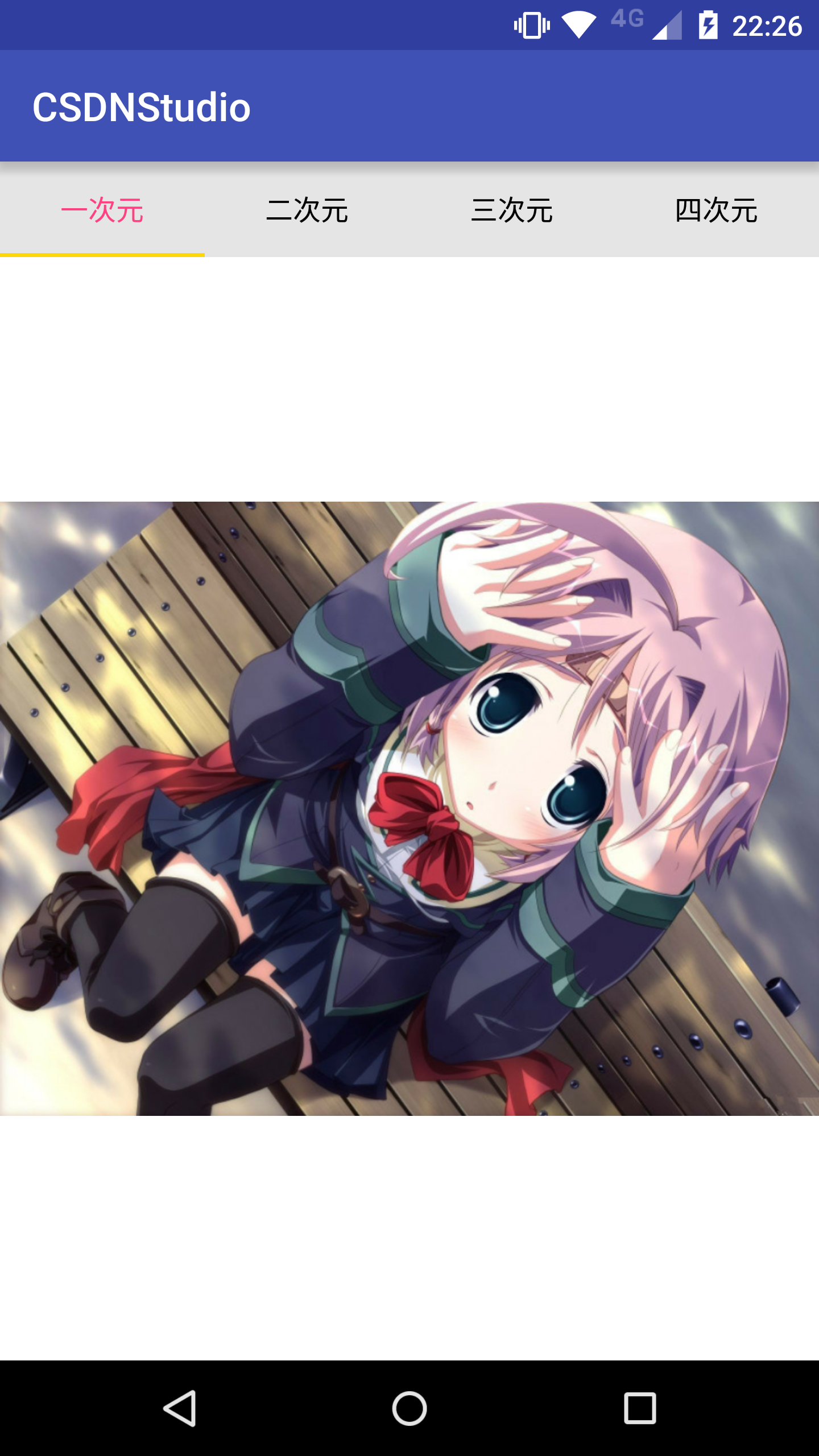
正常版TabLayout 总结
正常版呢,纯String的title,说实话,是无与伦比的选择,确实要比第三方库要好。
但是有想过吗????
带icon会怎样?那么来看不正常版!一路解析到底
ImageSpan版TabLayout FragmentPagerAdapter
public class ImageSpanTabLayoutFragmentAdapter extends FragmentPagerAdapter {

    private Context context;
    private int[] icons;
    private String[] tabTitles;
    private Fragment[] fragments;

    public ImageSpanTabLayoutFragmentAdapter(Context context, FragmentManager fm, Fragment[] fragments, String[] tabTitles, int[] icons) {
        super(fm);
        this.context = context;
        this.icons = icons;
        this.fragments = fragments;
        this.tabTitles = tabTitles;
    }

    /**
     * Return the Fragment associated with a specified position.
     *
     * @param position
     */
    @Override
    public Fragment getItem(int position) {
        return this.fragments[position];
    }

    /**
     * Return the number of views available.
     */
    @Override
    public int getCount() {
        return this.fragments.length;
    }

    /**
     * This method may be called by the ViewPager to obtain a title string
     * to describe the specified page. This method may return null
     * indicating no title for this page. The default implementation returns
     * null.
     *
     * @param position The position of the title requested
     * @return A title for the requested page
     */
    @Override
    public CharSequence getPageTitle(int position) {
        Drawable drawable;
        if (Build.VERSION.SDK_INT >= Build.VERSION_CODES.LOLLIPOP) {
            drawable = this.context.getResources().getDrawable(this.icons[position], null);
        } else {
            drawable = this.context.getResources().getDrawable(this.icons[position]);
        }
        if (drawable == null) return "";
        drawable.setBounds(0, 0, drawable.getIntrinsicWidth(), drawable.getIntrinsicHeight());
        // 这里多设置5个空格
        SpannableString spannableString = new SpannableString("     " + this.tabTitles[position]);
        ImageSpan imageSpan = new ImageSpan(drawable, ImageSpan.ALIGN_BOTTOM);
        //这里图片的开始和结束设置为0-3,根据上述的5个空格减去3个,然后有2个空格之间距离
        spannableString.setSpan(imageSpan, 0, 3, Spannable.SPAN_EXCLUSIVE_EXCLUSIVE);
        return spannableString;
    }

}在getPageTitle里,实例了对应的Drawable,然后通过Drawable再实例ImageSpan,最后放入到SpannableString里。在实例SpannableString的时候,多加了几个空格,作为paddingLeft的作用。
ImageSpan版TabLayout Activity
public class ImageSpanTabLayoutActivity extends AppCompatActivity {

    private TabLayout tabLayout;
    private ViewPager viewPager;

    private ImageSpanTabLayoutFragmentAdapter fragmentAdapter;

    @Override
    protected void onCreate(Bundle savedInstanceState) {
        super.onCreate(savedInstanceState);
        this.setContentView(R.layout.tablayout_image_span_activity);

        this.viewPager = (ViewPager) this.findViewById(R.id.view_pager_vp);
        this.tabLayout = (TabLayout) this.findViewById(R.id.tab_layout_tl);
        this.initData();
    }

    private void initData() {
        int[] icons = {R.mipmap.icon_msg_unread, R.mipmap.icon_remark, R.mipmap.icon_time, R.mipmap.icon_feedback};
        String[] tabTitles = {"一次元", "二次元", "三次元", "四次元"};
        Fragment[] fragments = {
                TabLayoutFirstFragment.getInstance(),
                TabLayoutSecondFragment.getInstance(),
                TabLayoutThirdFragment.getInstance(),
                TabLayoutFourthFragment.getInstance()
        };
        this.fragmentAdapter = new ImageSpanTabLayoutFragmentAdapter(this, this.getSupportFragmentManager(), fragments, tabTitles, icons);
        this.viewPager.setAdapter(this.fragmentAdapter);
        this.tabLayout.setupWithViewPager(this.viewPager);
    }

}
ImageSpan版TabLayout 效果图

ImageSpan版TabLayout 总结
细心的同学都能发现,图片是不对齐的。
其实这就是这种方法实现的坑处。
哎,这涉及到ImageSpan实例化时的
ImageSpan构造方法
    /**
     * @param verticalAlignment one of {@link DynamicDrawableSpan#ALIGN_BOTTOM} or
     * {@link DynamicDrawableSpan#ALIGN_BASELINE}.
     */
    public ImageSpan(Drawable d, int verticalAlignment) {
        super(verticalAlignment);
        mDrawable = d;
    }
int verticalAlignment涉及到DynamicDrawableSpan里的两个常量
    /**
     * A constant indicating that the bottom of this span should be aligned
     * with the bottom of the surrounding text, i.e., at the same level as the
     * lowest descender in the text.
     */
    public static final int ALIGN_BOTTOM = 0;

    /**
     * A constant indicating that the bottom of this span should be aligned
     * with the baseline of the surrounding text.
     */
    public static final int ALIGN_BASELINE = 1;
两种常量设置后,要么偏高要么偏低。总之,有居中强迫症的可以Over了。
SetIcon版TabLayout FragmentPagerAdapter
public class SetIconTabLayoutFragmentAdapter extends FragmentPagerAdapter {

    private Context context;
    private int[] icons;
    private String[] tabTitles;
    private Fragment[] fragments;

    public SetIconTabLayoutFragmentAdapter(Context context, FragmentManager fm, Fragment[] fragments, String[] tabTitles, int[] icons) {
        super(fm);
        this.context = context;
        this.icons = icons;
        this.fragments = fragments;
        this.tabTitles = tabTitles;
    }

    /**
     * Return the Fragment associated with a specified position.
     *
     * @param position
     */
    @Override
    public Fragment getItem(int position) {
        return this.fragments[position];
    }

    /**
     * Return the number of views available.
     */
    @Override
    public int getCount() {
        return this.fragments.length;
    }

    /**
     * This method may be called by the ViewPager to obtain a title string
     * to describe the specified page. This method may return null
     * indicating no title for this page. The default implementation returns
     * null.
     *
     * @param position The position of the title requested
     * @return A title for the requested page
     */
    @Override
    public CharSequence getPageTitle(int position) {
        // 多返回三个空格,作为padding的作用,挤开图片
        return "  "+this.tabTitles[position];
    }

}getPageTitle里面也多比正常版多了几个空格,作为paddingLeft的作用。
SetIcon版TabLayout Activity
public class SetIconTabLayoutActivity extends AppCompatActivity {

    private TabLayout tabLayout;
    private ViewPager viewPager;

    private SetIconTabLayoutFragmentAdapter fragmentAdapter;

    @Override
    protected void onCreate(Bundle savedInstanceState) {
        super.onCreate(savedInstanceState);
        this.setContentView(R.layout.tablayout_set_icon_activity);

        this.viewPager = (ViewPager) this.findViewById(R.id.view_pager_vp);
        this.tabLayout = (TabLayout) this.findViewById(R.id.tab_layout_tl);
        this.initData();
    }

    private void initData() {
        int[] icons = {R.mipmap.icon_msg_unread, R.mipmap.icon_remark, R.mipmap.icon_time, R.mipmap.icon_feedback};
        String[] tabTitles = {"一次元", "二次元", "三次元", "四次元"};
        Fragment[] fragments = {
                TabLayoutFirstFragment.getInstance(),
                TabLayoutSecondFragment.getInstance(),
                TabLayoutThirdFragment.getInstance(),
                TabLayoutFourthFragment.getInstance()
        };
        this.fragmentAdapter = new SetIconTabLayoutFragmentAdapter(this, this.getSupportFragmentManager(), fragments, tabTitles, icons);
        this.viewPager.setAdapter(this.fragmentAdapter);
        this.tabLayout.setupWithViewPager(this.viewPager);
        for (int i = 0; i < tabLayout.getTabCount(); i++) {
            TabLayout.Tab tab = tabLayout.getTabAt(i);
            if (tab == null) continue;
            tab.setIcon(icons[i]);
        }
    }

}Google官方的TabLayout封装是很有意思的,每个标签页就是一个TabView,TabView的逐个生成是依赖于TabLayout.Tab这个类的所有数据,有兴趣的可以看看,解耦了数据与View之间的过度依赖。所以我们可以通过TabLayout.Tab拿到数据,并改变数据
SetIcon版TabLayout 效果图

SetIcon版TabLayout 总结
我个人认为,通过设置TabLayout.Tab.icon去实现 icon + text 的标签页是 TabLayout最合理的办法。只需要偏历每个TabLayout.Tab,设置icon就好了。
主要,还是居中对齐的。
CustomView版TabLayout 介绍
如果觉得 纯text 或者 icon + text 无法满足要求,那么可以自定义View作为标签页的标签
TabLayout.Tab是提供setCustomView(@Nullable View view)这个方法的。
CustomView版TabLayout FragmentPagerAdapter
public class CustomViewTabLayoutFragmentAdapter extends FragmentPagerAdapter {

    private Fragment[] fragments;

    public CustomViewTabLayoutFragmentAdapter(FragmentManager fm, Fragment[] fragments) {
        super(fm);
        this.fragments = fragments;
    }

    /**
     * Return the Fragment associated with a specified position.
     *
     * @param position
     */
    @Override
    public Fragment getItem(int position) {
        return this.fragments[position];
    }

    /**
     * Return the number of views available.
     */
    @Override
    public int getCount() {
        return this.fragments.length;
    }

}CustomView版TabLayout的FragmentPagerAdapter连getPageTitle方法也不用覆写。
CustomView版TabLayout TabItem布局
item_icon_tab_layout.xml
<LinearLayout xmlns:android="http://schemas.android.com/apk/res/android"
    android:layout_width="match_parent"
    android:layout_height="match_parent"
    android:gravity="center"
    android:orientation="horizontal">

    <ImageView
        android:id="@+id/tab_layout_title_left_iv"
        android:layout_width="wrap_content"
        android:layout_height="wrap_content" />

    <TextView
        android:id="@+id/tab_layout_title_tv"
        android:layout_width="wrap_content"
        android:layout_height="wrap_content"
        android:textColor="@color/color_icon_tab_layout"
        android:layout_marginRight="5dp"
        android:layout_marginEnd="5dp"
        android:layout_marginStart="5dp"
        android:layout_marginLeft="5dp" />

    <ImageView
        android:id="@+id/tab_layout_title_right_iv"
        android:layout_width="wrap_content"
        android:layout_height="wrap_content" />


</LinearLayout>
自定义View的话,TextView的颜色还要自己设置 T T。
color_icon_tab_layout.xml
<selector xmlns:android="http://schemas.android.com/apk/res/android">
    <item android:state_selected="true" android:color="#ffFF4081" />
    <item android:state_focused="true" android:color="#ffFF4081" />
    <item android:state_pressed="true" android:color="#ffFF4081" />

    <item android:color="#FF000000" />
</selector>
CustomView版TabLayout Activity
public class CustomViewTabLayoutActivity extends AppCompatActivity {

    private TabLayout tabLayout;
    private ViewPager viewPager;

    private CustomViewTabLayoutFragmentAdapter fragmentAdapter;

    @Override
    protected void onCreate(Bundle savedInstanceState) {
        super.onCreate(savedInstanceState);
        this.setContentView(R.layout.tablayout_image_span_activity);

        this.viewPager = (ViewPager) this.findViewById(R.id.view_pager_vp);
        this.tabLayout = (TabLayout) this.findViewById(R.id.tab_layout_tl);
        this.initData();
    }

    private void initData() {
        int[] icons = {R.mipmap.icon_clean, R.mipmap.icon_remark, R.mipmap.icon_time, R.mipmap.icon_feedback};
        String[] tabTitles = {"一次元", "二次元", "三次元", "四次元"};
        Fragment[] fragments = {
                TabLayoutFirstFragment.getInstance(),
                TabLayoutSecondFragment.getInstance(),
                TabLayoutThirdFragment.getInstance(),
                TabLayoutFourthFragment.getInstance()
        };
        this.fragmentAdapter = new CustomViewTabLayoutFragmentAdapter(this.getSupportFragmentManager(), fragments);
        this.viewPager.setAdapter(this.fragmentAdapter);
        this.tabLayout.setupWithViewPager(this.viewPager);
        for (int i = 0; i < tabLayout.getTabCount(); i++) {
            View view = LayoutInflater.from(this).inflate(R.layout.item_icon_tab_layout, null);
            TextView tabTV = (TextView) view.findViewById(R.id.tab_layout_title_tv);
            ImageView tabLeftIV = (ImageView) view.findViewById(R.id.tab_layout_title_left_iv);
            ImageView tabRightIV = (ImageView) view.findViewById(R.id.tab_layout_title_right_iv);
            tabTV.setText(tabTitles[i]);
            tabLeftIV.setImageResource(icons[i]);
            tabRightIV.setImageResource(icons[i]);
            TabLayout.Tab tab = tabLayout.getTabAt(i);
            if (tab == null) continue;
            tab.setCustomView(view);
        }
    }

}
CustomView版TabLayout 效果图
这样的话,一开始没滑动的时候,没触发事件是没有颜色,是没颜色。如果要改进的话,肯定是在事件出发后,设置当前选中标签为选中颜色,同时,还要设置其他没选中的标签为没选中的颜色,这就有点恶心了。
刚进Activity,什么都没做,第一个是没颜色的

滑动后开始有颜色

CustomView版TabLayout 总结
CustomView版TabLayout,建议还是不要使用了
可以使用EasySlidingTabs
全部版本总结
1.如果是纯Text,可以选择正常版。
2.如果是 icon + text ,可以选择SetIcon版。
3.再复杂版本,请选择EasySlidingTabs。


 扫一扫
扫一扫
 566
566

 被折叠的 条评论
为什么被折叠?
被折叠的 条评论
为什么被折叠?
 到【灌水乐园】发言


