


微信扫码体验“咸虾米壁纸”最终项目
零基础入门uniapp Vue3组合式API版本到咸虾米壁纸项目实战,开发打包微信小程序、抖音小程序、H5、安卓APP客户端等 - B站视频
千锋教育前端uniapp入门到实战项目教程(微信小程序+H5+安卓APP+IOS APP) - B站视频
uni-pay支付商城项目开发,uniapp及uniCloud云开发进阶课,自建微信小程序购物商店项目实战『布局篇』
uniappVue3版本中组件生命周期和页面生命周期的详细介绍
开发uniapp使用Vue3组合式API版本,如何实现从vue模块中自动导入
免费测试api接口:https://jsonplaceholder.typicode.com/
随机猫咪API接口:https://api.thecatapi.com/v1/images/search?limit=1
咸虾米API接口:https://api.qingnian8.com/
NBA球员榜:https://tiyu.baidu.com/api/match/playerranking/match/NBA/tabId/60
整理下外边距合并
grid网格布局真香,比flex方便太多了,grid-template-columns用法 - B站视频
用css3写渐变色背景,4中不同类型的渐变可应用到小程序、APP开发中。linear-gradient()线性渐变和radial-gradient()径向渐变 - B站视频
ES6实用的深度解构赋值方法,解构对象、数组、混合解构以及连续解构的应用
开发uniapp项目好用的插件z-paging下拉刷新和触底加载的快速实现
在uniapp Vue3版本中如何解决web/H5网页浏览器跨域的问题
uniPush统一推送与App升级中心uni-upgrade-center系列uniapp进阶课,安卓apk打包及自定义基座
文章目录
- 一、开发环境及项目创建
- 二、常用的内置组件
- 三、vue3组合式API快速上手
- 3.1.vue3的模板语法插值表达式用法
- 3.2.使用ref定义响应式数据变量
- 3.3.v-bind指令配合图片轮播案例
- 3.4.class类和style内联样式的绑定
- 3.5.原生事件监听及组件内置事件处理
- 3.6.创建自定义模板快速创建uniapp的vue3页面结构
- 3.7.v-if条件渲染及v-show的选择对比
- 3.8.v-for列表渲染的用法
- 3.9.【购物车案例】for循环为什么使用key
- 3.10.【小鸡案例】表单focus和blur事件用法&双向绑定
- 3.11.【热梗案例】知识点阶段性综合汇总
- 3.12.computed计算属性用法及方法对比
- 3.13.【计价案例】计算属性配合循环遍历统计总价
- 3.14.watch和watchEffect监听的使用
- 四、深入vue组件及生命周期
- 五、uniapp全局文件配置和API调用
- 5.1.响应式单位rpx及搭配使用UI产品工具
- 5.2.@import导入css样式及scss变量用法与static目录
- 5.3.pages.json页面路由globalStyle的属性
- 5.4.pages设置页面路径及窗口表现
- 5.5.tabBar设置底部菜单选项及iconfont图标
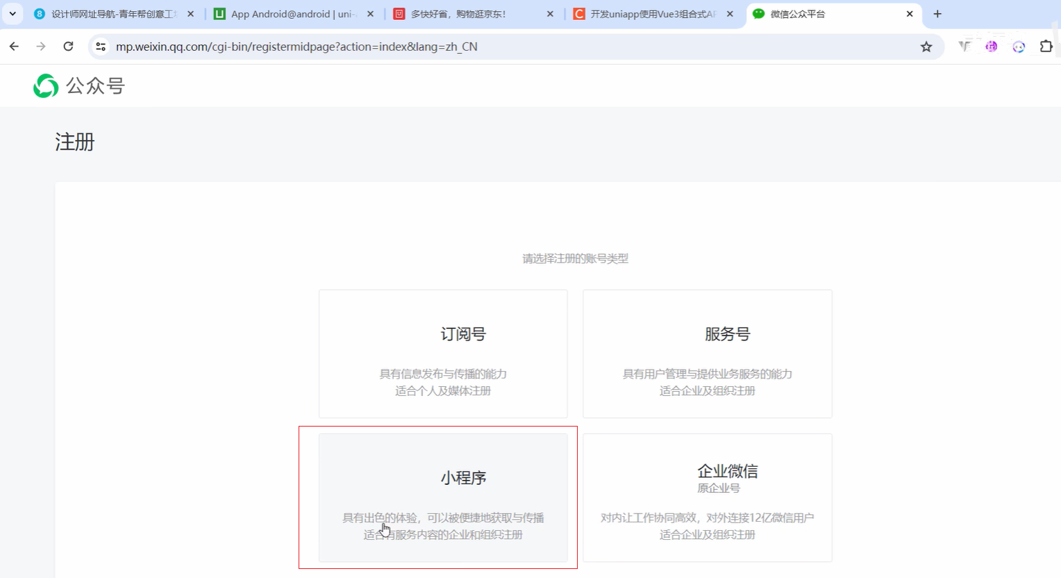
- 5.6.manifest.json配置和注册微信小程序appid
- 5.7.安装插件unplugin-auto-import自动导入vue和uniapp模块
- 5.8.uni-api交互反馈showToast的用法
- 5.9.showLoading加载和showModal模态框示例
- 5.10.showActionSheet从底部向上弹出操作菜单
- 5.11.动态设置页面导航条的样式
- 5.12.setTabBar设置TabBar和下拉刷新API
- 5.13.页面和路由API-navigateTo及页面栈getCurrentPages
- 5.14.StorageSync数据缓存API
- 5.15.uni.request发送网络请求
- 六、阶段性综合小实例-萌宠集
一、开发环境及项目创建
1.1.uniappVue版本知识点概述
uniapp官网:https://zh.uniapp.dcloud.io/
推荐使用uniapp的HBuilder来构建uniapp的项目;
直接下载HBuilder,解压即可使用(可将exe文件发送到桌面,方便使用)
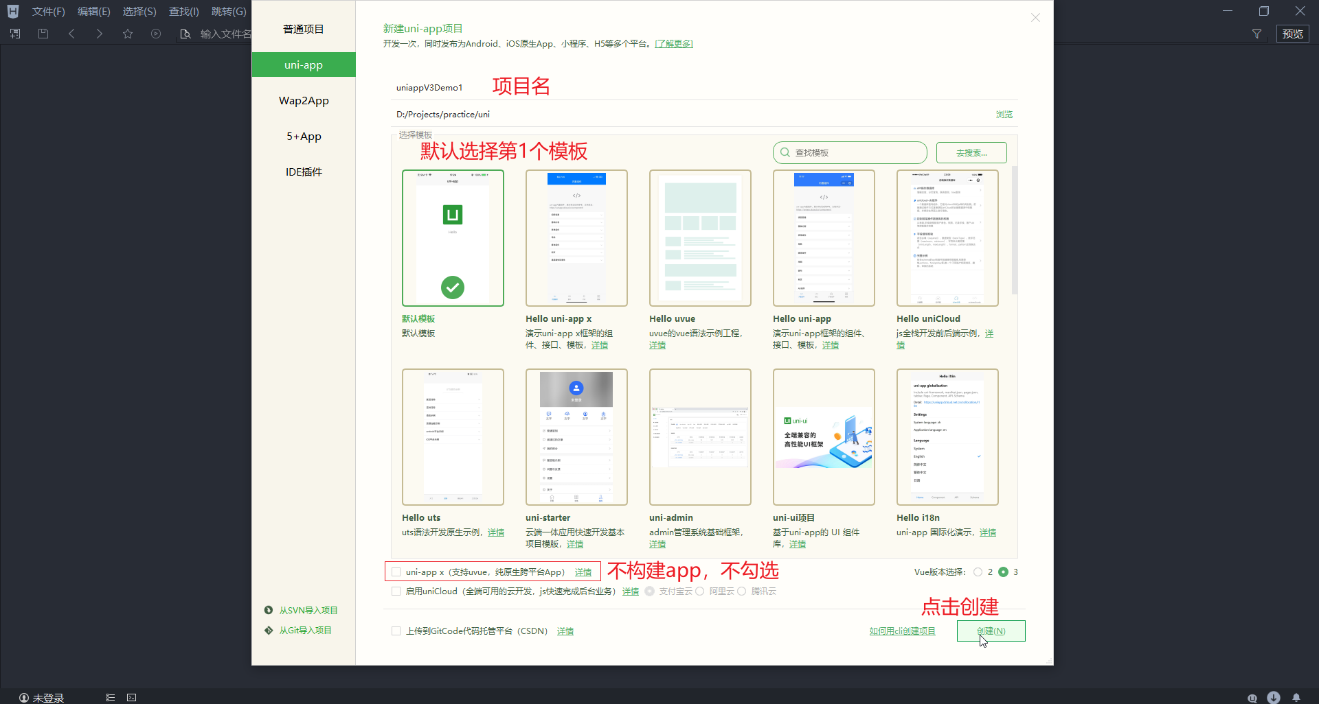
1.2.使用HBuilder编辑器创建vue3新项目
创建项目
文件 -> 新建 -> 项目
刚刚创建的uniappV3Demo项目如下
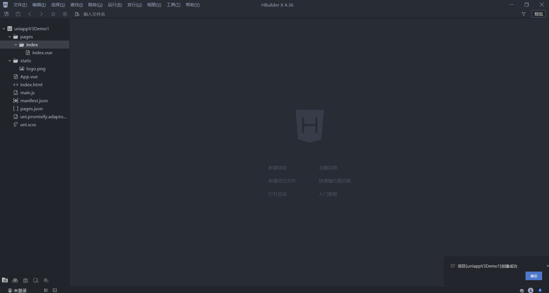
项目目录结构
其中,uniapp项目目录介绍如下https://zh.uniapp.dcloud.io/tutorial/project.html
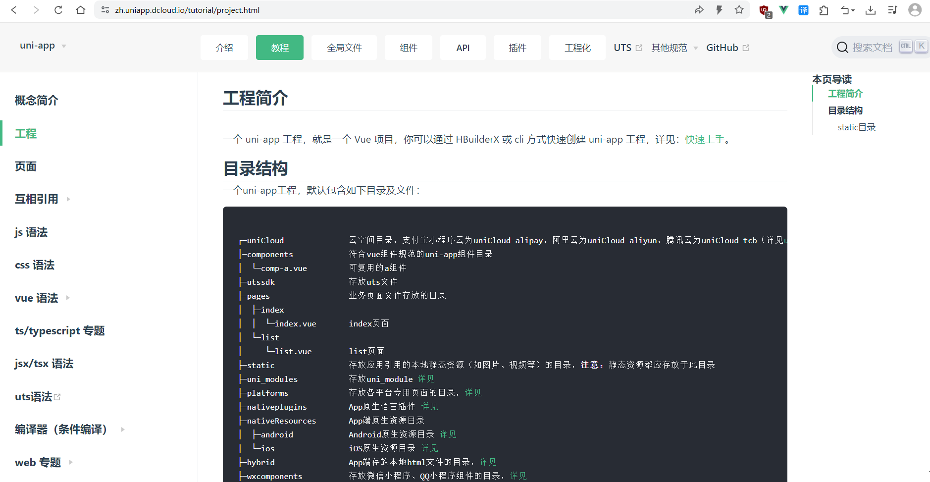
┌─uniCloud              云空间目录,支付宝小程序云为uniCloud-alipay,阿里云为uniCloud-aliyun,
│─components            符合vue组件规范的uni-app组件目录
│  └─comp-a.vue         可复用的a组件
├─utssdk                存放uts文件
├─pages                 业务页面文件存放的目录
│  ├─index
│  │  └─index.vue       index页面
│  └─list
│     └─list.vue        list页面
├─static                存放引用的本地静态资源(如图片、视频等)的目录,注意:静态资源都存放此目录
├─uni_modules           存放uni_module 详见
├─platforms             存放各平台专用页面的目录,详见
├─nativeplugins         App原生语言插件 详见
├─nativeResources       App端原生资源目录
│  ├─android            Android原生资源目录 详见
|  └─ios                iOS原生资源目录 详见
├─hybrid                App端存放本地html文件的目录,详见
├─wxcomponents          存放微信小程序、QQ小程序组件的目录,详见
├─mycomponents          存放支付宝小程序组件的目录,详见
├─swancomponents        存放百度小程序组件的目录,详见
├─ttcomponents          存放抖音小程序、飞书小程序组件的目录,详见
├─kscomponents          存放快手小程序组件的目录,详见
├─jdcomponents          存放京东小程序组件的目录,详见
├─unpackage             非工程代码,一般存放运行或发行的编译结果
├─main.js               Vue初始化入口文件
├─App.vue               应用配置,用来配置App全局样式以及监听 应用生命周期
├─pages.json            配置页面路由、导航条、选项卡等页面类信息,详见
├─manifest.json         配置应用名称、appid、logo、版本等打包信息,详见
├─AndroidManifest.xml   Android原生应用清单文件 详见
├─Info.plist            iOS原生应用配置文件 详见
└─uni.scss              内置的常用样式变量
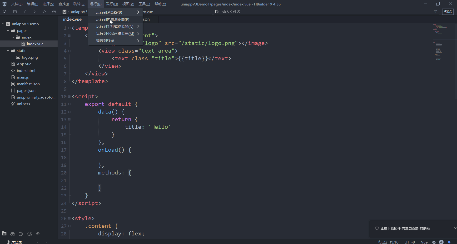
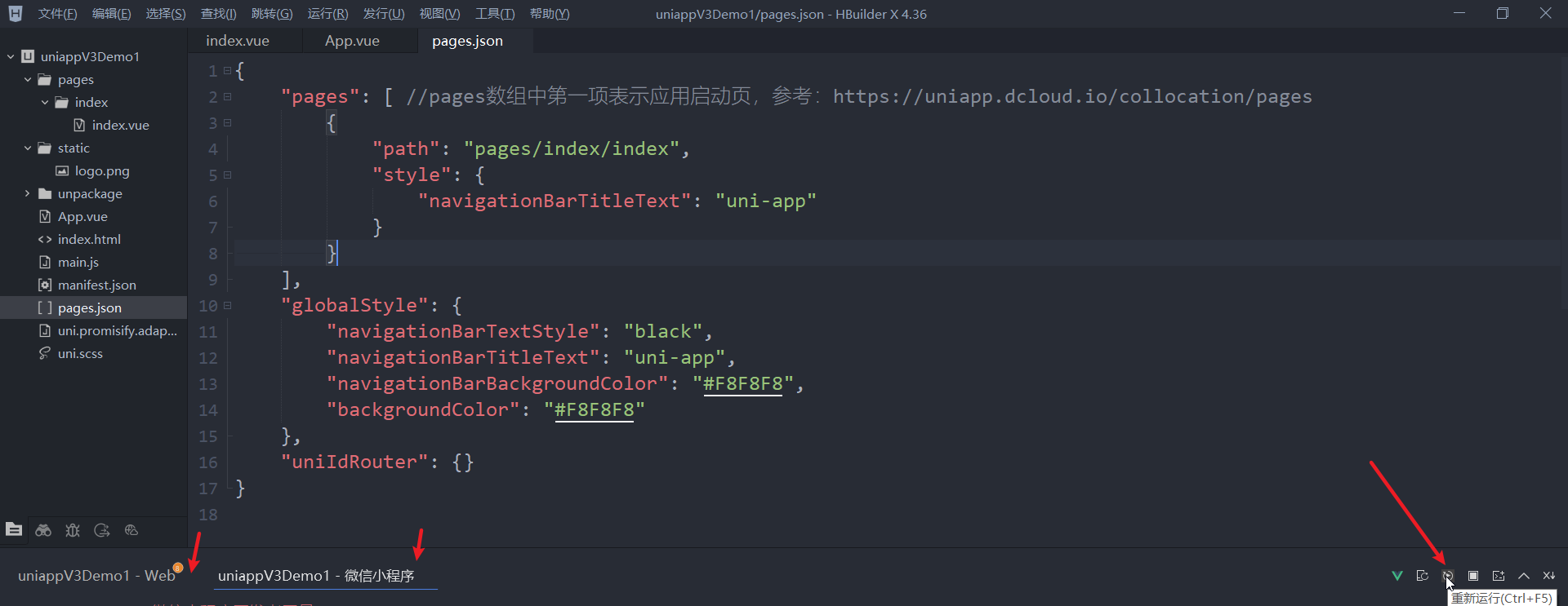
预览
运行到内置浏览器
运行 - 运行到内置浏览器
运行到浏览器
运行 - 运行到浏览器(如果打不开,在弹出的界面中配置浏览器路径即可)
1.3.配置外部浏览器及各种小程序模拟器
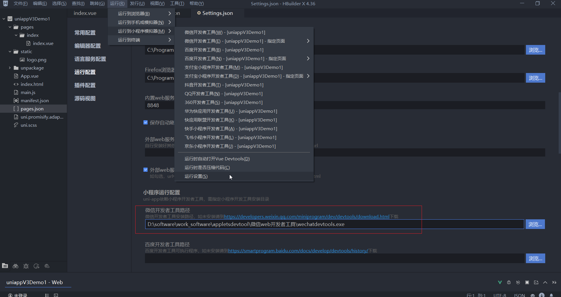
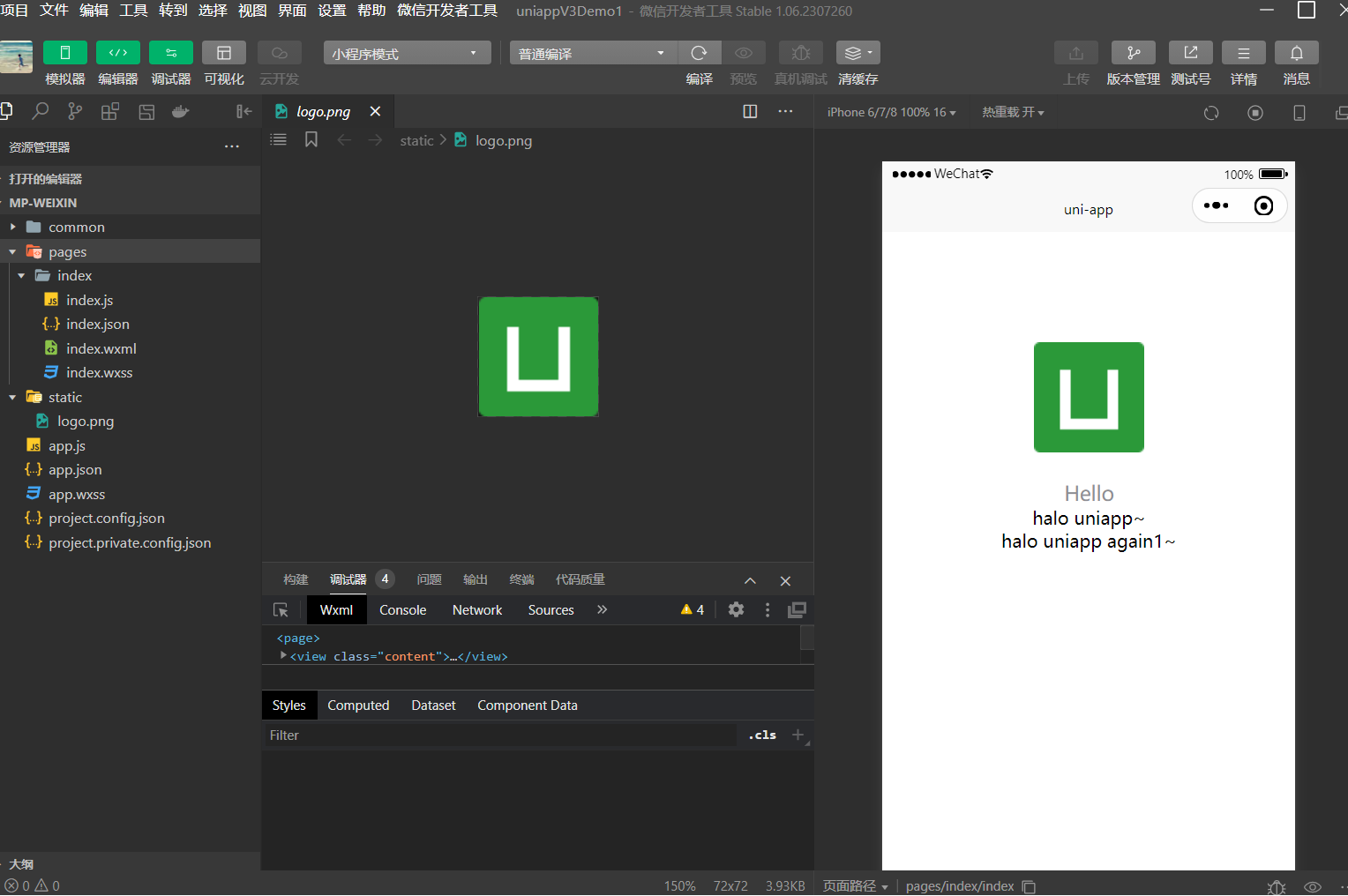
可以配置小程序模拟器,如:微信小程序、支付宝小程序、抖音小程序。
以微信小程序为例
1.4.创建页面及vue页面内基本组成部分
默认的页面
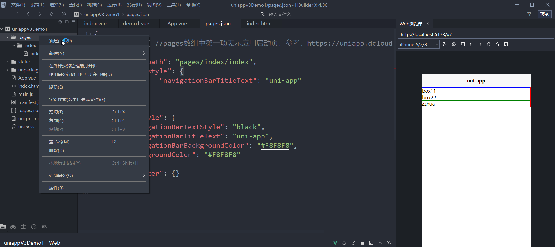
创建页面
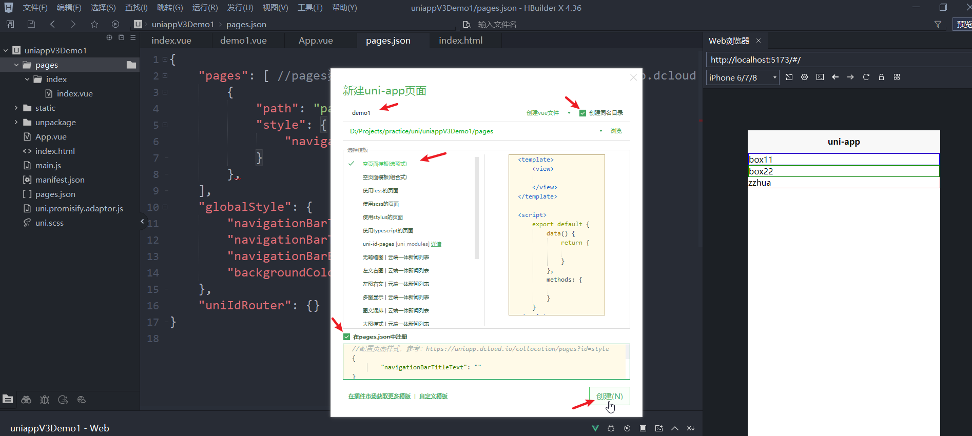
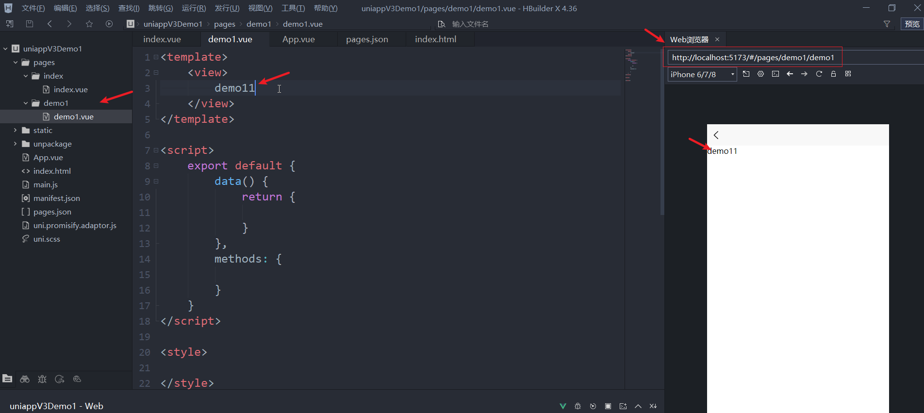
配置页面
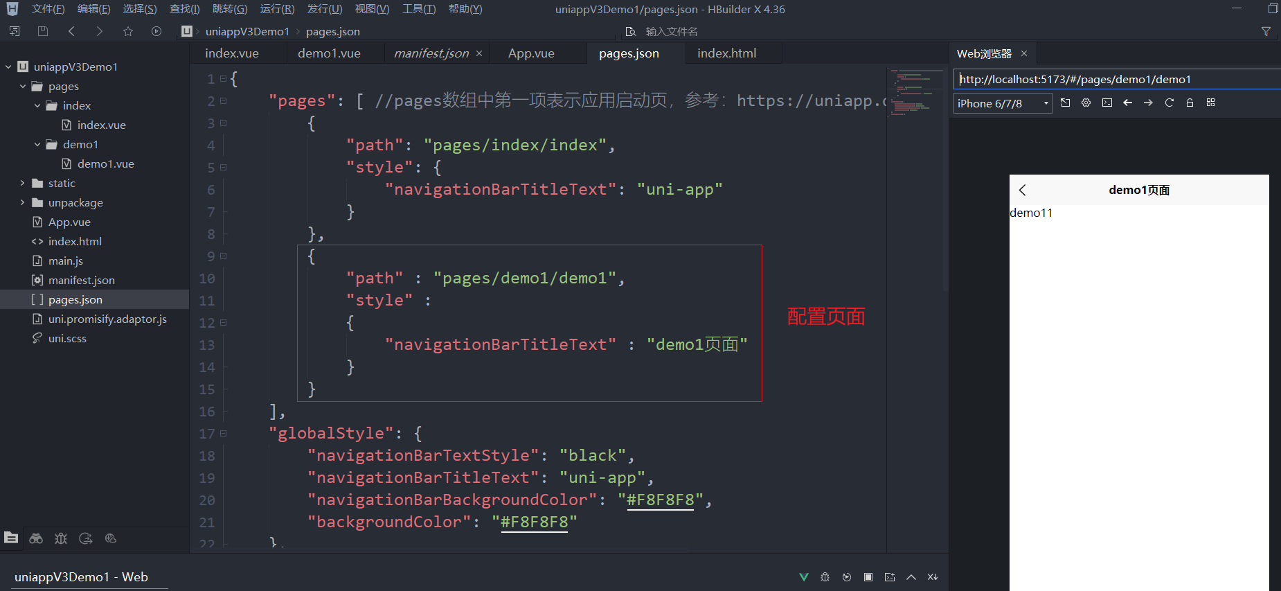
创建完的页面会自动添加到pages属性中
二、常用的内置组件
2.1.view和text常用视图容器组件
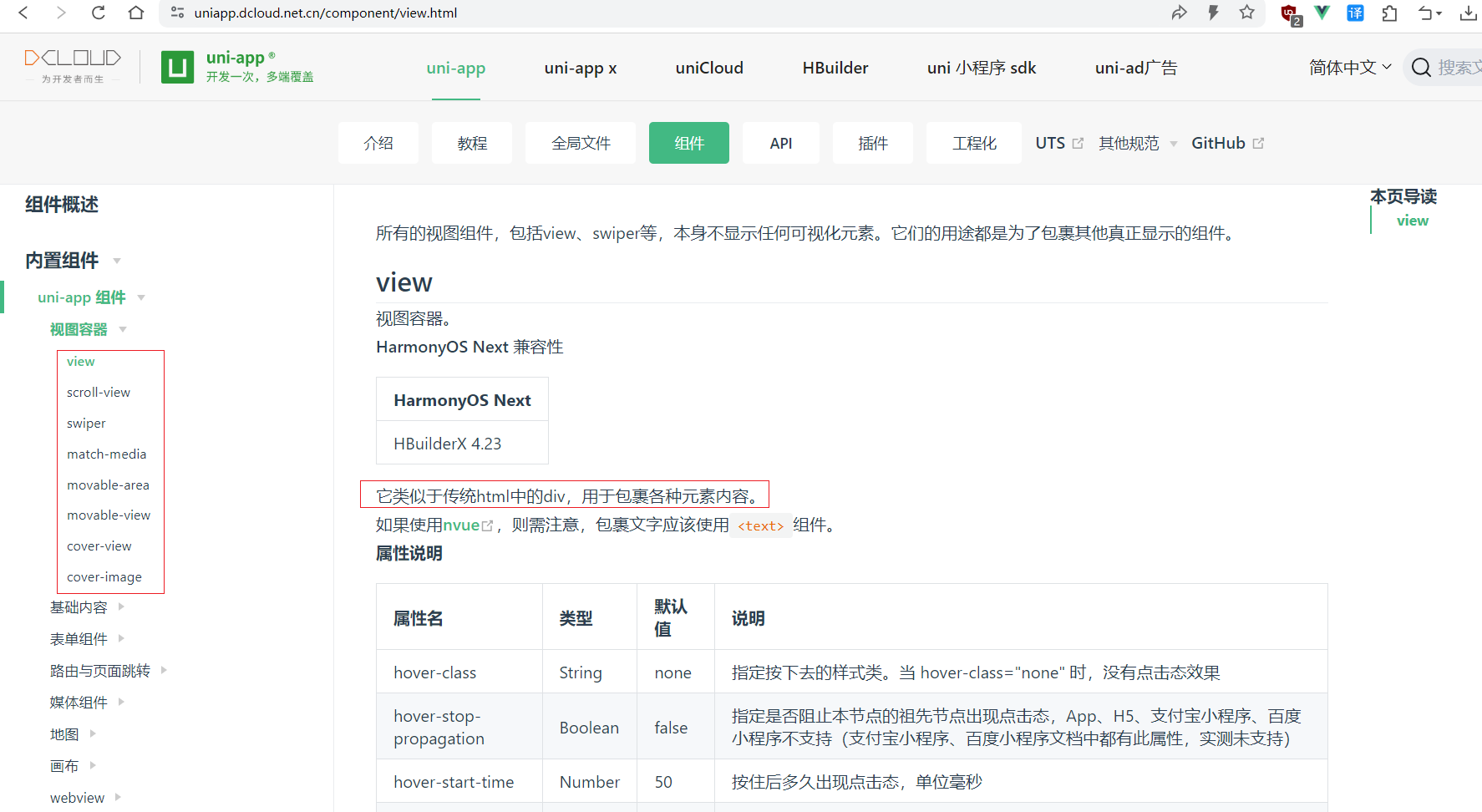
view组件
视图容器。
# 快捷键操作
view.box1,tab
view,回车
view,tab
<!-- 注意有些属性,只有部分终端类型支持,其它终端可能并不支持,需要看文档说明作适配哦 -->
<template>
	<view class="box" hover-class="boxHover" hover-stay-time="400">
        <!-- hover-stop-propagation 属性,阻止事件冒泡 -->
		<view class="inner" hover-class="innerHover" hover-stop-propagation></view>
	</view>
</template>

<script setup>
</script>

<style lang="scss">
	.box {
		width: 200px;
		height: 200px;
		background-color: #ccc;
	}
	.boxHover {
		background-color: orange;
	}

	.inner {
		width: 150px;
		height: 150px;
		background-color: green;
	}

	.innerHover {
		background-color: yellowgreen;
	}
</style>
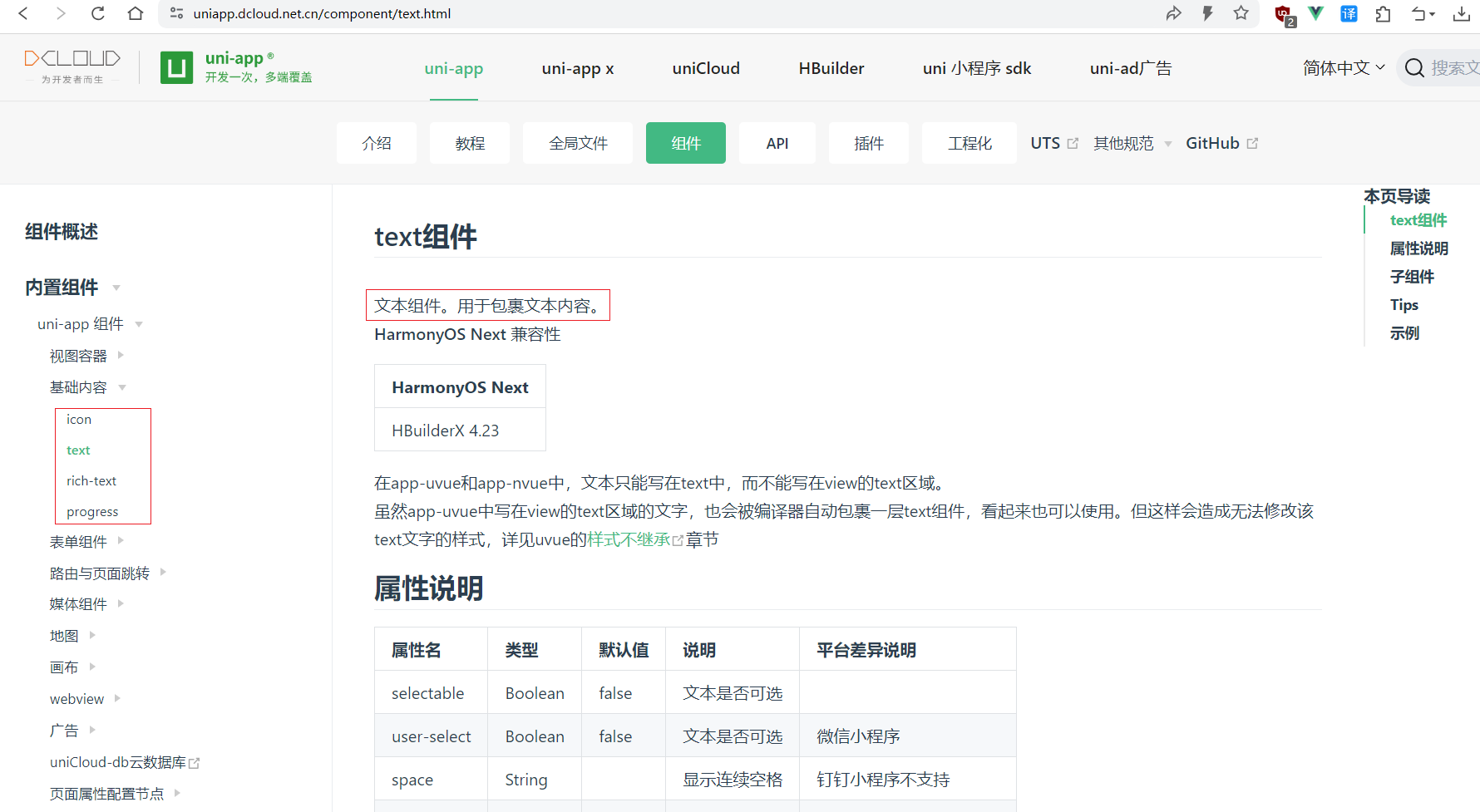
text组件
文本组件。用于包裹文本内容。
<!-- 注意,文本可选需要长按 -->
<text selectable space="emsp">
	文本文本                        文本
</text>
2.2.scroll-view可滚动视图区域组件
scroll-view
可滚动视图区域。用于区域滚动。
纵向滑动
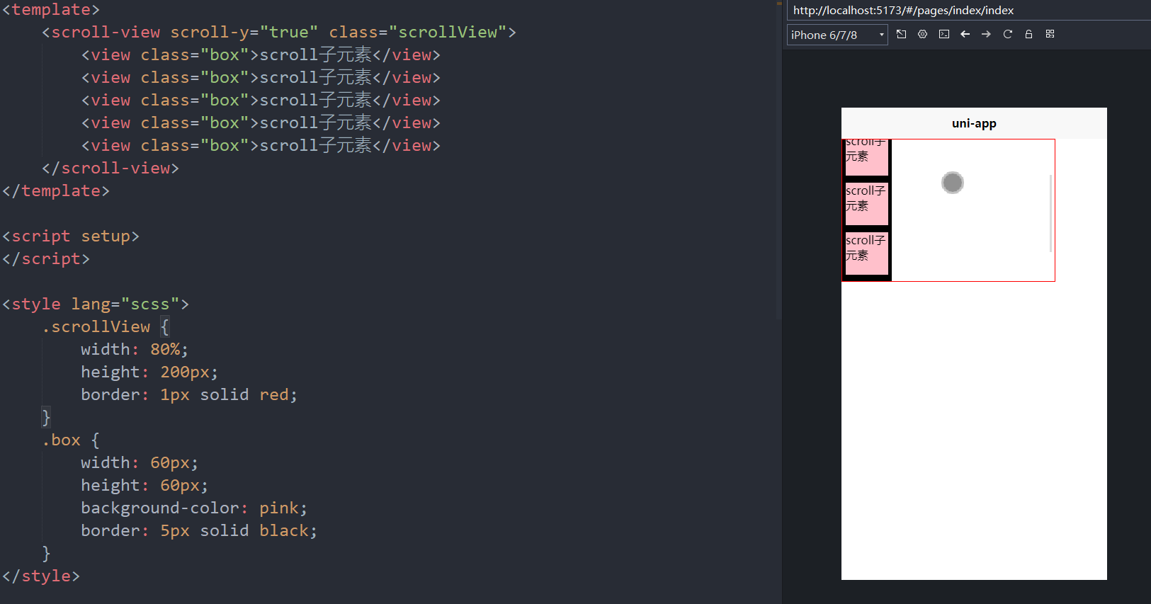
<template>
	<scroll-view scroll-y="true" class="scrollView">
		<view class="box">scroll子元素</view>
		<view class="box">scroll子元素</view>
		<view class="box">scroll子元素</view>
		<view class="box">scroll子元素</view>
		<view class="box">scroll子元素</view>
	</scroll-view>
</template>

<script setup>
</script>

<style lang="scss">
	.scrollView {
		width: 80%;
		height: 200px;
		border: 1px solid red;
	}
	.box {
		width: 60px;
		height: 60px;
		background-color: pink;
		border: 5px solid black;
	}
</style>
横向滑动
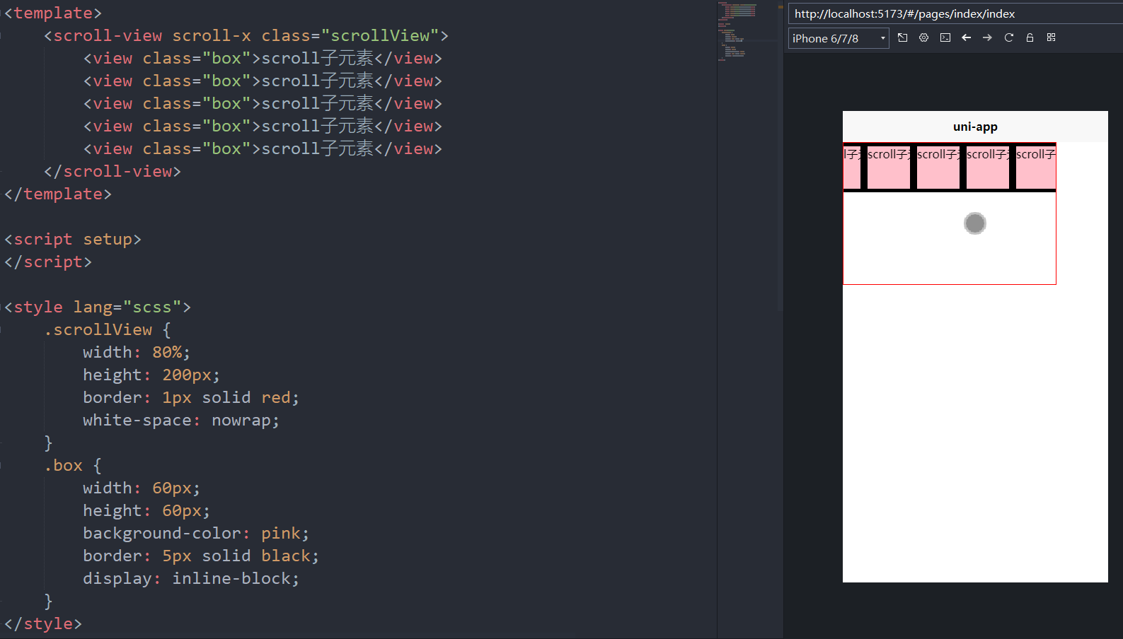
<template>
	<scroll-view scroll-x class="scrollView">
		<view class="box">scroll子元素</view>
		<view class="box">scroll子元素</view>
		<view class="box">scroll子元素</view>
		<view class="box">scroll子元素</view>
		<view class="box">scroll子元素</view>
	</scroll-view>
</template>

<script setup>
</script>

<style lang="scss">
	.scrollView {
		width: 80%;
		height: 200px;
		border: 1px solid red;
		white-space: nowrap; /* 不换行 */
	}
	.box {
		width: 60px;
		height: 60px;
		background-color: pink;
		border: 5px solid black;
		display: inline-block; /* 行内块 */
	}
</style>
2.3.swiper滑块视图容器的用法
swiper组件
滑块视图容器。
一般用于左右滑动或上下滑动,比如banner轮播图。
注意滑动切换和滚动的区别b,滑动切换是一屏一屏的切换。swiper下的每个swiper-item是一个滑动切换区域,不能停留在2个滑动区域之间。
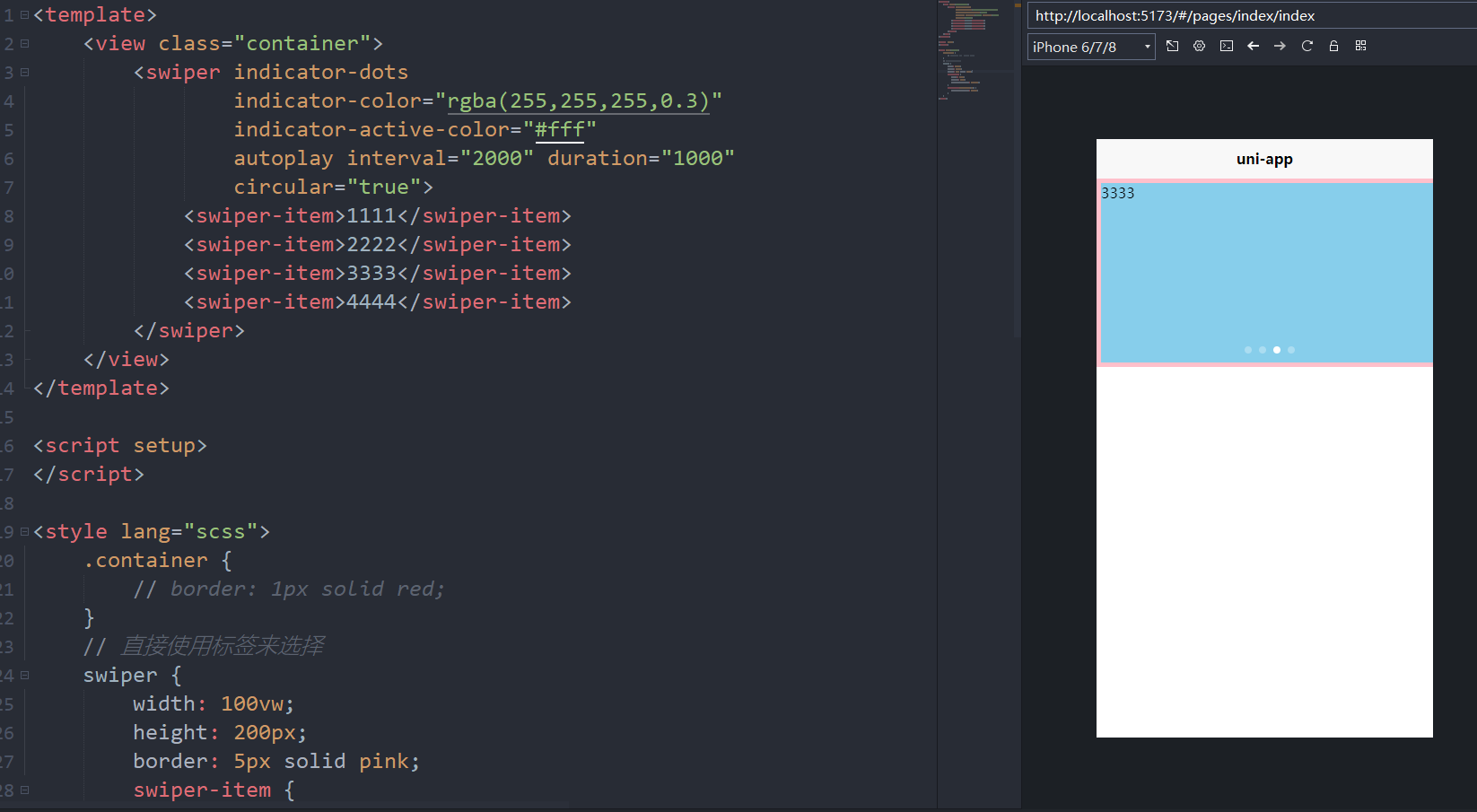
<!-- 属性为false, 只能通过绑定实现,否则写上就是true;
     属性为数值的,可以使用字符串数值; -->
<template>
	<view class="container">
		<swiper indicator-dots
				indicator-color="rgba(255,255,255,0.3)"
				indicator-active-color="#fff"
				autoplay interval="2000" duration="1000"
				circular="true">
			<swiper-item>1111</swiper-item>
			<swiper-item>2222</swiper-item>
			<swiper-item>3333</swiper-item>
			<swiper-item>4444</swiper-item>
		</swiper>
	</view>
</template>

<script setup>
</script>

<style lang="scss">
	.container {
		// border: 1px solid red;
	}
	// 直接使用标签来选择
	swiper {
		width: 100vw;
		height: 200px;
		border: 5px solid pink;
		swiper-item {
            /* 这里的2个100% 可以不写, 应该默认就是100% */
			width: 100%;
			height: 100%;
			background-color: skyblue;
		}
		swiper-item:nth-child(2n) {
			background-color: orange;
		}
	}
</style>
补充
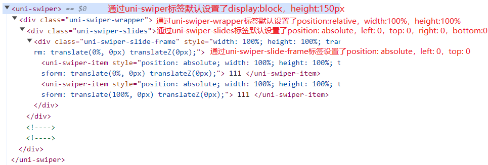
swiper {
	width: 100%;
    height: 100%;
}

将会处理成
uni-swiper[data-v-2dad6c07] {
    width: 100%;
    height: 100%;
}
2.4.image媒体组件属性配合swiper轮播
image组件
图片组件。
基础使用
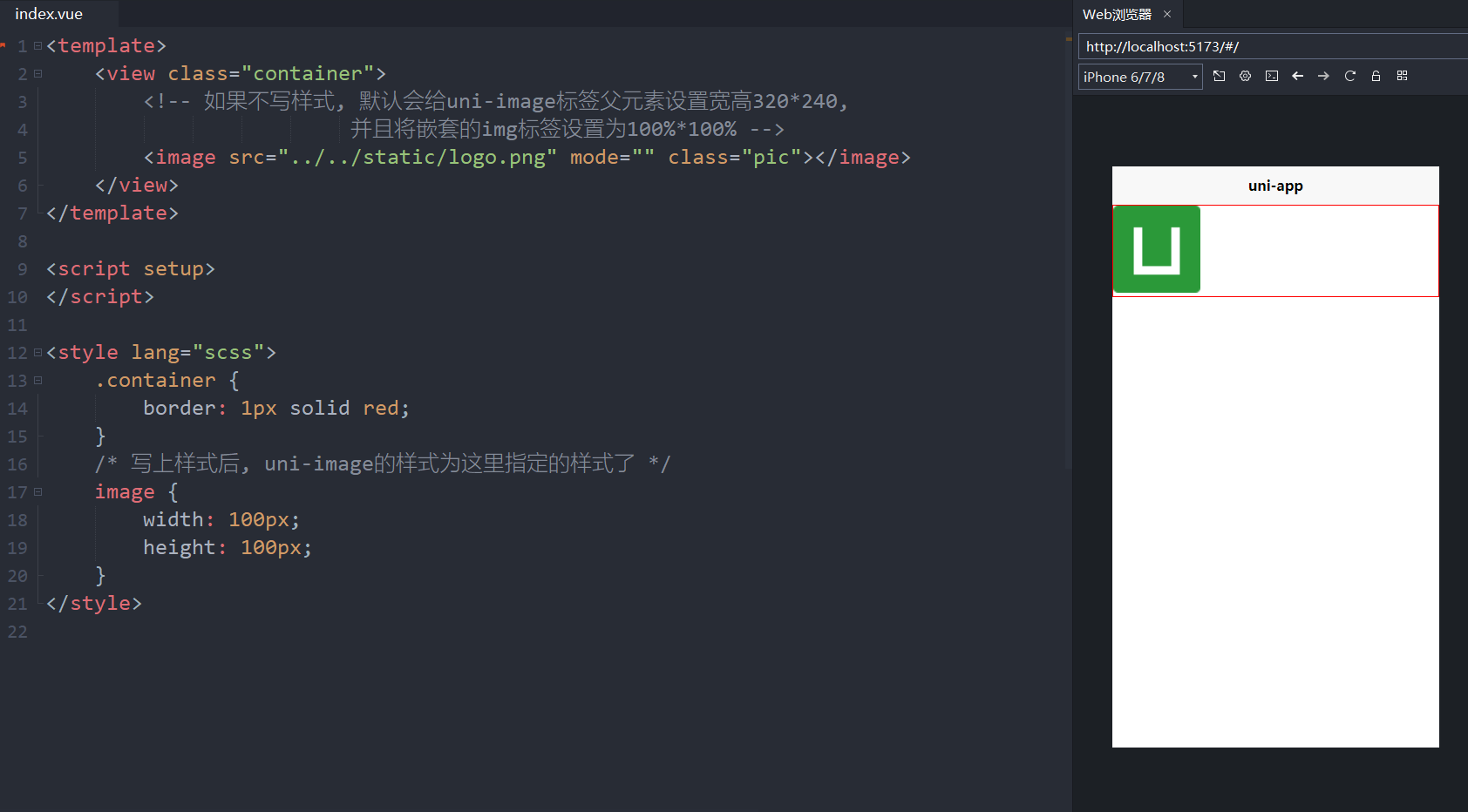
<template>
	<view class="container">
		<!-- 如果不写样式, 默认会给uni-image标签父元素设置宽高320px*240px,
		                 并且将嵌套的img标签设置为100%*100% -->
		<image src="../../static/logo.png" mode="" class="pic"></image>
	</view>
</template>

<script setup>
</script>

<style lang="scss">
	.container {
		border: 1px solid red;
	}
	/* 写上样式后, uni-image的样式为这里指定的样式了 */
	image {
		width: 100px;
		height: 100px;
	}
</style>
补充
<!-- 1、image标签默认会处理成1个uni-image标签,uni-image标签默认是个行内元素,但是这里会使用uni-image标签选择器,将样式设置为display:inline-block;width:320px;height:240px;position:reletive,变成行内块元素,并且指定了具体的宽高;
	 2、uni-image标签内部会嵌入1个div,它的背景图片就是url,并通过uni-image > div元素选择器,将它的宽和高都设置为100%;
	 3、uni-image标签内部还会嵌入1个img,src就是url,position:absolute,top:0,left:0,width:100%,height:100%;display: block;opacity: 0;
     4、综上,image默认大小就是320宽 * 240高
     5、所以,可以直接写image{width:xx;height:xx;},设置它的宽高,
            会处理成uni-image:{width:xx;height:xx;}
            这样可以把默认设置的宽高给覆盖掉-
            然后加上mode="aspectFill"设置背景图片的size为cover,position为center->
<image src="@/common/images/preview_small.webp"></image>
mode
image组件的mode选项:控制图片裁剪、缩放的模式。
默认值是:scaleToFill(宽和高拉伸到完全匹配)。
最常用的是:aspectFill
选项的具体效果可以在官网上看到每个选项的效果示例图。
| 模式 | 值 | 说明 |
|---|---|---|
| 缩放 | scaleToFill | 不保持纵横比缩放图片,使图片的宽高完全拉伸至填满 image 元素 |
| 缩放 | aspectFit | 保持纵横比缩放图片,使图片的长边能完全显示出来。也就是说,可以完整地将图片显示出来。 |
| 缩放 | aspectFill | 保持纵横比缩放图片,只保证图片的短边能完全显示出来。也就是说,图片通常只在水平或垂直方向是完整的,另一个方向将会发生截取。 |
| 缩放 | widthFix | 宽度不变,高度自动变化,保持原图宽高比不变 |
| 缩放 | heightFix | 高度不变,宽度自动变化,保持原图宽高比不变 App 和 H5 平台 HBuilderX 2.9.3+ 支持、微信小程序需要基础库 2.10.3 |
| 裁剪 | top | 不缩放图片,只显示图片的顶部区域 |
| 裁剪 | bottom | 不缩放图片,只显示图片的底部区域 |
| 裁剪 | center | 不缩放图片,只显示图片的中间区域 |
| 裁剪 | left | 不缩放图片,只显示图片的左边区域 |
| 裁剪 | right | 不缩放图片,只显示图片的右边区域 |
| 裁剪 | top left | 不缩放图片,只显示图片的左上边区域 |
| 裁剪 | top right | 不缩放图片,只显示图片的右上边区域 |
| 裁剪 | bottom left | 不缩放图片,只显示图片的左下边区域 |
| 裁剪 | bottom right | 不缩放图片,只显示图片的右下边区域 |
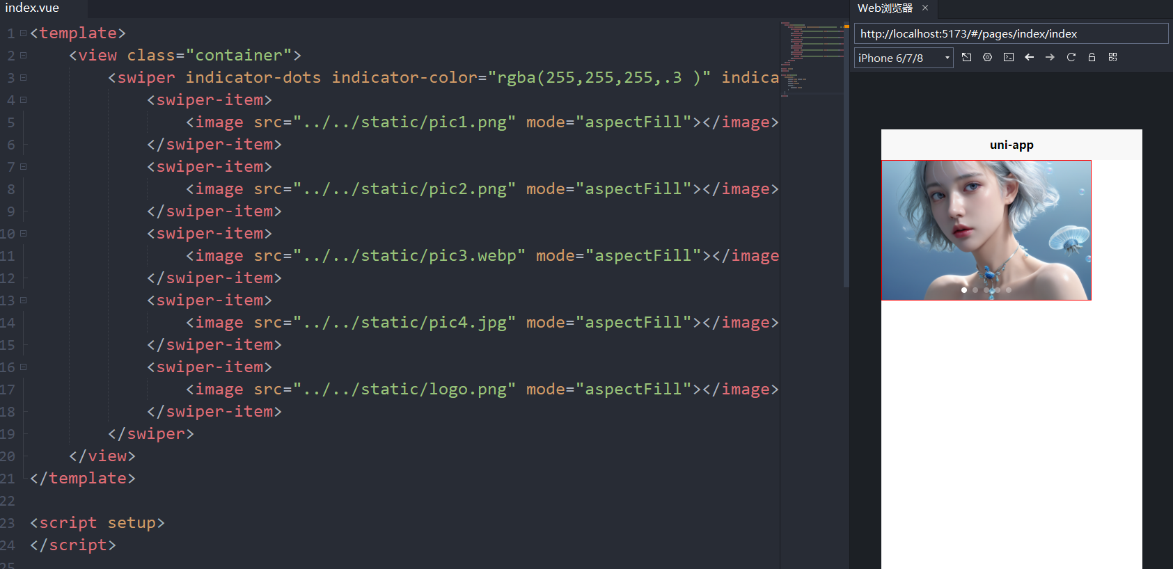
<template>
	<view class="container">
		<swiper indicator-dots indicator-color="rgba(255,255,255,.3	)"
                indicator-active-color="#fff">
			<swiper-item>
				<image src="../../static/pic1.png" mode="aspectFill"></image>
			</swiper-item>
			<swiper-item>
				<image src="../../static/pic2.png" mode="aspectFill"></image>
			</swiper-item>
			<swiper-item>
				<image src="../../static/pic3.webp" mode="aspectFill"></image>
			</swiper-item>
			<swiper-item>
				<image src="../../static/pic4.jpg" mode="aspectFill"></image>
			</swiper-item>
			<swiper-item>
				<image src="../../static/logo.png" mode="aspectFill"></image>
			</swiper-item>
		</swiper>
	</view>
</template>

<script setup>
</script>

<style lang="scss">
	.container {
		border: 1px solid red;
		width: 80%;
		height: 200px;
		swiper { /* uni-swiper 默认高度为150, 所以这里修改掉这个默认高度 */
			height: 100%;
		}
	}

</style>
2.5.navigator路由与页面跳转
navigator
页面跳转。
该组件类似HTML中的<a>组件,但只能跳转本地页面。目标页面必须在pages.json中注册。
除了组件方式,API方式也可以实现页面跳转,另见:https://uniapp.dcloud.io/api/router?id=navigateto
| 属性名 | 类型 | 默认值 | 说明 |
|---|---|---|---|
| url | String | 应用内的跳转链接,值为相对路径或绝对路径,如:“…/first/first”,“/pages/first/first”,注意不能加 .vue 后缀 | |
| open-type | String | navigate | 跳转方式 |
<template>
	<view>
		index
		<view>
			<!-- 默认值, 还能跳回来 -->
			<navigator url="/pages/demo1/demo1" open-type="navigate">
                1-跳转到demo1
            </navigator>
		</view>

		<view>
			<!-- 对应 uni.reLaunch 的功能, 关闭所有页面, 跳不回来了 -->
			<navigator url="/pages/demo1/demo1" open-type="reLaunch">
                2-跳转到demo1
            </navigator>
		</view>
	</view>
</template>
<!-- navigator标签默认会处理成uni-navigator标签,它是个行内元素,默认会使用uni-navigator标签选择器将它设置为display: block; 所以它默认其实就认为是块级元素
              uni-navigator标签内部会嵌入1个a标签-->
<navigator url="" class="item">11</navigator>
2.6.常用的表单组件button和input
button组件
| 属性名 | 类型 | 默认值 | 说明 |
|---|---|---|---|
| size | String | default | 按钮的大小 |
| type | String | default | 按钮的样式类型 |
| plain | Boolean | false | 按钮是否镂空,背景色透明 |
| disabled | Boolean | false | 是否禁用 |
| loading | Boolean | false | 名称前是否带 loading 图标 |
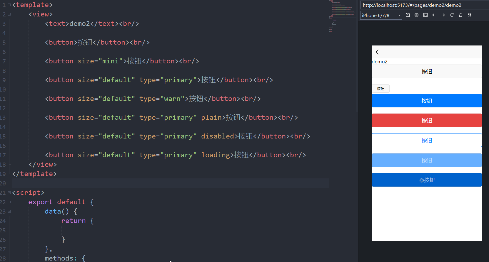
<template>
	<view>
		<text>demo2</text><br/>

		<button>按钮</button><br/>

		<button size="mini">按钮</button><br/>

		<button size="default" type="primary">按钮</button><br/>

		<button size="default" type="warn">按钮</button><br/>

		<button size="default" type="primary" plain>按钮</button><br/>

		<button size="default" type="primary" disabled>按钮</button><br/>

		<button size="default" type="primary" loading>按钮</button><br/>
	</view>
</template>
input组件
单行输入框。html规范中input不仅是输入框,还有radio、checkbox、时间、日期、文件选择功能。在uni-app规范中,input仅仅是输入框。其他功能uni-app有单独的组件或API。
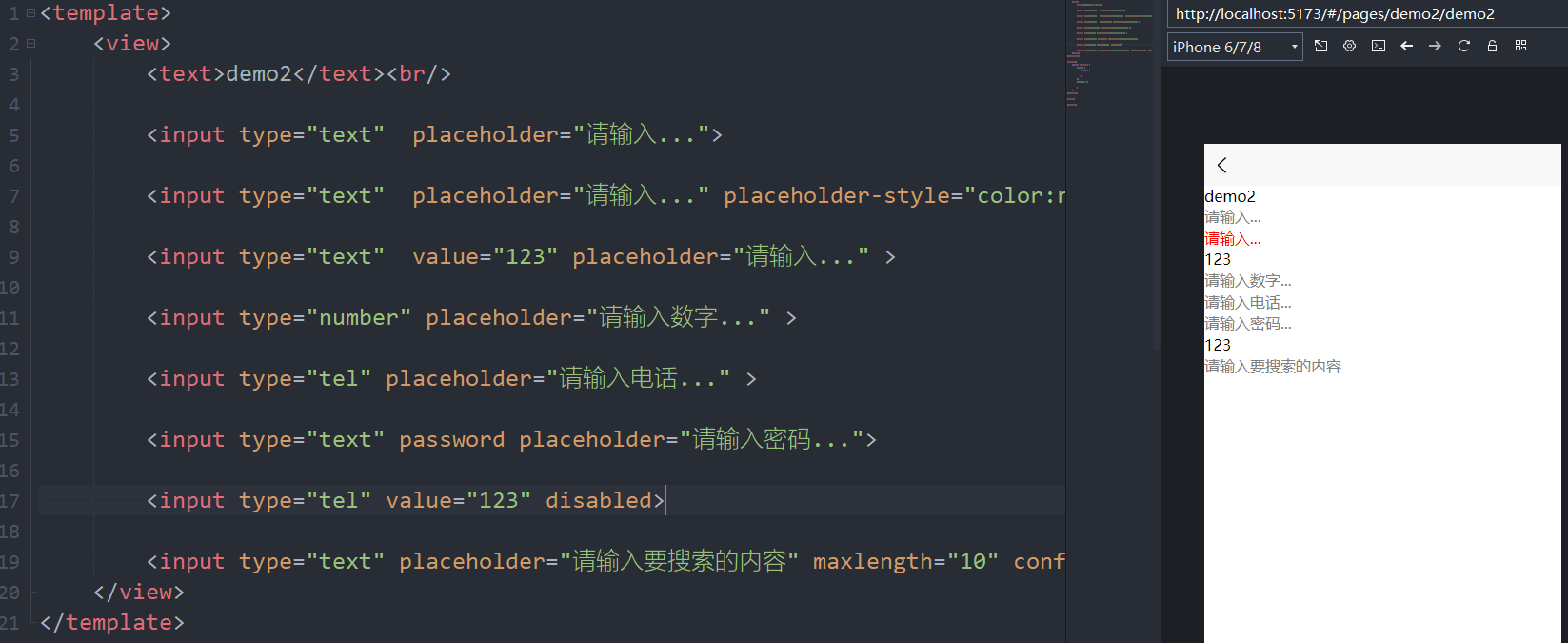
<view>
    <text>demo2</text><br/>

    <input type="text"  placeholder="请输入...">

    <input type="text"  placeholder="请输入..." placeholder-style="color:red">

    <input type="text"  value="123" placeholder="请输入..." >

    <input type="number" placeholder="请输入数字..." >

    <input type="tel" placeholder="请输入电话..." >

    <input type="text" password placeholder="请输入密码...">

    <input type="tel" value="123" disabled>

    <input type="text" placeholder="请输入要搜索的内容" maxlength="10" confirm-type="search">
</view>
checkbox组件
1、简单示例
实现双向绑定
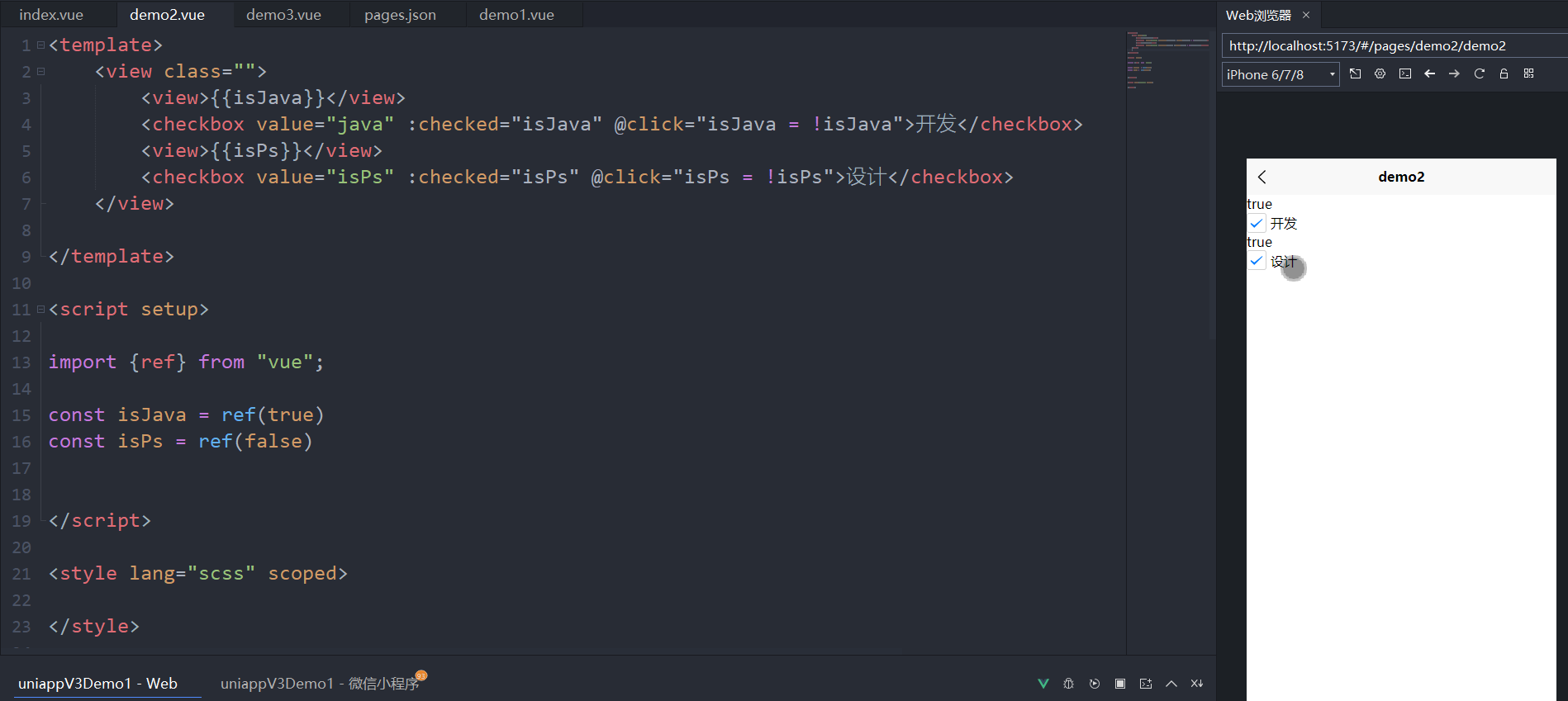
<template>
	<view class="">
		<view>{{isJava}}</view>
		<checkbox value="java" :checked="isJava" @click="isJava = !isJava">
            开发
        </checkbox>
		<view>{{isPs}}</view>
		<checkbox value="isPs" :checked="isPs" @click="isPs = !isPs">
            设计
        </checkbox>
	</view>

</template>

<script setup>

import {ref} from "vue";

const isJava = ref(true)
const isPs = ref(false)
</script>
2、简单案例2
实现双向绑定
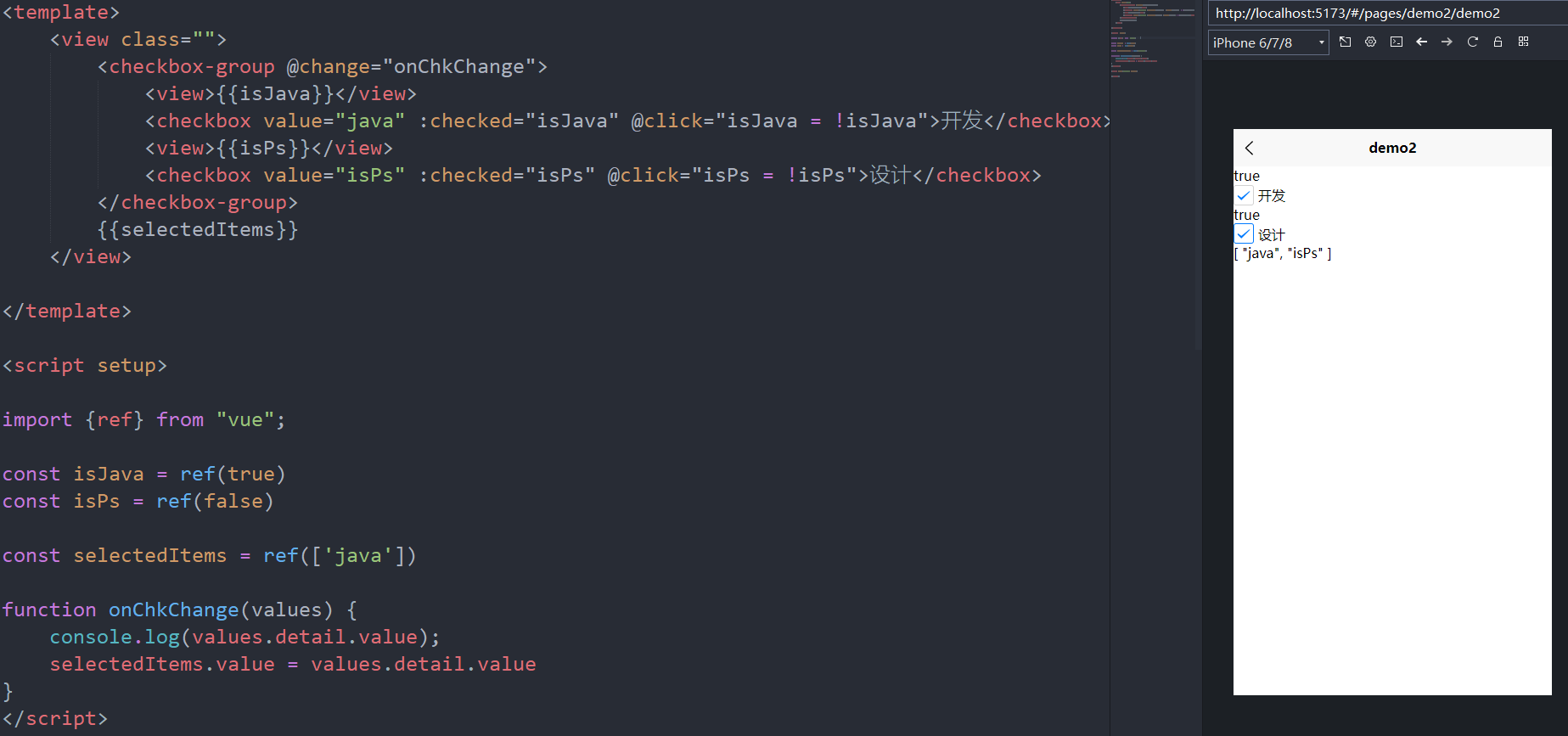
<template>
    <view class="">

        <checkbox-group @change="onChkChange">

            <view>{{isJava}}</view>

            <checkbox value="java" :checked="isJava" @click="isJava = !isJava">
                开发
            </checkbox>

            <view>{{isPs}}</view>

            <checkbox value="isPs" :checked="isPs" @click="isPs = !isPs">
                设计
            </checkbox>

        </checkbox-group>

        {{selectedItems}}
    </view>

</template>

<script setup>

    import {ref} from "vue";

    const isJava = ref(true)
    const isPs = ref(false)

    const selectedItems = ref(['java'])

    // 当多选框组中的多选框勾选状态发生变化时,触发该函数。
    function onChkChange(values) {

        console.log(values.detail.value); // 携带的参数{detail:[选中的value所组成的数组]}

        selectedItems.value = values.detail.value
    }

</script>
三、vue3组合式API快速上手
3.1.vue3的模板语法插值表达式用法
{{查指语法}}
3.2.使用ref定义响应式数据变量
用ref定义响应式数据
3.3.v-bind指令配合图片轮播案例
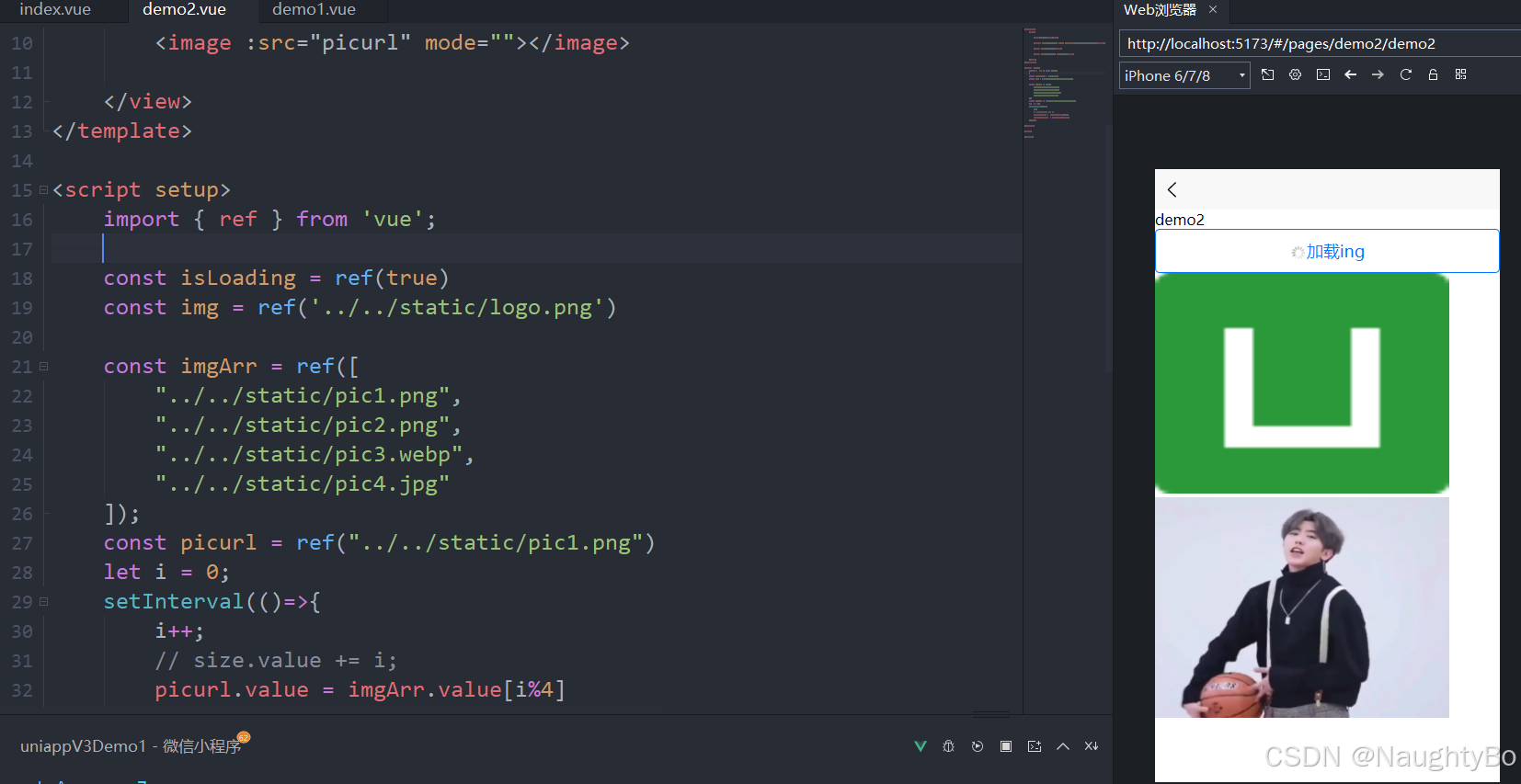
<template>
	<view>

		<text>demo2</text><br/>

		<button type="primary" plain :loading="isLoading">加载ing</button>

		<image :src="img"></image>

		<image :src="picurl" mode=""></image>

	</view>
</template>

<script setup>
	import { ref } from 'vue';

    // 绑定布尔值
	const isLoading = ref(true)

    // 绑定图片
	const img = ref('../../static/logo.png')

    // 绑定图片数组
	const imgArr = ref([
		"../../static/pic1.png",
		"../../static/pic2.png",
		"../../static/pic3.webp",
		"../../static/pic4.jpg"
	]);

    // 循环切换图片
    const picurl = ref("../../static/pic1.png")
	let i = 0;
	setInterval(()=>{
		i++;
		// size.value += i;
		picurl.value = imgArr.value[i%4]
		isActive.value = !isActive.value;
	},1000)

</script>

<style>

</style>
3.4.class类和style内联样式的绑定
<template>
	<view>

		<text>demo2</text><br/>

		<!-- 是否要用active这个样式 -->
		<view class="box" :class="{active:isActive}">
			v-bind指令
		</view>

		<!-- 使用哪个样式 -->
		<view class="box" :class="isActive ?'active':''"></view>

		<!-- 直接绑定样式 -->
		<view class="box" :style="{width: '300px',height:260+'px',fontSize:size+'px'}">
            内联样式
        </view>

	</view>
</template>

<script setup>
	import { ref } from 'vue';

	const isActive = ref(true);

</script>

<style>
.box{
	width: 200px;
	height: 200px;
	background: orange;
	font-size: 20px;
}
.active{
	background: green;
	color:#fff;
}
</style>
3.5.原生事件监听及组件内置事件处理
<template>
    <view class="box" @click="onClick" :style="{background:color}">
        {{num}}
    </view>
    <button type="primary" :loading="isLoading">登录</button>
    {{isLoading}}
    <switch @change="onChange"/>
</template>

<script setup>

    import {ref} from "vue";

    const num = ref(1);

    const color = ref("#fc359a");

    const isLoading = ref(false);

    function onClick(){
        num.value++;
        color.value = "#"+String(Math.random()).substring(3,9);
        console.log( String(Math.random()).substring(3,9) );
    }

    function onChange(e){
        isLoading.value = e.detail.value
    }
</script>

<style>
    .box{
        width: 200px;
        height: 200px;
        background: orange;
    }
</style>
3.6.创建自定义模板快速创建uniapp的vue3页面结构
<template>
	<view class="">
	</view>

</template>

<script setup>

import {ref} from "vue";

</script>

<style lang="scss" scoped>

</style>
3.7.v-if条件渲染及v-show的选择对比
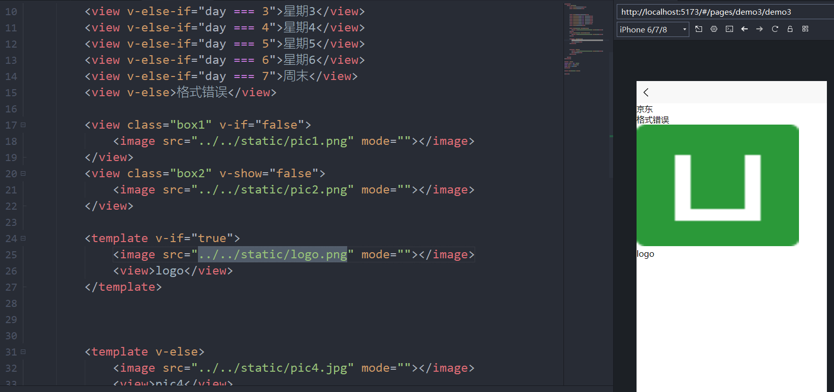
<template>
    <view class="">
        <view v-if="shop">京东</view>
        <view v-else>淘宝网</view>


        <view v-if="day===1">星期1</view>
        <view v-else-if="day === 2">星期2</view>
        <view v-else-if="day === 3">星期3</view>
        <view v-else-if="day === 4">星期4</view>
        <view v-else-if="day === 5">星期5</view>
        <view v-else-if="day === 6">星期6</view>
        <view v-else-if="day === 7">周末</view>
        <view v-else>格式错误</view>

        <view class="box1" v-if="false">
            <image src="../../static/pic1.png" mode=""></image>
        </view>
        <view class="box2" v-show="false">
            <image src="../../static/pic2.png" mode=""></image>
        </view>

        <template v-if="true">
            <image src="../../static/logo.png" mode=""></image>
            <view>logo</view>
        </template>

        <template v-else>
            <image src="../../static/pic4.jpg" mode=""></image>
            <view>pic4</view>
        </template>

    </view>
</template>

<script setup>
    import {ref} from "vue";
    const shop = ref(true);
    const day = ref(30);
</script>

<style lang="scss" scoped>

</style>
3.8.v-for列表渲染的用法
<template>
    <view class="out">
        <view class="box" v-for="(item,index) in 10" :key="index">box模块-{{index+1}}</view>

        <view v-for="item in nba" :key="item.id">
            球星:{{item.name}} - 球衣:{{item.num}}
        </view>
    </view>
</template>

<script setup>
    import {ref} from "vue";
    const nba = ref([
        {id:1,name:"乔丹",num:23},
        {id:2,name:"詹姆斯",num:6},
        {id:3,name:"科比",num:24},
    ])
</script>

<style lang="scss" scoped>

</style>
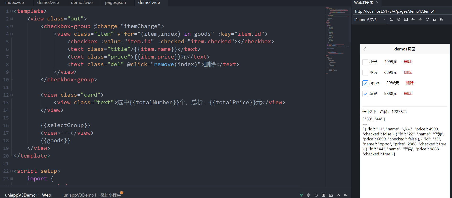
3.9.【购物车案例】for循环为什么使用key
购物车案例
<template>
	<view class="out">

        <!-- 当勾选或取消勾选时,会触发 change 事件 -->
		<checkbox-group @change="itemChange">
			<view class="item" v-for="(item,index) in goods" :key="item.id">
				<checkbox :value="item.id" :checked="item.checked"></checkbox>
				<text class="title">{{item.name}}</text>
				<text class="price">{{item.price}}元</text>
				<text class="del" @click="remove(index)">删除</text>
			</view>
		</checkbox-group>

		<view class="card">
			<view class="text">选中{{totalNumber}}个,总价:{{totalPrice}}元</view>
		</view>

		{{selectGroup}}
		<view>---</view>
		{{goods}}
	</view>
</template>

<script setup>

	import {computed,ref} from "vue";

	// 定义商品
	const goods = ref([
		{id: "11",name: "小米",price: 4999,checked: false},
		{id: "22",name: "华为",price: 6899,checked: false},
		{id: "33",name: "oppo",price: 2988,checked: false},
		{id: "44",name: "苹果",price: 9888,checked: false},
	])

	// 选中的商品id数组
	const selectGroup = ref([]);

	// 选中的商品的数量
	const totalNumber = computed(() => selectGroup.value.length)

	// 选中的商品的总价
	const totalPrice = computed(() => {
		return goods.value
            .filter(item => item.checked)
            .reduce((prev, curr) => prev + curr.price, 0)
	})

	// 从选中的商品中移除指定索引的商品
	function remove(index) {
		goods.value.splice(index, 1)
	}

	// 当勾选 或 取消勾选 时,触发
	function itemChange(e) {
        // 选中的商品id数组
		selectGroup.value = e.detail.value
        // 遍历所有商品,查看是否包含在已选中的商品id数组中
		goods.value.forEach(item => {
			item.checked = selectGroup.value.includes(item.id)
		})
	}
</script>

<style lang="scss" scoped>
	.out {
		padding: 10px;

		.item {
			padding: 10px 0;

			.price {
				margin-left: 30px;
			}

			.del {
				color: #c00;
				margin-left: 30px;
			}
		}

		.card {
			margin-top: 30px;
			border-top: 1px solid #eee;
			padding: 10px 0;
		}
	}
</style>
3.10.【小鸡案例】表单focus和blur事件用法&双向绑定
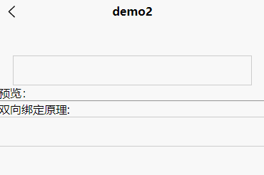
<template>


    <view class="out">

        <!-- v-model实现双向绑定 -->
        <!-- @confirm当输入软键盘的enter时 -->
        <input type="text"  @focus="isActive=true" @blur="isActive=false"
               v-model="iptValue"
               @confirm="onConfirm"/>

        <image src="../../static/chicken.gif" mode="" class="pic"
               :class="isActive?'active':''"></image>

    </view>

    <view>预览:{{iptValue}}</view>

	<hr/>

	<view>
		双向绑定原理:
		<input type="text" :value="iptValue2" @input="e=>iptValue2 = e.detail.value">
		{{iptValue2}}
	</view>
</template>

<script setup>
    import {ref} from "vue";

    const iptValue = ref("");
    const iptValue2 = ref("");

    const isActive = ref(false);

    function onConfirm(e){
        console.log(e);
    }
</script>

<style lang="scss" scoped>

	input{
	    border:1px solid #ccc;
	    height: 40px;
	    position: relative;
	    z-index: 2;
	    background: #fff;
	    padding:0 10px;
	}
    .out{
        padding:0 20px;
        margin-top:40px;
        position: relative;

        .pic{
            width: 24px;
            height: 24px;
            z-index: 1;
            position: absolute;
            top:0px;
            left:calc(50% - 12px);
            transition: top 0.3s;
        }
        .pic.active{
            top:-24px;
        }
    }
</style>
3.11.【热梗案例】知识点阶段性综合汇总
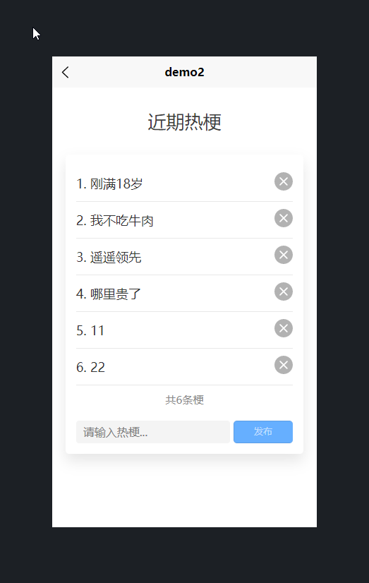
<template>

    <view class="title">
        近期热梗
    </view>

    <view class="out">

        <view class="list">

            <view class="row" v-for="(item,index) in lists" :key="item.id">

                <view class="text">{{index+1}}. {{item.title}}</view>

                <view class="close" @click="onClose(index)">
                    <icon type="clear" size="26"/>
                </view>

            </view>

        </view>

        <view class="count">
            共{{lists.length}}条梗
        </view>

        <view class="comment">

            <input type="text"
                   placeholder="请输入热梗..."
                   v-model="iptValut"
                   @confirm="onSubmit"/>
            <button size="mini"
                    type="primary"
                    :disabled="!iptValut.length"
                    @click="onSubmit">发布
            </button>
        </view>

    </view>
</template>

<script setup>
    import {ref} from "vue";
    const lists = ref([
        {id:111,title:"刚满18岁"},
        {id:222,title:"我不吃牛肉"},
        {id:333,title:"遥遥领先"},
        {id:444,title:"哪里贵了"}
    ])

    const iptValut = ref("");

    const onClose = function(index){
        lists.value.splice(index,1);
    }

    const onSubmit= function(){
        lists.value.push({id:Date.now(),title:iptValut.value});
        iptValut.value = '';
    }

</script>

<style lang="scss" scoped>
    .title{
        font-size: 26px;
        text-align: center;
        color:#3c3c3c;
        padding:30px 0 15px;
    }
    .out{
        width: 90vw;
        margin:15px auto;
        box-shadow: 0 10px 20px rgba(0,0,0,0.1);
        border-radius: 5px;
        padding:15px;
        box-sizing: border-box;
        .list{
            .row{
                padding:10px 0;
                border-bottom:1px solid #e8e8e8;
                display: flex;
                justify-content: space-between;
                align-items: center;
                font-size: 18px;
                color:#333;
                .text{
                    padding-right: 5px;
                    box-sizing: border-box;
                }
            }
        }
        .count{
            padding:10px 0;
            font-size: 15px;
            color:#888;
            text-align:center;
        }
        .comment{
            display: flex;
            margin-top:10px;
            input{
                flex:4;
                background: #f4f4f4;
                margin-right: 5px;
                height: 100%;
                height: 32px;
                border-radius: 4px;
                padding:0 10px;
                color:#333;
            }
            button{
                flex:1;
            }
        }
    }

</style>
3.12.computed计算属性用法及方法对比
<template>
	<view class="out">
		<input type="text" v-model="firstName" placeholder="请输入名"/>
		<input type="text" v-model="lastName" placeholder="请输入姓"/>

		<view>全称:{{fullName}}</view>
	</view>
</template>

<script setup>
import {ref,computed} from "vue";
const firstName = ref("迈克尔");
const lastName = ref("乔丹");

const fullName = computed(()=> {
	console.log("计算属性");
	return firstName.value +"-"+ lastName.value
})

console.log(fullName.value);

/*
const fullName = function(){
	console.log("方法");
	return firstName.value +"-"+ lastName.value;
}
*/

</script>

<style lang="scss" scoped>
.out{
	padding:20px;
	input{
		border:1px solid #ccc;
		height: 40px;
		padding:0 10px;
		margin:10px 0;
	}
}
</style>
3.13.【计价案例】计算属性配合循环遍历统计总价
拓展阅读:各种类型的for循环遍历,参看上面的购物车案例
3.14.watch和watchEffect监听的使用
拓展阅读:vue3中computed计算属性和watch监听的异同点
<template>
    <view class="out">
        <input type="text" v-model="firstName" placeholder="请输入名"/>
        <input type="text" v-model="lastName" placeholder="请输入姓"/>

        <view>全称:{{fullName}}</view>
    </view>
</template>

<script setup>
    import {ref,watch, watchEffect} from "vue";
    const firstName = ref("迈克尔");
    const lastName = ref("乔丹");

    const fullName = ref("")

    /*
    watch([firstName,lastName],([NfirstName,NlastName],[OfirstName,OlastName])=>{
        console.log(NfirstName,NlastName);
        console.log(OfirstName,OlastName);
    })

    watch(firstName,(nv,ol)=>{

    })
    watch(lastName,(nv,ol)=>{

    })
    */

    watchEffect(()=>{
        console.log(firstName.value,lastName.value);
    })


</script>

<style lang="scss" scoped>
    .out{
        padding:20px;
        input{
            border:1px solid #ccc;
            height: 40px;
            padding:0 10px;
            margin:10px 0;
        }
    }
</style>
四、深入vue组件及生命周期
4.1.uniapp创建组件和vue官方文档的差异对比
easycom
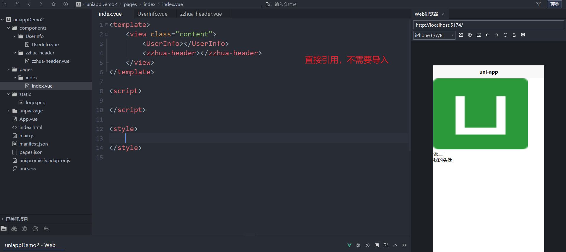
通过uni-app的easycom: 将组件引入精简为一步。只要组件安装在项目的 components 目录下,并符合 components/组件名称/组件名称.vue 目录结构。就可以不用引用、注册,直接在页面中使用。
easycom是自动开启的,不需要手动开启,有需求时可以在 pages.json 的 easycom 节点进行个性化设置,详见。
uni-app 搭建了组件的插件市场,有很多现成的组件,若下载符合components/组件名称/组件名称.vue目录结构的组件,均可直接使用。uni-app插件市场
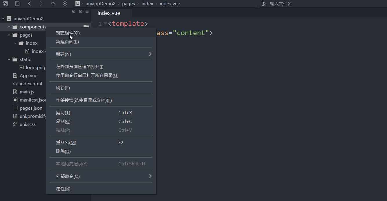
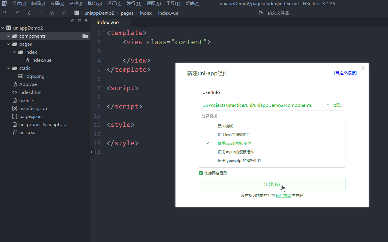
1、新建项目,在项目目录下,创建components文件夹(必须叫这个名字)
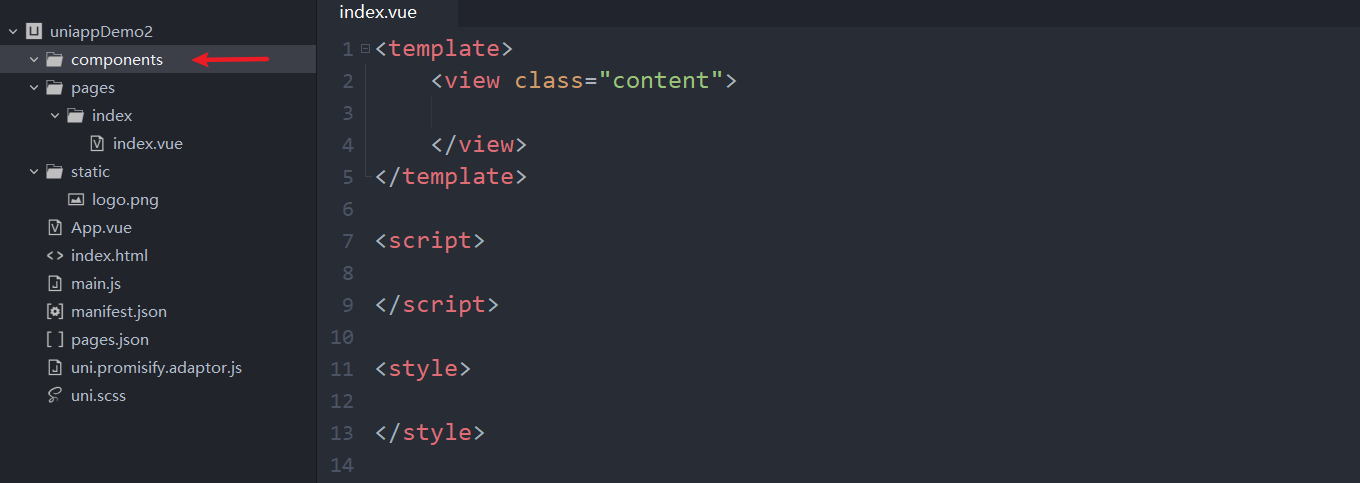
2、新建组件(这里会出现新建组件)
3、创建UserInfo组件 和 zzhua-header组件
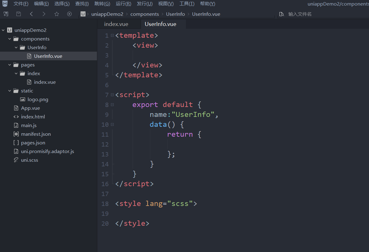
然后,自行添加html代码
4、在index.vue中直接使用,不需要导入
4.2.在组件中通过Props进行数据传递
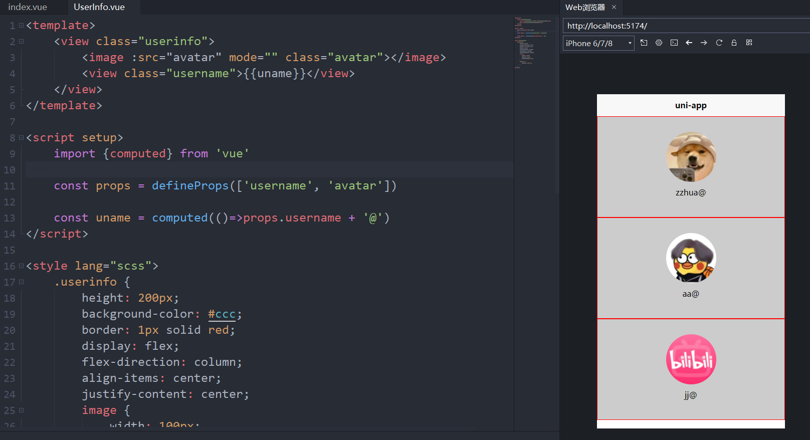
index.vue
<template>
	<view class="content">
		<UserInfo username="zzhua"avatar="../../static/pic1.jpg"></UserInfo>
		<UserInfo username="aa" avatar="../../static/pic2.jpg"></UserInfo>
		<UserInfo :username="uname" avatar="../../static/pic3.jpg"></UserInfo>
	</view>
</template>

<script setup>
	import {ref} from 'vue'

    const uname = ref('jj')
</script>

<style>

</style>
UserInfo.vue
<template>
	<view class="userinfo">
		<image :src="avatar" mode="" class="avatar"></image>
		<view class="username">{{uname}}</view>
	</view>
</template>

<script setup>
	import {computed} from 'vue'

	const props = defineProps(['username', 'avatar'])

	const uname = computed(()=>props.username + '@')
</script>

<style lang="scss">
	.userinfo {
		height: 200px;
		background-color: #ccc;
		border: 1px solid red;
		display: flex;
		flex-direction: column;
		align-items: center;
		justify-content: center;
		image {
			width: 100px;
			height: 100px;
			border-radius: 50%;
		}
		.username {
			padding: 10px 0;
		}
	}
</style>
4.3.Prop校验与prop默认值用法及循环遍历数组对象
props设置默认值
<template>
	<view class="content">
		<UserInfo username="zzhua" avatar="../../static/pic3.jpg"></UserInfo>
		<UserInfo ></UserInfo>
	</view>
</template>
<template>
    <view class="userinfo">
        <image :src="avatar" mode="" class="avatar"></image>
        <view class="username">{{uname}}</view>
    </view>
</template>

<script setup>
    import {computed} from 'vue'

    const props = defineProps({
        username: {
            type: String,
            default: '匿名'
        },
        avatar: {
            type: String,
            default: '../../static/logo.png'
        }
    })

    const uname = computed(()=>props.username + '@')
</script>

<style lang="scss">
    .userinfo {
        height: 200px;
        background-color: #ccc;
        border: 1px solid red;
        display: flex;
        flex-direction: column;
        align-items: center;
        justify-content: center;
        image {
            width: 100px;
            height: 100px;
            border-radius: 50%;
        }
        .username {
            padding: 10px 0;
        }
    }
</style>
循环遍历数组对象
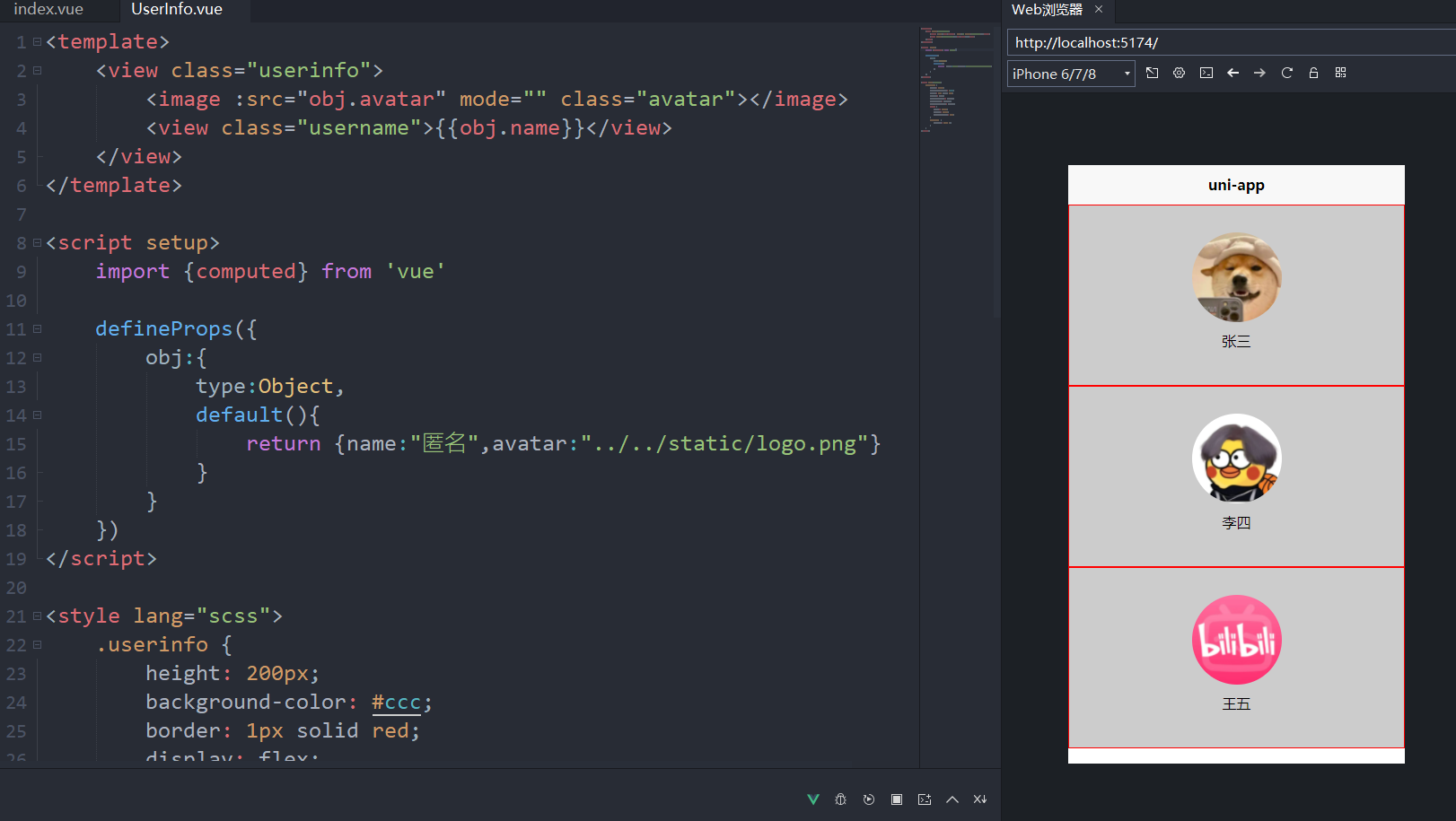
// index.vue组件
<template>
	<view class="content">
		<UserInfo v-for="(item,index) in userinfo" :obj="item"></UserInfo>
	</view>
</template>

<script setup>
	import {ref} from "vue";
	const userinfo = ref([
		{name:"张三",avatar:"../../static/pic1.jpg"},
		{name:"李四",avatar:"../../static/pic2.jpg"},
		{name:"王五",avatar:"../../static/pic3.jpg"},
	])
</script>

<style>

</style>
// UserInfo组件
<template>
    <view class="userinfo">
        <image :src="obj.avatar" mode="" class="avatar"></image>
        <view class="username">{{obj.name}}</view>
    </view>
</template>

<script setup>
    import {computed} from 'vue'

    defineProps({
        obj:{
            type:Object,
            default(){
                return {name:"匿名",avatar:"../../static/logo.png"}
            }
        }
    })
</script>

<style lang="scss">
    .userinfo {
        height: 200px;
        background-color: #ccc;
        border: 1px solid red;
        display: flex;
        flex-direction: column;
        align-items: center;
        justify-content: center;
        image {
            width: 100px;
            height: 100px;
            border-radius: 50%;
        }
        .username {
            padding: 10px 0;
        }
    }
</style>
4.4.插槽Slots及具名插槽实现组件高度定制化
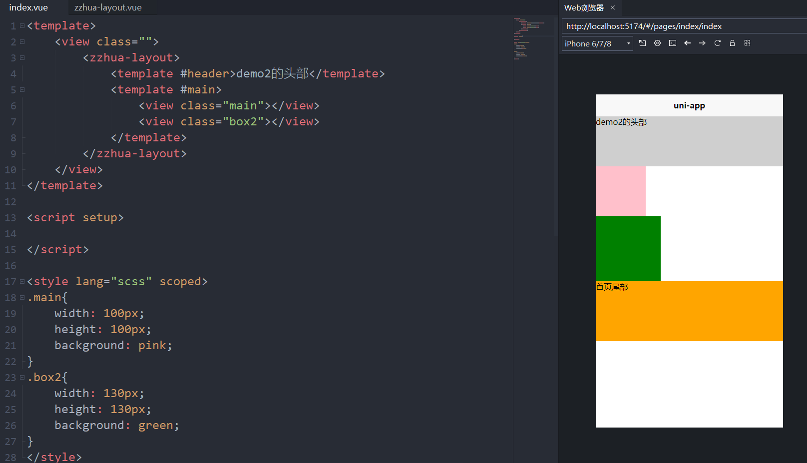
<template>
	<view class="">
		<zzhua-layout>
			<template #header>demo2的头部</template>
			<template #main>
				<view class="main"></view>
				<view class="box2"></view>
			</template>
		</zzhua-layout>
	</view>
</template>

<script setup>

</script>

<style lang="scss" scoped>
.main{
	width: 100px;
	height: 100px;
	background: pink;
}
.box2{
	width: 130px;
	height: 130px;
	background: green;
}
</style>
<template>
	<view class="layout">
		<view class="header">
			<slot name="header"></slot>
		</view>
		<view class="main">
			<slot name="main"></slot>
		</view>
		<view class="footer">
			<slot name="footer">首页尾部</slot>
		</view>
	</view>
</template>

<script setup>

</script>

<style lang="scss" scoped>
.layout{
	.header{
		height: 100px;
		background: #cfcfcf;
	}
	.main{
		min-height: 200px;
	}
	.footer{
		height: 120px;
		background: orange;
	}
}
</style>
4.5.组件中emit的声明触发事件
<template>
    <view class="">
        <zzhua-child @add="onAdd" @change="onChange"></zzhua-child>
        <view class="box" :style="{background:color,fontSize:size+'px'}">num:{{num}}</view>
    </view>
</template>

<script setup>
    import {ref} from "vue"
    const num = ref(0)
    const color = ref('#ccc');
    const size = ref(12)
    const onAdd = function(e){
        console.log(e);
        num.value = e;
        color.value ="#"+String(e).substring(3,6)
    }
    const onChange = function(e){
        console.log(e);
        size.value = e;
    }
</script>

<style lang="scss" scoped>
    .box{
        width: 200px;
        height: 200px;
    }
</style>
<template>
    <view>
        子组件
        <button @click="onClick">按钮</button>
        <!-- <button @click="$emit('add',Math.random())">按钮</button> -->

        <view>----</view>
        <input type="text" @input="onInput"/>
    </view>
</template>

<script setup>
    const emit = defineEmits(["add","change"])
    function onClick(){
        emit("add",Math.random())
    }
    function onInput(e){
        emit("change",e.detail.value)
    }
</script>

<style lang="scss" scoped>
    input{
        border:1px solid #cfcfcf;
        height: 40px;
    }
</style>
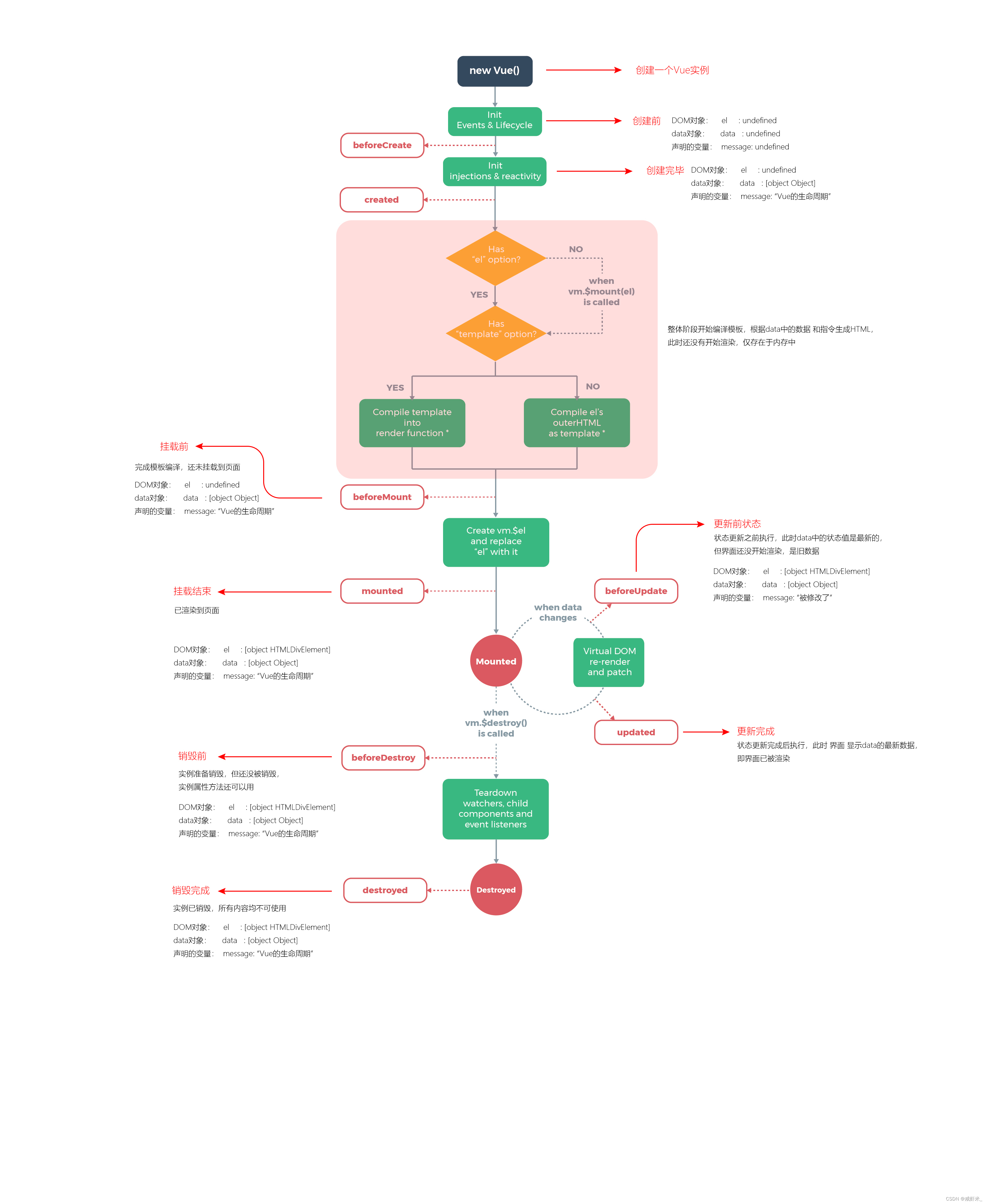
4.6.vue3组合式API中的组件的生命周期函数(钩子函数)
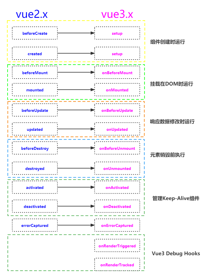
拓展阅读:uniappVue3版本中组件生命周期和页面生命周期的详细介绍
vue3生命周期函数
setup()是在beforeCreate和created之前运行的,所以可以用setup代替这两个钩子函数。
onBeforeMount() : 已经完成了模板的编译,但是组件还未挂载到DOM上的函数。
onMounted() : 组件挂载到DOM完成后执行的函数。
onBeforeUpdate(): 组件更新之前执行的函数。
onUpdated(): 由于数据更改导致的虚拟 DOM 重新渲染和打补丁,在这之后会调用该函数。
onBeforeUnmount(): 在组件实例被卸载之前调用。
onUnmounted(): 组件卸载完成后执行的函数
onActivated(): 若组件实例是 缓存树的一部分,当组件被插入到 DOM 中时调用。
onDeactivated(): 若组件实例是 缓存树的一部分,当组件从 DOM 中被移除时调用。
onErrorCaptured(): 在捕获了后代组件传递的错误时调用。
注意:在uniapp组件中,onBeforeUpdate、onUpdated、onActivated、onDeactivated,H5支持,小程序无法使用。
Vue2与Vue3的对比
示例
<template>
    <view class="layout">
        <scroll-view scroll-x scroll-y="true" class="scroll" ref="scroll">
            <view></view>
        </scroll-view>
        <life-demo v-if="show"></life-demo>
    </view>
</template>

<script setup>
    import {onMounted, ref} from "vue";

    const scroll = ref(null);

    const show = ref(true);

    setTimeout(()=>{
        show.value = false
    },2000)

    console.log(scroll.value,"..."); // null ...

    onMounted(()=>{
        //  Proxy(Object) {__v_skip: true, $getMain: ƒ} ~~~
        console.log(scroll.value, "~~~");
    })

</script>

<style lang="scss" scoped>

</style>
<template>
    <view>
        子组件
    </view>
</template>

<script setup>
    import {onUnmounted} from "vue"
    onUnmounted(()=>{

        console.log("子组件被卸载了");
    })

</script>

<style lang="scss">

</style>
4.7.使用defineExpose暴漏子组件的属性及方法
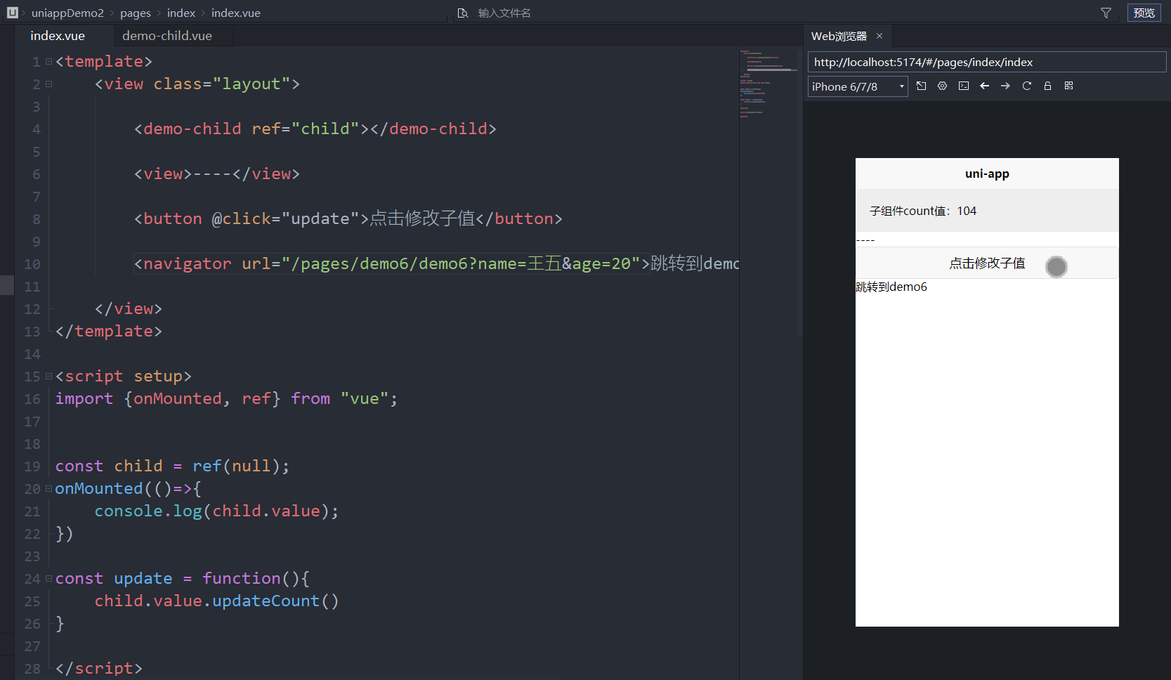
<template>
    <view class="layout">

        <demo-child ref="child"></demo-child>

        <view>----</view>

        <button @click="update">点击修改子值</button>

    </view>
</template>

<script setup>
    import {onMounted, ref} from "vue";


    const child = ref(null);
    onMounted(()=>{
        console.log(child.value);
    })

    const update = function(){
        child.value.updateCount()
    }

</script>

<style lang="scss" scoped>

</style>
<template>
    <view class="out">
        子组件count值:{{count}}
    </view>
</template>

<script setup>
    import {ref} from "vue"
    const count = ref(100)
    const updateCount = function(){
        count.value++
    }

    defineExpose({
        count,
        str:"咸虾米",
        updateCount
    })

</script>

<style lang="scss" scoped>
    .out{
        padding:20px;
        background: #eee;
    }
</style>
4.8.页面生命周期onLoad和onReady在vue3组合式api中的使用
onLoad&onReady
onLoad中可以拿到当前页面地址上的请求参数。
onReady中可以拿到ref标记的组件或dom。
index.vue
<template>
<view class="layout">
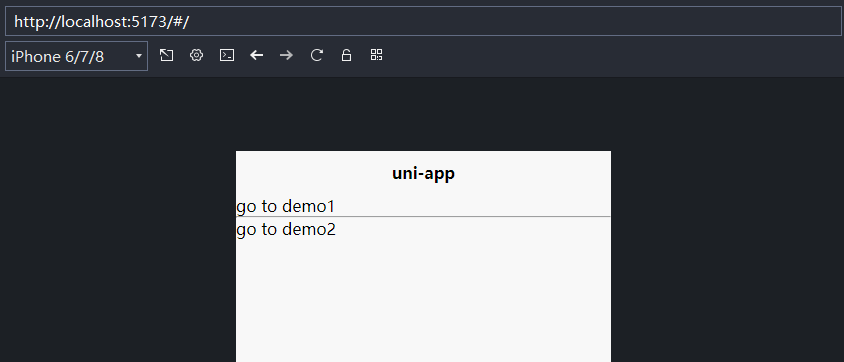
<navigator url="/pages/demo1/demo1">go to demo1</navigator>
<hr/>
<navigator url="/pages/demo2/demo2">go to demo2</navigator>
</view>
</template>
<script setup>
</script>
<style lang="scss" scoped>
</style>
demo1.vue
<template>
    <view class="">
        <view>demo1</view>
        <navigator url="/pages/demo2/demo2?name=张三&age=14">go to demo2</navigator>
    </view>

</template>

<script setup>


</script>

<style lang="scss" scoped>

</style>
demo2.vue
<template>
	<view class="">
		<view>demo2</view>
		姓名: {{ name }} - {{age}}

		<br/>

		<navigator url="/pages/index/index">go to index</navigator>

		<scroll-view ref="scrollRef">
			<view></view>
		</scroll-view>
	</view>

</template>

<script setup>

import {onBeforeMount, onMounted, ref} from "vue"
import {onLoad, onReady, onShow ,onHide, onUnload, onPageScroll} from "@dcloudio/uni-app"

const name = ref('unkonwn')
const age = ref(null)

const scrollRef = ref(null)

onLoad((e)=>{
	console.log("demo2-onload函数");
	console.log("demo2-onload函数",e); // 当前页面地址上的?后面的请求参数, 即跳转前页面传过来的参数
	if(e.name) {
		name.value = e.name
	}
	if(e.age) {
		age.value = e.age
	}

	console.log(scrollRef.value,'demo2-onLoad函数'); // 这里拿不到 scrollRef
})

onReady(()=>{ // 类似于onMounted
	console.log('demo2-onReady函数');
	console.log(scrollRef.value,'demo2-onReady'); // 这里能拿到 scrollRef
})


</script>
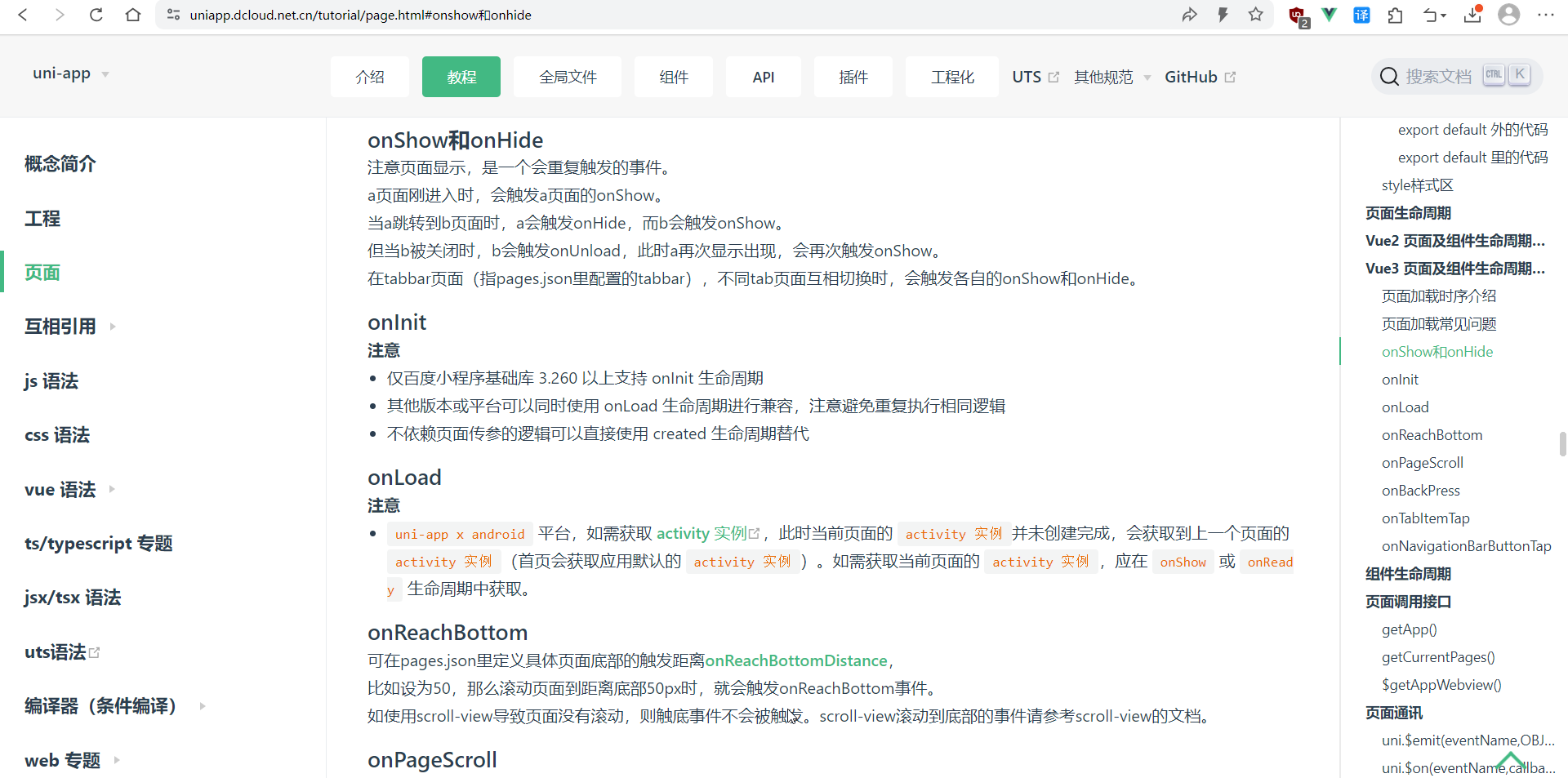
4.9.onShow和onHide钩子的对比和执行顺序
不包含组件的页面:onLoad > onShow > onReady(其中,只有onReady中一定能拿到dom)
包含组件的页面:onLoad > onShow > onBeforeMount > onReady > onMounted
页面跳转钩子执行示例
跳转步骤:index->demo1->demo2->demo1->demo2->index->demo2
注意到:
1、如果是点返回,那么前往页面的onLoad不会再调用
2、onShow会在页面前往任何页面都会调用
# 1.访问应用
App Launch
App Show

# 2.切到其它页面或tab
App Hide
App Show

# 3. 进入到demo1
demo1-onLoad函数
demo1-onShow函数
demo1-onShow函数 null
demo1-onBeforeMount函数
demo1-onReady函数
demo1-onReady函数 Proxy(Object) {…}
demo1-onMounted函数

# 4. 进入到demo2
demo1-onHide函数
demo2-onload函数
demo2-onload函数 {name: '张三', age: '14'}
demo2-onLoad函数 null
demo2-onShow函数
demo2-onShow函数 null
demo2-onReady函数
demo2-onReady函数 Proxy(Object) {__v_skip: true, $getMain: ƒ}

# 5. 回到demo1
demo1-onShow函数
demo1-onShow函数 Proxy(Object) {…}
demo2-onUnload函数
demo2-onUnload函数 Proxy(Object) {__v_skip: true, $getMain: ƒ}

# 6. 再次进入到demo2
demo1-onHide函数
demo2-onload函数
demo2-onload函数 {name: '张三', age: '14'}
demo2-onLoad函数 null
demo2-onShow函数
demo2-onShow函数 null
demo2-onReady函数
demo2-onReady函数 Proxy(Object) {__v_skip: true, $getMain: ƒ}

# 7.进入到index
无任何触发

# 8. 再次进入到demo2
demo2-onload函数
demo2-onload函数 {}
demo2-onLoad函数 null
demo2-onShow函数
demo2-onShow函数 null
demo2-onReady函数
demo2-onReady函数 Proxy(Object) {__v_skip: true, $getMain: ƒ}
App.vue
<script>
	export default {
		onLaunch: function() {
			console.log('App Launch')
		},
		onShow: function() {
			console.log('App Show')
		},
		onHide: function() {
			console.log('App Hide')
		}
	}
</script>

<style>
	/*每个页面公共css */
</style>
index.vue
<template>
	<view class="layout">

		<navigator url="/pages/demo1/demo1">go to demo1</navigator>
		<hr/>
		<navigator url="/pages/demo2/demo2">go to demo2</navigator>

	</view>
</template>
demo1.vue
<template>
	<view class="">
		<view ref="viewRef">demo1</view>
		<navigator url="/pages/demo2/demo2?name=张三&age=14">go to demo2</navigator>


	</view>

</template>

<script setup>
	import {onBeforeMount, onMounted, ref} from "vue"
	import {onLoad, onReady, onShow ,onHide, onUnload, onPageScroll} from "@dcloudio/uni-app"

	const viewRef = ref(null)

	onLoad(()=>{
		console.log('demo1-onLoad函数');
	})

	onUnload(()=>{
		console.log('demo1-onUnload函数');
		console.log('demo1-onUnload函数', scrollRef.value);
	})

	onReady(()=>{
		console.log('demo1-onReady函数');
		console.log('demo1-onReady函数', viewRef.value);
	})

	onShow(()=>{
		console.log('demo1-onShow函数');
		console.log('demo1-onShow函数', viewRef.value);
	})

	onHide(()=>{
		console.log('demo1-onHide函数');
	})

	onBeforeMount(()=>{
		console.log('demo1-onBeforeMount函数');
	})

	onMounted(()=>{
		console.log('demo1-onMounted函数');
	})


</script>

<style lang="scss" scoped>

</style>
demo2.vue
<template>
	<view class="">
		<view>demo2</view>
		姓名: {{ name }} - {{age}}

		<br/>

		<navigator url="/pages/index/index">go to index</navigator>

		<scroll-view ref="scrollRef">
			<view></view>
		</scroll-view>

		<view v-for="i in 50">
			{{i}}
		</view>
	</view>

</template>

<script setup>

import {onBeforeMount, onMounted, ref} from "vue"
import {onLoad, onReady, onShow ,onHide, onUnload, onPageScroll} from "@dcloudio/uni-app"

const name = ref('unkonwn')
const age = ref(null)

const scrollRef = ref(null)

onLoad((e)=>{
	console.log("demo2-onload函数");
	console.log("demo2-onload函数", e); // 当前页面地址上的?后面的请求参数, 即跳转前页面传过来的参数
	console.log('demo2-onLoad函数', scrollRef.value); // 这里拿不到 scrollRef
	if(e.name) {
		name.value = e.name
	}
	if(e.age) {
		age.value = e.age
	}

})

onUnload(()=>{  // 与navigator组件的open-type:relauch 相关
	console.log('demo2-onUnload函数');
	console.log('demo2-onUnload函数', scrollRef.value);
})


onReady(()=>{ // 类似于onMounted
	console.log('demo2-onReady函数');
	console.log('demo2-onReady函数', scrollRef.value); // 这里能拿到 scrollRef
})

onShow(()=>{ // 类似于onMounted
	console.log('demo2-onShow函数');
	console.log('demo2-onShow函数', scrollRef.value); // 这里不一定能拿到 scrollRef
})

onPageScroll((scrollTop)=>{
	// 拿到滚动距离后, 就可以通过控制响应式数据来控制页面了
	console.log(scrollTop);
})
</script>

<style lang="scss" scoped>

</style>
4.10.onUnload页面卸载和onPageScroll监听页面滚动
见4.9的示例即可。
五、uniapp全局文件配置和API调用
5.1.响应式单位rpx及搭配使用UI产品工具
尺寸单位rpx
uni-app 支持的通用 css 单位包括 px、rpx
-
px 即屏幕像素
-
rpx 即响应式 px,一种根据屏幕宽度自适应的动态单位。以 750 宽的屏幕为基准,750rpx 恰好为屏幕宽度。屏幕变宽,rpx 实际显示效果会等比放大,但在 App(vue2 不含 nvue) 端和 H5(vue2) 端屏幕宽度达到 960px 时,默认将按照 375px 的屏幕宽度进行计算,具体配置参考:rpx 计算配置 。
<template>
    <view class="layout">

        <view class="box">这是box</view>

        <view class="text">
            欢迎使用
        </view>

    </view>
</template>

<script setup>

</script>

<style lang="scss" scoped>
    .box{
        // width: 60%;
        // width: 40vw;
        // width: 400px;
        width: 130rpx;
        height: 130rpx;
        background: orange;
        font-size: 28rpx;
    }
    .text{
        font-size: 52rpx;
        color:$custom-color-1;

    }
</style>
5.2.@import导入css样式及scss变量用法与static目录
static目录
为什么需要static这样的目录?
@import导入样式
样式导入
创建common目录,并创建style.css
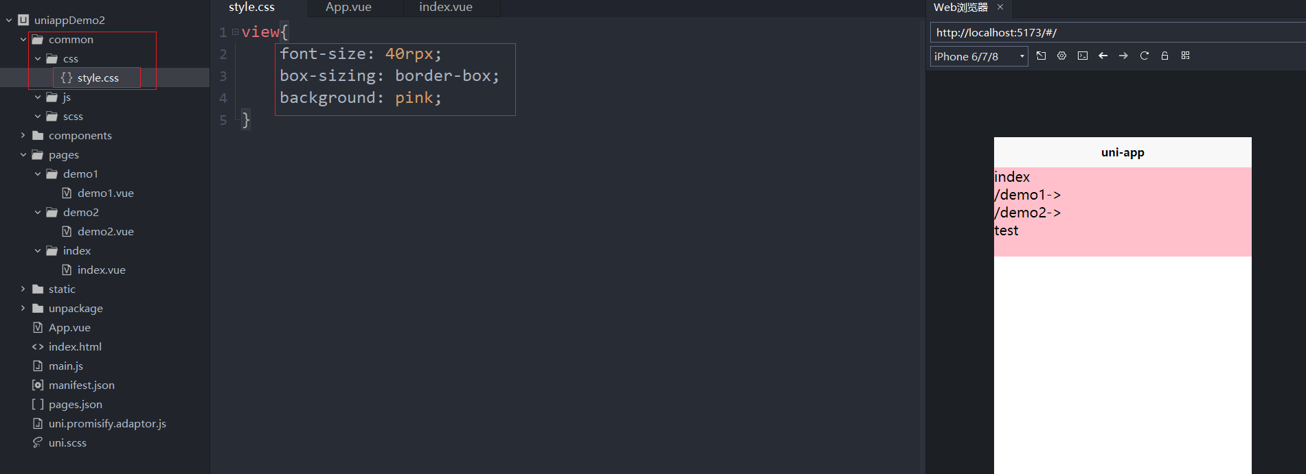
在App.vue中使用@import引入上面style.css样式,效果如上图所示
<script>
	export default {
		onLaunch: function() {
			console.log('App Launch')
		},
		onShow: function() {
			console.log('App Show')
		},
		onHide: function() {
			console.log('App Hide')
		}
	}
</script>

<style>
	/*每个页面公共css */
	@import "@/common/css/style.css";
	/* @import "./common/css/style.css"; */
	/* @import url('common/css/style.css'); */
	/* @import url('@/common/css/style.css'); */
</style>
index.vue
<template>
    <view class="layout">

        <view>index</view>

        <navigator url="/pages/demo1/demo1">/demo1-></navigator>
        <navigator url="/pages/demo2/demo2">/demo2-></navigator>

        <test></test>
    </view>
</template>

<script setup>


</script>

<style lang="scss" >

</style>
scss变量
在uniapp项目工程中,默认就有uni.scss文件,它会被自动引入,里面定义了很多变量,可以直接使用。
uni.scss
/**
 * 这里是uni-app内置的常用样式变量
 *
 * uni-app 官方扩展插件及插件市场(https://ext.dcloud.net.cn)上很多三方插件均使用了这些样式变量
 * 如果你是插件开发者,建议你使用scss预处理,并在插件代码中直接使用这些变量(无需 import 这个文件),方便用户通过搭积木的方式开发整体风格一致的App
 *
 */

/**
 * 如果你是App开发者(插件使用者),你可以通过修改这些变量来定制自己的插件主题,实现自定义主题功能
 *
 * 如果你的项目同样使用了scss预处理,你也可以直接在你的 scss 代码中使用如下变量,同时无需 import 这个文件
 */

/* 颜色变量 */

/* 行为相关颜色 */
$uni-color-primary: #007aff;
$uni-color-success: #4cd964;
$uni-color-warning: #f0ad4e;
$uni-color-error: #dd524d;

/* 文字基本颜色 */
$uni-text-color:#333;//基本色
$uni-text-color-inverse:#fff;//反色
$uni-text-color-grey:#999;//辅助灰色,如加载更多的提示信息
$uni-text-color-placeholder: #808080;
$uni-text-color-disable:#c0c0c0;

/* 背景颜色 */
$uni-bg-color:#ffffff;
$uni-bg-color-grey:#f8f8f8;
$uni-bg-color-hover:#f1f1f1;//点击状态颜色
$uni-bg-color-mask:rgba(0, 0, 0, 0.4);//遮罩颜色

/* 边框颜色 */
$uni-border-color:#c8c7cc;

/* 尺寸变量 */

/* 文字尺寸 */
$uni-font-size-sm:12px;
$uni-font-size-base:14px;
$uni-font-size-lg:16px;

/* 图片尺寸 */
$uni-img-size-sm:20px;
$uni-img-size-base:26px;
$uni-img-size-lg:40px;

/* Border Radius */
$uni-border-radius-sm: 2px;
$uni-border-radius-base: 3px;
$uni-border-radius-lg: 6px;
$uni-border-radius-circle: 50%;

/* 水平间距 */
$uni-spacing-row-sm: 5px;
$uni-spacing-row-base: 10px;
$uni-spacing-row-lg: 15px;

/* 垂直间距 */
$uni-spacing-col-sm: 4px;
$uni-spacing-col-base: 8px;
$uni-spacing-col-lg: 12px;

/* 透明度 */
$uni-opacity-disabled: 0.3; // 组件禁用态的透明度

/* 文章场景相关 */
$uni-color-title: #2C405A; // 文章标题颜色
$uni-font-size-title:20px;
$uni-color-subtitle: #555555; // 二级标题颜色
$uni-font-size-subtitle:26px;
$uni-color-paragraph: #3F536E; // 文章段落颜色
$uni-font-size-paragraph:15px;
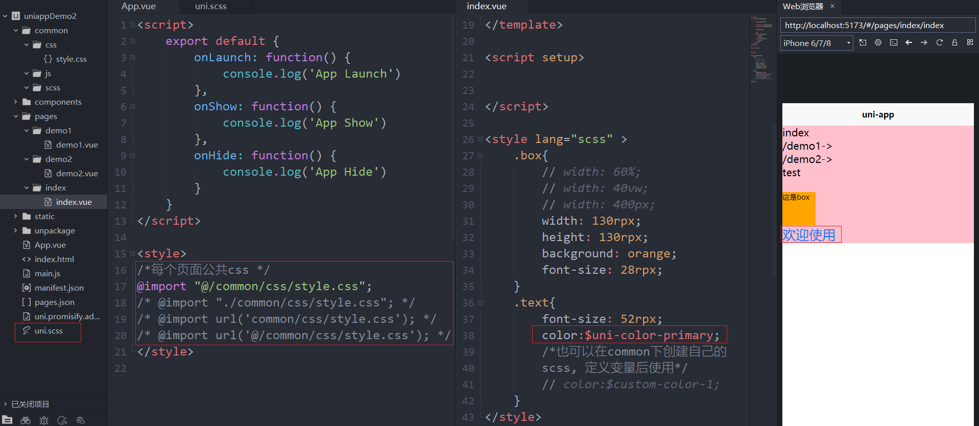
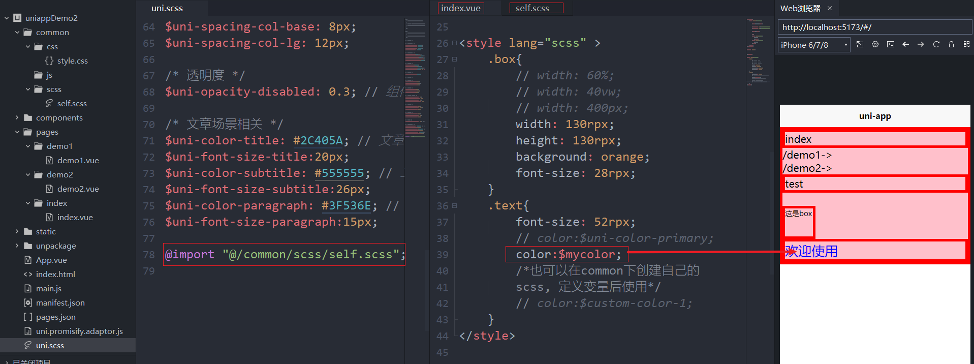
也可以在上述提到的common目录中,创建自己的scss,自定义css变量,然后使用@import引入后使用。(也可以在App.vue中直接使用@import导入该scss样式,在这里,在uni.scss中导入。注意,修改uni.scss,需要重启项目才会生效)
uni.scss
...
@import "@/common/scss/self.scss"; // 注意要加分号
self.scss
$mycolor: blue;

view{
	font-size: 40rpx;
	box-sizing: border-box;
	background: pink !important;
	border: 5px solid red;
}
在index.vue中使用self.scss中定义的变量
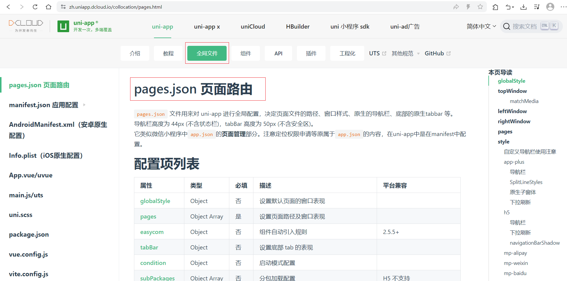
5.3.pages.json页面路由globalStyle的属性
{
	"pages": [ //pages数组中第一项表示应用启动页,参考:https://uniapp.dcloud.io/collocation/pages
		{
			"path": "pages/index/index",
			"style": {
				// "navigationBarTitleText": "uni-app"
			}
		}
	],
	"globalStyle": {
		// 导航栏文本颜色(微信必须是white或black)
		"navigationBarTextStyle": "white",
		// 导航栏文本内容(可以被页面配置中的navigationBarTitleText覆盖)
		"navigationBarTitleText": "zzhua",
		// 导航栏背景颜色
		"navigationBarBackgroundColor": "#2b9939",
		// 导航栏样式,仅支持 default/custom。custom即取消默认的原生导航栏
		// "navigationStyle": "custom"
		// 必须要开启下拉刷新,下拉时可以看到(仅限微信小程序能够看到背景色)
		"backgroundColor": "#000",
		// 下拉时loading的样式,仅支持dark/light
		"backgroundTextStyle": "light",
		// 是否开启下拉刷新
		"enablePullDownRefresh": true,
		// 页面上拉触底事件触发时距页面底部距离,单位只支持px,详见页面生命周期:onReachBottom
		"onReachBottomDistance": 300

	},
	"uniIdRouter": {}
}
onReachBottom触底监听
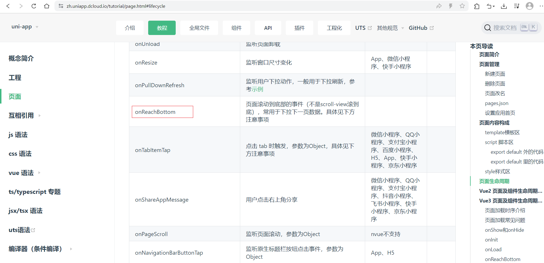
在pages.json中globalStyle中设置onReachBottomDistance定义距离页面底部距离,当页面滚动到底部距离小于等于这个距离时,触发onReachBottom事件。
<template>
    <view class="content">
        <image class="logo" src="/static/logo.png"></image>
        <view v-for="item in num">
            {{item}}
        </view>
    </view>
</template>

<script setup>

    import {ref} from 'vue'

    import {onReachBottom} from '@dcloudio/uni-app'

    const num  = ref(100)

    onReachBottom(()=>{
        console.log('触底了...');
    })
</script>

<style>
    .content {
        display: flex;
        flex-direction: column;
        align-items: center;
        justify-content: center;
    }

    .logo {
        height: 200rpx;
        width: 200rpx;
        margin-top: 200rpx;
        margin-left: auto;
        margin-right: auto;
        margin-bottom: 50rpx;
    }

    .text-area {
        display: flex;
        justify-content: center;
    }

    .title {
        font-size: 36rpx;
        color: #8f8f94;
    }
</style>
5.4.pages设置页面路径及窗口表现
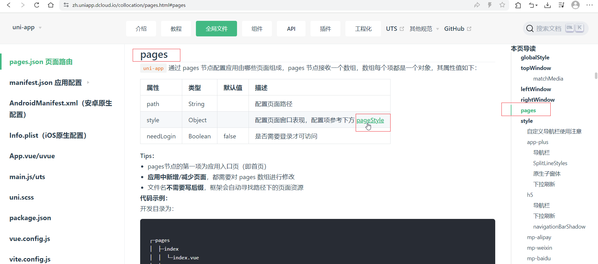
{
	"pages": [ // pages数组中第一项表示应用启动页,
               // 参考:https://uniapp.dcloud.io/collocation/pages
		{
			"path": "pages/index/index",
			"style": {
				"navigationBarTitleText": "uni-app"
			}
		},
		{
			"path" : "pages/classify/classify",
			"style" :
			{
				// 1. 覆盖globalStyle中定义的全局样式
				// 2. pages数组中第一项表示应用启动页
				"navigationBarTextStyle": "black",
				"navigationBarTitleText" : "分类",
				"navigationBarBackgroundColor": "#e8dbd5",
				"enablePullDownRefresh": true
			}
		}


	],
	"globalStyle": {
		// 导航栏文本颜色(微信必须是white或black)
		"navigationBarTextStyle": "white",
		// 导航栏文本内容(可以被页面配置中的navigationBarTitleText覆盖)
		"navigationBarTitleText": "zzhua",
		// 导航栏背景颜色
		"navigationBarBackgroundColor": "#2b9939",
		// 导航栏样式,仅支持 default/custom。custom即取消默认的原生导航栏
		// "navigationStyle": "custom"
		// 必须要开启下拉刷新,下拉时可以看到(仅限微信小程序能够看到背景色)
		"backgroundColor": "#000",
		// 下拉时loading的样式,仅支持dark/light
		"backgroundTextStyle": "light",
		// 是否开启下拉刷新
		"enablePullDownRefresh": true,
		// 页面上拉触底事件触发时距页面底部距离,单位只支持px,详见页面生命周期:onReachBottom
		"onReachBottomDistance": 300

	},
	"uniIdRouter": {}
}
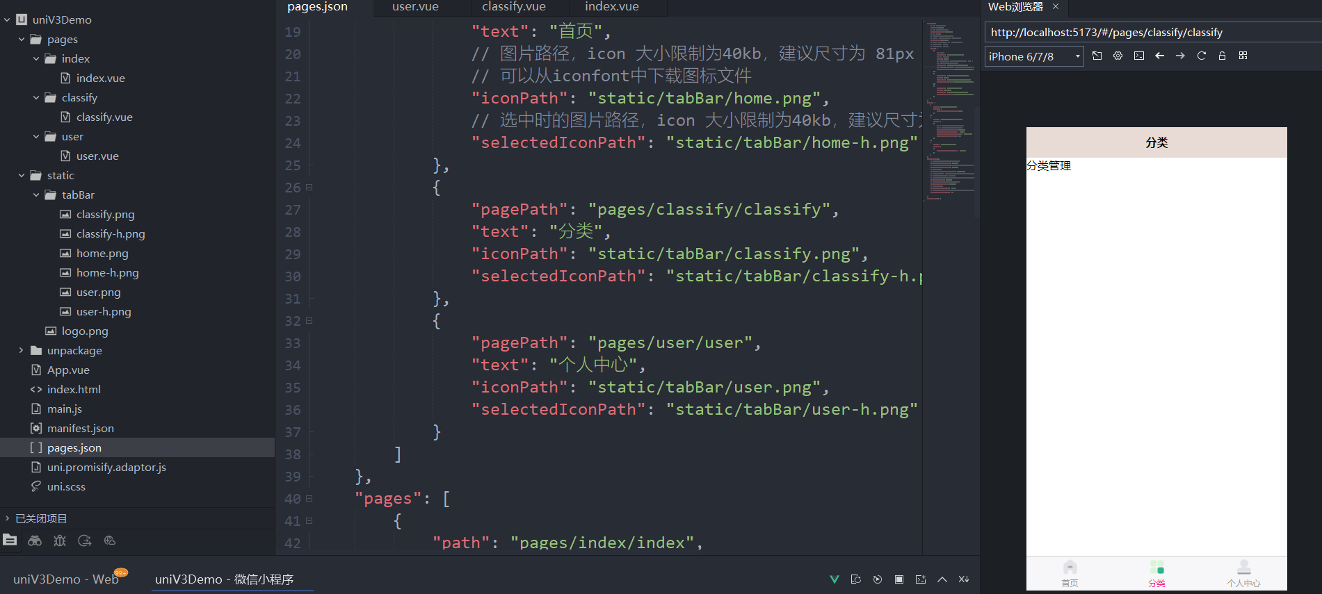
5.5.tabBar设置底部菜单选项及iconfont图标
tabBar
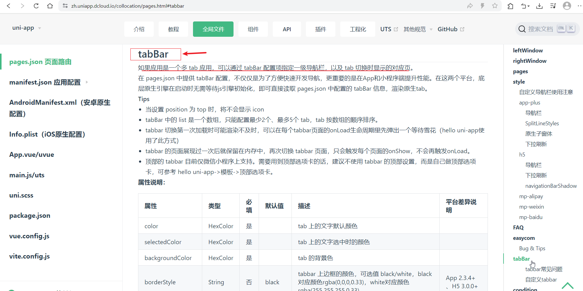
{
	"tabBar": {
		// tab 上的文字默认颜色
		"color": "#999",
		// tab 上的文字选中时的颜色
		"selectedColor": "#ff1493",
		// tab 的背景色
		// "backgroundColor":"#eee",
		// tabbar 上边框的颜色,可选值 black/white
		"borderStyle":"black",
		// 可选值 bottom、top, top 值仅微信小程序支持
		// "position": "top",
		// "fontSize": "16px",
		"list": [
			{
				// 页面路径
				"pagePath": "pages/index/index",
				// tab 上按钮文字
				"text": "首页",
				// 图片路径,icon 大小限制为40kb,建议尺寸为 81px * 81px
				// 可以从iconfont中下载图标文件
				"iconPath": "static/tabBar/home.png",
				// 选中时的图片路径,icon 大小限制为40kb,建议尺寸为 81px * 81px
				"selectedIconPath": "static/tabBar/home-h.png"
			},
			{
				"pagePath": "pages/classify/classify",
				"text": "分类",
				"iconPath": "static/tabBar/classify.png",
				"selectedIconPath": "static/tabBar/classify-h.png"
			},
			{
				"pagePath": "pages/user/user",
				"text": "个人中心",
				"iconPath": "static/tabBar/user.png",
				"selectedIconPath": "static/tabBar/user-h.png"
			}
		]
	},
	"pages": [
		{
			"path": "pages/index/index",
			"style": {
				"navigationBarTitleText": "首页"
			}
		},
		{
			"path" : "pages/classify/classify",
			"style" :
			{
				// 1. 覆盖globalStyle中定义的全局样式
				// 2. pages数组中第一项表示应用启动页
				"navigationBarTextStyle": "black",
				"navigationBarTitleText" : "分类",
				"navigationBarBackgroundColor": "#e8dbd5",
				"enablePullDownRefresh": true
			}
		},
		{
			"path" : "pages/user/user",
			"style" :
			{
				"navigationBarTitleText" : "个人中心"
			}
		}
	],
	"globalStyle": {
		// 导航栏文本颜色(微信必须是white或black)
		"navigationBarTextStyle": "white",
		// 导航栏文本内容(可以被页面配置中的navigationBarTitleText覆盖)
		"navigationBarTitleText": "zzhua",
		// 导航栏背景颜色
		"navigationBarBackgroundColor": "#2b9939",
		// 导航栏样式,仅支持 default/custom。custom即取消默认的原生导航栏
		// "navigationStyle": "custom"
		// 必须要开启下拉刷新,下拉时可以看到(仅限微信小程序能够看到背景色)
		"backgroundColor": "#000",
		// 下拉时loading的样式,仅支持dark/light
		"backgroundTextStyle": "light",
		// 是否开启下拉刷新
		"enablePullDownRefresh": true,
		// 页面上拉触底事件触发时距页面底部距离,单位只支持px,详见页面生命周期:onReachBottom
		"onReachBottomDistance": 300

	},
	"uniIdRouter": {}
}
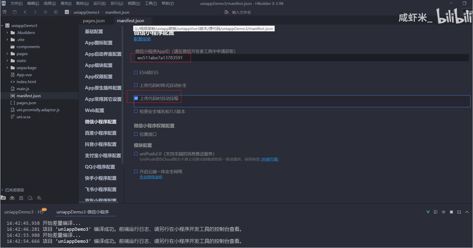
5.6.manifest.json配置和注册微信小程序appid
manifest.json 应用配置
manifest.json 文件是应用的配置文件,用于指定应用的名称、图标、权限等。HBuilderX 创建的工程此文件在根目录,CLI 创建的工程此文件在 src 目录。
注册小程序
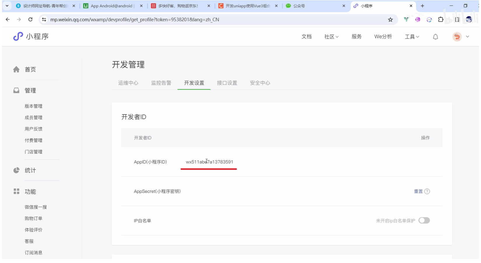
填写appid
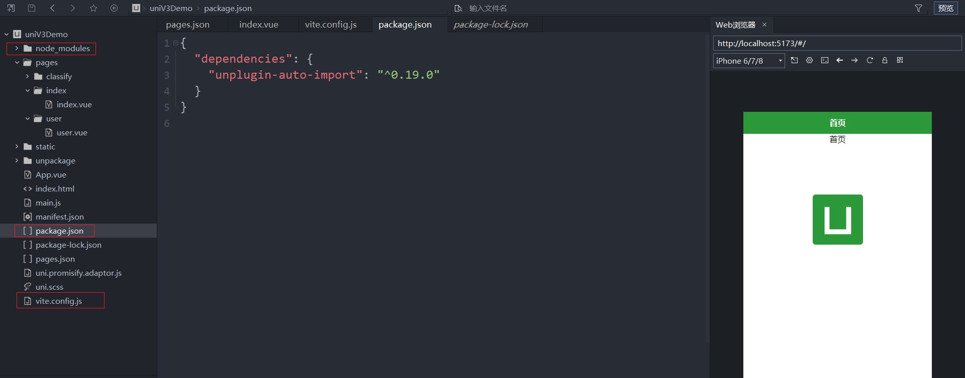
5.7.安装插件unplugin-auto-import自动导入vue和uniapp模块
使用说明:开发uniapp使用Vue3组合式API版本,如何实现从vue模块中自动导入
步骤
在常规开发uniappVue3的项目时,需要用到ref、computed等需要每次都手动import导入,使用unplugin-auto-import插件就可以免去每次导入的步骤了,在使用插件前的示例代码如下:
<script setup>
    import {onMounted, onUpdated, ref,computed} from "vue";
    import {onLoad,onReady} from "@dcloudio/uni-app"
    const count = ref(0);
    const state = ref(true)
    onLoad(()=>{
        console.log("onLoad,页面生命周期钩子");
    })
    onMounted(()=>{
        console.log("onMounted,组件生命周期函数");
    })
</script>
通过上面示例代码可以看到,每次使用生命周期函数时候,必须从vue模块导入之后才能使用,不然就会报错。
1.在项目命令行终端中执行如下代码(右键项目->使用命令行窗口打开所在目录,执行命令后,在项目目录下会多出来1个node_modules文件夹)
npm install unplugin-auto-import
2.根目录下创建vite.config.js,并拷贝下面的代码
import { defineConfig } from 'vite'
import uni from '@dcloudio/vite-plugin-uni'
import AutoImport from 'unplugin-auto-import/vite'

export default defineConfig({
    plugins: [
        uni(),
        // 自动导入配置
        AutoImport({
            imports:[
                // 预设
                'vue',
                'uni-app'
            ]
        })
    ]
})
3.去除vue和uniapp模块导入,项目可以正常运行
<script setup>
    const count = ref(0);
    const state = ref(true)
    onLoad(()=>{
        console.log("onLoad,页面生命周期钩子");
    })
    onMounted(()=>{
        console.log("onMounted,组件生命周期函数");
    })
</script>
5.8.uni-api交互反馈showToast的用法
uni.showToast()
OBJECT参数说明
| 参数 | 类型 | 必填 | 说明 | 平台差异说明 |
|---|---|---|---|---|
| title | String | 是 | 提示的内容,长度与 icon 取值有关。 | |
| icon | String | 否 | 图标,有效值详见下方说明,默认:success。 | |
| image | String | 否 | 自定义图标的本地路径(app端暂不支持gif) | App、H5、微信小程序、百度小程序、抖音小程序(2.62.0+) |
| mask | Boolean | 否 | 是否显示透明蒙层,防止触摸穿透,默认:false | App、微信小程序、抖音小程序(2.47.0+) |
| duration | Number | 否 | 提示的延迟时间,单位毫秒,默认:1500 | |
| position | String | 否 | 纯文本轻提示显示位置,填写有效值后只有 title 属性生效,且不支持通过 uni.hideToast 隐藏。有效值详见下方说明。 | App |
icon 值说明
| 值 | 说明 | 平台差异说明 |
|---|---|---|
| success | 显示成功图标,此时 title 文本在小程序平台最多显示 7 个汉字长度,App仅支持单行显示。 | 支付宝小程序无长度无限制 |
| error | 显示错误图标,此时 title 文本在小程序平台最多显示 7 个汉字长度,App仅支持单行显示。 | 支付宝小程序、快手小程序、抖音小程序、百度小程序、京东小程序、QQ小程序不支持 |
| fail | 显示错误图标,此时 title 文本无长度显示。 | 支付宝小程序、抖音小程序 |
| exception | 显示异常图标。此时 title 文本无长度显示。 | 支付宝小程序 |
| loading | 显示加载图标,此时 title 文本在小程序平台最多显示 7 个汉字长度。 | 支付宝小程序不支持 |
| none | 不显示图标,此时 title 文本在小程序最多可显示两 |
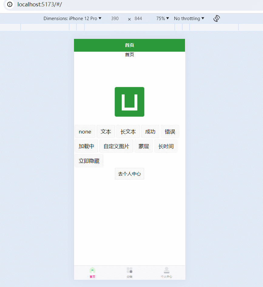
<template>
	<view class="content">
		<view>首页</view>
		<image class="logo" src="/static/logo.png"></image>
		<view class="btn-container">
			<button @click="none">none</button>
			<button @click="text">文本</button>
			<button @click="longtext">长文本</button>
			<button @click="success">成功</button>
			<button @click="error">错误</button>
			<button @click="loading">加载中</button>
			<button @click="pic">自定义图片</button>
			<button @click="mask">蒙层</button>
			<button @click="longtime">长时间</button>
			<button @click="hide">立即隐藏</button>

		</view>

		<!-- open-type默认是navigate, 它无法跳转到tabbar页面, 所以这里用reLaunch -->
		<navigator url="/pages/user/user" open-type="reLaunch" class="navigator">去个人中心</navigator>

	</view>
</template>

<script setup>

	function none() {
		uni.showToast({})
	}

	function text() {
		uni.showToast({title:'操作'})
	}

	function longtext() {
		// 小程序显示多行文本
		uni.showToast({title:'操作操作操作操作操作操作操作操作操作操作操作操作',icon:'none'})
	}

	function success() {
		uni.showToast({title:'操作成功',icon:'success'})
	}

	function error() {
		uni.showToast({title:'执行错误',icon:'error'})
	}

	function loading() {
		uni.showToast({title:'加载中',icon:'loading'})
	}

	function pic() {
		// 图片会自动适配;只能用相对路径;
		// uni.showToast({title:'自定义图片',image:'../../static/logo.png'})
		uni.showToast({title:'自定义图片',image:'../../static/xxmLogo.png'})
	}

	function mask() {
		uni.showToast({title:'蒙层',icon:'loading',mask:true})
	}

	function longtime() {
		uni.showToast({title:'长时间',duration: 10000})
	}

	function hide() {
		uni.hideToast()
	}

</script>

<style lang="scss">
	.content {
		display: flex;
		flex-direction: column;
		align-items: center;
		justify-content: space-around;
	}

	.btn-container {
		width: 100%;
		display: flex;
		flex-wrap: wrap;
		justify-content: flex-start;
		& > uni-button {
			margin: 5rpx;
		}
	}

	.logo {
		height: 200rpx;
		width: 200rpx;
		margin-top: 200rpx;
		margin-left: auto;
		margin-right: auto;
		margin-bottom: 50rpx;
	}

	.text-area {
		display: flex;
		justify-content: center;
	}

	.title {
		font-size: 36rpx;
		color: #8f8f94;
	}

	.navigator {
		border: 1rpx solid #dadada;
		border-radius: 4rpx;
		background-color: #f8f8f8;
		line-height: 75rpx;
		padding: 0 20rpx;
	}
</style>
5.9.showLoading加载和showModal模态框示例
uni.showLoading(OBJECT)
显示 loading 提示框, 需主动调用 uni.hideLoading 才能关闭提示框。
| 参数 | 类型 | 必填 | 说明 | 平台差异说明 |
|---|---|---|---|---|
| title | String | 是 | 提示的文字内容,显示在loading的下方 | |
| mask | Boolean | 否 | 是否显示透明蒙层,防止触摸穿透,默认:false | H5、App、微信小程序、百度小程序、抖音小程序(2.47.0+) |
uni.showLoading({
	title: '加载中',
    mask: true /* 这个如果要加的话, 要慎重, 一定要确保能关闭 */
});
uni.showModal(OBJECT)
显示模态弹窗,可以只有一个确定按钮,也可以同时有确定和取消按钮。类似于一个API整合了 html 中:alert、confirm。
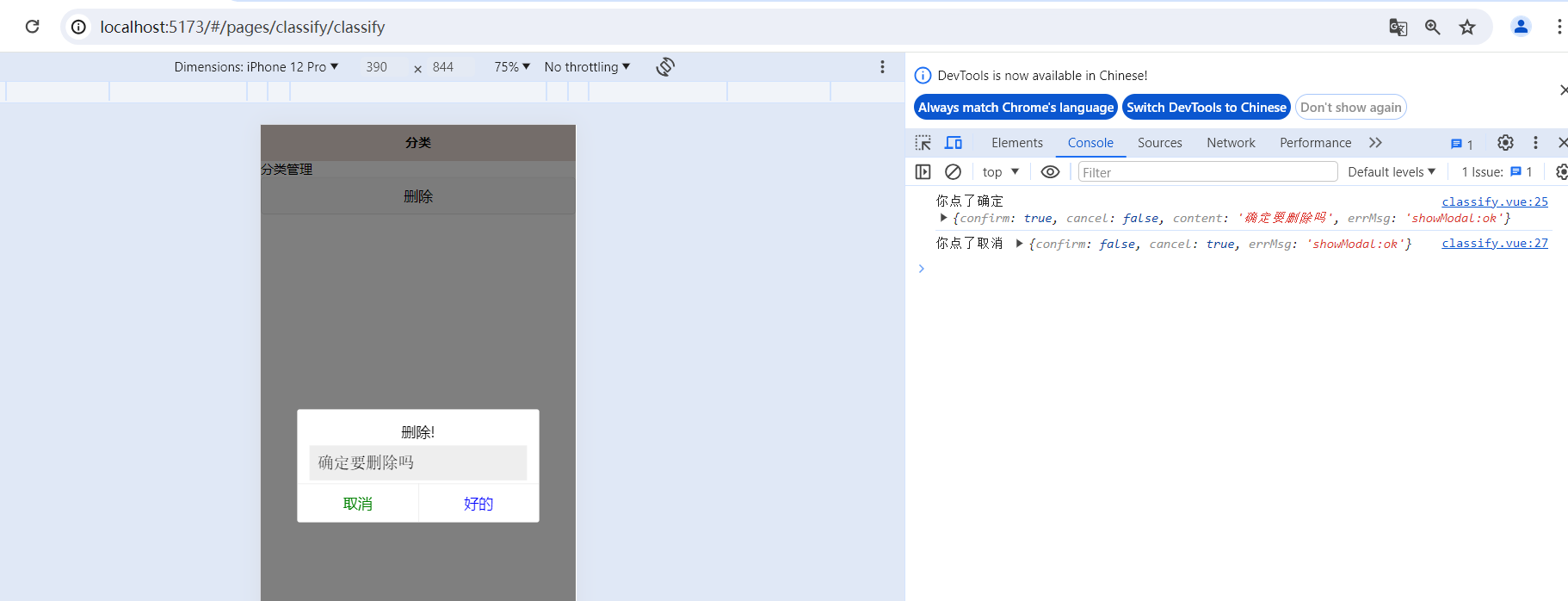
<template>
    <view class="">
        分类管理
        <button @click="remove">删除</button>
    </view>

</template>

<script setup>

    import {ref} from "vue";

    function remove() {
        uni.showModal({
            title: '删除!',
            content:'确定要删除吗',
            showCancel: true,
            cancelColor: 'green',
            confirmText:'好的',
            confirmColor:'blue',
            editable: true,
            placeholderText:'你要干啥?',
            success: function(res) {
                if(res.confirm) {
                    console.log('你点了确定', res);
                } else {
                    console.log('你点了取消', res);
                }
            }
        })
    }
</script>
5.10.showActionSheet从底部向上弹出操作菜单
uni.showActionSheet(OBJECT)
从底部向上弹出操作菜单
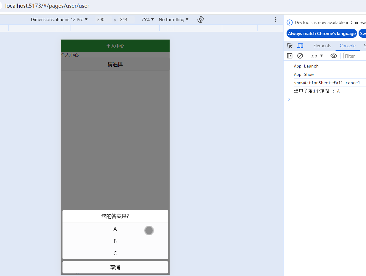
<template>
    <view class="">
        个人中心
        <button @click="showOptions">请选择</button>
    </view>

</template>

<script setup>

    const options = ref(['A', 'B', 'C'])
    function showOptions() {
        uni.showActionSheet({
            title:'您的答案是?',
            itemList: options.value,
            success: function (res) { // 点击任一选项时, 回调该函数
                console.log('选中了第' + (res.tapIndex + 1)
                            + '个按钮',':',options.value[res.tapIndex]);
            },
            fail: function (res) {    // 点击取消时, 回调该函数
                console.log(res.errMsg);
            }
        });

    }

</script>
5.11.动态设置页面导航条的样式
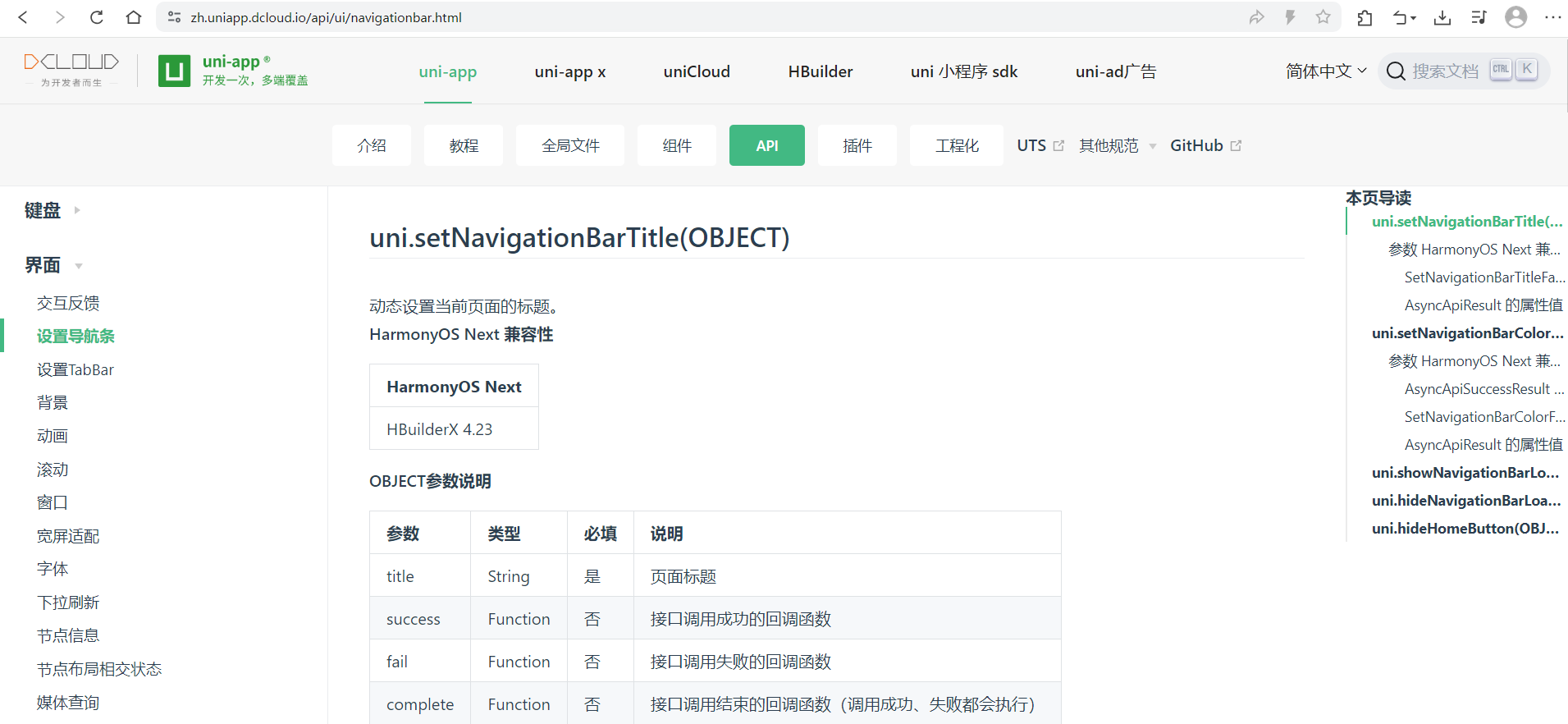
uni.setNavigationBarTitle(OBJECT)
动态设置当前页面的标题。
<template>
    <view class="">
        个人中心
    </view>

</template>

<script setup>

    // 动态设置导航栏标题
    // (如果需要在页面进入时设置标题,可以在onReady内执行,以避免被框架内的修改所覆盖。
    //  如果必须在onShow内执行需要延迟一小段时间)
    uni.setNavigationBarTitle({
        title:'zzhua的个人中心'
    })

    // 动态设置导航栏颜色
    uni.setNavigationBarColor({
        // 前景颜色值,包括按钮、标题、状态栏的颜色,仅支持 #ffffff 和 #000000
        frontColor:'#000000',
        // 背景颜色值,有效值为十六进制颜色
        backgroundColor:'#4cd964'
    })

    // 导航栏加载动画
    uni.showNavigationBarLoading()

    setTimeout(()=>{

        // 动态设置导航栏标题
        uni.setNavigationBarTitle({
            title:'zzh的个人中心'
        })

        // 关闭 导航栏加载动画
        uni.hideNavigationBarLoading()

    },2000)

</script>
uni.hideHomeButton(OBJECT)
隐藏返回首页按钮。
| App | HarmonyOS Next | H5 | 微信小程序 | 支付宝小程序 | 百度小程序 | 抖音小程序 | 飞书小程序 | QQ小程序 | 快手小程序 | 京东小程序 | 元服务 |
|---|---|---|---|---|---|---|---|---|---|---|---|
| x | x | x | √ | x | x | 1.48.0+ | x | 1.10.0+ | x | √ | x |
uni.hideHomeButton()
5.12.setTabBar设置TabBar和下拉刷新API
tabBar设置
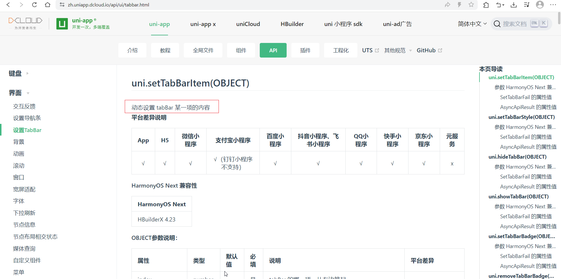
uni.setTabBarItem(OBJECT)
动态设置 tabBar 某一项的内容
| 属性 | 类型 | 默认值 | 必填 | 说明 | 平台差异 |
|---|---|---|---|---|---|
| index | number | 是 | tabBar 的哪一项,从左边算起 | ||
| text | String | 否 | tab 上的按钮文字 | ||
| iconPath | String | 否 | 图片路径,icon 大小限制为 40kb,建议尺寸为 81px * 81px,当 position 为 top 时,此参数无效。微信小程序 2.7.0+、支付宝小程序支持网络图片,其他平台暂不支持网络图片 | ||
| selectedIconPath | String | 否 | 选中时的图片路径,icon 大小限制为 40kb,建议尺寸为 81px * 81px ,当 position 为 top 时,此参数无效 | ||
| pagePath | String | 否 | 页面绝对路径,必须在 pages 中先定义,被替换掉的 pagePath 不会变成普通页面(仍然需要使用 uni.switchTab 跳转) | App(2.8.4+)、H5(2.8.4+) | |
| visible | Boolean | true | 否 | 该项是否显示 | App(3.2.10+)、H5(3.2.10+) |
| iconfont | Object | 否 | 字体图标,优先级高于 iconPath | App(3.4.4+) |
// App.vue
<script>
	export default {
		onLaunch: function() {
			console.log('App Launch')
            // 测试这里在微信小程序是可以的,但是h5会报错
			uni.setTabBarItem({
				index:1,
				text: '自定义'
			})
		},
		onShow: function() {
			console.log('App Show')
		},
		onHide: function() {
			console.log('App Hide')
		}
	}
</script>

<style>
	/*每个页面公共css */
</style>
<template>
	<view class="">
		个人中心
        <!-- 也可以这样动态修改 -->
		<button @click="changeTabbarTitle">改变第二个tabbar的标题</button>
	</view>

</template>

<script setup>

function changeTabbarTitle() {
	uni.setTabBarItem({
		index:1,
		text: 'halo'
	})
}
</script>
uni.setTabBarStyle(OBJECT)
动态设置 tabBar 的整体样式
| 属性 | 类型 | 默认值 | 必填 | 说明 |
|---|---|---|---|---|
| color | String | 否 | tab 上的文字默认颜色,HexColor | |
| selectedColor | String | 否 | tab 上的文字选中时的颜色,HexColor | |
| backgroundColor | String | 否 | tab 的背景色,HexColor | |
| backgroundImage | String | 否 | 图片背景。支持设置本地图片或创建线性渐变如,优先级高于 backgroundColor,仅 App 2.7.1+ 支持 |
<template>
    <view class="">
        个人中心
        <button @click="changeTabbarStyle">改变全部tabbar样式</button>
    </view>

</template>

<script setup>

    function changeTabbarStyle() {
        uni.setTabBarStyle({
            color: "cyan",
            selectedColor: "red"
        })
    }

</script>
uni.showTabBar(OBJECT)&uni.hideTabBar(OBJECT)
控制显示和隐藏tabBar
<template>
	<view class="">
		个人中心
		<button @click="hideTabBar">隐藏tabBar</button>
		<button @click="showTabBar">显示tabBar</button>
	</view>

</template>

<script setup>

function hideTabBar() {
	uni.hideTabBar()
}

function showTabBar() {
	uni.showTabBar()
}
</script>
uni.setTabBarBadge(OBJECT)
为 tabBar 某一项的右上角添加文本。
| 参数 | 类型 | 必填 | 说明 |
|---|---|---|---|
| index | Number | 是 | tabBar的哪一项,从左边算起 |
| text | String | 是 | 显示的文本,不超过 3 个半角字符 |
uni.removeTabBarBadge(OBJECT)
| 参数 | 类型 | 必填 | 说明 |
|---|---|---|---|
| index | Number | 是 | tabBar的哪一项,从左边算起 |
<template>
    <view class="">
        个人中心
        <button @click="msgCome">消息来了</button>
        <button @click="msgRead">消息已读</button>
    </view>

</template>

<script setup>

    function msgCome() {
        uni.setTabBarBadge({
            index: 1,
            // text: '', // 显示红点
            text: '999'  // 显示文本
        })
    }

    function msgRead() {
        uni.removeTabBarBadge({
            index:1
        })
    }
</script>

<style lang="scss" scoped>

</style>
uni.showTabBarRedDot(OBJECT)
显示 tabBar 某一项的右上角的红点。
| 参数 | 类型 | 必填 | 说明 |
|---|---|---|---|
| index | Number | 是 | tabBar的哪一项,从左边算起 |
uni.hideTabBarRedDot(OBJECT)
隐藏 tabBar 某一项的右上角的红点。
| 参数 | 类型 | 必填 | 说明 |
|---|---|---|---|
| index | Number | 是 | tabBar的哪一项,从左边算起 |
下拉刷新API
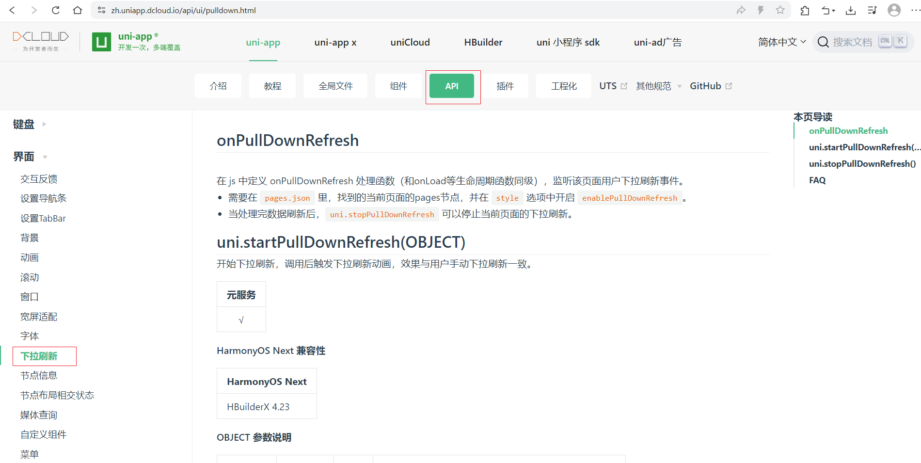
在 js 中定义 onPullDownRefresh 处理函数(和onLoad等生命周期函数同级),监听该页面用户下拉刷新事件。
- 需要在
pages.json里,找到的当前页面的pages节点,并在style选项中开启enablePullDownRefresh。 - 当处理完数据刷新后,
uni.stopPullDownRefresh可以停止当前页面的下拉刷新。
<template>
    <view class="content">
        <view>首页</view>
        <image class="logo" src="/static/logo.png"></image>
        <view class="btn-container">
            <button @click="startPd">开始下拉刷新</button>
            <button @click="stopPd">停止下拉刷新</button>
        </view>

    </view>
</template>

<script setup>

    onPullDownRefresh(()=>{
        console.log('下拉刷新...');
    })

    function startPd() {
        // 开始下拉刷新(api调用)
        uni.startPullDownRefresh()
    }

    function stopPd() {
        // 停止下拉刷新
        uni.stopPullDownRefresh()
    }


</script>
5.13.页面和路由API-navigateTo及页面栈getCurrentPages
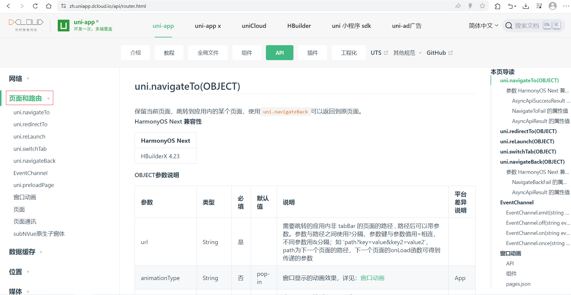
uni.navigateTo(OBJECT)
保留当前页面,跳转到应用内的某个页面,使用uni.navigateBack可以返回到原页面。
| 参数 | 类型 | 必填 | 默认值 | 说明 | 平台差异说明 |
| url | String | 是 | 需要跳转的应用内非 tabBar 的页面的路径 , 路径后可以带参数。参数与路径之间使用?分隔,参数键与参数值用=相连,不同参数用&分隔;如 ‘path?key=value&key2=value2’,path为下一个页面的路径,下一个页面的onLoad函数可得到传递的参数 | ||
| animationType | String | 否 | pop-in | 窗口显示的动画效果,详见:窗口动画 | App |
| animationDuration | Number | 否 | 300 | 窗口动画持续时间,单位为 ms | App |
| events | Object | 否 | 页面间通信接口,用于监听被打开页面发送到当前页面的数据。2.8.9+ 开始支持。 |
uni.redirectTo(OBJECT)
关闭当前页面,跳转到应用内的某个页面。
| 参数 | 类型 | 必填 | 说明 |
|---|---|---|---|
| url | String | 是 | 需要跳转的应用内非 tabBar 的页面的路径,路径后可以带参数。参数与路径之间使用?分隔,参数键与参数值用=相连,不同参数用&分隔;如 ‘path?key=value&key2=value2’ |
- 跳转到 tabBar 页面只能使用 switchTab 跳转
uni.reLaunch(OBJECT)
关闭所有页面,打开到应用内的某个页面。
| 参数 | 类型 | 必填 | 说明 |
|---|---|---|---|
| url | String | 是 | 需要跳转的应用内页面路径 , 路径后可以带参数。参数与路径之间使用?分隔,参数键与参数值用=相连,不同参数用&分隔;如 ‘path?key=value&key2=value2’,如果跳转的页面路径是 tabBar 页面则不能带参数 |
uni.switchTab(OBJECT)
跳转到 tabBar 页面,并关闭其他所有非 tabBar 页面。
| 参数 | 类型 | 必填 | 说明 |
|---|---|---|---|
| url | String | 是 | 需要跳转的 tabBar 页面的路径(需在 pages.json 的 tabBar 字段定义的页面),路径后不能带参数 |
uni.navigateBack(OBJECT)
关闭当前页面,返回上一页面或多级页面。可通过 getCurrentPages() 获取当前的页面栈,决定需要返回几层。
| 参数 | 类型 | 必填 | 默认值 | 说明 | 平台差异说明 |
|---|---|---|---|---|---|
| delta | Number | 否 | 1 | 返回的页面数,如果 delta 大于现有页面数,则返回到首页。 |
示例
pages.json
将/pages/demo1/demo1配置为pages的第一个元素,因此访问http://localhost:5173/#/进入应用第一个页面就是demo1页面。并且demo1页面不是tabBar页面
{
	"tabBar": {
		// tab 上的文字默认颜色
		"color": "#999",
		// tab 上的文字选中时的颜色
		"selectedColor": "#ff1493",
		// tab 的背景色
		// "backgroundColor":"#eee",
		// tabbar 上边框的颜色,可选值 black/white
		"borderStyle":"black",
		// 可选值 bottom、top, top 值仅微信小程序支持
		// "position": "top",
		// "fontSize": "16px",
		"list": [
			{
				// 页面路径
				"pagePath": "pages/index/index",
				// tab 上按钮文字
				"text": "首页",
				// 图片路径,icon 大小限制为40kb,建议尺寸为 81px * 81px
				// 可以从iconfont中下载图标文件
				"iconPath": "static/tabBar/home.png",
				// 选中时的图片路径,icon 大小限制为40kb,建议尺寸为 81px * 81px
				"selectedIconPath": "static/tabBar/home-h.png"
			},
			{
				"pagePath": "pages/classify/classify",
				"text": "分类",
				"iconPath": "static/tabBar/classify.png",
				"selectedIconPath": "static/tabBar/classify-h.png"
			},
			{
				"pagePath": "pages/user/user",
				"text": "个人中心",
				"iconPath": "static/tabBar/user.png",
				"selectedIconPath": "static/tabBar/user-h.png"
			}
		]
	},
	"pages": [
		{
			"path" : "pages/demo1/demo1",
			"style" :
			{
				"navigationBarTitleText" : ""
			}
		},
		{
			"path": "pages/index/index",
			"style": {
				"navigationBarTitleText": "首页"
			}
		},
		{
			"path" : "pages/classify/classify",
			"style" :
			{
				// 1. 覆盖globalStyle中定义的全局样式
				// 2. pages数组中第一项表示应用启动页
				"navigationBarTextStyle": "black",
				"navigationBarTitleText" : "分类",
				"navigationBarBackgroundColor": "#e8dbd5",
				"enablePullDownRefresh": true
			}
		},
		{
			"path" : "pages/user/user",
			"style" :
			{
				"navigationBarTitleText" : "个人中心"
			}
		},

		{
			"path" : "pages/demo2/demo2",
			"style" :
			{
				"navigationBarTitleText" : ""
			}
		}
	],
	"globalStyle": {
		// 导航栏文本颜色(微信必须是white或black)
		"navigationBarTextStyle": "white",
		// 导航栏文本内容(可以被页面配置中的navigationBarTitleText覆盖)
		"navigationBarTitleText": "zzhua",
		// 导航栏背景颜色
		"navigationBarBackgroundColor": "#2b9939",
		// 导航栏样式,仅支持 default/custom。custom即取消默认的原生导航栏
		// "navigationStyle": "custom"
		// 必须要开启下拉刷新,下拉时可以看到(仅限微信小程序能够看到背景色)
		"backgroundColor": "#000",
		// 下拉时loading的样式,仅支持dark/light
		"backgroundTextStyle": "light",
		// 是否开启下拉刷新
		"enablePullDownRefresh": true,
		// 页面上拉触底事件触发时距页面底部距离,单位只支持px,详见页面生命周期:onReachBottom
		"onReachBottomDistance": 300

	},
	"uniIdRouter": {}
}
demo1.vue
<template>
    <view class="">

        demo1

        <navigator url="/pages/demo2/demo2name=mike">方式1: 去demo2</navigator>
        <button @click="goDemo2">方式2: demo2</button>

        <view>---</view>

        <button @click="goIndex">去tabBar页面, 比如: 首页</button>

    </view>

</template>

<script setup>

    function goDemo2() {
        uni.navigateTo({
            url: '/pages/demo2/demo2?name=mike'
        })
    }

    function goIndex() {

        // 这个api不能去 tabBar页面, 否则会报错{errMsg: 'navigateTo:fail can not navigateTo a tabbar page'}
        /* uni.navigateTo({
			url: '/pages/index/index'
		}) */

        // 去tabBar页面, 可以用uni.reLaunch({})
        uni.reLaunch({
            url: '/pages/index/index'
        })
    }

    // 页面栈, 由于pages中配置/pages/demo1/demo1为第一个,所以刚进来这里页面栈中只有1个
    console.log(getCurrentPages(),'demo1');

</script>

<style lang="scss" scoped>

</style>
demo2.vue
<template>
    <view class="">
        demo2
        <button @click="goBack">返回</button>
    </view>

</template>

<script setup>

    onLoad((e)=>{
        console.log('demo2-onLoad', e); // demo2-onLoad {name: 'mike'}
    })

    function goBack() {
        uni.navigateBack()
    }

    // 页面栈, 从demo1 navigateTo demo2 这里页面栈中会有2个
    console.log(getCurrentPages(),'demo2');

</script>

<style lang="scss" scoped>

</style>
5.14.StorageSync数据缓存API
注意
uni-app的Storage在不同端的实现不同:
- H5端为localStorage,浏览器限制5M大小,是缓存概念,可能会被清理
- App端为原生的plus.storage,无大小限制,不是缓存,是持久化的
- 各个小程序端为其自带的storage api,数据存储生命周期跟小程序本身一致,即除用户主动删除或超过一定时间被自动清理,否则数据都一直可用。
- 微信小程序单个 key 允许存储的最大数据长度为 1MB,所有数据存储上限为 10MB。
- 支付宝小程序单条数据转换成字符串后,字符串长度最大200*1024。同一个支付宝用户,同一个小程序缓存总上限为10MB。
- 百度小程序策略详见、抖音小程序策略详见
- 非App平台清空Storage会导致uni.getSystemInfo获取到的deviceId改变
除此之外,其他数据存储方案:
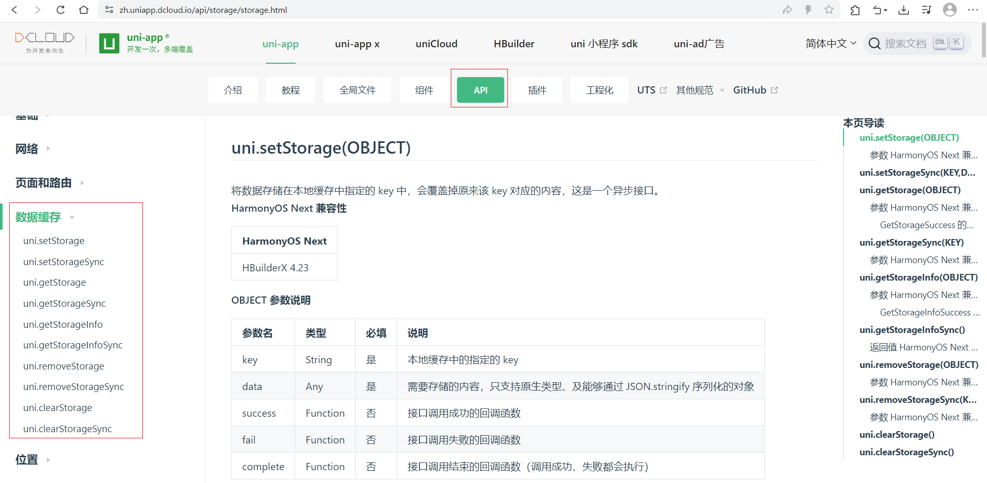
uni.setStorage(OBJECT)
将数据存储在本地缓存中指定的 key 中,会覆盖掉原来该 key 对应的内容,这是一个异步接口。
| 参数名 | 类型 | 必填 | 说明 |
|---|---|---|---|
| key | String | 是 | 本地缓存中的指定的 key |
| data | Any | 是 | 需要存储的内容,只支持原生类型、及能够通过 JSON.stringify 序列化的对象 |
uni.setStorageSync(KEY,DATA)
将 data 存储在本地缓存中指定的 key 中,会覆盖掉原来该 key 对应的内容,这是一个同步接口。
| 参数 | 类型 | 必填 | 说明 |
|---|---|---|---|
| key | String | 是 | 本地缓存中的指定的 key |
| data | Any | 是 | 需要存储的内容,只支持原生类型、及能够通过 JSON.stringify 序列化的对象 |
uni.getStorage(OBJECT)
从本地缓存中异步获取指定 key 对应的内容。
| 参数名 | 类型 | 必填 | 说明 |
|---|---|---|---|
| key | String | 是 | 本地缓存中的指定的 key |
| success | Function | 是 | 接口调用的回调函数,res = {data: key对应的内容} |
uni.getStorageSync(KEY)
从本地缓存中同步获取指定 key 对应的内容。
| 参数 | 类型 | 必填 | 说明 |
|---|---|---|---|
| key | String | 是 | 本地缓存中的指定的 key |
uni.getStorageInfo(OBJECT)
异步获取当前 storage 的相关信息。
uni.getStorageInfoSync()
同步获取当前 storage 的相关信息。
uni.removeStorage(OBJECT)
从本地缓存中异步移除指定 key。
| 参数名 | 类型 | 必填 | 说明 |
|---|---|---|---|
| key | String | 是 | 本地缓存中的指定的 key |
uni.removeStorageSync(KEY)
从本地缓存中同步移除指定 key。
| 参数名 | 类型 | 必填 | 说明 |
|---|---|---|---|
| key | String | 是 | 本地缓存中的指定的 key |
uni.clearStorage()
清理本地数据缓存。
uni.clearStorageSync()
同步清理本地数据缓存。
示例
<template>
    <view class="">
        <view>demo3</view>
        <button @click="setCache">设置缓存</button>
        <button @click="getCache">获取缓存</button>
        <button @click="getAllCache">获取全部缓存</button>
        <button @click="removeKeyCache">删除指定缓存</button>
        <button @click="clearCache">清除缓存</button>
    </view>

</template>

<script setup>

    function setCache() {
        // 浏览器存储到了 Application - LocalStorage中, 会永久保存, 一般需要手动清除
        // 微信小程序存储到了 Storage 中
        uni.setStorageSync("name","zzhua") // 存储的是 zzhua
        uni.setStorageSync("names", [1,2,3]) // 存储的是 {"type":"object","data":{"name":"zzhua"}}
        uni.setStorageSync("userInfo", {name:"zzhua"}) // 存储的是 {"type":"object","data":[1,2,3]}
    }

    function getCache() {
        let name = uni.getStorageSync("name")
        console.log(name,'name'); // zzhua name

        let names = uni.getStorageSync("names")
        console.log(names,'names'); //  'names'

        let userInfo = uni.getStorageSync("userInfo")
        console.log(userInfo,'userInfo'); //  {name: 'zzhua'} 'userInfo'
    }

    function getAllCache(){
        let storageInfo = uni.getStorageInfoSync()
        console.log(storageInfo, 'storageInfo'); // {keys: Array(3), currentSize: 1, limitSize: 1.7976931348623157e+308}
    }

    function removeKeyCache() {
        uni.removeStorageSync('name')
    }

    function clearCache() {
        uni.clearStorageSync()
    }

</script>

<style lang="scss" scoped>

</style>
5.15.uni.request发送网络请求
免费接口
免费测试api接口:https://jsonplaceholder.typicode.com/
随机猫咪API接口:https://api.thecatapi.com/v1/images/search?limit=1
咸虾米API接口:https://api.qingnian8.com/
NBA球员榜:https://tiyu.baidu.com/api/match/playerranking/match/NBA/tabId/60
uni.request(OBJECT)
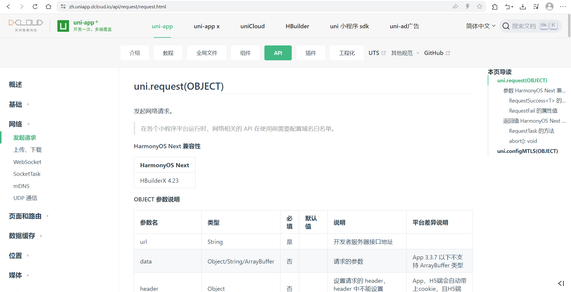
| 参数名 | 类型 | 必填 | 默认值 | 说明 | 平台差异说明 |
|---|---|---|---|---|---|
url | String | 是 | 开发者服务器接口地址 | ||
data | Object/String/ArrayBuffer | 否 | 请求的参数 | App 3.3.7 以下不支持 ArrayBuffer 类型 | |
header | Object | 否 | 设置请求的 header,header 中不能设置 Referer | App、H5端会自动带上cookie,且H5端不可手动修改 | |
method | String | 否 | GET | 有效值详见下方说明 | |
timeout | Number | 否 | 60000 | 超时时间,单位 ms | H5(HBuilderX 2.9.9+)、APP(HBuilderX 2.9.9+)、微信小程序(2.10.0)、支付宝小程序 |
dataType | String | 否 | json | 如果设为 json,会对返回的数据进行一次 JSON.parse,非 json 不会进行 JSON.parse | |
responseType | String | 否 | text | 设置响应的数据类型。合法值:text、arraybuffer | 支付宝小程序不支持 |
| sslVerify | Boolean | 否 | true | 验证 ssl 证书 | 仅App安卓端支持(HBuilderX 2.3.3+),不支持离线打包 |
| withCredentials | Boolean | 否 | false | 跨域请求时是否携带凭证(cookies) | 仅H5支持(HBuilderX 2.6.15+) |
| firstIpv4 | Boolean | 否 | false | DNS解析时优先使用ipv4 | 仅 App-Android 支持 (HBuilderX 2.8.0+) |
| enableHttp2 | Boolean | 否 | false | 开启 http2 | 微信小程序 |
| enableQuic | Boolean | 否 | false | 开启 quic | 微信小程序 |
| enableCache | Boolean | 否 | false | 开启 cache | 微信小程序、抖音小程序 2.31.0+ |
| enableHttpDNS | Boolean | 否 | false | 是否开启 HttpDNS 服务。如开启,需要同时填入 httpDNSServiceId 。 HttpDNS 用法详见 移动解析HttpDNS | 微信小程序 |
| httpDNSServiceId | String | 否 | HttpDNS 服务商 Id。 HttpDNS 用法详见 移动解析HttpDNS | 微信小程序 | |
| enableChunked | Boolean | 否 | false | 开启 transfer-encoding chunked | 微信小程序 |
| forceCellularNetwork | Boolean | 否 | false | wifi下使用移动网络发送请求 | 微信小程序 |
| enableCookie | Boolean | 否 | false | 开启后可在headers中编辑cookie | 支付宝小程序 10.2.33+ |
| cloudCache | Object/Boolean | 否 | false | 是否开启云加速(详见云加速服务) | 百度小程序 3.310.11+ |
| defer | Boolean | 否 | false | 控制当前请求是否延时至首屏内容渲染后发送 | 百度小程序 3.310.11+ |
success | Function | 否 | 收到开发者服务器成功返回的回调函数 | ||
fail | Function | 否 | 接口调用失败的回调函数 | ||
complete | Function | 否 | 接口调用结束的回调函数(调用成功、失败都会执行) |
data 数据说明
最终发送给服务器的数据是 String 类型,如果传入的 data 不是 String 类型,会被转换成 String。转换规则如下:
- 对于
GET方法,会将数据转换为 query string。例如{ name: 'name', age: 18 }转换后的结果是name=name&age=18。 - 对于
POST方法且header['content-type']为application/json的数据,会进行 JSON 序列化。 - 对于
POST方法且header['content-type']为application/x-www-form-urlencoded的数据,会将数据转换为 query string。
返回值
如果希望返回一个 requestTask 对象,需要至少传入 success / fail / complete 参数中的一个。例如:
var requestTask = uni.request({
	url: 'https://www.example.com/request', //仅为示例,并非真实接口地址。
	complete: ()=> {}
});
requestTask.abort();
如果没有传入 success / fail / complete 参数,则会返回封装后的 Promise 对象:Promise 封装
通过 requestTask,可中断请求任务。
Tips
-
请求的
header中content-type默认为application/json。 -
避免在
header中使用中文,或者使用 encodeURIComponent 进行编码,否则在百度小程序报错。 -
网络请求的
超时时间可以统一在manifest.json中配置 networkTimeout。
示例1
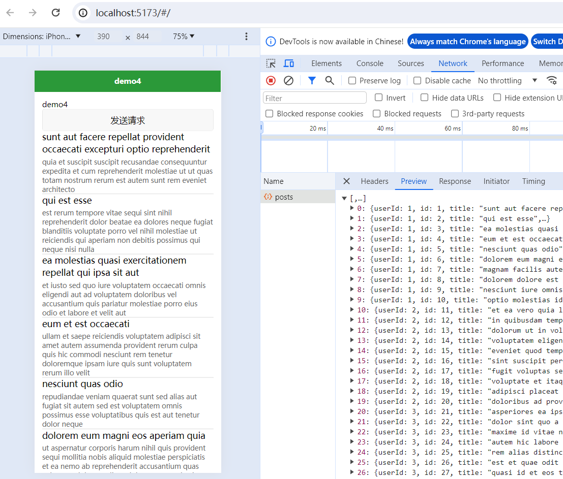
<template>
    <view class="layout">
        <view >demo4</view>
        <button @click="sendReq">发送请求</button>
        <view class="row" v-for="post in posts" :key="post.id">
            <view class="title">{{post.title}}</view>
            <view class="content">{{post.body}}</view>
        </view>
    </view>

</template>

<script setup>

    const posts = ref([])

    function sendReq() {

        /* uni.request({
			url:'https://jsonplaceholder.typicode.com/posts',
			method: 'GET',
			success(res) {
				posts.value = res.data
			}
		}) */

        /* uni.request({
			url:'https://jsonplaceholder.typicode.com/posts',
			method: 'GET',
		}).then(res=>{
			posts.value = res.data
		}) */

        // 也可以将async方在sendReq前面
        (async function() {
            let res = await uni.request({
                url:'https://jsonplaceholder.typicode.com/posts',
                method: 'GET',
            })
            posts.value = res.data
        })()

    }


</script>

<style lang="scss" scoped>
    .layout {
        padding: 30rpx;
        .row {
            border-bottom: 1px solid #cfcfcf;
            .title {
                margin-bottom: 10rpx;
                font-size: 36rpx;
            }
            .content {
                color: #666;
                font-size: 28rpx;
            }
        }
    }
</style>
示例2
<template>
	<view class="layout">

	</view>
</template>

<script setup>

function request(){
	uni.showLoading()
	uni.request({
		url:"https://jsonplaceholder.typicode.com/posts",
		data:{
			id:5
		},
		header:{
			token:"adfadsfadsf",
			"content-type":"application/x-www-form-urlencoded"
		},
		method:"post",
		timeout:15000,
		success:res=>{
			console.log(res);
		},
		fail:err=>{
			console.log("超时");
			console.log(err);
		},
		complete:()=>{
			uni.hideLoading()
		}
	})

}

request();
</script>
六、阶段性综合小实例-萌宠集
previewImage图片预览和lazy-load懒加载
图片预览
| 参数名 | 类型 | 必填 | 说明 | 平台差异说明 |
| current | String/Number | 详见下方说明 | 详见下方说明 | |
| showmenu | Boolean | 否 | 是否显示长按菜单,默认值为 true | 微信小程序2.13.0 |
| urls | Array<String> | 是 | 需要预览的图片链接列表 | |
| indicator | String | 否 | 图片指示器样式,可取值:“default” - 底部圆点指示器; “number” - 顶部数字指示器; “none” - 不显示指示器。 | App |
| loop | Boolean | 否 | 是否可循环预览,默认值为 false | App |
| longPressActions | Object | 否 | 长按图片显示操作菜单,如不填默认为保存相册 | App 1.9.5+ |
| success | Function | 否 | 接口调用成功的回调函数 | |
| fail | Function | 否 | 接口调用失败的回调函数 | |
| complete | Function | 否 | 接口调用结束的回调函数(调用成功、失败都会执行) |
-
小程序需要勾选不校验合法域名
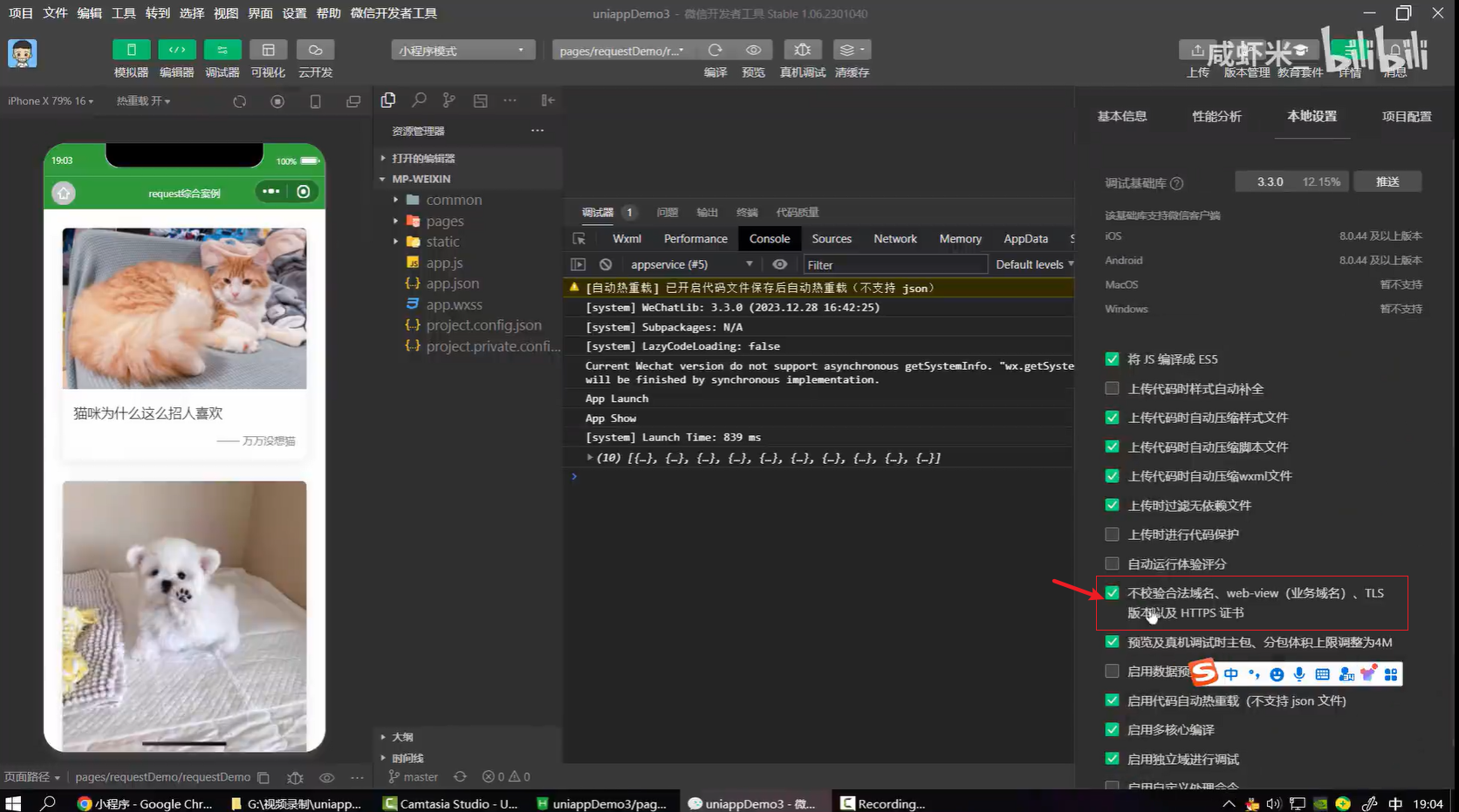
图片懒加载
<!-- lazy-load属性 图片懒加载。只针对page与scroll-view下的image有效,
	 并且支持微信小程序、百度小程序、抖音小程序、飞书小程序,不支持h5 -->
<image :src="item.url" mode="widthFix" lazy-load @click="previewImg(idx)"></image>
滚动
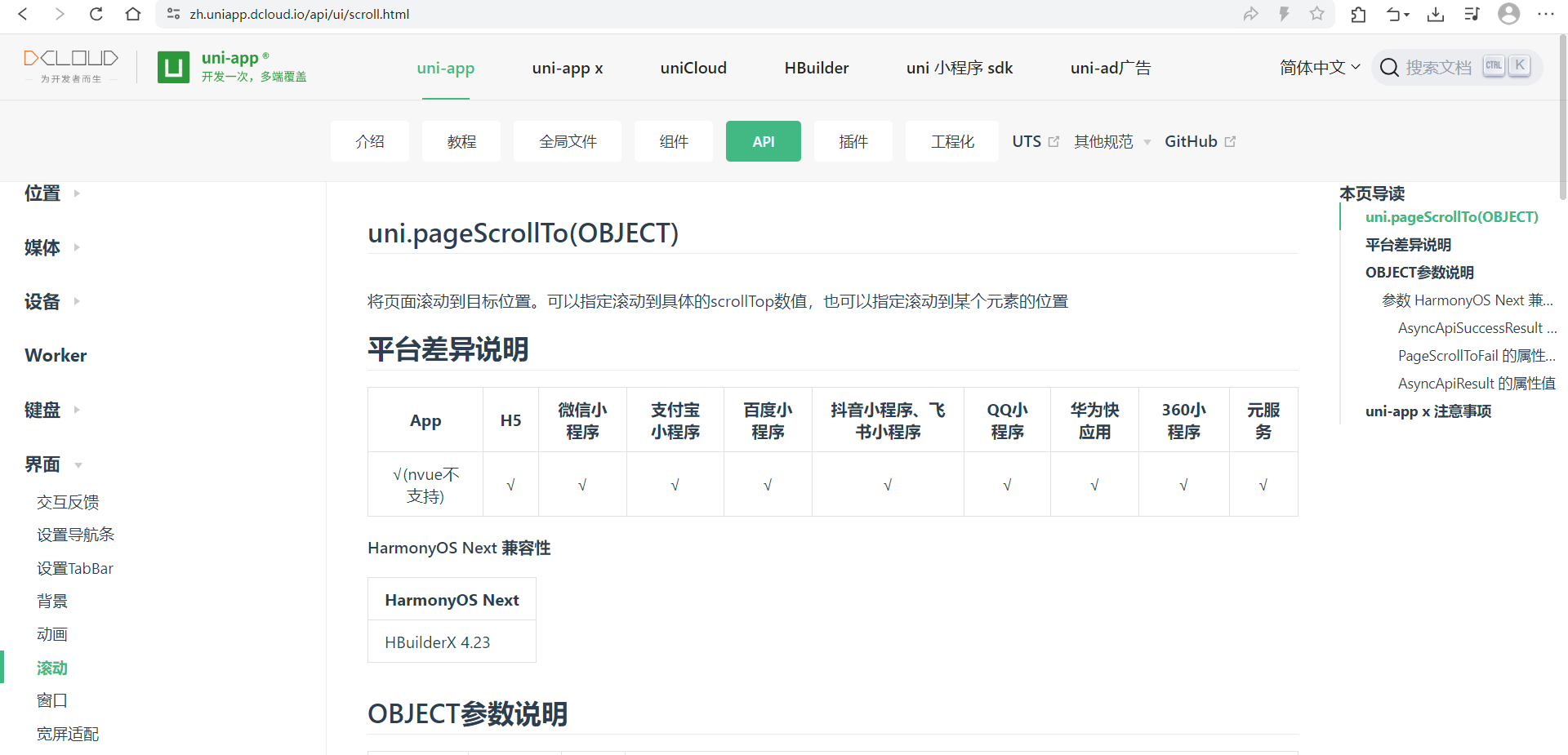
uni.pageScrollTo(OBJECT)
将页面滚动到目标位置。可以指定滚动到具体的scrollTop数值,也可以指定滚动到某个元素的位置
| 参数名 | 类型 | 必填 | 说明 |
|---|---|---|---|
| scrollTop | Number | 否 | 滚动到页面的目标位置(单位px) |
| selector | String | 否 | 元素选择器,用于指定要滚动到的元素位置,App、H5、微信小程序2.7.3+ 、支付宝小程序1.20.0+支持 |
| duration | Number | 否 | 滚动动画的时长,默认300ms,单位 ms |
| success | function | 否 | 接口调用成功的回调函数 |
| fail | function | 否 | 接口调用失败的回调函数 |
| complete | function | 否 | 接口调用结束的回调函数(调用成功、失败都会执行) |
底部安全区域css环境变量
env(safe-area-inset-bottom)
使用uni-ui扩展组件
使用uniapp官方的扩展组件 - 图标
1、点击下载安装
2、点击下载插件并导入hbuilderx
3、选择插件导入
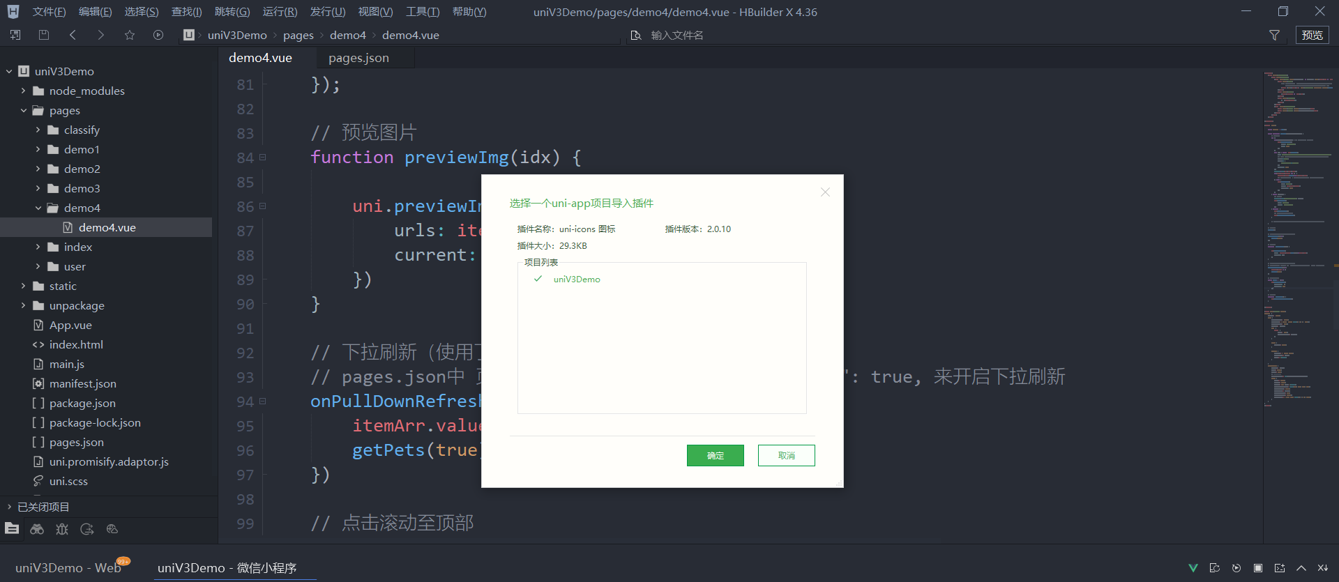
4、会导入到uni_modules中(微信小程序,需要重启哦)
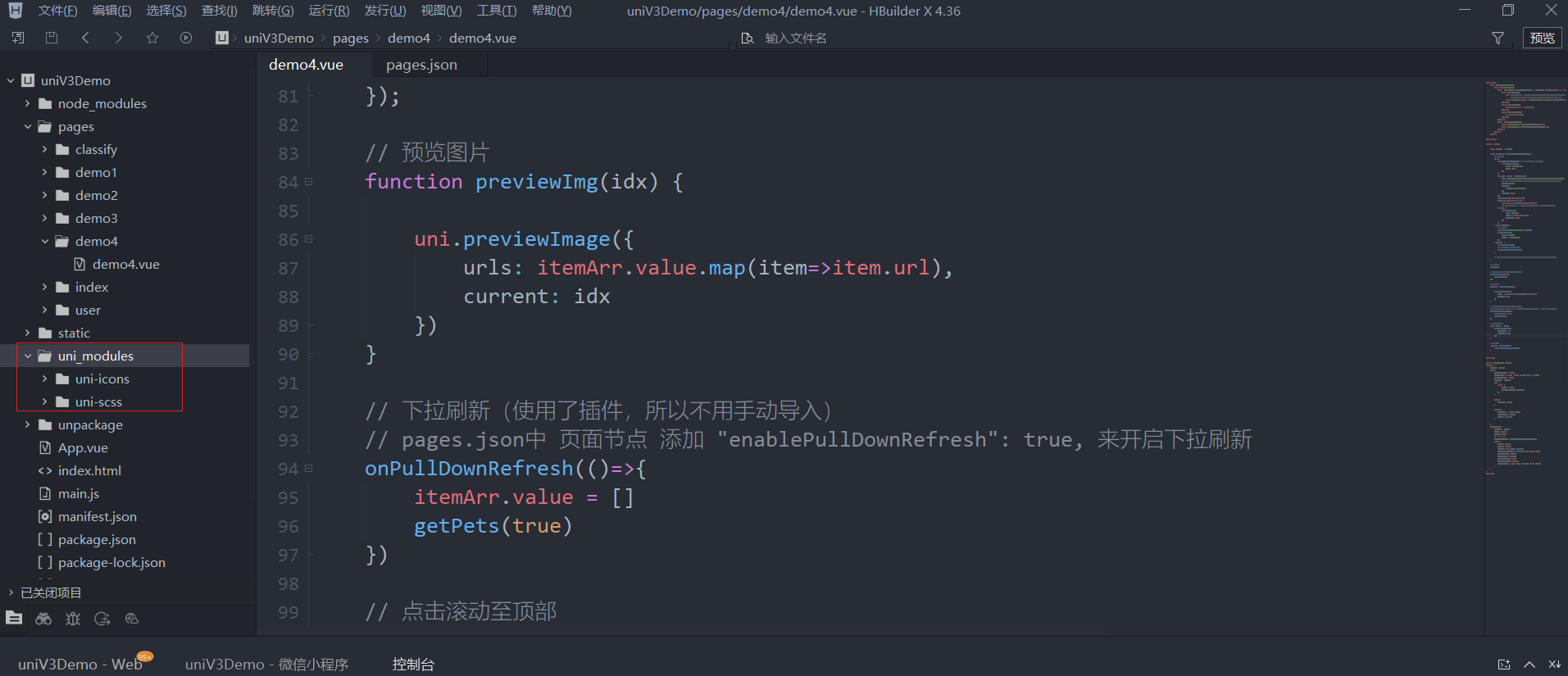
| 属性名 | 类型 | 默认值 | 说明 |
|---|---|---|---|
| size | Number | 24 | 图标大小 |
| type | String | - | 图标图案,参考示例 |
| color | String | - | 图标颜色 |
4、做完上面后,在页面中使用
<uni-icons type="arrow-up" color="#888" size="30"></uni-icons>
使用uniapp官方的扩展组件 - loadmore
<uni-load-more status="more"></uni-load-more>
使用uniapp官方的扩展组件 - 分段器组件
<template>
    <view>
        <uni-segmented-control :current="current" :values="items" @clickItem="onClickItem" styleType="button" activeColor="#4cd964"></uni-segmented-control>
        <view class="content">
            <view v-show="current === 0">
                选项卡1的内容
            </view>
            <view v-show="current === 1">
                选项卡2的内容
            </view>
            <view v-show="current === 2">
                选项卡3的内容
            </view>
        </view>
    </view>
</template>
<script>
export default {
  data() {
    return {
        ...
        items: ['选项1', '选项2', '选项3'],
        current: 0
    };
  },

  methods: {
    ...
    onClickItem(e) {
      if (this.current != e.currentIndex) {
        this.current = e.currentIndex;
      }
    }
  }
};
</script>
萌宠案例
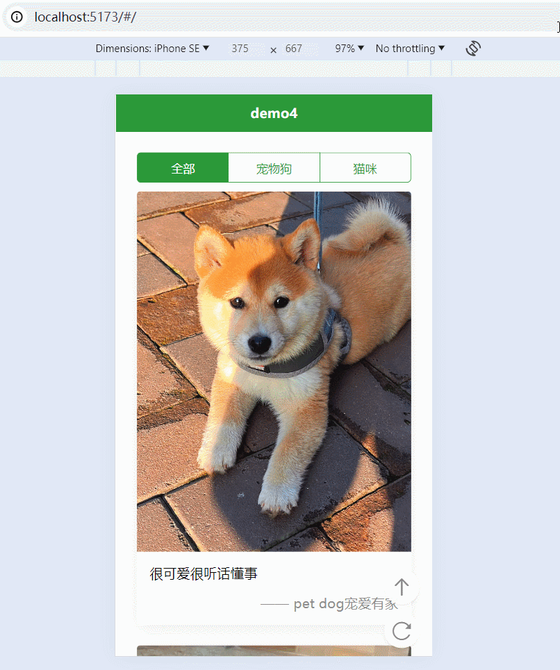
<template>
	<view class="container">
		<view class="layout">
			<uni-segmented-control :current="current" :values="items" @clickItem="onClickItem" styleType="button" activeColor="#2b9939"></uni-segmented-control>
			<view class="box" v-for="(item,idx) in itemArr" :key="item._id || item.id">
				<view class="pic">
					<!-- lazy-load属性 图片懒加载。只针对page与scroll-view下的image有效,
					     并且支持微信小程序、百度小程序、抖音小程序、飞书小程序,不支持h5 -->
					<image :src="item.url" mode="widthFix" lazy-load @click="previewImg(idx)"></image>
				</view>
				<view class="text">
					{{item.content || item.url}}
				</view>
				<view class="author">
					—— {{item.author}}
				</view>
			</view>
			<view class="load-more">
				<!-- <uni-load-more status="loading"></uni-load-more> -->
			</view>
			<view class="quick-tool">
				<view class="item" @click="toTop">
					<uni-icons type="arrow-up" color="#888" size="30"></uni-icons>
				</view>
				<view class="item" @click="toRefresh">
					<uni-icons type="refreshempty" color="#888" size="30"></uni-icons>
				</view>
			</view>
		</view>
	</view>

</template>

<script setup>
import { computed } from 'vue';

	const itemArr = ref([])

	const current = ref(0)
	const options = [{type:'all', desc: '全部'}, {type:'dog', desc: '宠物狗'},{type:'cat', desc: '猫咪'}]
	const items = computed(()=>{
		return options.map(option=>option.desc)
	})

	function onClickItem({currentIndex}) {
		current.value = currentIndex
		itemArr.value = []
		getPets()
	}


	async function getPets() {
		// return;
		try {
			let res = await uni.request({
				url: `https://tea.qingnian8.com/tools/petShow?size=2&type=${options[current.value].type}`,
				// url: 'https://api.thecatapi.com/v1/images/search?limit=2',
				method:'GET',
				header: {
					"access-key":'abc123'
				},
				timeout: 2000
			})
			console.log(res.data.data);
			if(res.data.errCode == 0) {
				itemArr.value.push(...res.data.data)
				// itemArr.value = [...itemArr.value, ...res.data.data]
			} else {
				uni.showToast({
					icon: 'none',
					title: res.data.errMsg,
					duration: 2000
				})
			}
		} catch (error) {
			// 比如超时
			console.log('请求接口发生错误', error);
			uni.showToast({
				icon: 'none',
				title: '请求接口失败'
			})
		} finally {
			uni.hideLoading()
			// 不管是什么,都停止下拉刷新
			uni.stopPullDownRefresh()
		}

		// uni.request({}).then((res)=>{}).catch(()=>{}).finally(()=>{})
	}

	// 首次加载
	getPets()

	// 触底刷新(使用了插件,所以不用手动导入)
	onReachBottom(()=>{
		getPets()
	});

	// 预览图片
	function previewImg(idx) {

		uni.previewImage({
			urls: itemArr.value.map(item=>item.url),
			current: idx
		})
	}

	// 下拉刷新(使用了插件,所以不用手动导入)
	// pages.json中 页面节点 添加 "enablePullDownRefresh": true, 来开启下拉刷新
	onPullDownRefresh(()=>{
		console.log('刷新??');
		itemArr.value = []
		getPets()
	})

	// 点击滚动至顶部
	const toTop = ()=>{
		uni.pageScrollTo({
			scrollTop: 0,
			duration: 100
		})
	}

	// 点击刷新
	function toRefresh() {
		uni.startPullDownRefresh()
	}

</script>

<style lang="scss" scoped>
.layout {
	padding: 50rpx;
	.box {
		margin-bottom: 50rpx;
		margin-top: 20rpx;
		box-shadow: 0 10rpx 40rpx rgba(0, 0, 0, 0.08);
		border-radius: 8rpx;
		overflow: hidden;
		.pic {
			image {
				width: 100%;
				vertical-align: bottom;
			}
		}

		.text {
			padding: 30rpx;
		}

		.author {
			padding: 0 30rpx 30rpx;
			text-align: right;
			color: #8d8d8d;
		}

	}

	.load-more {
		padding-bottom: cacl(env(safe-area-inset-bottom) + 50rpx);
	}

	.quick-tool {
		position: fixed;
		right: 30rpx;
		bottom: 0rpx;
		// 设置安全高度
		padding-bottom: env(safe-area-inset-bottom);
		.item {
			width: 80rpx;
			height: 80rpx;
			border: 1px solid #fafafa;
			background-color: rgba(255, 255, 255, 0.9);
			line-height: 80rpx;
			text-align: center;
			border-radius: 50%;
			margin-bottom: 20rpx;
			box-shadow: 0 5rpx 8rpx rgba(0, 0, 0, 0.08);
		}
	}
}
</style>


 扫一扫
扫一扫


 6014
6014

 被折叠的 条评论
为什么被折叠?
被折叠的 条评论
为什么被折叠?
 到【灌水乐园】发言


