


相关文章
前言
上篇文章简单的介绍了微信开发者工具和小程序的框架,后续文章将会对日历打卡各个模块的开发思路以及遇到的问题和大家做个分享,本篇将对首页的开发做个介绍。
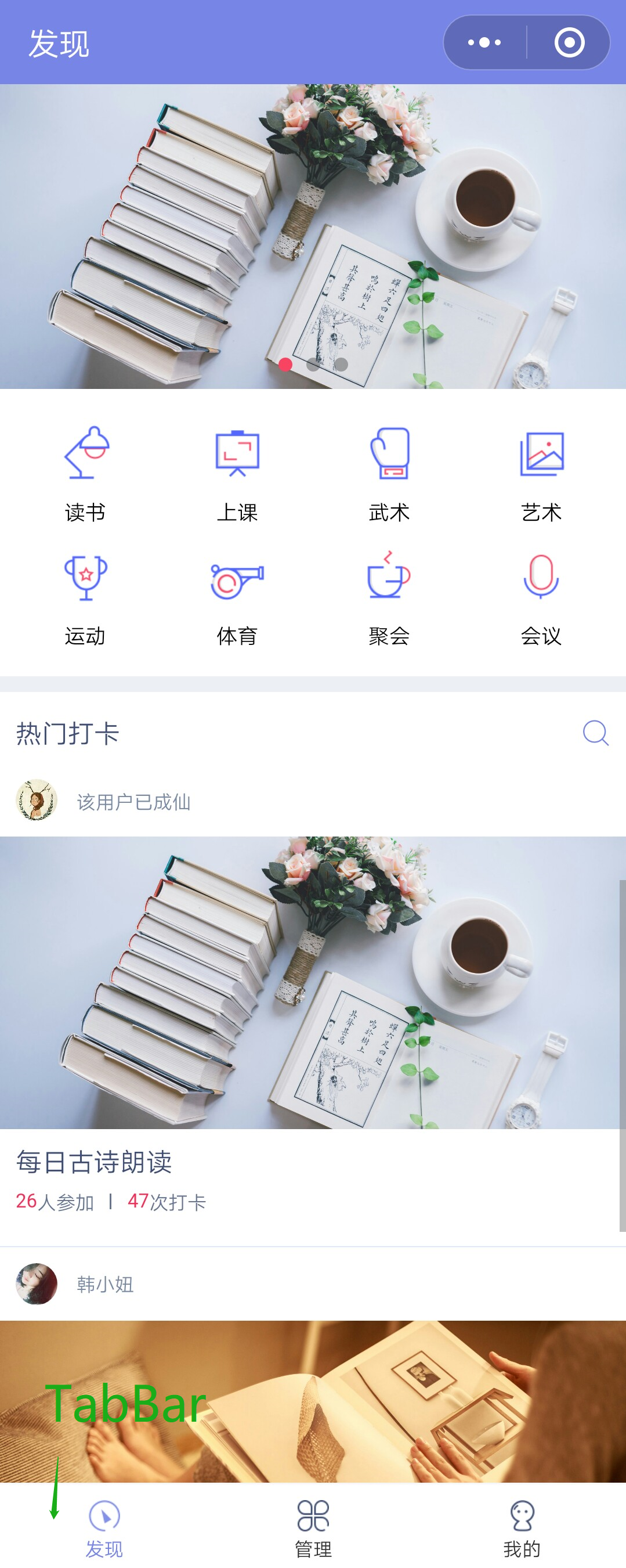
需求
发现页面需求图如下

① json文件配置
上篇文章在介绍小程序的框架时,每个页面都会有json文件,在json文件中可以配置当前页面的窗口信息。下面来介绍下常用的一些配置。
{
    "enablePullDownRefresh": true,                         //是否开启下拉刷新 对应js文件中
    "navigationBarBackgroundColor": "#7885e8",             //导航栏背景颜色 ,16进制
    "navigationBarTitleText": "发现",                       //导航栏标题内容
    "navigationBarTextStyle": "white",                     //导航栏标题字体颜色
    "backgroundColor": "#7885e8"                           //下拉后窗口拓展部分背景色,一般设置导航栏(默认白色)
    "disableScroll":false                                  //设置为true,则不能上下滚动,只在页面的page.json生效
    "onReachBottonDistance":100                            //触发上拉加载方法时距离底部距离(不设置为0)
}
②swiper控件 - 轮播图实现
相对于安卓开发来说,小程序中封装好了易于开发者操作的视图滑块容器,因为swiper组件属性过多,这里不一一介绍,有兴趣可以研究下开发文档。
<swiper indicator-dots='{{indicatorDots}}' autoplay='{{autoplay}}' indicator-active-color='{{indicatorSelectColor}}' duration='{{duration}}' circular="true" style="height:175px'>
      <block wx:for='{{bannerDatas}}'>
        <swiper-item>
          <image src='{{item.dakaPic}}'  class="slide-image" lazy-mode='true'  mode='aspectFill' style='height:100%' />
        </swiper-item>
      </block>
    </swiper>
这里顺带介绍下image组件,有两个比较重要的属性
- lazy-mode : 懒加载,对page和scroll-view下的image才有效。用户滚动页面自动获取更多的图片,不会一次性全部加载
- mode : 图片剪裁缩放模式,有13种,大家可以根据项目的需求自行选择。
③页面跳转(路由跳转)
这部分使用的是flex布局,将分类平分页面宽度即可。这里较为简单,不贴代码了。点击分类跳转到此分类的页面,下面来介绍下小程序页面的跳转。
wx.navigateTo({            //保留当前页面 跳转到其他页面,url来表明页面的地址
  url: 'test?id=1'
})

wx.redirectTo({            //关闭当前页面,跳转到其他页面
  url: 'test?id=1'
})

wx.switchTab({            //跳转tabbar页面,关闭其他所有非tabbar页面
  url: '/index'
})


wx.navigateBack({          //返回之前的页面,参数delta是返回的页面数
  delta: 2
})

wx.reLaunch({              //关闭所有页面,跳转到指定页面
  url: 'test?id=1'
})
页面之间相互跳转避免不了值传递,小程序里页面间传值也是很简单,小程序提供了属性data-xxx(名字自取),可以设置对应的值,通过bintap(点击事件绑定)在对应的方法中获取到传递的值通过url 路径拼接相应的参数。
<view class='read-layout tag-item' data-index='0' bindtap='tagClick'>
   <image class='tag-logo' src='../imgs/tag_read.png'></image>
   <text class='tag-name'>读书</text>
</view>
// 点击标签
tagClick: function (event) {    //绑定点击事件产生event事件,在
  console.log(event)            //控制台输出event事件对象
  var tagId = event.currentTarget.dataset.index;
  wx.navigateTo({
    url: 'taglist/taglist?tagId=' + tagId,       //传值到下个页面
  })
},
④template模板使用(重要)
考虑到模块化的复用,小程序提供了template,以发现列表热门打卡列表为例,将介绍模板的编写以及使用。
创建template文件夹以及item-hot.wxml 与 item-hot.wxss文件。

- 编写wxml文件(wxss样式文件这里就不贴出来)
<!--模板要定义一个名字 作为使用凭据-->
<template name="hotSignTemplate">
  <view class="list">
    <!-- 创建者信息 -->
    <view class="personal-info">
      <image class="avatar" src="{{headPortrait}}"></image>
      <text class="nickname">{{nickName}}</text>
    </view>
    <!-- 打卡封面 -->
    <image class="sign-cover" mode='aspectFill' src="{{pic}}"></image>
    <!-- 打卡活动名称 -->
    <text class="sign-title">{{activityName}}</text>
    <!-- 参加者信息 -->
    <view class="sign-info">
      <text class="numberop">{{joinNum}}</text>
      <text class="sign-hint1">人参加</text>
      <view class="line2"></view>
      <text class="sign-times">{{dakaNum}}</text>
      <text class="sign-hint1">次打卡</text>
    </view>
    <view class="line3"></view>
  </view>
</template>
- 页面引入template 模板
<!-- 导入template -->
<import src="../template/item-hot/item-hot.wxml" />

<view class="home-item">
  <block wx:for='{{signDatas}}' wx:for-item='item'>
    <!-- 模板上不能绑定点击事件,在外面添加一层view -->
    <view bindtap='tapToDetail'  data-id='{{item.id}}'>
      <!-- template使用 这里的 is="templateName" -->
      <template is='hotSignTemplate' data='{{...item}}' />
    </view>
  </block>

</view>
wxss文件也要导入template/item-hot/item-hot.wxss,模板样式才能生效
@import "../../template/item-hot/item-hot.wxss";
注意:小程序中template 是不需要在app.json 中注册的,它只是作为页面的组成部分,并不是页面,也没有自己的生命周期,当然我们在template中是可以创建item-hot.js和item.json文件的。
⑤底部 TabBar实现
在上一篇文章中介绍了小程序系统tabbar的配置,小程序提供的tabbar虽然方便,但是不能对其定制,根据要求设置对应的宽高,设置的图片看起来也很模糊,在开发时候舍弃了系统提供的tabbar,根据UI要求编写了自己的tabbar,通过模板的方式创建template/foot_menu/foot_menu,哪些页面需要使用直接以模板的形式引入即可。
wxml文件:
<template name="footMenu">
   <!--适配IPhoneX-->
  <view class="{{isIphoneX ? 'footMenuNavWrap-x':'footMenuNavWrap-normal'}}">
    <view class="{{isIphoneX ?'img-text-iphonex':'img-text-normal'}}" bindtap="bindTap" data-index='0'>
      <image class="menuIcon" src="{{isAtDiscovery ? '../imgs/discovery_select.png' : '../imgs/discovery_normal.png'}}" mode="widthFix" />
      <view class="text {{isAtDiscovery ? 'activityText' : 'defaultText'}}">发现</view>
    </view>

    <view class="{{isIphoneX ?'img-text-iphonex':'img-text-normal'}}" bindtap="bindTap" data-index='1'>
      <image class="menuIcon" src="{{isAtManage ? '../imgs/manage_select.png' : '../imgs/manage_normal.png'}}" mode="widthFix" />
      <view class="text {{isAtManage? 'activityText' : 'defaultText'}}">管理</view>
    </view>

    <view class="{{isIphoneX ?'img-text-iphonex':'img-text-normal'}}" bindtap="bindTap" data-index='2'>
      <image class="menuIcon" src="{{isAtMine ? '../imgs/mine_select.png' : '../imgs/mine_normal.png'}}" mode="widthFix" />
      <view class="text {{isAtMine ? 'activityText' : 'defaultText'}}">我的</view>
    </view>
  </view>
</template>
//wxss文件
.footMenuNavWrap-x {
  width: 100%;
  display: flex;
  flex-direction: row;
  align-items: center;
  height: 140rpx;
  position: fixed;
  bottom: 0;
  left: 0;
  background-color: #fff;
  border-top: 1px solid #F7F7F7;
}

.footMenuNavWrap-normal {
  width: 100%;
  display: flex;
  flex-direction: row;
  align-items: center;
  height: 100rpx;
  position: fixed;
  bottom: 0;
  left: 0;
  background-color: #fff;
  border-top: 1px solid #F7F7F7;
}

.footMenuNavWrap-x .img-text-iphonex {
  flex: 1;
  display: flex;
  flex-direction: column;
  padding-bottom: 20rpx;
  align-items: center;
}

.footMenuNavWrap-normal .img-text-normal {
  flex: 1;
  display: flex;
  flex-direction: column;
  align-items: center;
}

.footMenuNavWrap-x .menuIcon {
  margin-top: 5rpx;
  width: 38rpx;
  height: 38rpx;
}

.footMenuNavWrap-x .text {
  margin-top: 10rpx;
  font-size: 24rpx;
}

.footMenuNavWrap-x .defaultText {
  color: #333;
}

.footMenuNavWrap-x .activityText {
  color: #7885e8;
}

.footMenuNavWrap-normal .menuIcon {
  margin-top: 5rpx;
  width: 38rpx;
  height: 38rpx;
}

.footMenuNavWrap-normal .text {
  margin-top: 10rpx;
  font-size: 24rpx;
}

.footMenuNavWrap-normal .defaultText {
  color: #333;
}

.footMenuNavWrap-normal .activityText {
  color: #7885e8;
}


 2383
2383


 被折叠的 条评论
为什么被折叠?
被折叠的 条评论
为什么被折叠?
 到【灌水乐园】发言


