


文章目录
par(mfrow=c(n,m))基础作图
par(mfrowc(n,m))是R基础作图中的函数,只对基础作图函数plot的对象起作用
gridExtra::grid.arrange()针对ggplot对象
grid.arrange()函数只能用于对ggplot对象进行排布
用法
# 全部参数
grid.arrange(..., grobs = list(...), layout_matrix, vp = NULL,
  name = "arrange", as.table = TRUE, respect = FALSE, clip = "off",
  nrow = NULL, ncol = NULL, widths = NULL, heights = NULL, top = NULL,
  bottom = NULL, left = NULL, right = NULL, padding = unit(0.5, "line"),newpage=TRUE)

#常用格式
grid.arrange(p1,p2,p3,...,ncol=n,nrow=m)
实例
library(gridExtra)
library(ggplot2)
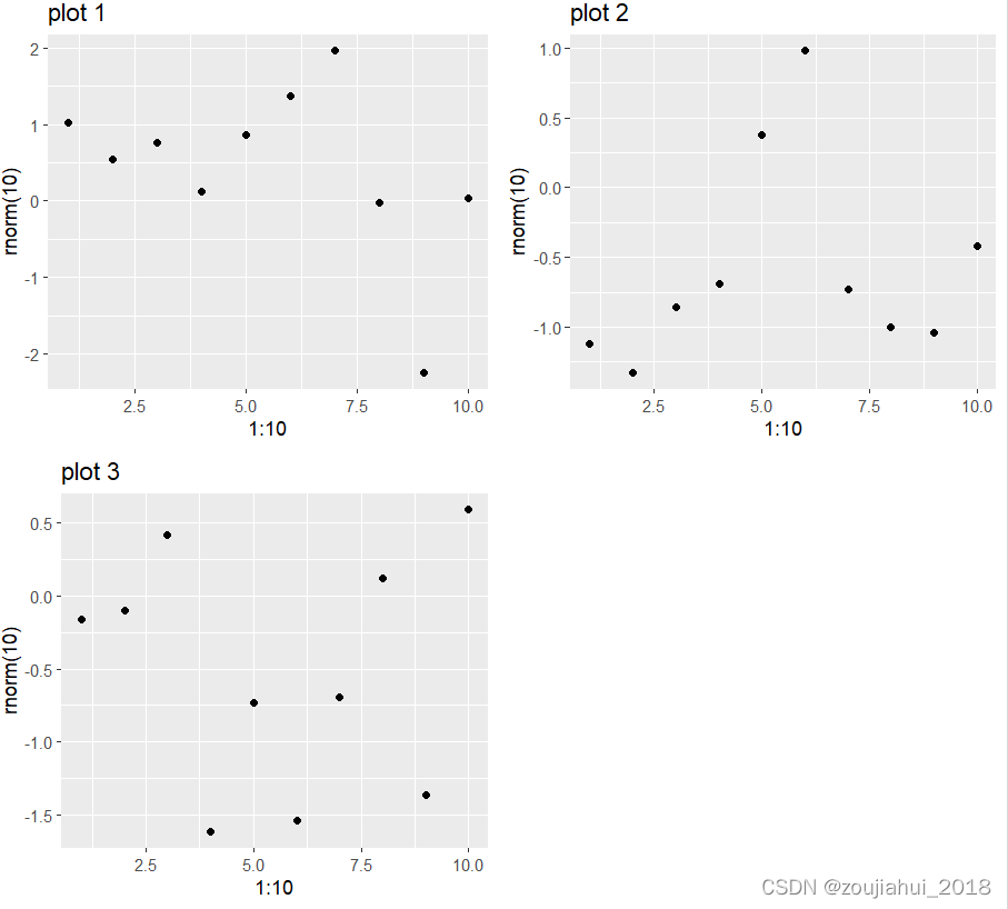
p1=qplot(1:10, rnorm(10), main=paste("plot", 1))
p2=qplot(1:10, rnorm(10), main=paste("plot", 2))
p3=qplot(1:10, rnorm(10), main=paste("plot", 3))
grid.arrange(p1,p2,p3,nrow=2,ncol=2)
ggpubr::ggarrange()可处理ggplot对象和基础plot对象
用法
ggarrange(
  ...,
  plotlist = NULL,
  ncol = NULL,
  nrow = NULL,
  labels = NULL,
  label.x = 0,
  label.y = 1,
  hjust = -0.5,
  vjust = 1.5,
  font.label = list(size = 14, color = "black", face = "bold", family = NULL),
  align = c("none", "h", "v", "hv"),
  widths = 1,
  heights = 1,
  legend = NULL,
  common.legend = FALSE,
  legend.grob = NULL
)
实例
library(ggplot2)
library(ggpubr)
data("ToothGrowth")
df <- ToothGrowth
df$dose <- as.factor(df$dose)

bxp <- ggboxplot(df, x = "dose", y = "len",
                 color = "dose", palette = "jco")
dp <- ggdotplot(df, x = "dose", y = "len",
                color = "dose", palette = "jco")
dens <- ggdensity(df, x = "len", fill = "dose", palette = "jco")


plt<- ~{
    par(
      mar = c(3, 3, 1, 1),
      mgp = c(2, 1, 0)
    )
    plot(sqrt)
  }

# Arrange
# ::::::::::::::::::::::::::::::::::::::::::::::::::
ggarrange(bxp, dp,dens,plt, ncol = 2, nrow = 2)
cowplot::plot_grid()可以用于不同对象
用法
plot_grid(
  ...,
  plotlist = NULL,
  align = c("none", "h", "v", "hv"),
  axis = c("none", "l", "r", "t", "b", "lr", "tb", "tblr"),
  nrow = NULL,
  ncol = NULL,
  rel_widths = 1,
  rel_heights = 1,
  labels = NULL,
  label_size = 14,
  label_fontfamily = NULL,
  label_fontface = "bold",
  label_colour = NULL,
  label_x = 0,
  label_y = 1,
  hjust = -0.5,
  vjust = 1.5,
  scale = 1,
  greedy = TRUE,
  byrow = TRUE,
  cols = NULL,
  rows = NULL
)
实例
library(ggplot2)
library(cowplot)
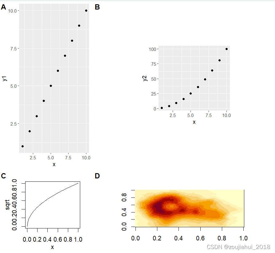
df <- data.frame(
x = 1:10, y1 = 1:10, y2 = (1:10)^2, y3 = (1:10)^3, y4 = (1:10)^4
)
p1 <- ggplot(df, aes(x, y1)) + geom_point()
p2 <- ggplot(df, aes(x, y2)) + geom_point()
p6 <- ~{
par(
mar = c(3, 3, 1, 1),
mgp = c(2, 1, 0)
)
plot(sqrt)
}
p7 <- function() {
par(
mar = c(2, 2, 1, 1),
mgp = c(2, 1, 0)
)
image(volcano)
}
# ggarrange(p1,p2,p3,p4)
# making rows and columns of different widths/heights
plot_grid(
p1, p2,p6,p7, nrow = 2,ncol=2,rel_heights = c(2,1), rel_widths = c(1, 2),labels = "AUTO",scale = c(1, .5, .9, .7)
)
#' # missing plots in some grid locations, auto-generate lower-case labels
plot_grid(
p1, NULL, NULL, p6, p7, NULL,
ncol = 2,
labels = "auto",
label_size = 12,
align = "v"
)

实现图形的重叠展示
library(tidyverse)
library(ggplot2)
library(cowplot)
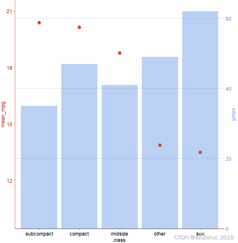
city_mpg <- mpg %>%
mutate(class = fct_lump(class, 4, other_level = "other")) %>%
group_by(class) %>%
summarize(mean_mpg = mean(cty),count = n()) %>%
mutate(class = fct_reorder(class, count))
city_mpg <- city_mpg %>%
mutate(class = fct_reorder(class, -mean_mpg))
p1 <- ggplot(city_mpg, aes(class, count)) +
geom_col(fill = "#6297E770") +
scale_y_continuous(
expand = expansion(mult = c(0, 0.05)),
position = "right"
) +
theme_minimal_hgrid(11, rel_small = 1) +
theme(
panel.grid.major = element_line(color = "#6297E770"),
axis.line.x = element_blank(),
axis.text.x = element_blank(),
axis.title.x = element_blank(),
axis.ticks = element_blank(),
axis.ticks.length = grid::unit(0, "pt"),
axis.text.y = element_text(color = "#6297E7"),
axis.title.y = element_text(color = "#6297E7")
)
p2 <- ggplot(city_mpg, aes(class, mean_mpg)) +
geom_point(size = 3, color = "#D5442D") +
scale_y_continuous(limits = c(10, 21)) +
theme_half_open(11, rel_small = 1) +
theme(
axis.ticks.y = element_line(color = "#BB2D05"),
axis.text.y = element_text(color = "#BB2D05"),
axis.title.y = element_text(color = "#BB2D05"),
axis.line.y = element_line(color = "#BB2D05")
)
aligned_plots <- align_plots(p1, p2, align="hv", axis="tblr")
ggdraw(aligned_plots[[1]]) + draw_plot(aligned_plots[[2]])
添加文本
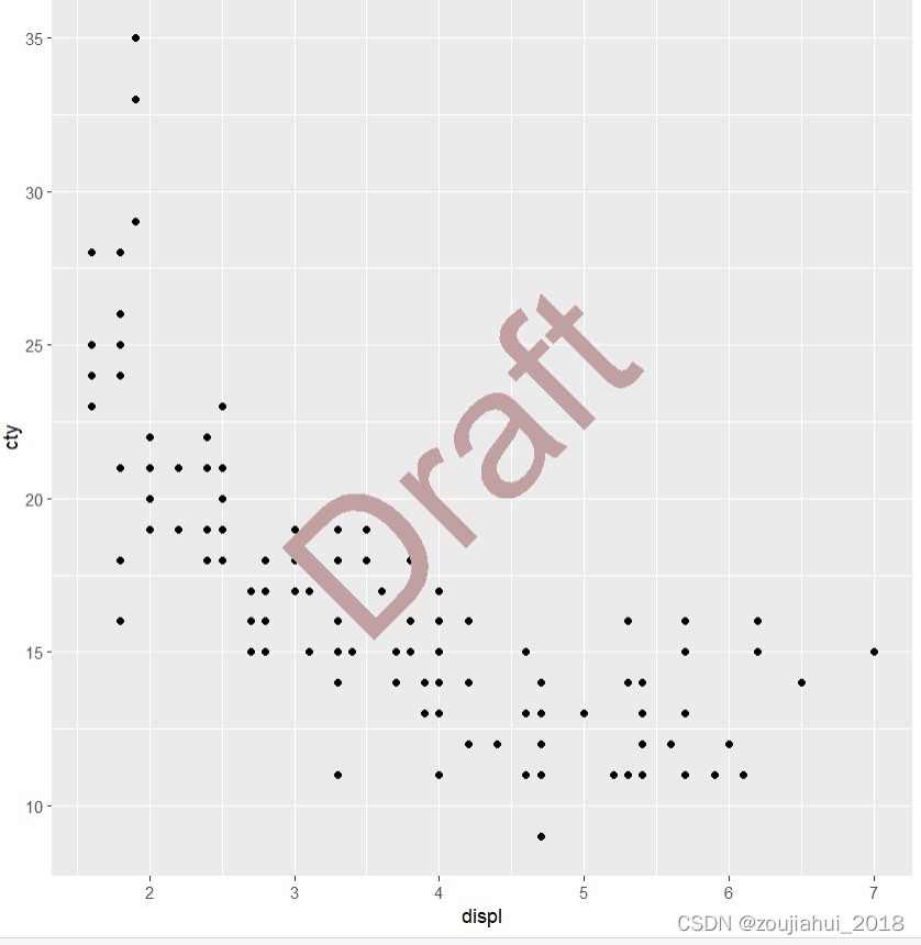
p <- ggplot(mpg, aes(displ, cty)) +geom_point()
#添加文本
ggdraw(p) +  draw_label("Draft", color = "#C0A0A0", size = 100, angle = 45)
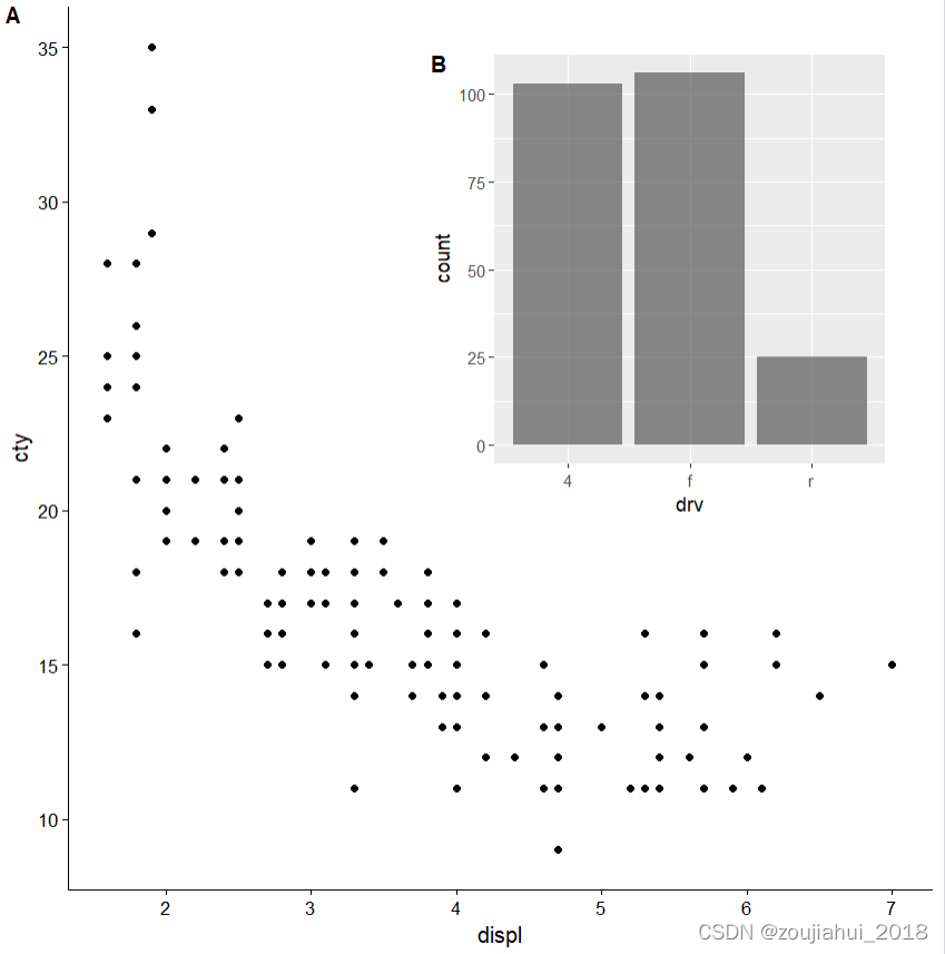
图形嵌套
inset <- ggplot(mpg, aes(drv)) +  geom_bar( alpha = 0.7)

ggdraw(p + theme_half_open(12)) +
  draw_plot(inset, .45, .45, .5, .5) +
  draw_plot_label(
    c("A", "B"),
    c(0, 0.45),
    c(1, 0.95),
    size = 12
  )
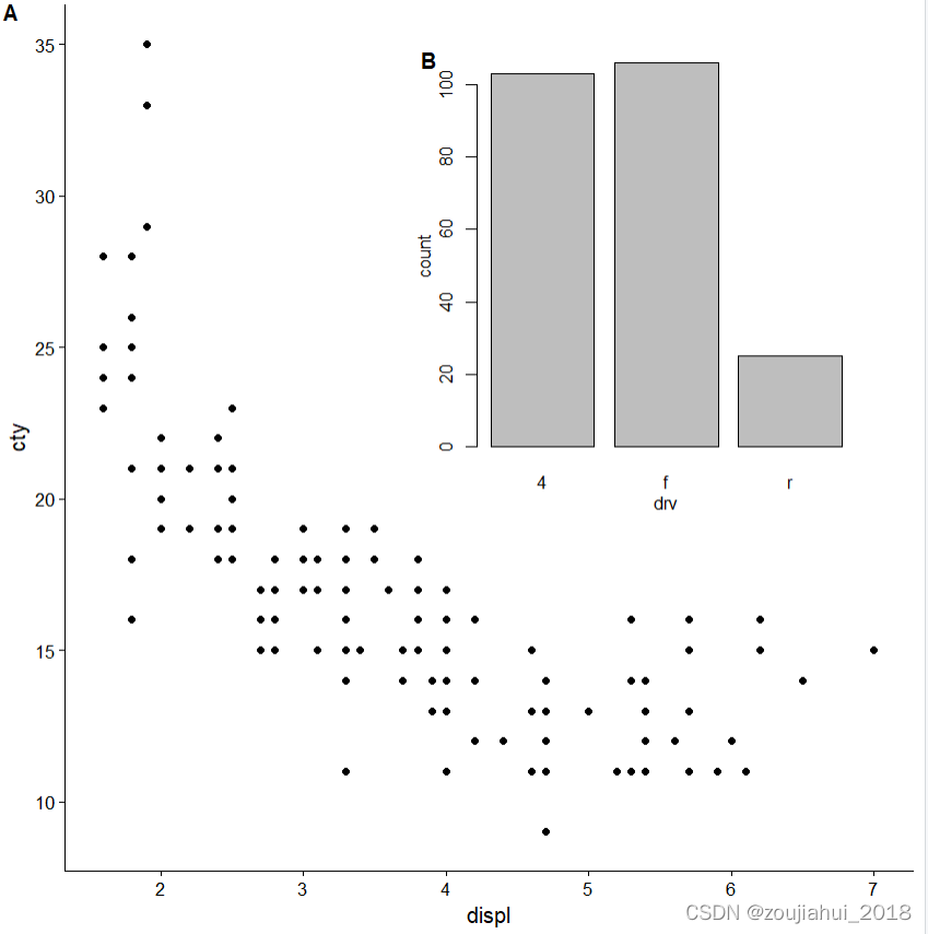
inset <- ~{
  counts <- table(mpg$drv)
  par(cex = 0.8,
      mar = c(3, 3, 1, 1),
      mgp = c(2, 1, 0))
  barplot(counts, xlab = "drv", ylab = "count")
}

ggdraw(p + theme_half_open(12)) +
  draw_plot(inset, .45, .45, .5, .5) +
  draw_plot_label(
    c("A", "B"),
    c(0, 0.45),
    c(1, 0.95),
    size = 12)
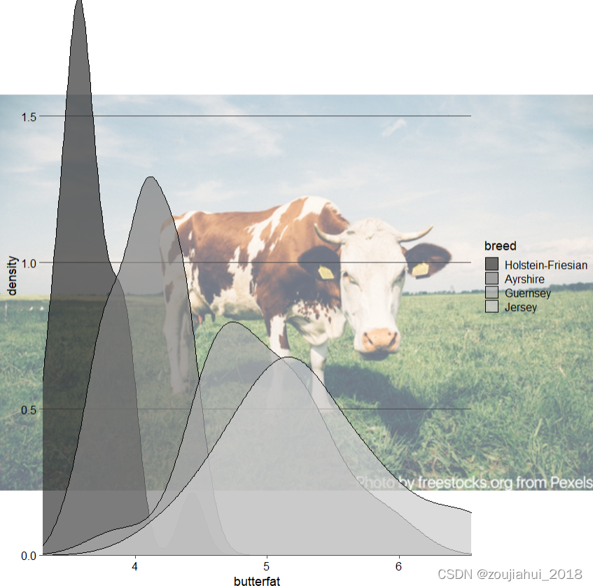
设置背景
library(magick)
library(dplyr)
library(forcats)

img <- system.file("extdata", "cow.jpg", package = "cowplot") %>%
  image_read() %>%
  image_resize("570x380") %>%
  image_colorize(35, "white")

p <- PASWR::Cows %>%
  filter(breed != "Canadian") %>%
  mutate(breed = fct_reorder(breed, butterfat)) %>%
  ggplot(aes(butterfat, fill = breed)) +
  geom_density(alpha = 0.7) +
  scale_fill_grey() +
  coord_cartesian(expand = FALSE) +
  theme_minimal_hgrid(11, color = "grey30")

ggdraw() +
  draw_image(img) +
  draw_plot(p)
customLayout::lay_new()功能更加强大灵活
未完待续…


 653
653

 被折叠的 条评论
为什么被折叠?
被折叠的 条评论
为什么被折叠?
 到【灌水乐园】发言


