


版权声明:本文为博主原创文章,未经博主允许不得转载。
本文纯个人学习笔记,由于水平有限,难免有所出错,有发现的可以交流一下。
一、Meterail Design 是什么
简单的说,Meterail Design 是一个视觉设计语言,实现一种接近真实实物的视觉效果,希望能让 UI 呈现的效果与我们实际中看到的实物效果一致,让 UI 的设计更符合用户的操作习惯等。(即添加交互效果)
官方链接:https://material.io/
极客学院中文版:http://wiki.jikexueyuan.com/project/material-design/components/bottom-sheets.html
以安卓应用中的 设置 进行说明:
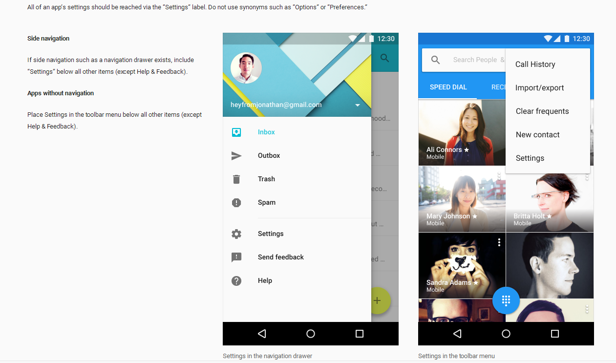
这张图是谷歌的 Meterail Design 对设置的位置说明,要求放在 Side navigation 或者 Apps without navigation 中。在 Side navigation 中,设置必须放在最后面(除了Help & Feedback)。
这些是为了让用户更常用的功能放在更容易找到并使用的地方,哪些功能更常用是谷歌通过大数据进行统计后得出的结论。类似的还有“三层原则”(功能点放在超过三层的位置,对于用户来说就是“看不到”)等。
另外,设置的作用必须是精选的一些能够让用户快速明白意思的,有提供选项给用户的,而且是根据优先级排列的 items。
Meterail Design 类似给出了一个很详细的应用开发建议,稍微了解一些,可以大大增强应用的交互性,更方便用户使用。
二、控件的兼容性
谷歌为了实现控件的兼容性,提供了v4、v7、v13等兼容包,后面的数字代表的是改兼容包支持的 api 的 version。
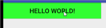
1.ripple
使用 ripple 来实现点击按钮的水波纹扩散效果,在 API 21 以上的机器没有问题,但是在小于这个版本的 API 上运行直接奔溃。
效果:
MainActivity .java
public class MainActivity extends AppCompatActivity {

    @Override
    protected void onCreate(Bundle savedInstanceState) {
        super.onCreate(savedInstanceState);
        setContentView(R.layout.activity_main);
    }
}
activity_main.xml
<LinearLayout
    xmlns:android="http://schemas.android.com/apk/res/android"
    xmlns:tools="http://schemas.android.com/tools"
    android:layout_width="match_parent"
    android:layout_height="match_parent"
    tools:context="com.xiaoyue.material.MainActivity">

    <Button
        android:layout_width="300dp"
        android:layout_height="50dp"
        android:text="Hello World!"
        style="@style/MyButton"/>

</LinearLayout>
style.xml
<resources>

    <style name="MyButton" >
        <item name="android:background">@drawable/selector_green_button</item>
        <item name="android:textSize">20dp</item>
    </style>

</resources>
selector_green_button.xml
<?xml version="1.0" encoding="utf-8"?>
<ripple xmlns:android="http://schemas.android.com/apk/res/android"
    android:color="@color/deep_green">
    <item android:drawable="@color/green"/>
</ripple>
colors.xml
<?xml version="1.0" encoding="utf-8"?>
<resources>
    <color name="deep_green">#00cfc8</color>
    <color name="green">#33ff33</color>
</resources>
这是一个简单的使用 API 来实现按钮点击水波纹效果,这个效果在低版本运行时候奔溃,是由于 ripple 这个在低版本的时候根本无法进行解析赋值,所以出错。
2.兼容
为了兼容低版本的 API,需要把上面的 selector_green_button.xml 移到 drawable-v21 包下面,重新在 draw 包下新建一个同名的 selector_green_button.xml 文件,实现一个点击效果。
新的 selector_green_button.xml
<?xml version="1.0" encoding="utf-8"?>
<selector xmlns:android="http://schemas.android.com/apk/res/android">
    <item android:drawable="@color/deep_green" android:state_pressed="true"/>
    <item android:drawable="@color/green"/>
</selector>
目录:
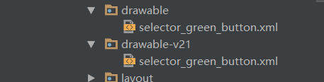
这样当运行在 API 21 以上的时候,采用 drawable-v21 下的 selector_green_button.xml,当 API 小于 21 的时候,会采用新定义的 selector_green_button.xml,程序就不会崩溃。实现一些控件的特效的时候,需要注意支持低版本的 API。
3.兼容优化
上面需要定义两个同名的 xml,相对来说会麻烦一些。对于这个例子来说,这边采用另一个方法进行兼容。
style.xml
<resources>

    <style name="NewMyButton">
        <item name="android:textColorHighlight">@color/deep_green</item>
        <item name="android:colorButtonNormal">@color/green</item>
    </style>

</resources>
activity_main.xml
<?xml version="1.0" encoding="utf-8"?>
<LinearLayout
    xmlns:android="http://schemas.android.com/apk/res/android"
    xmlns:tools="http://schemas.android.com/tools"
    android:layout_width="match_parent"
    android:layout_height="match_parent"
    tools:context="com.xiaoyue.material.MainActivity">

    <Button
        android:layout_width="300dp"
        android:layout_height="50dp"
        android:text="Hello World!"
        android:theme="@style/NewMyButton"/>

</LinearLayout>
在 Button 中使用的是主题,不再是样式了。这样的效果与上方写两个 xml 的效果是一样的。theme 可以兼容低版本的 API,主要原因是由于 AppCompatButton 这个控件的存在。AppCompatButton 与 v4 兼容包下的 android.support.v4.app.Button 功能是一模一样的。
三、AppCompatActivity
AppCompatActivity 就是一个兼容包,继承了AppCompatActivity 的 Activity 都会在解析XML 的时候,将xml里面所有的系统控件转换为 AppCompatButton 之类的 AppCompat 的控件。
这边源码采用 API 25 进行分析,不同版本略有差异。
查看 AppCompatActivity 下的 setContentView() 方法,可以很明显的看到与 Activity 的差异,AppCompatActivity 是使用 getDelegate()获取代理而不是直接使用 Window。
    public void setContentView(@LayoutRes int layoutResID) {
        getDelegate().setContentView(layoutResID);
    }
点击查看 getDelegate()方法,是使用 AppCompatDelegate.create()直接创建新的代理返回。在 AppCompatDelegate.create() 方法中,根据使用的版本不同返回对应的 AppCompatDelegate 的实现类。
    public AppCompatDelegate getDelegate() {
        if (mDelegate == null) {
            mDelegate = AppCompatDelegate.create(this, this);
        }
        return mDelegate;
    }
AppCompatDelegate 的 create:
    private static AppCompatDelegate create(Context context, Window window,
            AppCompatCallback callback) {
        final int sdk = Build.VERSION.SDK_INT;
        if (BuildCompat.isAtLeastN()) {
            return new AppCompatDelegateImplN(context, window, callback);
        } else if (sdk >= 23) {
            return new AppCompatDelegateImplV23(context, window, callback);
        } else if (sdk >= 14) {
            return new AppCompatDelegateImplV14(context, window, callback);
        } else if (sdk >= 11) {
            return new AppCompatDelegateImplV11(context, window, callback);
        } else {
            return new AppCompatDelegateImplV9(context, window, callback);
        }
    }
即继承 AppCompatActivity 的 Activity 类中 setContentView() 方法最终调的是 AppCompatDelegate的对应版本实现类中的 setContentView()方法。
AppCompatDelegateImplV7
AppCompatDelegate 的实现类根据支持的版本不同,有不一样的结果,这边已 AppCompatDelegateImplV7 类为例。点击查看 AppCompatDelegateImplV7 的 createView() 方法。
AppCompatDelegateImplV7 的 createView:
    public View createView(View parent, final String name, @NonNull Context context,
            @NonNull AttributeSet attrs) {
        if (mAppCompatViewInflater == null) {
            mAppCompatViewInflater = new AppCompatViewInflater();
        }

        boolean inheritContext = false;
        if (IS_PRE_LOLLIPOP) {
            inheritContext = (attrs instanceof XmlPullParser)
                    // If we have a XmlPullParser, we can detect where we are in the layout
                    ? ((XmlPullParser) attrs).getDepth() > 1
                    // Otherwise we have to use the old heuristic
                    : shouldInheritContext((ViewParent) parent);
        }

        return mAppCompatViewInflater.createView(parent, name, context, attrs, inheritContext,
                IS_PRE_LOLLIPOP, /* Only read android:theme pre-L (L+ handles this anyway) */
                true, /* Read read app:theme as a fallback at all times for legacy reasons */
                VectorEnabledTintResources.shouldBeUsed() /* Only tint wrap the context if enabled */
        );
    }
在 return 时候调用了 AppCompatViewInflater 的 createView 方法,可以很明确的看到就是根据获取的 xml 标签值进行判断,然后转换成 AppCompat 的组件,进行替换。
AppCompatViewInflater 的 createView:
public final View createView(View parent, final String name, @NonNull Context context,
            @NonNull AttributeSet attrs, boolean inheritContext,
            boolean readAndroidTheme, boolean readAppTheme, boolean wrapContext) {
        final Context originalContext = context;

        // We can emulate Lollipop's android:theme attribute propagating down the view hierarchy
        // by using the parent's context
        if (inheritContext && parent != null) {
            context = parent.getContext();
        }
        if (readAndroidTheme || readAppTheme) {
            // We then apply the theme on the context, if specified
            context = themifyContext(context, attrs, readAndroidTheme, readAppTheme);
        }
        if (wrapContext) {
            context = TintContextWrapper.wrap(context);
        }

        View view = null;

        // We need to 'inject' our tint aware Views in place of the standard framework versions
        switch (name) {
            case "TextView":
                view = new AppCompatTextView(context, attrs);
                break;
            case "ImageView":
                view = new AppCompatImageView(context, attrs);
                break;
            case "Button":
                view = new AppCompatButton(context, attrs);
                break;
            case "EditText":
                view = new AppCompatEditText(context, attrs);
                break;
            case "Spinner":
                view = new AppCompatSpinner(context, attrs);
                break;
            case "ImageButton":
                view = new AppCompatImageButton(context, attrs);
                break;
            case "CheckBox":
                view = new AppCompatCheckBox(context, attrs);
                break;
            case "RadioButton":
                view = new AppCompatRadioButton(context, attrs);
                break;
            case "CheckedTextView":
                view = new AppCompatCheckedTextView(context, attrs);
                break;
            case "AutoCompleteTextView":
                view = new AppCompatAutoCompleteTextView(context, attrs);
                break;
            case "MultiAutoCompleteTextView":
                view = new AppCompatMultiAutoCompleteTextView(context, attrs);
                break;
            case "RatingBar":
                view = new AppCompatRatingBar(context, attrs);
                break;
            case "SeekBar":
                view = new AppCompatSeekBar(context, attrs);
                break;
        }

        if (view == null && originalContext != context) {
            // If the original context does not equal our themed context, then we need to manually
            // inflate it using the name so that android:theme takes effect.
            view = createViewFromTag(context, name, attrs);
        }

        if (view != null) {
            // If we have created a view, check it's android:onClick
            checkOnClickListener(view, attrs);
        }

        return view;
    }
四、LinearLayoutCompat
这边分析一下 LinearLayoutCompat 的源码,顺便整理一下分析 View 的原则。
 1.这个类是干什么的,是控件还是组件,看他的初始化在干什么
 2.找到入口,一般是构造器
 3.找关键方法:onMeasure  onLayout   onDraw
1.是控件还是组件
这个比较简单,看这个类继承的是什么,继承 View 的是控件,继承 ViewGroup 的是组件。
public class LinearLayoutCompat extends ViewGroup {
	...
}
LinearLayoutCompat 继承 ViewGroup,所以是组件。
2.构造器
正常构造器都只是解析一些属性,有些时候可能会根据出来的属性值对一些其他值进行初始化判断。LinearLayoutCompat 也只是单纯的解析属性。大体上可以通过属性去猜测到这个 View 能做一些什么操作。
   public LinearLayoutCompat(Context context) {
        this(context, null);
    }

    public LinearLayoutCompat(Context context, AttributeSet attrs) {
        this(context, attrs, 0);
    }

    public LinearLayoutCompat(Context context, AttributeSet attrs, int defStyleAttr) {
        super(context, attrs, defStyleAttr);

        final TintTypedArray a = TintTypedArray.obtainStyledAttributes(context, attrs,
                R.styleable.LinearLayoutCompat, defStyleAttr, 0);

        int index = a.getInt(R.styleable.LinearLayoutCompat_android_orientation, -1);
        if (index >= 0) {
            setOrientation(index);
        }

        index = a.getInt(R.styleable.LinearLayoutCompat_android_gravity, -1);
        if (index >= 0) {
            setGravity(index);
        }

        boolean baselineAligned = a.getBoolean(R.styleable.LinearLayoutCompat_android_baselineAligned, true);
        if (!baselineAligned) {
            setBaselineAligned(baselineAligned);
        }

        mWeightSum = a.getFloat(R.styleable.LinearLayoutCompat_android_weightSum, -1.0f);

        mBaselineAlignedChildIndex =
                a.getInt(R.styleable.LinearLayoutCompat_android_baselineAlignedChildIndex, -1);

        mUseLargestChild = a.getBoolean(R.styleable.LinearLayoutCompat_measureWithLargestChild, false);

        setDividerDrawable(a.getDrawable(R.styleable.LinearLayoutCompat_divider));
        mShowDividers = a.getInt(R.styleable.LinearLayoutCompat_showDividers, SHOW_DIVIDER_NONE);
        mDividerPadding = a.getDimensionPixelSize(R.styleable.LinearLayoutCompat_dividerPadding, 0);

        a.recycle();
    }
其中 setDividerDrawable 这个方法是初始化 LinearLayout 的分割线。使用 LinearLayout 时候,有需要用到分割线,在 LinearLayoutCompat 里可以直接使用。
3.onMeasure
onMeasure 主要是测量,计算子控件的大小,同时计算自己的大小。
    @Override
    protected void onMeasure(int widthMeasureSpec, int heightMeasureSpec) {
        if (mOrientation == VERTICAL) {
            measureVertical(widthMeasureSpec, heightMeasureSpec);
        } else {
            measureHorizontal(widthMeasureSpec, heightMeasureSpec);
        }
    }
LinearLayoutCompat 自己的宽高是由子控件的宽高决定的,根据摆放的方向不同而计算宽高的算法不同。
4.onLayout
onLayout 是将子控件的上下左右位置进行确定。然后布局到 layout 上面。
    @Override
    protected void onLayout(boolean changed, int l, int t, int r, int b) {
        if (mOrientation == VERTICAL) {
            layoutVertical(l, t, r, b);
        } else {
            layoutHorizontal(l, t, r, b);
        }
    }
布局也是根据子控件的摆放方向进行不同的摆放。
5.onDraw
onDraw 只用来画自己的部分,LinearLayoutCompat 绘制自己的分割线。
    @Override
    protected void onDraw(Canvas canvas) {
        if (mDivider == null) {
            return;
        }

        if (mOrientation == VERTICAL) {
            drawDividersVertical(canvas);
        } else {
            drawDividersHorizontal(canvas);
        }
    }
绘制时候也是要按子控件的摆放方向进行判断。子控件的绘制由子控件自身进行绘制,当前控件 LinearLayoutCompat 只绘制自己的部分,在这边就只有分割线。
这边具体的不记录了,有兴趣可以跳转:http://blog.csdn.net/qq_18983205/article/details/72547972


 扫一扫
扫一扫


 21万+
21万+

 被折叠的 条评论
为什么被折叠?
被折叠的 条评论
为什么被折叠?
 到【灌水乐园】发言


