


接着上篇:我是传送门
#1. Text button
#2. Outlined button
#3. Contained button
#4. Toggle button
#5. Floating action button
我们前三种也都看到效果了,这篇示例Toggle button;
#先附上效果:
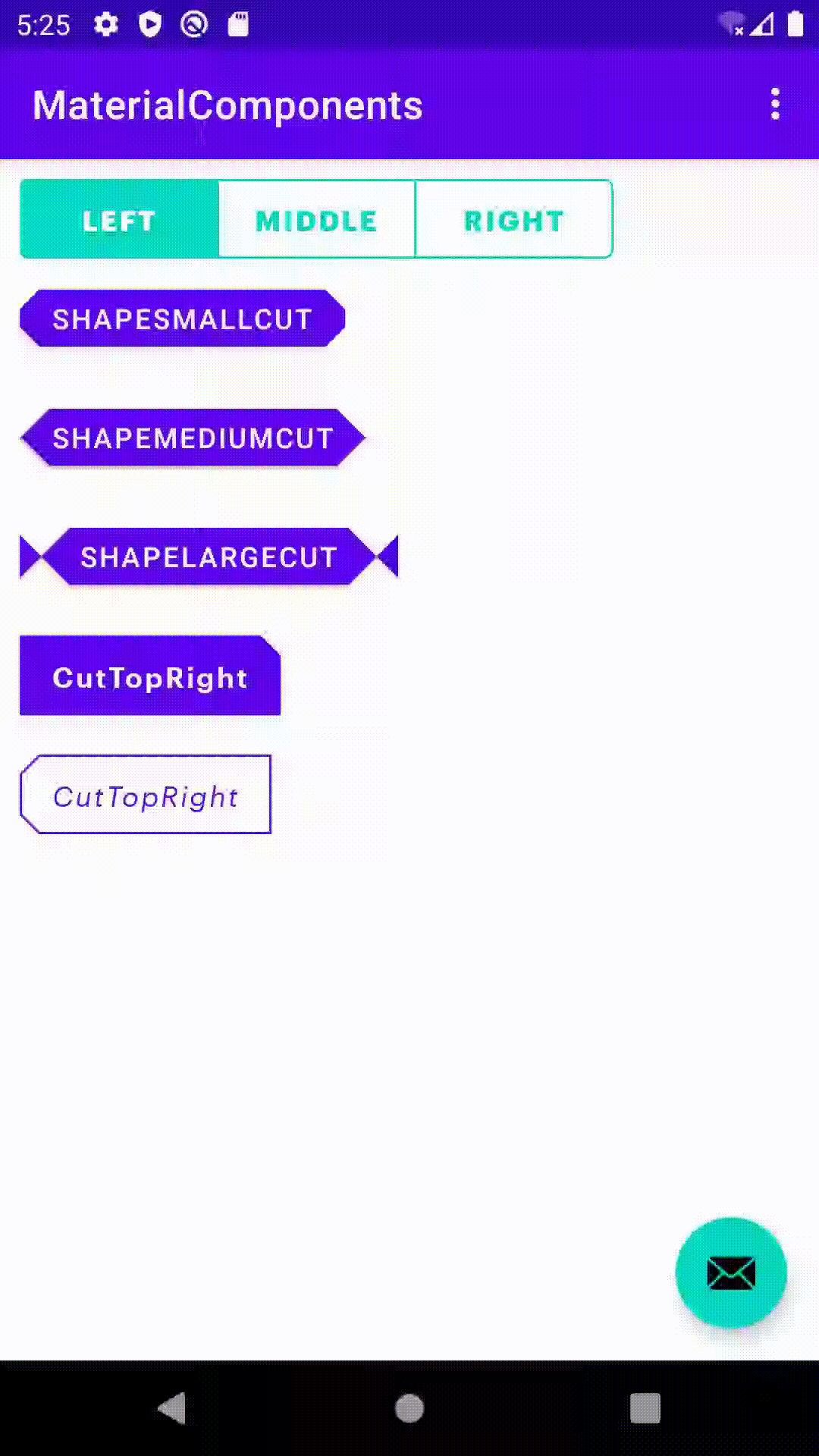
## Toggle button:切换按钮(上图的第一行按钮)
切换按钮可用于对相关选项进行分组。为了强调相关的切换按钮组,一组应共享一个公共容器。如果设置了singleSelection=true:一组切换按钮中只能选择一个选项,并且一次只能激活。选择一个选项会取消选择其他任何选项。(可以简单理解为:类似文章的对齐方式,可以选但只能选一个,或者都不选)
# xml布局:
<com.google.android.material.button.MaterialButtonToggleGroup
        android:id="@+id/button_toggle_group"
        android:layout_width="wrap_content"
        android:layout_height="wrap_content"
        app:checkedButton="@+id/btn_left"
        app:singleSelection="true">

        <Button
            android:id="@+id/btn_left"
            style="@style/OutlinedButton.GraphikBold.Green.ToggleGroup"
            android:layout_width="100dp"
            android:layout_height="40dp"
            android:text="left"
            android:textAllCaps="true" />

        <Button
            android:id="@+id/btn_middle"
            style="@style/OutlinedButton.GraphikBold.Green.ToggleGroup"
            android:layout_width="100dp"
            android:layout_height="40dp"
            android:text="middle"
            android:textAllCaps="true" />

        <Button
            android:id="@+id/btn_right"
            style="@style/OutlinedButton.GraphikBold.Green.ToggleGroup"
            android:layout_width="100dp"
            android:layout_height="40dp"
            android:text="right"
            android:textAllCaps="true" />
    </com.google.android.material.button.MaterialButtonToggleGroup>
cc: style="@style/OutlinedButton.GraphikBold.Green.ToggleGroup"这个是自己定义的style,具体下面有示例或者见上篇文章。
# Activity/Fragment:
    override fun onViewCreated(view: View, savedInstanceState: Bundle?) {
        super.onViewCreated(view, savedInstanceState)

        buttonToggleGroup.addOnButtonCheckedListener { group, checkedId, isChecked ->
            // TODO
        }
    }
⚠️ 如果我们需要 不能继续点击来取消选中(即单选 且 必须选中状态)需要给MaterialButtonToggleGroup 添加属性:
app:singleSelection="true"
app:selectionRequired="true"
到这Toggle button 完了,那效果图上那种带切角的是怎么弄的?那继续往下看👇
## ShapeAppearance属性
# xml布局:
<Button
        android:layout_width="wrap_content"
        android:layout_height="40dp"
        android:layout_marginVertical="10dp"
        android:text="ShapeSmallCut"
        app:shapeAppearance="@style/ShapeSmallCut" />

    <Button
        android:layout_width="wrap_content"
        android:layout_height="40dp"
        android:layout_marginVertical="10dp"
        android:text="ShapeMediumCut"
        app:shapeAppearance="@style/ShapeMediumCut" />

    <Button
        android:layout_width="wrap_content"
        android:layout_height="40dp"
        android:layout_marginVertical="10dp"
        android:paddingHorizontal="30dp"
        android:text="ShapeLargeCut"
        app:shapeAppearance="@style/ShapeLargeCut" />

    <Button
        style="@style/Button.GraphikSemiBold.Purple.CutTopRight"
        android:layout_width="wrap_content"
        android:layout_height="40dp"
        android:layout_marginVertical="10dp"
        android:text="CutTopRight" />
# styles_button_shape.xml
<resources>
    <style name="ShapeSmallCut" parent="ShapeAppearance.MaterialComponents.SmallComponent">
        <item name="cornerFamily">cut</item>
        <item name="cornerSize">10dp</item>
    </style>

    <style name="ShapeMediumCut" parent="ShapeAppearance.MaterialComponents.MediumComponent">
        <item name="cornerFamily">cut</item>
        <item name="cornerSize">15dp</item>
    </style>

    <style name="ShapeLargeCut" parent="ShapeAppearance.MaterialComponents.LargeComponent">
        <item name="cornerFamily">cut</item>
        <item name="cornerSize">25dp</item>
    </style>

    <style name="ShapeSmallCut.TopRight">
        <item name="cornerSize">0dp</item>
        <item name="cornerFamily">cut</item>
        <item name="cornerSizeTopRight">10dp</item>
    </style>

</resources>
# styles_button.xml设置添加进去就ok了
    <style name="Button" parent="Widget.MaterialComponents.Button">
        <item name="android:textColor">@color/colorWhite</item>
        <item name="android:textSize">14sp</item>
        <item name="android:insetTop">0dp</item>
        <item name="android:insetBottom">0dp</item>
        <item name="android:textAllCaps">false</item>
        <item name="android:gravity">center</item>
        <item name="backgroundTintMode">src_atop</item>
        <item name="backgroundTint">@color/colorPrimary</item>
        <item name="elevation">10dp</item>
        <item name="rippleColor">@color/colorWhite</item>
        <item name="iconTintMode">src_atop</item>
        <item name="iconTint">@color/colorWhite</item>
        <item name="iconGravity">textStart</item>
        <item name="iconPadding">0dp</item>
        <item name="iconSize">20dp</item>
    </style>

    <style name="Button.GraphikSemiBold">
        <item name="android:fontFamily">@font/graphik_semi_bold</item>
    </style>

    <style name="Button.GraphikSemiBold.Purple">
        <item name="backgroundTint">@color/colorPrimary</item>
    </style>

    <style name="Button.GraphikSemiBold.Purple.CutTopRight">
        <item name="shapeAppearance">@style/ShapeSmallCut.TopRight</item>
    </style>
Material Design 还有很多的效果,这里就简单的示例,自己可以去发现!
######## Material Design系列 - Button ########
# Material Design系列-MaterialButton(Icon)
# Material Design系列-Toggle Button(MaterialButtonToggleGroup/ShapeAppearance)


 扫一扫
扫一扫


 82
82

 被折叠的 条评论
为什么被折叠?
被折叠的 条评论
为什么被折叠?
 到【灌水乐园】发言


