


Button: 即使用按钮,用户只需单击一下即可执行操作并做出选择,并带有点击效果以及各种样式。
#1. 在使用 Material Buttons 按钮之前,建议将项目移至androidx,然后我们需要添加一个依赖:
在build.gradle中:
allprojects {
    repositories {
      google()
      jcenter()
    }
  }
在dependencies中:
dependencies {
    // ...
    implementation 'com.google.android.material:material:<version>'
    // ...
  }
cc:这样还不够,还需要更改您的应用程序主题以从Material Components主题中继承,示例:
<style name="AppTheme" parent="Theme.MaterialComponents.Light">
    <!-- ... -->
</style>
#2. 上面简单讲一下,下面进入主题。
MaterialButton包括以下五种:(这篇只涉及前三种使用)
#1. Text button
#2. Outlined button
#3. Contained button
#4. Toggle button
#5. FloatingActionButton
先附上效果:
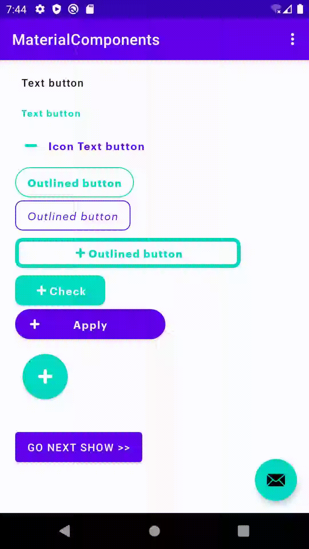
## Text button
<Button
        android:id="@+id/textButton"
        style="@style/Widget.MaterialComponents.Button.TextButton"
        android:layout_width="wrap_content"
        android:layout_height="wrap_content"
        android:text="Text button" />
## Outlined button
<Button
        android:id="@+id/outlinedButton"
        style="?attr/materialButtonOutlinedStyle"
        android:layout_width="wrap_content"
        android:layout_height="wrap_content"
        android:text="Outlined button" />
## Contained button(Button)
<Button
        style="?attr/materialButtonStyle"
        android:layout_width="wrap_content"
        android:layout_height="wrap_content"
        android:text="Contained button" />

<!--或者-->
<!--Button style默认指定Widget.MaterialComponents.Button/?attr/materialButtonStyle-->

<Button
        android:layout_width="wrap_content"
        android:layout_height="wrap_content"
        android:text="Contained button" />
### 他们还都支持添加icon:)
只需要更改在style在后面加上.Icon
style="@style/Widget.MaterialComponents.Button.TextButton.Icon"
style="@style/Widget.MaterialComponents.Button.OutlinedButton.Icon"
style="@style/Widget.MaterialComponents.Button.Icon"
它可以只有一个Icon,不带文字的按钮:
<!--实现只有icon的按钮 -->
<Button
        android:id="@+id/onlyIconButton"
        style="@style/Button.GraphikSemiBold.Green"
        android:layout_width="60dp"
        android:layout_height="60dp"
        android:layout_margin="10dp"
        app:cornerRadius="30dp"
        app:elevation="10dp"
        app:icon="@drawable/ic_plus"
        app:iconGravity="textStart"
        app:iconSize="30dp" />
### 属性示例:
<Button
        android:id="@+id/containedIconButton"
        style="@style/Widget.MaterialComponents.Button.Icon"
        android:layout_width="wrap_content"
        android:layout_height="50dp"
        android:layout_marginBottom="10dp"
        android:insetTop="0dp"
        android:insetBottom="0dp"
        android:text="Contained button"
        app:backgroundTint="@color/colorAccent"
        app:cornerRadius="14dp"
        app:elevation="15dp"
        app:icon="@drawable/ic_plus"
        app:iconGravity="textStart"
        app:iconSize="30dp"
        app:rippleColor="@color/colorWhite" />

android:insetTop/insetBottom //设置0dp可以让按钮的高度全充满设置的高度(layout_height)
app:backgroundTint //设置按钮填充的背景色
app:rippleColor//点击效果(水波纹)覆盖色
app:cornerRadius //设置按钮圆角
app:strokeColor //设置按钮线框颜色
app:elevation //设置按钮的海拔高度,可以理解为按下时的阴影效果,更高的海拔高度增加了内置按钮的突出度
app:icon //给按钮添加Icon
app:iconGravity//Icon在按钮中的位置,相对于Text的位置有四种textStart/textEnd/start/end;所以它不能显示在上下
app:iconSize //控制Icon显示的尺寸
### 另外,如果有需要设置按钮的状态(checkable/checked/enabled),可以去自定义,需要使用selector来设置各种状态的颜色:
<selector xmlns:android="http://schemas.android.com/apk/res/android">
    <item android:alpha="1.00" android:color="@color/colorBlack" android:state_enabled="true"/>
    <item android:alpha="1.00" android:color="@color/colorBlack" android:state_checkable="true" android:state_checked="true" android:state_enabled="true"/>
    <item android:alpha="0.60" android:color="?attr/colorOnSurface" android:state_checkable="true" android:state_checked="false" android:state_enabled="true"/>
    <item android:alpha="0.38" android:color="?attr/colorOnSurface"/>
</selector>
#### 最后,由上面发现MaterialComponents已经由默认都样式,如果想示例一样,由不同都需求显示,其实很麻烦的,所以...用style来优化(每次那么长一坨的一个按钮,自己不嫌弃,别人看的也累)
<!--TextButton-->
<Button
        android:id="@+id/textButton"
        style="@style/TextButton.GraphikSemiBold.Green"
        android:layout_width="wrap_content"
        android:layout_height="40dp"
        android:text="Text button"
        android:textSize="12sp" />

<!--OutlinedButton-->
<Button
        android:id="@+id/outlinedButton"
        style="@style/OutlinedButton.GraphikBold.Green"
        android:layout_width="wrap_content"
        android:layout_height="40dp"
        android:layout_marginBottom="4dp"
        android:text="Outlined button"
        app:cornerRadius="30dp" />

<!--Button-->
<Button
        android:id="@+id/btnCheck"
        style="@style/Button.GraphikSemiBold.Green.Check"
        android:layout_width="120dp"
        android:layout_height="40dp"
        android:layout_marginBottom="5dp"
        android:text="Check"
        app:icon="@drawable/ic_plus" />
是不是眼前一亮~,来看下具体的styles_button.xml(下面只展示:Button.GraphikSemiBold.Green.Check 相关的,其他的依葫芦画瓢):
<style name="Button" parent="Widget.MaterialComponents.Button">
        <item name="android:textColor">@color/colorWhite</item>
        <item name="android:textSize">14sp</item>
        <item name="android:insetTop">0dp</item>
        <item name="android:insetBottom">0dp</item>
        <item name="android:textAllCaps">false</item>
        <item name="android:gravity">center</item>
        <item name="backgroundTintMode">src_atop</item>
        <item name="backgroundTint">@color/colorPrimary</item>
        <item name="elevation">10dp</item>
        <item name="rippleColor">@color/colorWhite</item>
        <item name="iconTintMode">src_atop</item>
        <item name="iconTint">@color/colorWhite</item>
        <item name="iconGravity">textStart</item>
        <item name="iconPadding">0dp</item>
        <item name="iconSize">20dp</item>
    </style>
    <style name="Button.GraphikSemiBold">
        <item name="android:fontFamily">@font/graphik_semi_bold</item>
    </style>

    <style name="Button.GraphikRegularItalic">
        <item name="android:fontFamily">@font/graphik_regular_italic</item>
    </style>

    <style name="Button.GraphikSemiBold.Green">
        <item name="backgroundTint">@color/colorAccent</item>
    </style>

    <style name="Button.GraphikSemiBold.Purple">
        <item name="backgroundTint">@color/colorPrimary</item>
    </style>

    <style name="Button.GraphikSemiBold.Purple.Apply">
        <item name="cornerRadius">25dp</item>
        <item name="elevation">10dp</item>
    </style>

    <style name="Button.GraphikSemiBold.Green.Check">
        <item name="cornerRadius">10dp</item>
    </style>
######## Material Design系列 - Button ########
# Material Design系列-MaterialButton(Icon)
# Material Design系列-Toggle Button(MaterialButtonToggleGroup/ShapeAppearance)
# Material Design系列-FloatingActionButton(FAB)


 222
222


 被折叠的 条评论
为什么被折叠?
被折叠的 条评论
为什么被折叠?
 到【灌水乐园】发言


