


原生UI连载目录
EasyClick 原生UI教程
讲师:Mr-老鬼,QQ:1156346325
EasyClick 原生UI教程电梯直达:EasyClick 原生UI教程总纲
EasyClick 原生UI控件科普
写在前面,上一篇EasyClick 原生UI连载九 原生UI之布局科普,了解了之后接着来了解原生UI控件。
TextView控件
从字面意思就是一个文本视图,这是一个用来显示文字的控件。
例子:
<?xml version="1.0" encoding="utf-8"?>
<LinearLayout xmlns:android="http://schemas.android.com/apk/res/android"
		      android:layout_width="match_parent"
		      android:layout_height="match_parent">

		    <TextView  android:layout_width="wrap_content"
				       android:layout_height="wrap_content"
				       android:text="这是个文本" />

</LinearLayout>
显示出来的样子是这样的

注意: 任何一个Android 控件都要放在布局里,控件需要一个容器来存放自己否则就是错误的写法。
textview 的属性
layout_width:
组件的宽度,一般写:wrap_content或者match_parent(fill_parent),前者是控件显示的内容多大,控件就多大,而后者会填满该控件所在的父容器;当然也可以设置成特定的大小。
layout_height:
组件的高度,内容同上。
gravity:
设置控件中内容的对齐方向,详见EasyClick 原生UI连载九里面的gravity属性
text:
设置显示的文本内容。
textColor:
设置字体颜色,例如 #00FFAA。
textStyle:
设置字体风格,三个可选值:normal(无效果),bold(加粗),italic(斜体)
textSize:
字体大小,单位:sp
background:
控件的背景颜色,可以理解为填充整个控件的颜色;
还有更多的属性这里不再赘述 详见EasyClick 原生UI连载 一里的textview属性
Button控件
这是个按钮控件,举个例子如下图是个按钮,它可以干一些件事情。
代码演示:
<?xml version="1.0" encoding="utf-8"?>
<LinearLayout xmlns:android="http://schemas.android.com/apk/res/android"
   			  android:layout_width="match_parent"
   			  android:layout_height="match_parent">

		    <Button android:layout_width="wrap_content"
		       	    android:layout_height="wrap_content"
		            android:text="这是个按钮" />

</LinearLayout>
显示的样子是这样的

Button属性
text :
设置显示的文本
textColor:
设置显示文本的颜色
textSize :
设置显示文本字体大小
background :
可拉伸使用的背景
宽度高度这里不再赘述,更多属性详见:EasyClick 原生UI连载 一里的Button属性
EditText 输入框控件
字面意思这是一个输入文字的控件,就是个文本编辑框可以输入文字。
代码演示:
<?xml version="1.0" encoding="utf-8"?>
<LinearLayout xmlns:android="http://schemas.android.com/apk/res/android"
android:layout_width="match_parent"
android:layout_height="match_parent"
android:background="#AABBCC">
<!--为了区分布局和控件加了背景色-->
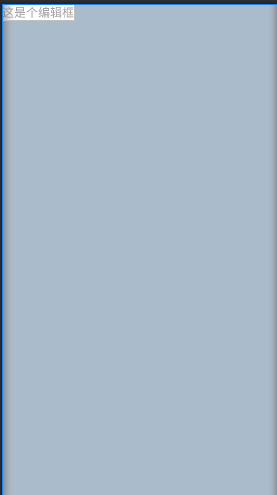
<EditText android:layout_width="wrap_content"
android:layout_height="wrap_content"
android:hint="这是个编辑框"
android:textColor="#000000"
android:background="#FFFFFF"/>
<!--为了更明显的显示出编辑框加了背景色区分-->
</LinearLayout>
显示效果如下
EditText 属性
hint
这个是提示文本,点击到这里后会输入文字内容会隐藏掉,用法:android:hint=“请输入文字内容” 。
更多属性详见EasyClick 原生UI连载 一里的EditText 属性。
CheckBox 复选框
这是多选框可以选择多个选项。就像是多选题的选择项可以勾选多个。
有两个状态:选择为true ,不选择为false
代码演示:
<?xml version="1.0" encoding="utf-8"?>
<LinearLayout xmlns:android="http://schemas.android.com/apk/res/android"
android:layout_width="match_parent"
android:layout_height="match_parent"
android:background="#AABBCC">
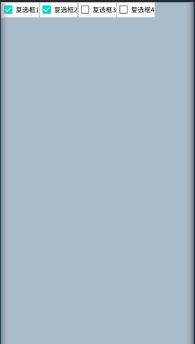
<CheckBox android:layout_width="wrap_content"
android:layout_height="wrap_content"
android:text="复选框1"
android:textColor="#000000"
android:background="#FFFFFF"
android:checked="true"/>
<CheckBox android:layout_width="wrap_content"
android:layout_height="wrap_content"
android:text="复选框2"
android:textColor="#000000"
android:background="#FFFFFF"
android:checked="true"/>
<CheckBox android:layout_width="wrap_content"
android:layout_height="wrap_content"
android:text="复选框3"
android:textColor="#000000"
android:background="#FFFFFF"/>
<CheckBox android:layout_width="wrap_content"
android:layout_height="wrap_content"
android:text="复选框4"
android:textColor="#000000"
android:background="#FFFFFF"/>
</LinearLayout>
显示效果如下:
CheckBox 属性
checked:
这个是默认选择或者不选择。例子:默认选择写法是这样的 android:checked=“true”。
更多属性详见EasyClick 原生UI连载 二里的CheckBox 属性。
RadioButton 单选框
字面意思就是个单选框,就像单选题一样只能选择一个。
RadioGroup 这个布局是专门存放单选框的,原生UI连载四已经讲了。
代码演示:
<?xml version="1.0" encoding="utf-8"?>
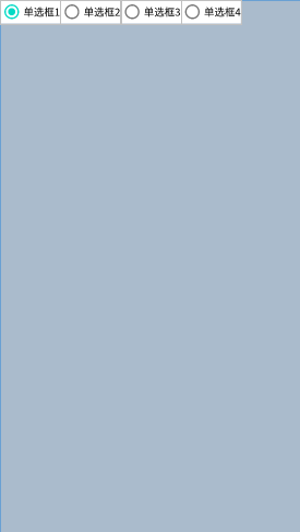
<RadioGroup xmlns:android="http://schemas.android.com/apk/res/android"
android:layout_width="match_parent"
android:layout_height="match_parent"
android:background="#AABBCC"
android:orientation="horizontal">
<RadioButton
android:layout_width="wrap_content"
android:layout_height="wrap_content"
android:text="单选框1"
android:textColor="#000000"
android:background="#FFFFFF"
android:checked="true"/>
<RadioButton
android:layout_width="wrap_content"
android:layout_height="wrap_content"
android:text="单选框2"
android:textColor="#000000"
android:background="#FFFFFF"/>
<RadioButton
android:layout_width="wrap_content"
android:layout_height="wrap_content"
android:text="单选框3"
android:textColor="#000000"
android:background="#FFFFFF"/>
<RadioButton
android:layout_width="wrap_content"
android:layout_height="wrap_content"
android:text="单选框4"
android:textColor="#000000"
android:background="#FFFFFF"/>
</RadioGroup>
显示效果:
RadioButton属性
同上面的复选框,这里不再赘述。
Spinner 下拉选择框
这是个下拉框控件,就是提供好多选项通过点击这个控件弹出一个下拉列表一样的选择框。
代码演示:
<?xml version="1.0" encoding="utf-8"?>
<LinearLayout xmlns:android="http://schemas.android.com/apk/res/android"
			  android:layout_width="match_parent"
			  android:layout_height="match_parent"
			  android:background="#AABBCC"
			  android:orientation="horizontal">
		    <TextView android:layout_width="wrap_content"
                      android:layout_height="wrap_content"
                      android:text="我是下拉框控件: " />
	<!--注意 下面的text属性这是EasyClick 官方写法 不是Android原生写法 -->
		    <Spinner  android:layout_width="wrap_content"
				      android:layout_height="wrap_content"
				      android:text="选择一|选择二|选择三"
				      android:textColor="#000000"
				      android:background="#FFFFFF"/>

</LinearLayout>
显示效果:

Spinner属性
text=“选项一|选项二”:
这个是EasyClick官方写法用来分隔下拉框的选项。更多属性详见EasyClick 原生UI连载 二里的Spinner 属性。
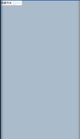
Swtich 开关按钮
这个玩意就是个开关,就和我们常见的开关是一个道理,有俩状态:开true或者关false;
代码演示
<?xml version="1.0" encoding="utf-8"?>
<LinearLayout xmlns:android="http://schemas.android.com/apk/res/android"
			  android:layout_width="match_parent"
			  android:layout_height="match_parent"
			  android:background="#AABBCC"
			  android:orientation="horizontal">

	   <Switch  android:layout_width="wrap_content"
		        android:layout_height="wrap_content"
		        android:text="我是开关"
		        android:textColor="#000000"
		        android:background="#FFFFFF"/>


</LinearLayout>
显示效果
Switch属性
同CheckBox 属性 这里不再赘述看一下上面写的。
ImageView 图像控件
这个是显示图片的一个视图,类似于相框一样的作用。
代码演示
<?xml version="1.0" encoding="utf-8"?>
<LinearLayout xmlns:android="http://schemas.android.com/apk/res/android"
		      android:layout_width="match_parent"
		      android:layout_height="match_parent"
		      android:background="#AABBCC"
		      android:orientation="horizontal">

	    <ImageView  android:layout_width="wrap_content"
			        android:layout_height="wrap_content"
			        android:src="@drawable/EC"/>


</LinearLayout>
显示效果
ImageView属性
src:
使用引用资源图片方式android:src= “@drawable/EC”;
引用网络图片方式android:src= “图片URL链接”;
EasyClick 原生UI连载 二里的ImageView属性。
WebView 内嵌浏览器
这个就是加载一个网页的控件。类似于浏览器显示一个网页的东西。
代码演示
<?xml version="1.0" encoding="utf-8"?>
<LinearLayout xmlns:android="http://schemas.android.com/apk/res/android"
		      android:layout_width="match_parent"
		      android:layout_height="match_parent"
		      android:background="#AABBCC"
		      android:orientation="horizontal">
	<!-- EasyClick 官方写法 -->
	    <WebView    android:layout_width="wrap_content"
			        android:layout_height="wrap_content"
			        android:url="http://www.baidu.com"/>

</LinearLayout>
显示效果

WebView属性
url :
加载一个网页 使用方法: android:url=“http://www.baidu.com”//加载百度主页
更多属性详见 EasyClick 原生UI连载 二里的WebView属性。
总结
控件就是布局里面装的各种东西,就像冰箱里的水果、饮料、啤酒之类的。当然了你只能看不能拿走吃喝了。
注意
文中没有提到的属性请参考
公有属性: EasyClick 原生UI连载 三
本文的布局代码没有注明EasyClick官方写法的是基于Android编写并不是用EasyClick 编辑的,两者有的地方是有区别的。具体参考官方支持的属性和写法。
我是Mr-老鬼、QQ1156346325 。交流QQ群:620028786,647082990
---------------------------------------版权声明------------------------------------------------------
版权所有~Mr-老鬼 ~转载请注明原文地址。
免责声明:本文所有的教程仅限交流学习使用不得用于违法用途,造成的法律后果本人不承担责任。


 1047
1047


 被折叠的 条评论
为什么被折叠?
被折叠的 条评论
为什么被折叠?
 到【灌水乐园】发言


