


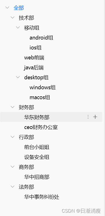
废话不多说,直接上图:
直接上代码:
前提条件,需在pubspec.yaml中依赖如下三方组件
  fluent_ui:
    git: https://github.com/bdlukaa/fluent_ui.git

  # 可展开收缩de列表小部件
  expandable: ^5.0.1
1.调用入口
SingleChildScrollView(
                      child: material.Material(
                        color: Colors.transparent,
                        child: Padding(
                          padding: const EdgeInsets.symmetric(horizontal: 5),
                          child: ExpandableTheme(
                            data: const ExpandableThemeData(
                              useInkWell: true,
                              inkWellBorderRadius: BorderRadius.all(
                                Radius.circular(3),
                              ),
                            ),
                            child: Builder(
                              builder: (BuildContext context) {
                                return buildDepartTree(true, null,
                                    _personManagerVM.showDepartGroupTree, 0);
                              },
                            ),
                          ),
                        ),
                      ),
                    )
2.函数buildDepartTree()代码
/// 记录当前都被展开的部门id
Map<String?, ExpandableController> expandedGroupIds = {};

Widget buildDepartTree(bool isAllItem, GroupVO? parentGroupVO,
      GroupVO? groupVO, int itemIndentMultiple) {
    if (!_personManagerVM.expandedGroupIds.containsKey(groupVO?.id)) {
      _personManagerVM.expandedGroupIds[groupVO?.id] =
          ExpandableController(initialExpanded: isAllItem ? true : false);
    }
    return ExpandableNotifier(
      controller: _personManagerVM.expandedGroupIds[groupVO?.id],
      child: ScrollOnExpand(
        child: ExpandablePanel(
          theme: const ExpandableThemeData(
            headerAlignment: ExpandablePanelHeaderAlignment.center,
            tapBodyToExpand: true,
            tapBodyToCollapse: false,
            hasIcon: false,
          ),
          header: DepartGroupItemMouseRegionWidget(
            itemIndentMultiple: itemIndentMultiple,
            parentDepartGroup: parentGroupVO,
            departGroup: groupVO ?? GroupVO(name: "--"),
            needShowItemMenuIcon: isAllItem ? false : true,
            onTap: () {
              // 选中的部门,需要更新右侧展示的人员列表
              logI('onSelectionChanged: ${groupVO?.toString()}');
              if (groupVO?.id == null || (groupVO?.id?.isEmpty ?? true)) {
                _personManagerVM.getAllPersons();
              } else {
                _personManagerVM.getEmployeeByGroupIds(
                    groupIds: [groupVO?.id ?? ""], init: true);
              }
              _personManagerVM.currentSelectedGroupId = groupVO?.id;
            },
          ),
          collapsed: const SizedBox.shrink(),
          expanded: buildChildDepartList(
              groupVO, groupVO?.sub ?? [], itemIndentMultiple),
        ),
      ),
    );
  }
3.组件DepartGroupItemMouseRegionWidget代码如下:
class DepartGroupItemMouseRegionWidget extends StatefulWidget {
  final GroupVO? parentDepartGroup;
  final GroupVO departGroup;
  final bool? needShowItemMenuIcon;
  final int itemIndentMultiple;
  final GestureTapCallback? onTap;

  const DepartGroupItemMouseRegionWidget(
      {super.key,
      this.parentDepartGroup,
      required this.departGroup,
      this.needShowItemMenuIcon,
      required this.itemIndentMultiple,
      this.onTap});

  @override
  State<StatefulWidget> createState() =>
      _DepartGroupItemMouseRegionWidgetState();
}

class _DepartGroupItemMouseRegionWidgetState
    extends State<DepartGroupItemMouseRegionWidget> {
  final List<String> departOperateList = [
    /*move, copy, */ S.current.reSetName,
    S.current.delete
  ];
  var menuController = FlyoutController();
  var menuAttachKey = GlobalKey();
  bool isEnter = false;

  @override
  Widget build(BuildContext context) {
    return MouseRegion(
      cursor: SystemMouseCursors.click,
      onEnter: (event) {
        setState(() {
          isEnter = true;
        });
      },
      onExit: (event) {
        setState(() {
          isEnter = false;
        });
      },
      child: Row(
        mainAxisSize: MainAxisSize.max,
        mainAxisAlignment: MainAxisAlignment.start,
        crossAxisAlignment: CrossAxisAlignment.center,
        children: [
          Offstage(
            offstage: (widget.departGroup.sub?.isEmpty ?? true),
            child: Row(
              children: [
                SizedBox(
                  width: widget.itemIndentMultiple * 15,
                ),
                ExpandableIcon(
                  theme: const ExpandableThemeData(
                    expandIcon: FluentIcons.chevron_right,
                    collapseIcon: FluentIcons.chevron_down,
                    iconColor: HLColors.c000000o86,
                    iconSize: 10.0,
                    iconRotationAngle: math.pi / 2,
                    iconPadding: EdgeInsets.only(left: 15, right: 13),
                  ),
                ),
              ],
            ),
          ),
          Expanded(
            child: GestureDetector(
              onTap: widget.onTap,
              child: Container(
                // 添加背景色,不然GestureDetector-》onTap点击空白区域时不响应事件
                color: Colors.transparent,
                alignment: Alignment.centerLeft,
                padding: EdgeInsets.only(
                    left: (widget.departGroup.sub?.isEmpty ?? true)
                        ? (38 + widget.itemIndentMultiple * 15)
                        : 0,
                    right: 15,
                    top: 5,
                    bottom: 5),
                child: Selector<PersonManagerVM, String?>(
                  builder: (context, currentSelectedGroupId, child) => Text(
                    ((widget.departGroup.id?.isEmpty ?? true) ||
                            (widget.departGroup.name?.isEmpty ?? true))
                        ? HLStrings.all
                        : widget.departGroup.name ?? "",
                    maxLines: 1,
                    overflow: TextOverflow.ellipsis,
                    style: ((currentSelectedGroupId ?? "") ==
                            widget.departGroup.id)
                        ? HLTextStyles.s14c0064FFw400
                        : HLTextStyles.s14c000000w400,
                  ),
                  selector: (_, p1) => p1.currentSelectedGroupId,
                ),
              ),
            ),
          ),
          if (widget.needShowItemMenuIcon == true)
            Offstage(
              offstage: !isEnter,
              child: FlyoutTarget(
                key: menuAttachKey,
                controller: menuController,
                child: IconButton(
                  style: ButtonStyle(padding: ButtonState.all(EdgeInsets.zero)),
                  icon: const SizedBox(
                    width: 20,
                    height: 20,
                    child: Icon(FluentIcons.more_vertical, size: 11),
                  ),
                  onPressed: () async {
                    menuController.showFlyout(
                      autoModeConfiguration: FlyoutAutoConfiguration(
                        preferredMode: FlyoutPlacementMode.bottomCenter,
                      ),
                      barrierDismissible: true,
                      dismissOnPointerMoveAway: false,
                      dismissWithEsc: true,
                      builder: (ctx) {
                        // 部门操作菜单
                        return MenuFlyout(
                          items: createDepartOperateMenuList(),
                        );
                      },
                    );
                  },
                ),
              ),
            ),
          Visibility.maintain(
            visible: isEnter,
            child: Padding(
              padding: const EdgeInsets.only(right: 10),
              child: IconButton(
                style: ButtonStyle(padding: ButtonState.all(EdgeInsets.zero)),
                icon: const SizedBox(
                  width: 20,
                  height: 20,
                  child: Icon(FluentIcons.add, size: 11),
                ),
                onPressed: () {
                  // 创建部门或组织,支持多层级部门

                },
              ),
            ),
          ),
        ],
      ),
    );
  }

  /// 部门操作菜单
  List<MenuFlyoutItemBase> createDepartOperateMenuList() {
    return [
      for (int index = 0; index < departOperateList.length; index++)
        MenuFlyoutItem(
          text: Text(departOperateList[index]),
          onPressed: () {
            HLRouter.pop();
            switch (index) {
              /*case 0:
              case 1:
                // todo 菜单中部门操作项后续 》复制、移动

                break;*/
              case 0:
                // 重命名

                break;
              case 1:
                // 删除
                HLSimpleDialog(
                  context,
                  title: S.current.confirmDelete,
                  cancelBtnStr: S.current.cancel,
                  content: S.current.confirmDeleteDepartGroupTips,
                  customConfirmBtn: Button(
                    onPressed: NoDoubleClickUtils.debounce(() async {
                      // 点击删除按钮

                    }),
                    child: Text(S.current.delete,
                        style: HLTextStyles.s14w400cDD3459),
                  ),
                ).showSimpleDialog();
                break;
              default:
                break;
            }
          },
        ),
    ];
  }
}
4.函数buildChildDepartList()代码如下:
buildChildDepartList(
      GroupVO? parentGroupVO, List<GroupVO> sub, int itemIndentMultiple) {
    itemIndentMultiple++;
    return Column(
      children: sub.map(
        (value) {
          return buildDepartTree(
              false, parentGroupVO, value, itemIndentMultiple);
        },
      ).toList(),
    );
  }
5.数据bean:
class GroupVO {
  String? id;
  String? name;
  List<GroupVO>? sub;
  // 部门是否选中
  bool isSelected = false;

  GroupVO({
    this.id,
    this.name,
    this.sub,
  });
}
6.提供一个带标题、内容、底部两按钮的弹窗组件HLSimpleDialog,代码如下:
/// HLSimpleDialog
/// 简单通用的dialog
///
/// 包含:标题、内容(传入contentWidget可自定义)、两个按钮(左边cancel按钮无背景色,右边confirm按钮背景有默认主题色也支持修改);
/// 支持修改按钮字体样式,支持自定义点击事件回调
class HLSimpleDialog {
  late final BuildContext context;
  late final String title;
  late final double? dialogWidth;
  late final double? dialogHeight;
  late final bool? showCloseIcon;
  late final String? content;
  late final Widget? contentWidget;
  late final Widget? customConfirmBtn;
  late final String? cancelBtnStr;
  late final String? confirmBtnStr;
  late final TextStyle? cancelBtnTextStyle;
  late final TextStyle? confirmBtnTextStyle;
  late final Color? confirmBtnBgColor;
  late final VoidCallback? cancelClick;
  late final VoidCallback? confirmClick;

  HLSimpleDialog(this.context,
      {required this.title,
      this.dialogWidth,
      this.dialogHeight,
      this.showCloseIcon,
      this.content,
      this.contentWidget,
      this.customConfirmBtn,
      this.confirmBtnStr,
      this.cancelBtnStr,
      this.cancelBtnTextStyle,
      this.confirmBtnTextStyle,
      this.confirmBtnBgColor,
      this.confirmClick,
      this.cancelClick});

  Future<bool?> showSimpleDialog() async {
    return await showDialog<bool>(
      barrierDismissible:
          (confirmBtnStr == null && cancelBtnStr == null) ? true : false,
      context: context,
      builder: (_) {
        return ContentDialog(
          constraints: BoxConstraints.expand(
            width: dialogWidth ?? 448,
            height: dialogHeight ?? 188,
          ),
          title: Row(
            children: [
              Text(
                title ?? "",
                style: HLTextStyles.s20c000000w600,
              ),
              const Spacer(),
              if (showCloseIcon == true)
                IconButton(
                  icon: Image.asset(
                    'assets/images/2.0x/close.png',
                    width: 10.9,
                    height: 10.9,
                  ),
                  onPressed: () {
                    Navigator.pop(context, true);
                  },
                )
            ],
          ),
          content: SizedBox.expand(
            child: contentWidget ??
                Text(
                  content ?? "",
                  style: HLTextStyles.s14w400,
                ),
          ),
          actions: (confirmBtnStr == null &&
                  customConfirmBtn == null &&
                  cancelBtnStr == null)
              ? null
              : [
                  const SizedBox(),
                  if (confirmBtnStr == null && customConfirmBtn == null)
                    const SizedBox(),
                  cancelBtnStr != null
                      ? Button(
                          onPressed: cancelClick ??
                              () {
                                Navigator.pop(context, false);
                              },
                          child: Text(cancelBtnStr ?? "",
                              style: cancelBtnTextStyle ??
                                  HLTextStyles.s14c000000w400),
                        )
                      : const SizedBox(),
                  customConfirmBtn ??
                      ((confirmBtnStr != null)
                          ? FilledButton(
                              style: ButtonStyle(
                                  backgroundColor: ButtonState.all(
                                      confirmBtnBgColor ?? HLColors.c0064FF)),
                              onPressed: confirmClick ??
                                  () {
                                    Navigator.pop(context, true);
                                  },
                              child: Text(confirmBtnStr ?? "",
                                  style: confirmBtnTextStyle ??
                                      HLTextStyles.s14w400cFFFFFF),
                            )
                          : const SizedBox.shrink()),
                ],
        );
      },
    );
  }
}
扩展:可追加多选框
具体效果如下:
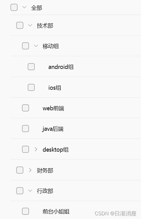
可修改DepartGroupItemMouseRegionWidget中子组件排版或全新自定义head字段所对应的组件,不如定义一个ItemCheckBoxWidget组件,通过ValueListenableBuilder局部刷新勾选状态,同时勾选状态也可定义一个list做保存,下次进来加载上次的勾选状态,类似代码片段如下:
typedef TreeViewSelectionChanged = Future<void> Function(
    Iterable<GroupVO?> selectedItems)?;


class ItemCheckBoxWidget extends StatelessWidget {
@override
  Widget build(BuildContext context) {
    ValueNotifier<bool?> isSelected =
        ValueNotifier<bool?>(mGroupVO?.isSelected);
    var controlManagerPageVM = context.read<AccessControlManagerPageVM>();
    controlManagerPageVM.checkBoxValueNotifierList[GroupVO] =
        isSelected;
    return ValueListenableBuilder(
      valueListenable: isSelected,
      builder: (context, value, child) => SizedBox(
        width: 18,
        height: 18,
        child: Checkbox(
          style: const CheckboxThemeData(margin: EdgeInsets.all(0)),
          checked: value,
          onChanged: (value) {
            logI("ItemCheckBoxWidget - onChanged value = $value");
            if (value == null) return;
            // 更新选中项、刷新UI
            updateGroupVoSelect(controlManagerPageVM, accessControlBean, value);
            // 回调选中集合,此处由于用到vm存储集合,可无需回调直接使用vm中的
            onSelectionChanged
                ?.call(controlManagerPageVM.selectedAccessControlList);
          },
        ),
      ),
    );
  }
}


 2784
2784


 被折叠的 条评论
为什么被折叠?
被折叠的 条评论
为什么被折叠?
 到【灌水乐园】发言


