


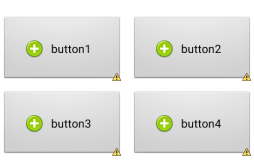
先上预览图
现在好多应用都喜欢这样设计,看上去简单也耐看。那么,今天就说说这个布局的实现。
乍一看,这个布局里面有图片和文字,4个大按钮也是按线性布局的等比分配实现的。
但是呢,其实有更简单高效的方法,这里我先把代码贴出来。
<?xml version="1.0" encoding="utf-8"?>
<TableLayout xmlns:android="http://schemas.android.com/apk/res/android"
android:layout_width="fill_parent"
android:layout_height="fill_parent"
android:background="@android:color/white"
android:gravity="center_vertical" >
<TableRow>
<Button
android:layout_width="fill_parent"
android:layout_height="wrap_content"
android:layout_margin="5dp"
android:layout_weight="1"
android:drawableLeft="@drawable/add"
android:drawablePadding="1dp"
android:gravity="center"
android:padding="30dp"
android:text="button1" />
<Button
android:layout_width="fill_parent"
android:layout_height="wrap_content"
android:layout_margin="5dp"
android:layout_weight="1"
android:drawableLeft="@drawable/add"
android:drawablePadding="1dp"
android:gravity="center"
android:padding="30dp"
android:text="button2" />
</TableRow>
<TableRow>
<Button
android:layout_width="fill_parent"
android:layout_height="wrap_content"
android:layout_margin="5dp"
android:layout_weight="1"
android:drawableLeft="@drawable/add"
android:drawablePadding="1dp"
android:gravity="center"
android:padding="30dp"
android:text="button3" />
<Button
android:layout_width="fill_parent"
android:layout_height="wrap_content"
android:layout_margin="5dp"
android:layout_weight="1"
android:drawableLeft="@drawable/add"
android:drawablePadding="1dp"
android:gravity="center"
android:padding="30dp"
android:text="button4" />
</TableRow>
</TableLayout>
是的,就这么简单,图片可以通过android:drawableLeft来放到文字的左边。然后4个按钮的线性比重分配通过表哥布局实现,大大缩短了代码量,同时也减少了布局嵌套的层数,提高效率。
最后,就是动态更换button中插入的图片,代码:
Drawable drawable = getResources().getDrawable(imageID);
drawable.setBounds(0, 0, drawable.getMinimumWidth(),
drawable.getMinimumHeight());
button.setCompoundDrawables(drawable,null, null, null);


 165
165

 被折叠的 条评论
为什么被折叠?
被折叠的 条评论
为什么被折叠?
 到【灌水乐园】发言


