Android 5.0新特性
1.Material Design设计语言
注意:必须用在API 21以上版本
1.1 主题
谷歌官方我们提供了三种配色风格的Material Design样式:
- 黑色主题
Theme.Material - 明亮主题
Theme.Material.Light - 明亮主题黑色ActionBar
Theme.Material.Light.DarkActionBar
注:这是在values-21目录下的style.xml中定义的主题样式,只适用于API 21或更高版本
- <?xml version="1.0" encoding="utf-8"?>
- <resources>
- <style name="AppTheme" parent="android:Theme.Material.Light">
-
- <item name="android:colorPrimaryDark">#66ccff</item>
-
- <item name="android:statusBarColor">#720ecc</item>
-
- <item name="android:colorPrimary">#cc311f</item>
-
- <item name="android:navigationBarColor">#34cc44</item>
-
- <item name="android:textColor">#cc3239</item>
- </style>
- </resources>
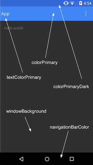
主题颜色常用代码:
android:colorPrimaryDark 应用的主要暗色调,statusBarColor默认使用该颜色android:statusBarColor 状态栏颜色,默认使用colorPrimaryDarkandroid:colorPrimary 应用的主要色调,actionBar默认使用该颜色android:windowBackground 窗口背景颜色android:navigationBarColor 底部栏颜色android:colorForeground 应用的前景色,ListView的分割线,switch滑动区默认使用该颜色android:colorBackground 应用的背景色,popMenu的背景默认使用该颜色android:colorAccent 一般控件的选种效果默认采用该颜色android:colorControlNormal 控件的默认色调 android:colorControlHighlight 控件按压时的色调android:colorControlActivated 控件选中时的颜色,默认使用colorAccentandroid:colorButtonNormal 默认按钮的背景颜色android:textColor Button,textView的文字颜色android:textColorPrimaryDisableOnly RadioButton checkbox等控件的文字android:textColorPrimary 应用的主要文字颜色,actionBar的标题文字默认使用该颜色
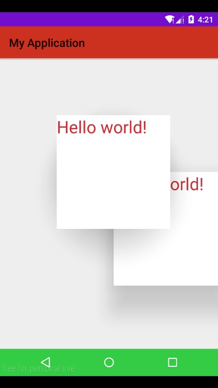
1.2 阴影
注:5.0中添加的坐标Z轴,可以设置控件距离屏幕的距离,由此产生了阴影
特殊:产生阴影的控件的父控件必须范围大于子控件,否则子控件将被截取,无法显示阴影
- <RelativeLayout xmlns:android="http://schemas.android.com/apk/res/android"
- android:layout_width="match_parent"
- android:layout_height="match_parent"
- >
-
-
- <TextView
- android:id="@+id/tv_head"
- android:layout_width="200dp"
- android:layout_height="200dp"
- android:layout_marginLeft="100dp"
- android:layout_marginTop="100dp"
- android:background="#fff"
- android:elevation="50dp"
- android:text="@string/hello_world"
- android:textSize="30sp"/>
-
- <TextView
- android:layout_width="200dp"
- android:layout_height="200dp"
- android:layout_marginLeft="200dp"
- android:layout_marginTop="200dp"
- android:background="#fff"
- android:elevation="49dp"
- android:text="@string/hello_world"
- android:textSize="30sp"/>
-
-
- </RelativeLayout>
效果演示:
特殊请注意:如果控件背景是一张图片则不能指通过布局来设置阴影,阴影将无法显示。要通过代码来控制
- TextView tv_head = (TextView) findViewById(R.id.tv_head);
- ViewOutlineProvider viewOutlineProvider = new ViewOutlineProvider() {
- public void getOutline(View view, Outline outline) {
-
- outline.setOval(0, 0, view.getWidth(), view.getHeight());
- }
- };
- tv_head.setOutlineProvider(viewOutlineProvider);
1.3 裁剪
注:方便的裁减控件
- TextView tv_head = (TextView) findViewById(R.id.tv_head);
- ViewOutlineProvider viewOutlineProvider = new ViewOutlineProvider() {
- public void getOutline(View view, Outline outline) {
-
- outline.setRoundRect(0,0,view.getHeight(),view.getWidth(),30);
-
- outline.setOval(0, 0, view.getWidth(), view.getHeight());
- }
- };
- tv_head.setOutlineProvider(viewOutlineProvider);
- tv_head.setClipToOutline(true);
1.4 选择器——单张图片
使用方法:在【drawable】目录下创建一个bitmap的xml文件代替按下时的图片,然后选择器按下时的图片选择此bitmap的xml文件即可。bitmap写法如下:
- <?xml version="1.0" encoding="utf-8"?>
- <bitmap
- xmlns:android="http://schemas.android.com/apk/res/android"
- android:src="@mipmap/selector"
- android:tint="#66ccff"
- android:tintMode="multiply"/>
-
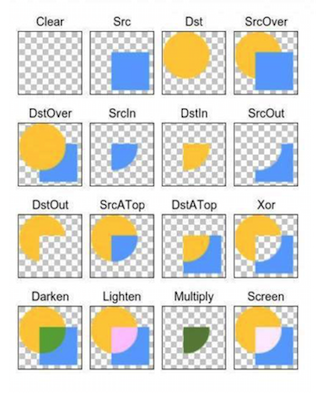
tint的渲染模式有总共有16种,xml文件中可以使用6种,代码中我们可以设置16种,渲染模式决定了渲染颜色和原图颜色的取舍和合成规则:
PorterDuff.Mode.CLEAR 所绘制不会提交到画布上。PorterDuff.Mode.SRC 显示上层绘制图片PorterDuff.Mode.DST 显示下层绘制图片PorterDuff.Mode.SRC_OVER 正常绘制显示,上下层绘制叠盖。PorterDuff.Mode.DST_OVER 上下层都显示。下层居上显示。PorterDuff.Mode.SRC_IN 取两层绘制交集。显示上层。PorterDuff.Mode.DST_IN 取两层绘制交集。显示下层。PorterDuff.Mode.SRC_OUT 取上层绘制非交集部分。PorterDuff.Mode.DST_OUT 取下层绘制非交集部分。PorterDuff.Mode.SRC_ATOP 取下层非交集部分与上层交集部分PorterDuff.Mode.DST_ATOP 取上层非交集部分与下层交集部分PorterDuff.Mode.XOR 取两层绘制非交集。两层绘制非交集。PorterDuff.Mode.DARKEN 上下层都显示。变暗PorterDuff.Mode.LIGHTEN 上下层都显示。变亮PorterDuff.Mode.MULTIPLY 取两层绘制交集PorterDuff.Mode.SCREEN 上下层都显示。


 扫一扫
扫一扫
 741
741

 被折叠的 条评论
为什么被折叠?
被折叠的 条评论
为什么被折叠?
 到【灌水乐园】发言


