


actionBar 效果 :
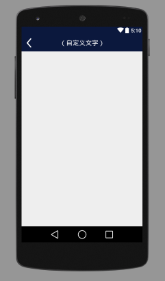
采用了沉浸式布局 看着比较舒服
继承自RelativeLayout 只有一个自定义属性 定义 自定义文字 的文字
public class Lyt_ActionBar extends RelativeLayout {

    private ImageView iv;
    private TextView tv;
    private String text;

    public Lyt_ActionBar(Context context, AttributeSet attrs, int defStyleAttr) {
        super(context, attrs, defStyleAttr);

        LayoutInflater inflater = (LayoutInflater) context.getSystemService(Context.LAYOUT_INFLATER_SERVICE);
        inflater.inflate(R.layout.actionbar_custom, this);
        iv = (ImageView) findViewById(R.id.iv_exit);
        tv = (TextView) findViewById(R.id.tv);
        iv.setOnClickListener(new OnClickListener() {
            @Override
            public void onClick(View v) {
                customclicklistener.click();
            }
        });

        TypedArray a = context.obtainStyledAttributes(attrs, R.styleable.actionbar, defStyleAttr, 0);
        text = a.getString(R.styleable.actionbar_text);
        a.recycle(); // 回收资源
        tv.setText(text);
    }

    public Lyt_ActionBar(Context context, AttributeSet attrs) {
        this(context, attrs, 0);
    }

    public Lyt_ActionBar(Context context) {
        this(context, null);
    }

    /**
     * 给箭头图片添加监听 ——----回调接口
     */
    public interface CustomClickListener {
        void click();
    }

    private CustomClickListener customclicklistener;

    public void setCustomClickListener(CustomClickListener customclicklistener) {
        this.customclicklistener = customclicklistener;
    }

}
三个构造方法 相互调用 不懂的看代码 ViewGroup 的构造方法这些基础不解释
接着在三个参数的构造方法中进行初始化控件等操作
自定义属性 text 定义在 values 文件夹下的attr 文件中 (没有的话自己创建)
attr 文件 :
<?xml version="1.0" encoding="utf-8"?>
<resources>
    <declare-styleable name="actionbar">
        <attr name="text" format="string"/>
    </declare-styleable>
</resources>
inflater.inflate(R.layout.actionbar_custom, this);由于我们传入的是this 根据看API 源码 得知返回的就是View 当前的这个RelativeLayout 所以不需要再定义一个View去接受这个返回值
当然我们这个自定义控件的目的就是 xml中动态设置这个actionbar的各种属性 而不是每次都重复写一大堆布局
虽然我上面的Lyt_ActionBar 中就一个属性 但是你可以在attr 中添加任意你想要的属性
最后的可能比较难理解 :给箭头对应的ImageView 添加一个onClick 监听 ,然后定义一个 回掉接口 实现外界的调用
外界调用的方法 :实现CustomClickListener 接口 然后重写 click方法 就可以让这个箭头干 你想让它干的事了
actionbar_custom 代码 :
<?xml version="1.0" encoding="utf-8"?>
<RelativeLayout xmlns:android="http://schemas.android.com/apk/res/android"
    android:layout_width="match_parent"
    android:layout_height="50dp"
    android:layout_weight="1"
    android:background="@color/baseColor">


    <TextView
        android:text="(自定义文字)"
        android:id="@+id/tv"
        android:layout_width="match_parent"
        android:layout_height="match_parent"
        android:gravity="center"
        android:textColor="@android:color/white"
        android:textSize="19sp" />

    <ImageView
        android:id="@+id/iv_exit"
        android:layout_width="30dp"
        android:layout_height="30dp"
        android:layout_alignParentLeft="true"
        android:layout_alignParentStart="true"
        android:layout_centerVertical="true"
        android:layout_marginLeft="8dp"
        android:src="@mipmap/jiantou" />

</RelativeLayout>
调用自定义控件的方法 :
  <com.example.weekview.View.Lyt_ActionBar
        android:layout_width="match_parent"
        android:layout_height="wrap_content"
laowang:text="设置" />xmlns:laowang="http://schemas.android.com/apk/res-auto"


 扫一扫
扫一扫
 608
608

 被折叠的 条评论
为什么被折叠?
被折叠的 条评论
为什么被折叠?
 到【灌水乐园】发言


