


原理:使用css3中的transform:rotate旋转,通过定位改变位置。
.out{
            width: 300px;
            height: 150px;
            background-color: pink;
            margin:200px;
            position: relative;
        }

        .out::before{
            content:"";
            position: absolute;
            width: 50px;
            height: 50px;
            background-color: pink;
            transform:rotate(45deg);
            left:40%;
            top:-15px;

        }
         <div class="out">
         </div>
效果图:
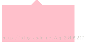
根据自己的需求改变left top bottom right的值可以实现小三角的位置。


 1557
1557

 被折叠的 条评论
为什么被折叠?
被折叠的 条评论
为什么被折叠?
 到【灌水乐园】发言


