


用于论文等正式场合的图。
linestyle线的种类:
- 实线:'-'
- 虚线:'--'
- 点线:':'
- 杠点线:'-.'
marker参数在折线上打标记:
- 实心点:'.'
- 无标记:','
- 实心点:'o'
- 三角形(上下左右):'^' 'v' '<' '>'
- 无圈奔驰标(下上左右):'1' '2' '3' '4'
- 四边形:'s'
- 五边形:'p'
- 星标:'*'
- 六边形(角向上边向上):'h' 'H'
- 加号:'+'
- 叉号:'x'
- 瘦菱形:'d'
- 菱形:'D'
- 竖线:'|'
- 横线:'_'
线条透明度选项:
- alpha = 0.1
#encoding=utf-8
import matplotlib.pyplot as plt
import numpy as np
import pandas as pd
#输入因变量
y1 = pd.read_csv('11.csv')
y1 = np.array(y1)
y2 = pd.read_csv('12.csv')
y2 = np.array(y2)
#assert y1.shape[0]==y2.shape[0], '两个因变量个数不相等!'
fig,ax=plt.subplots(figsize=(6.4,4.8), dpi=100)
#设置自变量的范围和个数
x = np.linspace(1, 10, y1.shape[0])
#画图
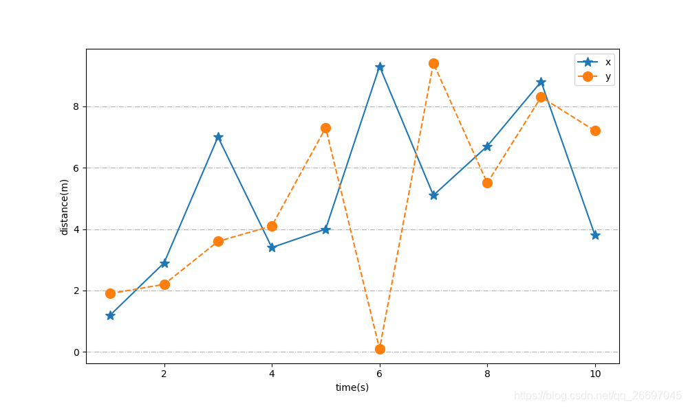
ax.plot(x,y1, label='x', linestyle='-', marker='*', markersize='10')
ax.plot(x,y2, label='y', linestyle='--', marker='o', markersize='10')
#设置坐标轴
#ax.set_xlim(0, 9.5)
#ax.set_ylim(0, 1.4)
ax.set_xlabel('time(s)')
ax.set_ylabel('distance(m)')
#设置刻度
ax.tick_params(axis='both')
#显示网格
#ax.grid(True, linestyle='-.')
ax.yaxis.grid(True, linestyle='-.')
#添加图例
legend = ax.legend(loc='best')
plt.show()
fig.savefig('1.png')双y轴的图
#encoding=utf-8
import numpy as np
import pandas as pd
import matplotlib.pyplot as plt
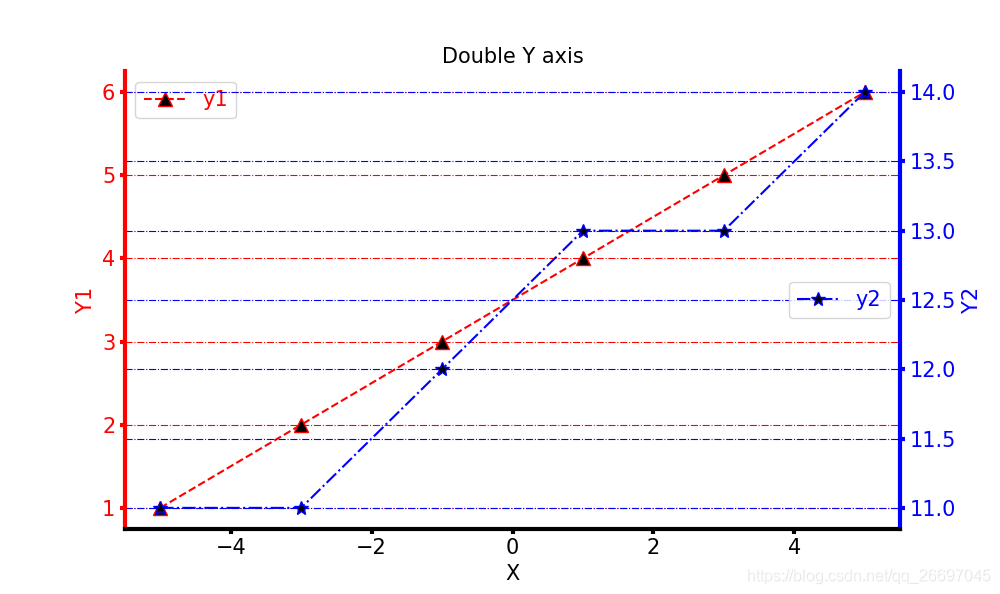
fig, ax1 = plt.subplots(figsize=(10,9))
ax2 = ax1.twinx()
#输入因变量。
y1 = pd.read_csv('2_1.csv')
y1 = np.array(y1)
y2 = pd.read_csv('2_2.csv')
y2 = np.array(y2)
#设置自变量的范围和个数。
x = np.linspace(-5, 5, y1.shape[0])
ax1.plot(x, y1, label='y1', color='red', linestyle='--', marker='^', markerfacecolor='black', markersize='10')
ax1.tick_params(axis='y', labelcolor='red', labelsize=15, width=3, color='red')
ax1.set_ylabel('Y1', color='red', fontsize=15)
ax1.yaxis.grid(True, which='major', linestyle='-.', color='red')
ax2.plot(x, y2, label='y2', color='blue', linestyle='-.', marker='*', markerfacecolor='black', markersize='10')
ax2.tick_params(axis='y', labelcolor='blue', labelsize=15, width=3, color='blue')
ax2.set_ylabel('Y2', color='blue', fontsize=15)
ax2.yaxis.grid(True, which='major', linestyle='-.', color='blue')
#设置坐标轴
ax1.set_title("Double Y axis", color='black', fontsize=15)
ax1.set_xlabel('X', color='black', fontsize=15)
ax1.tick_params(axis='x', labelcolor='black', labelsize=15, width=3, color='black')
ax1.spines['top'].set_color('none')
ax2.spines['top'].set_color('none')
ax2.spines['left'].set_color('red')
ax2.spines['left'].set_linewidth(3)
ax2.spines['right'].set_color('blue')
ax2.spines['right'].set_linewidth(3)
ax2.spines['bottom'].set_linewidth(3)
#保存。
lax1=ax1.legend(loc='left', fontsize=15)
lax1.get_texts()[0].set_color('red')
lax2=ax2.legend(loc='right', fontsize=15)
lax2.get_texts()[0].set_color('blue')
plt.show()
fig.savefig('22.png')2_1.csv
data
1
2
3
4
5
6
2_2.csv
data
11
11
12
13
13
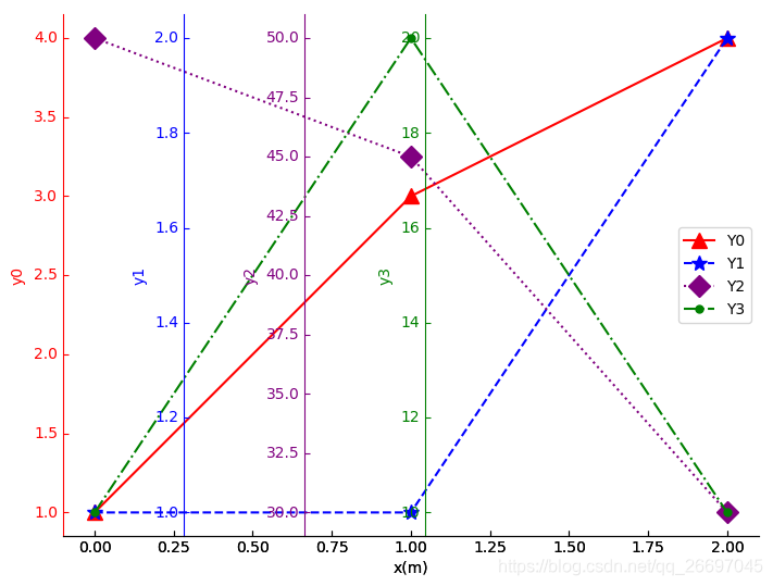
14任意个y轴:
#encoding=utf-8
from mpl_toolkits.axisartist.parasite_axes import HostAxes, ParasiteAxes
import matplotlib.pyplot as plt
import numpy as np

#fig,ax=plt.subplots(figsize=(10,8))
fig = plt.figure(1)
#[左侧空白, 下侧空白, 横向缩放, 纵向缩放],空白只对plt.subplots有效
ax0 = HostAxes(fig, [0, 0, 1, 1])
ax0.axis['right'].set_visible(False)
ax0.axis['top'].set_visible(False)
ax0.axis['left'].set_visible(False)
ax0.set_xlabel('x(m)')
fig.add_axes(ax0)

#数据
colors=['red', 'blue', 'purple', 'green']
linestyles=['-', '--', ':', '-.']
markers=['^', '*', 'D', '.', '2', 's', 'h', '+']
x=[0, 1, 2]
ys=[[1, 3, 4], [1, 1, 2], [50, 45, 30], [10, 20, 10]]

#创建4个坐标轴,并加入图形
axs = []
faxs = []
for i in range(4):
	axs.append(ParasiteAxes(ax0, sharex=ax0))
	faxs.append(axs[i].get_grid_helper().new_fixed_axis)
	axs[i].set_ylabel('y'+str(i))
	axs[i].axis['left'+str(i)] = faxs[i](loc='left', axes=axs[i], offset=(i*80,0))
	axs[i].axis['left'+str(i)].label.set_color(colors[i])
	axs[i].axis['left'+str(i)].major_ticks.set_color(colors[i])
	axs[i].axis['left'+str(i)].major_ticklabels.set_color(colors[i])
	axs[i].axis['left'+str(i)].line.set_color(colors[i])
	axs[i].plot(x, ys[i], label="Y"+str(i), linestyle=linestyles[i], marker=markers[i], color=colors[i], markersize='10')
	ax0.parasites.append(axs[i])

ax0.legend(loc='center right')
#fig.subplots_adjust(right=0.3)
plt.show()
fig.savefig('1.png', bbox_inches='tight')


 1072
1072

 被折叠的 条评论
为什么被折叠?
被折叠的 条评论
为什么被折叠?
 到【灌水乐园】发言


