


<h2>Hero List</h2>

<p><i>Pick a hero from the list</i></p>
<ul>
  <li *ngFor="let hero of heroes" (click)="selectHero(hero)">
    {{hero.name}}
  </li>
</ul>

<app-hero-detail *ngIf="selectedHero" [hero]="selectedHero"></app-hero-detail>
- represents a new component, HeroDetailComponent
- defines the hero-detail child view of HeroListComponent
Data Binding
{{hero.name}}, (click), [hero]
- bind program data to and from the DOM
1. directives
- Directives give instructions to Angular on how to render the templates to the DOM
- A directive can be defined in Angular as a class with the @Directive decorator
- A component is a special kind of directive with a template assoiciated to it
directive types: Structural and Attribute
2. Structural directive
- alter the layout by adding, removing and replacing elements in DOM
- Apply a structural directive to a host element in the DOM and its descendents
(e.g. ngFor structural directive)
Common Structural Directives
- NgIf
<div *ngIf="selectedDish">...</div>
[value = true, the div is added into the dump]
if the selectedDish is not null then this div will be added to the DOM.
[value = false, removing the div]
If that selectedDish is null, then this div, whatever is contained in this div, will not be added to the DOM
NgFor
<mat-list-item *ngFor="let dish of dishes">
this allows us to iterate over the array of dishes that are defined in our type script code
NgSwitch
This allows you to selectively add certain elements to the DOM by specifying a condition, depending on what the condition evaluates to, then you will be using one of those elements among the list.
Practise
Objective:
- Make use of the Angular material grid list component to display a list of items.
- Use the material Card component to display detailed information.
- Use a built-in Angular pipe to turn a word into uppercase in the template.
Updating the Menu Template
- Open menu.component.html and update its content as follows:
<div class="container"
     fxLayout="column"
     fxLayoutGap="10px">

  <div fxFlex>
    <div>
      <h3>Menu</h3>
      <hr>
    </div>
  </div>

  <div fxFlex>
    <mat-grid-list cols="2" rowHeight="200px">
      <mat-grid-tile *ngFor="let dish of dishes">
        <img height="200px" src={{dish.image}} alt={{dish.name}}>
        <mat-grid-tile-footer>
          <h1>{{dish.name | uppercase}}</h1>
        </mat-grid-tile-footer>
      </mat-grid-tile>
    </mat-grid-list>
  </div>

</div>
- Here we are using the Grid list Angular material component to display the information.
- Open app.module.ts and update it as follows:
. . .

import { MatGridListModule } from '@angular/material/grid-list';
import { MatCardModule } from '@angular/material/card';
import { MatButtonModule } from '@angular/material/button';

. . .

  imports: [
    . . .,
    MatGridListModule,
    MatCardModule,
    MatButtonModule,
    . . .
  ],

. . .
- Also, update the menu.component.ts file as follows to move the details of the dishes into a constant, in preparation for introducing services in a future exercise:
 . . .

 const DISHES: Dish[] = [
 . . .

 ];

 . . .

 export class MenuComponent implements OnInit {

  dishes = DISHES;

  selectedDish = DISHES[0];

 . . .

 }
Add a Card ComponentUpdate
- the menu.component.html template to display the details of a selected dish using the Material Card component as follows:
  <div fxFlex *ngIf="selectedDish">
    <mat-card>
      <mat-card-header>
        <mat-card-title>
          <h3>{{selectedDish.name | uppercase}}</h3>
        </mat-card-title>
      </mat-card-header>
      <img mat-card-image src={{selectedDish.image}} alt={{selectedDish.name}}>
      <mat-card-content>
        <p>{{selectedDish.description}}
        </p>
      </mat-card-content>
      <mat-card-actions>
        <button mat-button>LIKE</button>
        <button mat-button>SHARE</button>
      </mat-card-actions>
    </mat-card>
  </div>
Check the size of pages on different screen
- open ‘developer tools’ on chrome
- click the button ‘toggle devise toolbar’
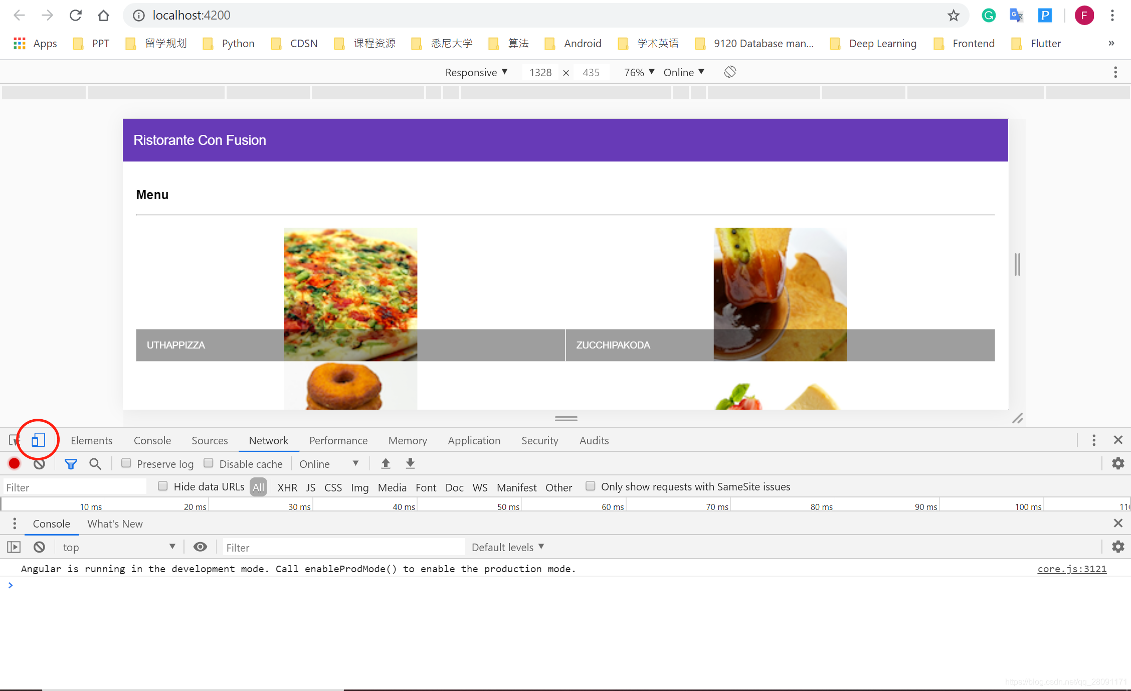
- observe the pages on different screen


 1万+
1万+


 被折叠的 条评论
为什么被折叠?
被折叠的 条评论
为什么被折叠?
 到【灌水乐园】发言


