


Material Design
Material Design 是专为设计适用于多个平台和设备的视觉、运动与互动效果而制定的综合指南。 Android 现在已支持 Material Design 应用。 如果要在您的 Android 应用中使用 Material Design,请遵循Material Design 规范内定义的指导方针,并使用 Android 5.0(API 级别 21)及以上版本所提供的新组件和功能。
Materia Design for Android
Android 为您提供了以下元素来构建 Material Design 应用:
- 全新的风格主题
- 用于设计复杂视图的全新小工具
- 用于自定义阴影和动画的全新 API
有关在 Android 上实现 Material Design 的详细信息,请参阅使用 Material Design 创建应用。
相关链接:
1. Material主题
width="560" height="315" src="https://storage.googleapis.com/spec-host-backup/mio-design%2Fassets%2F1b7zteqiB7LCxy1R_NQwQZZ3_c8JqLE7T%2Ftheming-overview-applyingtheming.mp4" allowfullscreen="">Typography
Text Label
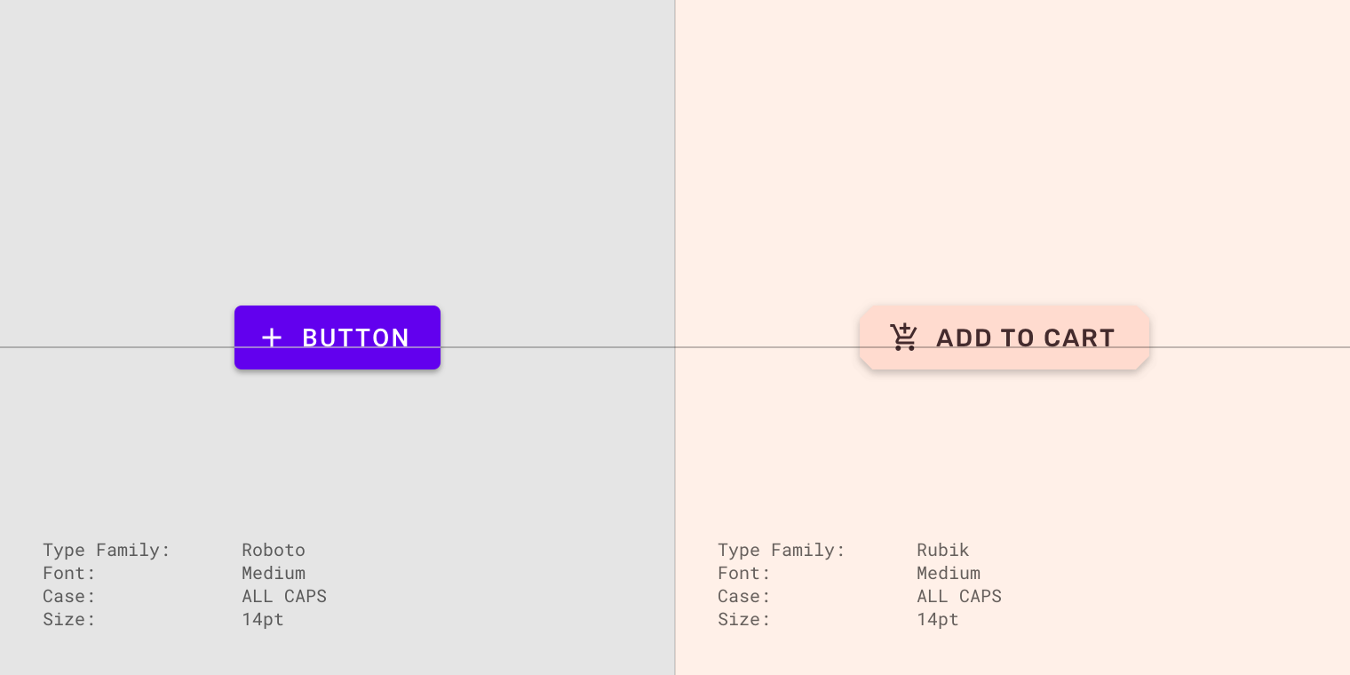
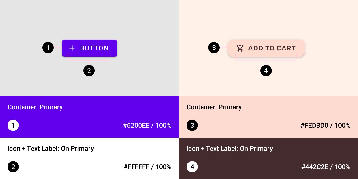
Color
Iconography
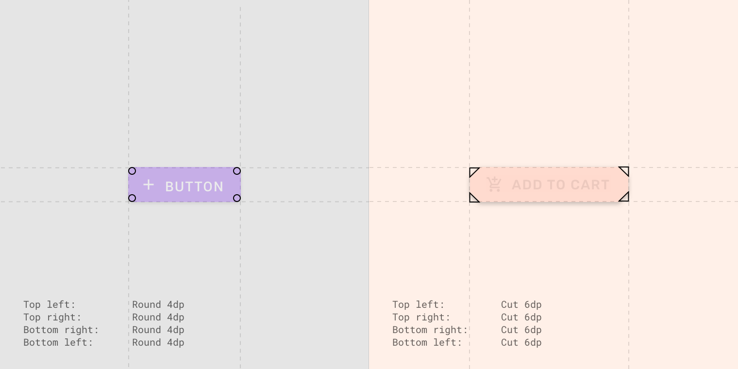
Shape
2. Material组件
App bars: bottom
相较于顶部的app bar,底部的app bar更加关注用户需要经常使用的功能,比如搜索,添加…
bottom app bar提供了直接调用bottom navigation drawer和floating action button等控件的功能
使用bottom app bar可以突出floating button的效果,而且app bar的layout可以适配floating button
动画效果
width="560" height="315" src="https://storage.googleapis.com/spec-host-backup/mio-design%2Fassets%2F1KJSld6h82fzkcafrHCDFPOITibpWxF-5%2Fbehavior-layout-primary.mp4" allowfullscreen="">App bars: top
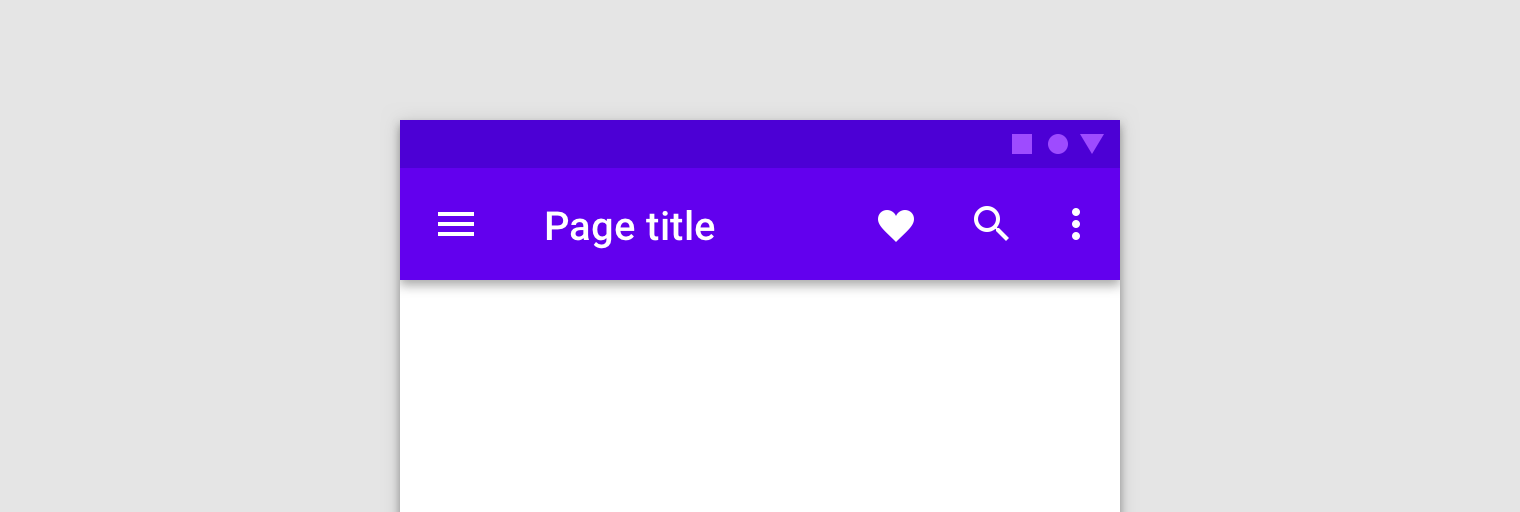
布局分析
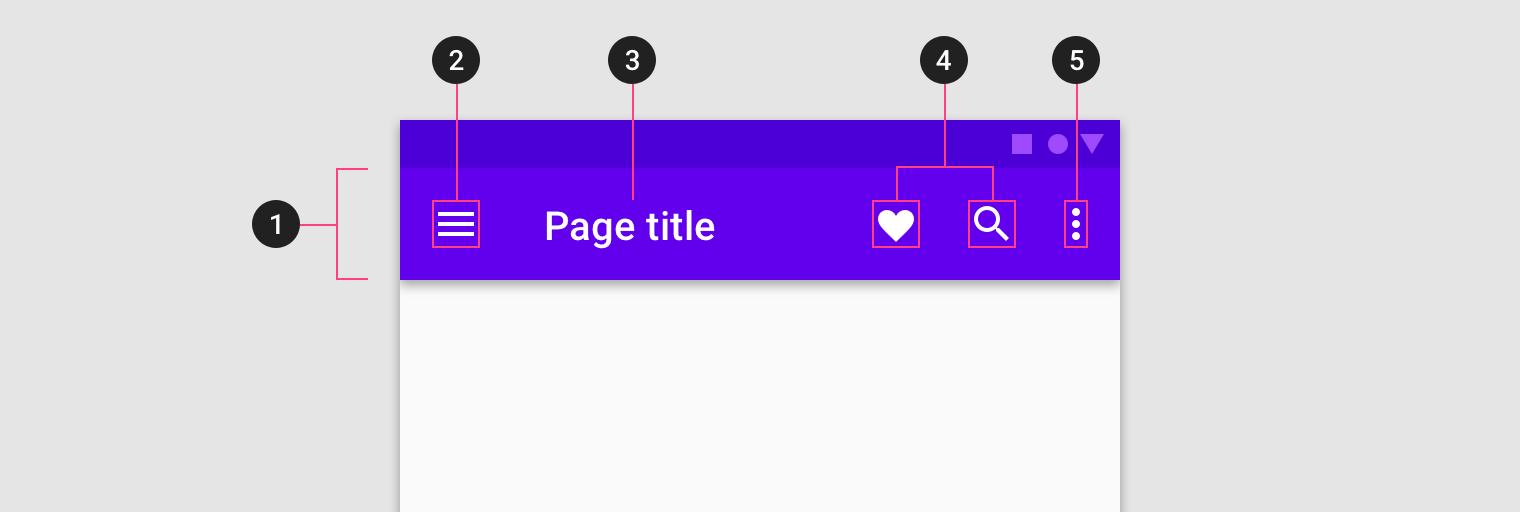
- Container
- Navigation icon (optional)
- Title (optional)
- Action items (optional)
- Overflow menu (optional)
带背景图片的App bar
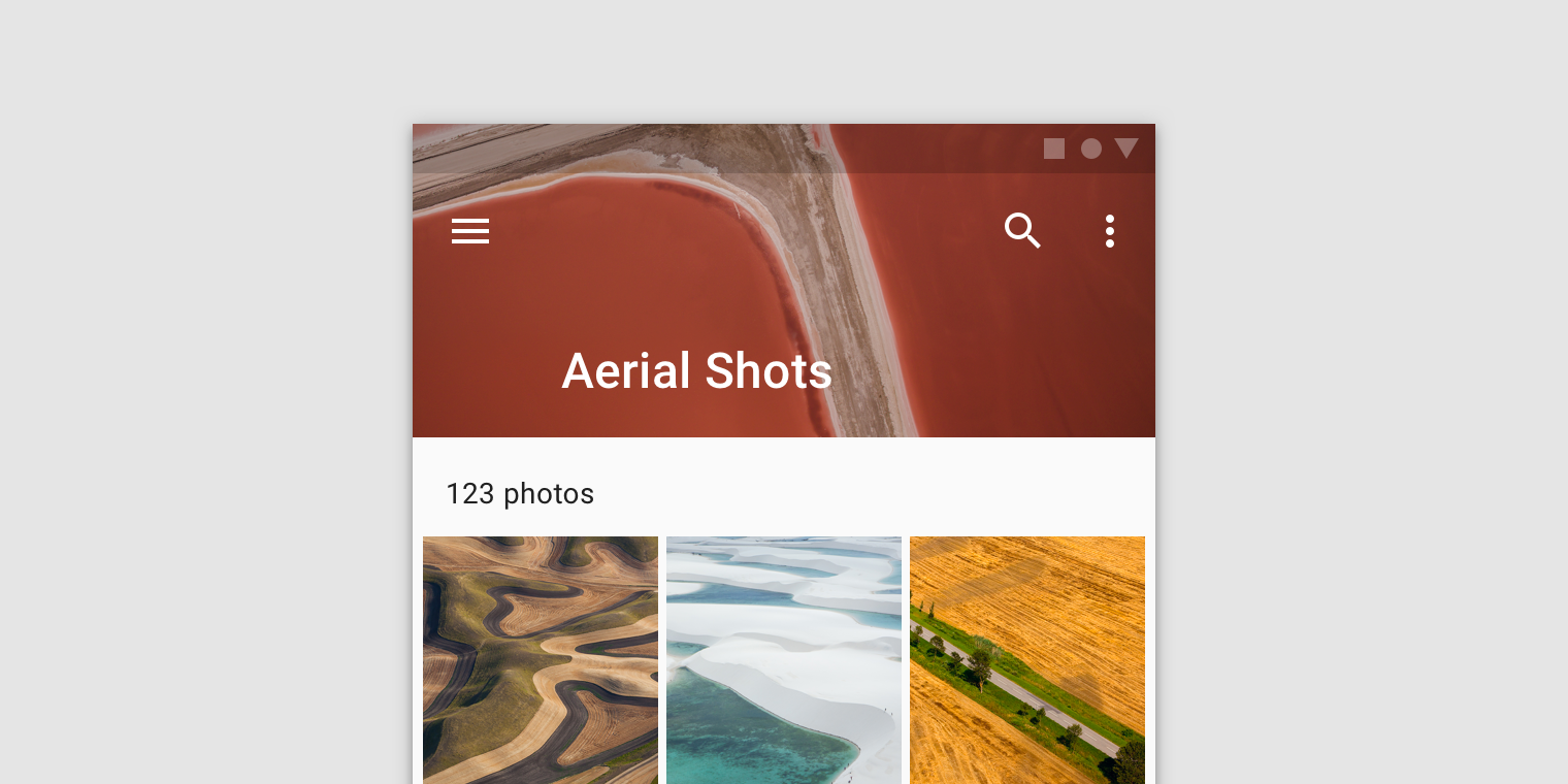
标题占据另一行,整体突出标题,app bar有背景图片,可以使整个布局上方构图更加和谐
标题动画
width="560" height="315" src="https://storage.googleapis.com/spec-host-backup/mio-design%2Fassets%2F1d3jb571H-QqU8rMvcvksU1e8-Di0lgu0%2Ftopappbars-behavior-scrolling-prominent-to-regular.mp4" allowfullscreen="">隐藏app bar的策略
width="560" height="315" src="https://storage.googleapis.com/spec-host-backup/mio-design%2Fassets%2F1l9V1QOK0KGQvXatVxL6RrQuRzMSfIRoV%2Ftopappbars-behavior-scrolling-hide.mp4" allowfullscreen="">app bar中的actions可以自适应
width="560" height="315" src="https://storage.googleapis.com/spec-host-backup/mio-design%2Fassets%2F1KdAErO7UPreCyc_6PJWv78o-0XawHtAt%2Ftopappbars-behavior-nesting.mp4" allowfullscreen="">实现根据上下文自动变化的action bar
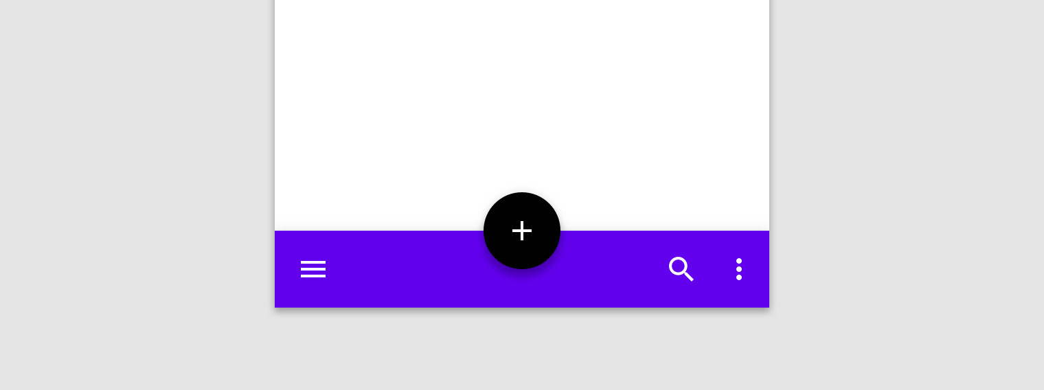
width="560" height="315" src="https://storage.googleapis.com/spec-host-backup/mio-design%2Fassets%2F10aFSUYy0w3n3cuo8yfaCzpUwAUDpREk0%2Ftopappbars-behavior-transformation.mp4" allowfullscreen="">Buttons: floating action button
floating action button由两部分组成Container和Icon
FAB containers 有两种大小:
Default (56 x 56dp)
Mini (40 x 40dp)
出现在屏幕上
当FAB在屏幕上动画时,它会从中心点向外扩展。其中的图标也可以是动画。
虽然FAB应与屏幕内容相关,但它们不会附加到显示内容的表面。FAB由于其相对重要性而与其他UI元素分开移动。
屏幕转换
FAB可以变形以启动相关操作。当屏幕更改其布局时,FAB应该消失并在转换期间重新出现。
再现
只有当它与新屏幕相关时,FAB才会重新出现。如果可能的话,它应该重新出现在相同的位置。
width="560" height="315" src="https://storage.googleapis.com/spec-host-backup/mio-design%2Fassets%2F1JEaZVuuYXGEHDNHY1gT0K0dYFeoSG6mm%2Ffab-behavior-transition-v01.mp4" allowfullscreen="">使用FAB可以实现Speed dial
按下时,FAB可以以快速拨号的形式显示三到六个相关动作。此转换可以通过以下方式之一进行:
按下后,FAB可以发出相关动作
按下后,FAB可以转换为包含相关操作的菜单(仅限Android)
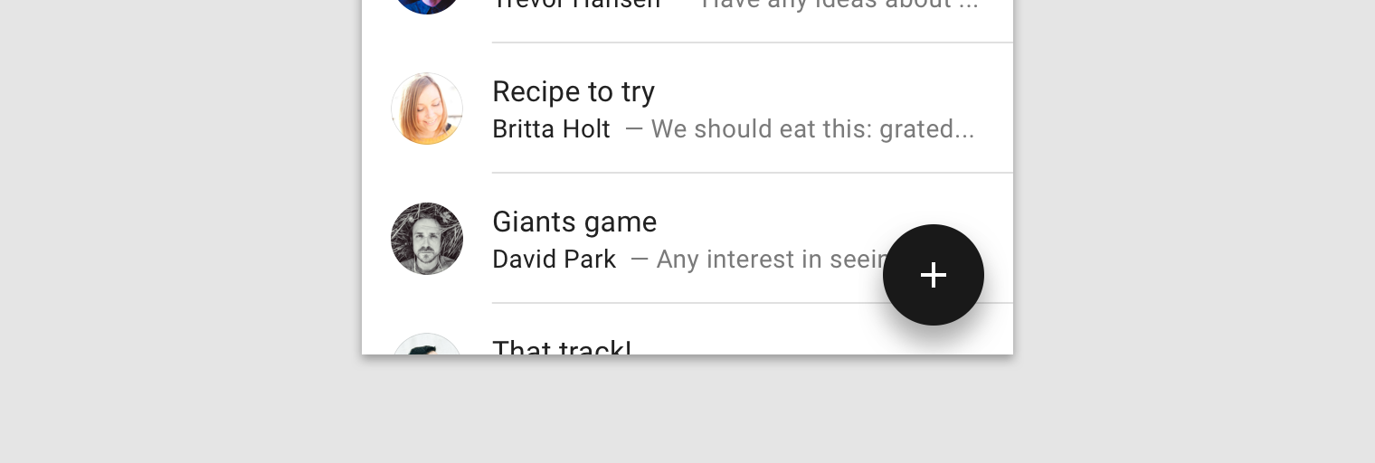
Lists
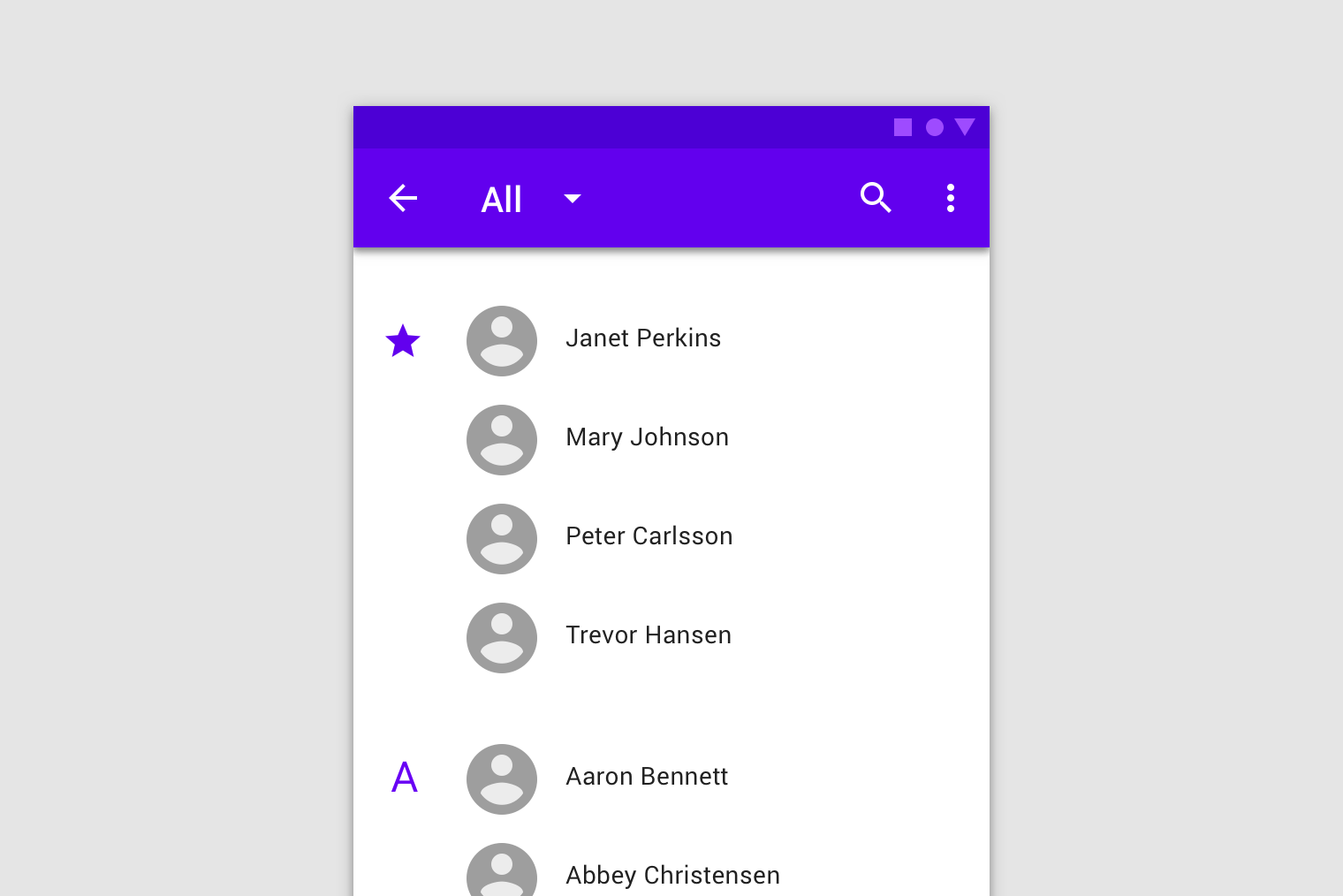
Materia Design 风格下的list有更多的特性,涉及到动画效果,交互方式,布局要求等
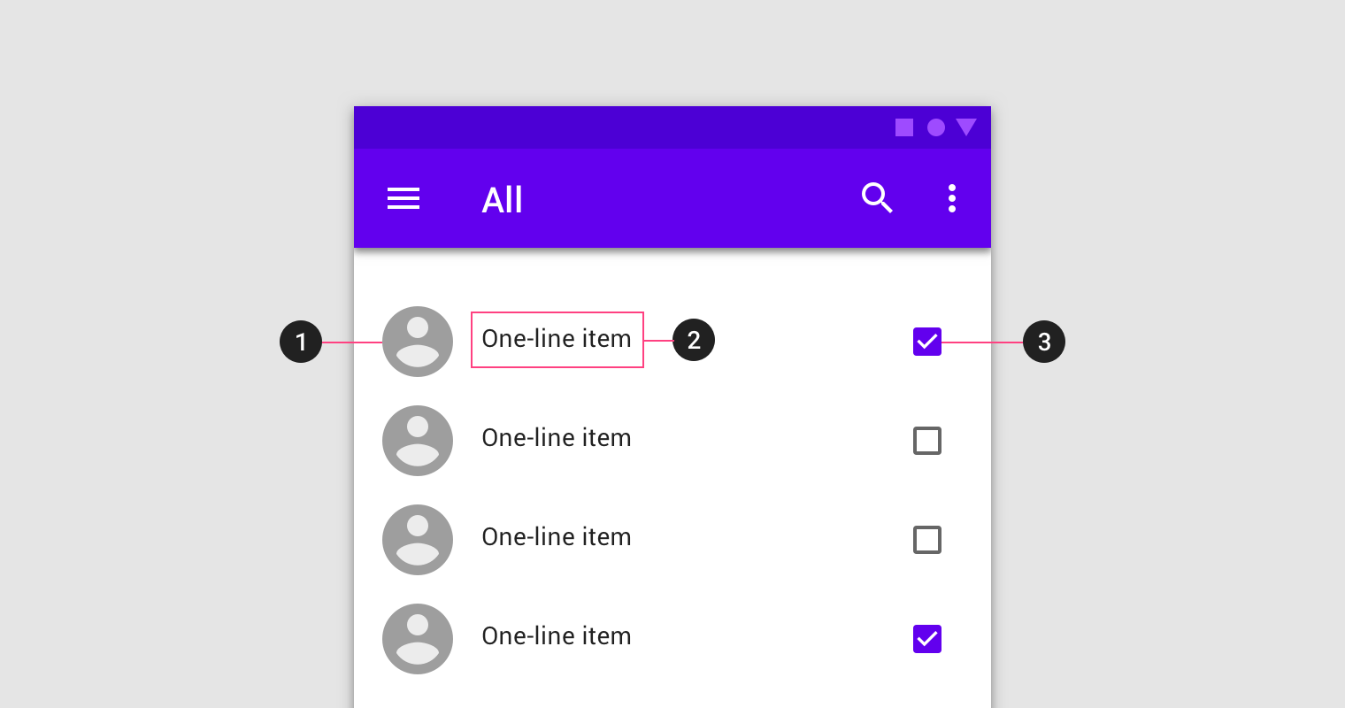
基本上由三个部分组成:
- 相关图片
- 主要文字内容
- 额外信息或控制选项
与此同时,item与item之间的分割线需要谨慎使用
动画效果
width="560" height="315" src="https://storage.googleapis.com/spec-host-backup/mio-design%2Fassets%2F1qIHOMquJE7flVh1ttDTSogXdvEX2lY_1%2F01-list-parentchild.mp4" allowfullscreen="">手势
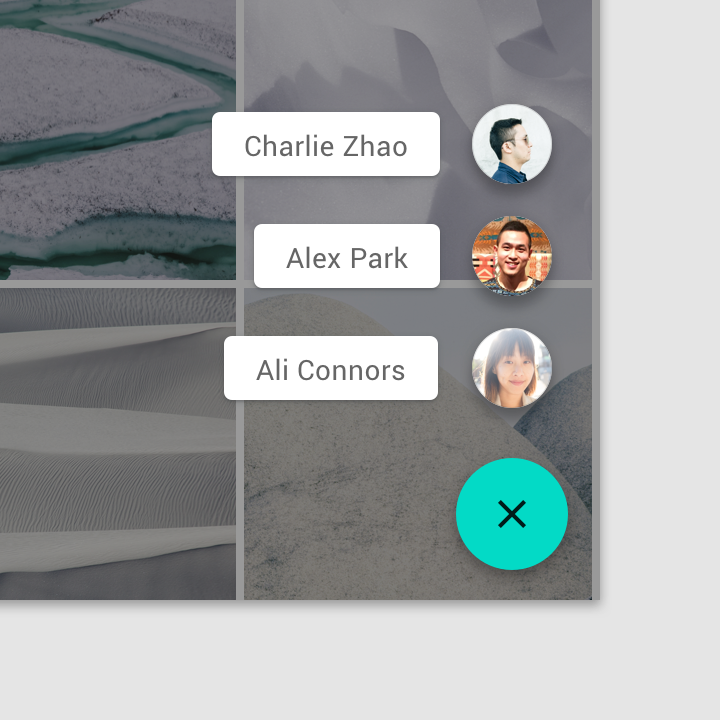
包括左划右划,拖拽
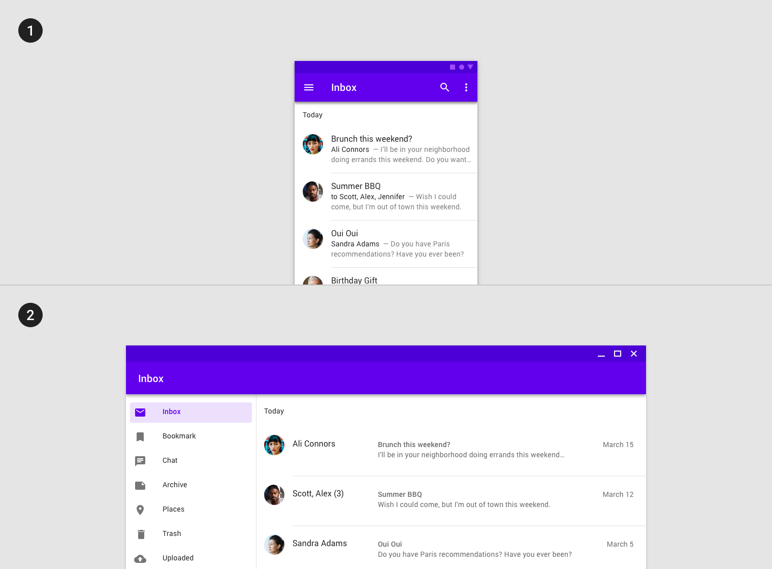
width="560" height="315" src="https://storage.googleapis.com/spec-host-backup/mio-design%2Fassets%2F17m39WCnuYdi1omF2Xpd6fdTaSJPAbRP7%2F02-list-swipetodismiss.mp4" allowfullscreen=""> width="560" height="315" src="https://storage.googleapis.com/spec-host-backup/mio-design%2Fassets%2F1dtprsH4jZ2nOnjBCJeJXd7n4U-jmWyas%2F03-list-reorder.mp4" allowfullscreen="">拓展
主要是在不同设备上实现不同的布局,比如平板和手机
选项卡的收起与展开
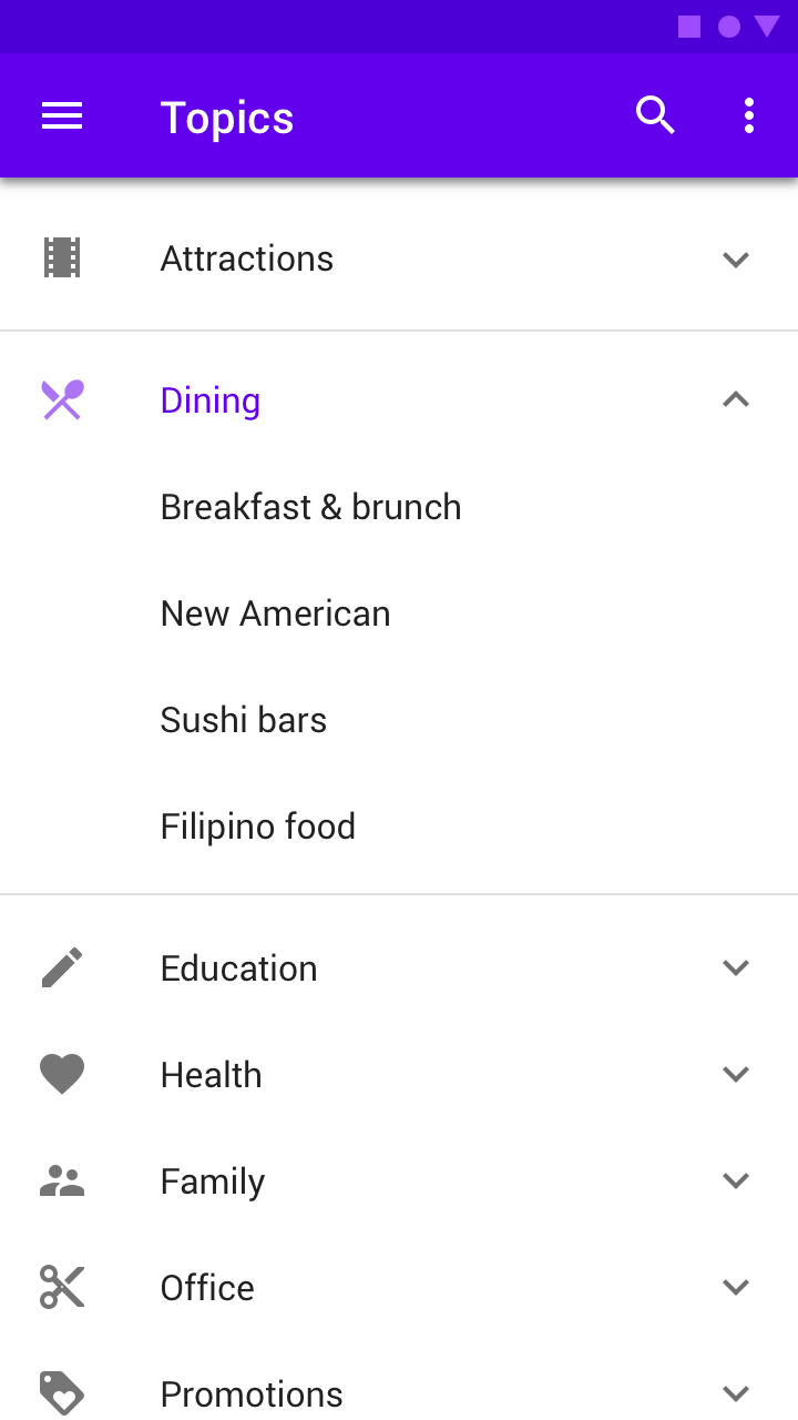
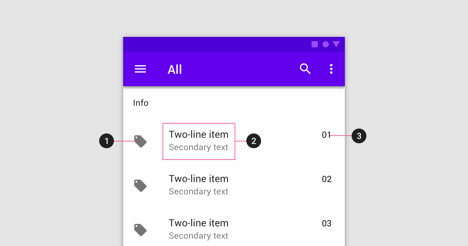
布局要求
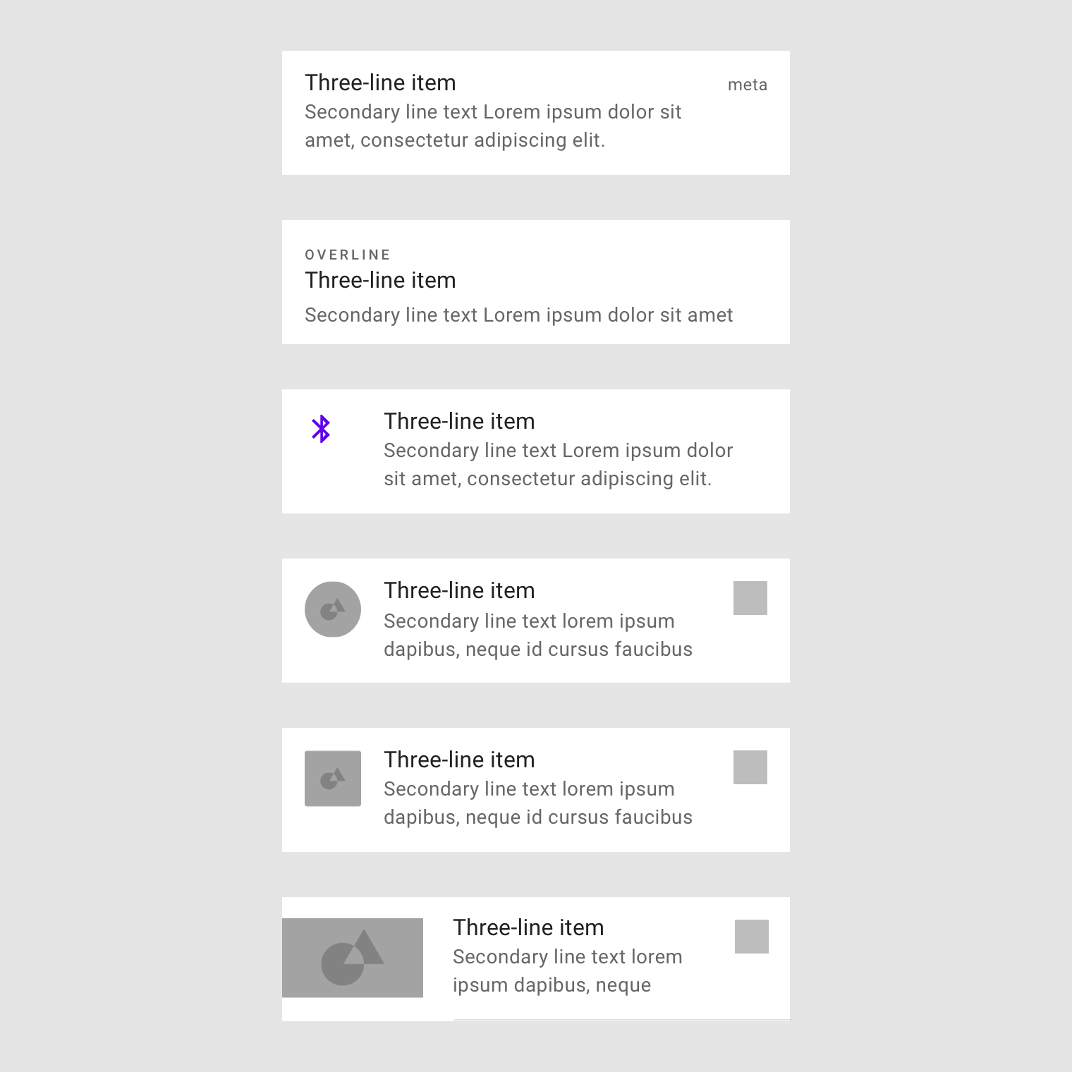
单行item
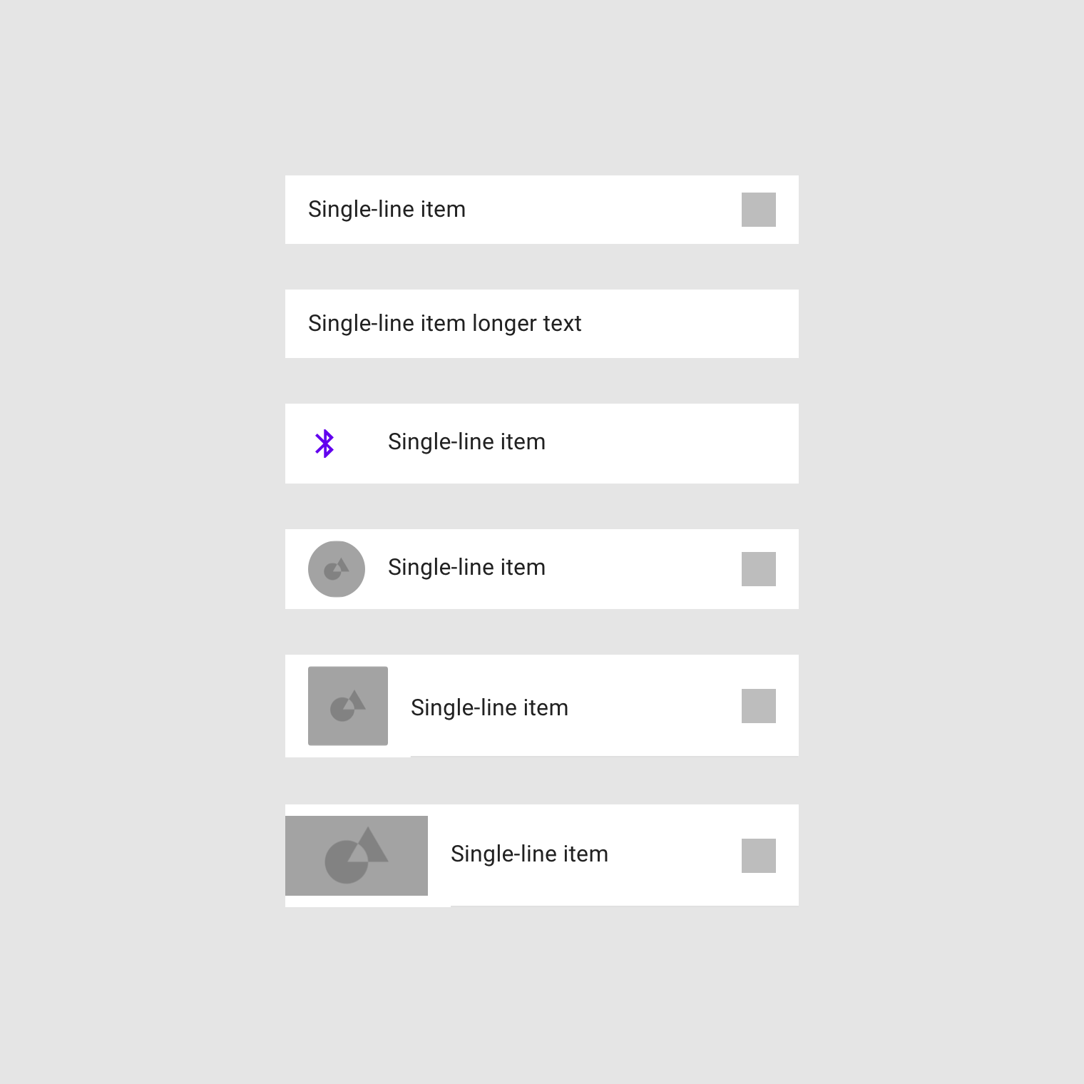
双行item
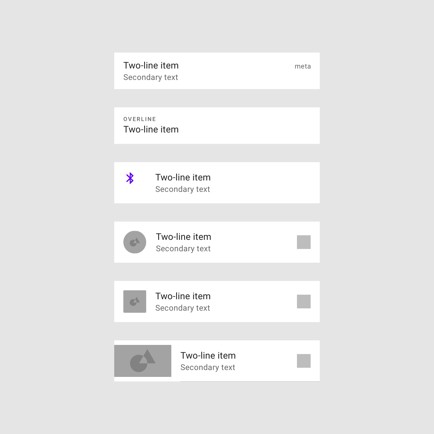
三行item
Tooltips
Tooltips主要用于帮助用户了解当前控件的功能,在用户长按某个按钮时,根据Tooltips显示当前按钮的描述
根据不同设备的尺寸,tooltips的描述的大小也会随之改变
width="560" height="315" src="https://storage.googleapis.com/spec-host-backup/mio-design%2Fassets%2F0B8wSqcLwbhFuYlpHNGcxdXRfZkE%2F01-tooltip-interaction.mp4" allowfullscreen="">Materia Design 组件
- App bars: bottom
- App bars: top
- Backdrop
- Banners
- Bottom navigation
- Bottons
- Floating action botton
- Cards
- Chips
- Data tables
- Dialogs
- Dividers
- Image lists
- Lists
- Menus
- Navigation drawer
- Progress indictors
- Selection controls
- Sheets: bottom
- Sheet: side
- Sliders
- Snackbars
- Tabs
- Text fields
- Tooltips


 1532
1532


 被折叠的 条评论
为什么被折叠?
被折叠的 条评论
为什么被折叠?
 到【灌水乐园】发言


