


matplotlib更新之后发现默认的scatter函数绘制的离散点不带有边框。查阅相关文档之后发现需要对其中的参数进行设置。
官方手册:https://matplotlib.org/api/_as_gen/matplotlib.pyplot.scatter.html
导入相关包
import numpy as np
import matplotlib.pyplot as plt
scatter函数
绘制颜色为红色 c = 'r'
形状为圆形 marker = 'o'
x = np.arange(1,10)
y = x
fig = plt.figure()
ax1 = fig.add_subplot(111)
ax1.set_title('Scatter Plot')
plt.xlabel('X')
plt.ylabel('Y')
ax1.scatter(x,y,c = 'r',marker = 'o')
plt.legend('x1')
plt.show() 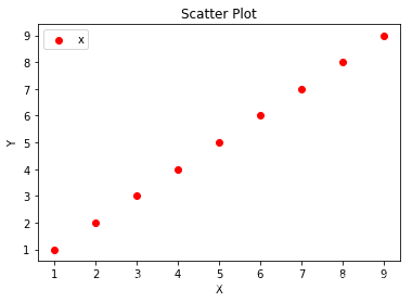
绘制颜色为红色 c = 'r'
形状为圆形 marker = 'o'
大小为30 s=30
边框为1(越大边框越粗) linewidths=1
边框颜色为黑色 edgecolors='k'
x = np.arange(1,10)
y = x
fig = plt.figure()
ax1 = fig.add_subplot(111)
ax1.set_title('Scatter Plot')
plt.xlabel('X')
plt.ylabel('Y')
ax1.scatter(x,y,c = 'r', s=30, linewidths=1, marker='o',edgecolors='k' )
plt.legend('x1')
plt.show() 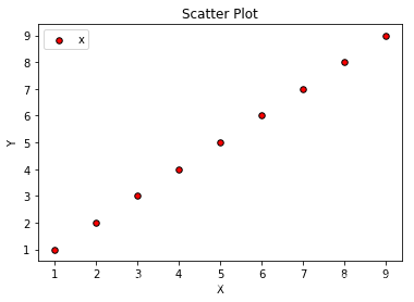
对于plot函数来说,在连线上画出点的为位置,并且描出边框。其参数与scatter其中的参数不同。
绘制颜色为红色 c = 'r'
形状为圆形 marker = 'o'
点的大小为6 markersize = 6
x = np.arange(1,10)
y = x
fig = plt.figure()
ax1 = fig.add_subplot(111)
ax1.set_title('Scatter Plot')
plt.xlabel('X')
plt.ylabel('Y')
ax1.plot(x,y,c = 'r', markersize=6, marker='o')
plt.legend('x1')
plt.show() 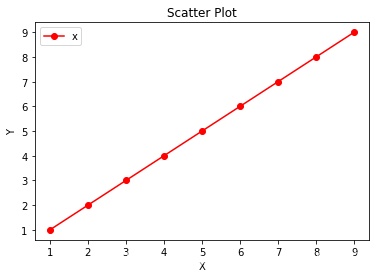
绘制颜色为红色 c = 'r'
形状为圆形 marker = 'o'
点的大小为6 markersize = 6
边界的颜色为黑色 markeredgecolor = 'k'
点的颜色为黄色 markerfacecolor = 'y'
x = np.arange(1,10)
y = x
fig = plt.figure()
ax1 = fig.add_subplot(111)
ax1.set_title('Scatter Plot')
plt.xlabel('X')
plt.ylabel('Y')
ax1.plot(x,y,c = 'r', markersize=6, marker='o',markeredgecolor = 'k', markerfacecolor = 'y')
plt.legend('x1')
plt.show() 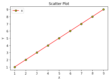


 980
980

 被折叠的 条评论
为什么被折叠?
被折叠的 条评论
为什么被折叠?
 到【灌水乐园】发言


