


【Flutter 组件】003-基础组件:按钮
文章目录
一、ElevatedButton 悬浮按钮
**按钮概述:**Material 组件库中提供了多种按钮组件如
ElevatedButton、TextButton、OutlineButton等,它们都是直接或间接对RawMaterialButton组件的包装定制,所以他们大多数属性都和RawMaterialButton一样。所有 Material 库中的按钮的共同点:
- 按下时都会有“水波动画”(又称“涟漪动画”,就是点击时按钮上会出现水波扩散的动画)。
- 有一个
onPressed属性来设置点击回调,当按钮按下时会执行该回调,如果不提供该回调则按钮会处于禁用状态,禁用状态不响应用户点击。
1、概述
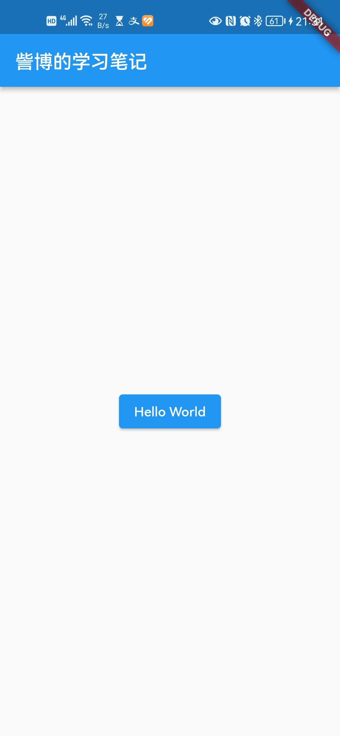
ElevatedButton 即"漂浮"按钮,它默认带有阴影和灰色背景。按下后,阴影会变大。
2、构造方法
const ElevatedButton({
    super.key,
    required super.onPressed,
    super.onLongPress,
    super.onHover,
    super.onFocusChange,
    super.style,
    super.focusNode,
    super.autofocus = false,
    super.clipBehavior = Clip.none,
    super.statesController,
    required super.child,
  });
3、示例
代码示例
import 'package:flutter/material.dart';
void main() {
runApp(MaterialApp(
home: Scaffold(
appBar: AppBar(title: const Text("訾博的学习笔记")),
body: const MyApp(),
),
));
}
class MyApp extends StatelessWidget {
const MyApp({Key? key}) : super(key: key);
Widget build(BuildContext context) {
return Center(
child: Container(
alignment: Alignment.center,
height: 200,
width: 200,
child: ElevatedButton(
// 点击事件
onPressed: () {
print("Hello World");
},
// 按钮样式
style: ButtonStyle(
backgroundColor: MaterialStateProperty.all(Colors.blue),
),
// 内容
child: const Text("Hello World"),
),
),
);
}
}
运行结果
二、TextButton 文本按钮
1、概述
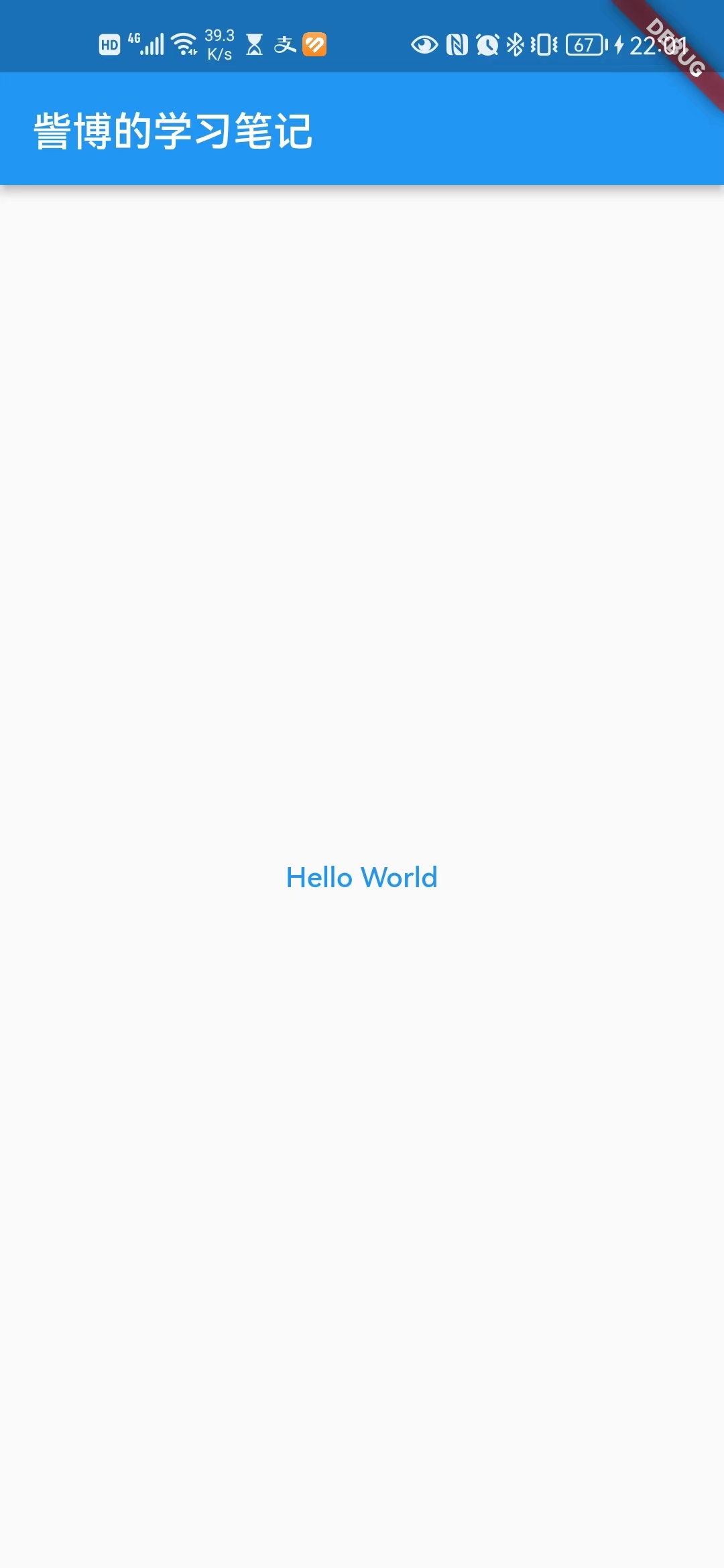
TextButton即文本按钮,默认背景透明并不带阴影。按下后,会有背景色。
2、构造方法
const TextButton({
    super.key,
    required super.onPressed,
    super.onLongPress,
    super.onHover,
    super.onFocusChange,
    super.style,
    super.focusNode,
    super.autofocus = false,
    super.clipBehavior = Clip.none,
    super.statesController,
    required Widget super.child,
  });
3、示例
代码示例
import 'package:flutter/material.dart';
void main() {
runApp(MaterialApp(
home: Scaffold(
appBar: AppBar(title: const Text("訾博的学习笔记")),
body: const MyApp(),
),
));
}
class MyApp extends StatelessWidget {
const MyApp({Key? key}) : super(key: key);
Widget build(BuildContext context) {
return Center(
child: Container(
alignment: Alignment.center,
height: 200,
width: 200,
child: TextButton(
// 点击事件
onPressed: () {
print("Hello World");
},
// 按钮内容
child: Text("Hello World"),
),
),
);
}
}
运行结果
三、OutlinedButton 边框按钮
1、概述
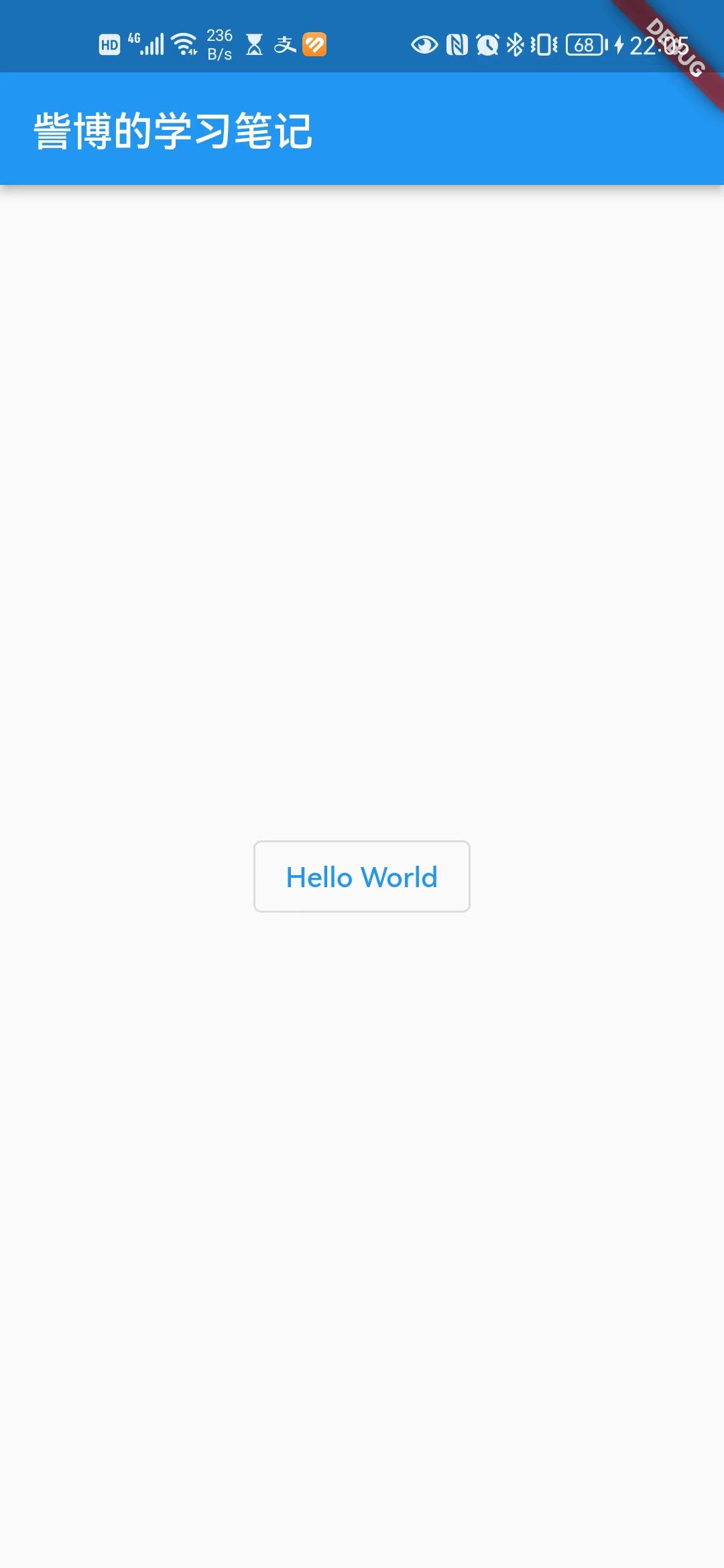
OutlinedButton 默认有一个边框,不带阴影且背景透明。按下后,边框颜色会变亮、同时出现背景和阴影(较弱)。
2、构造方法
const OutlinedButton({
    super.key,
    required super.onPressed,
    super.onLongPress,
    super.onHover,
    super.onFocusChange,
    super.style,
    super.focusNode,
    super.autofocus = false,
    super.clipBehavior = Clip.none,
    super.statesController,
    required Widget super.child,
  });
3、示例
代码示例
import 'package:flutter/material.dart';
void main() {
runApp(MaterialApp(
home: Scaffold(
appBar: AppBar(title: const Text("訾博的学习笔记")),
body: const MyApp(),
),
));
}
class MyApp extends StatelessWidget {
const MyApp({Key? key}) : super(key: key);
Widget build(BuildContext context) {
return Center(
child: Container(
alignment: Alignment.center,
height: 200,
width: 200,
child: OutlinedButton(
// 点击事件
onPressed: () {
print("Hello World");
},
// 按钮内容
child: Text("Hello World"),
),
),
);
}
}
运行结果
四、IconButton 图标按钮
1、概述
IconButton是一个可点击的Icon,不包括文字,默认没有背景,点击后会出现背景。
2、构造方法
const IconButton({
    super.key,
    this.iconSize,
    this.visualDensity,
    this.padding = const EdgeInsets.all(8.0),
    this.alignment = Alignment.center,
    this.splashRadius,
    this.color,
    this.focusColor,
    this.hoverColor,
    this.highlightColor,
    this.splashColor,
    this.disabledColor,
    required this.onPressed,
    this.mouseCursor,
    this.focusNode,
    this.autofocus = false,
    this.tooltip,
    this.enableFeedback = true,
    this.constraints,
    this.style,
    this.isSelected,
    this.selectedIcon,
    required this.icon,
  }) : assert(padding != null),
       assert(alignment != null),
       assert(splashRadius == null || splashRadius > 0),
       assert(autofocus != null),
       assert(icon != null);
3、示例
代码示例
import 'package:flutter/material.dart';
void main() {
runApp(MaterialApp(
home: Scaffold(
appBar: AppBar(title: const Text("訾博的学习笔记")),
body: const MyApp(),
),
));
}
class MyApp extends StatelessWidget {
const MyApp({Key? key}) : super(key: key);
Widget build(BuildContext context) {
return Center(
child: Container(
alignment: Alignment.center,
height: 200,
width: 200,
child: IconButton(
// 图标
icon: const Icon(Icons.add),
// 点击事件
onPressed: () {
print("Hello World");
},
),
),
);
}
}
运行结果
五、带图标的按钮
1、概述
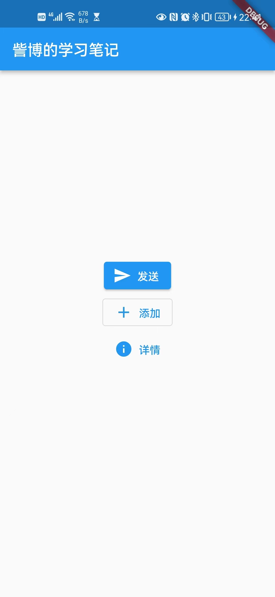
ElevatedButton、TextButton、OutlineButton都有一个icon 构造函数,通过它可以轻松创建带图标的按钮。
2、示例
代码示例
import 'package:flutter/material.dart';
void main() {
runApp(MaterialApp(
home: Scaffold(
appBar: AppBar(title: const Text("訾博的学习笔记")),
body: const MyApp(),
),
));
}
class MyApp extends StatelessWidget {
const MyApp({Key? key}) : super(key: key);
Widget build(BuildContext context) {
return Center(
child: Container(
alignment: Alignment.center,
height: 200,
width: 200,
child: Center(
child: Column(
children: [
ElevatedButton.icon(
icon: Icon(Icons.send),
label: Text("发送"),
onPressed: () {},
),
OutlinedButton.icon(
icon: Icon(Icons.add),
label: Text("添加"),
onPressed: () {},
),
TextButton.icon(
icon: Icon(Icons.info),
label: Text("详情"),
onPressed: () {},
),
],
),
),
),
);
}
}
运行结果
六、点击和长按事件
1、点击事件
ElevatedButton(
     child: Text("爱你"),
     onPressed: () {
         print('我被点击了');
    },
);
2、长按事件
ElevatedButton(
     child: Text("爱你"),
     onLongPress : () {
         print('我被长按了');
    },
);
七、ButtonStyle 按钮样式
1、概述
ButtonStyle 是大多数按钮的共同样式。
按钮及其主题有一个 ButtonStyle 属性,该属性定义其默认值将被覆盖的视觉属性。默认值由各个按钮小部件定义,通常基于整体主题的ThemeData.colorScheme和ThemeData.textTheme。
2、构造方法
注释见代码示例。
const ButtonStyle({
    this.textStyle,
    this.backgroundColor,
    this.foregroundColor,
    this.overlayColor,
    this.shadowColor,
    this.surfaceTintColor,
    this.elevation,
    this.padding,
    this.minimumSize,
    this.fixedSize,
    this.maximumSize,
    this.side,
    this.shape,
    this.mouseCursor,
    this.visualDensity,
    this.tapTargetSize,
    this.animationDuration,
    this.enableFeedback,
    this.alignment,
    this.splashFactory,
  });
3、示例
代码示例
import 'package:flutter/material.dart';
void main() {
runApp(MaterialApp(
home: Scaffold(
appBar: AppBar(title: const Text("訾博的学习笔记")),
body: const MyApp(),
),
));
}
class MyApp extends StatelessWidget {
const MyApp({Key? key}) : super(key: key);
Widget build(BuildContext context) {
return Center(
child: Container(
alignment: Alignment.center,
height: 200,
width: 200,
child: Center(
child: ElevatedButton(
onPressed: () {
print("Hello World");
},
child: const Text("Hello World"),
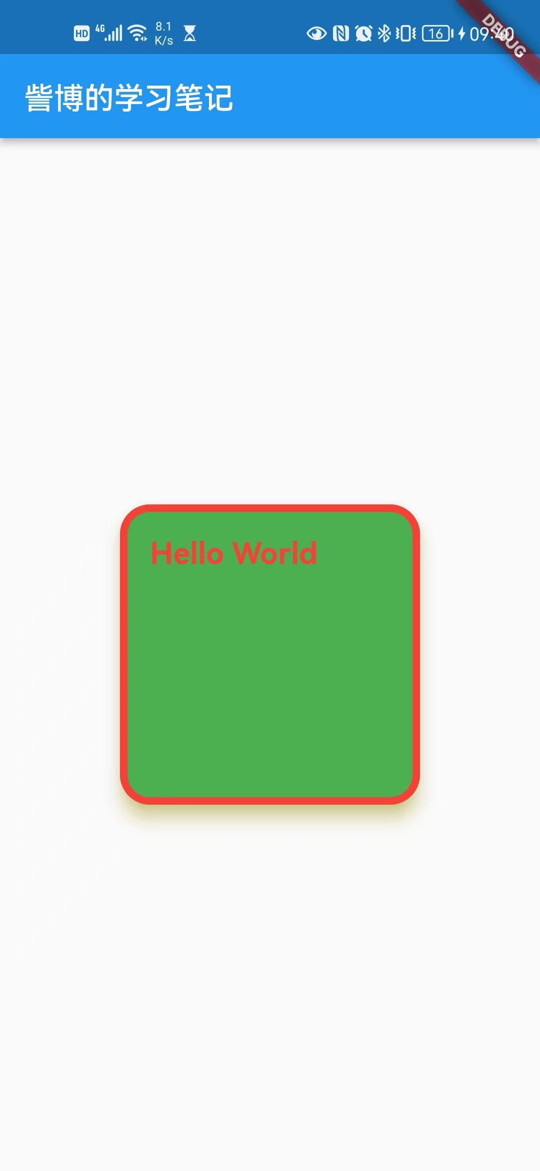
style: ButtonStyle(
// 文本样式
textStyle: MaterialStateProperty.all(
// 这个字体样式里面的颜色,并不能改变文本的颜色
// 但 fontSize 可以改变文本的大小,fontWeight 可以改变文本的粗细
const TextStyle(fontSize: 20, color: Colors.red, fontWeight: FontWeight.bold),
),
// 背景色
backgroundColor: MaterialStateProperty.all(Colors.green),
// 前景色:这才是改变文本的颜色
foregroundColor: MaterialStateProperty.all(Colors.red),
// 叠加颜色:这个是点击时候的颜色
overlayColor: MaterialStateProperty.all(Colors.black),
// 阴影颜色
shadowColor: MaterialStateProperty.all(Colors.yellow),
// 表面颜色:这个暂时没发现效果在哪,不做过多解释
surfaceTintColor: MaterialStateProperty.all(Colors.purple),
// 悬浮高度
elevation: MaterialStateProperty.all(10),
// 内边距
padding: MaterialStateProperty.all(const EdgeInsets.all(20)),
// 最小尺寸
minimumSize: MaterialStateProperty.all(const Size(200, 200)),
// 固定尺寸
fixedSize: MaterialStateProperty.all(const Size(200, 200)),
// 最大尺寸
maximumSize: MaterialStateProperty.all(const Size(200, 200)),
// 边框
side: MaterialStateProperty.all(const BorderSide(color: Colors.red, width: 5)),
// 形状
shape: MaterialStateProperty.all(
RoundedRectangleBorder(
borderRadius: BorderRadius.circular(20),
),
),
// 鼠标光标
mouseCursor: MaterialStateProperty.all(
SystemMouseCursors.forbidden,
),
// 视觉密度
visualDensity: VisualDensity.adaptivePlatformDensity,
// 点击目标大小
tapTargetSize: MaterialTapTargetSize.shrinkWrap,
// 动画时长
animationDuration: const Duration(seconds: 1),
// 启用反馈:没看出来效果
enableFeedback: true,
// 对齐方式(内部文本的)
alignment: Alignment.topLeft,
// 飞溅工厂(点击水波效果)
splashFactory: InkRipple.splashFactory,
),
),
),
),
);
}
}
运行结果
M、扩展阅读
Flutter 中圆角按钮,渐变色按钮
https://blog.csdn.net/qq_44888570/article/details/120906870
N、参考资料
Flutter的button的按钮ElevatedButton
https://blog.csdn.net/qq_41619796/article/details/115658314
Flutter 实战
https://book.flutterchina.club/chapter3/buttons.html#_3-2-1-elevatedbutton


 2200
2200

 被折叠的 条评论
为什么被折叠?
被折叠的 条评论
为什么被折叠?
 到【灌水乐园】发言


