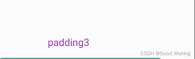
1.Padding给其子节点添加边距类似于Android Layout布局里面的padding属性。
 	Padding(
         padding: EdgeInsets.all(20),
                child: Text(
                  'padding1',
                  style: TextStyle(fontSize: 20,color: Colors.red),
                ),
              ),
              Padding(
                padding: EdgeInsets.all(5),
                child: Text(
                  'padding2',
                  style: TextStyle(fontSize: 20,color: Colors.blueAccent),
                ),
              ),
              Padding(
                padding: EdgeInsets.only(left: 100,top: 100),
                child: Text(
                  'padding3',
                  style: TextStyle(fontSize: 20,color: Colors.purple),
                ),
              )
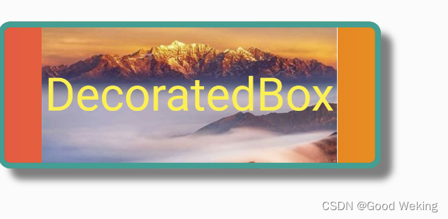
2.DecoratedBox可以在其子组件绘制前(或后)绘制一些装饰(Decoration),如背景、边框、渐变等。
DecoratedBox(
position: DecorationPosition.background,
decoration: BoxDecoration(
color: Colors.red,
gradient: LinearGradient(
colors: [Colors.red, Colors.orange.shade700]),
image: const DecorationImage(
image: NetworkImage(
'https://tse1.mm.bing.net/th/id/OET.1ffb291d38a046a6921fd6559c91b06d?w=272&h=135&c=7&rs=1&o=5&dpr=2&pid=1.9')),
border: Border.all(color: Colors.teal, width: 5),
borderRadius: BorderRadius.circular(10),
boxShadow: const [
BoxShadow(
color: Colors.black54,
offset: Offset(10.0, 10.0),
blurRadius: 4.0)
],
shape: BoxShape.rectangle),
child: const Padding(
padding: EdgeInsets.all(40),
child: Text(
'DecoratedBox',
style: TextStyle(color: Colors.yellow, fontSize: 40),
),
),
)
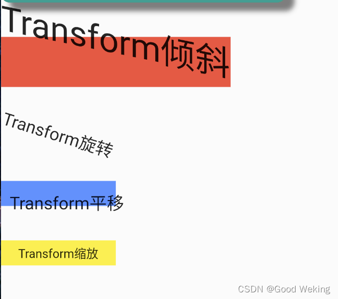
3.Transform子组件绘制时对其应用一些矩阵变换来实现一些特效。Matrix4是一个4D矩阵,通过它我们可以实现各种矩阵操作
  Container(
                color: Colors.red,
                child: Transform(
                  alignment: Alignment.centerRight,
                  transform: Matrix4.skewY(0.2),
                  child: const Text(
                    'Transform倾斜',
                    style: TextStyle(fontSize: 40),
                  ),
                ),
              ),
              const SizedBox(
                height: 40,
              ),
              Transform.rotate(
                  angle: 0.3,
                  child: const Text(
                    'Transform旋转',
                    style: TextStyle(fontSize: 20),
                  )),
              const SizedBox(
                height: 40,
              ),
              Container(
                color: Colors.blueAccent,
                child: Transform.translate(
                  offset: const Offset(10, 10),
                  child: const Text(
                    'Transform平移',
                    style: TextStyle(fontSize: 20),
                  ),
                ),
              ),
              const SizedBox(
                height: 40,
              ),
              Container(
                color: Colors.yellow,
                child: Transform.scale(
                  scale: 0.7,
                  child: const Text(
                    'Transform缩放',
                    style: TextStyle(fontSize: 20),
                  ),
                ),
              )
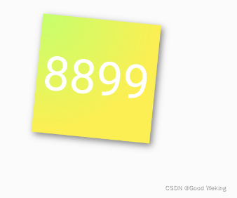
4.Container可以定制装饰子控件的容器背景,边距,间距,渐变,阴影…
Container(
margin: EdgeInsets.only(top: 10.0, left: 40.0),
constraints: BoxConstraints.tightFor(width: 100.0, height: 100.0),
decoration: BoxDecoration(
gradient: RadialGradient(
colors: [Colors.lightGreenAccent, Colors.yellow],
center: Alignment.topLeft,
radius: .98,
),
boxShadow: [
BoxShadow(
color: Colors.black54,
offset: Offset(2.0, 2.0),
blurRadius: 4.0,
)
],
borderRadius: BorderRadius.all(
Radius.circular(4.0),
)
),
transform: Matrix4.rotationZ(.1),
alignment: Alignment.center,
child: Text(
"8899", style: TextStyle(color: Colors.white, fontSize: 40.0),
),
)
5.Clip裁剪子控件
- ClipOval 子组件为正方形时剪裁成内贴圆形;为矩形时,剪裁成内贴椭圆
- ClipRRect 将子组件剪裁为圆角矩形
- ClipRect 默认剪裁掉子组件布局空间之外的绘制内容(溢出部分剪裁)
- ClipPath 按照自定义的路径剪裁
class _ClipWidget extends StatelessWidget {
  final Image photo = Image.network(
    'https://tse1.mm.bing.net/th/id/OET.5272002b31e349ca8b7f061d2d17466f?w=135&h=272&c=7&rs=1&o=5&dpr=2&pid=1.9',
    height: 100,
    width: 100,
    fit: BoxFit.cover,
  );

  @override
  Widget build(BuildContext context) => MaterialApp(
        home: Scaffold(
          body: Center(
            child: Column(
              mainAxisAlignment: MainAxisAlignment.center,
              crossAxisAlignment: CrossAxisAlignment.center,
              children: [
                photo,
                const SizedBox(
                  height: 20,
                ),
                ClipOval(
                  child: photo,
                ),
                const SizedBox(
                  height: 20,
                ),
                ClipRRect(
                  child: photo,
                  borderRadius: const BorderRadius.all(Radius.circular(20)),
                ),
                const SizedBox(
                  height: 20,
                ),
                Container(
                  color: Colors.yellow,
                  width: 120,
                  child: Row(
                    children: [
                      Align(
                        alignment: Alignment.centerRight,
                        widthFactor: .5,
                        child: ClipRect(
                          child: photo,
                        ),
                      ),
                      const Text('我是文本')
                    ],
                  ),
                ),
              ],
            ),
          ),
        ),
      );
}
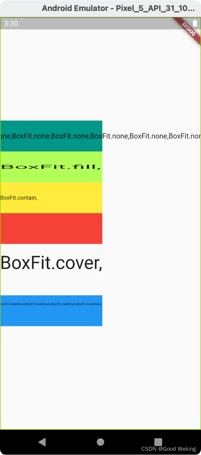
6.FittedBox对其子控件缩放布局
const FittedBox({
Key? key,
this.fit = BoxFit.contain,
this.alignment = Alignment.center,
this.clipBehavior = Clip.none,
Widget? child,
})
- BoxFit.none :不做任何填充
- BoxFit.fill:不按宽高比例填充,内容不会超过容器范围
- BoxFit.contain:按照宽高比等比模式填充,内容不会超过容器范围
- BoxFit.cover:按照原始尺寸填充整个容器模式。内容可能回超过容器范围
- BoxFit.scaleDown:会根据情况缩小范围
class _FittedBoxWidget extends StatelessWidget {
@override
Widget build(BuildContext context) => MaterialApp(
home: Scaffold(
body: Column(
mainAxisAlignment: MainAxisAlignment.center,
children: [
Container(
color: Colors.teal,
width: 200,
height: 60,
child: FittedBox(
fit: BoxFit.none,
child: Padding(
padding: const EdgeInsets.symmetric(vertical: 30.0),
child: Row(
children: [Text('BoxFit.none,' * 10)]),
),
),
),
Container(
width: 200,
color: Colors.lightGreenAccent,
height: 60,
child: FittedBox(
fit: BoxFit.fill,
alignment: Alignment.topLeft,
child: Padding(
padding: const EdgeInsets.symmetric(vertical: 30.0),
child: Row(
children: const [Text('BoxFit.fill,')]),
),
),
),
Container(
width: 200,
color: Colors.yellow,
height: 60,
child: FittedBox(
fit: BoxFit.contain,
alignment: Alignment.topLeft,
child: Padding(
padding: const EdgeInsets.symmetric(vertical: 30.0),
child: Row(
children: const [Text('BoxFit.contain,')]),
),
),
),
Container(
width: 200,
color: Colors.red,
height: 60,
child: FittedBox(
fit: BoxFit.cover,
alignment: Alignment.topLeft,
child: Padding(
padding: const EdgeInsets.symmetric(vertical: 30.0),
child: Row(
children: const [Text('BoxFit.cover,')]),
),
),
),
const SizedBox(height: 100,),
Container(
width: 200,
color: Colors.blue,
height: 60,
child: FittedBox(
fit: BoxFit.scaleDown,
alignment: Alignment.topLeft,
child: Padding(
padding: const EdgeInsets.symmetric(vertical: 30.0),
child: Row(
children: const [Text('BoxFit.scaleDown,BoxFit.scaleDown,BoxFit.scaleDown,BoxFit.scaleDown,')]),
),
),
),
],
),
),
);
}
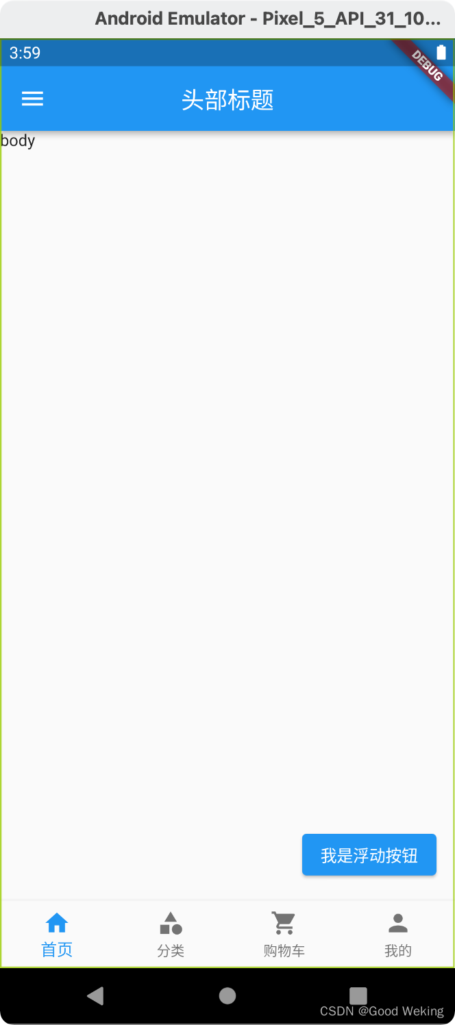
7.Scaffold支持页面标题,侧边栏,底部导航,浮动按钮…
class _ScaffoldWidget extends StatelessWidget {
  @override
  Widget build(BuildContext context) => MaterialApp(
        home: Scaffold(
            appBar: AppBar(
              title: const Text('头部标题'),
              centerTitle: true,
            ),
            body: const Text("body"),
            floatingActionButton: ElevatedButton(
              child: const Text('我是浮动按钮'),
              onPressed: () {},
            ),
            drawer: Drawer(
              child: Container(
                alignment: Alignment.center,
                child: const Text('这个是侧边栏'),
                color: Colors.blue,
              ),
            ),
            bottomNavigationBar: BottomNavigationBar(
              type: BottomNavigationBarType.fixed,
              items: const [
                BottomNavigationBarItem(
                    icon: Icon(Icons.home),
                    label: '首页',
                    backgroundColor: Colors.blue),
                BottomNavigationBarItem(
                    icon: Icon(Icons.category), label: '分类'),
                BottomNavigationBarItem(
                    icon: Icon(Icons.shopping_cart), label: '购物车'),
                BottomNavigationBarItem(icon: Icon(Icons.person), label: '我的')
              ],
            )),
      );
}


 2110
2110


 被折叠的 条评论
为什么被折叠?
被折叠的 条评论
为什么被折叠?
 到【灌水乐园】发言


