


因为ElementuiPlus的dialog弹框的初始样式不太好看,而公司要求又要好看,本来是已经实现了,但是后来想想了发现封装完dialog的其他功能也要,所以特此记录一下
方案一
思路:封装一个组件,将所有新增的参数引入el-dialog 参数中,实现参数共用
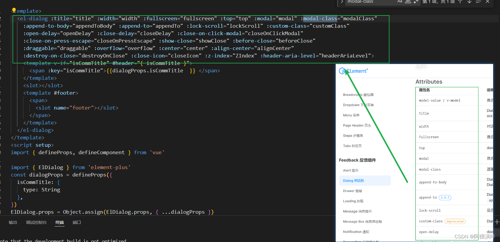
新建一个组件,将官网暴露的属性全部引用了
main.js
import { createApp } from 'vue'
import ElementPlus from 'element-plus'
import 'element-plus/dist/index.css'
import App from './App.vue'
import ElDialogSp1 from './ElDialogSp1.vue'
const app = createApp(App)

app.use(ElementPlus)
app.component('ElDialogSp1',ElDialogSp1)
app.mount('#app')
ElDialogSp1.vue
<template>
  <el-dialog :title="title" :width="width" :fullscreen="fullscreen" :top="top" :modal="modal" :modal-class="modalClass"
    :append-to-body="appendToBody" :append-to="appendTo" :lock-scroll="lockScroll" :custom-class="customClass"
    :open-delay="openDelay" :close-delay="closeDelay" :close-on-click-modal="closeOnClickModal"
    :close-on-press-escape="closeOnPressEscape" :show-close="showClose" :before-close="beforeClose"
    :draggable="draggable" :overflow="overflow" :center="center" :align-center="alignCenter"
    :destroy-on-close="destroyOnClose" :close-icon="closeIcon" :z-index="ZIndex" :header-aria-level="headerAriaLevel">
    <template v-if="isCommTitle" #header="{ isCommTitle }">
      <span :key="isCommTitle">{{dialogProps.isCommTitle  }} </span>
    </template>
    <slot></slot>
    <template #footer>
      <span>
        <slot name="footer"></slot>
      </span>
    </template>
  </el-dialog>
</template>
<script setup>
import { defineProps, defineComponent } from 'vue'

import { ElDialog } from 'element-plus'
const dialogProps = defineProps({
  isCommTitle: {
    type: String
  },
})
ElDialog.props = Object.assign(ElDialog.props, { ...dialogProps })
console.log('ElDialog', ElDialog)
defineComponent({
  ...ElDialog,
})
</script>
<style scoped></style>
使用组件
<template>
  <el-button plain @click="dialogVisible = true">
    ElDialogSp1
  </el-button>

  <el-button plain @click="dialogVisible1 = true">
    ElDialogSp2
  </el-button>

  <ElDialogSp1 :isCommTitle="'没错我是ElDialogSp1的标题'"  v-model="dialogVisible">
    ElDialogSp1中间内容
    <template #footer>
      <el-button plain @click="dialogVisible = false">
        ElDialogSp1
      </el-button>
    </template>
  </ElDialogSp1>
</template>

<script setup>
import {  ref } from "vue";

const dialogVisible = ref(false);
</script>

方案二
思路:封装一个组件,组件内部嵌套el-dialog,然后定义好公共样式,定义好方法,直接使用
缺陷:因为很多属性定义好了,导致如果超出既定样式的方案就得重新调整代码
main.js
import { createApp } from 'vue'
import ElementPlus from 'element-plus'
import 'element-plus/dist/index.css'
import App from './App.vue'
import ElDialogSp2 from './ElDialogSp2.vue'
const app = createApp(App)
app.use(ElementPlus)
app.component('ElDialogSp2',ElDialogSp2)
app.mount('#app')
ElDialogSp2.vue
<template>
  <el-dialog v-model="dialogVisible">
    <template #header="{title}">
     <span :key="title"> {{props.title }}</span>
    </template>
    <slot></slot>
    <template #footer>
      <el-button @click="cancel()">Cancel</el-button>
      <el-button type="primary" @click="confirm()">
        Confirm
      </el-button>
    </template>
  </el-dialog>
</template>

<script setup>
import {  ref,watch,defineProps,defineEmits } from "vue";
const emit = defineEmits(['cancel','confirm'])
const props= defineProps({
  dialogVisible:{
    type:Boolean
  },
  title:{
    type: String
  }
})
const dialogVisible = ref(props.dialogVisible)
function cancel() {
  emit('cancel')
}
function confirm() {
  emit('confirm')
}
watch(()=>props.dialogVisible,(newValue)=>{
  dialogVisible.value = newValue
})

</script>
使用组件
<template>
<el-button plain @click="dialogVisible1 = true">
ElDialogSp2
</el-button>
<ElDialogSp2 @confirm="()=>{dialogVisible1= false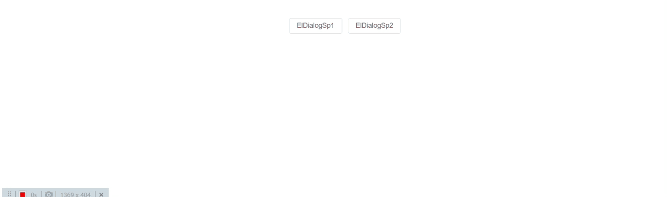
}"
@cancel="()=>{dialogVisible1= false}"
:title="'没错我是ElDialogSp2的标题'" :dialogVisible="dialogVisible1">
ElDialogSp2中间内容
</ElDialogSp2>
</template>
<script setup>
import { ref } from "vue";
const dialogVisible1 = ref(false);
</script>
效果图


 870
870

 被折叠的 条评论
为什么被折叠?
被折叠的 条评论
为什么被折叠?
 到【灌水乐园】发言


