


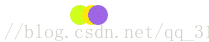
加载动画:循环运动的三个圆球,一边运动,一边变色,实现加载动画的效果,效果如下:
<!DOCTYPE html>
<html>
<head lang="en">
    <meta charset="UTF-8">
    <title></title>
    <style>


        div div {
            width: 20px;
            height: 20px;
            background-color: red;
            /*画一个圆*/
            -moz-border-radius: 10px;
            -webkit-border-radius: 10px;
            -moz-border-radius: 10px;
            position: relative;
            float: left;
        }

        #circle{
            animation: anim 2s infinite alternate;
        }

        #circle2{
            animation: anim2 2s infinite alternate;
        }
        #circle3{
            animation: anim3 2s infinite alternate;
        }
        @keyframes anim {
            0%{background: red;left:0px;top:0px}
            15%{background: orangered;left:20px;top:0px}
            35%{background: orange;left:40px;top:0px}
            50%{background: greenyellow;left:60px;top:0px}
            75%{background: yellow;left:80px;top:0px}
            85%{background: #FFF68F;left:100px;top:0px}
            100%{background: red;left:120px;top:0px}
        }

        @-webkit-keyframes anim {
            0%{background: red;left:0px;top:0px}
            15%{background: orangered;left:20px;top:0px}
            35%{background: orange;left:40px;top:0px}
            50%{background: greenyellow;left:60px;top:0px}
            75%{background: yellow;left:80px;top:0px}
            85%{background: #FFF68F;left:100px;top:0px}
            100%{background: red;left:120px;top:0px}
        }


        @keyframes anim2 {
            0%{background: #228B22;left:60px;top:0px}
            25%{background: #ADFF2F;left:60px;top:0px}
            50%{background: #FFD700;left:60px;top:0px}
            75%{background: yellow;left:60px;top:0px}
            100%{background: #EEE8AA;left:60px;top:0px}
        }

        @keyframes anim3 {
            100%{background: #A4D3EE;left:0px;top:0px}
            85%{background: #9F79EE;left:20px;top:0px}
            65%{background: #9F79EE;left:40px;top:0px}
            50%{background: #9A32CD;left:60px;top:0px}
            35%{background: #8B2252;left:80px;top:0px}
            15%{background: #8B2252;left:100px;top:0px}
            0%{background: #8B0000;left:120px;top:0px}
        }

        @-webkit-keyframes anim3 {
            100%{background: #A4D3EE;left:0px;top:0px}
            85%{background: #9F79EE;left:20px;top:0px}
            65%{background: #9F79EE;left:40px;top:0px}
            50%{background: #9A32CD;left:60px;top:0px}
            35%{background: #8B2252;left:80px;top:0px}
            15%{background: #8B2252;left:100px;top:0px}
            0%{background: #8B0000;left:120px;top:0px}
        }

    </style>
</head>
<body>

    <div style="width: 1300px;height: 40px;" align="center">

        <div id="circle">

        </div>
        <div id="circle2">

        </div>
        <div id="circle3">

        </div>

    </div>

</body>
</html>


 162
162

 被折叠的 条评论
为什么被折叠?
被折叠的 条评论
为什么被折叠?
 到【灌水乐园】发言


