


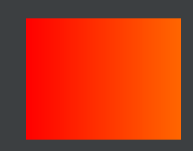
一、使用shape实现背景色渐变效果
在drawable目录下新建shape_color_gradient.xml文件,代码如下
<?xml version="1.0" encoding="utf-8"?>
<shape xmlns:android="http://schemas.android.com/apk/res/android"
    android:shape="rectangle">
    <size
        android:width="@dimen/dp_90"
        android:height="@dimen/dp_70"/>
    <!-- 调整angle实现水平渐变,垂直渐变或者对角渐变 -->
    <gradient
        android:angle="0"
        android:endColor="@color/orange"
        android:startColor="@color/red"
        android:type="linear" />
</shape>
android:angle=“0”:从左往右
android:angle=“90” 从下往上
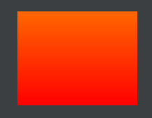
android:angle=“180” 从右往左

android:angle=“270” 从上往下

径向渐变
<?xml version="1.0" encoding="utf-8"?>
<!-- 矩形内部填充-径向渐变,一般不用在rect上,用到圆或者椭圆上 -->
<shape xmlns:android="http://schemas.android.com/apk/res/android"
    android:shape="rectangle"
    android:useLevel="true">
    <size
        android:width="45dp"
        android:height="45dp" />
    <stroke
        android:width="1px"
        android:color="@color/blue" />

    <!-- 径向渐变angle无效 -->
    <gradient
        android:angle="0"
        android:centerX="0.5"
        android:centerY="0.5"
        android:startColor="@color/orange"
        android:endColor="@color/white"
        android:gradientRadius="40dp"
        android:type="radial" />
</shape>

扫描渐变
<?xml version="1.0" encoding="utf-8"?>
<!-- 矩形内部填充-扫描渐变 -->
<shape xmlns:android="http://schemas.android.com/apk/res/android"
android:shape="rectangle"
android:useLevel="true">
<!--如果布局中没有设置View的大小,会size设置的大小为默认值-->
<size
    android:width="45dp"
    android:height="45dp" />
<stroke
    android:width="1px"
    android:color="@color/blue" />
<!--调整angle不能实现角度变化
    centerX,centerY是中心点的位置,这里用的是百分比值(0-1)
    在rect中gradientRadius无效-->
<gradient
    android:angle="0"
    android:centerX="0.5"
    android:centerY="0.5"
    android:startColor="@color/orange"
    android:endColor="@color/white"
    android:gradientRadius="20dp"
    android:type="sweep" />
</shape>

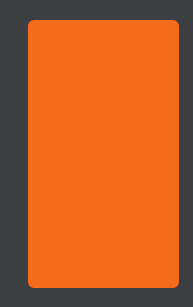
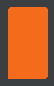
二、使用shape实现圆角纯色背景
<?xml version="1.0" encoding="utf-8"?>
<shape xmlns:android="http://schemas.android.com/apk/res/android"
    android:shape="rectangle">
    <solid android:color="@color/orange_main"/>
    <corners android:radius="@dimen/dp_15"/>
</shape>
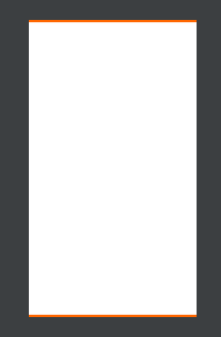
三、使用shape实现圆角边框背景
<?xml version="1.0" encoding="utf-8"?>
<shape xmlns:android="http://schemas.android.com/apk/res/android"
    android:shape="rectangle">
    <stroke
        android:width="@dimen/dp_1"
        android:color="@color/orange"/>
    <corners android:radius="@dimen/dp_4"/>
    <solid android:color="#fffdf9"/>
</shape>
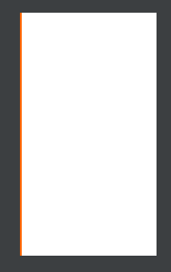
四、使用shape实现单边边框
1、左边框
<?xml version="1.0" encoding="utf-8"?>
<layer-list xmlns:android="http://schemas.android.com/apk/res/android">
    <item>
        <shape>
            <solid android:color="@color/orange"/>
        </shape>
    </item>
    <!-- 左边线 -->
    <item android:left="@dimen/dp_2">
        <shape>
            <solid android:color="@color/white"/>
        </shape>
    </item>
</layer-list>
2、上下边框
<?xml version="1.0" encoding="utf-8"?>
<layer-list xmlns:android="http://schemas.android.com/apk/res/android">
    <item>
        <shape>
            <solid android:color="@color/orange"/>
        </shape>
    </item>
    <!-- 上边线 -->
    <item android:top="@dimen/dp_2" android:bottom="@dimen/dp_2">
        <shape>
            <solid android:color="@color/white"/>
        </shape>
    </item>
</layer-list>
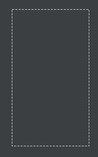
矩形虚线边框
<?xml version="1.0" encoding="utf-8"?>
<!-- 虚线边框 -->
<shape xmlns:android="http://schemas.android.com/apk/res/android"
    android:shape="rectangle"
    android:useLevel="true">
    <stroke
        android:width="2dp"
        android:color="#ffffff"
        android:dashGap="5dp"
        android:dashWidth="10dp" />
</shape>
<?xml version="1.0" encoding="utf-8"?>
<!-- 虚线边框+内部填充 -->
<shape xmlns:android="http://schemas.android.com/apk/res/android"
    android:shape="rectangle"
    android:useLevel="true">
    <stroke
        android:width="2dp"
        android:color="@color/white"
        android:dashGap="5dp"
        android:dashWidth="10dp" />
    <solid android:color="@color/orange" />
</shape>

四、使用shape实现圆形框
<?xml version="1.0" encoding="utf-8"?>

<shape
    xmlns:android="http://schemas.android.com/apk/res/android"
    android:shape="oval"
    android:useLevel="false">
    <solid android:color="@color/white" />
    <size
        android:width="5dp"
        android:height="5dp" />
</shape>

圆环
<?xml version="1.0" encoding="utf-8"?>
<!-- 圆形边框 + 填充 -->
<shape xmlns:android="http://schemas.android.com/apk/res/android"
    android:shape="oval"
    android:useLevel="true">
    <size
        android:width="80dp"
        android:height="80dp" />
    <stroke
        android:width="2dp"
        android:color="@color/orange" />
    <solid android:color="@color/white" />
</shape>

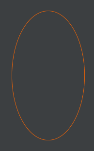
椭圆
<?xml version="1.0" encoding="utf-8"?>
<!-- 椭圆边框 -->
<shape xmlns:android="http://schemas.android.com/apk/res/android"
    android:shape="oval"
    android:useLevel="true">
    <stroke
        android:width="2dp"
        android:color="@color/orange" />
</shape>
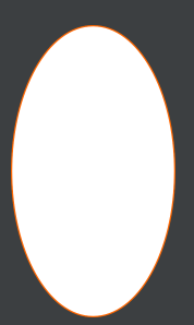
<?xml version="1.0" encoding="utf-8"?>
<!-- 椭圆边框 + 填充-->
<shape xmlns:android="http://schemas.android.com/apk/res/android"
    android:shape="oval"
    android:useLevel="true">
    <stroke
        android:width="3dp"
        android:color="@color/orange" />
    <solid android:color="@color/white" />
</shape>
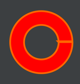
<?xml version="1.0" encoding="utf-8"?><!-- 圆环 -->
<shape xmlns:android="http://schemas.android.com/apk/res/android"
    android:innerRadiusRatio="4"
    android:shape="ring"
    android:thicknessRatio="4"
    android:useLevel="false">
    <!--android:useLevel="false"必须是false-->
    <size
        android:width="80dp"
        android:height="80dp" />
    <solid android:color="@color/orange" />
</shape>

<?xml version="1.0" encoding="utf-8"?>
<!-- 圆环 -->
<shape xmlns:android="http://schemas.android.com/apk/res/android"
    android:innerRadius="20dp"
    android:shape="ring"
    android:thickness="16dp"
    android:useLevel="false">
    <!--android:useLevel="false"必须是false-->
    <size
        android:width="80dp"
        android:height="80dp" />
    <solid android:color="#80ff0000" />
    <stroke
        android:width="2dp"
        android:color="#ffff00ff" />
</shape>
五、实线、虚线
<?xml version="1.0" encoding="utf-8"?>
<!-- 实线 -->
<shape xmlns:android="http://schemas.android.com/apk/res/android"
    android:shape="line"
    android:useLevel="true">
<stroke
    android:width="2dp"
    android:color="#ffff0000" />
</shape>

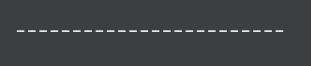
<?xml version="1.0" encoding="utf-8"?>
<!--虚线
    设置类型为line
   需要关闭硬件加速虚线才能绘制出来,布局文件中使用的时候需要设置android:layerType="software"
    android:width 线宽,布局文件中的View的高度需要比这个值大才可以绘制出来
    android:dashWidth 每段破折线的长度
    android:dashGap="5dp"每段破折线之间的间隔-->
<shape xmlns:android="http://schemas.android.com/apk/res/android"
    android:shape="line"
    android:useLevel="true">
    <stroke
        android:width="2dp"
        android:dashGap="5dp"
        android:dashWidth="10dp"
        android:color="#ffffff" />
</shape>
<?xml version="1.0" encoding="utf-8"?>
<!--三边圆角是-->
<shape xmlns:android="http://schemas.android.com/apk/res/android"
       android:shape="rectangle">
    <solid android:color="@color/orange_main" />
    <corners
             android:topLeftRadius="@dimen/dp_30"
             android:topRightRadius="@dimen/dp_30"
             android:bottomLeftRadius="0dp"
             android:bottomRightRadius="@dimen/dp_30"/>
</shape>


 635
635


 被折叠的 条评论
为什么被折叠?
被折叠的 条评论
为什么被折叠?
 到【灌水乐园】发言


