


简述
NavigationView标准导航菜单,也叫做侧滑菜单,是谷歌对侧滑功能的一个整理。
一般是放在DrawerLayout中一起使用。
先来一张最简单的Material design风格的效果图
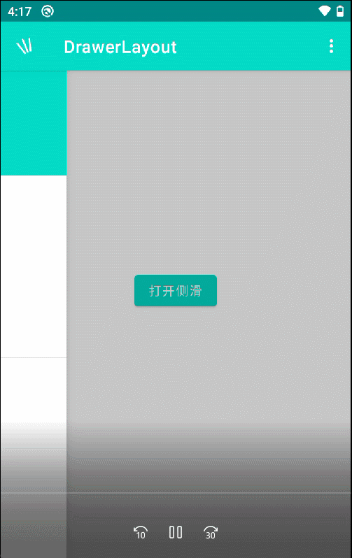
我们具体分解一下

该图由toolbar+drawerLayout+NavigationView组成
红色部分toolbar就不说了,大家的老朋友了,该篇主要讲紫色部分也就是drawerLayout+NavigationView
开始实现,首先依赖
implementation 'com.google.android.material:material:1.3.0'布局activity_drawer_layout
<?xml version="1.0" encoding="utf-8"?>
<androidx.constraintlayout.widget.ConstraintLayout xmlns:android="http://schemas.android.com/apk/res/android"
    xmlns:app="http://schemas.android.com/apk/res-auto"
    android:layout_width="match_parent"
    android:layout_height="match_parent">

    <include
        android:id="@+id/include"
        layout="@layout/layout_toolbar" />


    <androidx.drawerlayout.widget.DrawerLayout
        android:id="@+id/drawer_layout"
        android:layout_width="match_parent"
        android:layout_height="match_parent">

        <LinearLayout
            android:layout_width="match_parent"
            android:layout_height="wrap_content"
            android:gravity="center"
            android:orientation="vertical">

            <Button
                android:id="@+id/btn_open_left"
                android:layout_width="wrap_content"
                android:layout_height="wrap_content"
                android:text="打开侧滑" />

        </LinearLayout>

        <!-- 左边侧滑菜单 -->
        <com.google.android.material.navigation.NavigationView
            android:id="@+id/navigation_view"
            android:layout_width="200dp"
            android:layout_height="match_parent"
            android:layout_gravity="start"
            app:headerLayout="@layout/nav_header"
            app:menu="@menu/menu_nav" />

    </androidx.drawerlayout.widget.DrawerLayout>

</androidx.constraintlayout.widget.ConstraintLayout>
工具栏 layout_toolbar
<?xml version="1.0" encoding="utf-8"?>
<com.google.android.material.appbar.AppBarLayout xmlns:android="http://schemas.android.com/apk/res/android"
    xmlns:app="http://schemas.android.com/apk/res-auto"
    android:layout_width="match_parent"
    android:layout_height="wrap_content">

    <androidx.appcompat.widget.Toolbar
        android:id="@+id/toolbar"
        android:layout_width="match_parent"
        android:layout_height="wrap_content"
        android:background="?attr/colorPrimary"
        android:minHeight="?attr/actionBarSize"
        android:theme="@style/AppTheme.ToolBar"//风格随便设计
        app:menu="@menu/menu_toolbar"//menu大家也都不陌生
        app:navigationIcon="@mipmap/ic_back"
        app:title="@string/app_name"
        app:titleTextColor="@color/white" />

</com.google.android.material.appbar.AppBarLayout>
NavigationView的头布局
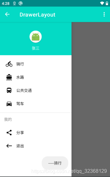
橙色部分是NavigationView的头布局nav_header
<?xml version="1.0" encoding="utf-8"?>
<LinearLayout xmlns:android="http://schemas.android.com/apk/res/android"
    xmlns:app="http://schemas.android.com/apk/res-auto"
    android:layout_width="match_parent"
    android:layout_height="@dimen/nav_header_height"
    android:background="@color/colorPrimary"
    android:gravity="bottom"
    android:orientation="vertical"
    android:paddingLeft="16dp"
    android:paddingTop="16dp"
    android:paddingRight="16dp"
    android:paddingBottom="16dp"
    android:theme="@style/ThemeOverlay.AppCompat.Dark">

    <ImageView
        android:id="@+id/imageView"
        android:layout_width="wrap_content"
        android:layout_height="wrap_content"
        android:layout_gravity="center"
        android:contentDescription="@null"
        app:srcCompat="@mipmap/ic_launcher_round" />

    <TextView
        android:layout_width="wrap_content"
        android:layout_height="wrap_content"
        android:layout_gravity="center"
        android:text="张三"
        android:textAppearance="@style/TextAppearance.AppCompat.Body1" />
</LinearLayout>
菜单按钮功能
绿色部分则是菜单按钮功能,这部分也是由谷歌整理出规范,我们在menu文件夹中创建菜单xml
menu_nav
<?xml version="1.0" encoding="utf-8"?>
<menu xmlns:android="http://schemas.android.com/apk/res/android"
    xmlns:tools="http://schemas.android.com/tools"
    tools:showIn="navigation_view">

    <group android:checkableBehavior="single">
        <item
            android:id="@+id/nav_collect"
            android:icon="@drawable/ic_baseline_directions_bike_24"
            android:title="骑行" />
        <item
            android:id="@+id/nav_about"
            android:icon="@drawable/ic_baseline_directions_boat_24"
            android:title="水路" />
        <item
            android:id="@+id/nav_gallery"
            android:icon="@drawable/ic_baseline_directions_bus_24"
            android:title="公共交通" />
        <item
            android:id="@+id/nav_manage"
            android:icon="@drawable/ic_baseline_directions_car_24"
            android:title="驾车" />
    </group>

    <item android:title="我的">
        <menu>
            <item
                android:id="@+id/nav_share"
                android:icon="@drawable/ic_menu_share"
                android:title="分享" />
            <item
                android:id="@+id/nav_finish"
                android:icon="@drawable/ic_baseline_west_24"
                android:title="退出" />
        </menu>
    </item>

</menu>
drawerlayout与toolbar关联
activtiy中将drawerlayout与toolbar关联起来,以实现gif当中 变成
变成 得动画效果
得动画效果
val actionBarDrawerToggle =ActionBarDrawerToggle
        (this, mBinding.drawerLayout, mToolbar, R.string.open, R.string.close)
        //初始化状态
        actionBarDrawerToggle.syncState()
        mBinding.drawerLayout.addDrawerListener(actionBarDrawerToggle)
侧滑功能菜单得按钮点击事件
若想要侧滑功能菜单得按钮点击事件,需实现
NavigationView.OnNavigationItemSelectedListener 接口
    //NavigationView 内容点击事件
    mBinding.navigationView.setNavigationItemSelectedListener(this)
override fun onNavigationItemSelected(menuItem: MenuItem): Boolean {
val title = menuItem.title as String
Toast.makeText(this, "-----$title", Toast.LENGTH_SHORT).show()
return false
}
这样下来得话基本功能就完成了
但是有些人可能不满足要求,比如需要把toolbar盖上,例如
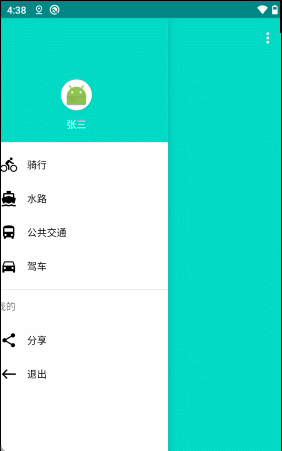
我们只需要把toolbar放在drawerlayout内部即可
 <androidx.drawerlayout.widget.DrawerLayout
        android:id="@+id/drawer_layout"
        android:layout_width="match_parent"
        android:layout_height="match_parent">

        <include
            android:id="@+id/include"
            layout="@layout/layout_toolbar"/>
        ...

</androidx.drawerlayout.widget.DrawerLayout>
误区
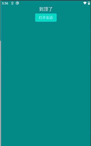
这个时候我们还可以把状态栏变透明,或者去掉状态栏就会有这样那样的问题,效果不好


最终效果
所以我们直接说解决方式
首先我们给activity设置个theme
  <style name="AppTheme.Activity" parent="AppTheme">
        <item name="android:windowTranslucentStatus">false</item>
        <item name="android:windowTranslucentNavigation">true</item>
        <!--Android 5.x开始需要把颜色设置透明,否则导航栏会呈现系统默认的浅灰色-->
        <item name="android:statusBarColor">@android:color/transparent</item>
    </style>
其次我们需要把内容区,侧滑区设置,不然就会出现图上内容区,侧滑区顶到状态栏的问题
android:fitsSystemWindows="true"<?xml version="1.0" encoding="utf-8"?>
<androidx.constraintlayout.widget.ConstraintLayout
xmlns:android="http://schemas.android.com/apk/res/android"
xmlns:app="http://schemas.android.com/apk/res-auto"
xmlns:tools="http://schemas.android.com/tools"
android:layout_width="match_parent"
android:background="@color/colorPrimaryDark"//为了状态栏与下方颜色一致
android:layout_height="match_parent">
<androidx.drawerlayout.widget.DrawerLayout
android:id="@+id/drawer_layout"
android:layout_width="match_parent"
android:layout_height="match_parent">
<!-- 中间内容区 -->
<LinearLayout
android:layout_width="match_parent"
android:layout_height="wrap_content"
android:fitsSystemWindows="true"//这里重点
android:gravity="center_horizontal"
android:orientation="vertical">
<TextView
android:layout_width="wrap_content"
android:layout_height="wrap_content"
android:text="到顶了"
android:textColor="@color/white"
android:textSize="20sp"/>
<Button
android:id="@+id/btn_open_left"
android:layout_width="wrap_content"
android:layout_height="wrap_content"
android:text="打开左边"/>
</LinearLayout>
<!-- 左边侧滑 -->
<com.google.android.material.navigation.NavigationView
android:id="@+id/navigation_view"
android:layout_width="200dp"
android:layout_height="match_parent"
android:layout_gravity="start"
android:fitsSystemWindows="true"//这里重点
app:headerLayout="@layout/nav_header"
app:menu="@menu/menu_nav"/>
</androidx.drawerlayout.widget.DrawerLayout>
</androidx.constraintlayout.widget.ConstraintLayout>
直接看结果
NavigationView属性含义
| 属性 | 含义 |
|---|---|
| app:headerLayout | 头布局 |
| app:elevation | 底部阴影 |
| app:menu | 菜单 |
| app:insetForeground | 设置transparent透明不显示顶部阴影 |
| app:itemIconTint | 条目左侧图标矢量图颜色 |
| app:itemBackground | 设置每一个条目的背景颜色 |
| app:itemTextColor | 设置条目的背景颜色 |
| app:itemHorizontalPadding | 条目距离横向边距 |
| app:itemIconPadding | 条目左侧图标距离边距 |
| app:itemIconSize | 条目左侧图标大小 |
| app:itemShapeFillColor | 定义用于填充形状的颜色 |
| app:itemShapeAppearanceOverlay | 定义自定义形状 |
| app:itemShapeAppearance | 定义自定义形状 |
void | addHeaderView(View view) 将视图作为导航菜单的标题添加。 |
void | draw(Canvas canvas) |
MenuItem | getCheckedItem() 返回此导航菜单中当前选中的项。 |
int | getHeaderCount() 获取此导航视图中的标题数。 |
View | getHeaderView(int index) 获取指定位置的标头视图。 |
Drawable | getItemBackground() 返回可绘制的菜单项背景。 |
int | getItemHorizontalPadding() 返回应用于菜单项的水平(左和右)填充像素。 |
int | getItemIconPadding() 返回图标(如果存在)和菜单项文本之间的填充像素。 |
ColorStateList | getItemIconTintList() 返回应用于菜单项图标的色调。 |
int | getItemMaxLines() 获取菜单项中文本视图的android:maxLine属性。 |
ColorStateList | getItemTextColor() 返回应用于菜单项图标的色调。 |
Menu | getMenu() 返回 |
View | inflateHeaderView(int res) 膨胀视图并将其作为导航菜单的标题添加。 |
void | inflateMenu(int resId) 将菜单资源充气到此导航视图中。 |
void | removeHeaderView(View view) 移除先前添加的标头视图。 |
void | setCheckedItem(MenuItem checkedItem) 在此导航菜单中设置当前选中的项。 |
void | setCheckedItem(int id) 在此导航菜单中设置当前选中的项。 |
void | setDrawBottomInsetForeground(boolean drawBottomInsetForeground) |
void | setDrawTopInsetForeground(boolean drawTopInsetForeground) |
void | setElevation(float elevation) |
void | setItemBackground(Drawable itemBackground) 将菜单项的背景设置为给定的资源。 |
void | setItemBackgroundResource(int resId) 将菜单项的背景设置为给定的资源。 |
void | setItemHorizontalPadding(int padding) 设置以菜单项像素为单位的水平(左和右)填充。 |
void | setItemHorizontalPaddingResource(int paddingResource) 设置菜单项的水平(左、右)填充。 |
void | setItemIconPadding(int padding) 在图标(如果存在)和菜单项文本之间设置以像素为单位的填充。 |
void | setItemIconPaddingResource(int paddingResource) 设置图标(如果存在)和菜单项文本之间的填充。 |
void | setItemIconSize(int iconSize) 设置用于菜单项图标的大小(以像素为单位)。 |
void | setItemIconTintList(ColorStateList tint) 设置适用于菜单项图标的色调。 |
void | setItemMaxLines(int itemMaxLines) 设置菜单项中文本视图的android:maxLine属性。 |
void | setItemTextAppearance(int resId) 将菜单项的文本外观设置为给定资源。 |
void | setItemTextColor(ColorStateList textColor) 设置在菜单项上使用的文本颜色。 |
void | setNavigationItemSelectedListener(NavigationView.OnNavigationItemSelectedListener listener) 设置将在选择菜单项时通知的侦听器。 |
void | setOverScrollMode(int overScrollMode) |
void | setScrimInsetForeground(Drawable drawable) 设置用于嵌入前景的可绘制性。 |
收工


 3930
3930


 被折叠的 条评论
为什么被折叠?
被折叠的 条评论
为什么被折叠?
 到【灌水乐园】发言


