


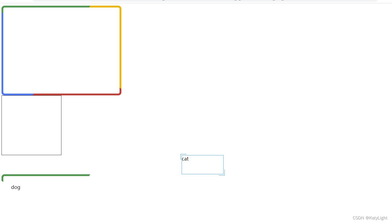
这些我也是从别的地方扣下来的。
<!DOCTYPE html>
<html lang="en">
<head>
  <meta charset="UTF-8">
  <title>Title</title>
  <style>
    .dash {
      height: 200px;
      width: 200px;
      background-size: 4px 1px, 4px 1px, 1px 4px, 1px 4px;

      background-image: linear-gradient(90deg, #333 50%, transparent 0),
      linear-gradient(90deg, #333 50%, transparent 0), linear-gradient(0deg, #333 50%, transparent 0),
      linear-gradient(0deg, #333 50%, transparent 0);
      background-repeat: repeat-x, repeat-x, repeat-y, repeat-y;
      background-position: 0 0, 0 100%, 0 0, 100% 0;
      outline: 1px solid #333;

      outline-offset: -1px;
    }

    .dash:hover {
      outline: none;
      animation: linearGradientMove .3s infinite linear;

    }

    @keyframes linearGradientMove {

      100% {
        background-position: 4px 0, -4px 100%, 0 -4px, 100% 4px;
      }

    }
    *, *::before, *::after {
      box-sizing: border-box;
    }

    @keyframes rotate {
      100% {
        transform: rotate(1turn);
      }
    }

    .rainbow {
      position: relative;
      z-index: 0;
      width: 400px;
      height: 300px;
      border-radius: 10px;
      overflow: hidden;
      padding: 2rem;


    }
    .rainbow::before {
      content: '';
      position: absolute;
      z-index: -2;
      left: -50%;
      top: -50%;
      width: 200%;
      height: 200%;
      background-color: #399953;
      background-repeat: no-repeat;
      background-size: 50% 50%, 50% 50%;
      background-position: 0 0, 100% 0, 100% 100%, 0 100%;
      background-image: linear-gradient(#399953, #399953), linear-gradient(#fbb300, #fbb300), linear-gradient(#d53e33, #d53e33), linear-gradient(#377af5, #377af5);
      animation: rotate 4s linear infinite;
    }

    .rainbow::after {
      content: '';
      position: absolute;
      z-index: -1;
      left: 6px;
      top: 6px;
      width: calc(100% - 12px);
      height: calc(100% - 12px);
      background: white;
      border-radius: 5px;
      animation: opacityChange 3s infinite alternate;
    }
    @keyframes opacityChange {
      50% {
        opacity:1;
      }
      100% {
        opacity: .5;
      }
    }
    :root {
      --borderColor: #03A9F3;
    }
    .cat {
      position: relative;
      width: 140px;
      height: 64px;
      margin: auto;
      border: 1px solid #03A9F3;
      cursor: pointer;


    }


    .cat::before,
    .cat::after {
      content: "";
      position: absolute;
      width: 20px;
      height: 20px;
      transition: .3s ease-in-out;
    }

    .cat::before {
      top: -5px;
      left: -5px;
      border-top: 1px solid var(--borderColor);
      border-left: 1px solid var(--borderColor);
    }

    .cat::after {
      right: -5px;
      bottom: -5px;
      border-bottom: 1px solid var(--borderColor);
      border-right: 1px solid var(--borderColor);
    }

    .cat:hover::before,
    .cat:hover::after {
      width: calc(100% + 9px);
      height: calc(100% + 9px);
    }
    *, *::before, *::after {
      box-sizing: border-box;
    }

    @keyframes rotate {
      100% {
        transform: rotate(1turn);
      }
    }

    .dog {
      position: relative;
      z-index: 0;
      width: 400px;
      height: 300px;
      border-radius: 10px;
      overflow: hidden;
      padding: 2rem;


    }
    .dog::before {
      content: '';
      position: absolute;
      z-index: -2;
      left: -50%;
      top: -50%;
      width: 200%;
      height: 200%;
      background-color: #fff;
      background-repeat: no-repeat;
      background-size: 50% 50%;
      background-position: 0 0;
      background-image: conic-gradient(#399953, #399953);

      animation: rotate 4s linear infinite;
    }

    .dog::after {
      content: '';
      position: absolute;
      z-index: -1;
      left: 6px;
      top: 6px;
      width: calc(100% - 12px);
      height: calc(100% - 12px);
      background: white;
      border-radius: 5px;
      animation: opacityChange 3s infinite alternate;
    }
    @keyframes opacityChange {
      50% {
        opacity:1;
      }
      100% {
        opacity: .5;
      }
    }
    .border-image-clip-path {
      width: 200px;
      height: 100px;
      margin: auto;
      border: 10px solid;
      border-image: linear-gradient(45deg, gold, deeppink) 1;
      clip-path: inset(0px round 10px);
      animation: huerotate 6s infinite linear;
      filter: hue-rotate(360deg);
    }

    @keyframes huerotate {
      0% {
        filter: hue-rotate(0deg);
      }
      100% {
        filter: hue-rotate(360deg);
      }
    }

  </style>
</head>
<body>
<div class="rainbow"></div>
<div class="dash"></div>
<div class="cat">cat</div>
<div class="dog">dog</div>
<div class="border-image-clip-path">dog</div>
</body>
</html>


 2534
2534


 被折叠的 条评论
为什么被折叠?
被折叠的 条评论
为什么被折叠?
 到【灌水乐园】发言


