


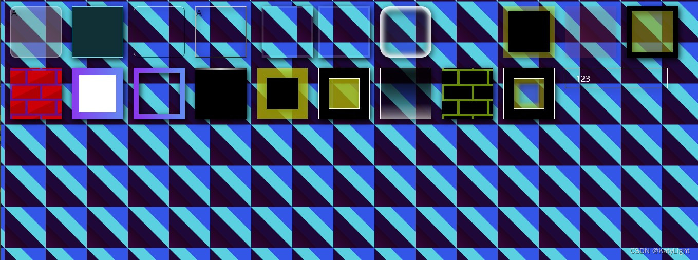
这个先放在这里,奇怪的效果会有一天用上。
<!DOCTYPE html>
<html lang="en">
<head>
  <meta charset="UTF-8">
  <title>Title</title>
  <style>
    .cube {
      height: 100px;
      width: 100px;
      margin: 10px;
      float: left;
      position: relative;
      user-select: none;
      box-sizing: border-box;
    }

    .cube.a1 {
      border: 2px solid #FFFFFF55;
      border-radius: 10px;
      background-color: #FFFFFF44;
    }

    .cube.a1:hover {
      animation: infinite .2s flash;

    }
    body{
    /*  filter:wave(add=add,freq=freq,lightstrength=strength,phase=phase,strength=20);*/
    filter: drop-shadow(2px 4px 6px black)}
    @keyframes flash {
      0% {
        border-color: #FFFFFF55;
      }
      100% {
        border-color: #FF000077;
      }

    }

    @keyframes rotateMe {
      0% {
        transform: rotate(0deg);
      }
      100% {
        transform: rotate(360deg);
      }

    }

    .cube.a2 {
      background-color: #023036;
      border: 1px solid #00e8ff;
      transition: border .1s ease-in;
    }

    .cube.a2:hover {
      border-width: 5px;
      transition: border .1s ease-in;

    }


    @keyframes shake {
      0% {
        transform: translateX(-10px);
      }
      20% {
        transform: translateX(10px);
      }
      30% {
        transform: translateX(-10px);
      }
      40% {
        transform: translateX(10px);
      }
    }

    .cube.a3 {
      backdrop-filter: blur(2px);
      background-color: transparent;
      border-radius: 10px;
      border: 1px solid #FFFFFFA1;
      border-right-color: #000000A1;
      border-bottom-color: #000000A1;
    }

    .cube.a3:hover {
      animation: forwards .2s shake;

    }

    .cube.a4 {
      backdrop-filter: blur(2px);
      background-color: transparent;
      border: 2px solid;
      border-right-color: rgba(89, 85, 85, 0.88);
      border-top-color: rgba(236, 220, 220, 0.88);
      border-left-color: rgba(197, 182, 182, 0.88);
      border-bottom-color: rgba(31, 27, 27, 0.88);
    }

    .cube.a4:active {
      animation: forwards .2s shake;

    }

    .cube.a5 {

      backdrop-filter: blur(10px);
      background: inherit;
      border: 4px solid #FFFFFF22;
    }

    .cube.a5:active {
      animation: forwards 1.2s shake;

    }

    .cube.a6 {

      backdrop-filter: blur(10px);
      background: inherit;
      border: 4px solid #FFFFFF22;
    }

    .cube.a6:active {
      animation: forwards 2s growUP;

    }

    /*.cube.a7{*/
    /*  margin: -20px;*/
    /*  border: 10px solid #FFFFFF22;*/
    /*  background: inherit;*/
    /*  position: relative;*/
    /*  z-index: 5;*/
    /*}*/
    /*.cube.a7::before  {*/
    /*  content: '';*/
    /*  position: absolute;*/
    /*  left:0;*/
    /*  top: 0;*/
    /*  right:0;*/
    /*  bottom: 0;*/
    /*  backdrop-filter: blur( 120px);*/
    /*  background: inherit;*/
    /*  box-sizing: border-box;*/


    /*}*/
    .cube.a7:before {
      content: '';
      position: absolute;
      top: 0;
      left: 0;
      right: 0;
      bottom: 0;
      background: inherit;
      filter: blur(25px);
      -webkit-filter: blur(25px);
      /*! -moz-filter: blur(6px); */
      -o-filter: blur(25px);
      -ms-filter: blur(25px);
      border: 1px solid white;
      outline: 1px solid white;
      box-sizing: border-box;

    }

    .cube.a7 {
      background: inherit;
      position: absolute;
      border-radius: 15px;
      border: 21px solid rgba(255, 255, 255, 0);
      box-shadow: 1px 1px 4px rgba(0, 0, 0, .8);
      z-index: 5;
      font-size: 1.4rem;
      cursor: move;
      height: 200px;
      width: 200px;


    }

    .cube.a7.b1 {
      top: 100px;
      left: 100px;
    }

    .cube.a7.b2 {
      top: 80px;
      left: 150px;
    }

    @keyframes growUP {
      0% {
        transform: scale(1.4);
      }
      20% {
        transform: scale(.7);
      }
      30% {
        transform: scale(1.4);
      }
      40% {
        transform: scale(.7)
      }
    }

    .cube.a8 {
      box-shadow: inset 0 0 10px 6px white;
      border-radius: 20px;
      background: #00FFFF11;
      backdrop-filter: brightness(5);

      /*    contrast(180%)*/
    }

    .cube.a10 {
      background: inherit;
      filter: blur(22px);
      position: fixed;
      top: 0;
      right: 0;
      bottom: 0;
      left: 0;
      height: revert;
      width: revert;
    }

    .cube.a11 {

      background: inherit;
      filter: blur(0);
      z-index: 11;
    }

    body {
      background-image: linear-gradient(45deg, #3b0a3b 0%, #230422 30%, #210a3a 30%, #1f0a36 50%, #0cd0e1 50%, #0cd0e1 70%, #195ae5 70%, #195ae5 100%);
      /*background-repeat: no-repeat;*/
      background-size: 80px 80px;
      background-position: center;
      background-attachment: fixed;
    }

    .cube.a12 {

      border: 10px solid #FFFF0055;
      background-clip: padding-box;
      background-color: black;
    }

    .cube.a13 {
      transition: all .1s ease-in;

      /*background-image: linear-gradient(#FF4F7622, #b2314e22);*/
      background-color: #FF4F7622;
      /*background: inherit;*/
      box-shadow: 0 0 0 0 #5b1021;
    }

    .cube.a13:active {
      box-shadow: 10px 10px 0 0 rgba(16, 80, 91, 0.27);
      transition: all .1s ease-in;
    }

    .cube.a14 {

      border: 10px solid black;
      background-clip: padding-box;
      background-color: #FFFF0055;
    }

    .cube.a15 {
      background-color: rgba(148, 31, 187, 0.73);
      background-image: linear-gradient(335deg, #b00 23px, transparent 23px),
      linear-gradient(155deg, #d00 23px, transparent 23px),
      linear-gradient(335deg, #b00 23px, transparent 23px),
      linear-gradient(155deg, #d00 23px, transparent 23px);
      background-size: 58px 58px;
      background-position: 0px 2px, 4px 35px, 29px 31px, 34px 6px;
    }

    .cube.a16 {
      border: 14px solid transparent;
      border-image-source: linear-gradient(to right, #8f41e9, #578aef);
      border-image-slice: 12;
      background-color: white;
      background-clip: padding-box;
    }

    .cube.a17 {
      border: 10px solid;
      border-image: linear-gradient(to right, #8f41e9, #578aef) 1;
    }

    .cube.a18 {
      border-top: 4px solid transparent;
      background-color: black;
      border-image: linear-gradient(90deg, #222, #ccc, #222) 1;
    }

    .cube.a19 {
      border: 1px solid white;
      padding: 18px;
      background-color: #FFFF0088;
    }

    .cube.a19 > .inner {
      height: 60px;
      width: 60px;
      border: 1px solid white;
      background-color: black;
    }

    .cube.a20{

      border: 1px solid white;

      box-shadow: inset 0 0 0 19px black;
      padding: 19px;
    }
    .cube.a20>.inner{
      height: 58px;
      width: 58px;

      border: 1px solid white;
      background-color: #FFFF0088;
    }
    .cube.a21{
      border: 1px solid white;
      background-image: linear-gradient(#000000AA 10%,transparent),linear-gradient(transparent 70%,#FFFFFF88);
    }
    .cube.a22 {
      background-color: rgba(130, 187, 31, 0.73);
      background-image: linear-gradient(335deg, #000 23px, transparent 23px),
      linear-gradient(155deg, #000 23px, transparent 23px),
      linear-gradient(335deg, #000 23px, transparent 23px),
      linear-gradient(155deg, #000 23px, transparent 23px);
      background-size: 58px 58px;
      background-position: 0 2px, 4px 35px, 29px 31px, 34px 6px;
      border: 1px solid white;
    }
    .cube.a22:hover{
      filter: brightness(80%) hue-rotate(10deg);
    }
    .cube.a23{
      border: 1px solid white;
      box-shadow: inset 0 0 0 19px black;
      padding: 19px;
    }
    .cube.a23>.inner{
      height: 58px;
      width: 58px;
      border: 1px solid white;
      box-shadow: inset 0 0 5px 10px #FFFF0055;
      backdrop-filter: brightness(5);
      background-color: #FFFF0011;
    }
    .cube.a24{
       border: 1px solid white;
       background-color: transparent;
       position: relative;
       height: 40px;
       vertical-align: middle;
       line-height: 40px;
       width: 200px;
       margin-top: 10px;
       margin-left: 10px;
       user-select: none;

     }

    .cube.a24 > .z1,  .cube.a24 > .z2 {
      position: absolute;
      left: 0;
      top: 0;
      right: 0;
      bottom: 0;
      padding-inline-start: 20px;

    }

    .cube.a24:hover > .z2 {
      clip: rect(0px, 200px, 50px, 0px);
      transition: 1s ease all;
    }

    .cube.a24 > .z1 {
      background-color: transparent;
      color: white;
      z-index: 1;
    }

    .cube.a24 > .z2 {
      color: black;
      z-index: 8;
      background-color: white;
      clip: rect(0, 0, 50px, 0);
      transition: 1s ease all;

    }

  </style>
</head>
<body>
<div class="cube a1">A</div>
<div class="cube a2"></div>
<div class="cube a3"></div>
<div class="cube a4">A</div>
<div class="cube a5"></div>
<div class="cube a6"></div>
<div class="cube a8"></div>
<div class="cube a9"></div>
<div class="cube a12"></div>
<div class="cube a13"></div>
<div class="cube a14"></div>
<div class="cube a15"></div>
<div class="cube a16"></div>
<div class="cube a17"></div>
<div class="cube a18"></div>
<div class="cube a19">
  <div class="inner"></div>
</div>
<div class="cube a20">
  <div class="inner"></div>
</div>
<div class="cube a21"></div>
<div class="cube a22"></div>
<div class="cube a23">
  <div class="inner"></div>
</div>
<div class="cube a24">
  <div class="z1">123</div>
  <div class="z2">123</div>
</div>
<!--背景模糊,对象清晰-->
<!--<div class="cube a10"></div>-->
<!--<div class="cube a11"></div>-->
<!--模糊玻璃-->
<!--<div class="cube a7 b1"></div>-->
<!--<div class="cube a7 b2" ></div>-->
</body>
</html>


 被折叠的 条评论
为什么被折叠?
被折叠的 条评论
为什么被折叠?
 到【灌水乐园】发言


