


 本文介绍了Material设计中的颜色使用原则,包括颜色调色板的选择、对比度的要求、不同UI元素的颜色应用示例等。同时,还提供了如何为应用程序选择合适的主题颜色的建议。
Color in material design is inspired by bold hues juxtaposed with muted environments, deep shadows, and bright highlights.
Color
Contents
Color palette
Material takes cues from contemporary architecture, road signs, pavement marking tape, and athletic courts. Color should be unexpected and vibrant.
This color palette comprises primary and accent colors that can be used for illustration or to develop your brand colors. They’ve been designed to work harmoniously with each other. The color palette starts with primary colors and fills in the spectrum to create a complete and usable palette for Android, Web, and iOS. Google suggests using the 500 colors as the primary colors in your app and the other colors as accents colors.
Themes enable consistent app styling through surface shades, shadow depth, and ink opacity.

Download color swatches
0.02 MB (.zip)
- Red500#F44336
- #FFEBEE
- 100#FFCDD2
- #EF9A9A
- 300#E57373
- #EF5350
- 500#F44336
- #E53935
- 700#D32F2F
- #C62828
- #B71C1C
- A100#FF8A80
- #FF5252
- #FF1744
- A700#D50000
- Pink500#E91E63
- #FCE4EC
- 100#F8BBD0
- #F48FB1
- 300#F06292
- #EC407A
- 500#E91E63
- #D81B60
- 700#C2185B
- 800#AD1457
- 900#880E4F
- A100#FF80AB
- #FF4081
- #F50057
- A700#C51162
- Purple500#9C27B0
- #F3E5F5
- 100#E1BEE7
- #CE93D8
- 300#BA68C8
- #AB47BC
- 500#9C27B0
- #8E24AA
- 700#7B1FA2
- #6A1B9A
- #4A148C
- A100#EA80FC
- #E040FB
- #D500F9
- A700#AA00FF
- Deep Purple500#673AB7
- #EDE7F6
- 100#D1C4E9
- #B39DDB
- 300#9575CD
- #7E57C2
- 500#673AB7
- #5E35B1
- 700#512DA8
- #4527A0
- #311B92
- A100#B388FF
- #7C4DFF
- #651FFF
- A700#6200EA
- Indigo500#3F51B5
- #E8EAF6
- 100#C5CAE9
- #9FA8DA
- 300#7986CB
- #5C6BC0
- 500#3F51B5
- #3949AB
- 700#303F9F
- #283593
- #1A237E
- A100#8C9EFF
- #536DFE
- #3D5AFE
- A700#304FFE
- Blue500#2196F3
- #E3F2FD
- 100#BBDEFB
- #90CAF9
- 300#64B5F6
- #42A5F5
- 500#2196F3
- #1E88E5
- 700#1976D2
- #1565C0
- #0D47A1
- A100#82B1FF
- #448AFF
- #2979FF
- A700#2962FF
- Light Blue500#03A9F4
- #E1F5FE
- 100#B3E5FC
- #81D4FA
- 300#4FC3F7
- #29B6F6
- 500#03A9F4
- #039BE5
- 700#0288D1
- #0277BD
- #01579B
- A100#80D8FF
- #40C4FF
- #00B0FF
- A700#0091EA
- Cyan500#00BCD4
- #E0F7FA
- 100#B2EBF2
- #80DEEA
- 300#4DD0E1
- #26C6DA
- 500#00BCD4
- #00ACC1
- 700#0097A7
- #00838F
- #006064
- A100#84FFFF
- #18FFFF
- #00E5FF
- A700#00B8D4
- Teal500#009688
- #E0F2F1
- 100#B2DFDB
- #80CBC4
- 300#4DB6AC
- #26A69A
- 500#009688
- #00897B
- 700#00796B
- #00695C
- #004D40
- A100#A7FFEB
- #64FFDA
- #1DE9B6
- A700#00BFA5
- Green500#4CAF50
- #E8F5E9
- 100#C8E6C9
- #A5D6A7
- 300#81C784
- #66BB6A
- 500#4CAF50
- #43A047
- 700#388E3C
- #2E7D32
- #1B5E20
- A100#B9F6CA
- #69F0AE
- #00E676
- A700#00C853
- Light Green500#8BC34A
- #F1F8E9
- 100#DCEDC8
- #C5E1A5
- 300#AED581
- #9CCC65
- 500#8BC34A
- #7CB342
- 700#689F38
- #558B2F
- #33691E
- A100#CCFF90
- #B2FF59
- #76FF03
- A700#64DD17
- Lime500#CDDC39
- #F9FBE7
- 100#F0F4C3
- #E6EE9C
- 300#DCE775
- #D4E157
- 500#CDDC39
- #C0CA33
- 700#AFB42B
- #9E9D24
- #827717
- A100#F4FF81
- #EEFF41
- #C6FF00
- A700#AEEA00
- Yellow500#FFEB3B
- #FFFDE7
- 100#FFF9C4
- #FFF59D
- 300#FFF176
- #FFEE58
- 500#FFEB3B
- #FDD835
- 700#FBC02D
- #F9A825
- #F57F17
- A100#FFFF8D
- #FFFF00
- #FFEA00
- A700#FFD600
- Amber500#FFC107
- #FFF8E1
- 100#FFECB3
- #FFE082
- 300#FFD54F
- #FFCA28
- 500#FFC107
- #FFB300
- 700#FFA000
- #FF8F00
- #FF6F00
- A100#FFE57F
- #FFD740
- #FFC400
- A700#FFAB00
- Orange500#FF9800
- #FFF3E0
- 100#FFE0B2
- #FFCC80
- 300#FFB74D
- #FFA726
- 500#FF9800
- #FB8C00
- 700#F57C00
- #EF6C00
- #E65100
- A100#FFD180
- #FFAB40
- #FF9100
- A700#FF6D00
- Deep Orange500#FF5722
- #FBE9E7
- 100#FFCCBC
- #FFAB91
- 300#FF8A65
- #FF7043
- 500#FF5722
- #F4511E
- 700#E64A19
- #D84315
- #BF360C
- A100#FF9E80
- #FF6E40
- #FF3D00
- A700#DD2C00
- Brown500#795548
- #EFEBE9
- 100#D7CCC8
- #BCAAA4
- 300#A1887F
- #8D6E63
- 500#795548
- #6D4C41
- 700#5D4037
- #4E342E
- #3E2723
- Grey500#9E9E9E
- #FAFAFA
- 100#F5F5F5
- #EEEEEE
- 300#E0E0E0
- #BDBDBD
- 500#9E9E9E
- #757575
- 700#616161
- #424242
- #212121
- Blue Grey500#607D8B
- #ECEFF1
- 100#CFD8DC
- #B0BEC5
- 300#90A4AE
- #78909C
- 500#607D8B
- #546E7A
- 700#455A64
- #37474F
- #263238
- Black#000000
- #FFFFFF
Color schemes
Choosing a color palette
Your app's color palette may be defined by using a custom palette suited to your brand, such as monochromatic, black and white, full color, or neutral. Alternatively, you may use the material design color palette. All color palettes should include sufficient contrast between different UI elements.
Related

Customize the color palette
Define your app’s color palette.
Using the material design color palette
Apps that don’t have existing color schemes may select colors from the material design color palette. Limit your selection of colors to three hues from the primary palette and one accent color from the secondary palette.
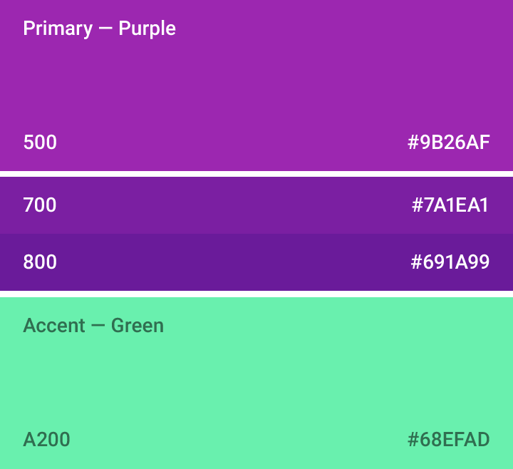
Example of a color palette using two purple hues from the primary palette and one accent green hue.

Example of UI color application
Primary color
When using a primary color in your palette, this color should be the most widely used across all screens and components.

Example of a primary color palette with variations for when a darker or lighter version of the color is needed
Secondary color
Palettes with a secondary color may use this color to indicate a related action or information.
The secondary color may be a darker or lighter variation of the primary color.

Example of a secondary palette with variations for when a darker or lighter version of the color is needed
Accent color
The accent should be used for the floating action button and interactive elements, such as:
- Text fields and cursors
- Text selection
- Progress bars
- Selection controls, buttons, and sliders
- Links

Floating action button using the accent color

Switch using the accent color

Do.
Only use the accent color for body text to accent a web link.

Don't.
Don’t use the accent color for body text color.

Do.
Use the accent color for your primary action button and components like switches or sliders.

Don't.
Don’t use the accent color for app bars or larger areas of color. Avoid using the same color for the floating action button and the background.

The App bar, toolbar and system status bar can be customized using your palette accent color. In this example, the toolbar uses the 500 version of indigo, while the status bar uses the 700 version.

Web links and buttons can be customized using your palette accent color.

Text fields and selection controls can be customized using your palette accent color.

Text selection can be customized using your palette accent color.
Alternative accent colors
Darker shades and lighter tints
If your accent color is too light or dark to sufficiently contrast with the background color, use a darker shade or lighter tint of the accent color instead.

Do.
Use a fallback accent color over background colors that are too light or too dark.

Don't.
Don’t use the accent color over a background color if there isn’t enough contrast.
Primary color variations
Another alternative accent color is the 500 version of your primary color on white backgrounds.
However, if your background color is already the 500 version of your primary color, make your accent color either white 100% or black 54%.
Text and background colors
Text opacity
Text may be displayed with different degrees of opacity to convey how important certain information is relative to other information. The level of opacity used for text depends on whether your background is darker or lighter.
Dark text on light backgrounds
For dark text on light backgrounds, apply the following opacity levels:
- The most important text has an opacity of 87%.
- Secondary text, which is lower in the visual hierarchy, has an opacity of 54%.
- Text hints (like those in text fields and labels) and disabled text have even lower visual prominence with an opacity of 38%.

Dark text on light backgrounds
| Dark text (#000000) | Opacity |
| Primary text | 87% |
| Secondary text | 54% |
| Disabled text, hint text, and icons | 38% |
| Dividers | 12% |
White text on dark backgrounds
The table values relay relative levels of importance for white text on dark backgrounds.
White text appearing on colored backgrounds should do so at an opacity of 100%.

White text on dark backgrounds
| Light text (#FFFFFF) | Opacity |
| Primary text | 100% |
| Secondary text | 70% |
| Disabled text, hint text, and icons | 50% |
| Dividers | 12% |
Use opacity instead of grey
Black or white text that is transparent remains legible and vibrant against background color changes. This makes it more flexible than grey text in the same contexts.

Don't.
Grey text (hex value of #727272) on a white background becomes hard to read if the background color changes to magenta.

Do.
Black text, set to a 0.54 opacity, ensures a minimum degree of legibility and color harmony with new background colors.
Icons and other elements
Elements like icons benefit from having a hex value of black or white (rather than a specific color) at 38% opacity so that they work on backgrounds of any color.
| Dark icons (#000000) | Opacity |
| Active icon | 54% |
| Inactive icon | 38% |
| Light icons (#FFFFFF) | Opacity |
| Active icon | 100% |
| Inactive icon | 50% |
Themes
Themes let you apply a consistent tone to an app. The theme specifies the darkness of the surfaces, level of shadow, and appropriate opacity of ink elements. To promote greater consistency between apps, light and dark themes are available to choose from.
Download themes
1.23 MB (.ai)
Light theme
1. Status bar
2. App bar
3. Background
4. Cards/Dialogs

Light theme palette

UI application
Dark theme
1. Status bar
2. App bar
3. Background
4. Cards/Dialogs

Dark theme palette

UI application


 扫一扫
扫一扫


 952
952

 被折叠的 条评论
为什么被折叠?
被折叠的 条评论
为什么被折叠?
 到【灌水乐园】发言


