


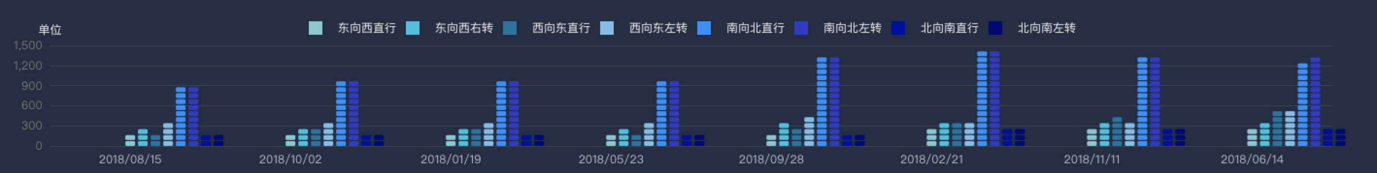
首先附上实现效果,被分了段的柱状图
幸亏了公司的设计师出的难题,不然我也不会去捣鼓这个东西的
这个图表的类型是 pictoriaBar ,在echarts 3.4版本(版本记得不太明确)之后有了这个类型的图
介绍下这个属性的具体用处:
barWidth: 设置柱子的宽度
symbol:设置小块的样式
symbolRepeat: 设置柱子上的小块是否重复,我尝试过发现,默认为false,只显示一个小块
symbolOffset: 设置每个柱子的位置(每个柱子的位置需要进行计算得出)
symbolSize: 设置每个小块的大小
const chartInit = {
color: [
"#7AC9D2",
"#00C1DE",
"#00749F",
"#77BEE8",
"#1890FF",
"#3436C7",
"#0103A0",
"#000272"
],
backgroundColor: "transparent",
grid: {
left: "10px",
top: "50px",
right: "50px",
bottom: "16px",
containLabel: true
},
xAxis: {
type: "category",
data: [
"2018/08/15",
"2018/10/02",
"2018/01/19",
"2018/05/23",
"2018/09/28",
"2018/02/21",
"2018/11/11",
"2018/06/14"
],
axisLabel: {
color: "#AFBCC4"
},
axisTick: {
show: false
},
axisLine: {
show: false
}
},
yAxis: {
name: "单位",
axisLine: {
show: false
},
type: "value",
nameGap: 10,
axisTick: {
show: false
},
axisLabel: {
color: "#747677"
},
splitLine: {
lineStyle: {
color: "rgba(216,216,216,0.10)",
type: "solid"
}
}
},
legend: {
top: 20,
data: [
{ name: "东向西直行", icon: "square" },
{ name: "东向西右转", icon: "square" },
{ name: "西向东直行", icon: "square" },
{ name: "西向东左转", icon: "square" },
{ name: "南向北直行", icon: "square" },
{ name: "南向北左转", icon: "square" },
{ name: "北向南直行", icon: "square" },
{ name: "北向南左转", icon: "square" }
]
},
series: [
{
name: "东向西直行",
type: "pictorialBar",
symbol: "roundRect",
symbolRepeat: true, // 分节
barWidth: 10,
symbolSize: [10, 5], //size,单个symbol的大小
data: [120, 132, 101, 134, 90, 230, 210, 180]
},
{
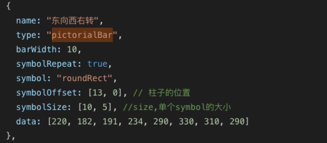
name: "东向西右转",
type: "pictorialBar",
barWidth: 10,
symbolRepeat: true,
symbol: "roundRect",
symbolOffset: [13, 0], // 柱子的位置
symbolSize: [10, 5], //size,单个symbol的大小
data: [220, 182, 191, 234, 290, 330, 310, 290]
},
{
name: "西向东直行",
type: "pictorialBar",
symbolRepeat: true,
symbol: "roundRect",
symbolOffset: [26, 0], // 柱子的位置
symbolSize: [10, 5], //size,单个symbol的大小
barWidth: 10,
data: [150, 232, 201, 154, 190, 330, 410, 430]
},
{
name: "西向东左转",
type: "pictorialBar",
symbolRepeat: true,
symbol: "roundRect",
symbolOffset: [39, 0], // 柱子的位置
symbolSize: [10, 5], //size,单个symbol的大小
barWidth: 10,
data: [320, 332, 301, 334, 390, 330, 320, 503]
},
{
name: "南向北直行",
type: "pictorialBar",
barWidth: 10,
symbol: "roundRect",
symbolRepeat: true,
symbolOffset: [52, 0], // 柱子的位置
symbolSize: [10, 5], //size,单个symbol的大小
data: [820, 932, 901, 934, 1290, 1330, 1320, 1222]
},
{
name: "南向北左转",
type: "pictorialBar",
barWidth: 10,
symbol: "roundRect",
symbolRepeat: true,
symbolOffset: [65, 0], // 柱子的位置
symbolSize: [10, 5], //size,单个symbol的大小
data: [820, 932, 901, 934, 1290, 1330, 1320, 1290]
},
{
name: "北向南直行",
type: "pictorialBar",
barWidth: 10,
symbol: "roundRect",
symbolRepeat: true,
symbolOffset: [78, 0], // 柱子的位置
symbolSize: [10, 5], //size,单个symbol的大小
data: [120, 132, 101, 134, 90, 230, 210, 180]
},
{
name: "北向南左转",
type: "pictorialBar",
barWidth: 10,
symbol: "roundRect",
symbolRepeat: true,
symbolOffset: [91, 0], // 柱子的位置
symbolSize: [10, 5], //size,单个symbol的大小
data: [120, 132, 101, 134, 90, 230, 210, 180]
}
]
};


 3万+
3万+


 被折叠的 条评论
为什么被折叠?
被折叠的 条评论
为什么被折叠?
 到【灌水乐园】发言


