


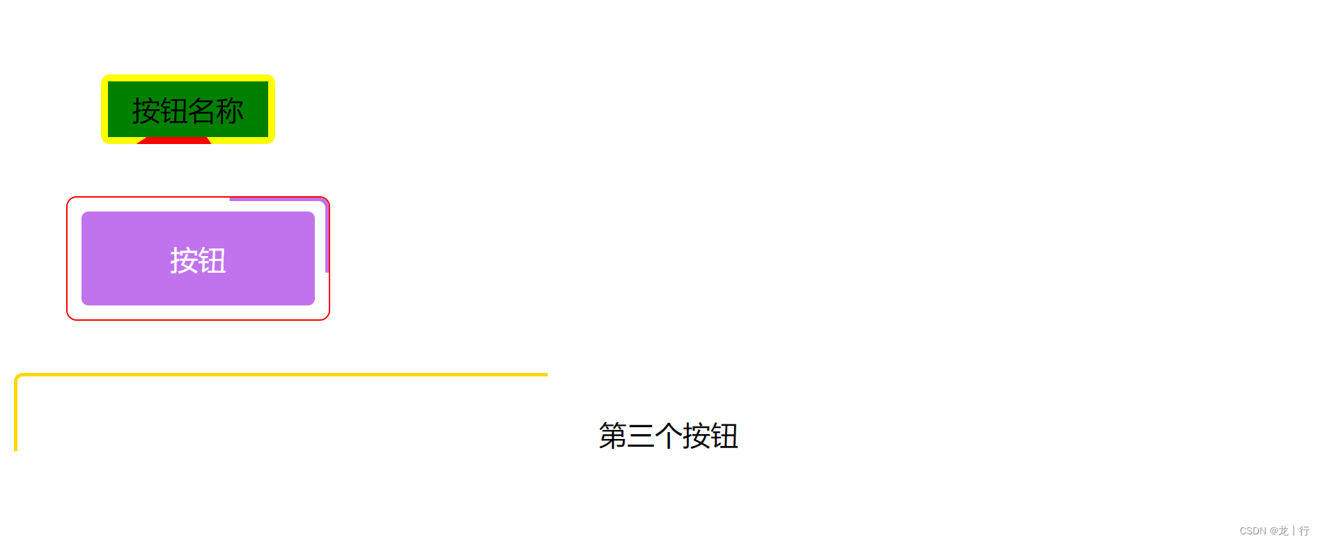
时间短就直接看第三个使用 clip-path + animation 完成。
<!DOCTYPE html>
<html>

<head>
    <style>
        /* 第一个 */
        .btn {
            width: 100px;
            height: 40px;
            background: yellow;
            position: relative;
            display: flex;
            align-items: center;
            justify-content: center;
            border-radius: 5px;
            margin-left: 50px;
            margin-top: 50px;
            overflow: hidden;
        }

        .btn::before {
            content: '';
            width: 200%;
            height: 200%;
            background-color: red;
            animation: move 3s infinite linear;
            transform-origin: 0 0;
            position: absolute;
            top: 50%;
            left: 50%;
        }

        .btn::after {
            content: '';
            position: absolute;
            width: calc(100% - 8px);
            height: calc(100% - 8px);
            background-color: green;
        }

        .btn .name {
            z-index: 1;
        }


        @keyframes move {
            to {
                transform: rotate(1turn);
            }
        }


        /* 第二个 */

        .borderShow {
            width: 150px;
            height: 70px;
            margin: 30px;
            position: relative;
            border-radius: 6px;
            overflow: hidden;
            border: 1px solid red;
            display: flex;
            justify-content: space-around;
            align-items: center;

            &::after {
                content: '';
                position: absolute;
                top: 2px;
                left: 2px;
                width: calc(100% - 4px - 12px);
                height: calc(100% - 4px - 12px);
                text-align: center;
                border: 6px solid white;
                border-radius: 4px;
                background-color: #fff;
                animation: showRound 3s infinite linear;

            }


            /* 内部的盒子 */
            .borderShowCenter {
                position: absolute;
                top: 8px;
                left: 8px;
                width: calc(100% - 4px - 12px);
                height: calc(100% - 4px - 12px);
                text-align: center;
                border-radius: 4px;
                display: flex;
                justify-content: space-around;
                align-items: center;
                color: #fff;
                background-color: #c073ed;
                z-index: 10;
                /* 覆盖伪元素 */
            }
        }

        @keyframes showRound {

            /* box-shadow : x轴 y轴 模糊 放大 颜色; */
            0%,
            100% {
                box-shadow: 0px -66px 0px 0px #c073ed;
                /* 上 */
            }

            25% {
                box-shadow: 146px 0px 0px 0px #c073ed;
                /* 右 */
            }

            50% {
                box-shadow: 0px 66px 0px 0px #c073ed;
                /* 下 */
            }

            75% {
                box-shadow: -146px 0px 0px 0px #c073ed;
                /* 左 */
            }
        }


        /* 第三 */

        .clippath_wrap {
            /* width: 150px; */
            height: 70px;
            display: flex;
            align-items: center;
            justify-content: center;
            position: relative;

            &::before {
                content: "";
                position: absolute;
                top: 0;
                left: 0;
                right: 0;
                bottom: 0;
                border: 2px solid gold;
                animation: clippath 3s infinite linear;

                border-radius: 5px
            }
        }

        @keyframes clippath {

            0%,
            100% {
                clip-path: inset(0 0 95% 0);
            }

            25% {
                clip-path: inset(0 95% 0 0);
            }

            50% {
                clip-path: inset(95% 0 0 0);
            }

            75% {
                clip-path: inset(0 0 0 95%);
            }
        }
    </style>
</head>

<body>


    <div class="btn"> <span class="name">按钮名称</span></div>


    <div class="borderShow">
        <div class="borderShowCenter">按钮</div>
    </div>


    <div class="clippath_wrap">第三个按钮</div>

</body>

</html>


 8519
8519


 被折叠的 条评论
为什么被折叠?
被折叠的 条评论
为什么被折叠?
 到【灌水乐园】发言


