


0 效果
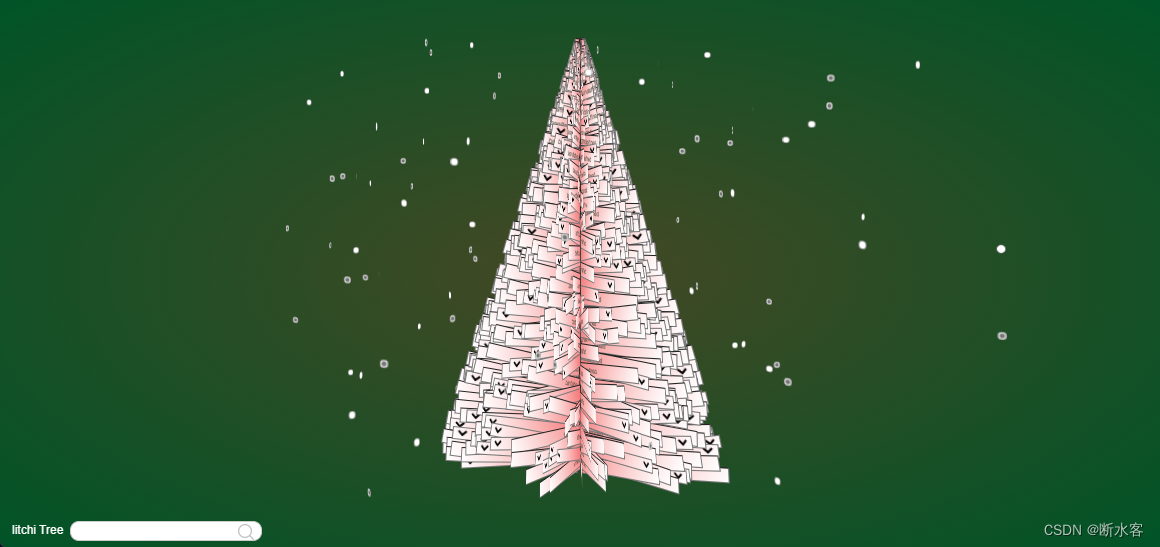
做法:
- 创建三个文件tree.html、tree.js、tree.css,放在同一个目录下
- 按1、2、3小节填充这三个文件
- 浏览器打开tree.html文件
1 .HTML-基本布局
搞一个.html文件,内容如下
<!DOCTYPE html>
<html lang="en">

<head>
  <meta charset="utf-8" />
  <meta name="description" content="给litchi0的圣诞树" />
  <meta name="author" content="Cat" />
  <meta http-equiv="X-UA-Compatible" content="chrome=1" />
  <title>litchi Tree</title>
  <link href="litchiTree.css" rel="stylesheet" media="screen" />
  <link href="search.css" rel="stylesheet" media="screen" />
  <link href="https://fonts.googleapis.com/css?family=Armata" rel="stylesheet" type="text/css" />
</head>

<body>
  <div class="tree"></div>
  <script src="litchiTree.js"></script>

  <p class="project-title">litchi Tree</p>

  <form target="_blank" method="get" action="https://cn.bing.com/search?" class="parent">
    <input type="text" class="search" name="q" placeholder="">
    <input type="submit" value="" name="" style="background: url('search.png') no-repeat;" id="" class="subm">
  </form>

</body>

</html>
2 .JS-添加元素
const width = 521; //树的宽度
const height = 843; //树的长度
const quantity = 1314; //树枝的数量
const types = ["text", "select", "radio"];

const greetings = [
  //文字
  "      ------万事胜意",
  "      ------喜乐平安",
  "      ------健康快乐",
  "      ------常获幸福",
];
let tree = document.querySelector(".tree"),
  treeRotation = 0;
tree.style.width = width + "px";
tree.style.height = height + "px";

window.addEventListener("resize", resize, false);

for (var i = 0; i < quantity; i++) {
  let element = null,
    type = types[Math.floor(Math.random() * types.length)],
    greeting = greetings[Math.floor(Math.random() * greetings.length)];

  let x = width / 2,
    y = Math.round(Math.random() * height);

  let rx = 0,
    ry = Math.random() * 360,
    rz = -Math.random() * 15;

  let elemenWidth = 5 + ((y / height) * width) / 2,
    elemenHeight = 26;

  switch (type) {
    case "select":
      element = document.createElement("select");
      element.setAttribute("selected", greeting);
      element.innerHTML = "<option>" + greetings.join("</option><option>") + "</option>";
      element.style.width = elemenWidth + "px";
      element.style.height = elemenHeight + "px";
	  element.style.backgroundImage = 'linear-gradient(120deg,#f57777,#ffffff)';
	  element.style.fontcolor = "#444433";
      break;
    case "text":
    default:
      element = document.createElement("input");
      element.setAttribute("type", "text");
      element.setAttribute("value", greeting);
      element.style.width = elemenWidth + "px";
      element.style.height = elemenHeight + "px";
	  element.style.backgroundImage = 'linear-gradient(120deg,#f58888,#ffffff)';
	  element.style.color = "#444433";

  }

  element.style.transform = `translate3d(${x}px, ${y}px, 0px) rotateX(${rx}deg) rotateY(${ry}deg) rotateZ(${rz}deg)`;

  tree.appendChild(element);
}

for (var i = 0; i < 99; i++) {
  let element = document.createElement("input");
  element.setAttribute("type", "radio");

  let spread = window.innerWidth * 4 / 7;

  let x = Math.round(Math.random() * spread) - spread / 4,
    y = Math.round(Math.random() * height),
    z = Math.round(Math.random() * spread) - spread / 2;

  let rx = 0,
    ry = Math.random() * 360,
    rz = 0;

  if (Math.random() > 0.5) element.setAttribute("checked", "");

  element.style.transform = `translate3d(${x}px, ${y}px, ${z}px) rotateX(${rx}deg) rotateY(${ry}deg) rotateZ(${rz}deg)`;
  element.style.color = "#f58888";
  element.style.backgroundColor = "#f58888";
  tree.appendChild(element);
}

function resize() {
  tree.style.top = (window.innerHeight - height - 100) / 2 + "px";
}

resize();
3 .CSS-具体样式
/* 去除默认样式 */
*{
    margin: 0;
    padding: 0;
}
li{
    list-style: none;
}
a{
    text-decoration: none;
}
body,
html {
    overflow: hidden;
    font-family: Helvetica, Arial, sans-serif;
    color: #824;
    font-size: 11px;
    width: 100%;
    height: 100%;
    background: #454824;

	background: -moz-radial-gradient(center, ellipse cover, #454824 0%, #005427 100%);
    background: -webkit-gradient(radial, center center, 0px, center center, 100%, color-stop(0%, #454824), color-stop(100%, #005427));
    background: -webkit-radial-gradient(center, ellipse cover, #454824 0%, #005427 100%);
    background: radial-gradient(center, ellipse cover, #454824 0%, #005427 100%);
}

@keyframes spin {
    0% {
        transform: rotateY(0deg);
    }

    100% {
        transform: rotateY(360deg);
    }
}

body {
    /* 透视效果 */
    perspective: 3000px;
    perspective-origin: 0 10%;
}

.tree {
    margin: 0 auto;
    position: relative;
    animation: spin 60s infinite linear;
    transform-origin: 50% 0;
    transform-style: preserve-3d;
}

.tree * {
    position: absolute;
    transform-origin: 0 0;
}

.project-title {
    position: absolute;
    left: 24px;
    bottom: 21px;
    font-size: 24px;
    color: #fff;
}

.credits {
    position: absolute;
    right: 21px;
    bottom: 25px;
    font-size: 21px;
    z-index: 20;
    color: #fff;
    vertical-align: middle;
}

.credits a {
    padding: 8px 10px;
    color: rgba(255, 255, 255, 0.7);
    border: 2px solid rgba(255, 255, 255, 0.7);
    text-decoration: none;
}

.credits a:hover {
    border-color: #fff;
    color: #fff;
}

@media screen and (max-width: 1040px) {
    .project-title {
        display: none;
    }

    .credits {
        width: 100%;
        left: 0;
        right: auto;
        bottom: 0;
        padding: 30px 0;
        background: #ff0000;
        text-align: center;
    }

    .credits a {
        display: inline-block;
        margin-top: 7px;
        margin-bottom: 7px;
    }
}


 519
519


 被折叠的 条评论
为什么被折叠?
被折叠的 条评论
为什么被折叠?
 到【灌水乐园】发言


